Complete Guide to UI Interface Optimization
Introduction
Hi Travelers, welcome back! 
In this post, I’ll be sharing a complete guide on how to manage and optimize UI Interface systems in Miliastra Wonderland, focusing on Control Groups, HUD elements, Nameplates, and Text Bubble systems.
This guide is designed to help you build a visually appealing, well-structured, and gameplay-friendly UI layout that enhances readability without overwhelming the player.
A good UI is not just decoration, it is the bridge between your mechanics and the player’s experience. Through proper grouping, hierarchy, and styling techniques, you can transform a default interface into a polished and visually compelling HUD.
Inside this guide, we will cover:
Managing UI Control Groups
- Understanding Inherent Content (Mini Map, Skill Area, HP Bars, Joystick, etc.)
- Customizing Interactive Buttons
- Designing Item Displays & Deck Selectors
- Styling Text Boxes & Pop-ups
- Progress Bars, Timers, and Scoreboards
Advanced UI Text Styling
- Text Formatting Basics
- H5 Color Tags & Highlight System
- Special Characters
Whether you are a beginner Craftsperson learning UI basics or an experienced creator refining your stage presentation, this guide will help you design a clean, structured, and scalable UI framework. Let’s optimize your interface and elevate your game presentation to the next level. 

Chapter 1: Managing UI Control Groups
In this chapter, we will focus on organizing and structuring UI elements using Control Groups. Proper management of UI Control Groups helps maintain a clean layout, improves workflow efficiency, and ensures that interface components function correctly within the stage. By understanding how to group, arrange, and configure UI elements effectively, you can build a more scalable, organized, and polished interface system.
Part 1: Understanding Inherent UI Content
In this part, we will explore the default HUD elements that are automatically integrated into the stage interface. These inherent UI components include essential gameplay indicators such as the Mini Map, Skill Area, HP Bars, Joystick, Team Information, and system buttons.
Understanding how each element functions, where it is positioned, and how it impacts player experience is the foundation of effective UI optimization. By mastering these built-in components, you can create a cleaner layout, improve readability, and ensure that critical information remains clear during both exploration and combat.
📝 Wonderland Guide:
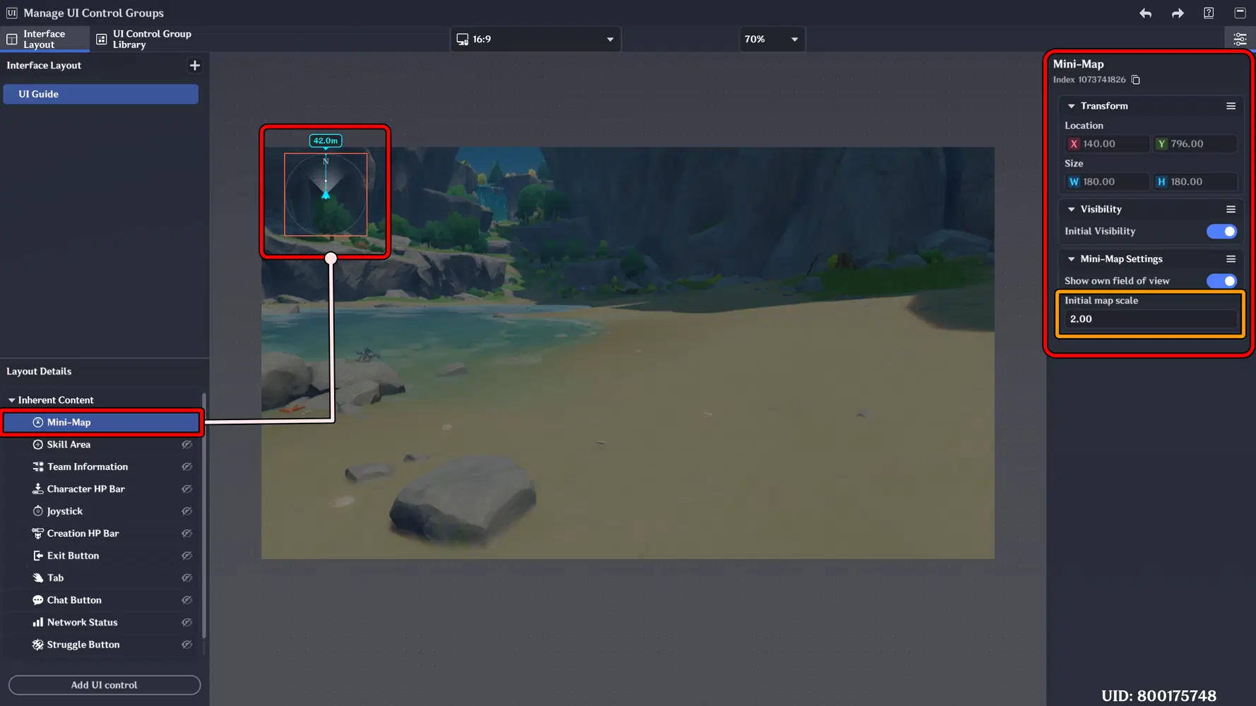
a. Mini Map
A compact navigation interface that displays your surrounding area, nearby objectives, and important points of interest in real time. It helps players track movement, locate targets, and maintain spatial awareness during exploration and combat.
Implementation:
You can apply this feature to any object, whether it is a static object, an enemy, or even the player.
In the Object Details panel, add a new component "Mini-Map Marker" – Advanced Editing. Click the “+” button to add a new marker, then select the marker type and color you prefer to display on the Mini Map.
You can also add a custom description to each marker, allowing players to better understand the purpose or significance of that location or unit.
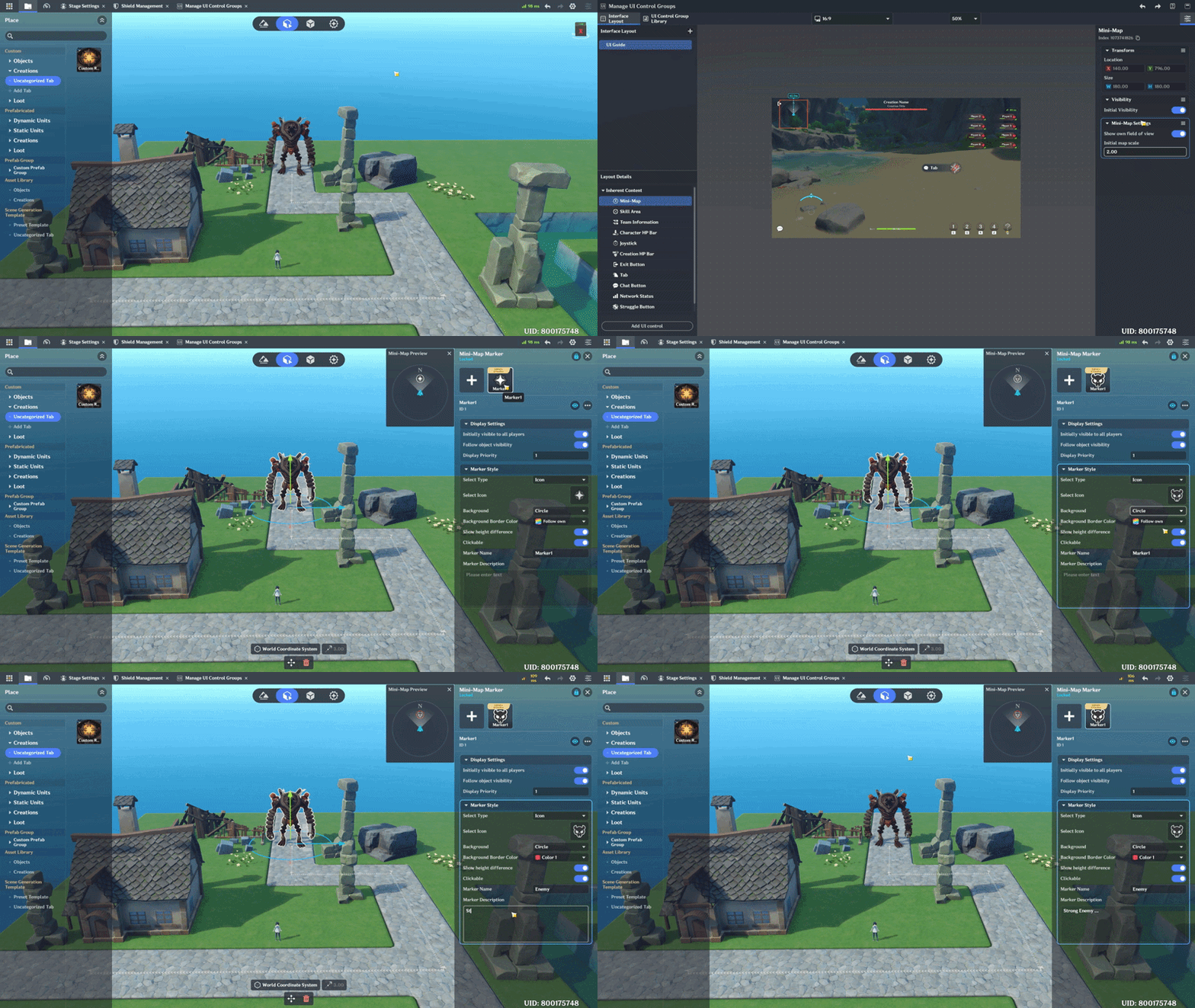
Important: If the object marker does not appear on the Mini Map, adjust the Initial Map Scale to a smaller value.
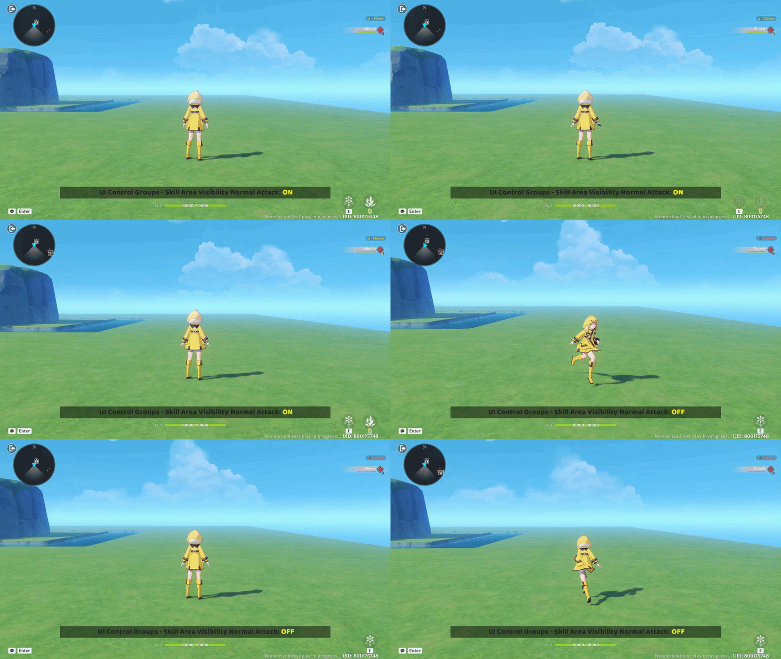
b. Skill Area
Displays the Skill buttons used to Activate character Skill. If this UI element is disabled, you will not be able to use any skills-even if they have already been added to your character. Make sure to keep this UI enabled to ensure proper skill functionality.
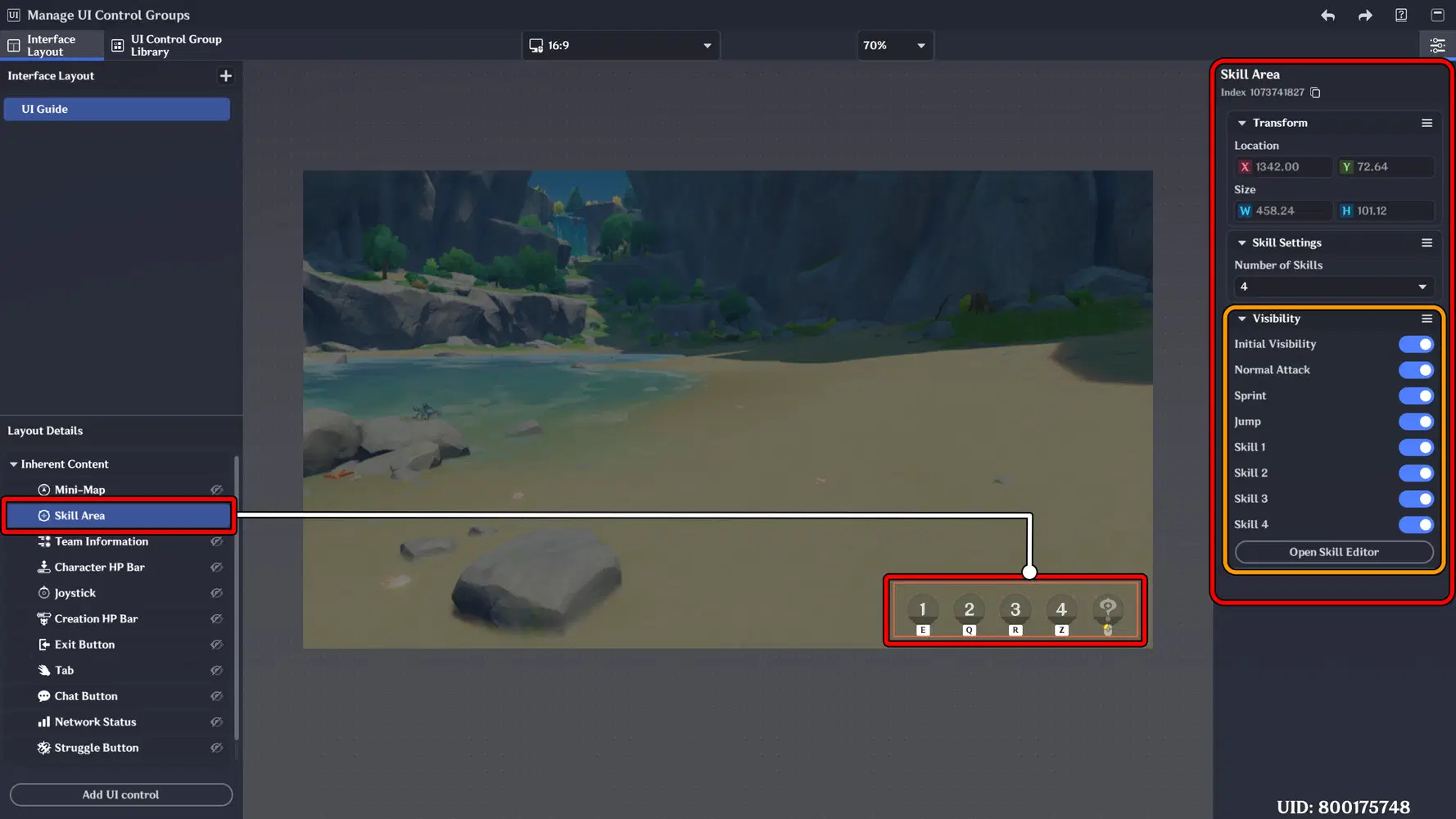
Implementation:
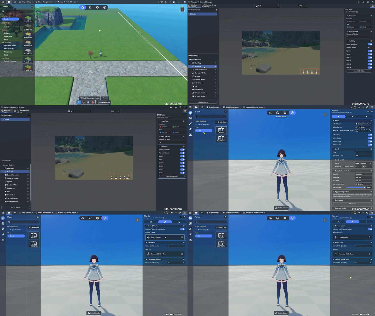
Create a Skill first, then add Skill to Player Template Class - Initial Class.
For a complete guide about Skill implementation, you can visit my previous post.
c. Team Information
Displays team information. This interface is integrated with the faction system and becomes especially valuable when developing a game or stage with a CO-OP system. However, it can also be effectively used in single-player mode.
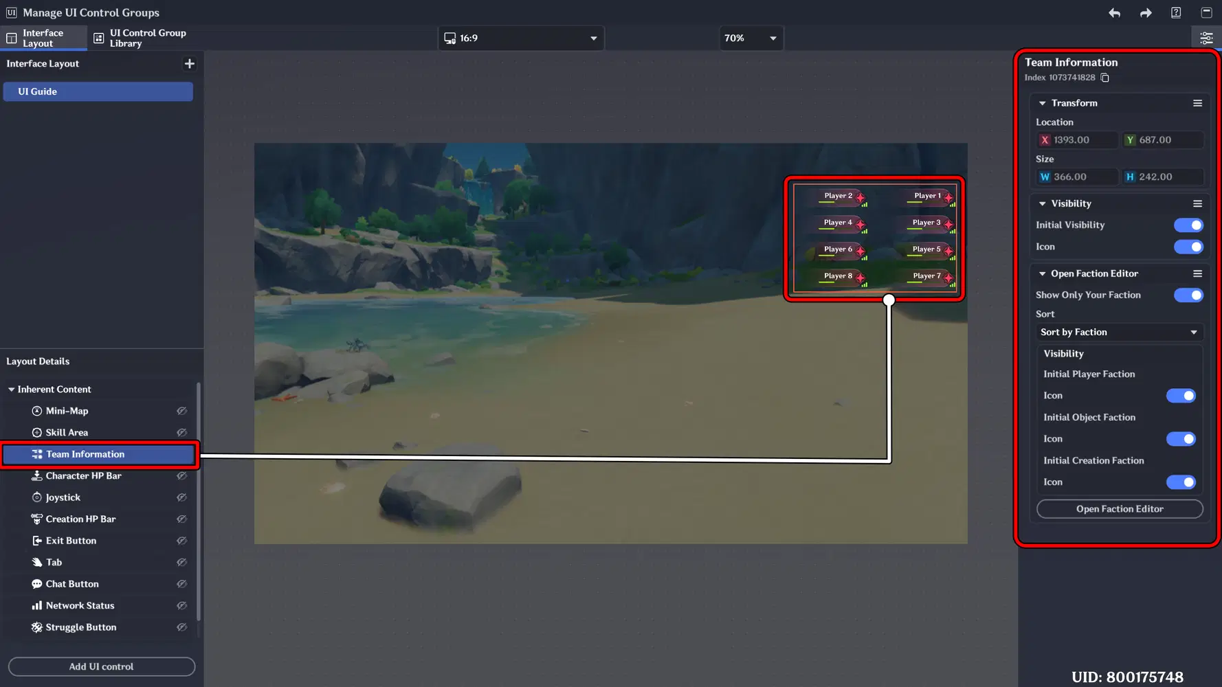
Implementation:
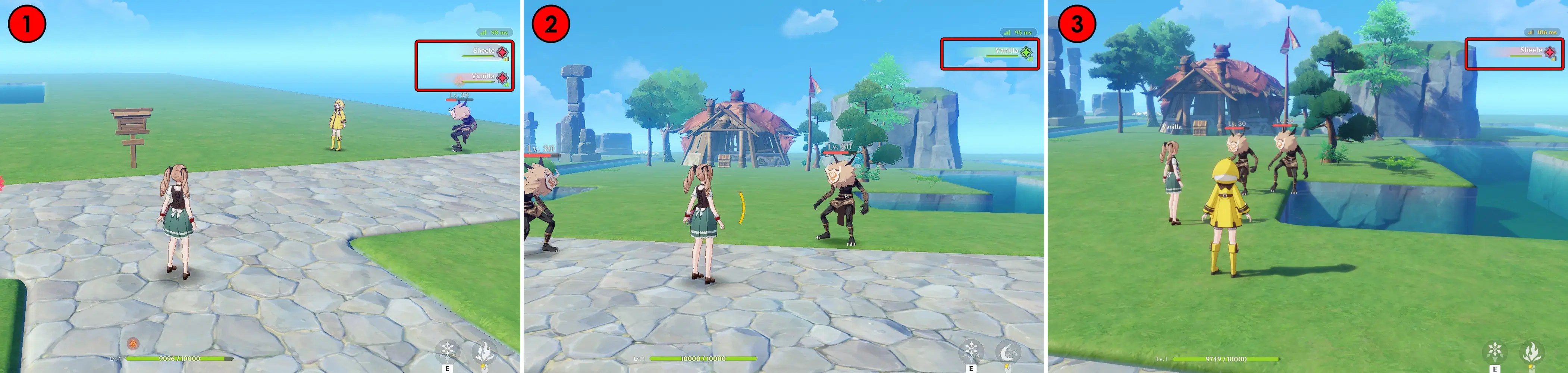
Add a New Faction for Another Player
- This is the display when you are on the same team as another player with the same faction.
- This is the display when you are in a different faction from another player (POV: Player 2).
- This is the display when you are in a different faction from another player (POV: Player 1).
d. Character HP Bar
Displays the player current health status in real time. This bar provides clear visual feedback during combat, allowing players to monitor damage taken, recovery effects, and overall survivability.
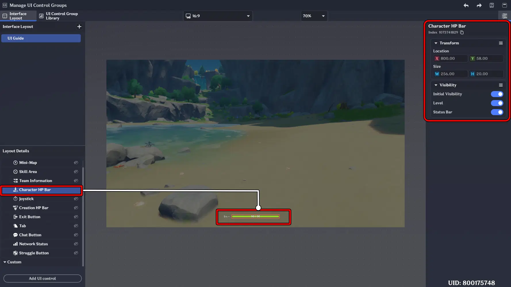
Visibility
- Initial Visibility : Controls whether the Character HP UI is displayed.
- Level : Displays the character’s level, shown on the left side of the HP Bar.
- Status Bar : Shows positive or negative status effects applied to the character. For example, if affected by the Wet status, a Hydro element icon will appear above HP Bar.
Implementation:
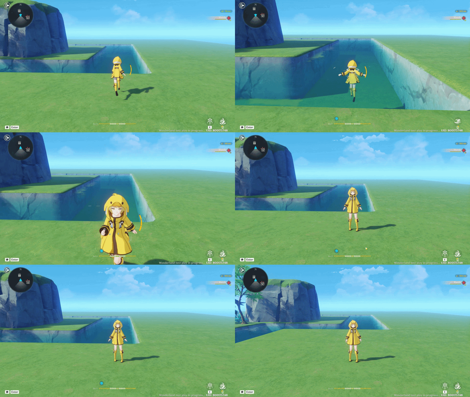
✦ First Implementation
The Character HP Bar is visible, and when the character falls into water, they receive the Wet (Hydro) effect. The Hydro status icon appears above the HP Bar as a visual indicator.
✦ Second Implementation
The Character HP UI is hidden to create a cleaner screen appearance. This setup is suitable for game or stage designs using a first-person camera, such as shooting or horror games, where minimal HUD elements enhance immersion.
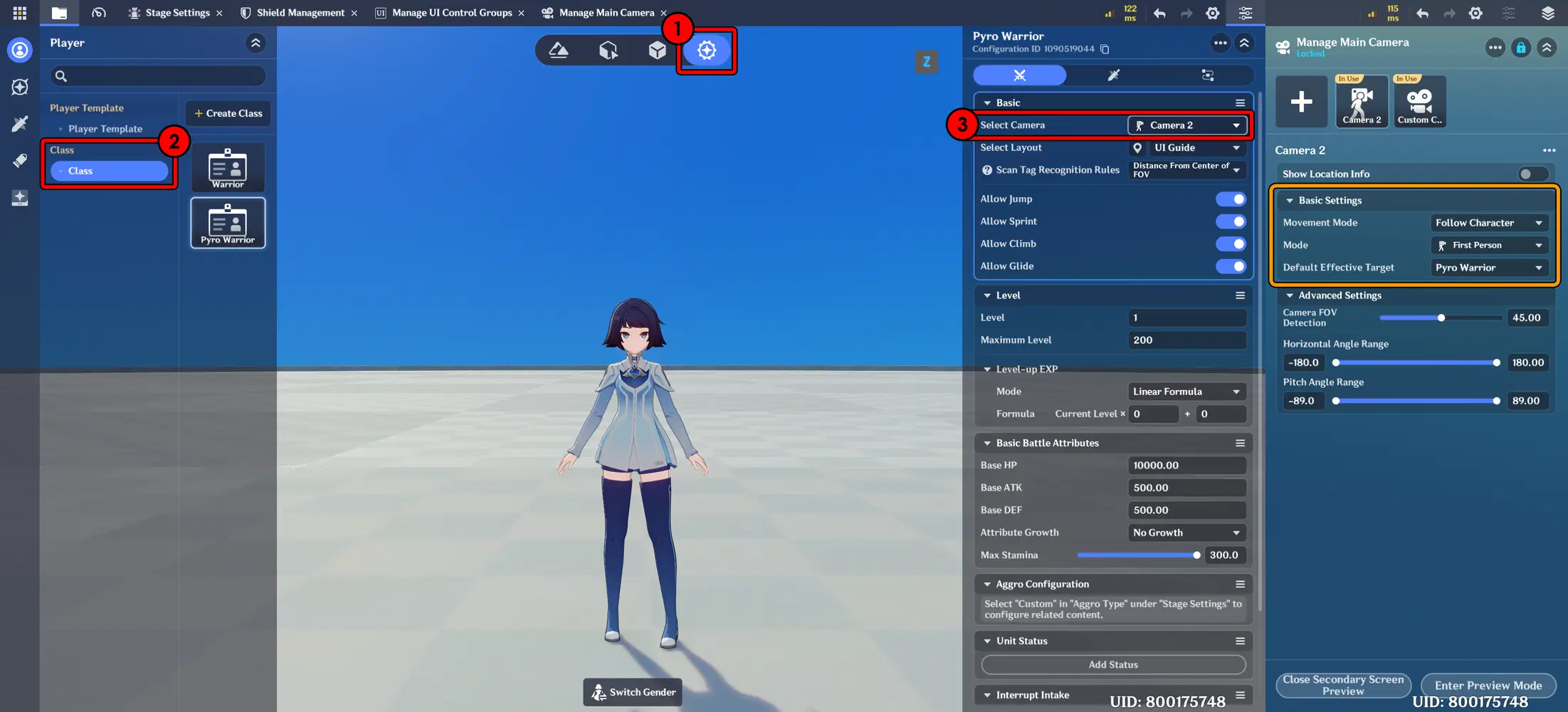
Implement Camera First Person in Player Class
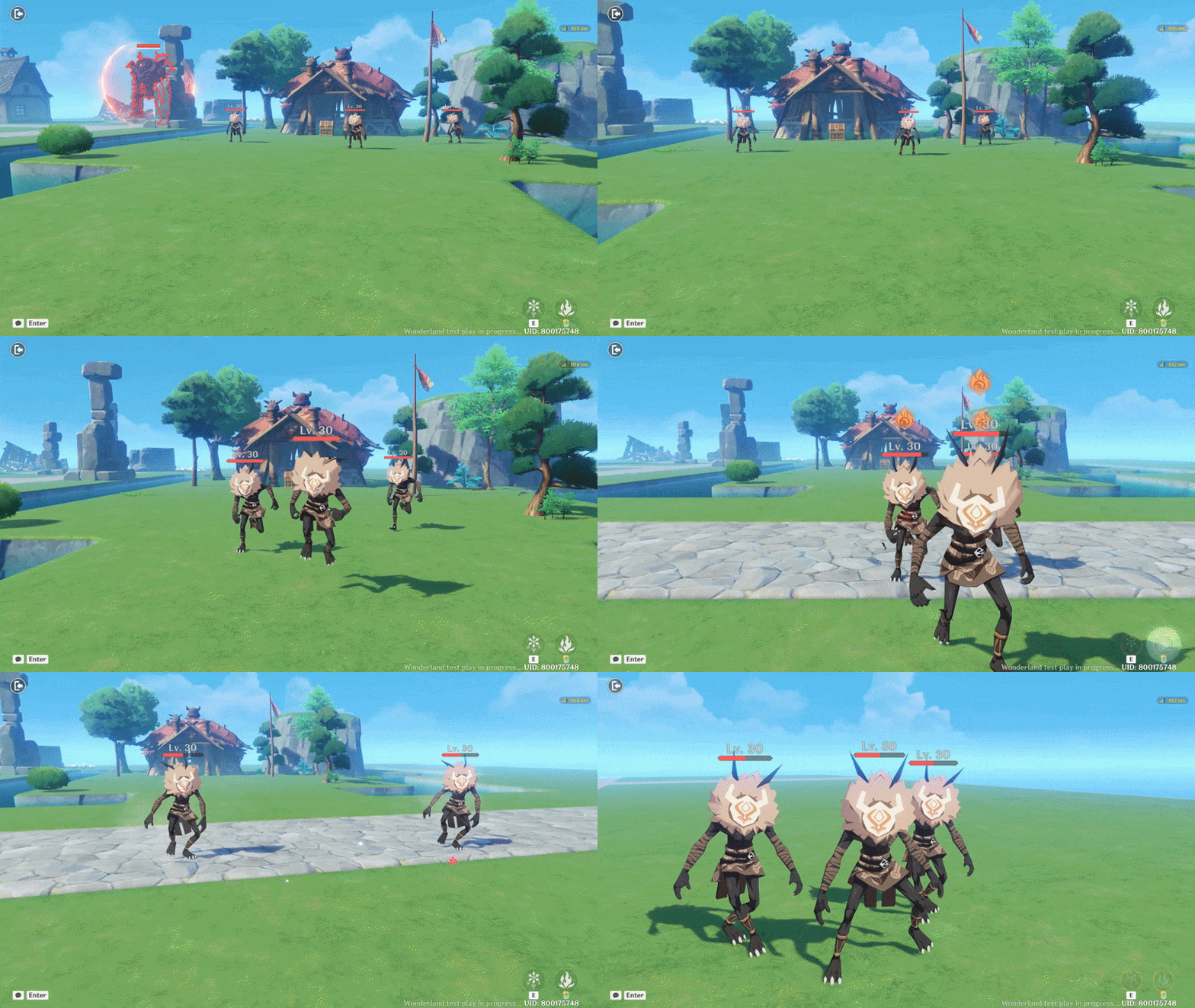
e. Creation HP Bar
Displays the health status of Creations (Monsters) in real time. This bar allows players to monitor enemy durability during combat and make tactical decisions based on remaining HP.
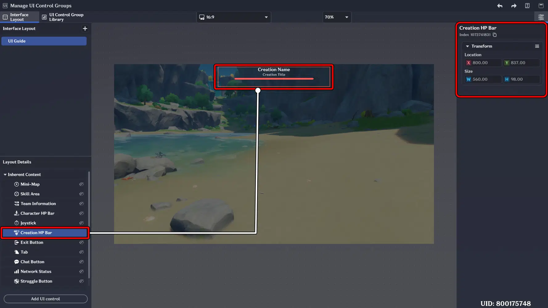
However, at the moment, there are no specific customization options available for this UI. As an alternative, you can utilize the Nameplate HP Bar by adding the appropriate component to the Creation object, allowing for more flexible customization and visual adjustments. 

f. Joystick
The Joystick is the primary movement control interface for the player. It allows directional movement and character navigation, especially for mobile or touch-based gameplay. Make sure to enable Initial Visibility if your stage is available for mobile devices.
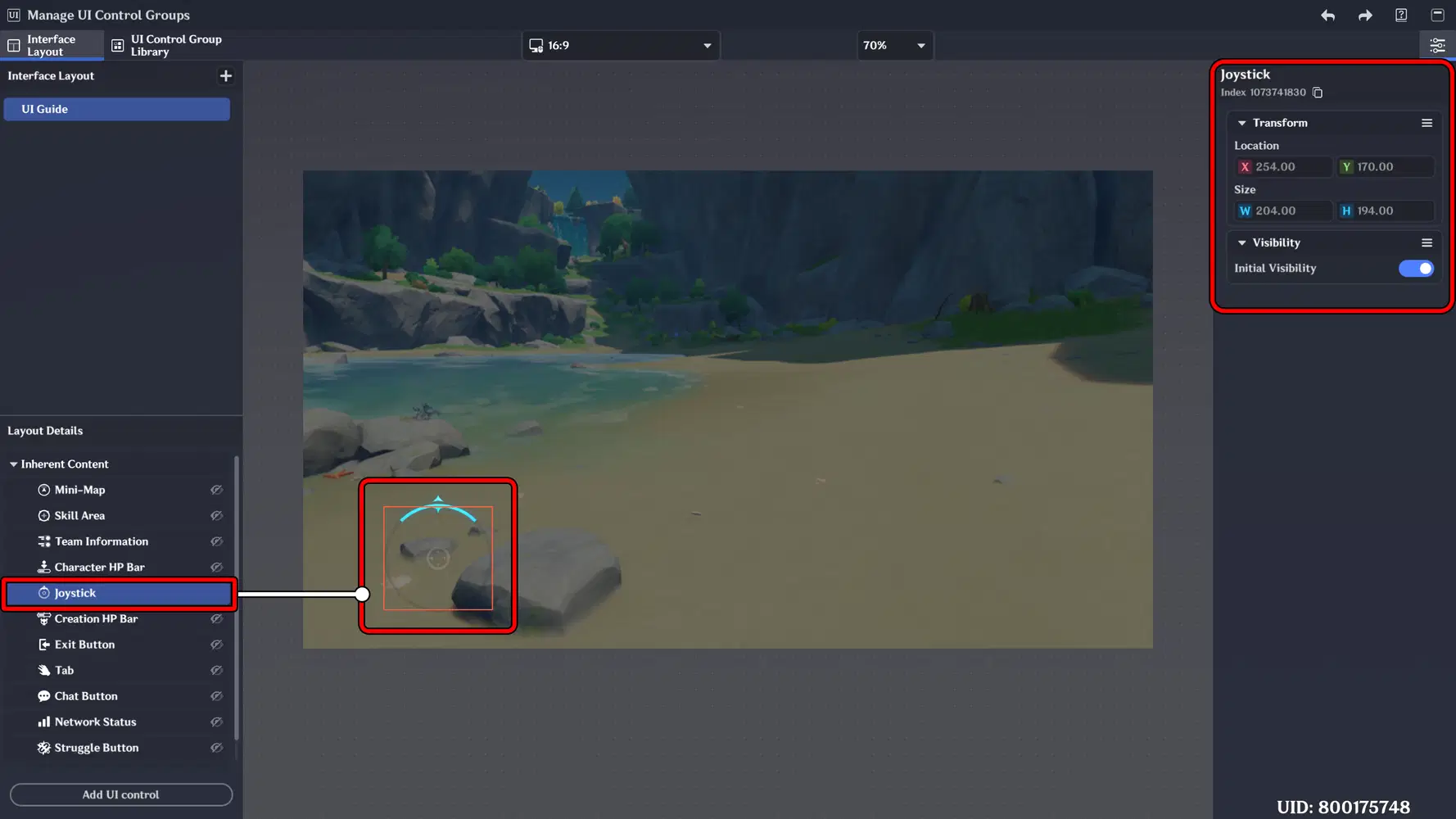
g. Tab
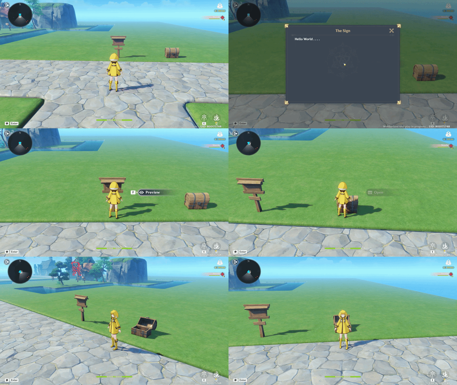
The Tab button functions as an interactive key used to interact with objects in the environment. It allows players to trigger actions such as opening doors, collecting items, activating mechanisms, or starting dialogues when near an interactable object.
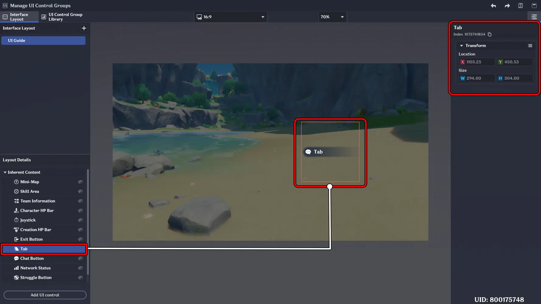
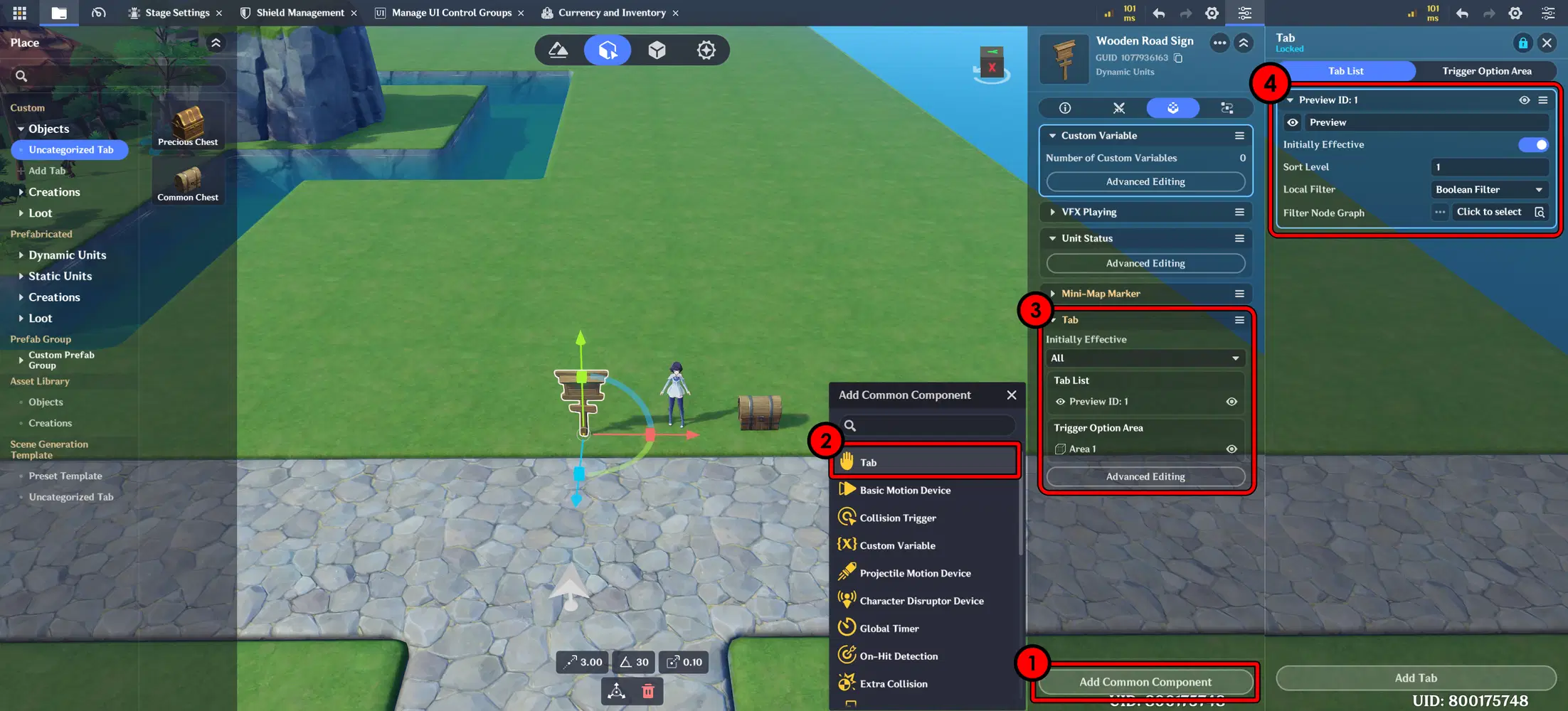
Implementation:
You can apply this feature by adding the Tab component to an object. For example, here I added it to a signboard object. For the configuration settings, you can refer to the setup shown below.
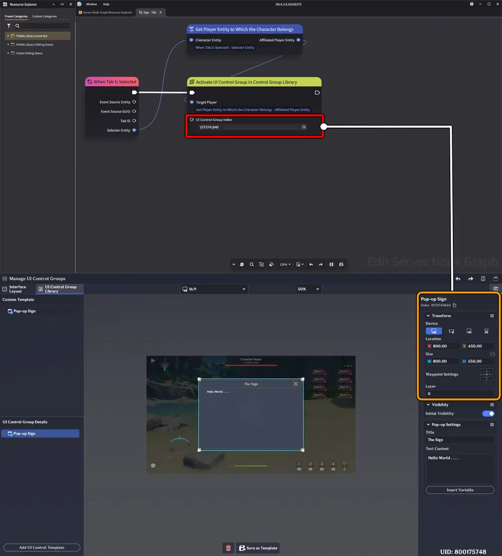
Next, create a UI Pop-up and set up a Node Graph to handle the interaction logic. With this setup, when the Tab button on the object is pressed, it will trigger the Node Graph and display the Pop-up window on the screen.
This setup can also be applied to other objects, such as interacting with and opening a treasure chest.
h. Chat Button
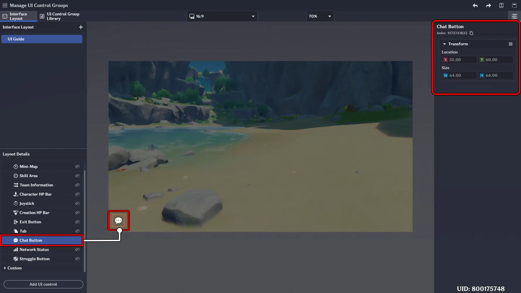
The Chat Button provides access to the in-game communication system. It allows players to open the chat panel, send messages, and coordinate with teammates during gameplay.
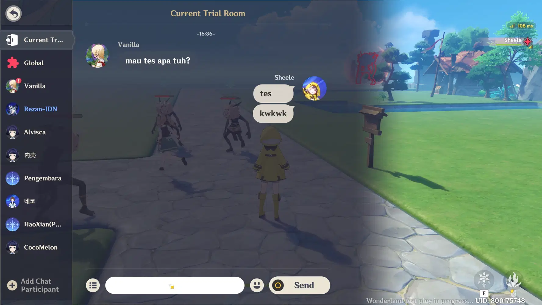
This is the display shown when using the Chat feature inside a stage, allowing players to communicate without leaving the gameplay environment.
i. Network Status
Displays the current connection condition during gameplay. It helps players monitor network stability, latency, and connectivity to ensure smooth multiplayer or online interactions.
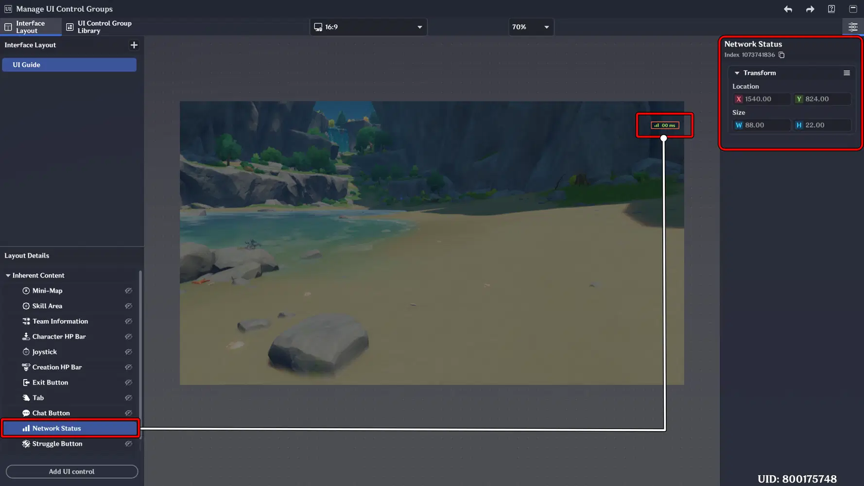
At the moment, this feature cannot be customized, including changing its position on the screen.
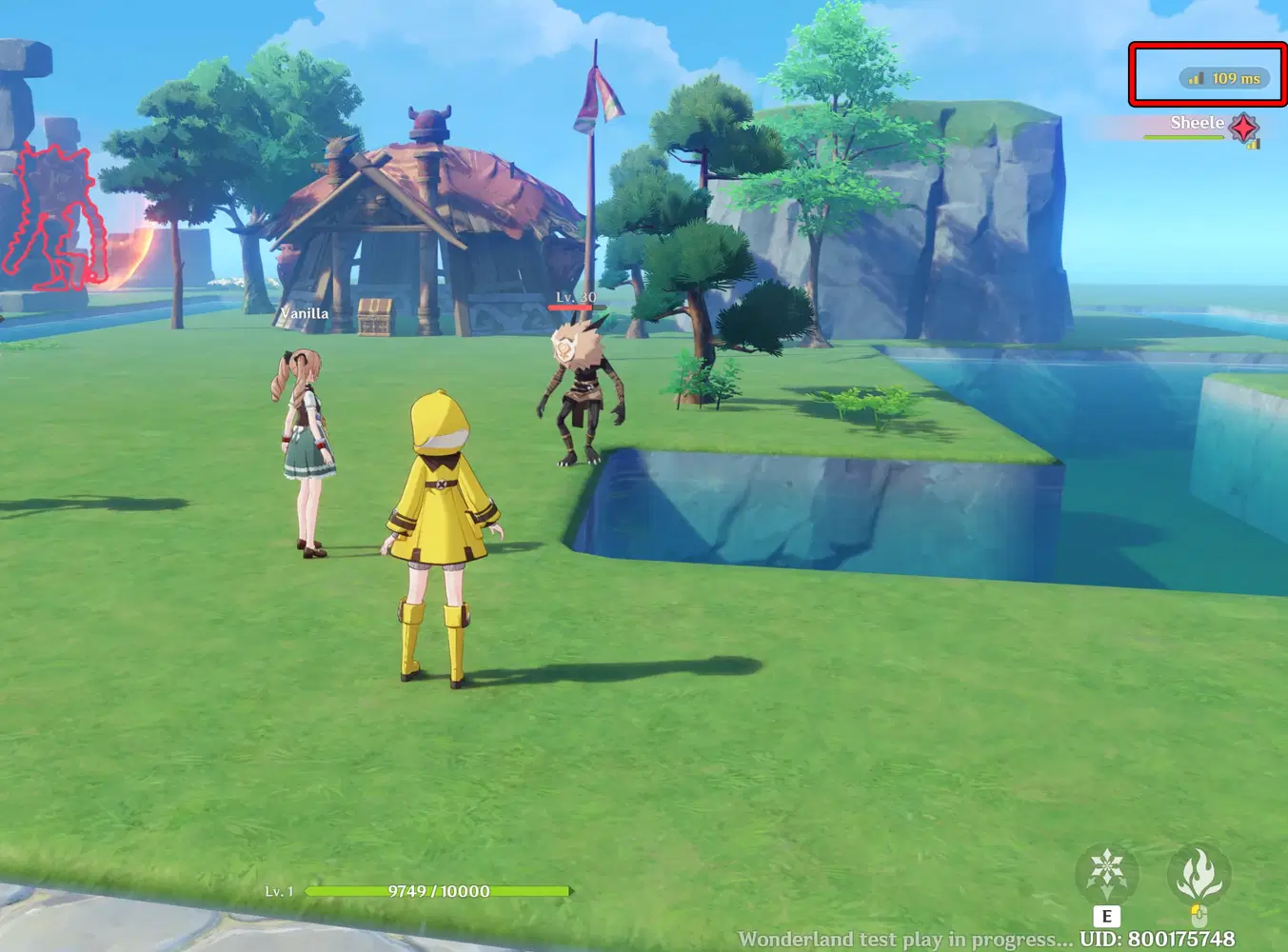
j. Struggle Button
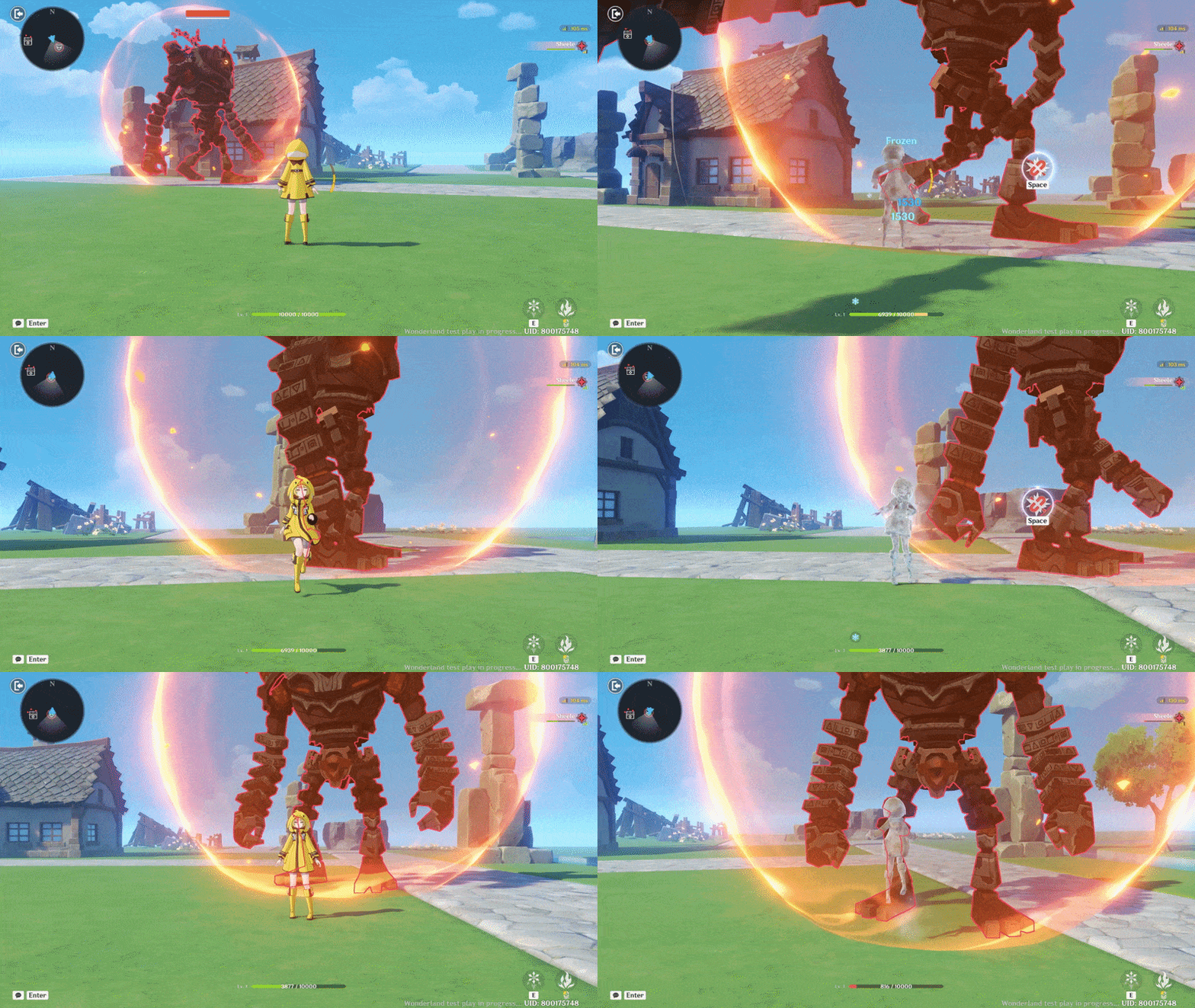
The Struggle Button appears when the character is affected by certain control-impairing effects, such as freeze. Pressing this button allows the player to attempt to break free and regain control of their character. It adds an interactive recovery mechanic during critical combat situations.
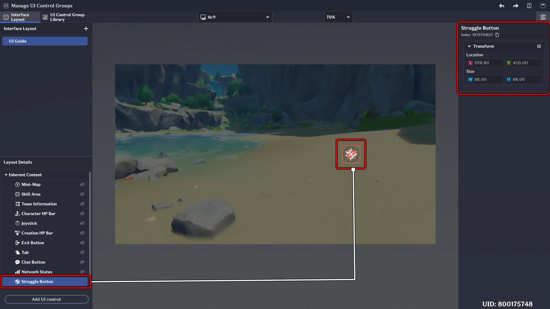
Implementation:
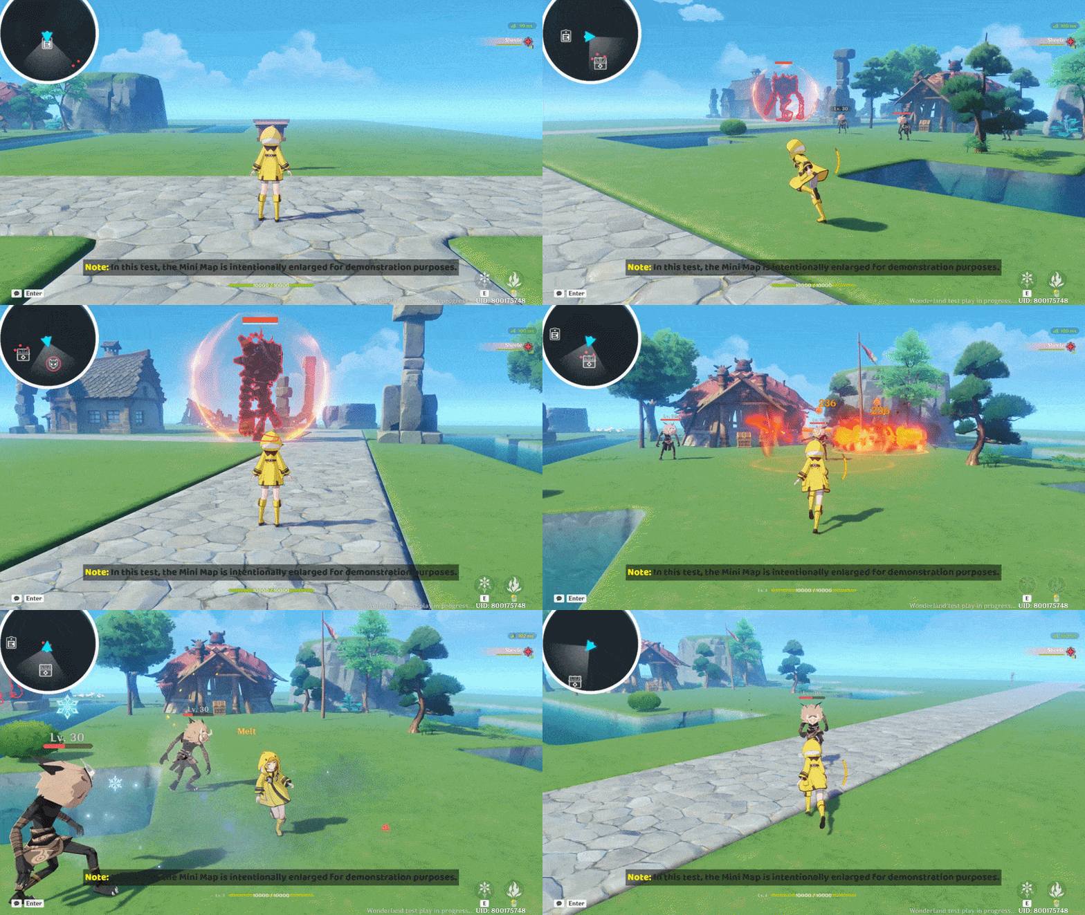
In this implementation, when the character is hit by a Ruin Guard attack that applies Hydro and Cryo effects, the character becomes Frozen. When this happens, the Struggle Button appears on the screen. Press the button repeatedly to break the Freeze effect and regain control of the character.

Part 2: UI Control Template
In this part, we will focus on the Prefabricated UI Controls, which function as ready-to-use templates for building interactive and structured interface elements. These include Interactive Buttons, Item Displays, Text Boxes, Pop-ups, Progress Bars, Timers, Scoreboards, and Deck Selectors.
By understanding how to configure and customize these controls, you can create a consistent, functional, and visually polished UI system for your stage.
📝 Wonderland Guide:
a. Interactive Button
An interactive UI element used to trigger actions, execute commands, or navigate between menus. It serves as a core control component, allowing players to interact with systems, confirm selections, or activate specific functions within the interface.
Implementation:
In this guide, I will demonstrate how to implement it by creating an Achievement Menu within the stage.
We will use the Interactive Button as the trigger to access the Achievement menu.
In the UI Control Group Library, add an Interactive Button, then adjust its position and visual appearance. In this example, I use a book icon to represent the Achievement menu and place it on the right side of the screen.
Finally, don’t forget to add this template to the Interface Layout to ensure it appears during gameplay.
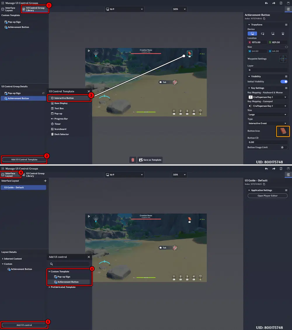
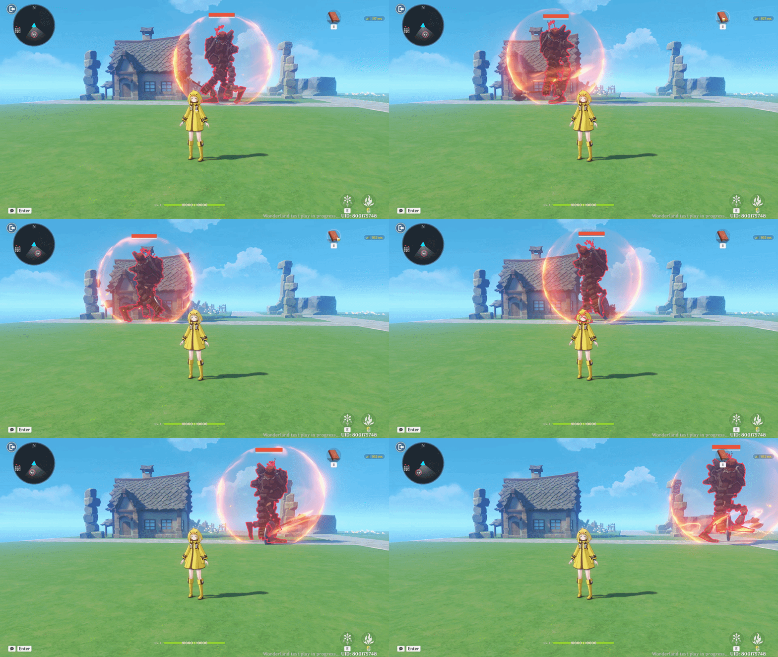
Here is the result: a new button with a book icon appears in the top-right corner of the screen.
However, when you press it, nothing happens. This is because we have not yet added the operational function or created the Pop-up window for the Achievement menu. 
b. Text Box
A UI component used to display structured text content such as dialogue, system messages, descriptions, objectives, or formatted information. It supports text styling and layout customization, making it essential for delivering clear communication and enhancing the overall interface presentation.
Implementation:
In this guide, I will demonstrate how to implement it by adding text to the Achievement button, allowing it to display a clear label and improve user recognition and interface clarity.
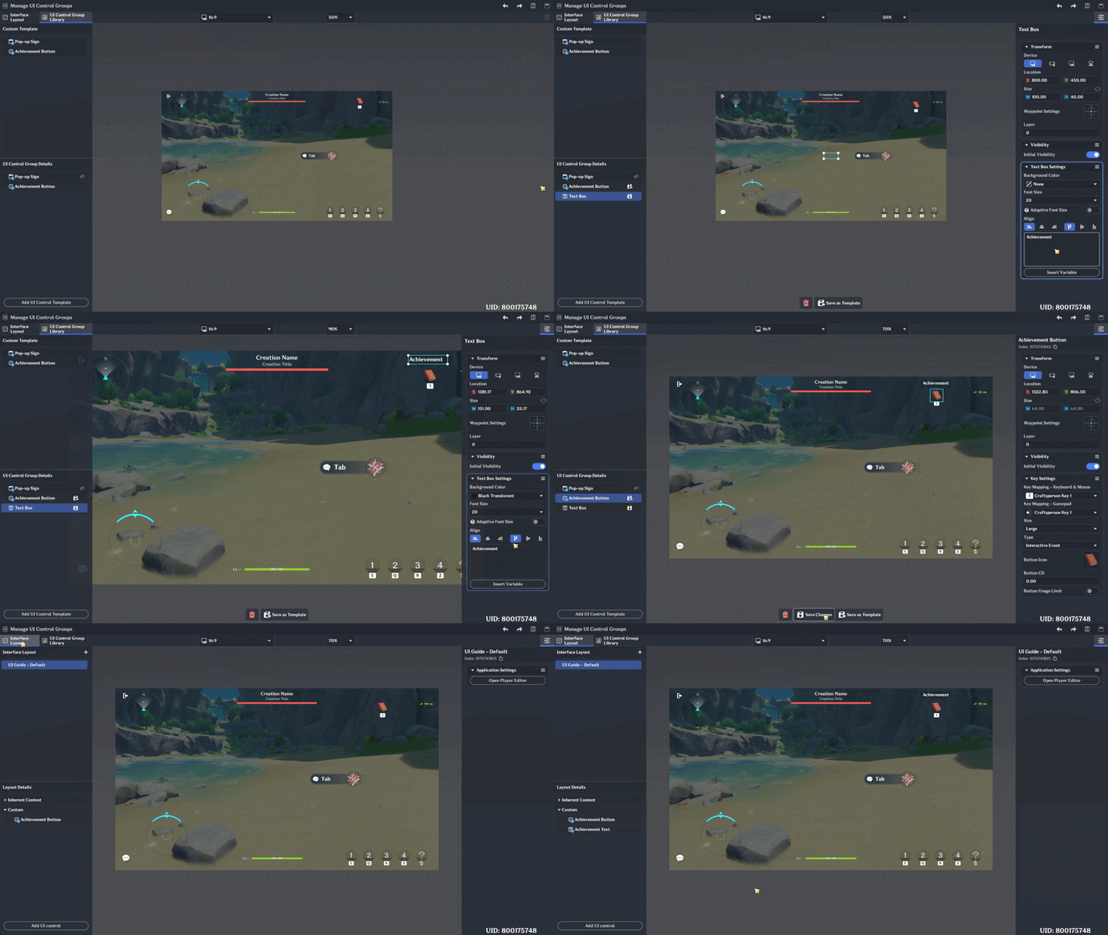
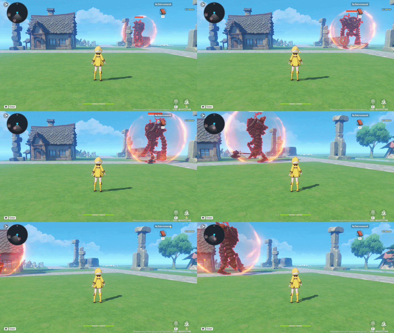
Here is the result: a label “Achievement” is added above the button to make its function clearer and easier to recognize.
c. Pop-up
A temporary UI window used to display additional information, confirmations, notifications, or interactive menus. It appears on top of the current interface and is commonly used for alerts, system messages, or opening sub-menus such as the Achievement panel.
Implementation:
Continuing from the previous step, create and add a Pop-up for the Achievement menu. In the Pop-up Settings, you can add text content to display the achievements that need to be completed. Simply write the achievement objectives there, such as mission goals or special challenges the player must accomplish.
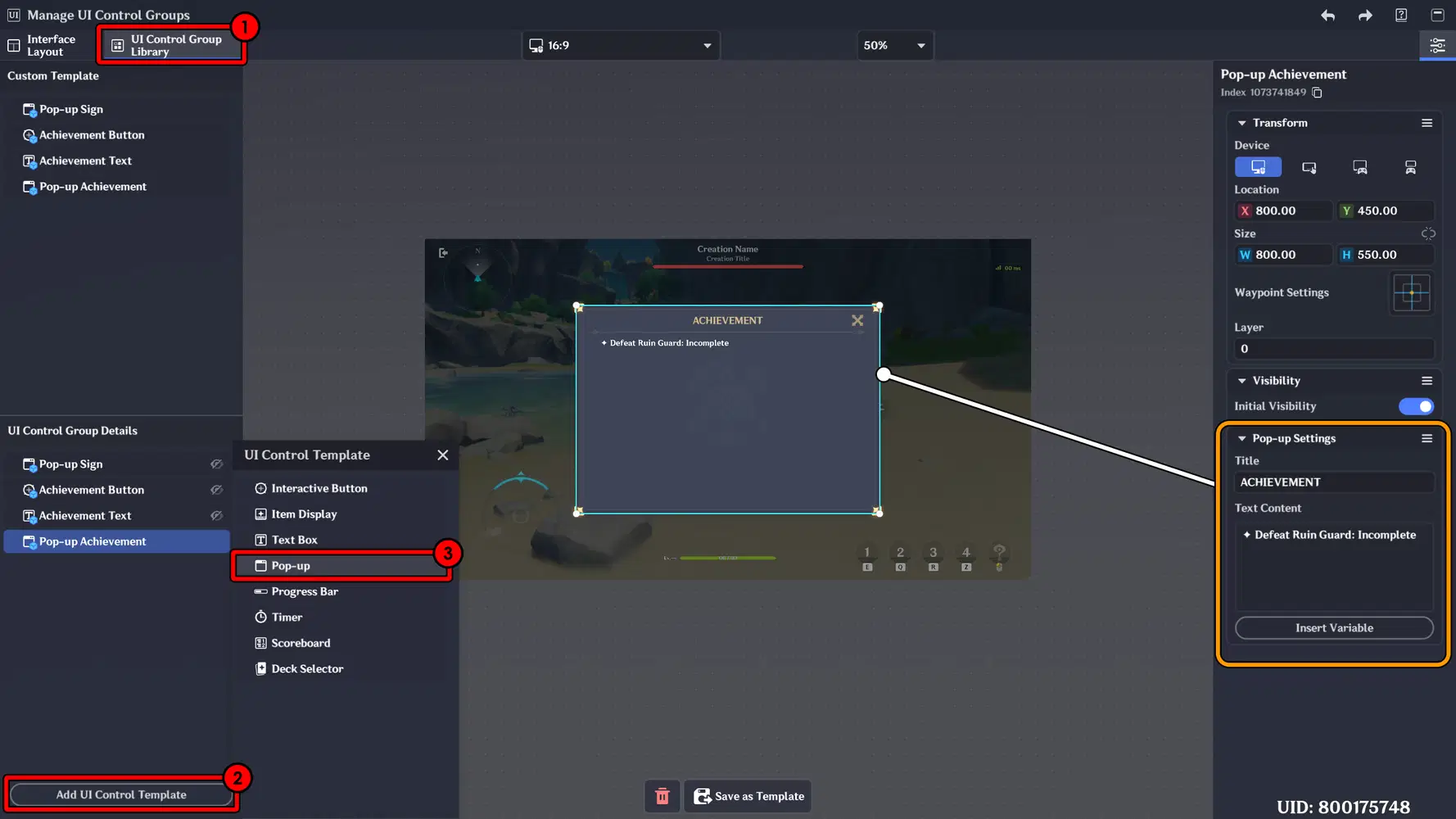
Next, create a new Node that functions to display the Achievement Pop-up when the Interactive Button is pressed. After setting up the logic, attach the created Node to the Player, so the interaction can properly trigger the Pop-up during gameplay.
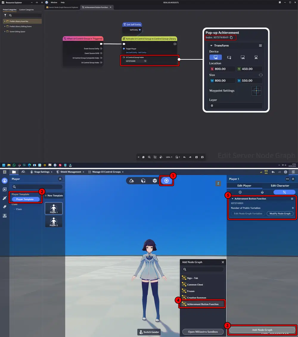
Here is the result: When interacting with the Achievement button, the Achievement Pop-up appears on the screen.
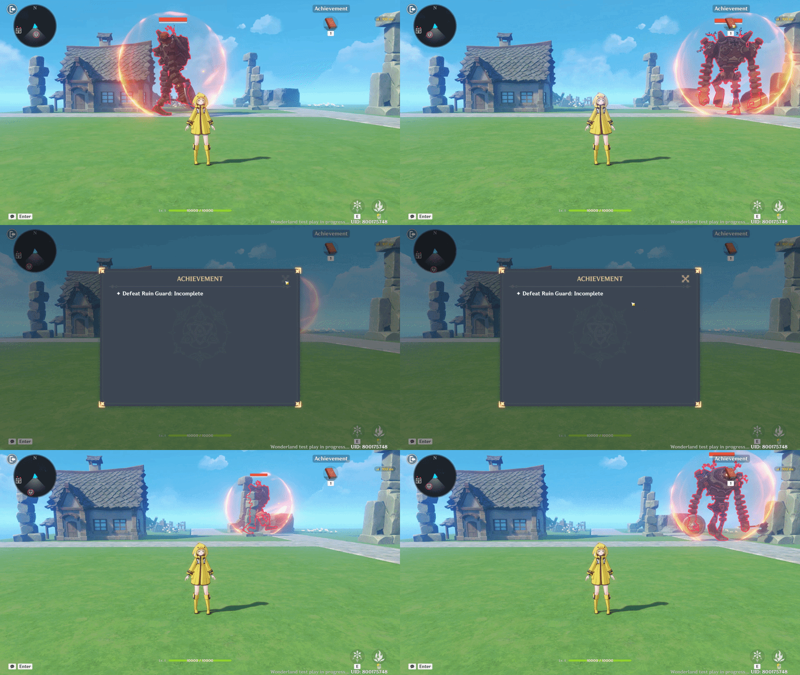
d. Progress Bar
A visual indicator used to represent dynamic values such as completion status, health, loading progress, or achievement tracking. It updates in real time, allowing players to clearly monitor progression toward a specific goal or condition.
Implementation:
Continuing from the previous guide, here I will create a Progress Bar that updates whenever an enemy is defeated. As enemies are eliminated, the Progress Bar will gradually fill up, and once all enemies are defeated, the Achievement will be completed.
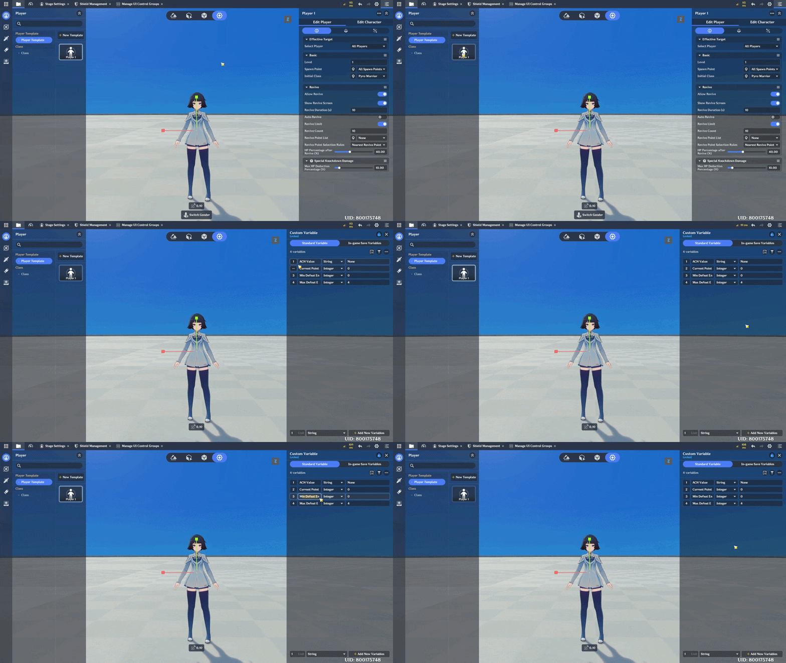
First, create custom variables on the Player.
- ACH Value : The achievement value displayed on the Pop-up. (String)
- Current Point : The current number of enemies defeated. (Interger)
- Min Defeat Enemy : The minimum required number of defeated enemies. (Interger)
- Max Defeat Enemy : The maximum target number of defeated enemies. (Interger)
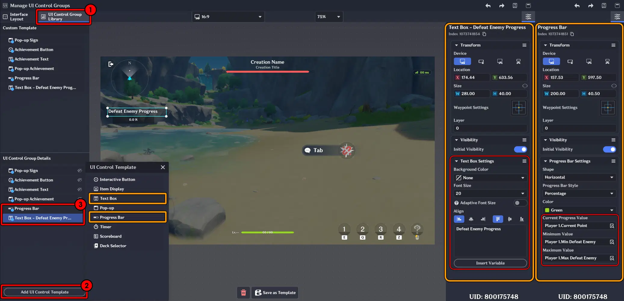
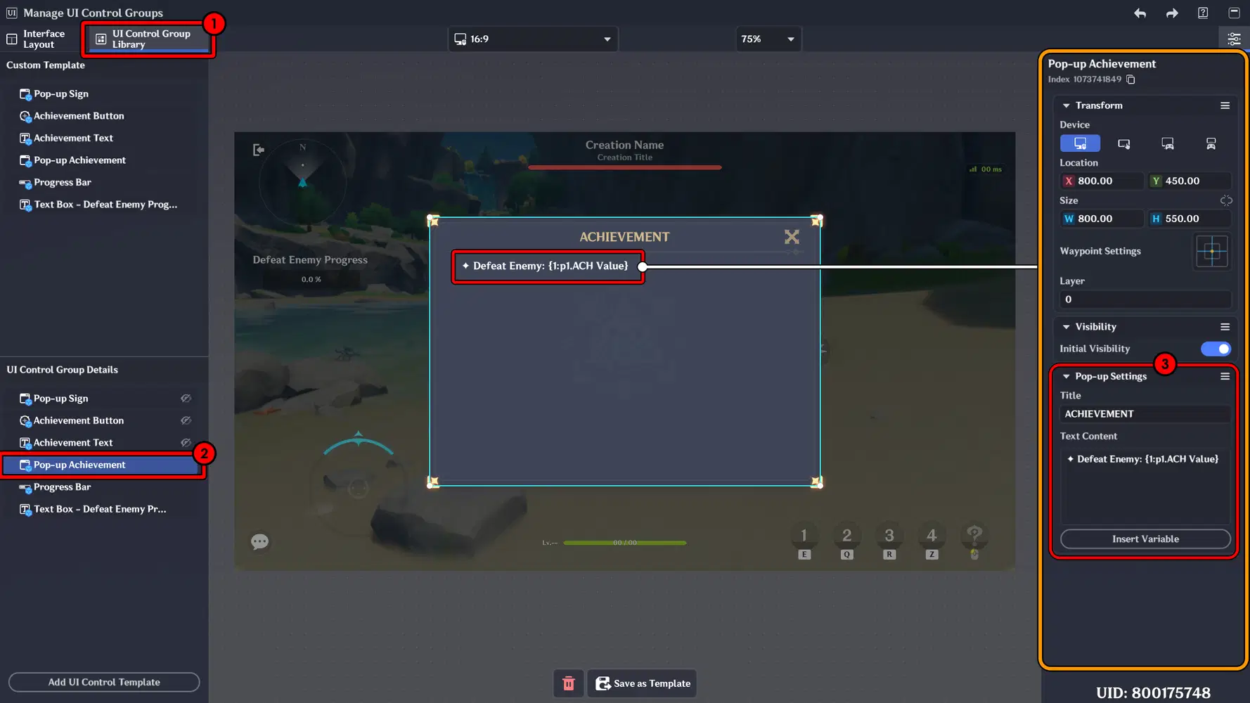
The next step is to add and create a Progress Bar and a Text Box in the UI Control Group Library, then position them according to your preferred layout.
For the Text Box, adjust the alignment (such as centering the text) and configure the Background color.
For the Progress Bar, assign the previously created variable to the Current Progress Value field. Make sure this field is properly filled in, as it is required for the Progress Bar to function correctly.
Next, edit and add a dynamic value indicator inside the Achievement Pop-up using the following format:
{1:p1.ACH Value}
This will display the real-time value of the ACH Value variable within the Pop-up, allowing the achievement progress to update dynamically during gameplay.
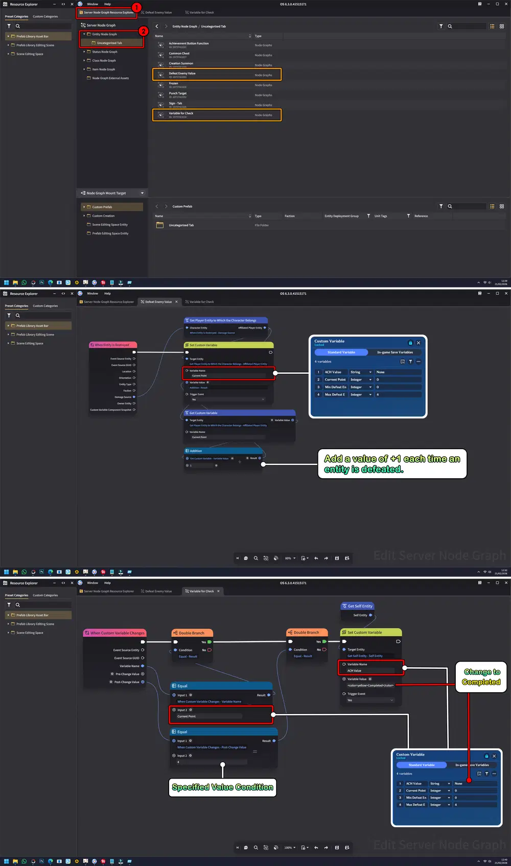
Next, create two separate Node Graphs:
- The first Node Graph is used to monitor when an entity is defeated. Place on Stage Entity.
- The second Node Graph handles updating and modifying the Achievement values accordingly. Place on Player.
By separating these functions, the system becomes more structured, easier to manage, and scalable for future achievements.
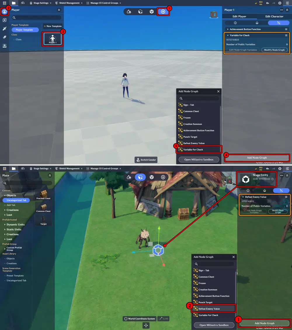
Don't forget to attach these Node Graphs to player and stage entities.
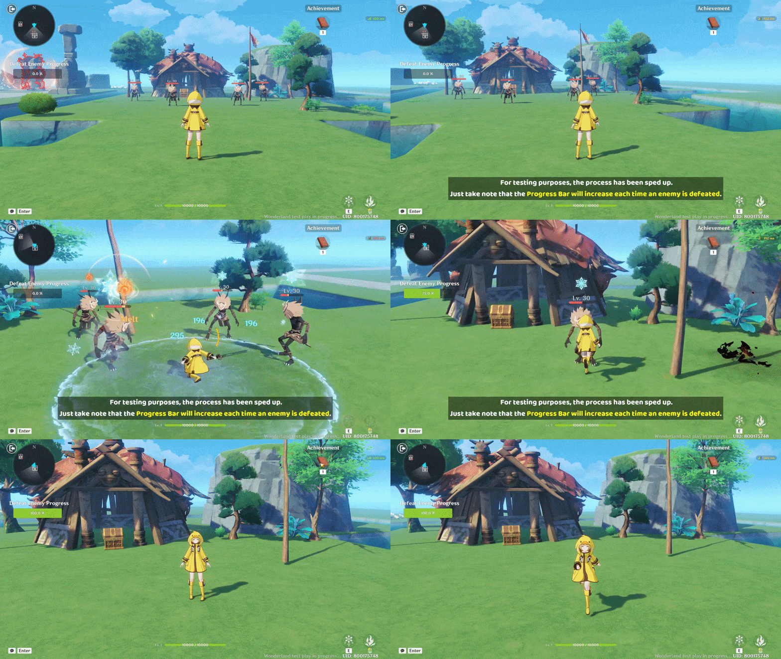
And here is the final result: When you defeat enemies, the Progress Bar gradually fills up, and once it reaches the required amount, the Achievement is completed.
e. Scoreboard
A UI component used to display player scores, rankings, or performance statistics during a stage. It provides clear real-time feedback on progress and results, making it especially useful for competitive modes, CO-OP stages, or performance-based challenges.
Implementation:
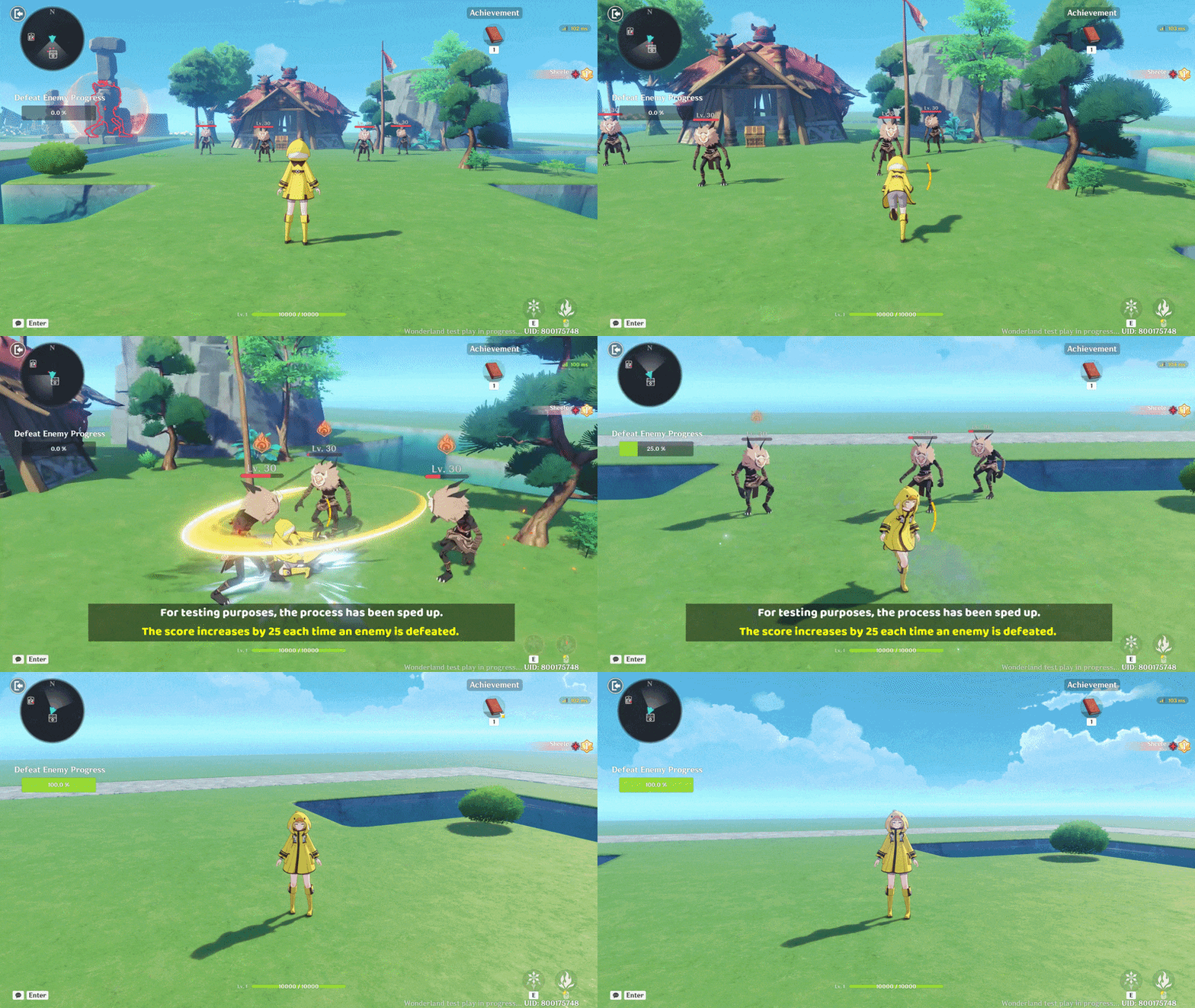
Continuing from the previous guide, this time I added a Scoreboard to provide scoring whenever you defeat an enemy. Once your score reaches the target value, the Achievement will be unlocked. Technically, this system works very similarly to the previous Progress Bar setup, with the main difference being that it tracks score accumulation instead of a defeat counter.
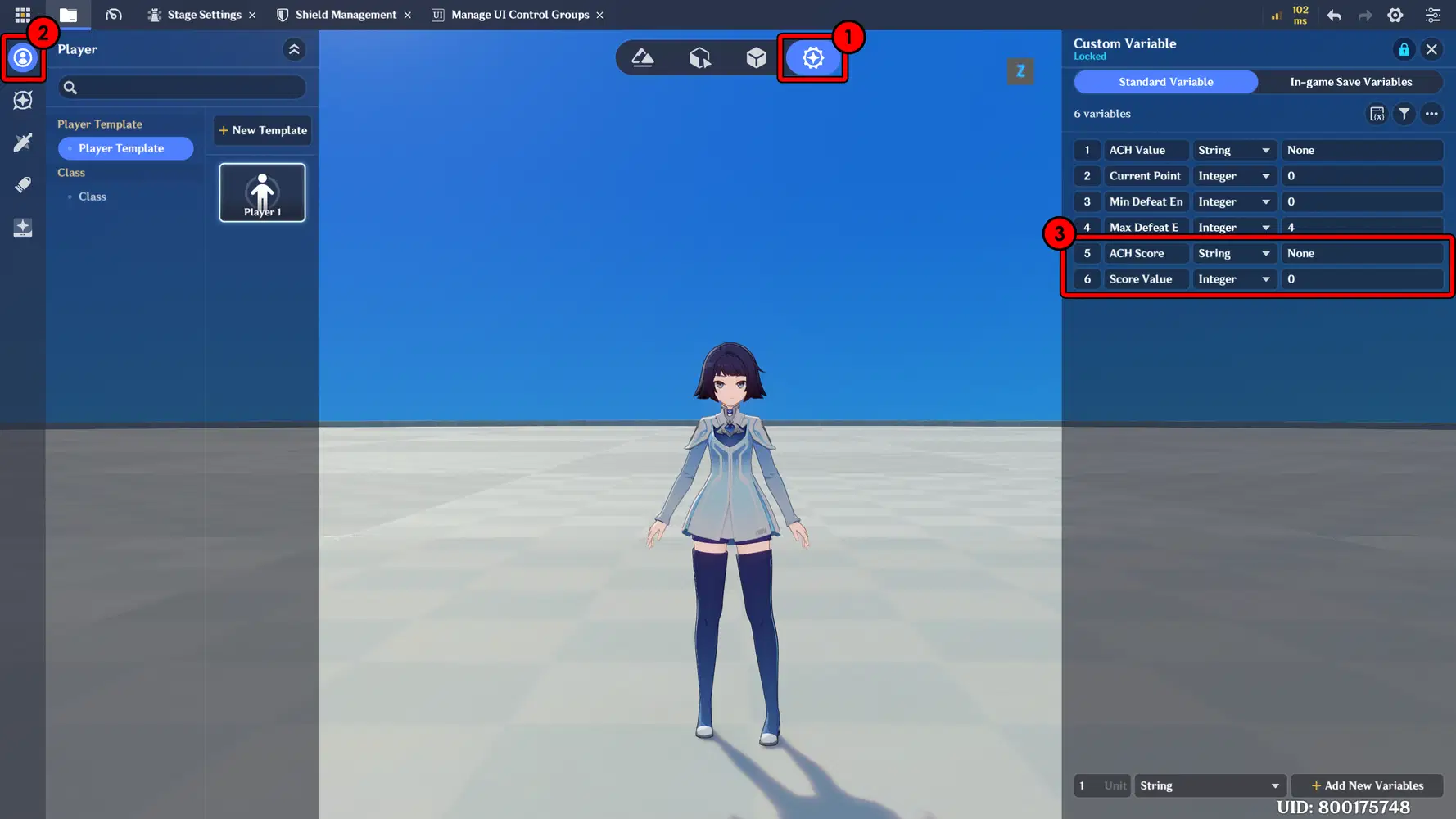
First, create new variables on the Player.
Here, I added one variable to calculate and store the Score, and another variable dedicated to tracking the Achievement related to that score.
- ACH Score : The achievement value displayed on the Pop-up. (String)
- Score Value : The current score of enemies defeated. (Interger)
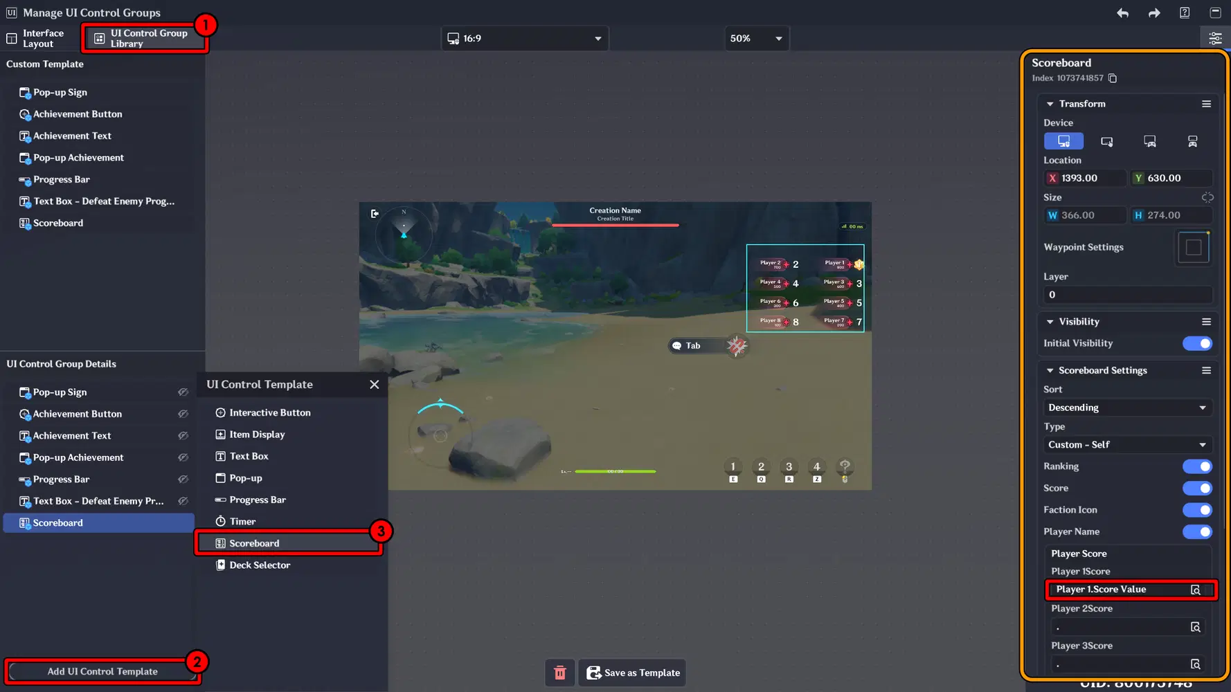
Next, add a Scoreboard in the UI Control Group Library. Position it wherever you prefer on the screen, then assign the Score Value variable to the Player Score field to ensure the score updates correctly during gameplay.
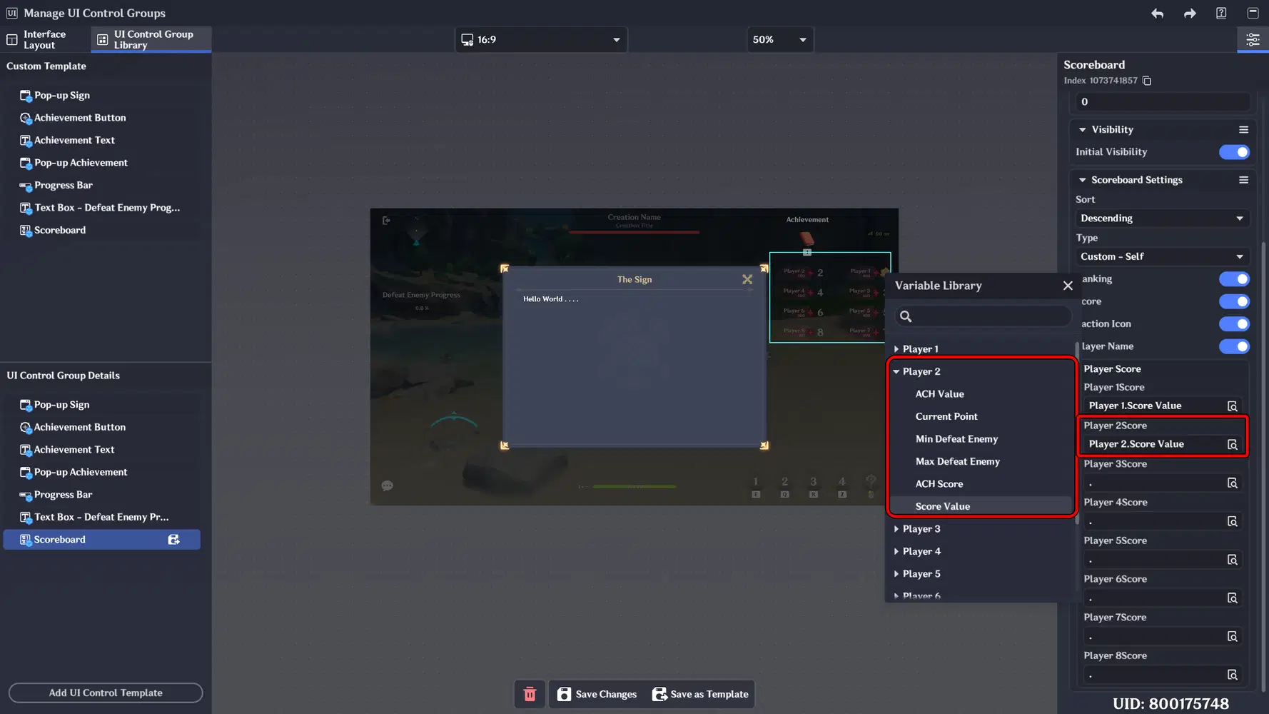
And if the stage you are developing is designed for CO-OP gameplay, don’t forget to assign the corresponding variables for the other players in the Scoreboard.
Make sure to configure the score fields according to the total number of players, so each player score is properly tracked and displayed.
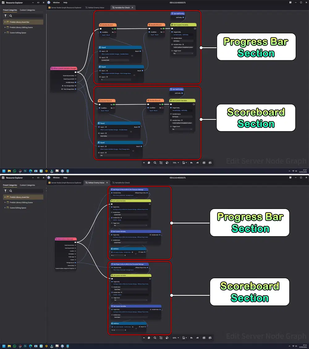
Next, add a new Node to the existing Node Graph that was previously created for the Progress Bar system. This new Node will handle the Score update logic, allowing both the Progress and Score systems to work together within the same structured flow.
Here is the result: When you defeat one enemy, you gain 25 points, which are recorded on the Scoreboard. Once the score reaches 100 points, the Achievement is completed. This will also apply when you play in CO-OP.
f. Timer
A UI element that tracks and displays time during gameplay, such as countdowns, time limits, or elapsed duration. It is commonly used in challenge modes, survival stages, or objective-based missions where time management is a key mechanic.
Implementation:
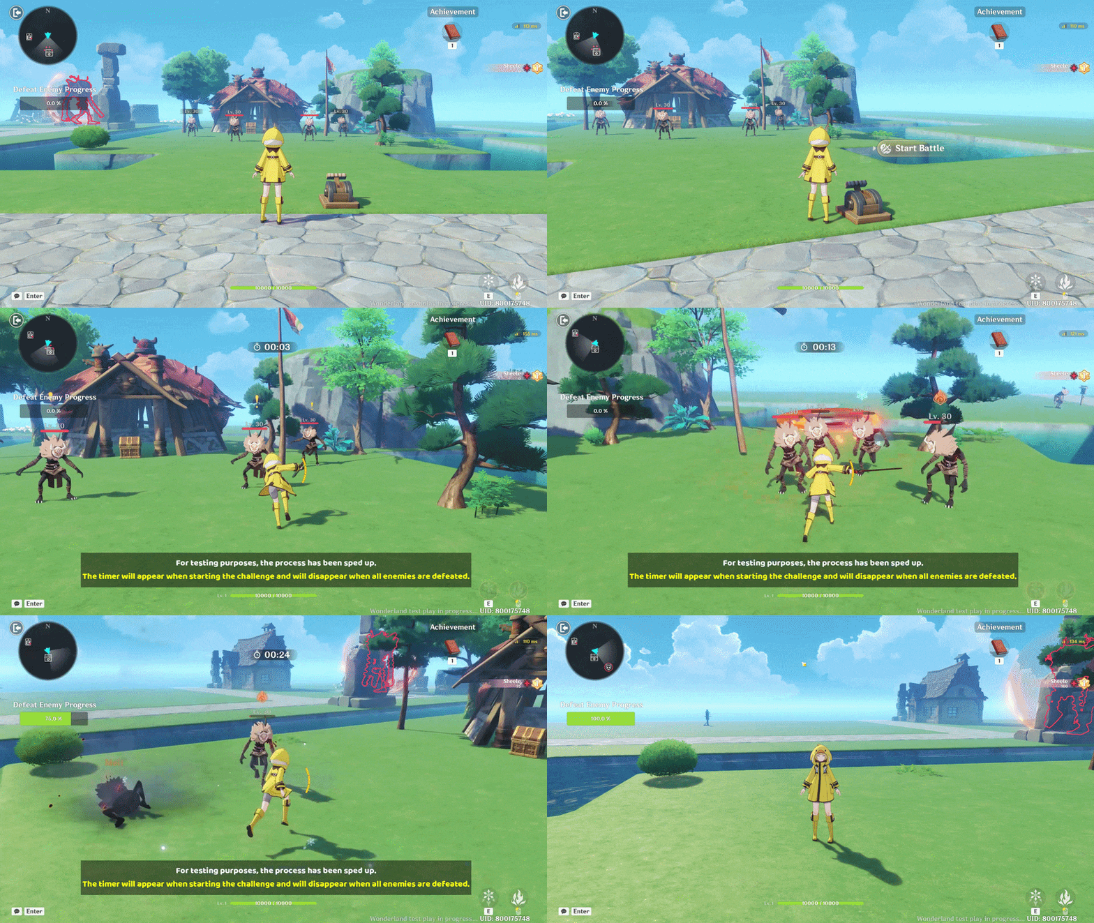
Continuing from the previous guide, to implement the Timer, I created a time-based challenge. When all enemies are defeated, the Timer display will disappear and complete the Achievement.
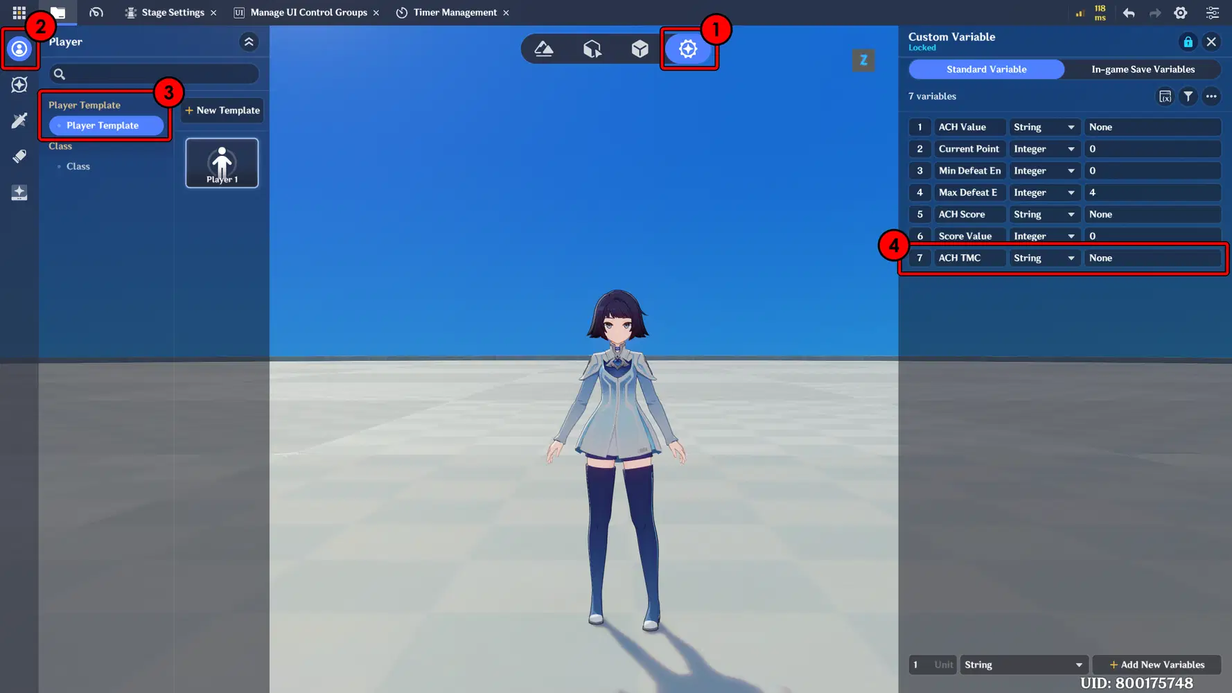
The first step is to add a new variable to the Player to Achievement function.
- ACH TMC : The achievement value displayed on the Pop-up. (String)
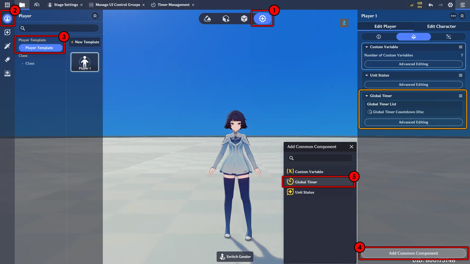
Next, add the Global Timer component to the Player Template to manage the time-based challenge.
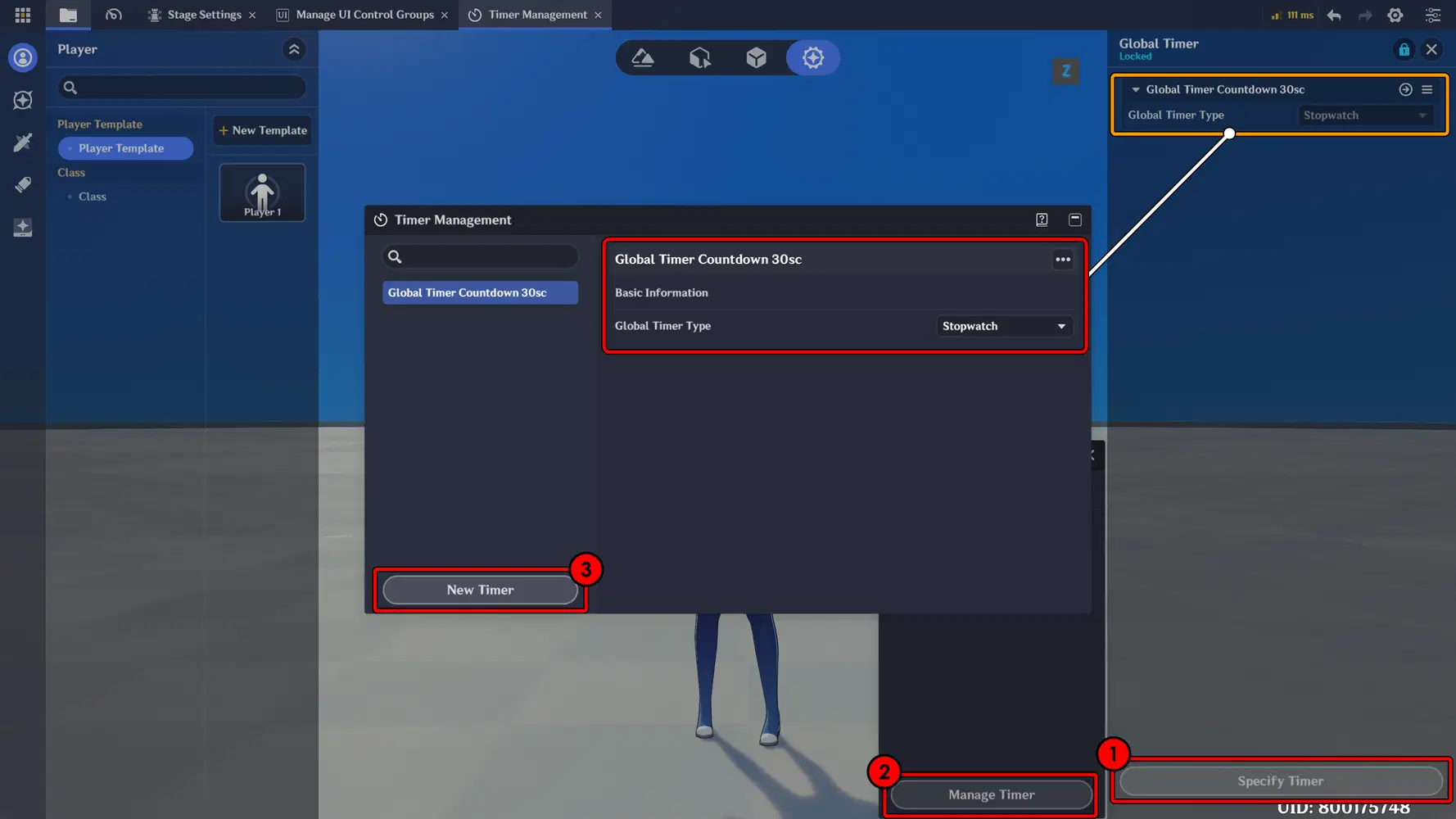
In the Advanced Editing section of the Global Timer, create and add a new Global Timer. For the Timer type, you can adjust and select the option that best fits your gameplay needs.
Next, create and add a UI Timer component. In the Timer Settings - Specific Timer, assign the Timer configuration that you previously created to ensure it functions correctly during the challenge. Disable its Visibility for now so it can be controlled later according to the intended logic.
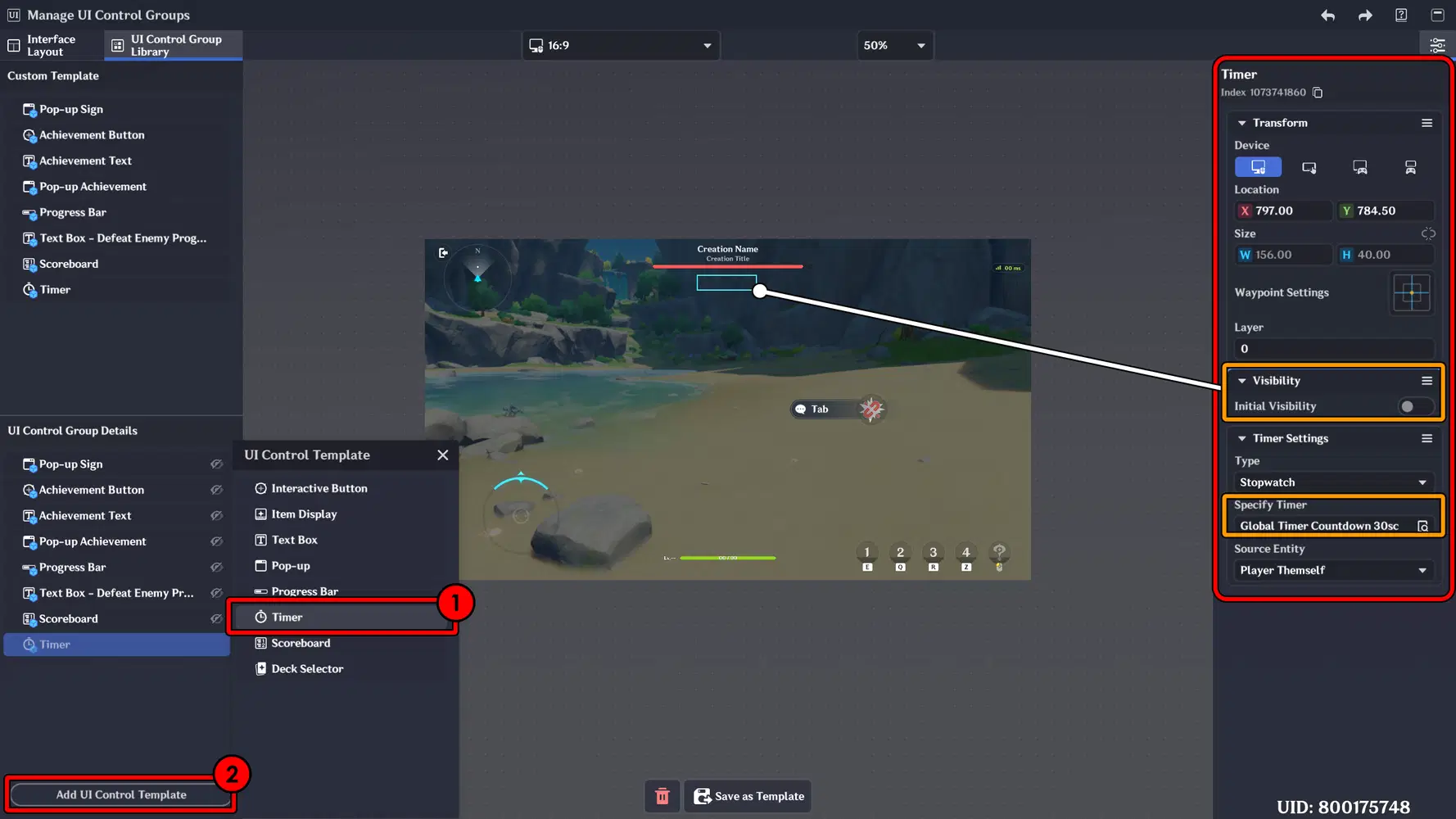
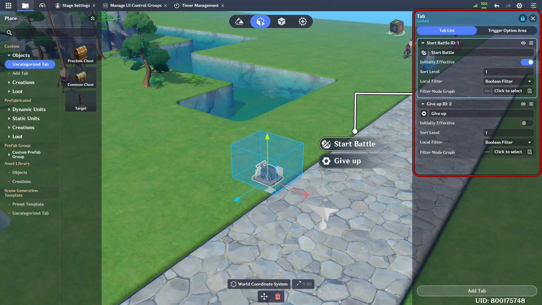
Next, create and place an interactive object in the area, then add a Tab component to enable player interaction. This object will serve as the trigger to start the challenge and activate the Timer. It can also be used to cancel the challenge and remove the Timer display from the screen.
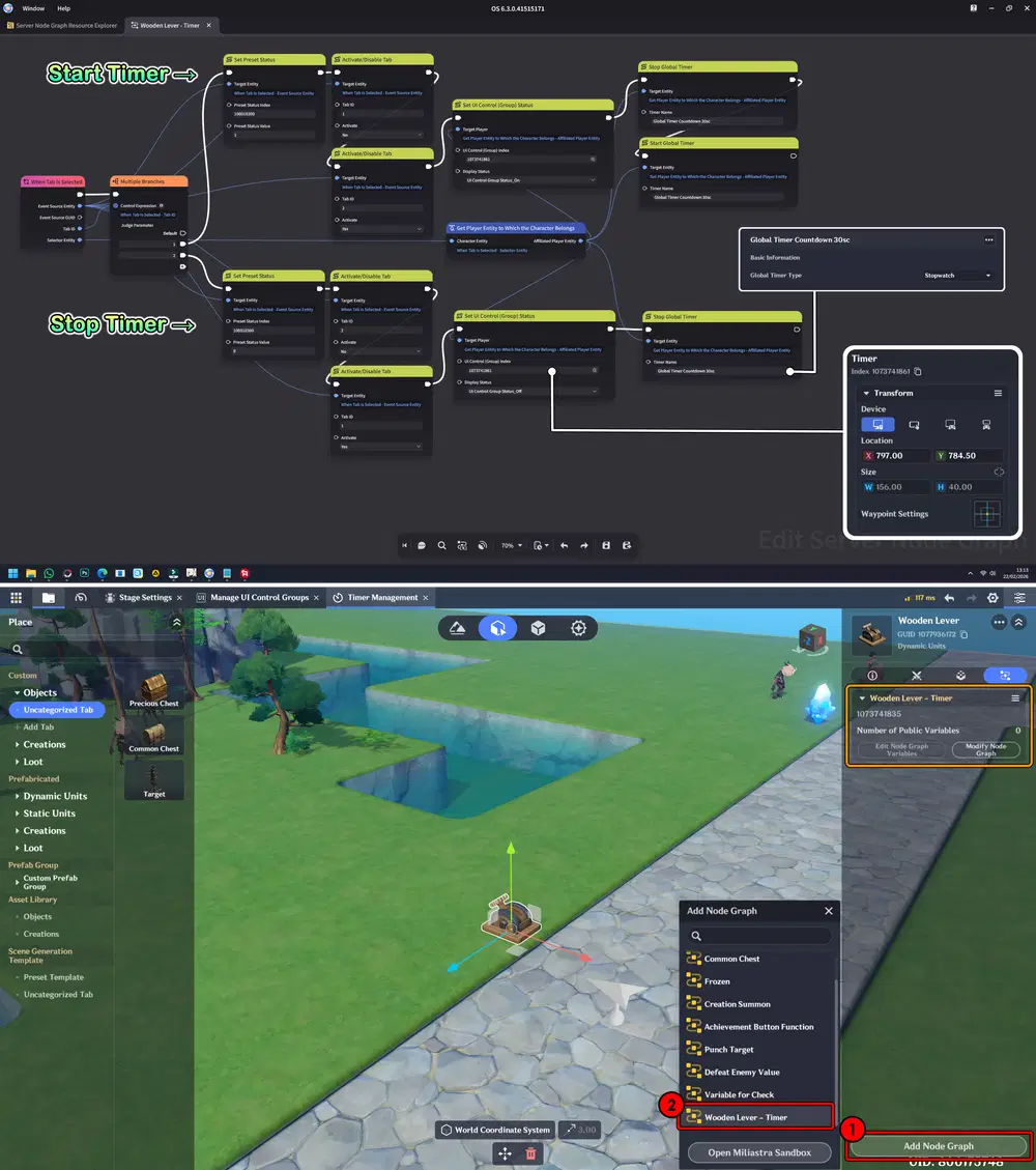
Next, create a Node Graph to handle the interaction with this object, as well as to control the Timer visibility and start function.
Don’t forget to attach the Node Graph to the interactive object to ensure the interaction and Timer logic work properly.
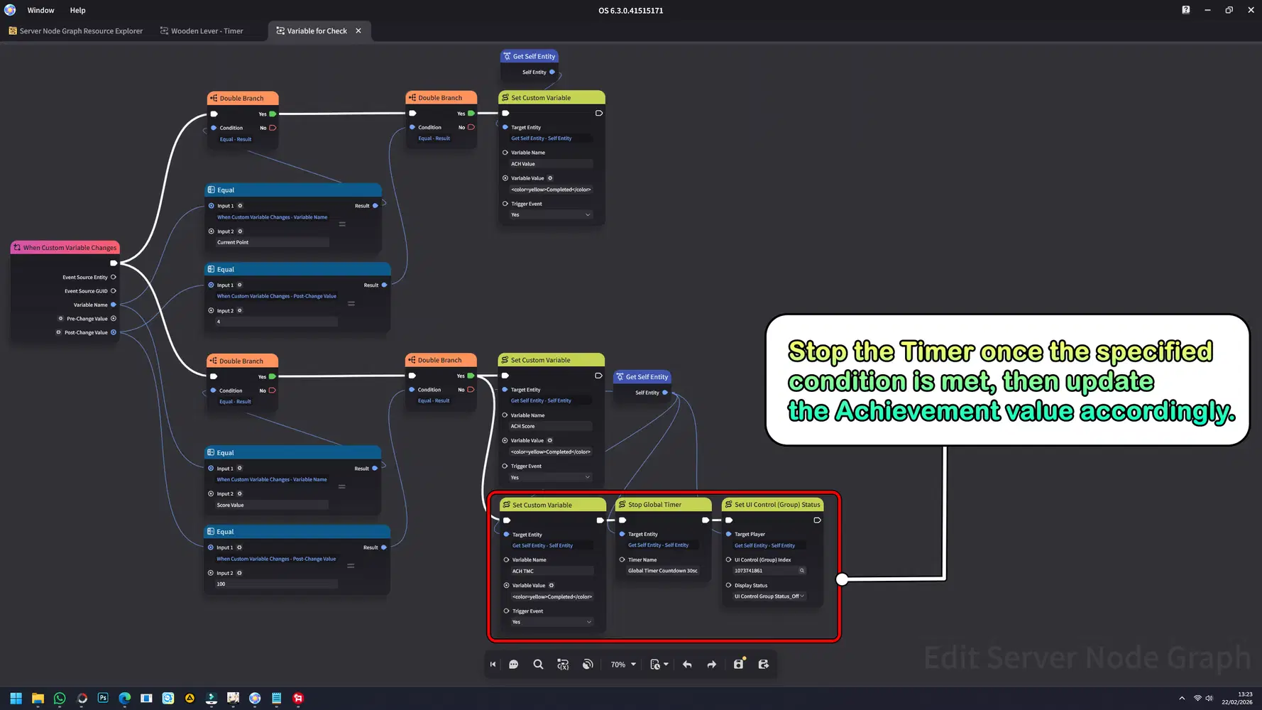
Next, in the previously created Achievement Node Graph, add this new Node to handle the Timer completion logic. This Node will mark the Timer Achievement as completed and disable the Timer display once the required condition is met.
Here is the result: When the Lever is activated, the Timer appears and starts running. Once you defeat all enemies and reach the target score, the Timer disappears, and the Time Challenge Achievement is completed - or you can press the Lever again to give up the challenge.
g. Item Display
A UI component used to showcase items, icons, quantities, and related details within the interface. It helps present rewards, inventory contents, or collectible information in a clear and organized visual format.
Implementation:
Here, I want to implement this feature to display the Equipment used by the player. When the player obtains an Equipment item and equips it, the equipped item will be shown in the Item Display slot on the main interface page.
First, prepare the Equipment and configure the Inventory system. For a detailed guide on creating Items and setting up the Inventory, you can refer to my previous guide, where I explained the process clearly and step by step for easy implementation.
➥ Chapter 3: Map Creation & World Design - Part 7: Inventory System
➥ Chapter 1: Character Skill Development - Part 2: Creating Custom Skills
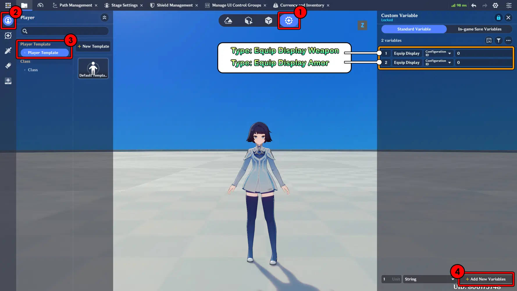
After completing both systems (Inventory and Equipment), the next step is to create new variables on the Player.
Create two variables with the type set to Configuration ID:
- One variable for Weapon
- One variable for Armor
These variables will store the equipped item data and allow the system to display the currently equipped Equipment in the Item Display slot on the main interface.
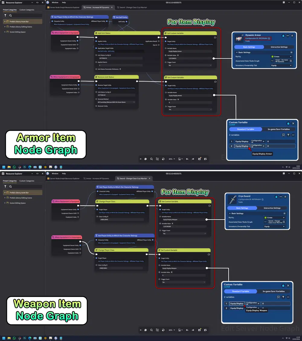
Next, add a new Node to the existing Item Node Graph section that you previously embedded.
This Node will handle updating the Configuration ID variable whenever an item is equipped, ensuring the equipped Weapon or Armor is correctly stored and ready to be displayed in the Item Display slot.
Next, create and add a UI Item Display, then adjust its position and size according to your desired layout. Set the Item Display Type to Player Current Equipment. Lastly, make sure to assign the previously created Configuration ID variables to the Equipment Config ID Variable field in the right panel to ensure the equipped items are displayed properly.
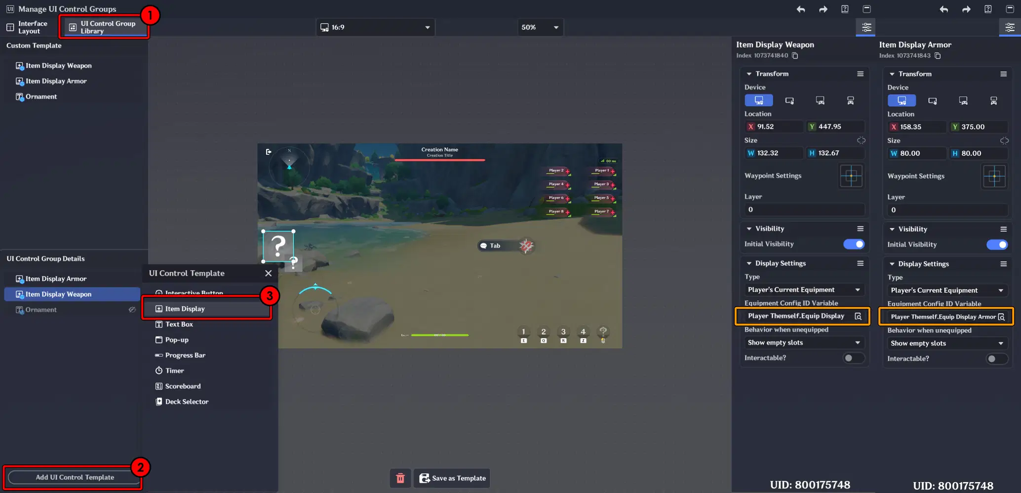
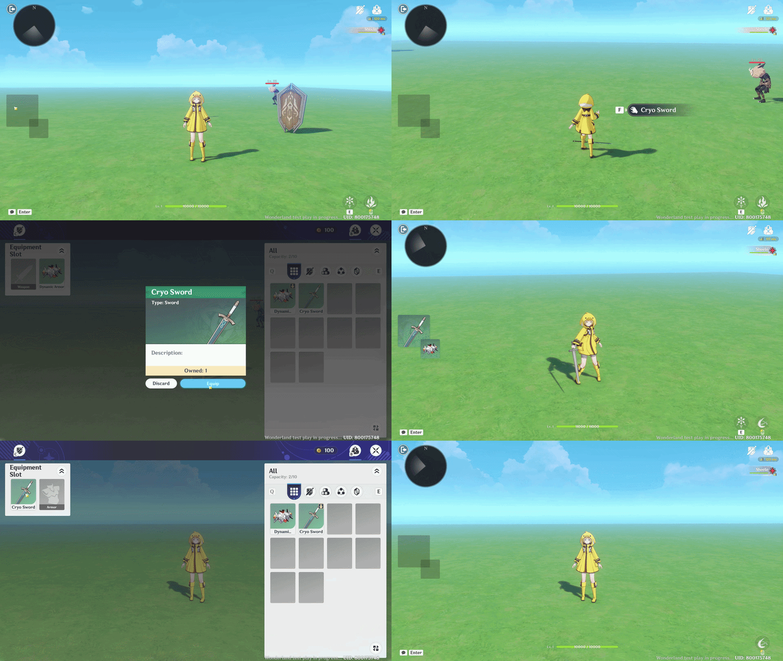
Here is the result: In the normal state, the Item Display appears on the left side of the screen with an empty slot.
When you equip an item, you have obtained, the empty slot will be filled with the equipped Equipment. If you remove the Equipment, the slot will return to its empty state.
h. Deck Selector
A UI component that allows players to choose, manage, and switch between different skill sets or loadouts. It provides flexibility in gameplay strategy by enabling quick customization of abilities before or during a stage.
Implementation:
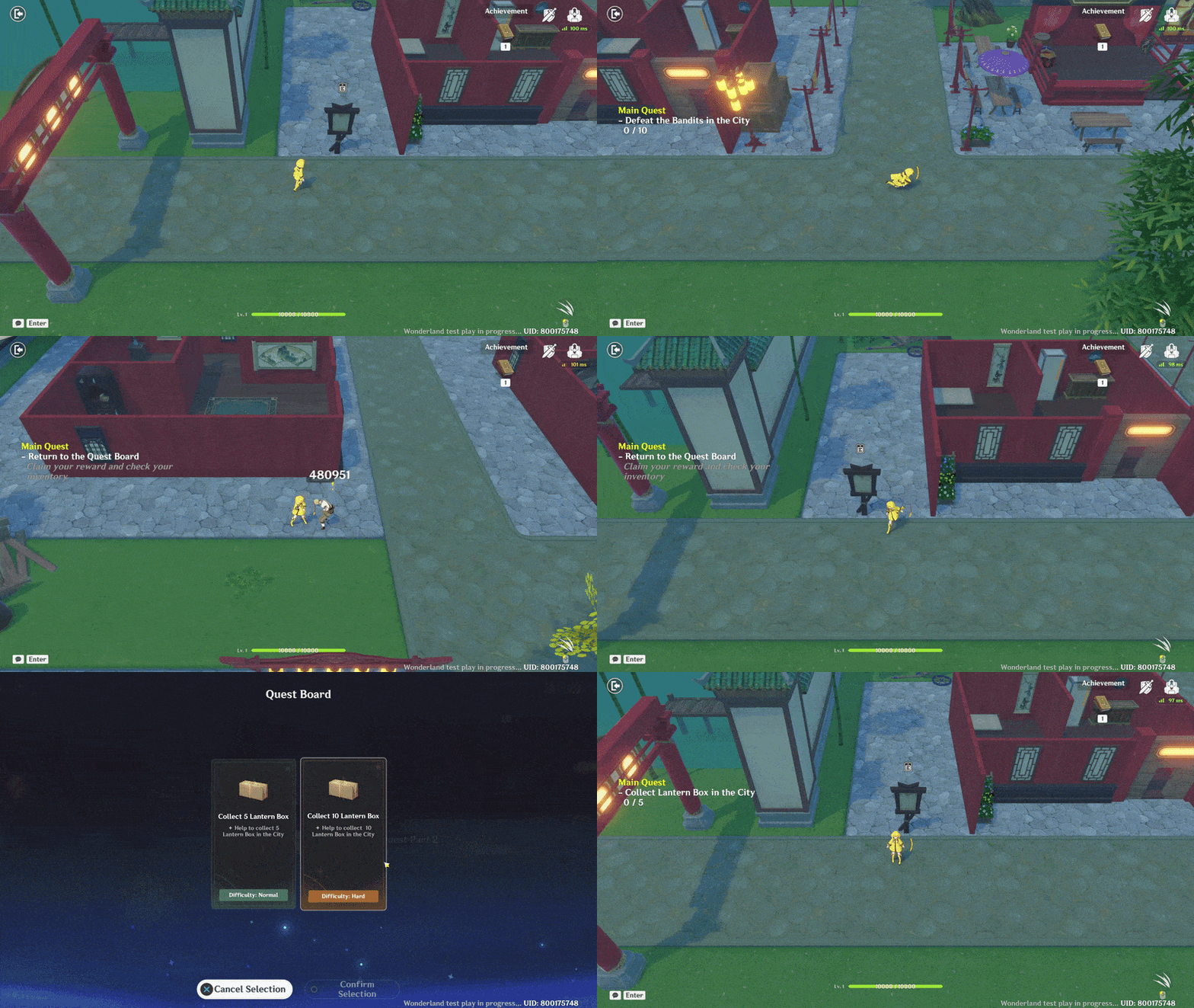
I implemented this system in the Quest Selection feature, where I provide two quest options with different difficulty levels.
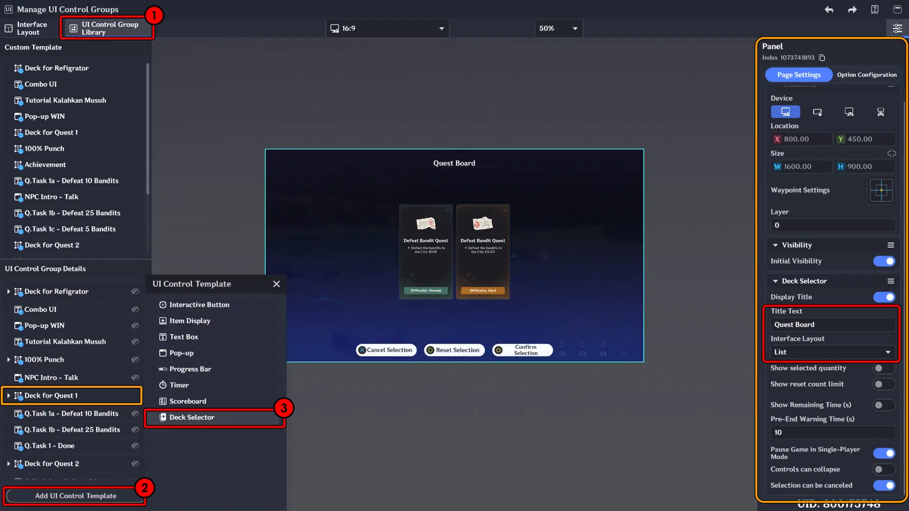
First, create and add a UI Deck Selector, then customize its settings such as the Title and the layout type according to your design preference.
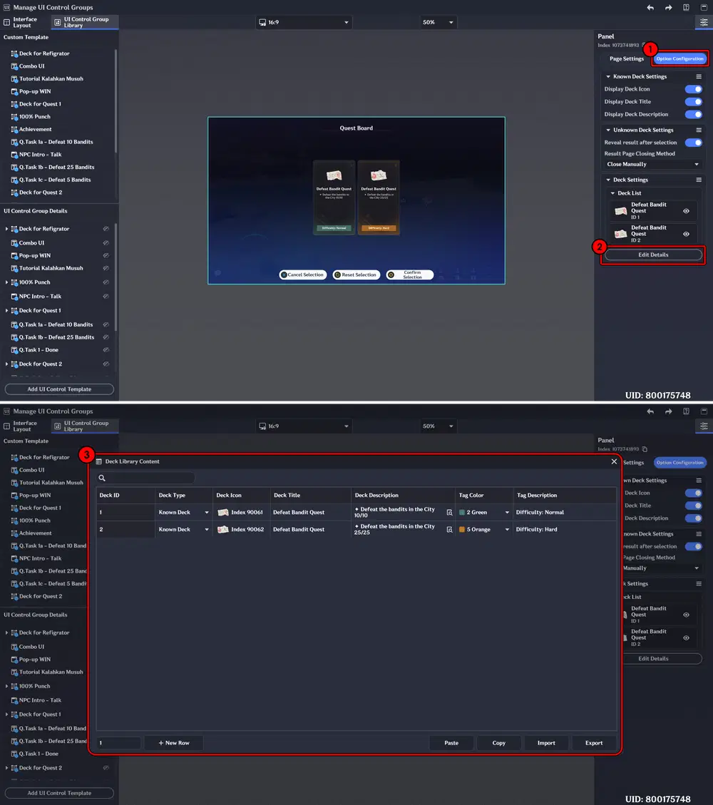
Then, go to the Option Configuration tab and select Edit Details.
A new window will open, where you can customize the title, description, and even the deck icon that will be displayed.
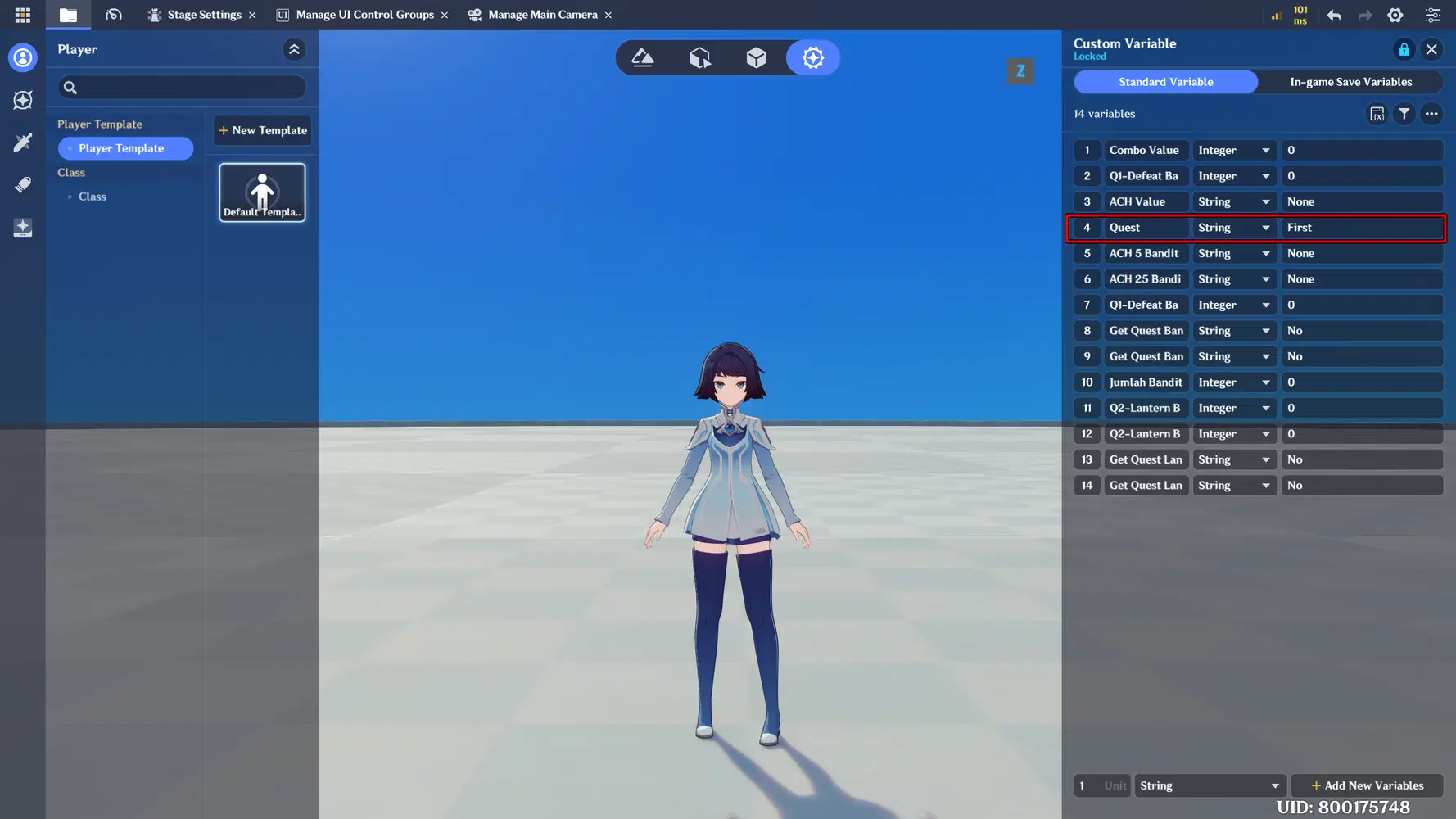
Create a new variable on the Player that will function as the Quest variable.
This variable will store the selected quest data and be used to control the quest logic and progression.
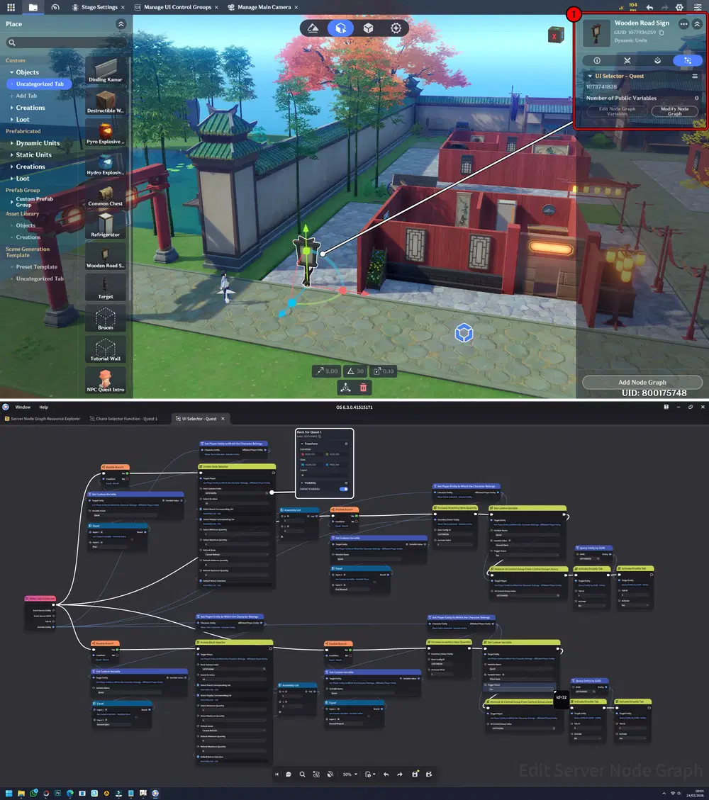
Next, create an object that will function as the interaction medium to open the Deck Selector.
In this example, I use a signboard as the interactive object, and on that object add graph node.
Next, create and add a new Node Graph to the Player. This Node will handle the feedback system when the player interacts with the Deck Selector and confirms their choice, ensuring the selected quest is properly processed and applied.
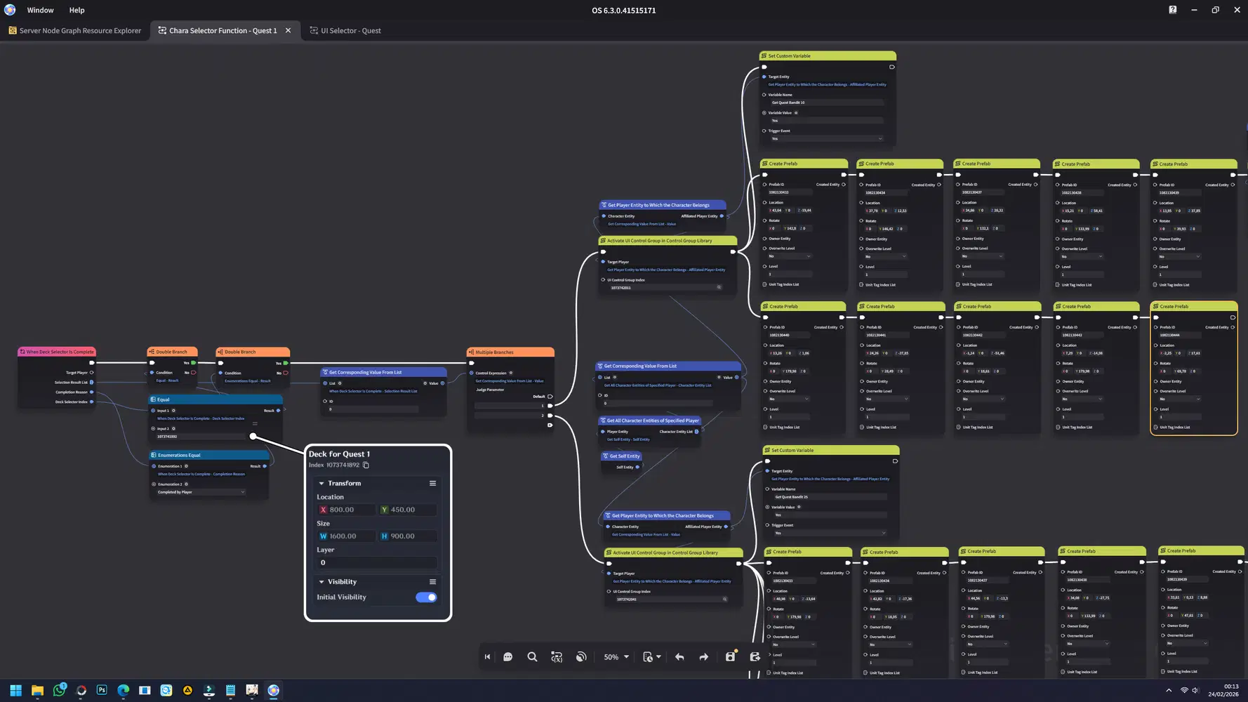
This Node may look complicated at first and might seem overwhelming  , but it will become much easier to understand once you see the final result in action.
Chapter 2: Advanced UI Text Styling & Custom Interface Design
In this chapter, we will explore advanced techniques for enhancing the visual quality and uniqueness of your interface. This includes text formatting, color customization, styling techniques, and creative layout adjustments that transform a basic UI into a polished and professional-looking design.
By mastering these styling methods, you can create interfaces that are not only functional but also visually distinctive, immersive, and aligned with your game’s theme.
Part 1: Text Formatting Basics
In this section, we will cover the fundamental techniques for formatting text within the UI. This includes adjusting style elements such as Bold, Italic, Color tags, Alignment, and Line Breaks. Mastering these basic formatting tools is essential for creating clear, readable, and visually appealing interface text that enhances both presentation and user experience.
📝 Wonderland Guide:
a. Bold
The Bold format is used to emphasize important text within the UI, making it stand out visually from regular content. It is commonly applied to titles, achievement notifications, warnings, key values, or important keywords to improve readability and draw player attention.
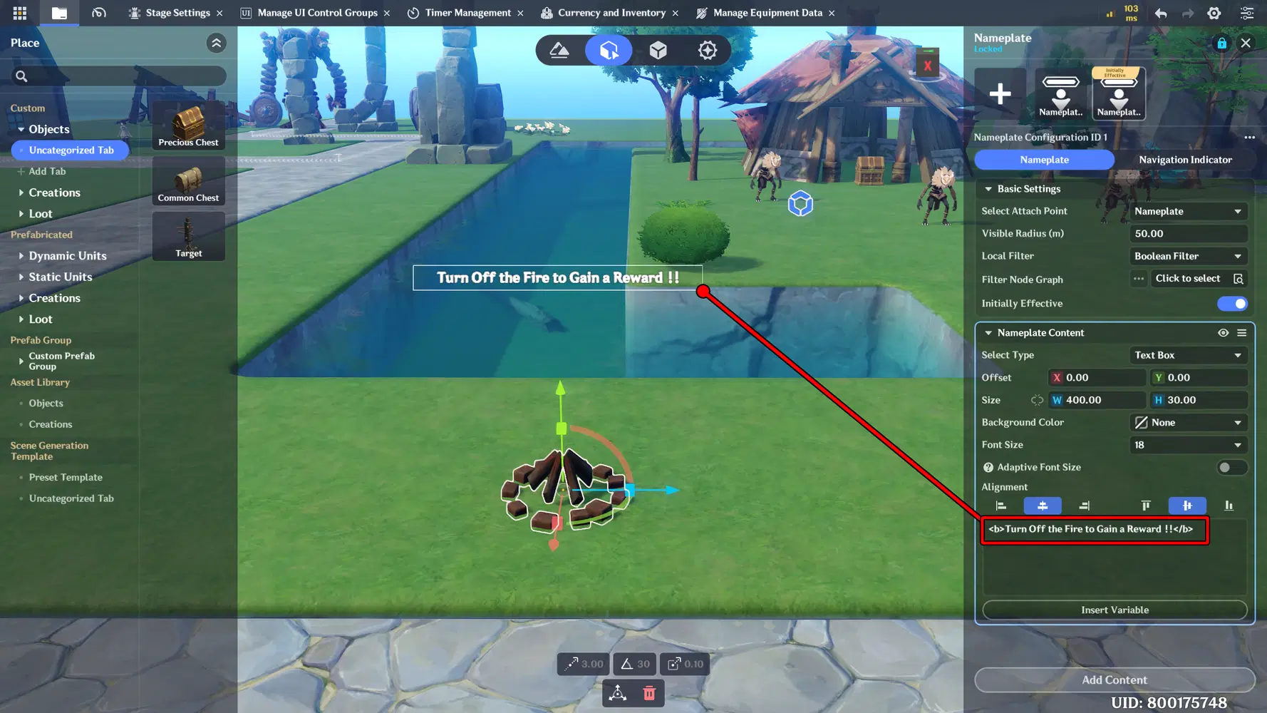
Rich Text code: Text Here
Implementation:
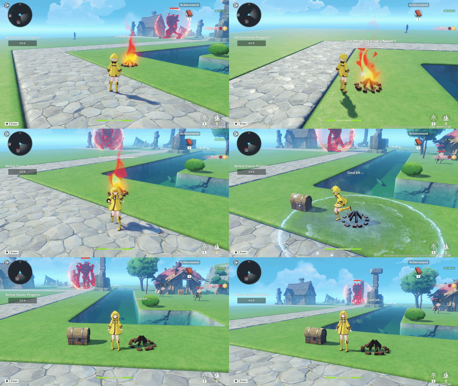
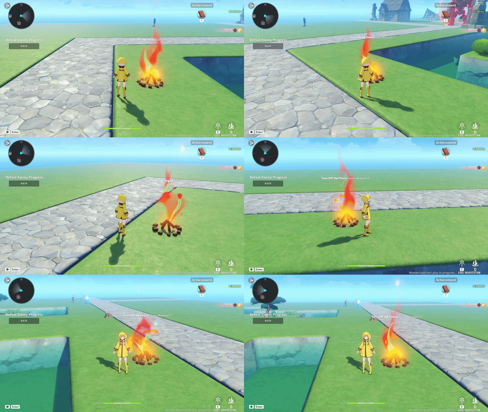
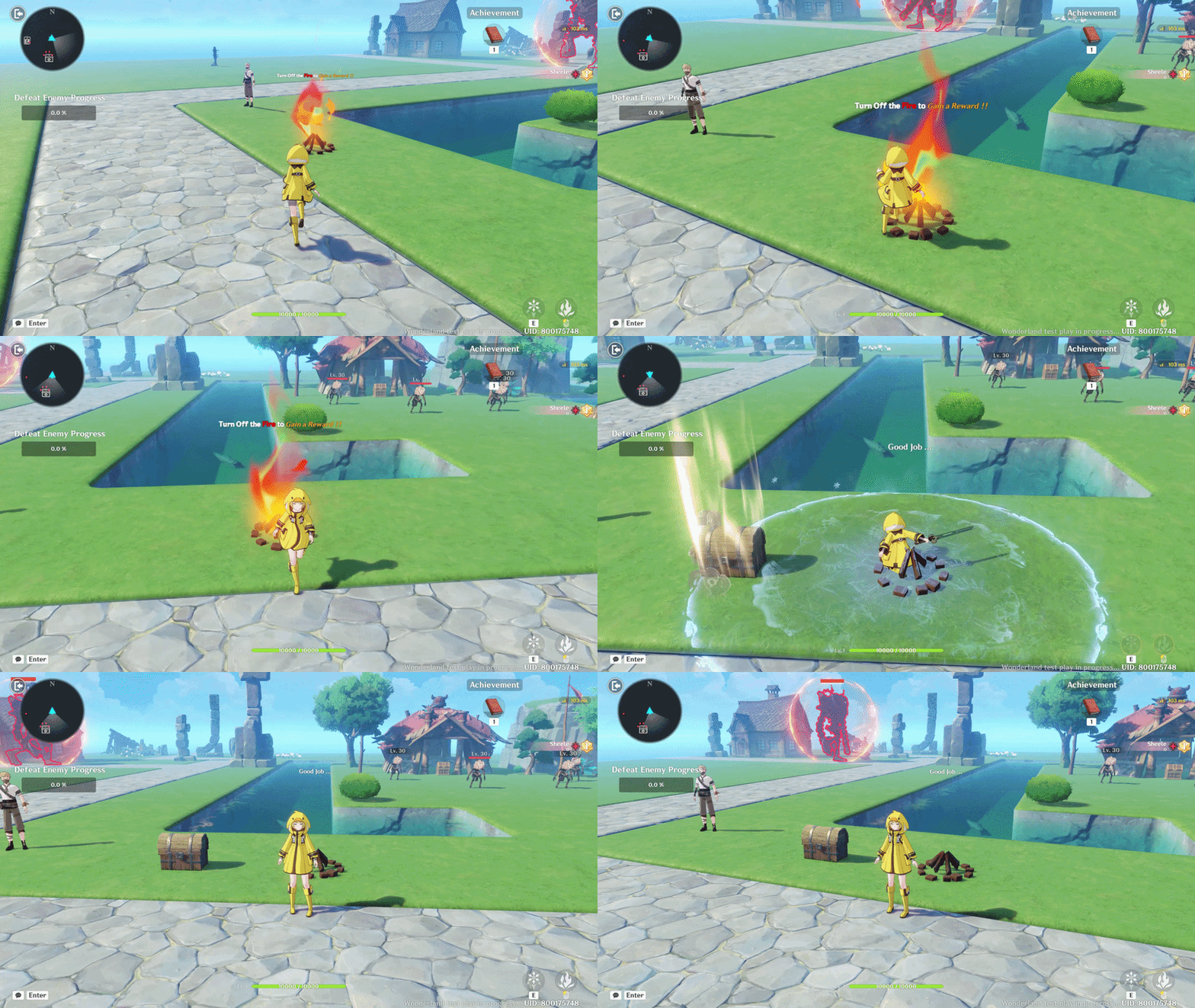
So, I created a campfire object with active flames and attached a Nameplate component containing an instruction written using Bold formatting to make it stand out. When the player extinguishes the campfire, a reward appears along with the text “Good Job” displayed in normal format.
What you need to do first is create a new object, then add and configure the following components: Hurtbox, VFX, Nameplate, and an Attachment Point. These components will allow the object to receive interaction or damage, display visual fire effects, show instructional text, and define the position where effects or rewards will appear.
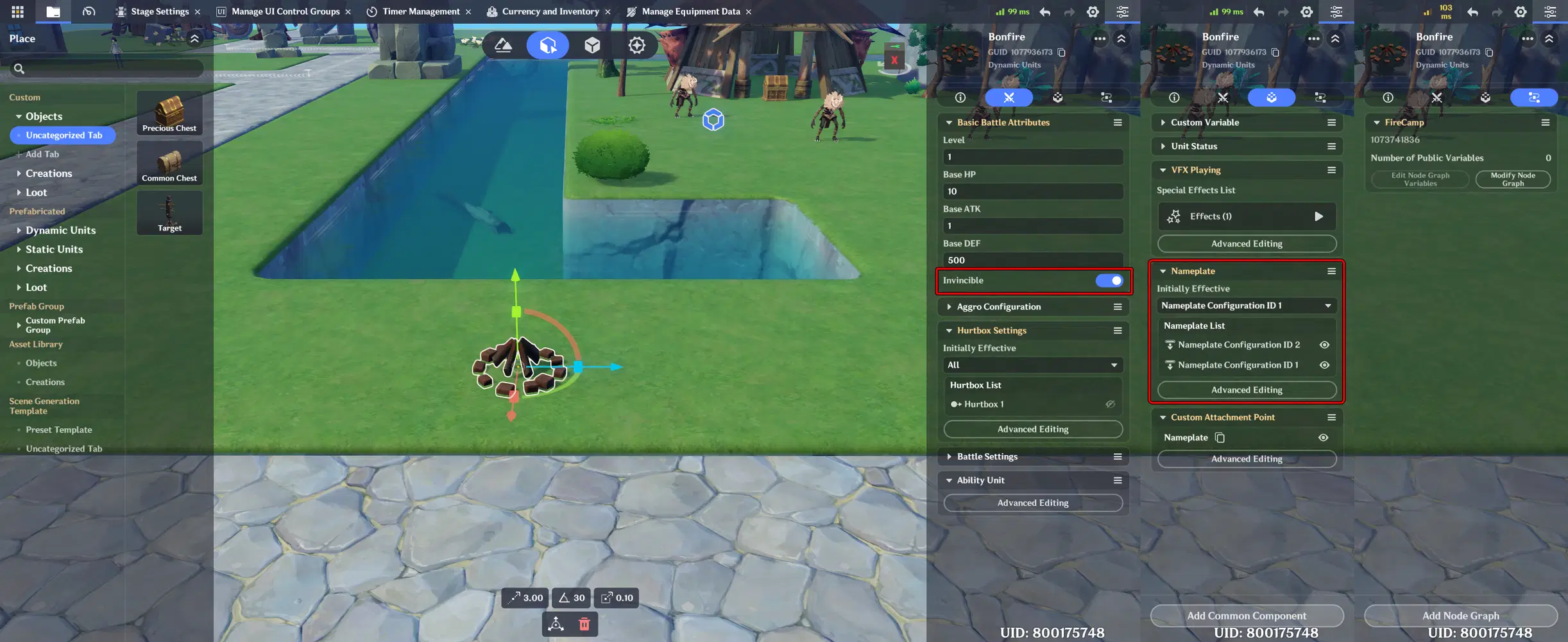
Enable Invincible so that when you attack the object, it will not be destroyed. Below is how you can make the text bold on the Nameplate by adding the Rich Text code directly into the text field.
And here is the result when it is tested in-game.
b. Italic
The Italic format is used to give text a subtle emphasis or stylistic variation without making it as strong as bold text. It is often used for hints, flavor text, dialogue tone, system notes, or secondary information in the UI.
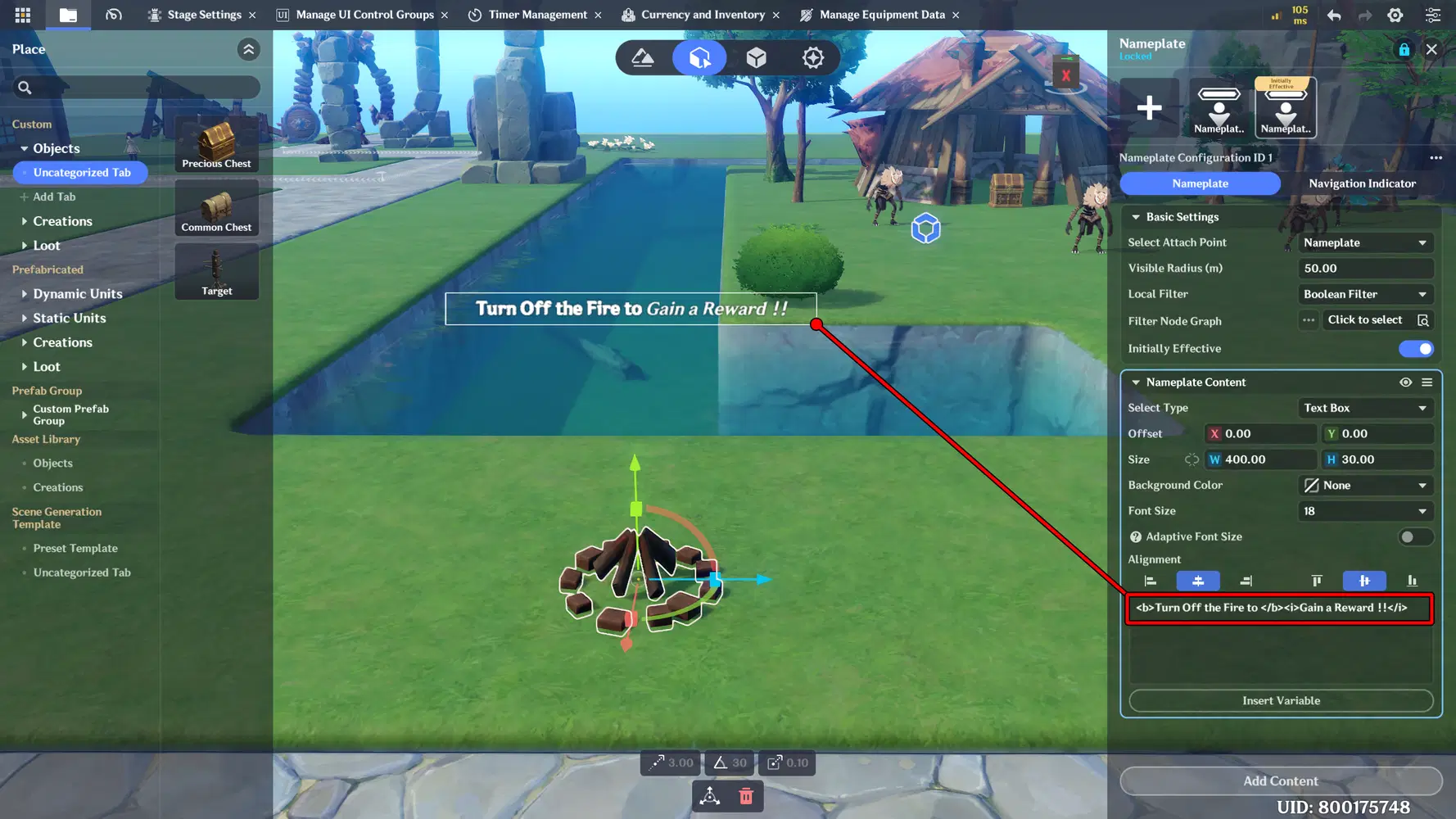
Rich Text code: Text Here
Implementation:
Still using the previous implementation, this time the phrase “Gain a Reward” is written in Italic style. This is intended to provide subtle visual emphasis on the reward, drawing the player’s attention without making the entire instruction appear too strong or heavy like Bold formatting.
c. Line break
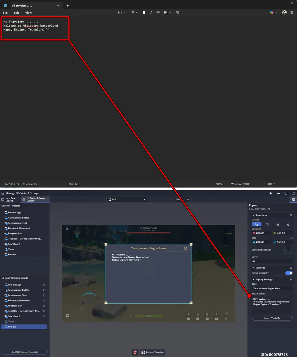
A Line Break moves text to the next line, improving readability and UI layout. It’s especially useful for instructions, quest descriptions, or multi-line notifications. You can use a text editor like Notepad, then copy and paste your text into Miliastra Sandbox. This allows you to insert line breaks quickly and manage your text more efficiently and neatly.
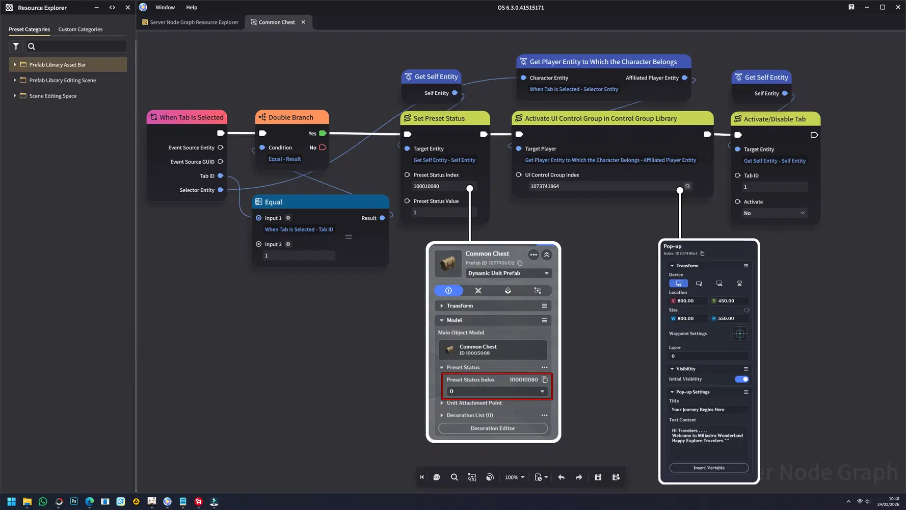
Add a node to the Common Chest to trigger a pop-up when it is opened.
Implementation:
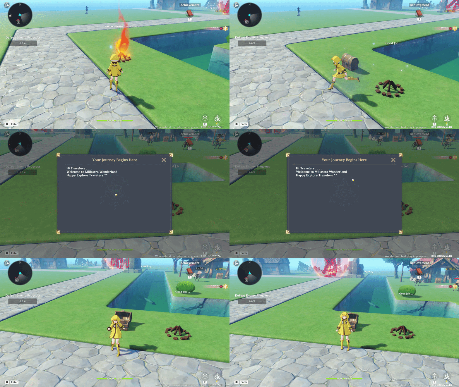
For implementation, this is best used in pop-ups or text boxes, as they often display large amounts of text at once. Using line breaks helps organize the content and keep it clean and readable.
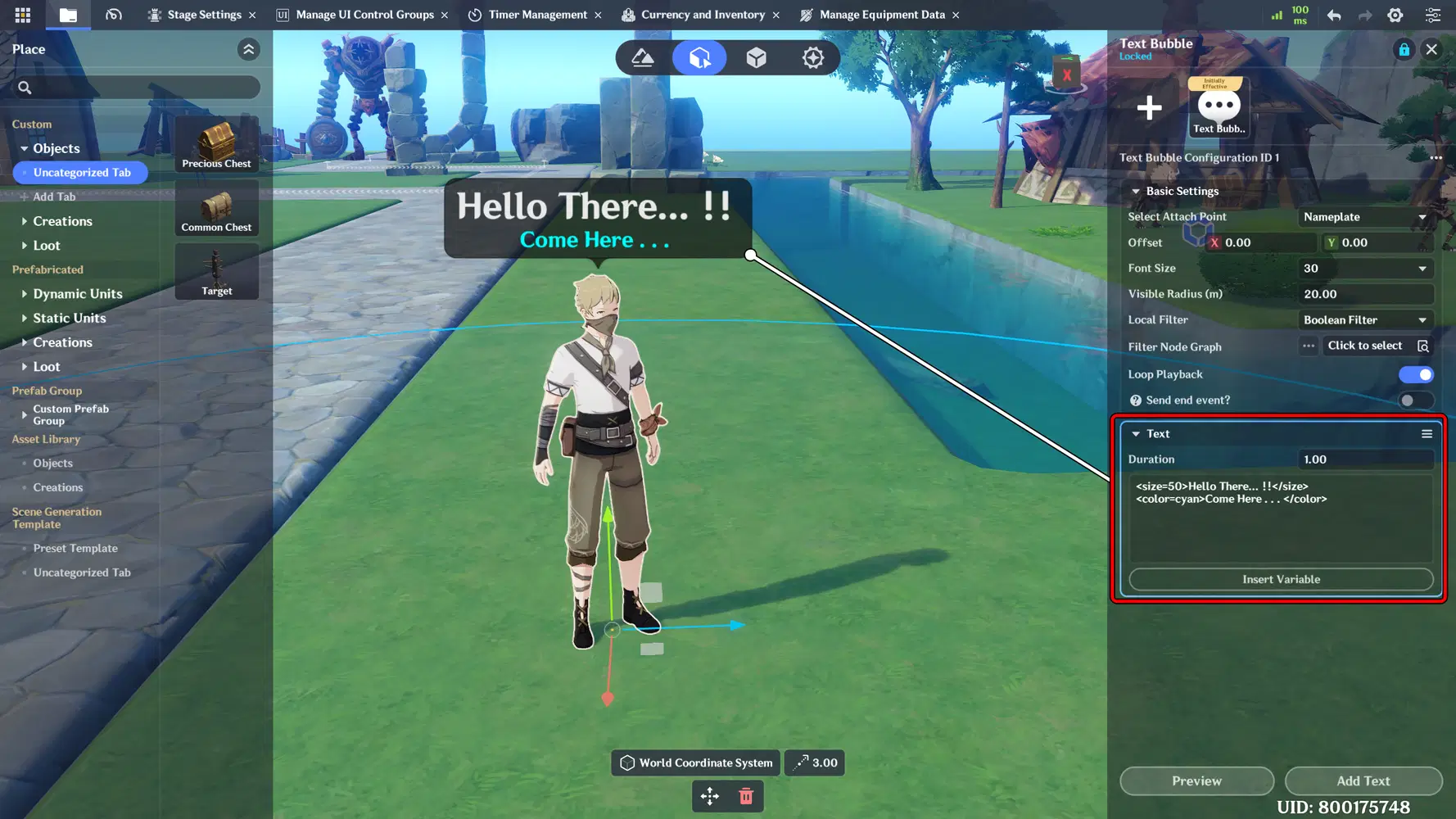
d. Font Size
Font size is used to control visual hierarchy within the UI. Larger font sizes are applied to emphasize critical information, such as combat feedback or status indicators, while smaller sizes are used for secondary details.
Rich Text code: Text Here
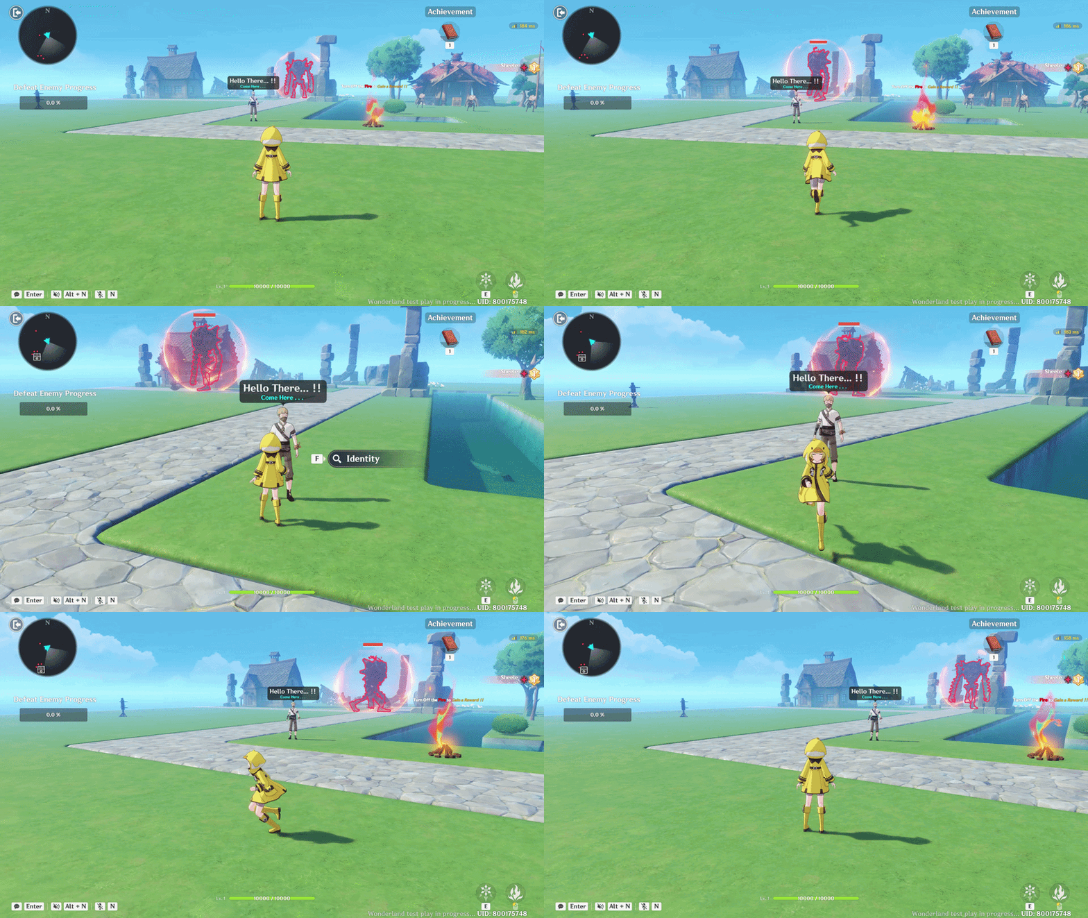
Implementation:
As an example, I applied font size adjustments to the NPC chat bubble so that players can clearly read what the NPC is saying from a distance. It can also be used to emphasize specific dialogue lines. This approach can similarly be applied to Popups and Text Boxes to highlight important information.
e. Alignment
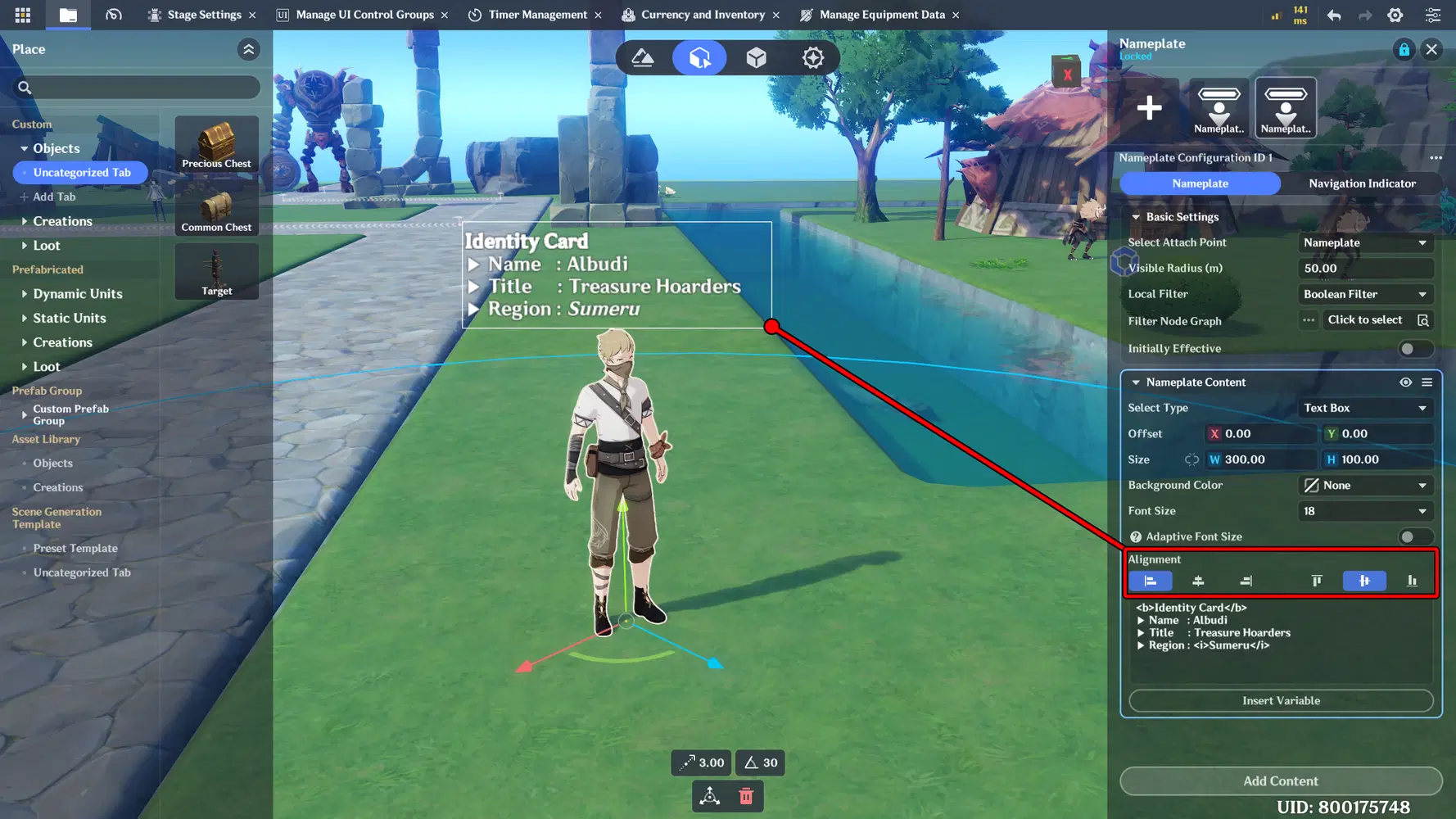
Use Alignment settings to control the text position within the UI, such as left, center, or right alignment, to ensure a clean and well-structured layout.
Implementation:
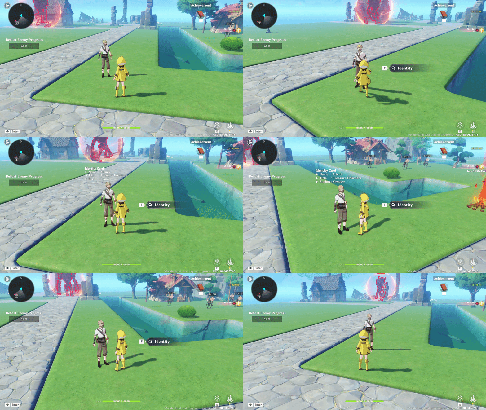
Here, I will apply it to the NPC Nameplate so the NPC can display their identity using a left-aligned format, making it look clean and well-organized. You can also use this format for other UI elements to keep the layout consistent and tidy.
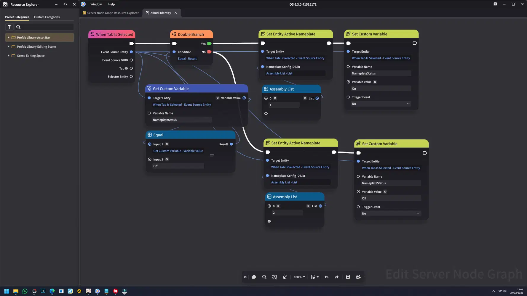
For the NPC setup, add a new variable to control the Nameplate’s On/Off state. Then configure the NPC so it does not perform any attacks during this testing phase. Below is the Node Graph I used for this NPC setup.
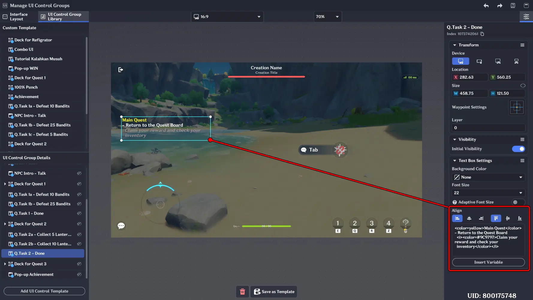
Another example is using a Text Box and adjusting the text alignment for the Quest UI. This helps organize longer quest descriptions and keeps the layout clean, structured, and easy to read.
Part 2: H5 Color Tags & Highlight System
In this part, we’ll explore how to use H5 Color Tags and apply custom color codes to enhance your UI text. You’ll learn how to style text with different colors to highlight important information, improve readability, and create a more visually engaging interface.
📝 Wonderland Guide:
a. HEX Color Usage
HEX (Hexadecimal) color is a six-digit code used to define specific colors in digital design. It starts with a # followed by a combination of numbers and letters (0–9, A–F), or you can also directly use the name of the color for example:
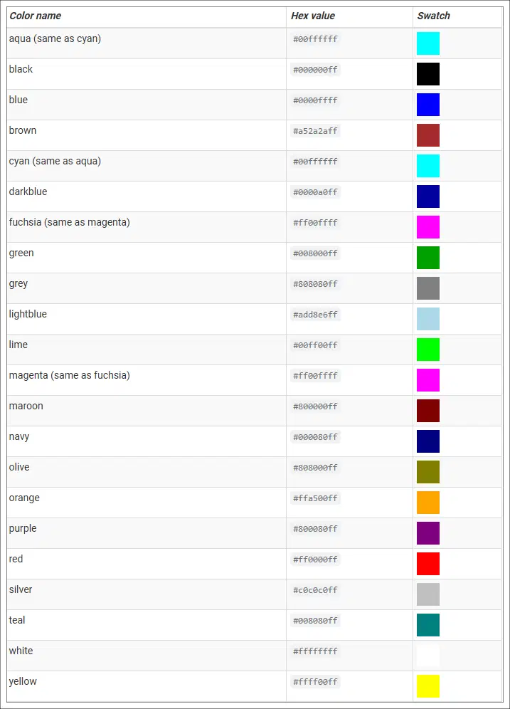
You can visit this site to find out more: Unity - Rich Text
Each pair of digits represents the intensity of Red, Green, and Blue (RGB) values.
By using HEX codes, you can apply precise and consistent custom colors to UI text, making your interface more visually structured and engaging.
Implementation:
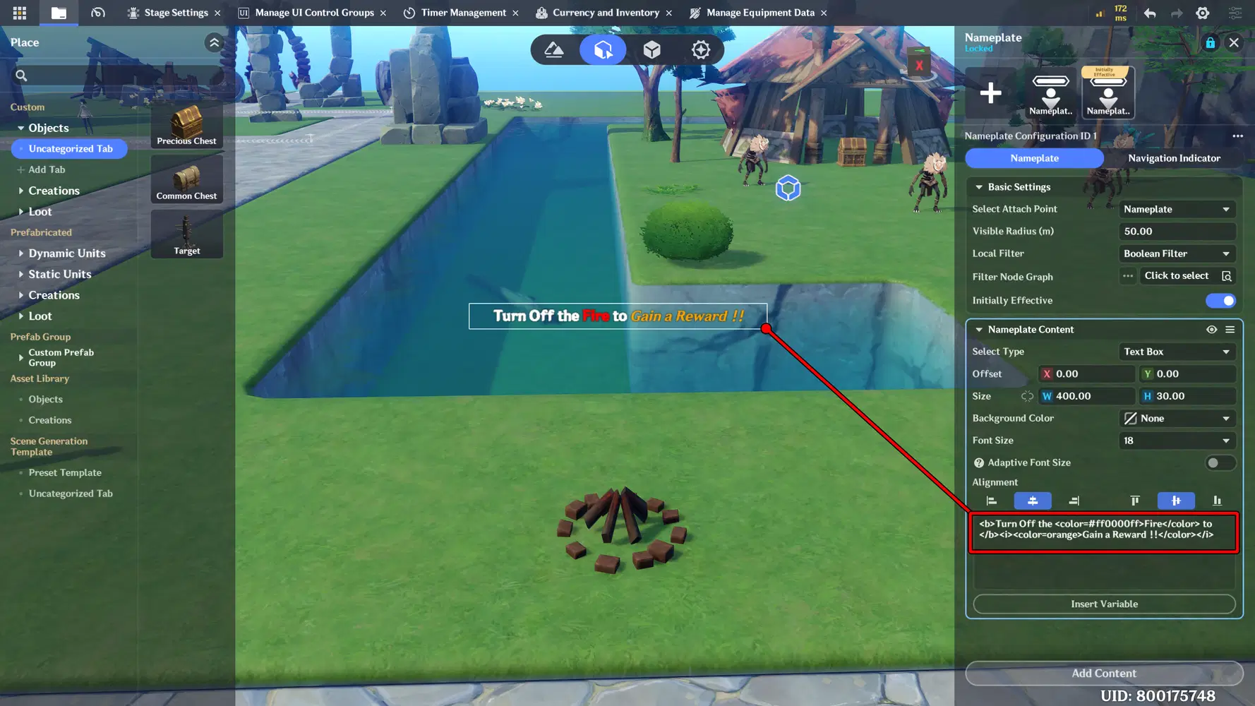
For the implementation, I modified the previously created text by applying new colors. In this case, I changed the word “Fire” to red to better represent its elemental theme and make it stand out visually. For the word “Gain a Reward,” I used orange to make it more noticeable and appealing to the player.
b. Highlight System
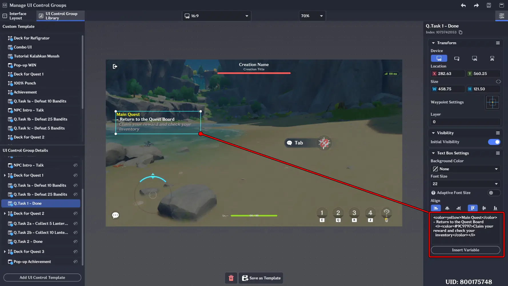
You can also apply this method to Textboxes in the UI Control Library, allowing you to style text with Color tags. This makes instructions, notifications, or labels visually distinct and easier for players to read.
Implementation:
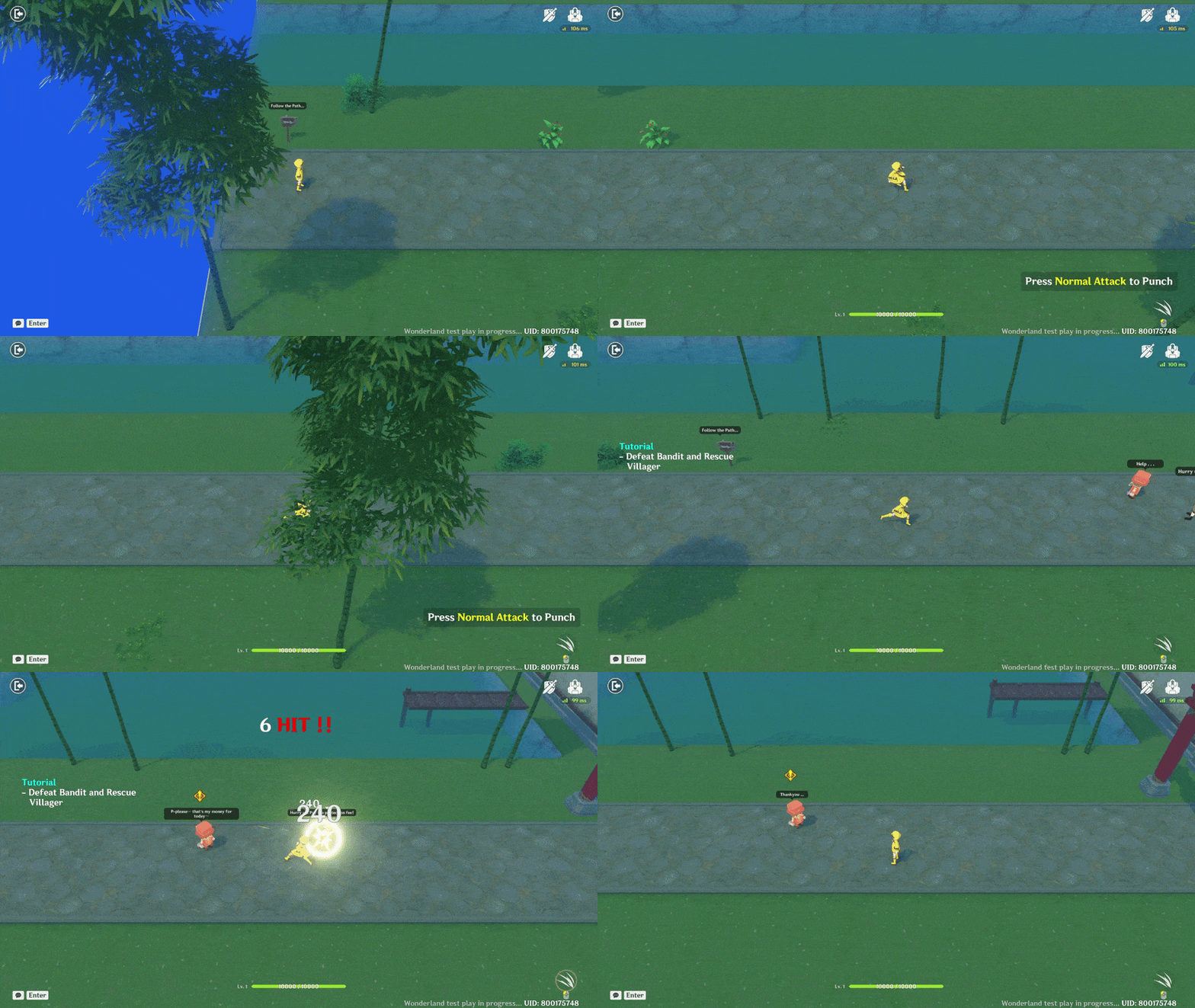
In this example, I implemented it in the tutorial instructions by creating a Textbox and applying color codes so the instructions can be clearly and immediately understood. Additionally, I also applied it to the textbox that appears when the player attacks an enemy.
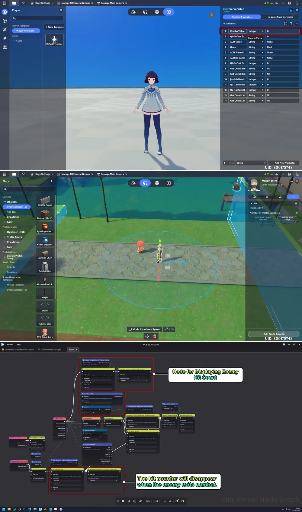
To create the hit text that appears when attacking an enemy, you need to first create a variable on the player. Then, set up and configure a node graph that will be attached to the Enemy as the damage receiver. Within this setup, the system will calculate how many hits the Enemy has received. When the Enemy exits combat or is defeated, the hit count will automatically reset to zero and disappear.
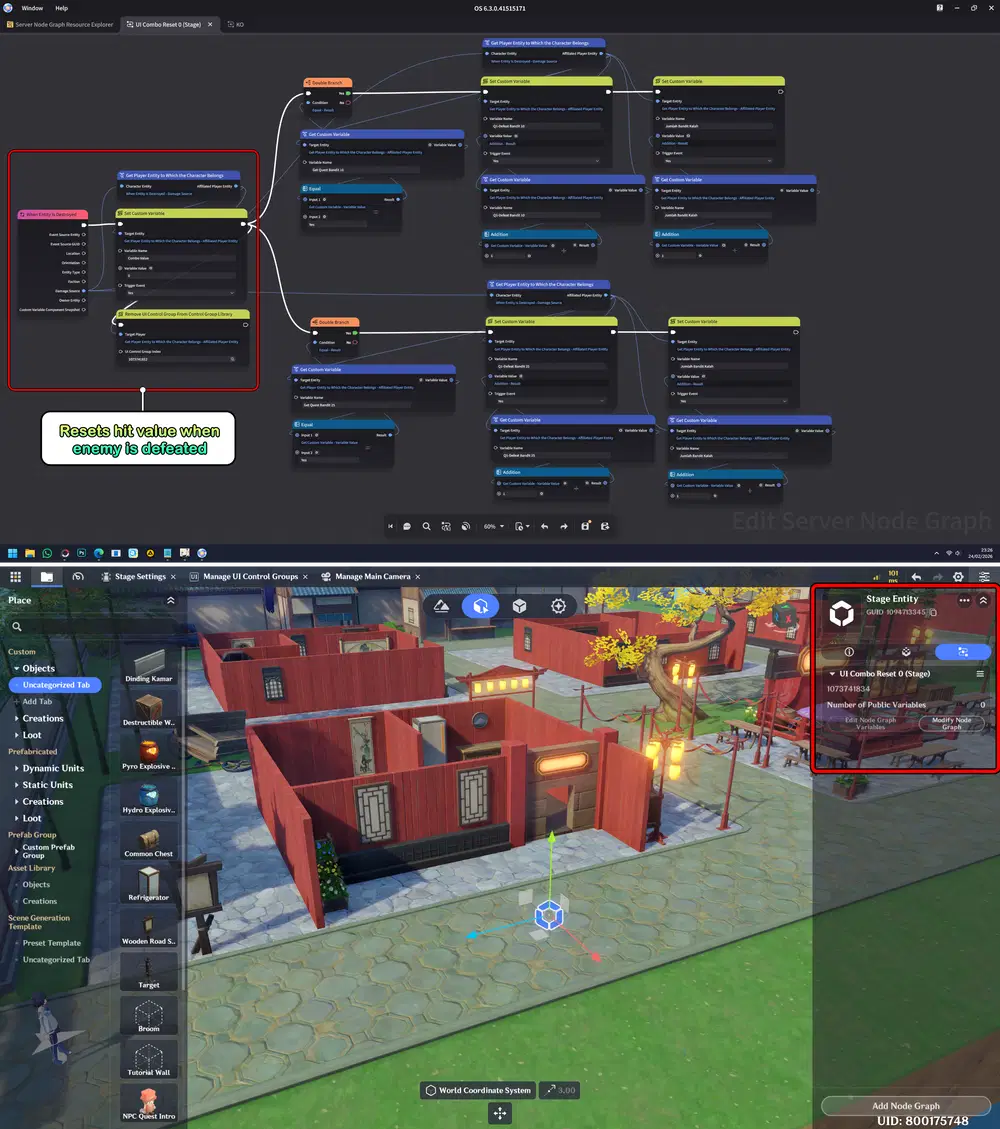
Second, add a Node to the Stage to monitor the combat state and reset the hit value to 0 whenever an entity is defeated.
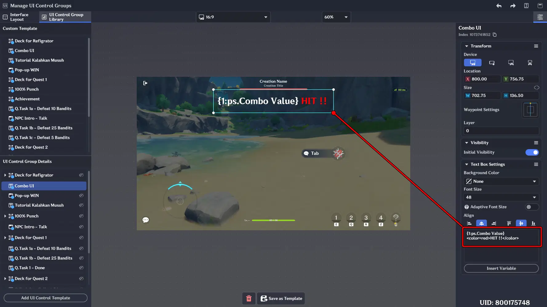
Last, configure the UI Control Group by adding a Textbox that functions to display the hit text and the attack value dealt. The code {1:ps.Combo Value} is used to display the recorded value from the player variable whenever the player lands a hit on the enemy.
The following shows the final result after implementing the system. When the player lands a hit on the enemy, the hit counter increases in real time and is displayed clearly on the screen. Once the enemy is defeated or exits combat, the hit counter automatically resets to zero.
Part 3: Special Characters
This section focuses on the use of Special Characters to enhance the visual appearance of the UI. Decorative symbols and unique characters are added to make text elements more visually appealing and engaging. These additions help create a more polished interface while also giving important information a stronger visual presence.
📝 Wonderland Guide:
a. Divider Lines
Divider lines are special character combinations used to visually separate sections within the UI. They help organize information, making the layout cleaner and easier to read. By adding decorative line elements, the interface appears more structured and visually balanced.
Line Symbol:
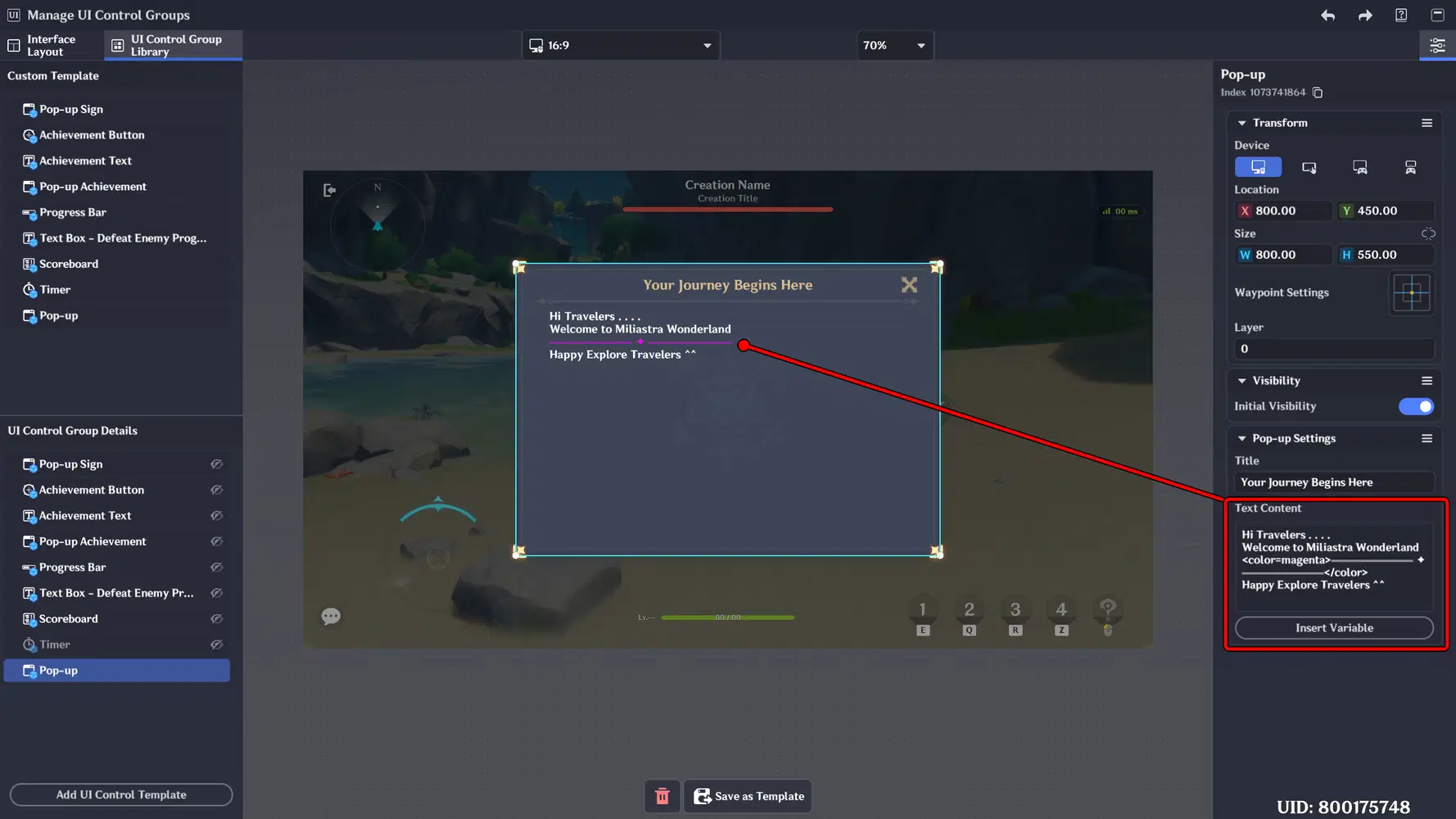
──────────── | ══════ ✦ ══════ | ◆────────◆ | ☷☷☷☷☷☷☷ | ╳╳╳╳╳╳ | ≡≡≡≡≡≡≡≡≡ | ╲╲╲╲╲╲
and many more.
Implementation:
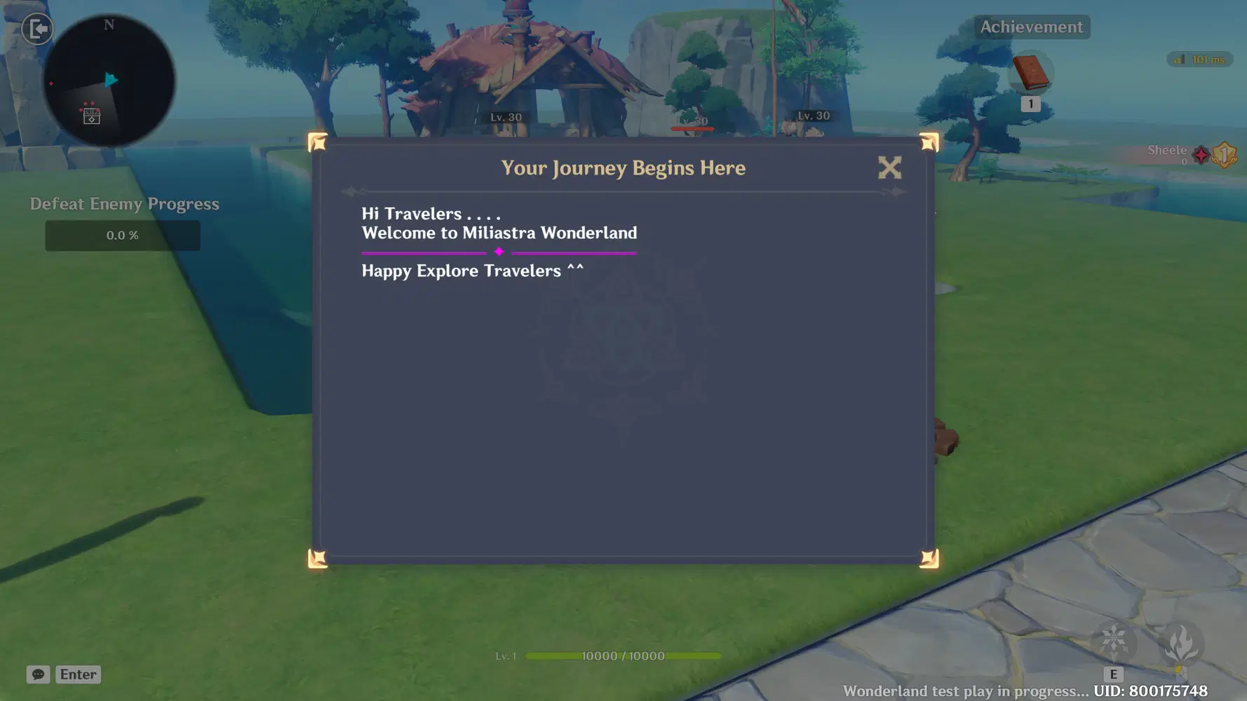
I added divider lines as separators between sentences in the popup. However, they can also be applied to other UI elements, such as the Nameplate, Text box, etc. Additionally, you can combine them with color variations to make the interface more visually appealing.
b. Decorative Symbol
Decorative symbols are used to enhance the visual appeal of the UI by adding small stylistic elements to text. These symbols can be placed before or after sentences, titles, or important information to make them stand out and feel more dynamic. While simple, decorative symbols contribute to a more polished and engaging interface.
Example Symbols:
❤︎ ✦ ☠︎︎ ★ ✌︎︎ ♛ ♡ ▶︎ ⊘ ✿ ➤ ✶, and many more.
Implementation:
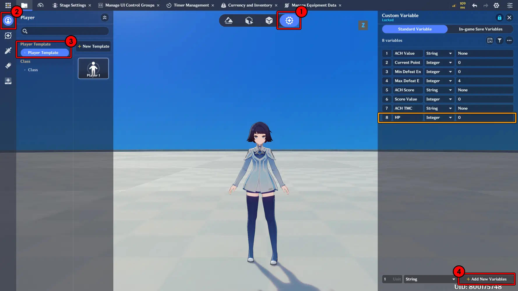
In this implementation, I modified the default HP Bar into a symbolic HP system using the Hearth icon for a more visually appealing design. The character has 4 HP bars represented by Hearth symbols. Each time the player takes damage from an enemy, they lose 1 Hearth point. When all Hearth symbols are depleted, the character is defeated.
First, create a new variable that will be used to store and track the character’s HP value. This variable will serve as the main reference for managing health reduction and related UI updates.
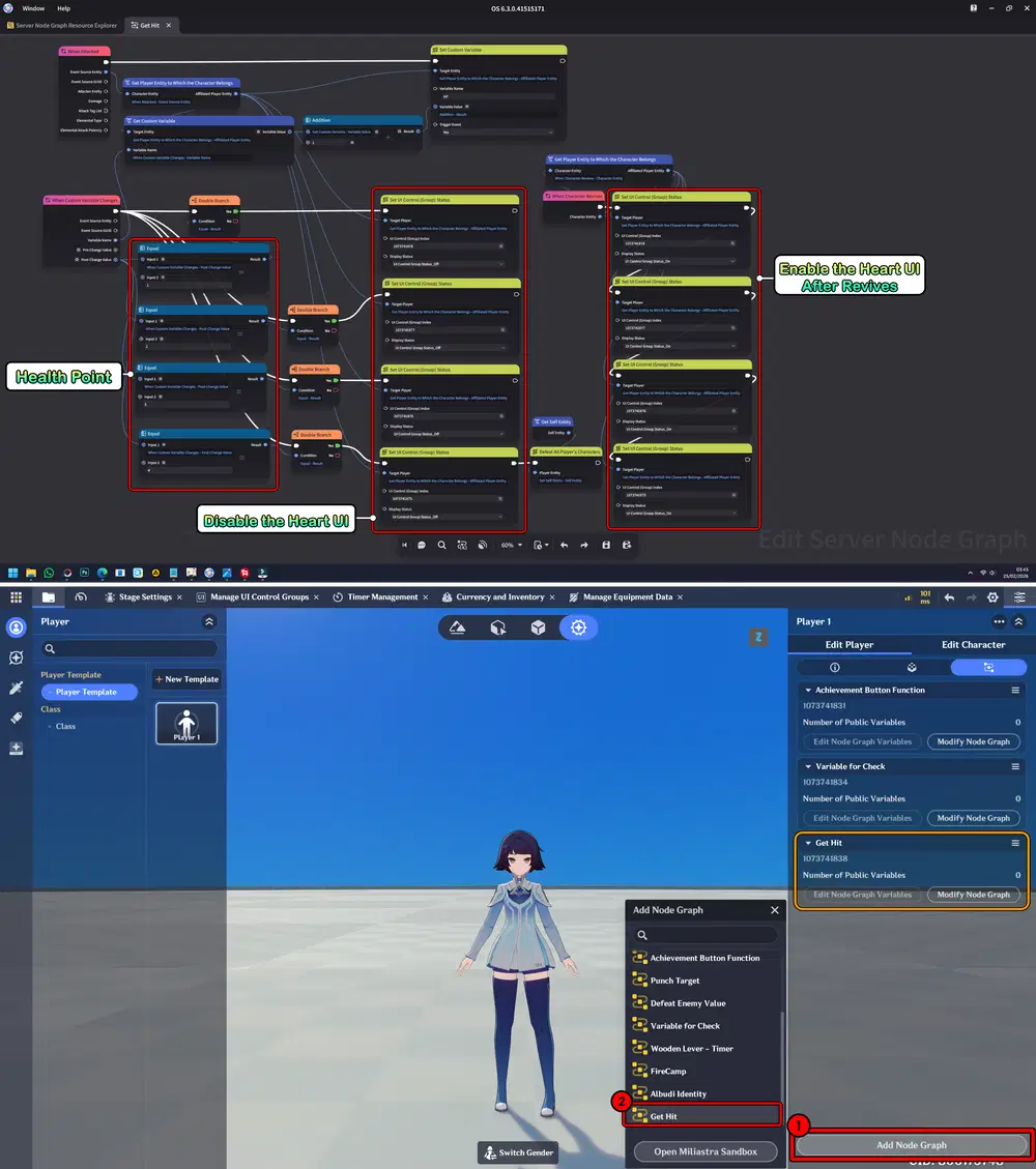
Then, create a new node graph that functions to detect when the character is hit. Each time the character receives damage, the system reduces the number of hearts by 1. When all 4 hearts are depleted, the player is defeated.
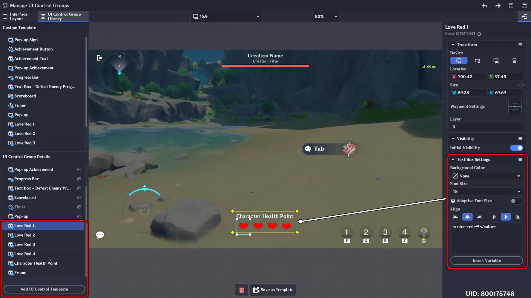
Don’t forget to design the UI layout. In this implementation, I used 6 Textboxes where symbols and text are inserted to create the Heart display and related UI elements. I also made color changes and size adjustments.
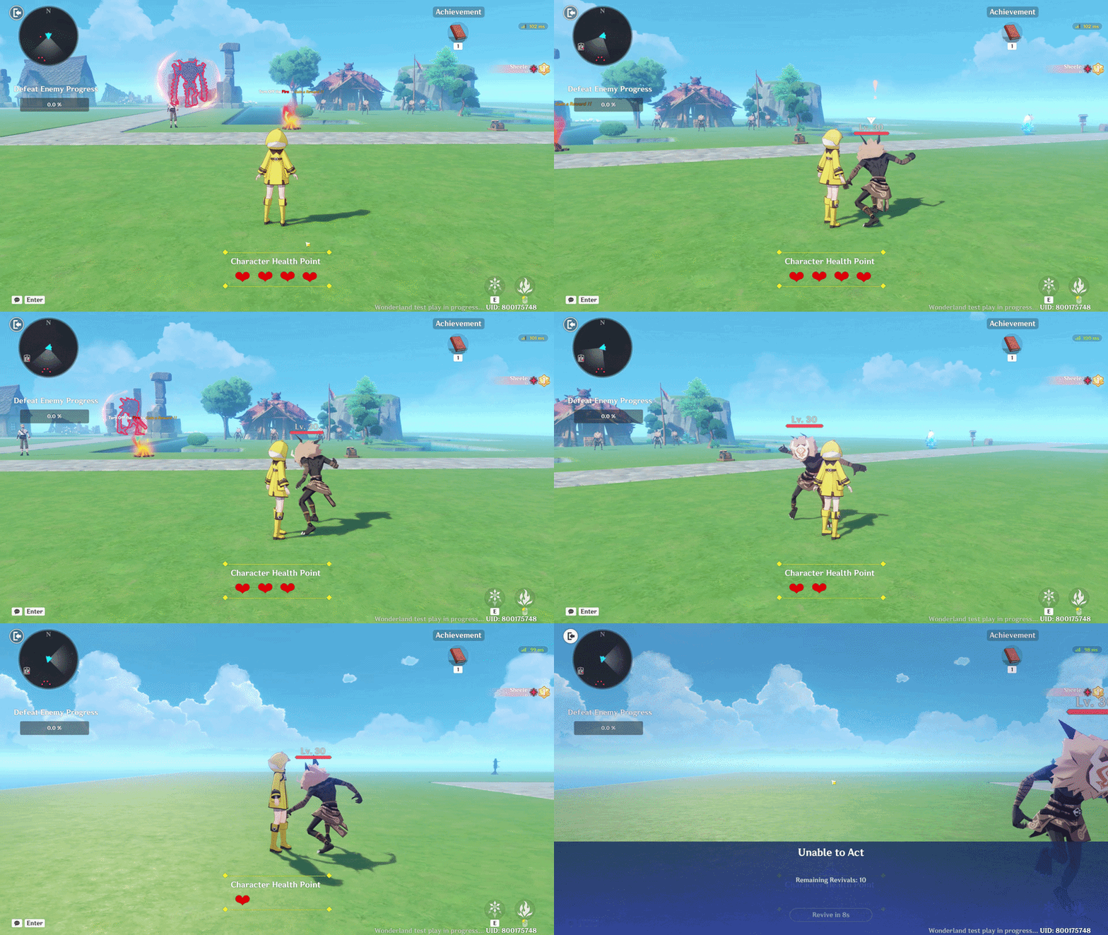
And here is the final result. The Heart-based HP system is now displayed clearly on the UI, with each Hearth symbol representing one health point. When the player takes damage, one Hearth disappears, and once all Hearth symbols are gone, the player enters the defeat state.
Wonderland Stage Showcase
Here are a few stages I’ve created that might inspire you in developing your own stages. 
Escape or Conquer Stage GUID: 16305205759 [Asia]
Slime & Dragon Stage GUID: 29190107647 [Asia]
Reference Guide
As another source of guidance, you can visit the guide provided by the Official Genshin Impact x Miliastra Wonderland
Miliastra Wonderland - General Guide
Miliastra Wonderland - Tutorial