This guide will teach you how to design and implement Frontend interfaces in MW using UI Control Groups

We will cover:
The UI Control Group Library: Understanding the workspace.
UI Control Groups: A deep dive into each type.
Practical examples: From simple buttons to advanced Deck Selectors.

1. Introduction to UI Control Group Library
The UI Control Group is the backbone of player interaction. Think of it as a toolkit designed to bridge the gap between your stage’s logic and the player’s experience.
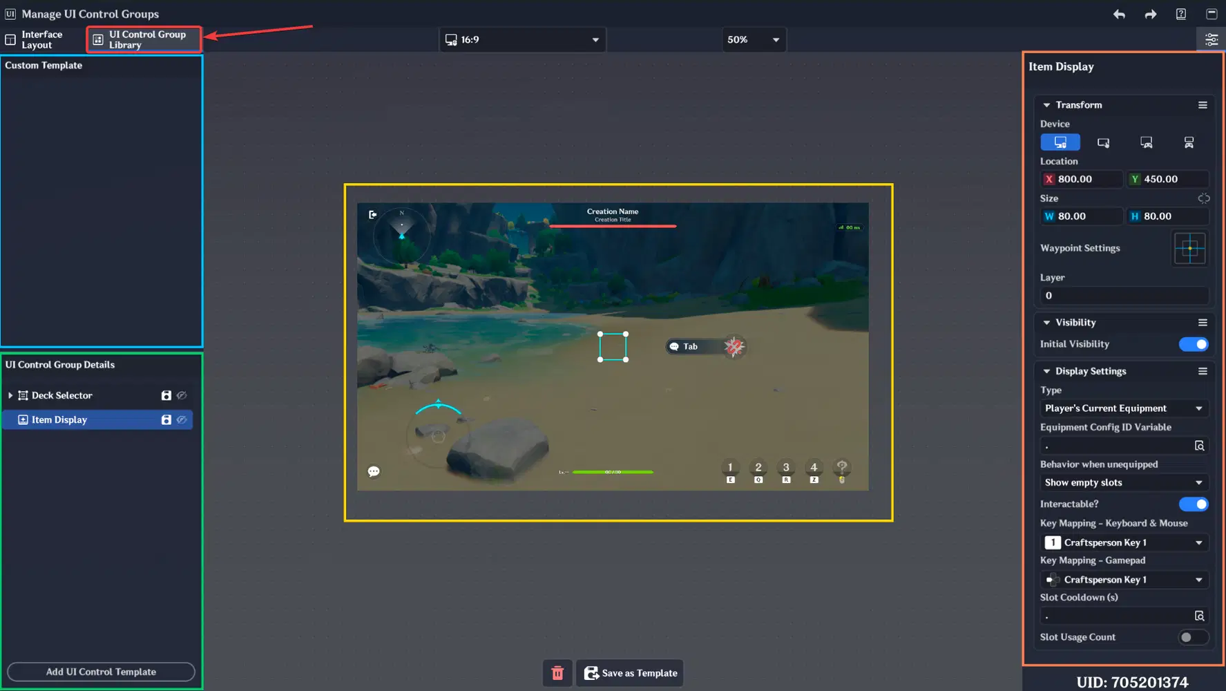
The Library is divided into 4 main sections:
- Custom Templates: Your library of saved UI Control Groups.
- UI Control Group Details: The hierarchy/layering of your current UI.
- UI Viewport: The real-time preview of your interface.
- Properties Panel: Where you configure the behavior and appearance of UI Control Group.
UI Control Group Library
Workspace Controls:
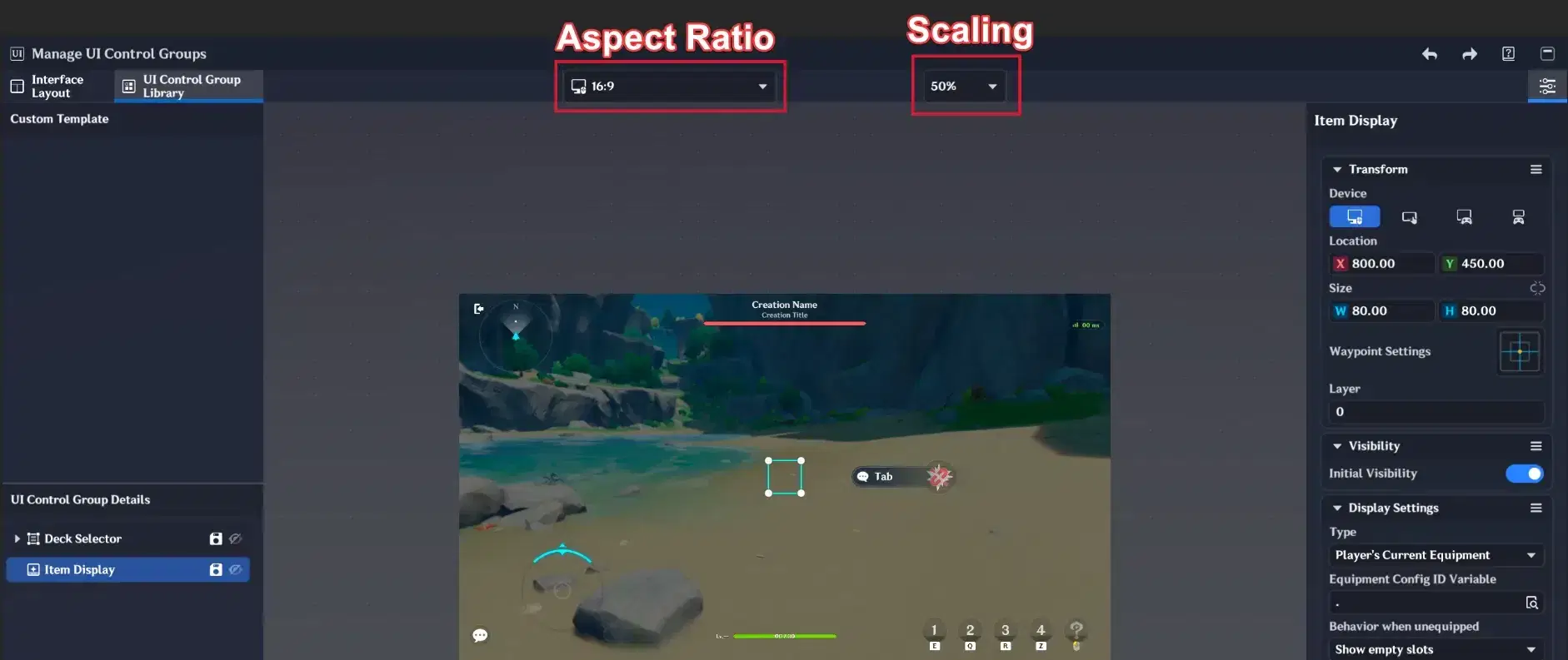
At the top of the Library, you can find the Scaling Options and Aspect Ratio Selector.
- Scaling: Adjust the preview zoom (e.g., 75%) to fit the entire UI layout into your screen comfortably or use your mouse wheel.
- Aspect Ratio: Switch between formats like 16:9 or 21:9 to ensure your interface remains aesthetic on different monitor types.
Aspect Ratio & Scaling
1.1. Custom Templates
This section stores UI Control Groups you have "Saved as Template".
- The Workflow: Once a UI Control Group is saved, it appears here with a modified icon. You can delete UI Control Groups from the Details list to keep your workspace clean and simply bring them back later by left-clicking the template.
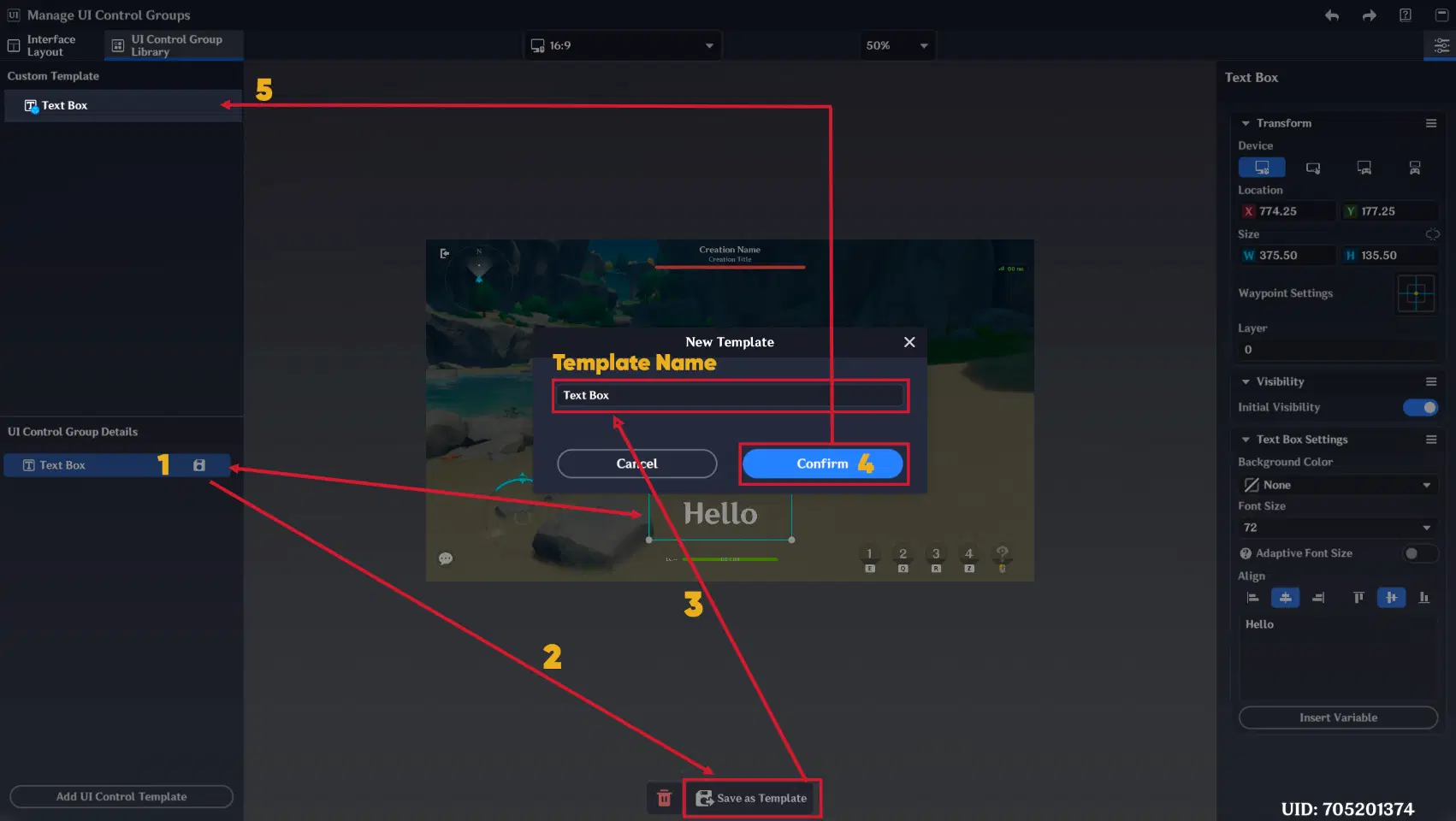
Save UI Control Group as Template
- Important: To save changes to a template, you must click "Save Changes" or use the Ctrl + Alt + S hotkey
Note: Ctrl + S will not update the UI Control Group template, only the local instance.
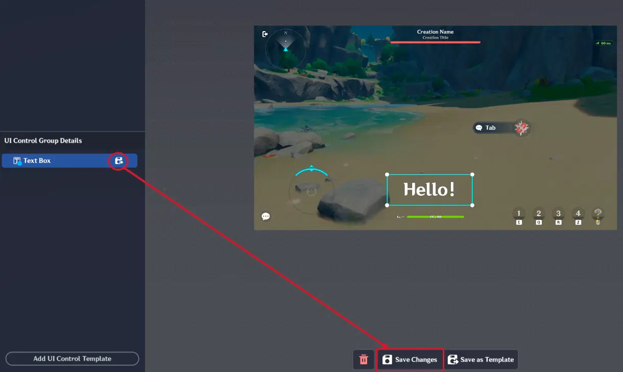
Save changes to template
- Implementation Methods: Saved templates can be triggered dynamically using the "Activate UI Control Group in Control Group Library" execution node.
- Alternatively, they can be placed directly in the Interface Layout for initial visibility.
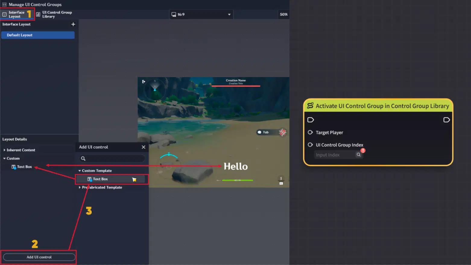
UI Control Group display
1.2. UI Control Group Details
This is a list of all UI Control Groups currently active in your layout.
To add new UI Control Group press "Add UI Control Template" button and choose UI Control Group from the list.
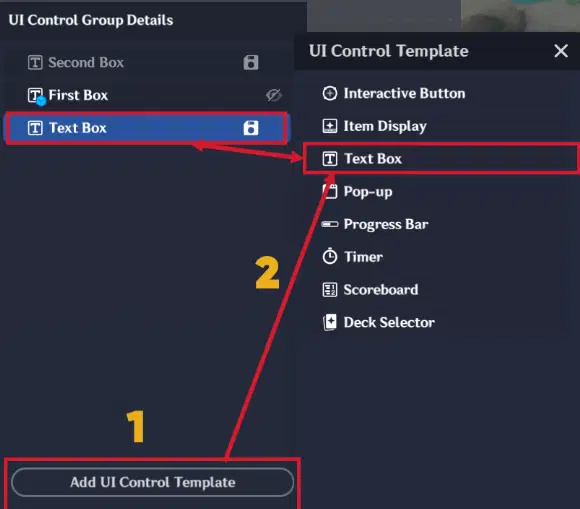
UI Control Group creation
UI Control Group Details has following features:
- Layering: The order matters. UI Control Groups higher on the list appear "closer" to the player (on top of other elements). You can also adjust this via Layer Settings. To switch UI Control Group position in list, "Right-click" on UI Control Group and select "Move Up", "Move Down", "Pin" or "Pin to bottom".
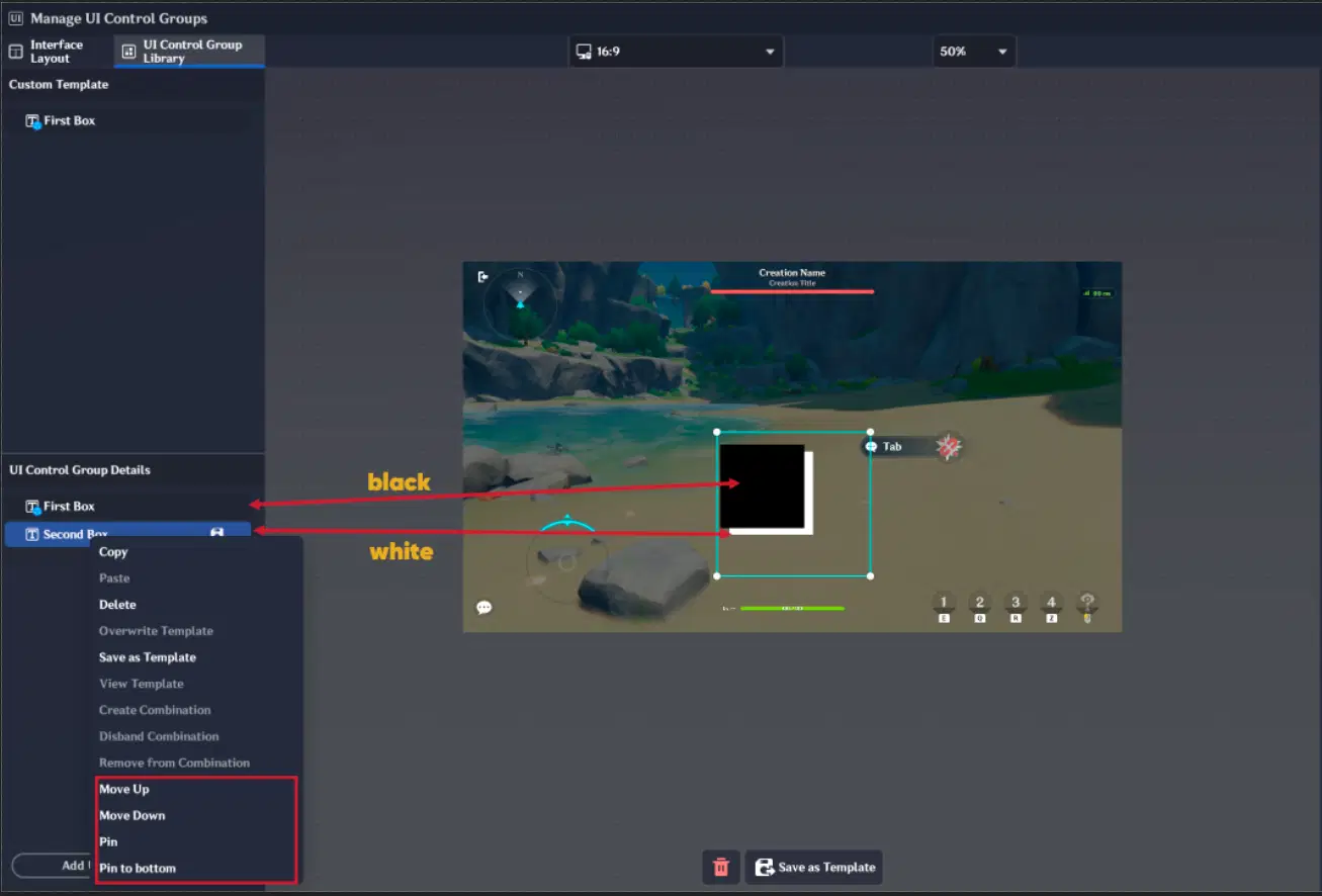
Layering feature (Part 1)
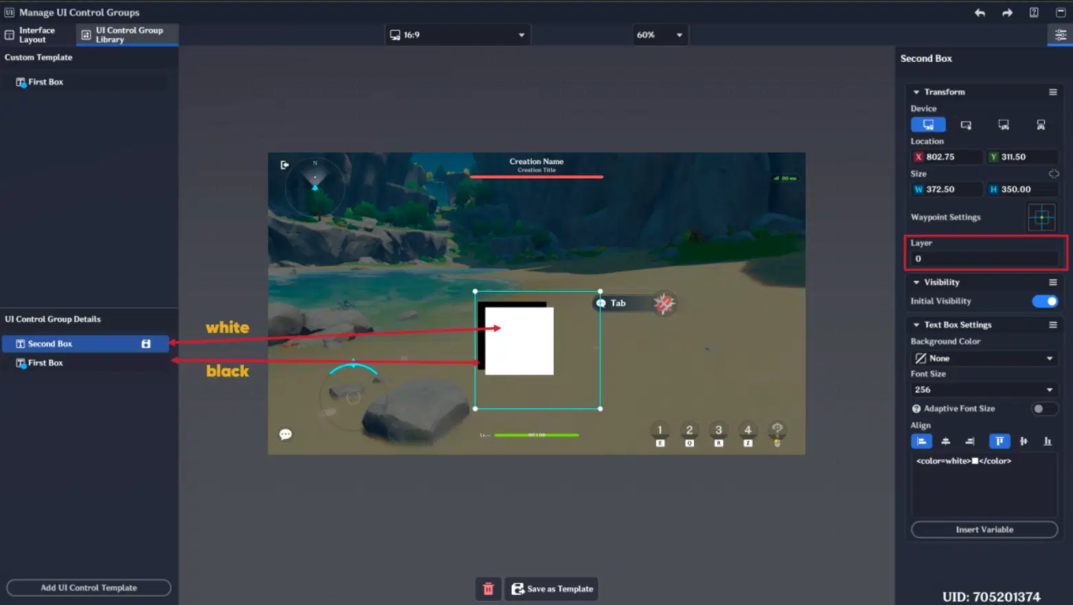
Layering feature (Part 2)
- Organization: Use UI Combinations (Ctrl + G) to group multiple UI Control Groups or choose them using "Left-Shift + Left-click" hotkey, then right-click on selected UI Control Groups and press "Create Combination".
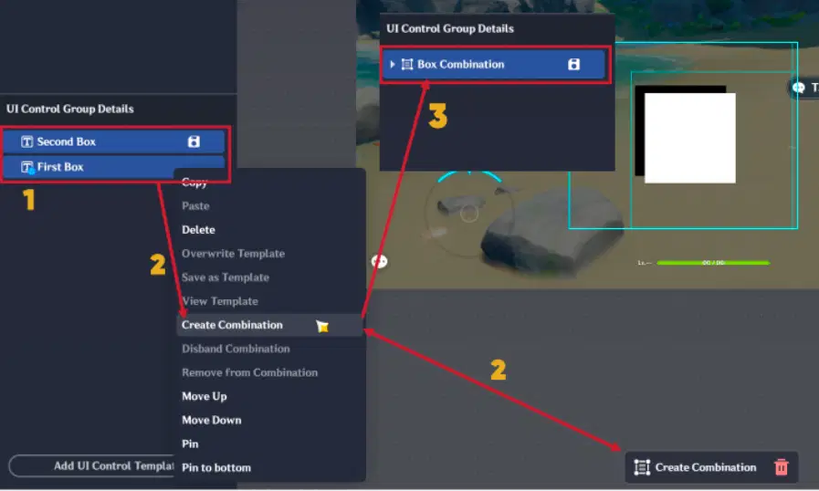
UI Combination
- Status Icons:
- File Icon: The UI Control Group needs to be saved as a template.
- File with Arrow: You have unsaved changes in your template.
- Eye Icon: Hover over an element to toggle its visibility in the Viewport (this does not affect in-game visibility).
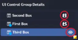
Status Icons
1.3. UI Viewport
The Viewport shows exactly what the player will see.
- Positioning: Simply drag elements with your mouse.
- Bounding Box: Adjust the blue selection frame to define boundaries of your element.
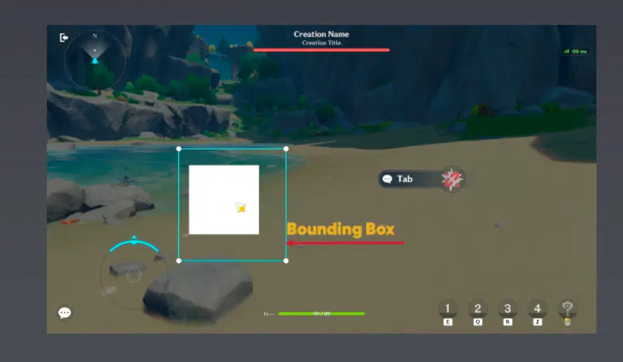
Bounding Box
1.4. UI Control Group properties
When you select UI Control Group, you can modify its properties.
Note: UI Control Group must be saved as a template to generate a Unique Index, which is required to call the UI Control Group via Execution Nodes.
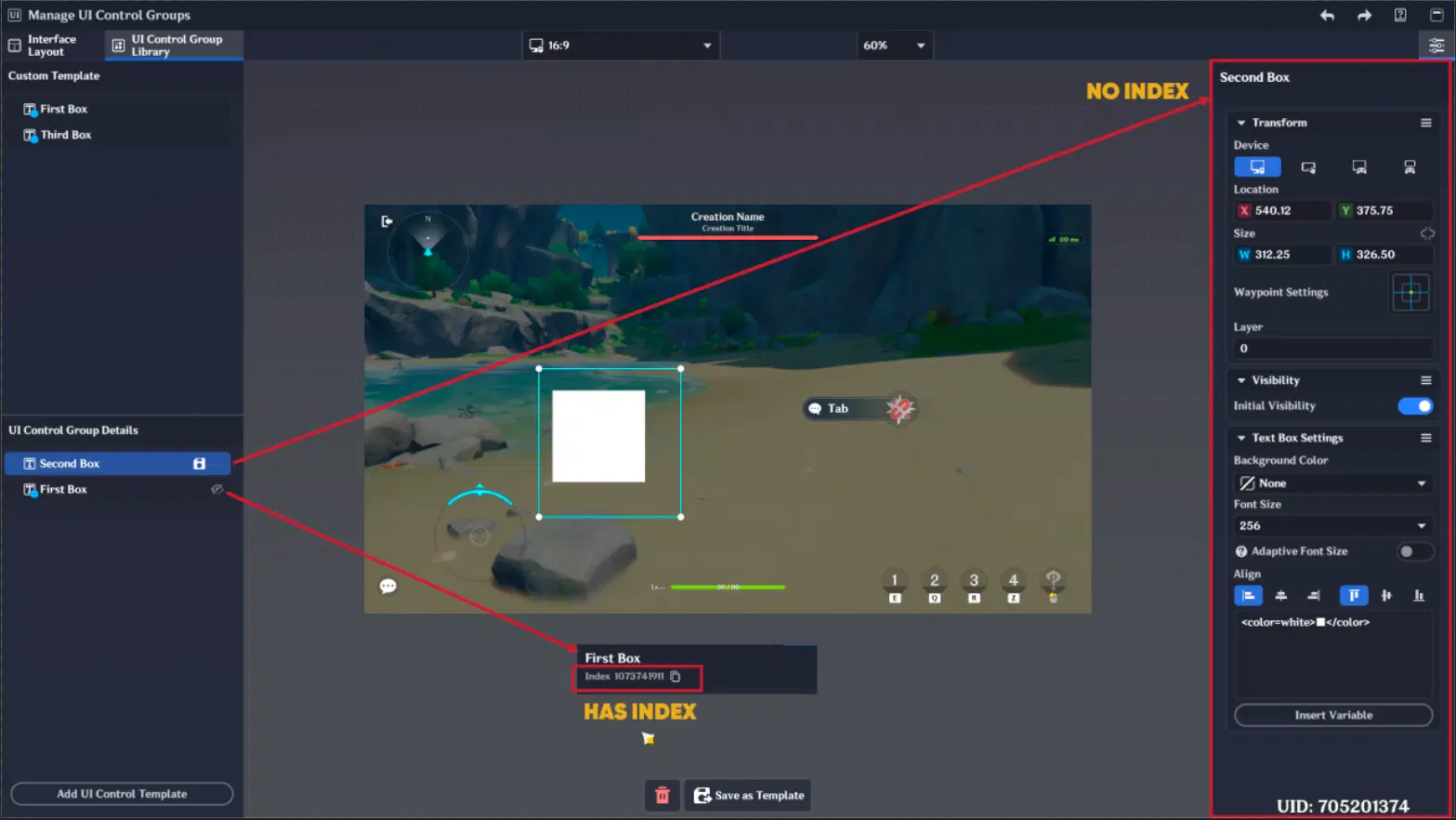
UI Control Group properties
1.4.1. Transform Tab
Device Type: Switch between platforms to see how your UI Control Groups are displayed. Each UI Control Group position needs to be configured in each device type.
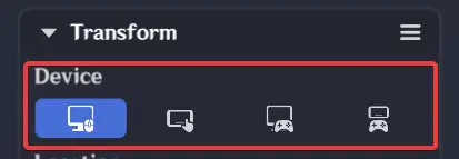
Device Type
Location(x,y): Represents UI Control Group position in UI.
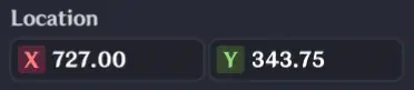
Location
Tip: Use "Sync information to all platforms" to quickly apply UI Control Group position across PC, Mobile, and Console.
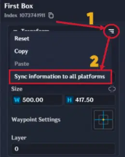
Sync information to all platforms
Size & Constraints: Click the "Chain" icon to lock the Aspect Ratio. This prevents your icons from looking stretched when you resize them.
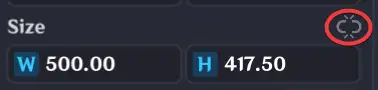
Size & Constraints
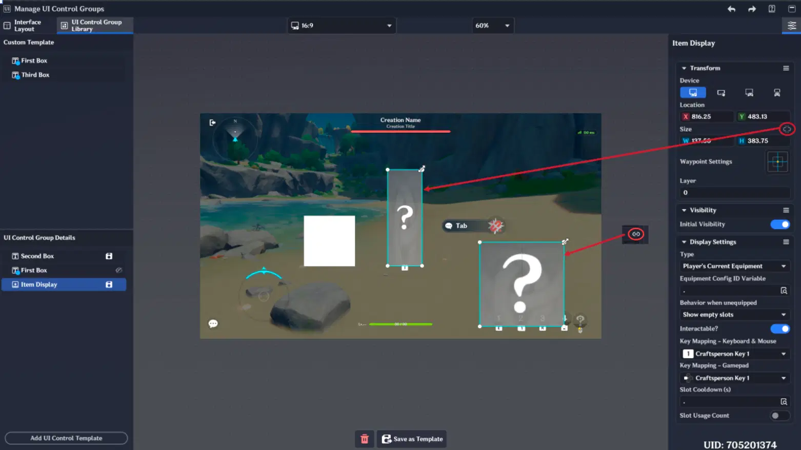
Chain option
Waypoint Settings: Defines the origin of transformation. Setting this correctly is essential for preventing "UI drift" when switching between devices.
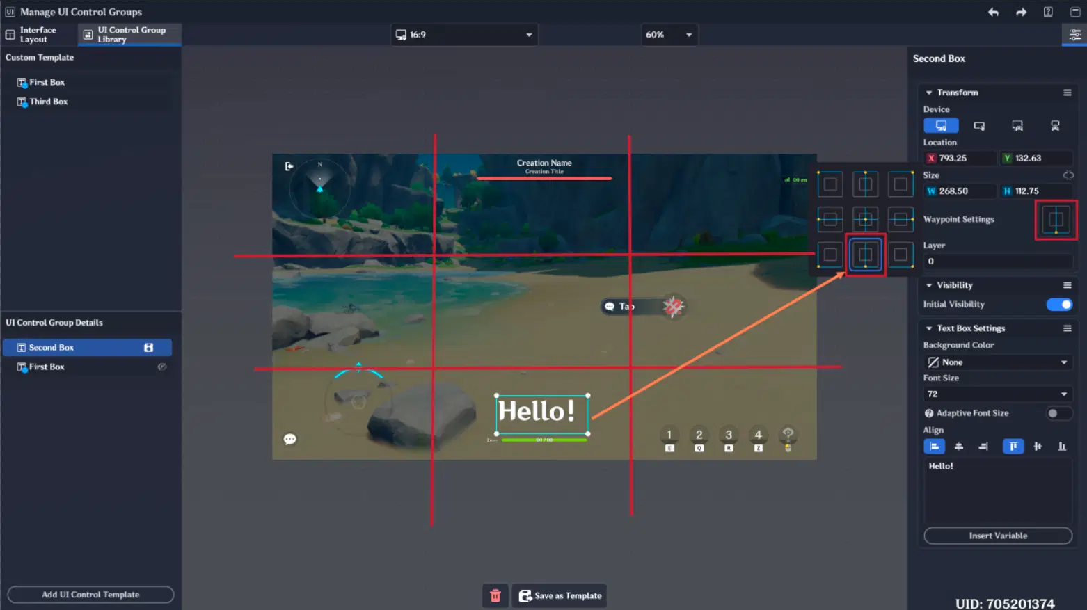
Waypoint Settings
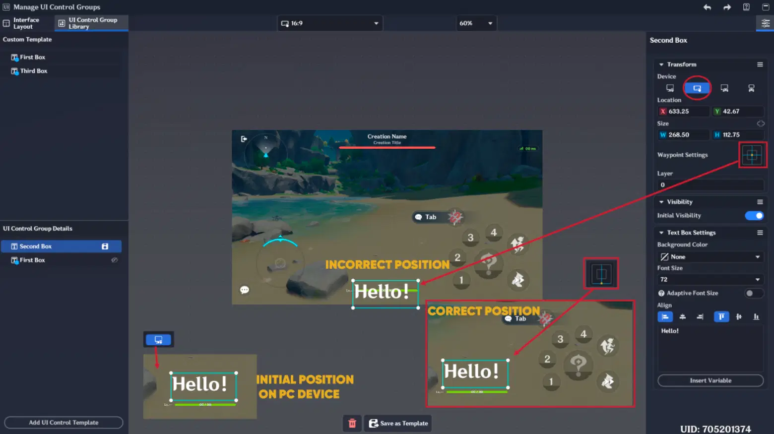
Waypoint settings difference
1.4.2. Visibility Tab
Initial Visibility: If turned off, then UI Control Group won't be initial visible, when it is called via Nodes or created in Interface Layout.
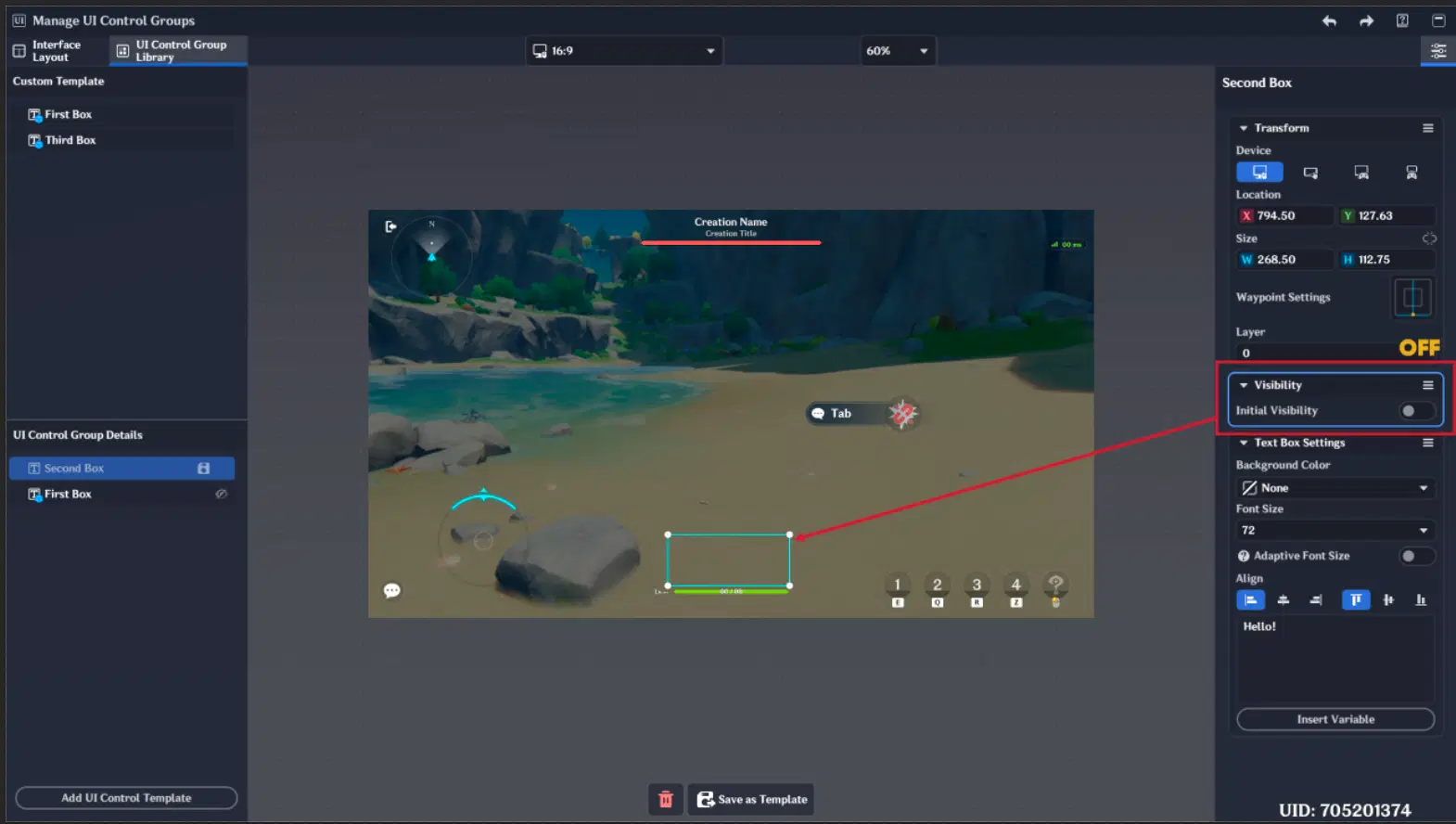
Initial Visibility
2. UI Control Groups
This section will explain various UI Control Group types. In the Miliastra Wonderland editor, a "UI Control Group" refers to an individual, functional UI element. Each type comes with a unique set of Functions - built-in logic and parameters that determine how the UI Control Group behaves, reacts to player input, and displays data.
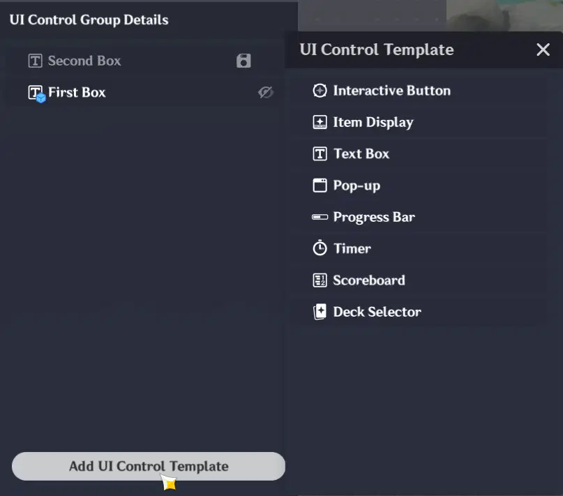
UI Control Group Types
2.1. Interactive Button
The Interactive Button is the way for players to interact with your stage using a mouse, keyboard, or gamepad. It is used to trigger Node Graphs, activate character skills, or consume inventory items.
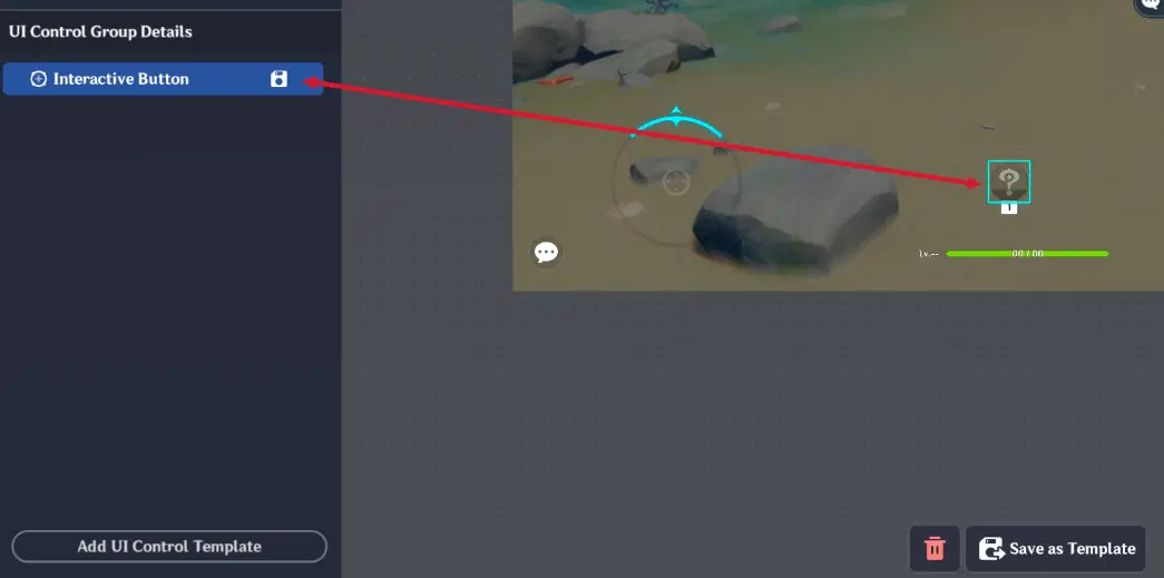
Interactive Button
It has addition tab named "Key Settings". This tab allows you to configure:
Input Mapping: Define specific keys for Mouse & Keyboard and Gamepad.
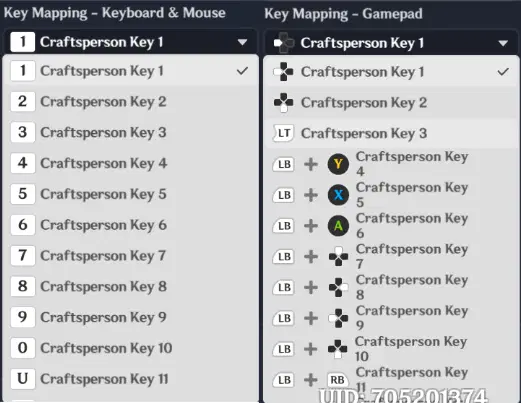
Input Mapping
Visual Size: Choose between Large or Small presets to fit your UI design.
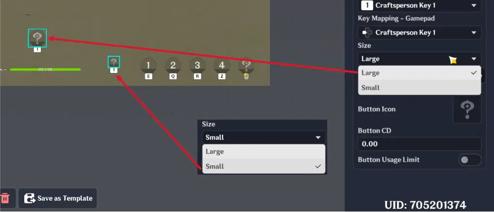
Visual Size
Button Type: This is the most important setting, as it determines the button's logic:
- Button Skill: Triggers a character's skill when pressed.
- Interactive Event: Triggers a specific Node Graph.
- Use Items: Triggers inventory-related nodes, such as "When Inventory Item is Used" or "When the Quantity of Inventory Item is Changed".
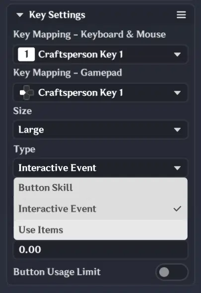
Key Settings
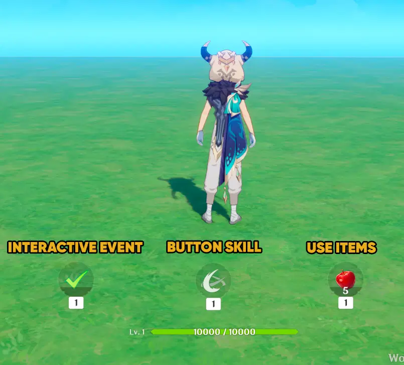
Interactive button types
Depending on the Type you select, you will need to configure specific parameters:
- When "Button Skill" is chosen:
- You must assign a specific Skill from your character's skills to this button.
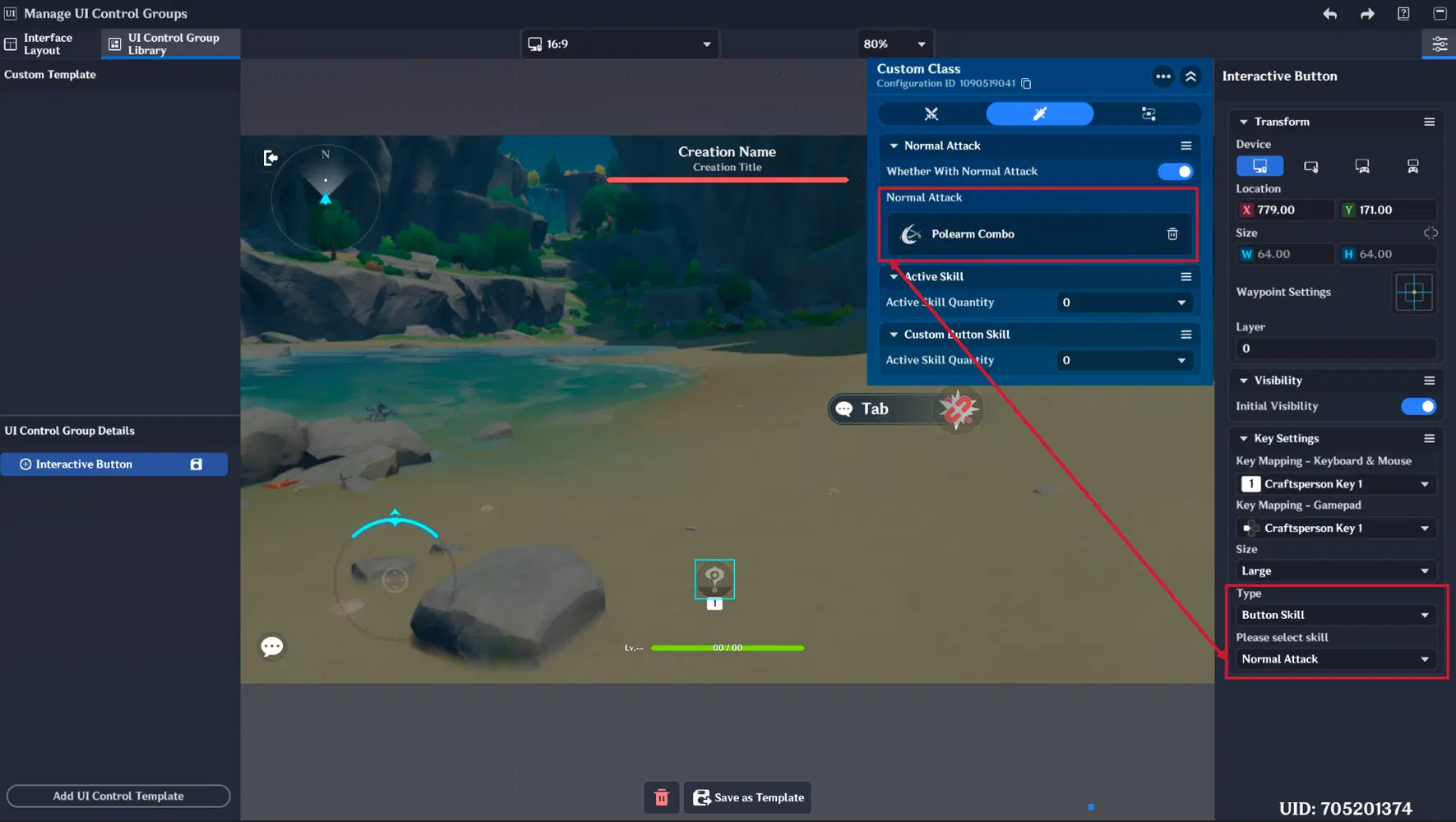
Button Skill type
- When "Interactive Event" is chosen:
- You need to specify a Button Icon, a Cooldown (CD), and a Usage Limit.
- Note: If you enable a Usage Limit, you must create a matching variable in the Custom Variable Component on either the Stage Entity or the Player Entity to track the remaining uses.
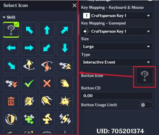
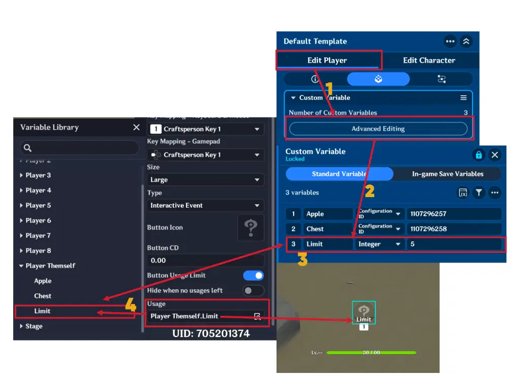
Usage Limit variable
- When "Use Item" is chosen:
- You need to link an Item Config ID Variable (must create a matching variable in the Custom Variable Component on the Player Entity). Additionally, you must choose the Behavior when there are no items:
- Icon Grayed Out: The button remains visible but disabled.
- Do Not Show Icon: The button frame stays, but the icon disappears.
- Hide Button: The entire UI element is hidden from the player.
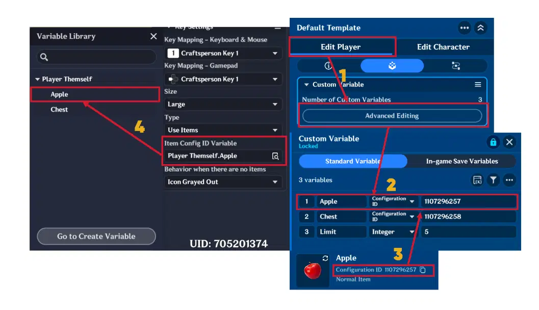
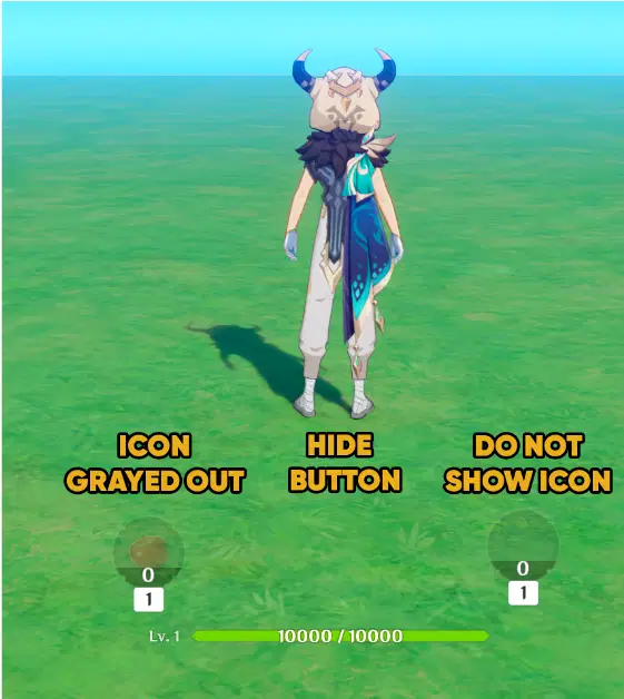
Button different behaviour
2.1.1. Interactive Button example
In this example, the Interactive Button will be used to create a functional "Unstuck" button. This is a classic UI feature that teleports the player back to a safe, defined location if they get stuck in the environment.
Key settings are the following:
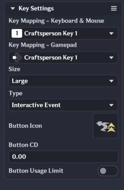
Button key settings
Node graph logic is following:
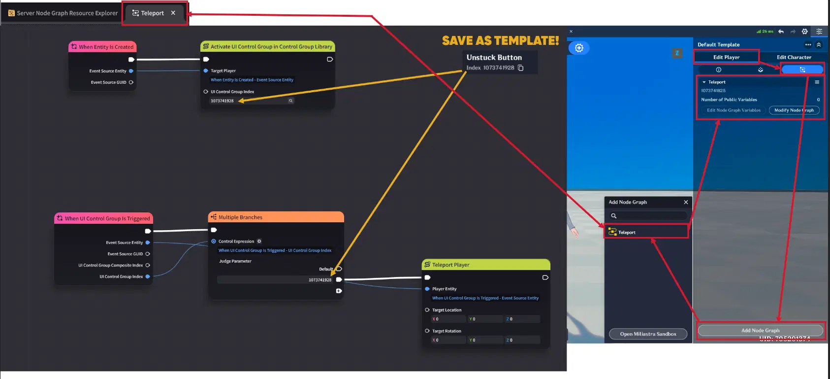
Node Graph
To bring the button to life, you must create a dedicated Node Graph (e.g., "Teleport") and attach it directly to the Player Entity to ensure the initial event node ("When Entity is Created") triggers correctly. The process follows a simple execution chain:
- Initialization: When the player entity is created in the stage, the "When Entity is Created" event triggers, executing the "Activate UI Control Group in Control Group Library" node to display the Interactive Button on the player's screen.
- Interaction: Once the player presses the button, the "When UI Control Group is Triggered" node is triggered.
- Execution: Finally, node graph executes the "Teleport Player" node, but only after verifying that the UI Control Group Index matches Interactive Button.
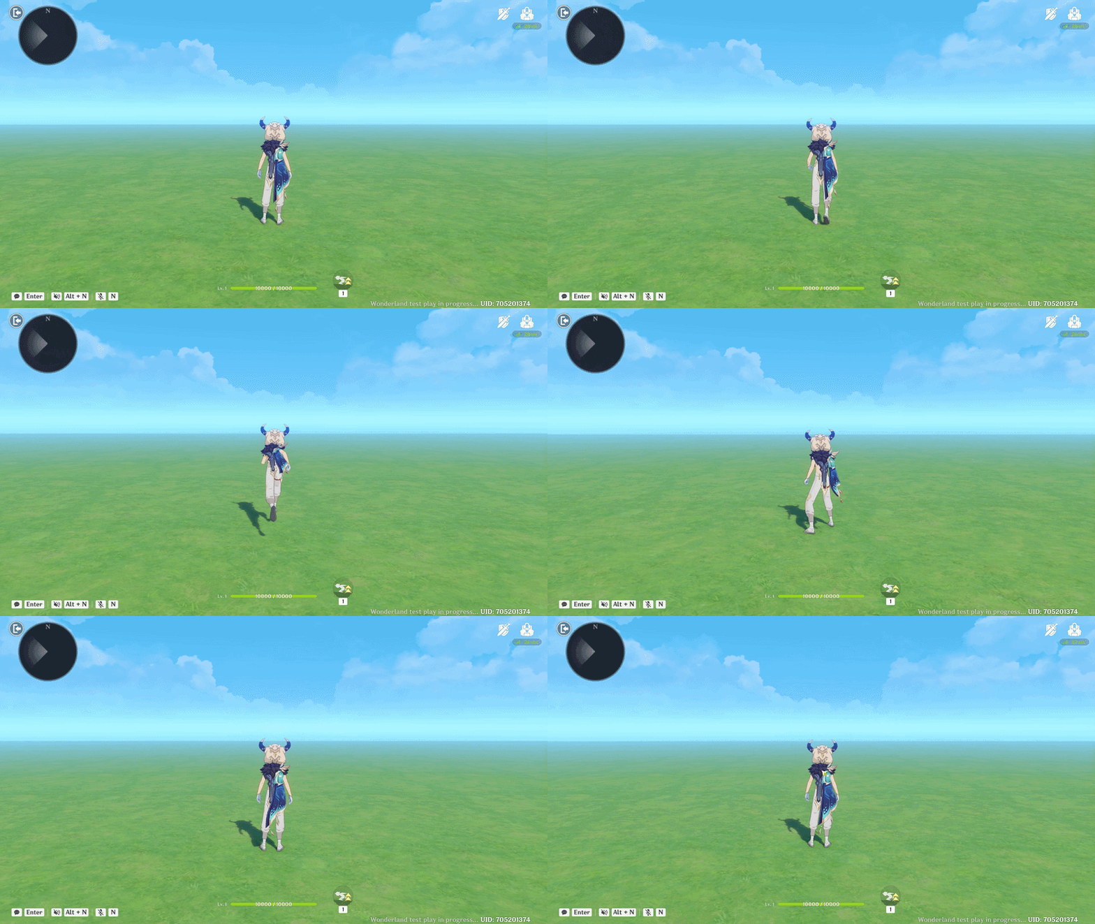
Interactive Button Showcase
2.2. Item Display
The Item Display is a UI Control Group designed to showcase items or equipment.
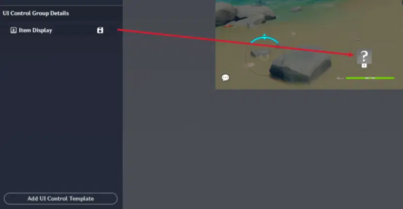
Item Display
It has addition tab named "Display Settings". This tab allows you to configure:
1. Item Display Type
This determines where the data comes from:
- Player's Current Equipment: Displays players equipment item in inventory.
- Template Item: Displays a specific, pre-defined item.
- Items in Inventory: Displays a specific item from the player's inventory.
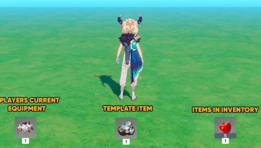
Item Display Type
2. Interactable Toggle
If you want the player to be able to click on the item (to use it), enable this toggle. You will then need to configure:
- Input Mapping: Keys for Keyboard & Mouse and Gamepad.
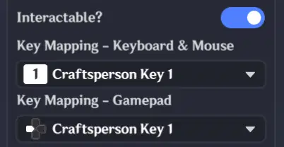
Input Mapping
- Cooldown (CD): To prevent rapid clicking (optional).
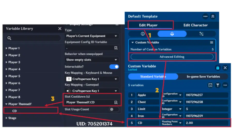
С
- Slot Usage Limit: Limits how many times the item can be interacted with (optional). Need to specify variable same as in Interactive Button Usage Limit.
Configuration Logic by Type:
Depending on the Display Type selected, additional parameters must be set:
- When "Player's Current Equipment" is selected:
- Equipment Config ID Variable: Must create a variable with item Config ID in the Custom Variable Component on the Player Entity.
- Behavior when Unequipped: Choose to either Show Empty Slot or Hide Slot entirely.
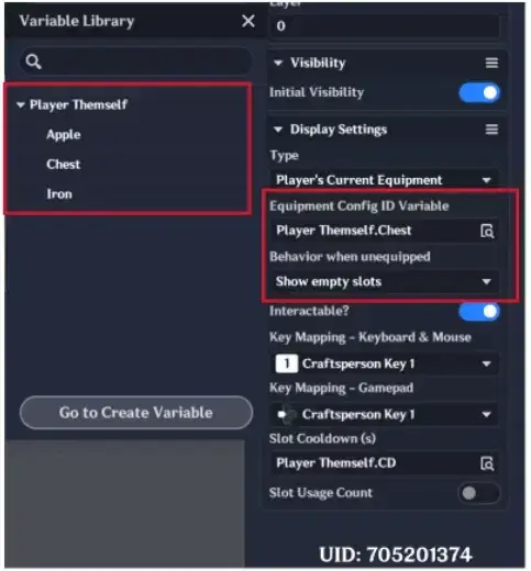
Player's Current Equipment Type
- When "Template Item" is selected:
- Item Config ID Variable: Must create a variable with item Config ID in the Stage or Player variables in Custom Variable Component.
- Item Quantity Display: Toggle the visibility of the item counter.
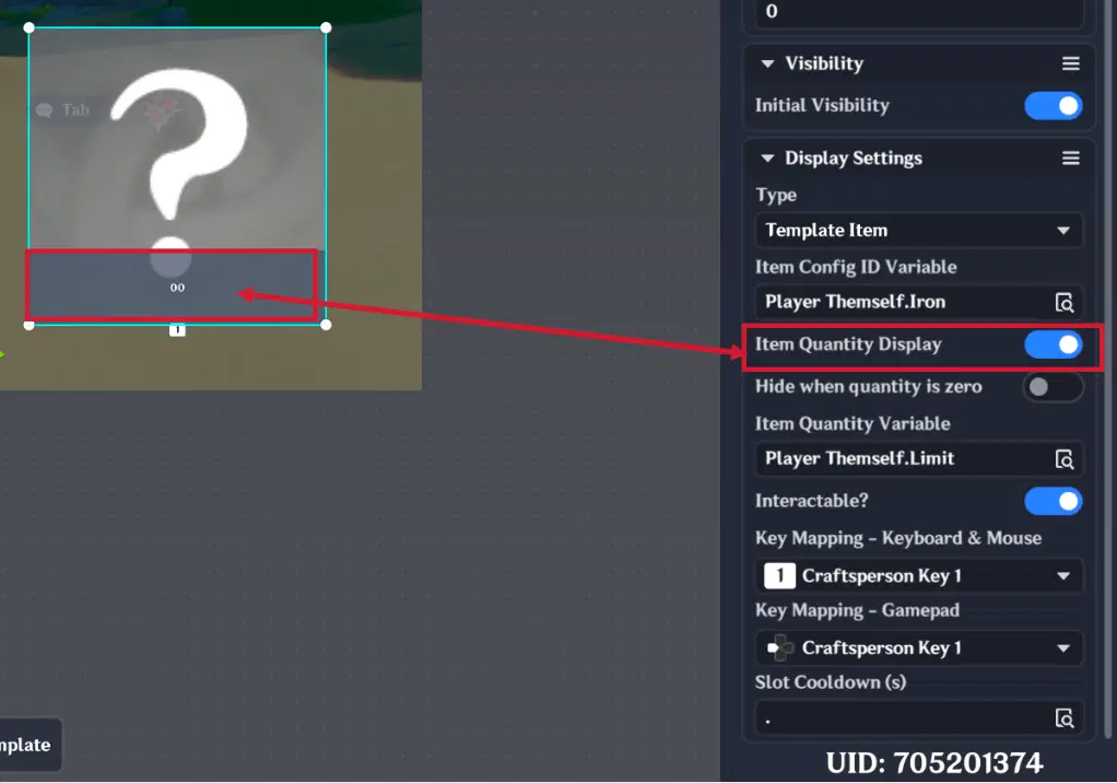
Item Quantity Display
- Hide when Quantity is Zero: Automatically removes the UI Control Group if the player don't have item.
- Item Quantity Variable: Must create a variable in the Stage or Player variables in Custom Variable Component.
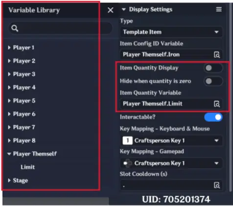
Template Item Type
- When "Items in Inventory" is selected:
- Item Config ID Variable: Must create a variable in the Player variables in Custom Variable Component.
- Behavior when Empty: Choose to Show Empty Slot or Hide Slot.
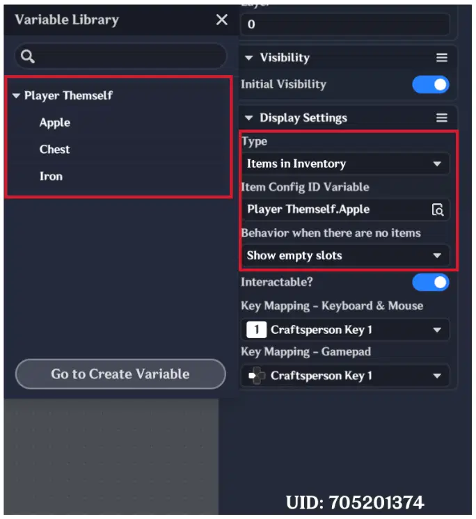
Items in Inventory type
2.2.1. Item Display example
In this example, will be demonstrated how to create a Dynamic Inventory Slot using Display Item. This slot will track a specific item in the player's inventory and update its quantity in real-time.
Display Setting are following:
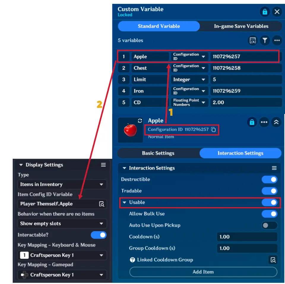
Display Setting
Node graph logic is following:
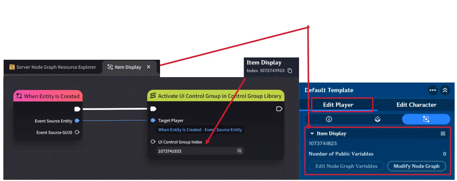
Item display Node Graph
To display and use items, create a dedicated Node Graph (e.g., "Item Display") and attach it to the Player Entity. This will track each player's inventory individually:
- Initialization: When the player spawns, the "When Entity is Created" event triggers the "Activate UI Control Group in Control Group Library" node, instantly rendering the Item Display on the player's screen.
- Automatic Interaction: Since the Item Display is linked to a specific Item Config ID variable, once the player will press the display item, it will instantly consume one "Apple" and update the quantity on the UI.
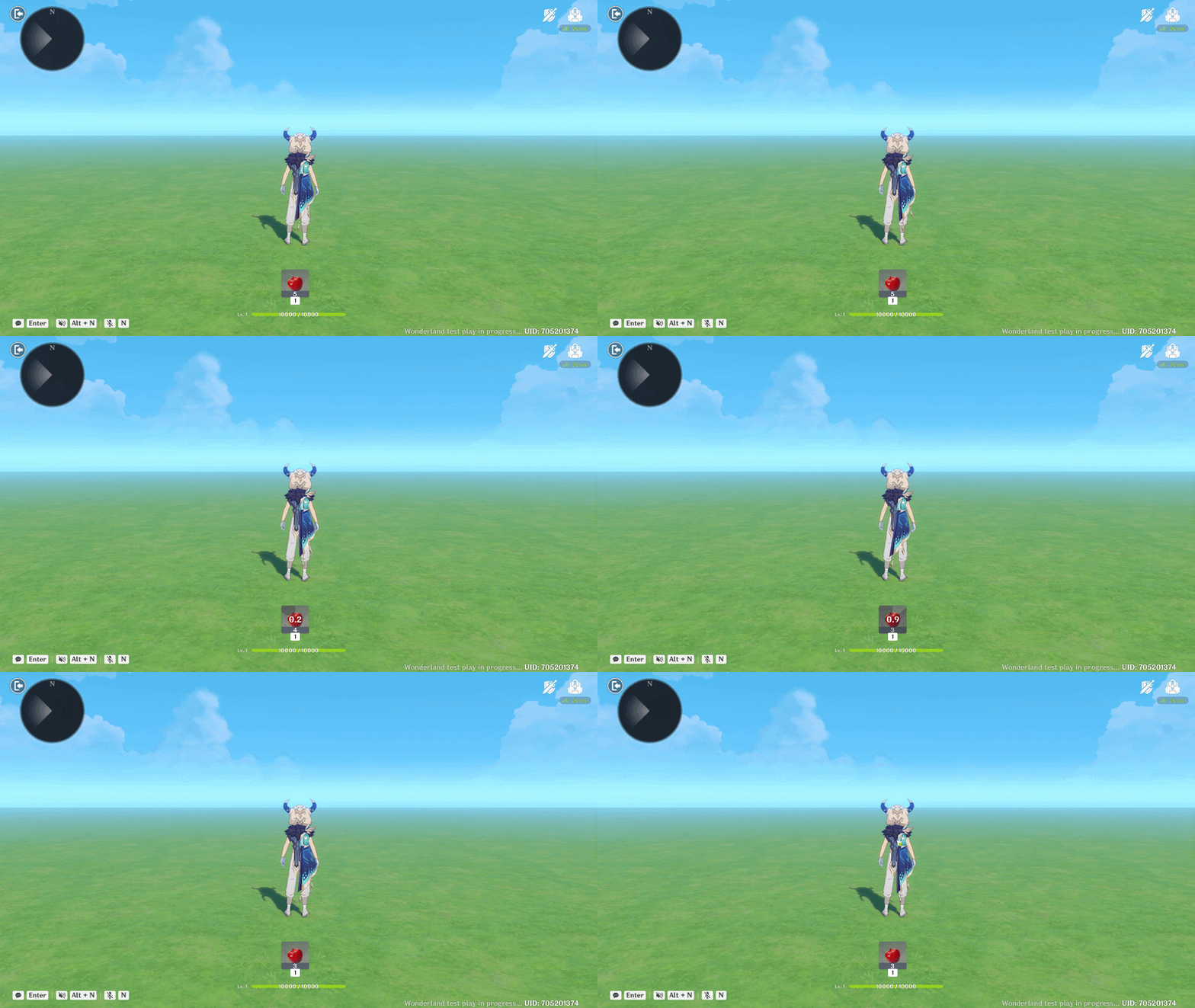
Item Display Showcase
2.3. Text Box
The Text Box is a UI Control Group designed to display characters. Beyond simple labels, it allows you to build Custom UI Structures - such as quest logs, dialogue windows, and shop interfaces - by layering them creatively.
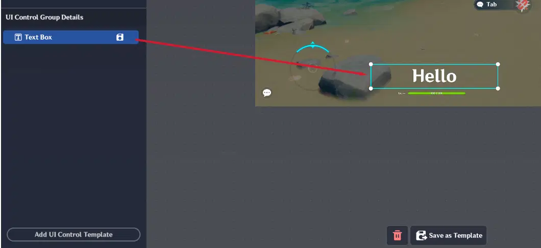
Text Box
Have addition tab named "Text Box Settings". This tab allows you to configure:
Background Color: Choose between None (transparent) or Black Translucent (semi-transparent) for better readability over busy gameplay backgrounds.
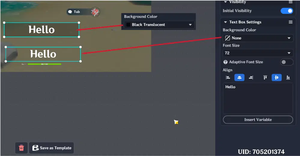
Background Color
Font Size: Adjustable from 10 to 512.
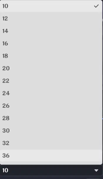
Font Size
Adaptive Font Size: A toggle that automatically shrinks the text to fit its container. Essential if your stage supports multiple languages, as some translations are often longer than English or your origin language.

Adaptive Font Size
Align Options: Control text placement horizontally (Left/Center/Right) and vertically (Top/Middle/Bottom).
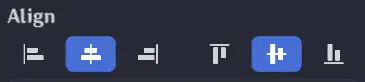
Align Options
Text Content: The area where you input your text.
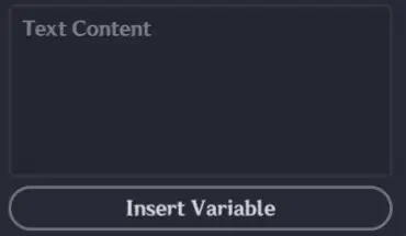
Text Content
Supported Rich Text Tags:
You can style your text directly in the text content using these tags:
- Color: Text (RGB) or Text (RGBA for transparency). You can also use named colors like .
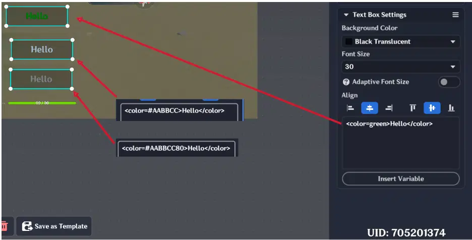
Text color
- Bold: Text (Makes text thicker).
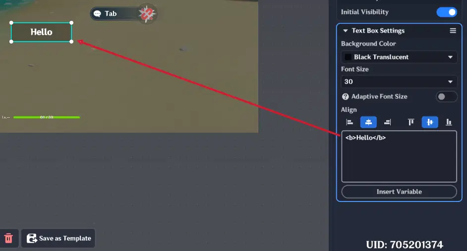
Bold text
- Italic: Text (Slants the text).
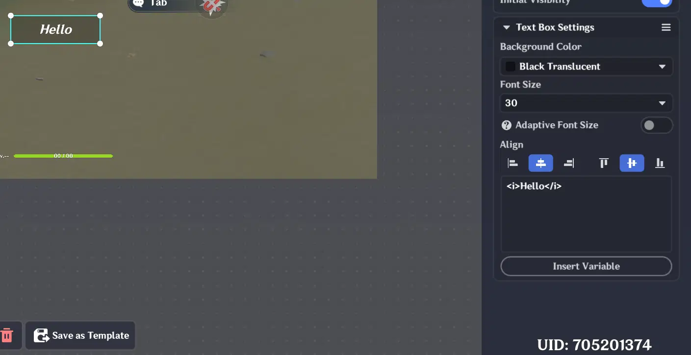
Italic text
- Size: Text (Overrides the global font size for specific words).
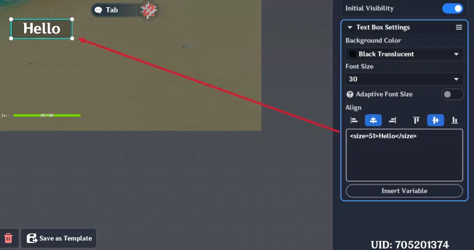
Custom text size
Dynamic Variable Insertion:
The Text Box’s usefull feature is its ability to display variables using the "Insert Variable" button. You can pull values from:
- Stage Entity: Global variables like "Total Boss HP".
- Player (Themself): Individual variables like "Currency" or "Level". This is the most common choice for personal HUD elements.
- Specific Players (1-8): Useful for creating leaderboards.
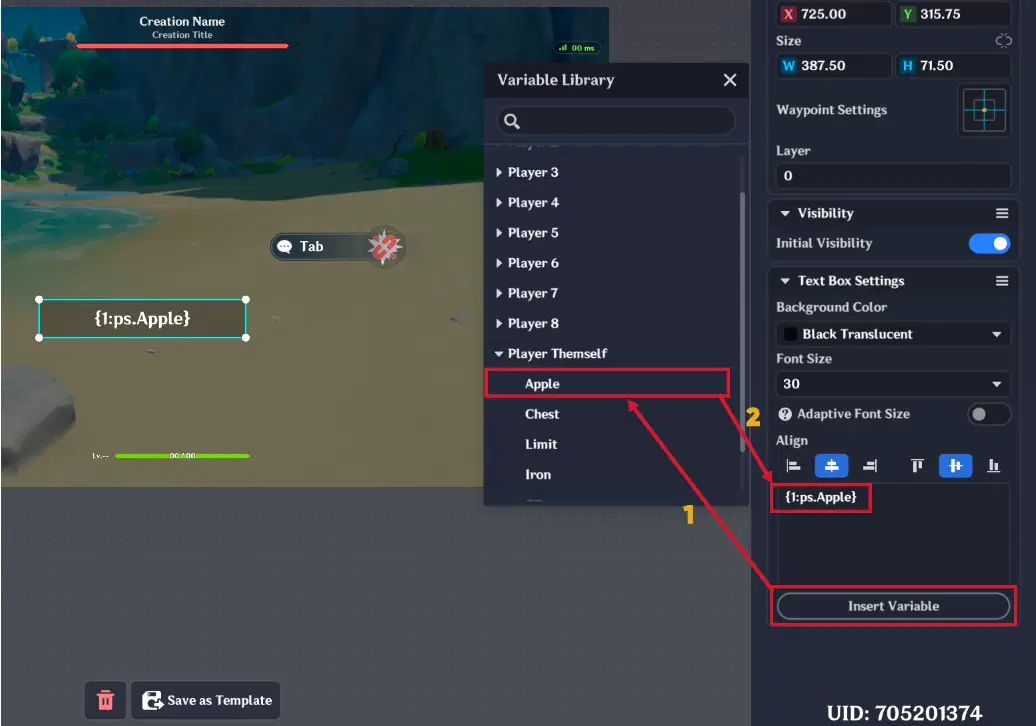
Variable insertion
2.3.1. Text Box example
This example will show you how to display player's currency in UI. In this example, will be created a dynamic "Currency" text box counter that updates every time a player's currency changes.
Text box settings are the following:
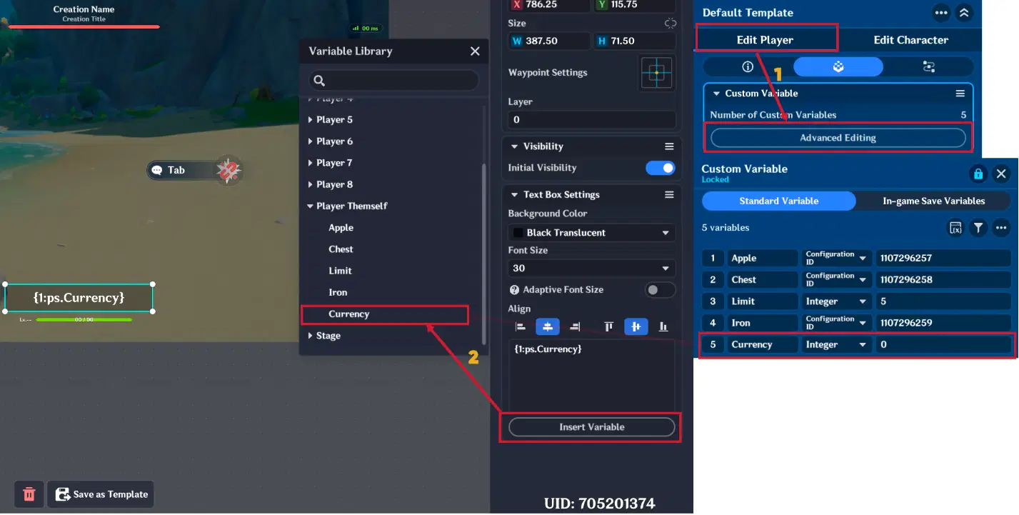
Text box settings
Node graph logic is following:
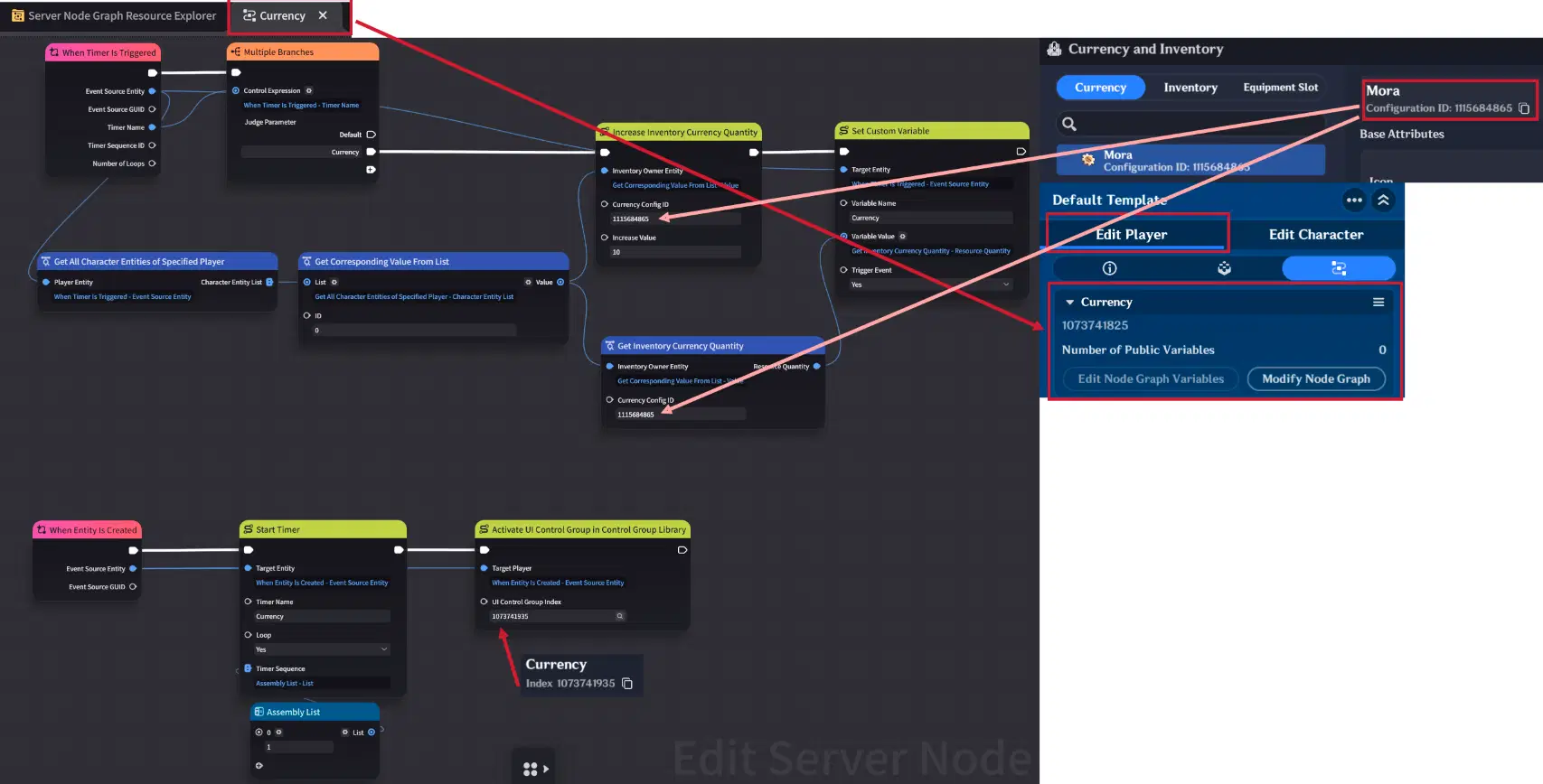
Node graph logic
Firstly we need to create a Node Graph (e.g., "Currency") and attach it to the Player Entity. This will track each player's "Currency" variable individually:
- Initialization: When the player spawns, the "When Entity is Created" event triggers the "Activate UI Control Group in Control Group Library" node, instantly rendering the Text Box on the player's screen. Simultaneously, a "Start Timer" node begins a 1-second loop.
- Timer Loop iterations: Every time the "When Timer is Triggered" event node is triggered (once per second), the node graph executes a math operation to increase the player's currency by 10.
- UI Synchronization: This new value is instantly saved to the "Currency" custom variable, therefore Text Box will instantly display modified currency value.
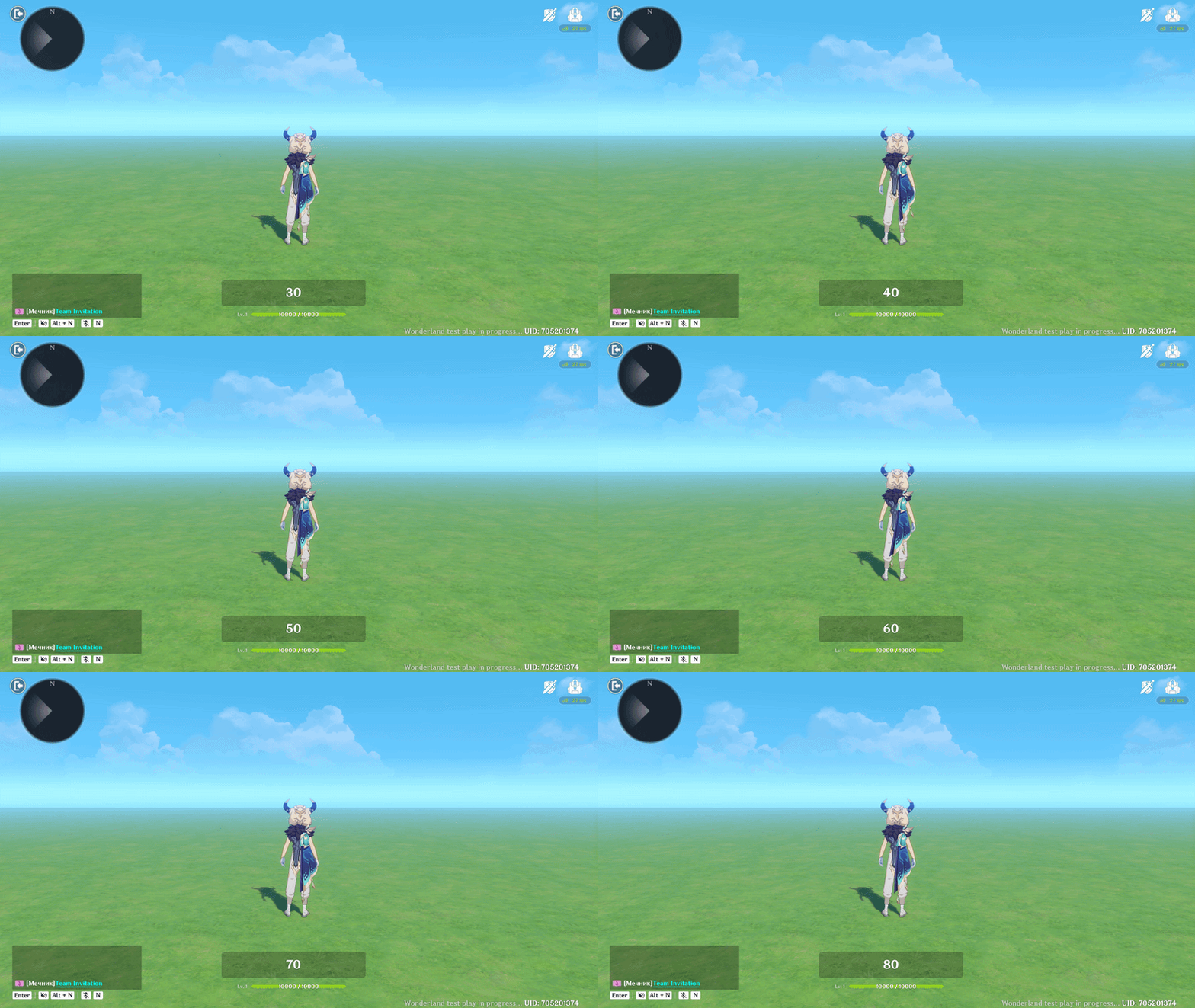
Text Box showcase
2.4. Pop-up
The Pop-up is a UI Control Group designed to deliver high-priority information, such as tutorials, gameplay hints, or system alerts. Unlike a standard Text Box, a Pop-up usually comes with a pre-formatted layout that commands the player’s attention.
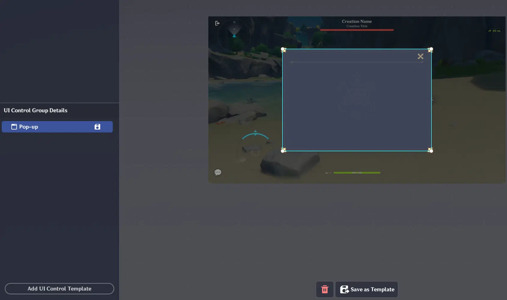
Pop-up
Have addition tab named "Pop-up Settings". This tab allows you to configure:
Title: The header text displayed at the top of the window (e.g., "Welcome" or "Warning!").
Text Content: The main body of the message. This supports the same Rich Text Tags (, , etc.) and Variable Insertion as the standard Text Box.
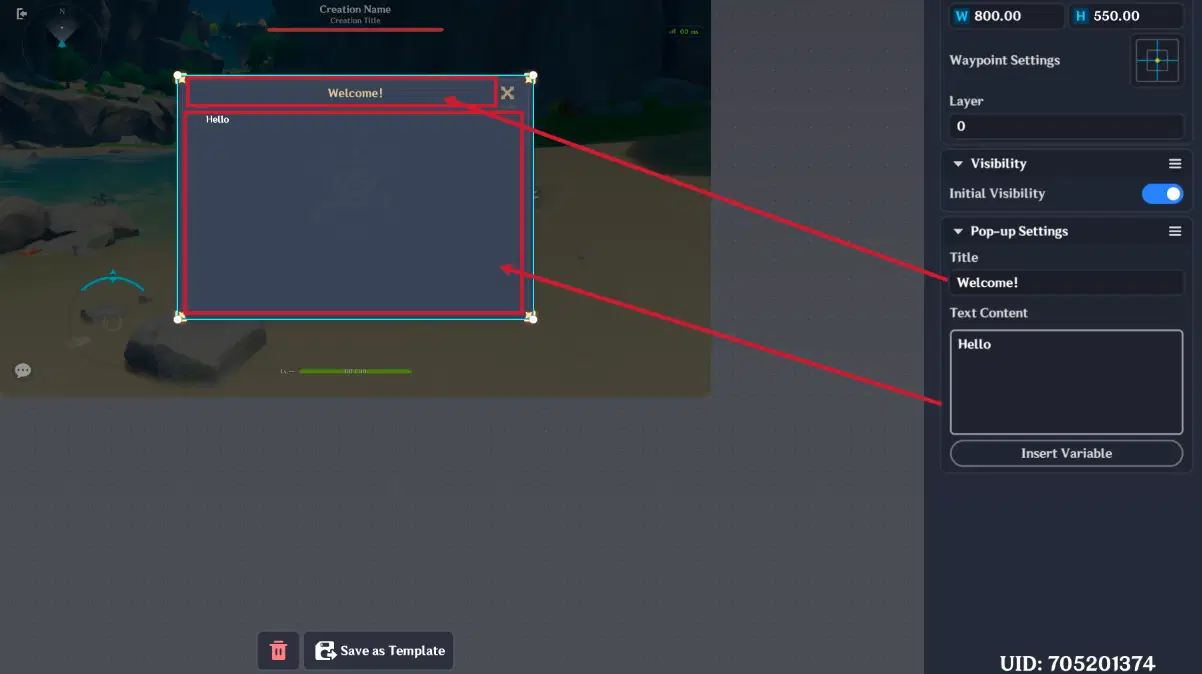
Pop-up Settings
2.4.1. Pop-up example
In this example, will be created a Pop-up that appears the moment a player joins the stage, explaining stage gameplay.
(different classes)
Pop-up Setting are following:
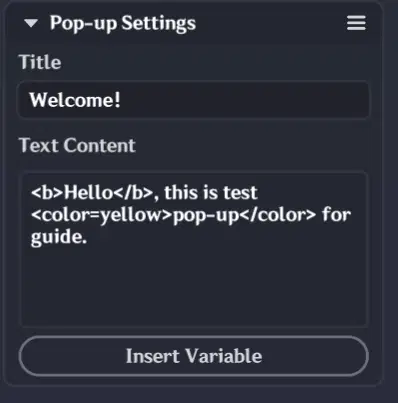
Pop-up settings
Node graph logic is following:
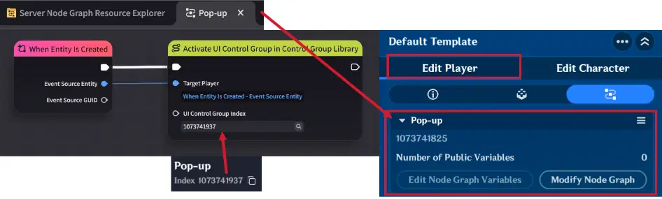
Node Graph logic
Firstly we need to create a Node Graph (e.g., "Pop-up") and attach it to the Player Entity. This will enable pop-up for each player:
- Initialization: When the player spawns, the "When Entity is Created" event triggers the "Activate UI Control Group in Control Group Library" node, instantly rendering the Pop-up on the player's screen.
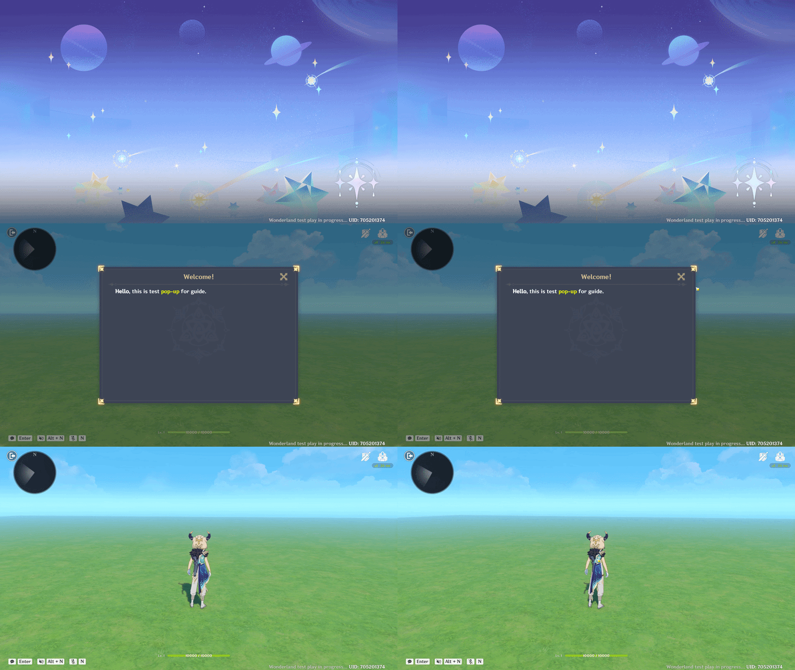
Pop-up showcase
2.5. Progress Bar
The Progress Bar is a UI Control Group designed to visualize numerical data - such as health, stamina, task progress etc. It is the primary tool for providing Visual Feedback, allowing players to understand their status or task completion at a glance.
Creative Tip: You can also use Progress Bars as decorative UI elements, such as thin horizontal or vertical dividers, to give your UI a structured look.
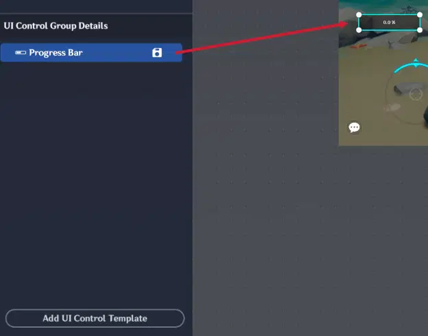
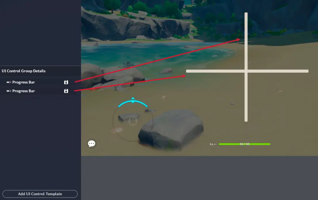
Progress Bar as horizontal or vertical lines
Have addition tab named "Progress Bar settings". This tab allows you to configure:
- Shape: Choose between Horizontal, Vertical, or Ring (circular) formats.
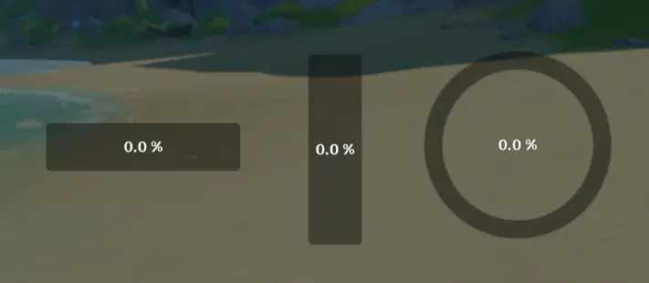
Progress Bar shapes
- Progress Bar Style: Determines how the data is labeled:
- Percentage: Shows 0% to 100%.
- Current Value: Displays the raw number.
- 1:1 Scale: Shows "Current/Max" (e.g., 80/100).
- Do Not Show: Only shows the visual fill without text.
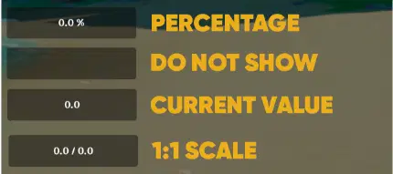
Progress Bar Style
- Color: Available in Green, Red, Yellow, Blue, and White.
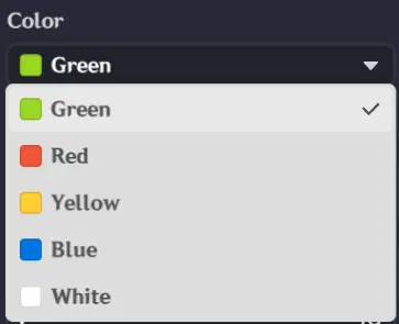
Progress Bar colors
- Data Sources: To function, the bar requires three variables (stored in the Player or Stage entity):
- Current Progress Value: The actual number at this moment.
- Minimum Value: Usually set to 0.
- Maximum Value: The target or full capacity (e.g., 100).
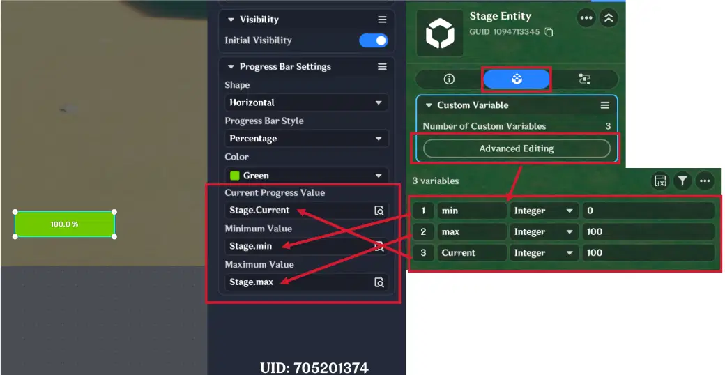
Progress Bar data sources
2.5.1. Progress Bar example
In this example, we will create a progress bar that tracks how many "Coins" a player has collected out of a required total.
Progress Bar settings are following:
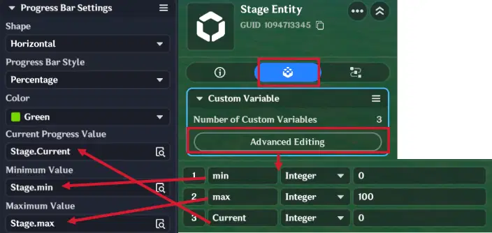
Progress Bar settings
Node Graphs are following:
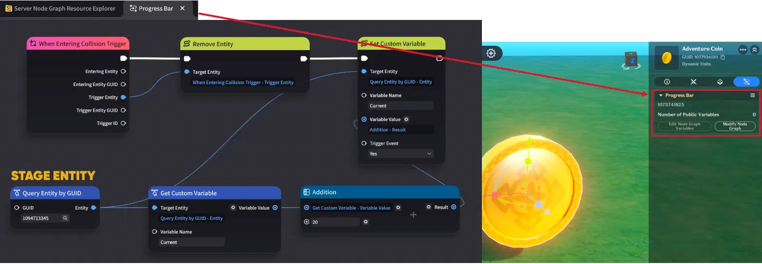
Node Graph (Part 1)
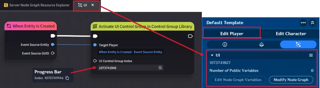
Node Graph (Part 2)
To make the Progress Bar work with coin entities, you need to set up two Node Graphs:
- Player Node Graph (UI): Attach this to the Player Entity. Use the "When Entity is Created" event node to execute the "Activate UI Control Group in Control Group Library" node. This ensures the Progress Bar appears on the player's screen as soon as they join the stage.
- Coin Node Graph (Progress Bar): Attach this to the Coin Entity. Use the "When Entering Collision Trigger" event to detect when a player enters coin collision. Once triggered, the node will remove the Coin Entity from the stage and increase the stage's "Current" variable by 20.
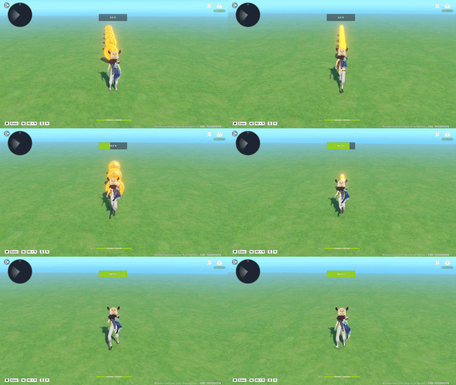
Progress Bar showcase
2.6. Timer
The Timer is a UI Control Group specifically designed to display Global Timers on the player's screen.
Important Setup Note: Before you can display a timer in your UI, you must first create and configure it in the Timer Management panel of the editor.
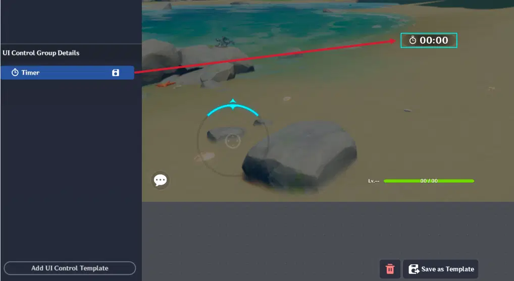
Timer
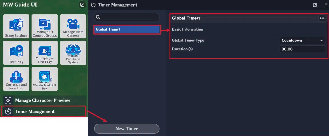
Timer Management
Have addition tab named "Timer Settings". This tab allows you to configure:
- Type: Choose between a Stopwatch (counts up from zero) or a Countdown (counts down from a set time).
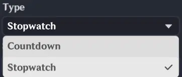
Timer Type
- Specify Timer: Select the specific Global Timer you created in Timer Management to link it to this UI Control Group.
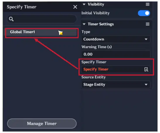
Timer selection
- Source Entity: Define which entity the timer is attached to. Usually, this is the Stage (for a global match timer) or Player (for individual trial timers).
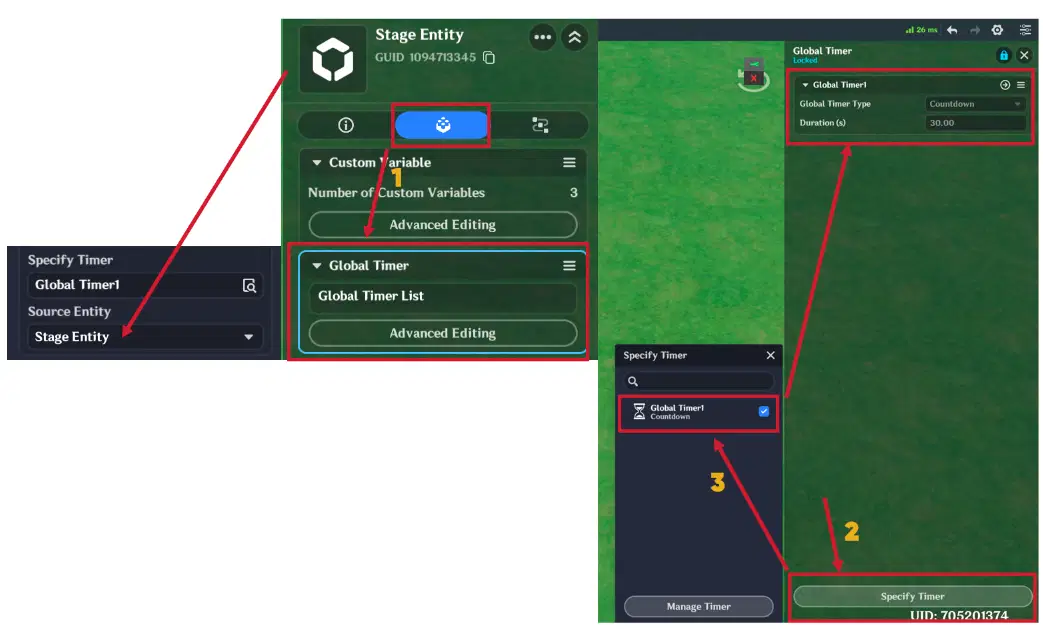
Timer Source Entity
If you select the Countdown type, you can set a Warning Time (s):
- When the timer hits this threshold (e.g., 10 seconds remaining), the UI Control Group will automatically blink in red and trigger alert sound effects. This provides vital feedback to the player that time is running out.
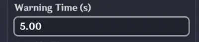
Timer's warning time
2.6.1. Timer example
This example will show you how to configure Timer to complete stage.
Timer settings are following:
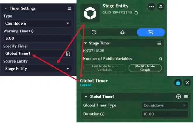
Timer settings
Node Graps are following:
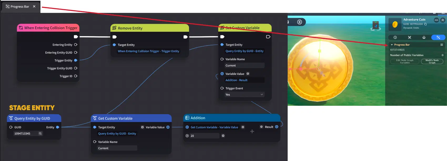
Node Graph (Part 1)
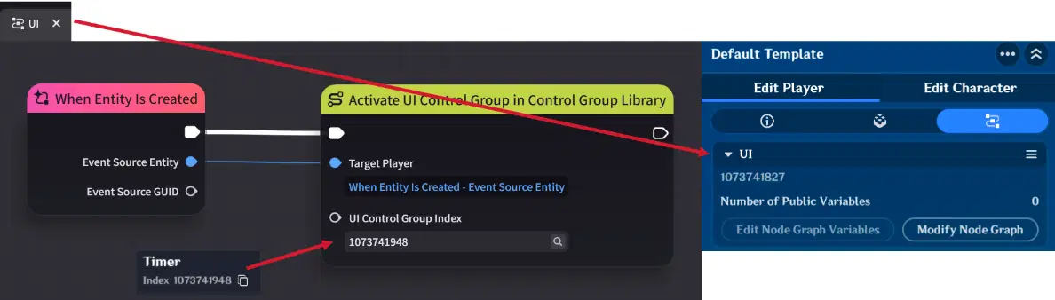
Node Graph (Part 2)
Node Graph (Part 3)
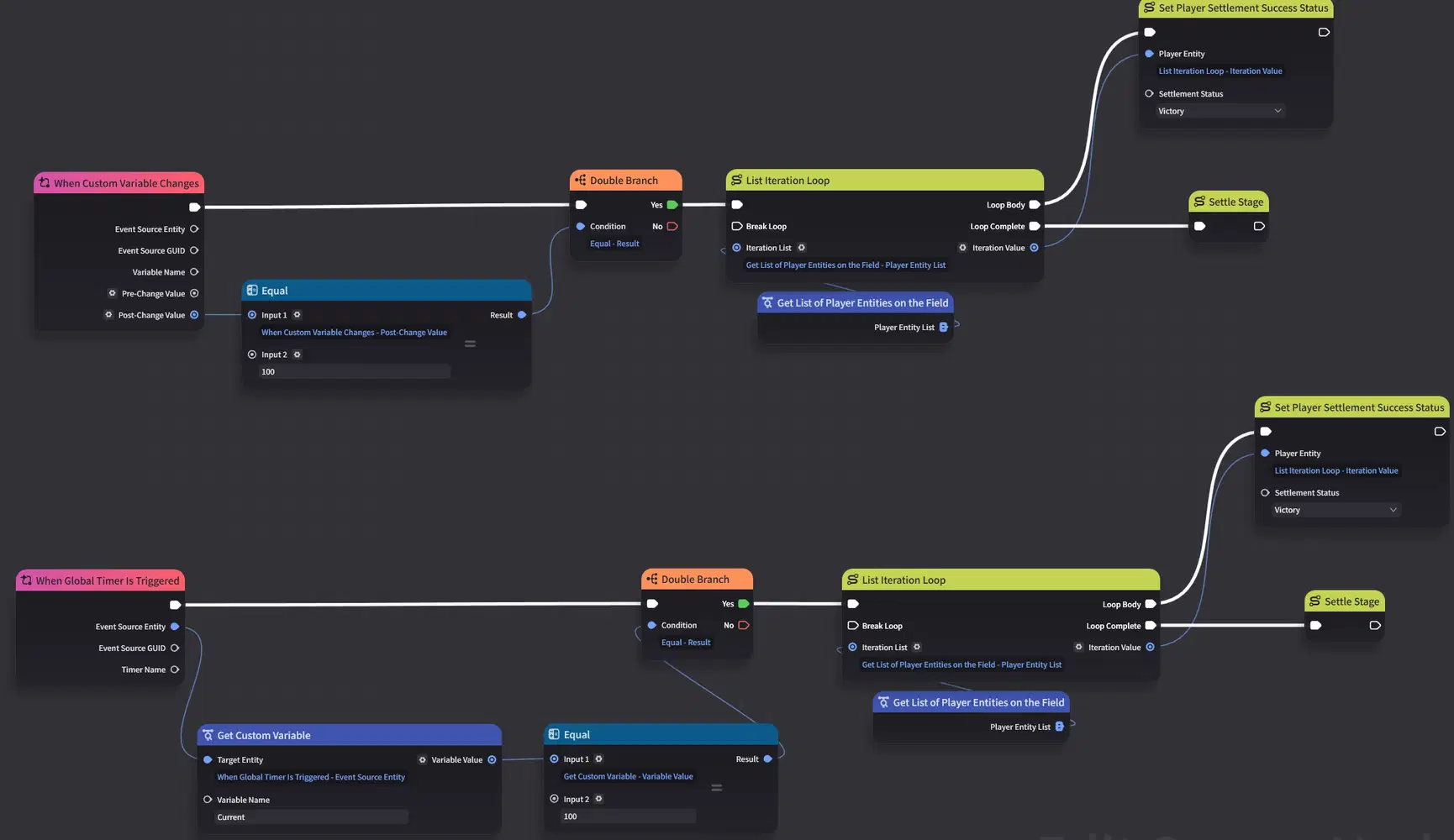
To make the Timer work, you need to set up 3 Node Graphs:
- Player Node Graph (UI): Attach this to the Player Entity. Use the "When Entity is Created" event node to execute the "Activate UI Control Group in Control Group Library" node. This ensures the Timer appears on the player's screen as soon as they join the stage.
- Coin Node Graph (Progress Bar): Attach this to the Coin Entity. Use the "When Entering Collision Trigger" event to detect when a player enters coin collision. Once triggered, the node will remove the Coin Entity from the stage and increase the stage's "Current" variable by 20.
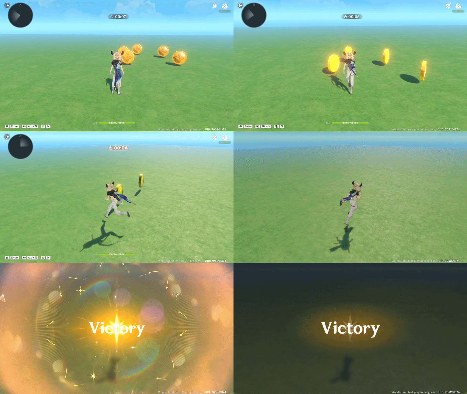
- Stage Node Graph (Stage Timer): Attach this to the Stage Entity. Use the "When Global Timer is Triggered" event node to check if player collected 5 coins. If yes, settle stage win victory status. Also use the "When Custom variable Changes" to check if player collected all coins before Timers ends. If he collected all 5 coins, stage will settle with victory status as well.
Timer showcase
2.7. Scoreboard
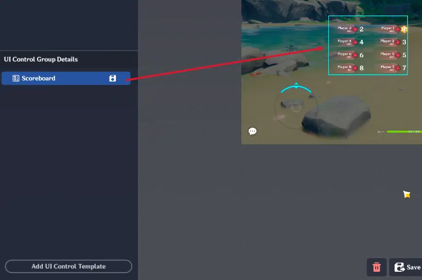
UI Control Group designed to display real-time rankings for players or factions during a match, allowing everyone to see their progress, score, and standing relative to others.
The Scoreboard is UI Control Group designed to display real-time rankings for players or factions during a match. It provides a clear overview of everyone’s ranking and score, and standing relative to others.
Scoreboard
Have addition tab named "Scoreboard Settings". This tab allows you to configure:
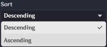
- Sort: Choose between Descending (highest score at the top) or Ascending (lowest value at the top).
Scoreboard Sort type
- Type: Custom - Self: Displays individual player statistics.
- Custom - Faction: Groups scores by factions.
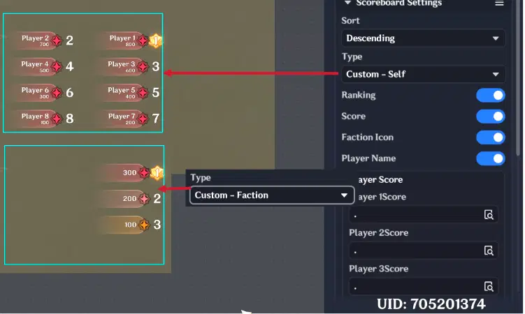
Scoreboard type
- Visual Toggles: You can individually show or hide the Ranking Number, Total Score, Faction Icon, and Player Name to keep the interface clean.
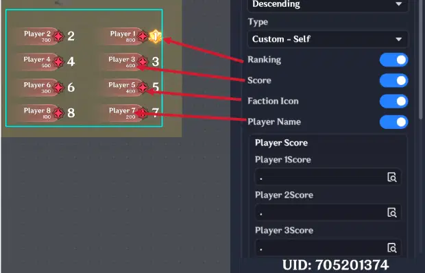
Scoreboard visuals
- Score Definition: This is where you link the scoreboard to your variables. You must select the Custom Variables (created on the Stage or Player entity) that track the points you want to display.
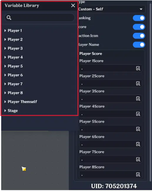
Scoreboard player/faction score
2.8. Deck Selector
The Deck Selector is a UI Control Group designed specifically for Player Decision Making.
Important: This element is unique to the UI Control Group Library and can only be triggered via the "Invoke Deck Selector" execution node.
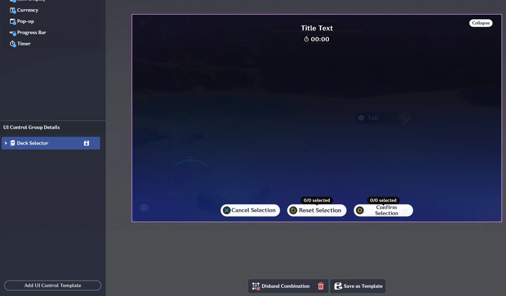
Deck Selector
Have addition tab named "Deck Selector". This tab allows you to configure:
- Display Title & Title Text: Toggle this to show a custom header at the top of the selection screen (e.g., "Choose Your Reward" or "Select a Hero").
- Interface Layout: Choose between a List (vertical) or a Grid (multi-row) to fit your design.
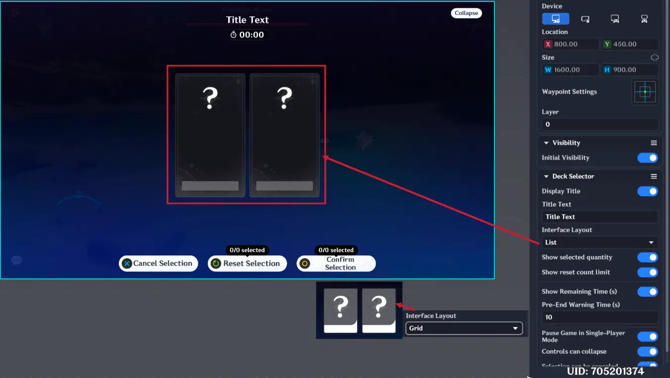
Deck Selector Layouts
- Show Selected Quantity: If enabled, the UI will display a counter showing how many items the player has already picked (e.g., "1/3 Selected").
- Show Reset Count Limit: Displays how many times the player is allowed to refresh or "reroll" the available options.
- Time Management: Toggle Show Remaining Time and set a Pre-end Warning Time to alert players when they are running out of time to choose.
- Game Flow: Use the Pause Game in Single-Player Mode toggle to let players think without being attacked.
- Control Toggles: Decide if the selection can be canceled or if the controls can be collapsed during the process.
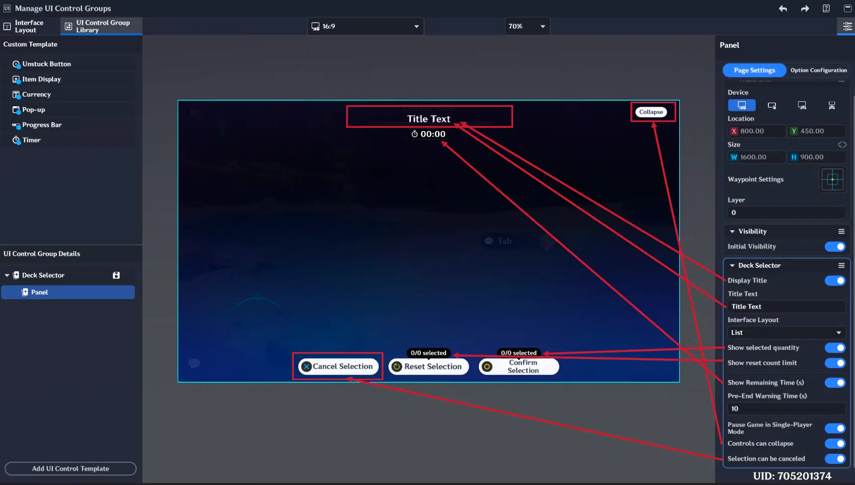
Deck Selector Settings
Section 2: Option Configuration
This section determines how information is revealed to the player:
- Known Decks: Choose to display or hide the Icon, Title, and Description.
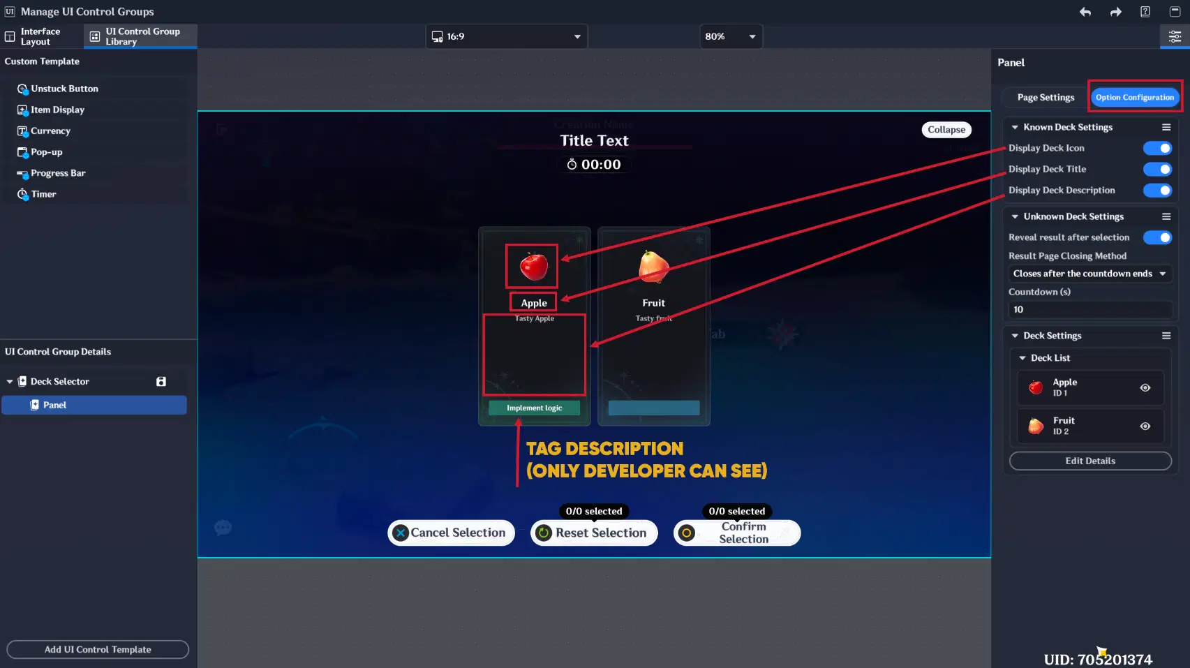
Know Deck configuration
- Unknown Decks (Mystery Choice):
- Reveal Result: If enabled, the result will be shown after you selected unknown deck.
- Closing Method: After the result is shown, the window can Close Manually or automatically after a Countdown (s).
Deck List (Deck Library Content)
Here, you define each individual "Card" or "Option" the player will see. For each deck, you must configure:
- Deck Type: Known (visible) or Unknown (mystery).
- Visuals: Assign a unique Icon, Title, and Description.
- Tagging: Set a Tag Color and Tag Description
- Note: Tag descriptions are for your reference as a developer and are not visible to the player
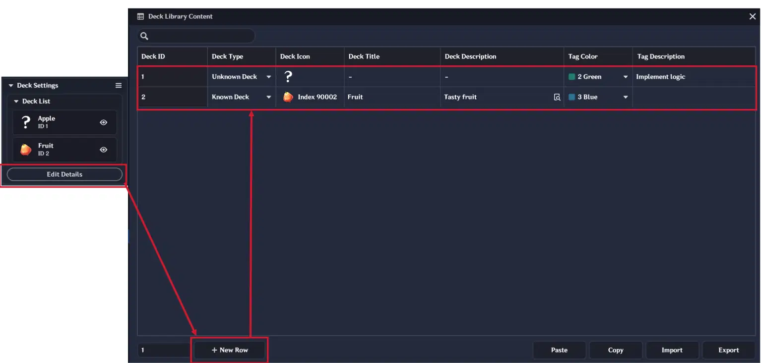
Deck Library Content
2.8.1. Deck Selector example
This example will show you how to change player's class based on their decision.
In this example, will be used the Deck Selector to let a player choose their class at the start of the game.
Deck Library Content is following:

Deck Library Content
Node Graph are following:
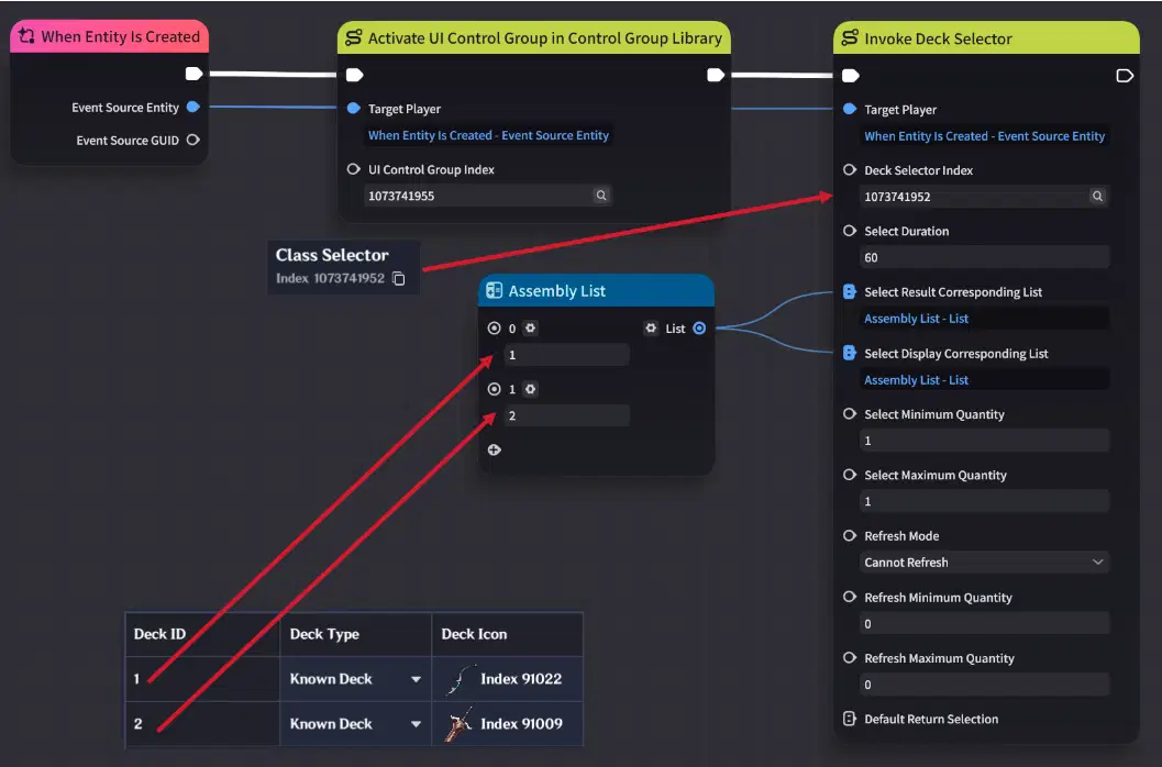
Node Graph (Part 1)
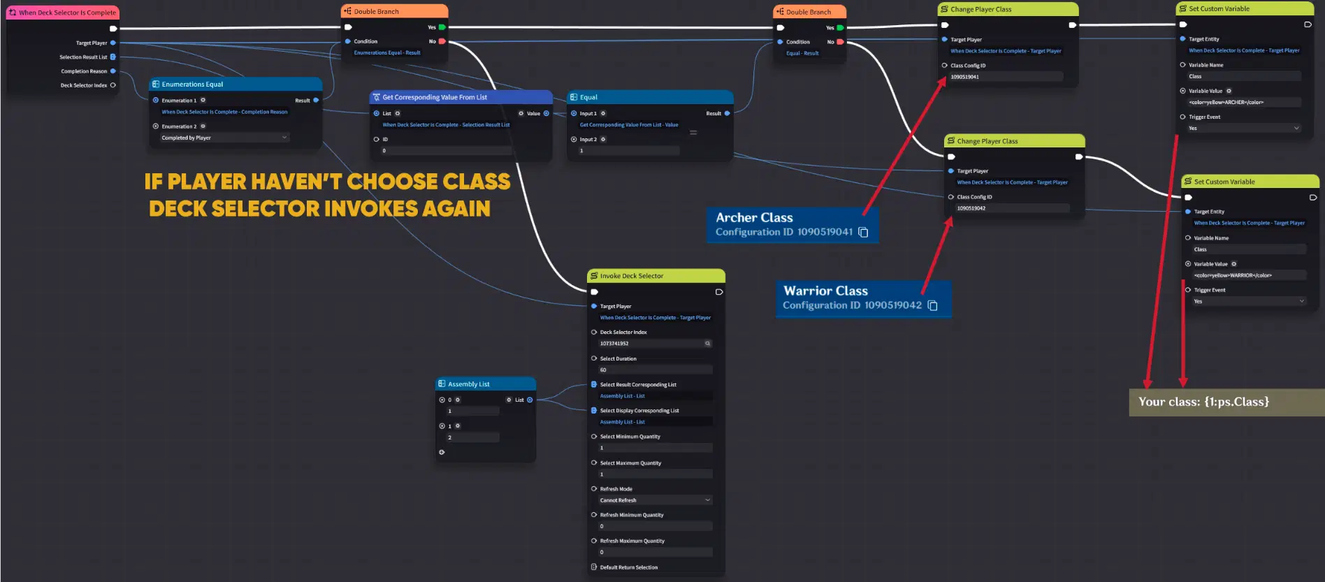
Node Graph (Part 2)
To make the Deck Selector work, you need to set up 1 Node Graph:
Player Node Graph (UI): Attach this to the Player Entity. Use the "When Entity is Created" event node to execute the "Activate UI Control Group in Control Group Library" node for text box and invoke deck selector using "Invoke Deck Selector" node.
For Deck Selector results use "When Deck Selector is Complete" event node. If the player has not made a choice, the deck selector is invoked again, but if player has chosen Archer Class (ID 1) or Warrior Class (ID 2), then player's class will be changed and string variable "Class" will change accordingly.
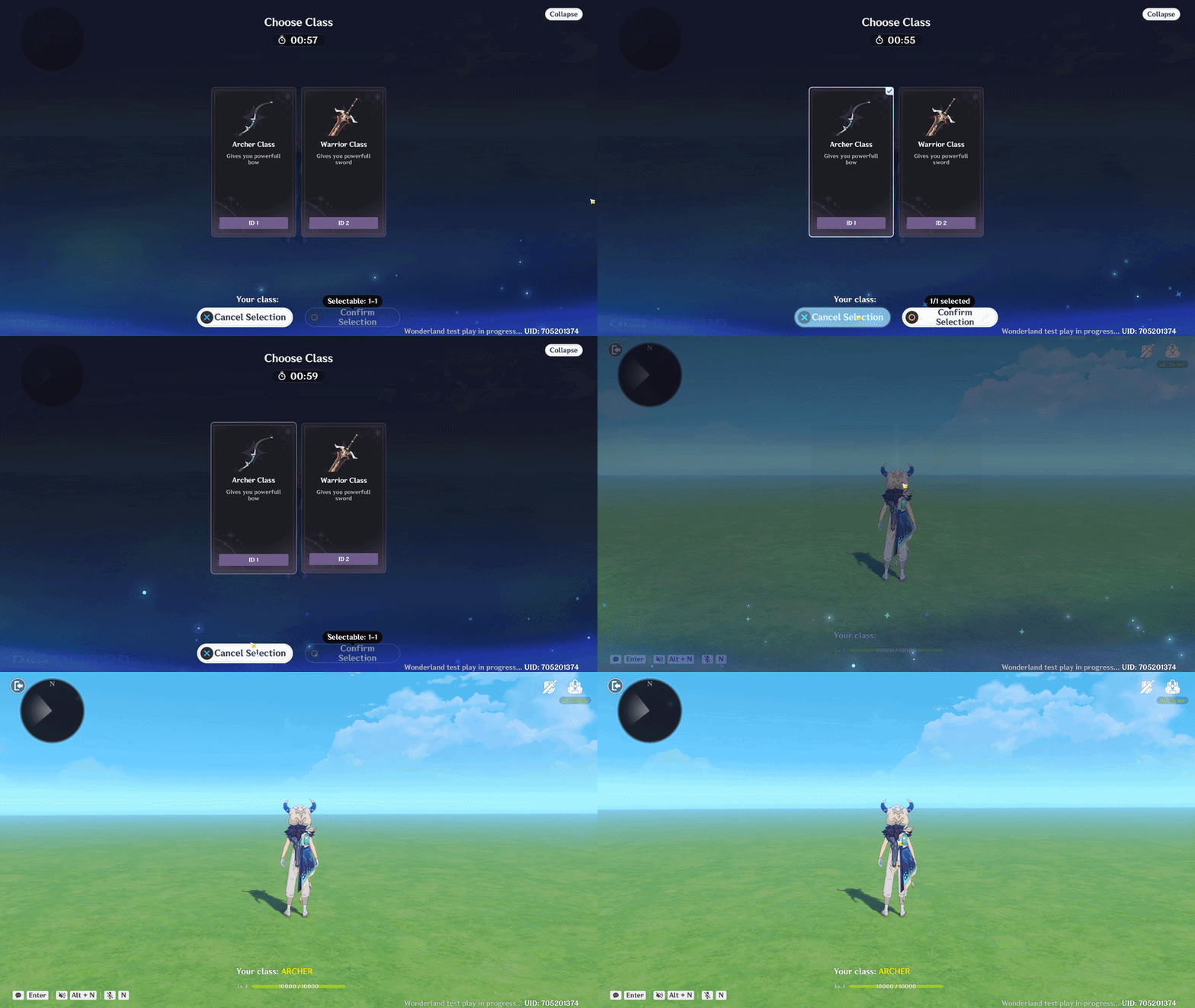
Deck Selector showcase
Part 2 of Frontend Interface Design, where will be shown advanced examples of using UI Control Groups is here