This guide is a continuation of the previous part. Here, we will focus on advanced use cases for UI Control Groups.

1. Advanced UI Control Group examples
This section covers the advanced use of UI Control Groups, where we combine multiple Control Groups and complex Node Graphs.

1.1. Custom Shop Menu
By combining Text Boxes, Item Displays, and Interactive Buttons, you can create a fully custom Shop interface. This example demonstrates how to build a Custom Shop from scratch using UI Control Groups and Node Graph logic.
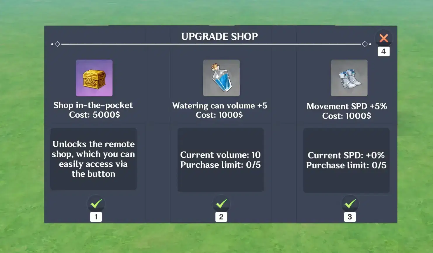
Custom shop created with UI Control Groups
Step 1: Background and Header
- Background: The shop background is constructed using a Text Box filled with the ■ character and colored with .
- Header: The Title is placed at the top, followed by a decorative divider line created in a Text Box using a combination of •◇— characters.
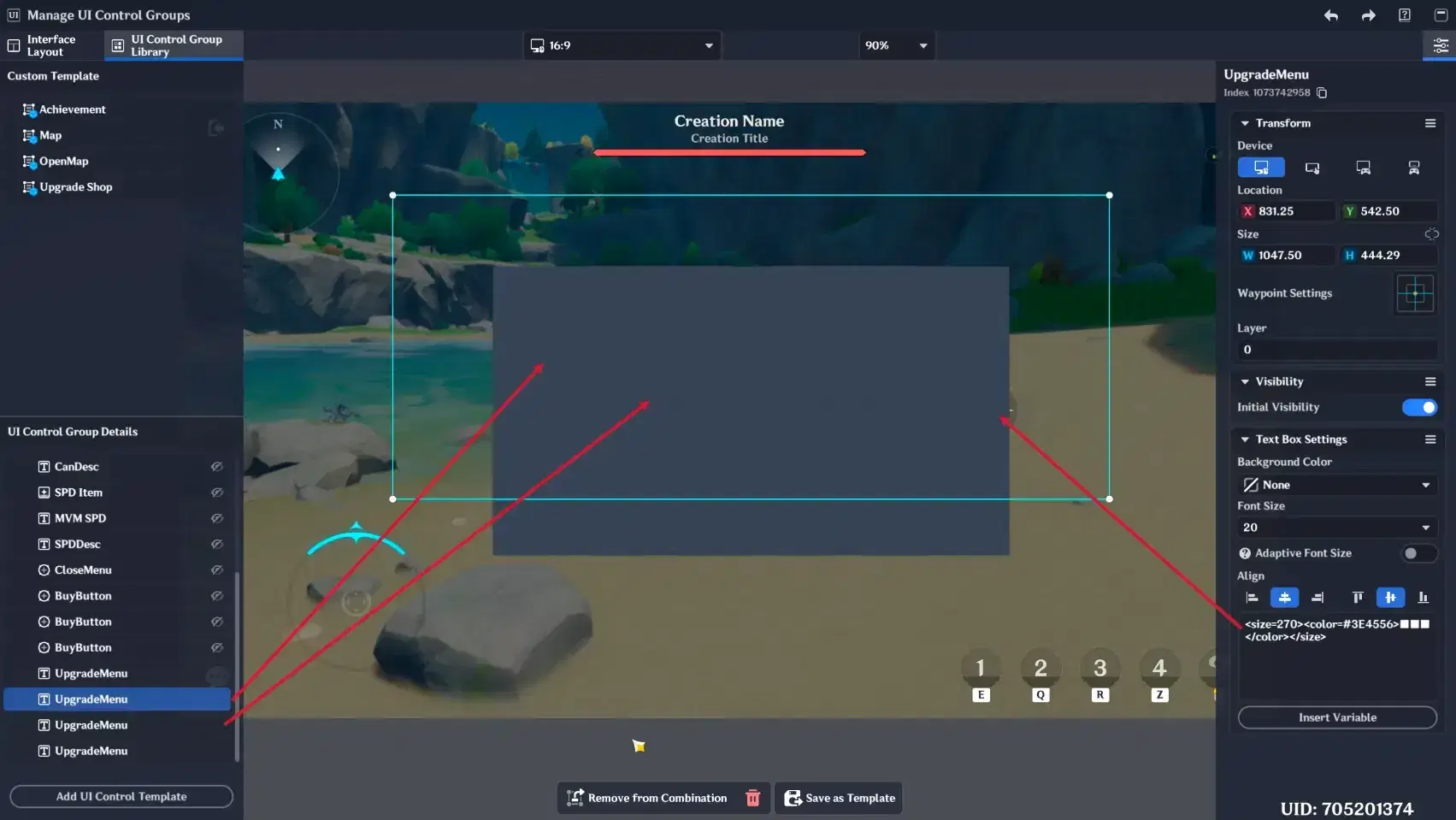
Shop's background
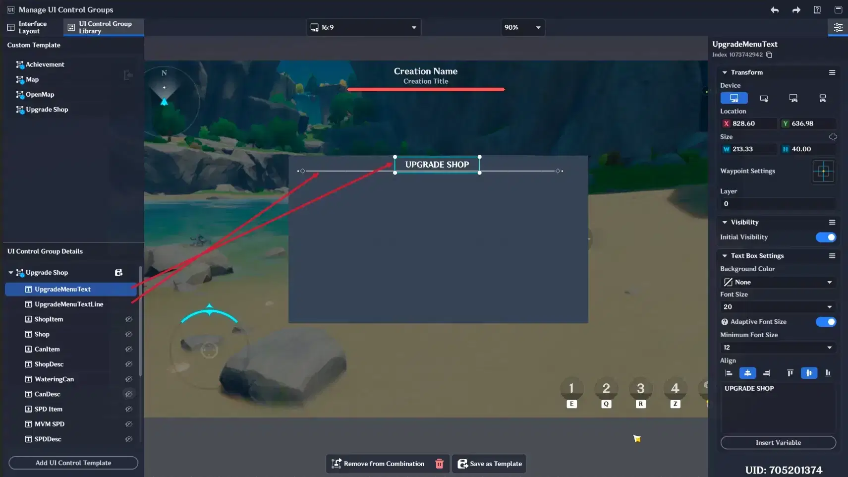
Shop's title
Step 2: Item Slots and Dynamic Pricing
- Item Layout: Item Displays are placed to show the items, with Text Boxes underneath to display the item price.
- Dynamic Data: Since prices and stock can change, the Item Displays and Price labels are linked to Custom Variables on the Stage and Player entities. This ensures the shop updates in real-time.
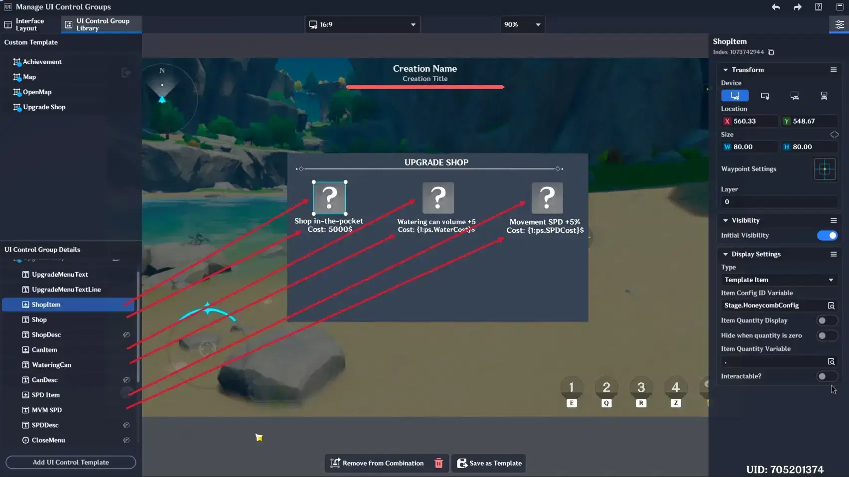
Shop display Items and prices
Step 3: Description and Interaction
- Information: Additional Text Boxes are added to provide detailed item descriptions.
- Controls: Interactive Buttons (Size: Small, Type: Interactive Event) are placed at the bottom to handle "Buy" actions and "Close Shop" functions.
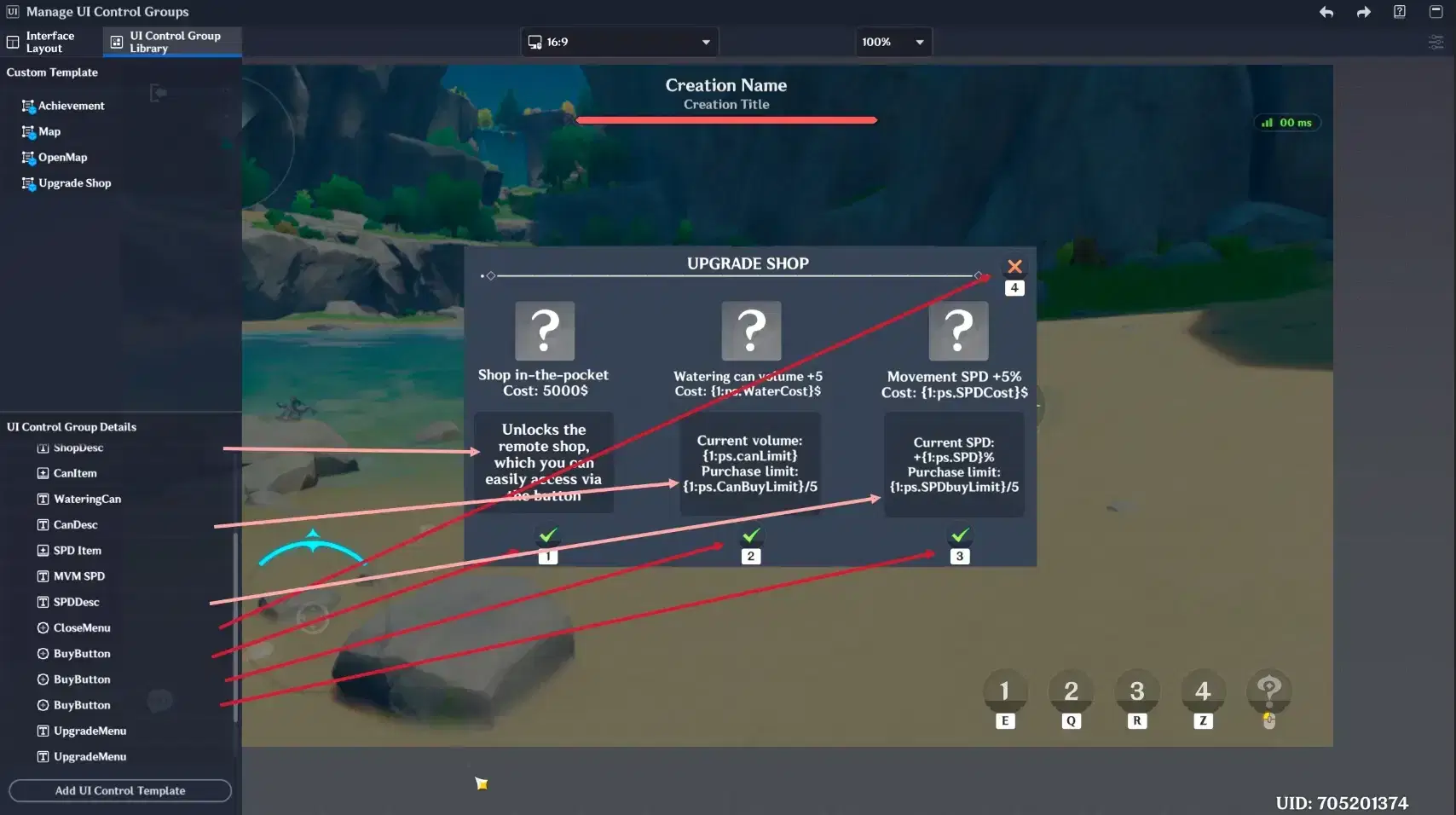
Interactive Buttons and Item description
Step 4: Functionality (Node Graphs)
For the shop to function, a dedicated Node Graph handles the logic:
- It monitors button clicks to trigger the "Buy" event.
- It checks if the player has enough currency before deducting the cost and adding the item to their inventory.
- It updates the UI variables to reflect the new balance and stock levels.
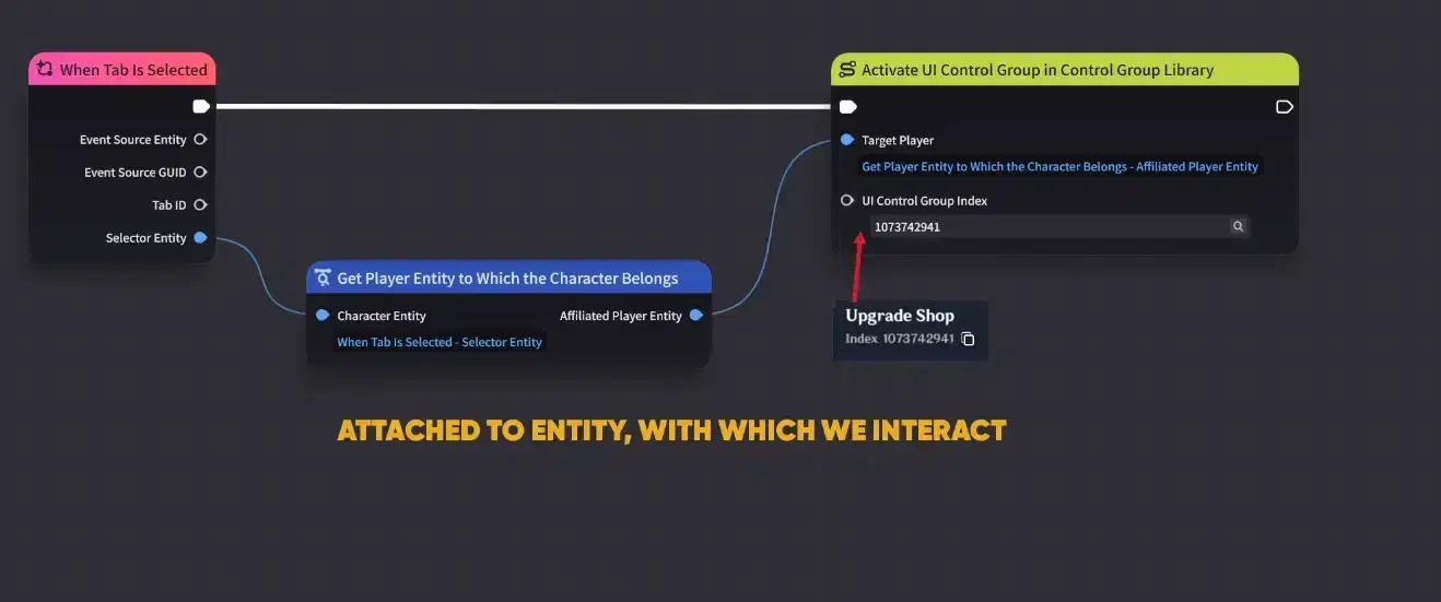
Node Graph (Part 1)
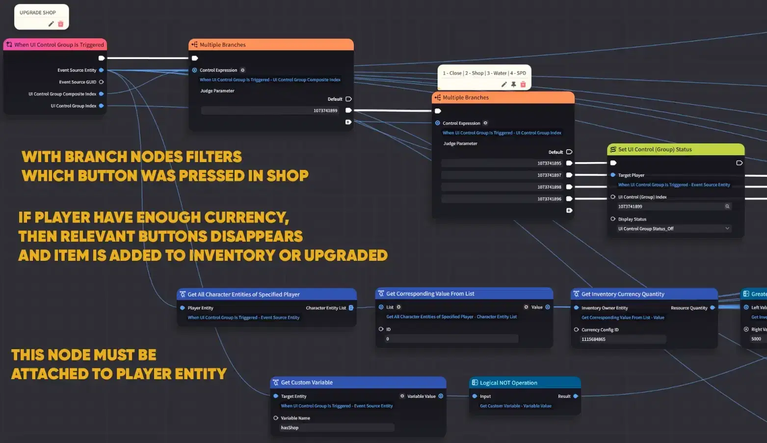
Node Graph (Part 2)
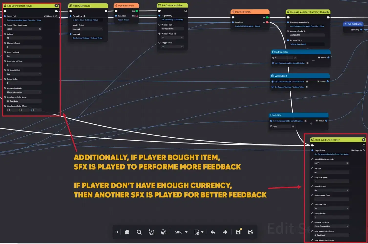
Node Graph (Part 3)
1.2. Item and Equipment Display
This example demonstrates how to create a dynamic HUD that reflects the player's current equipment and inventory in real-time.

If you don't know how to create Items - you can check my previous guide
Step 1: Resource Preparation
First, create the Equipment and Items in the editor that you intend to display. For this setup, we will use 5 Item Displays linked to 5 Custom Variables on the Player Entity containing the specific Item Config IDs.
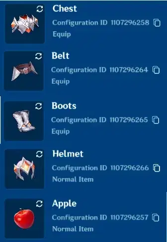
Items for display
Step 2: Configuring Display Types
- Equipment Slots: Set the Display Type to "Player's Current Equipment".
- Inventory Slots: For items like the Apple, set the type to "Items in Inventory" and enable the Interaction toggle.
- Visibility Logic: Equipment is automatically shown if assigned. To hide an equipment slot when nothing is equipped, set the corresponding Custom Variable to 0.
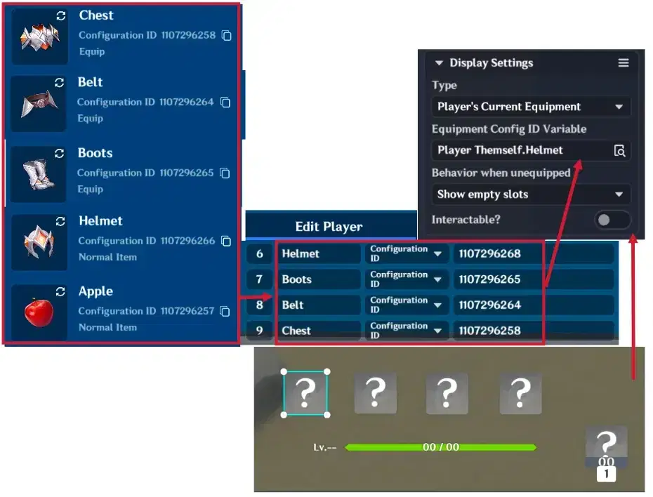
Display Item configuration
Step 3: Equipment Logic (On Equip / Unequip)
To ensure the UI updates when the player changes equipment, attach a Node Graph to all equipment items:
- Equip Event: When the item is equipped, the logic updates the Player's Custom Variable with the Item's Config ID.
- Unequip Event: When the item is removed, the logic resets the Player's Custom Variable to 0, clearing the slot on the UI.
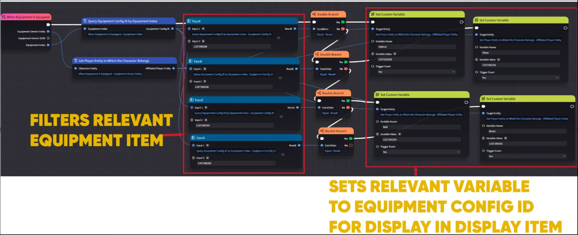
Equipment Node Graph (Part 1)
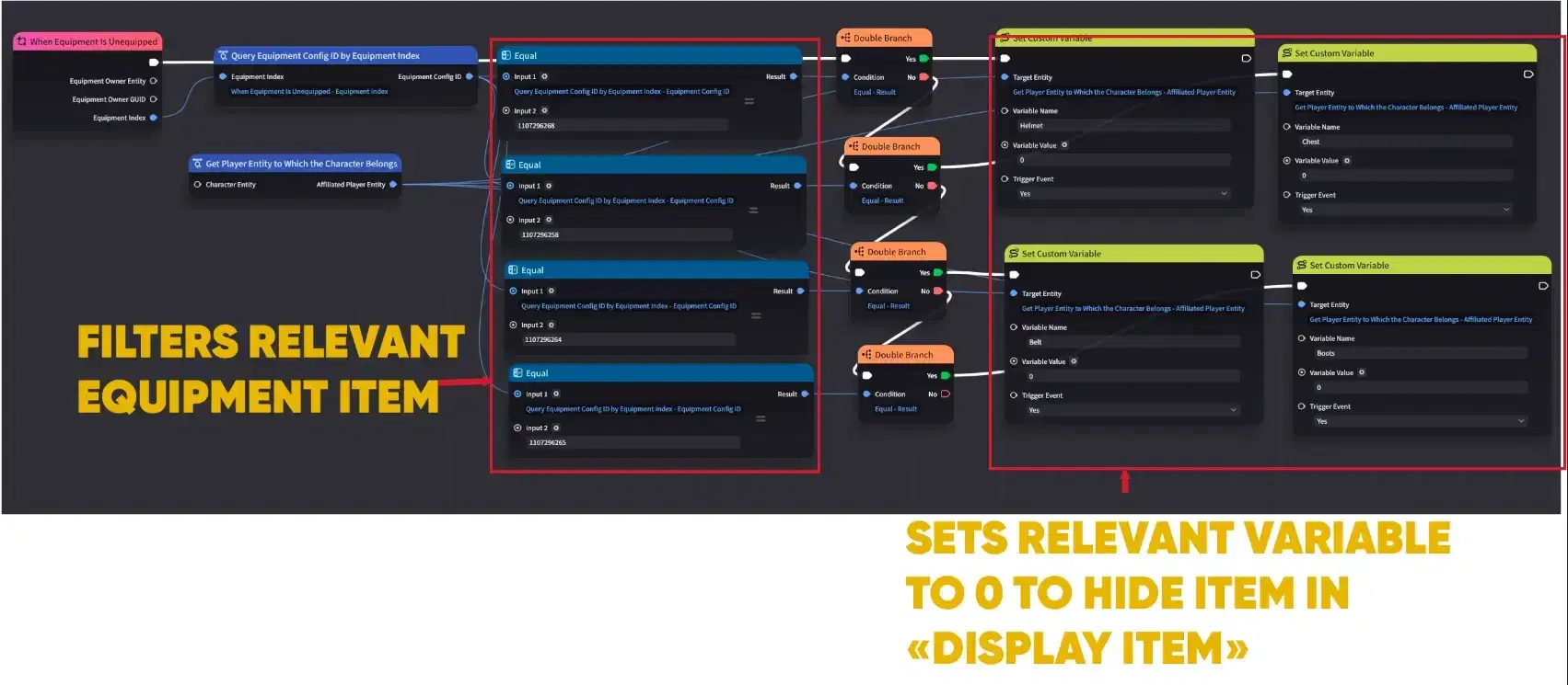
Equipment Node Graph (Part 2)
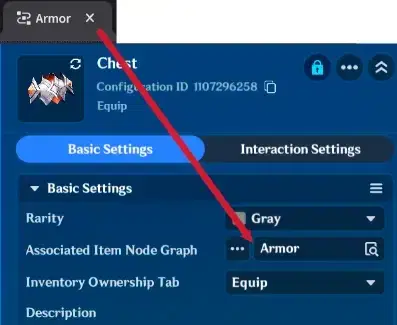
Node Graph attachment
Step 4: Consumable Logic (The Apple)
For usable items like the Apple, create a logic trigger that restores 200 HP upon consumption. Since the Item Display has interaction enabled, clicking it or pressing key will trigger this effect and automatically deduct one Apple from the inventory.
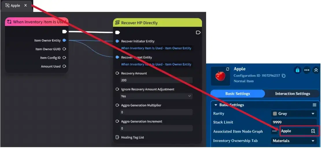
Apple logic
Step 5: Initialization
Finally, attach an activation Node Graph to the Player Entity. This graph uses the "When Entity is Created" event to enable all 5 Item Displays as soon as the player spawns into the stage.
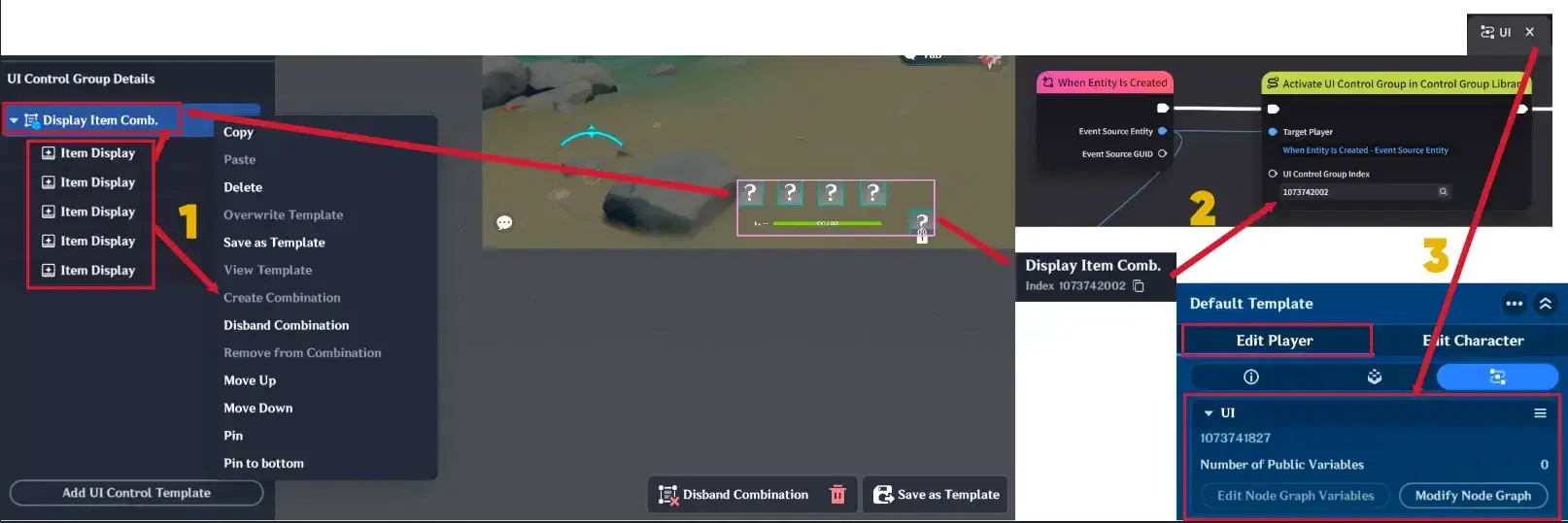
Player's node graph
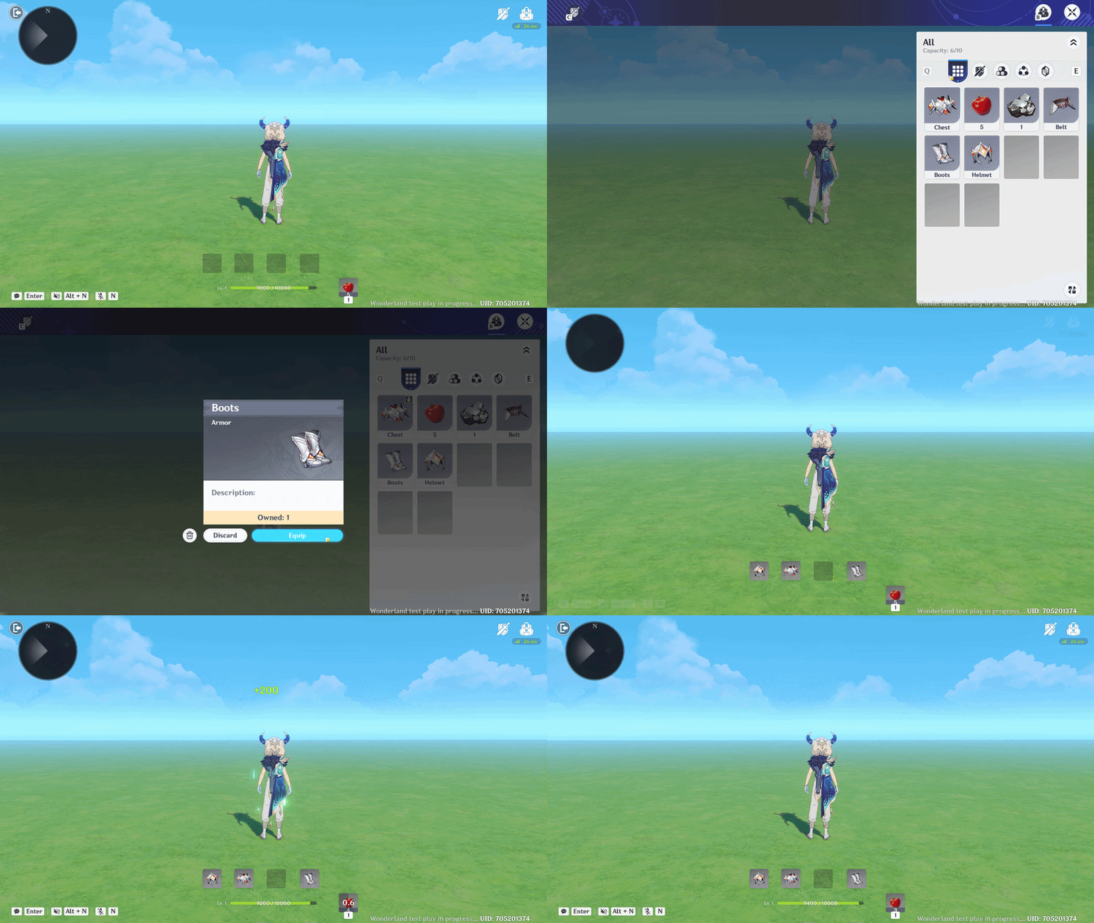
Display Items showcase
1.3. Active Buff & Potion Duration HUD
This example demonstrates how to create a visual feedback system to track the duration of consumable items, such as a "Strength Potion." This allows players to see exactly how much time remains before their buff expires.
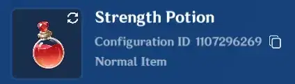
Potion item
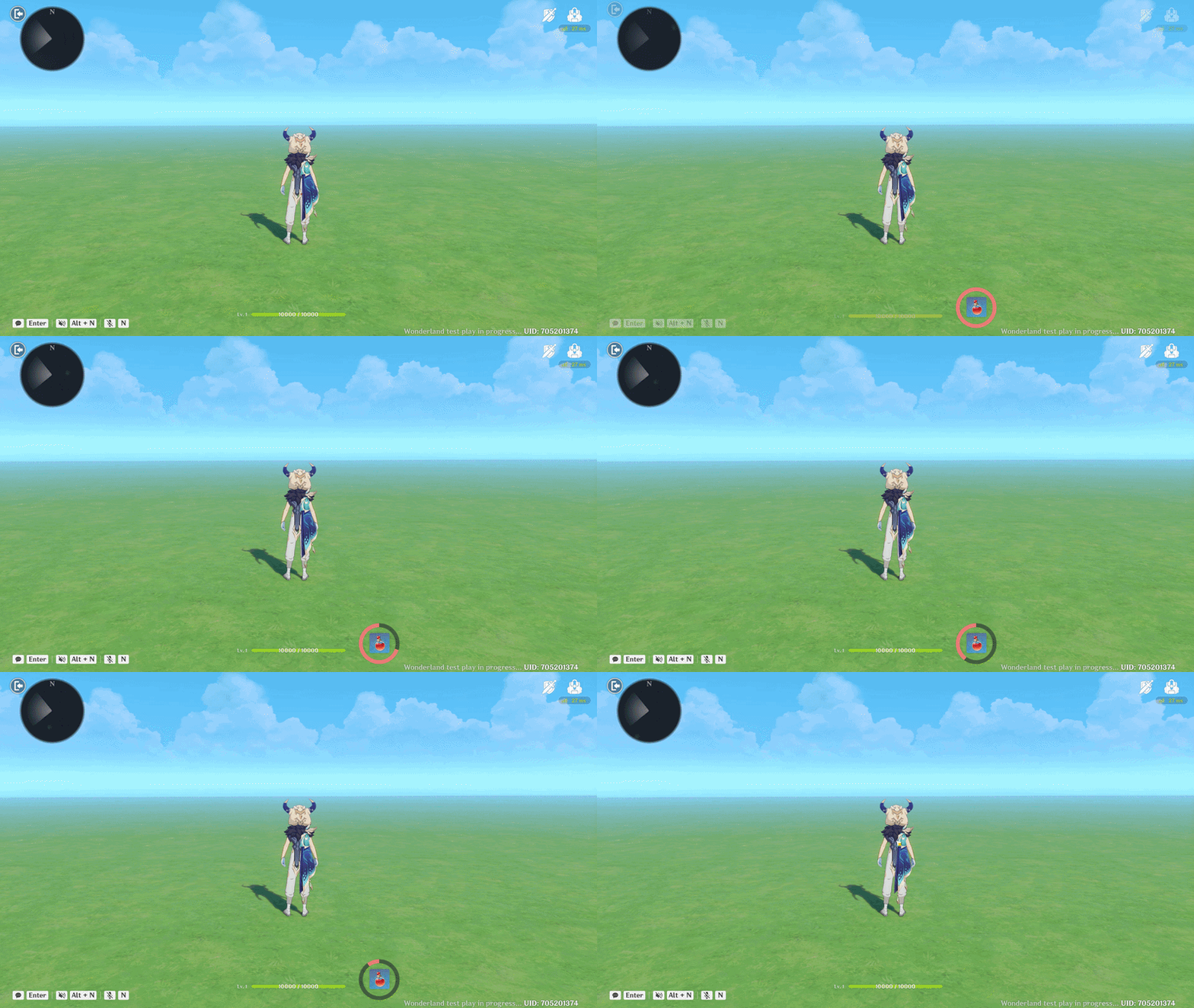
Potion Duration showcase
Step 1: UI Template Construction
To create the feedback icon, you need to combine an Item Display (for the potion icon) and a Progress Bar (for the duration ring).
- Design: Place the Progress Bar over the Item Display and save them together as a single UI Template.
- Progress Bar Settings: Set the shape type to "Ring" to simulate a depleting timer.
- Item Display Settings: Link the icon to your specific Potion ID and disable interaction if you only want it to serve as a visual indicator.
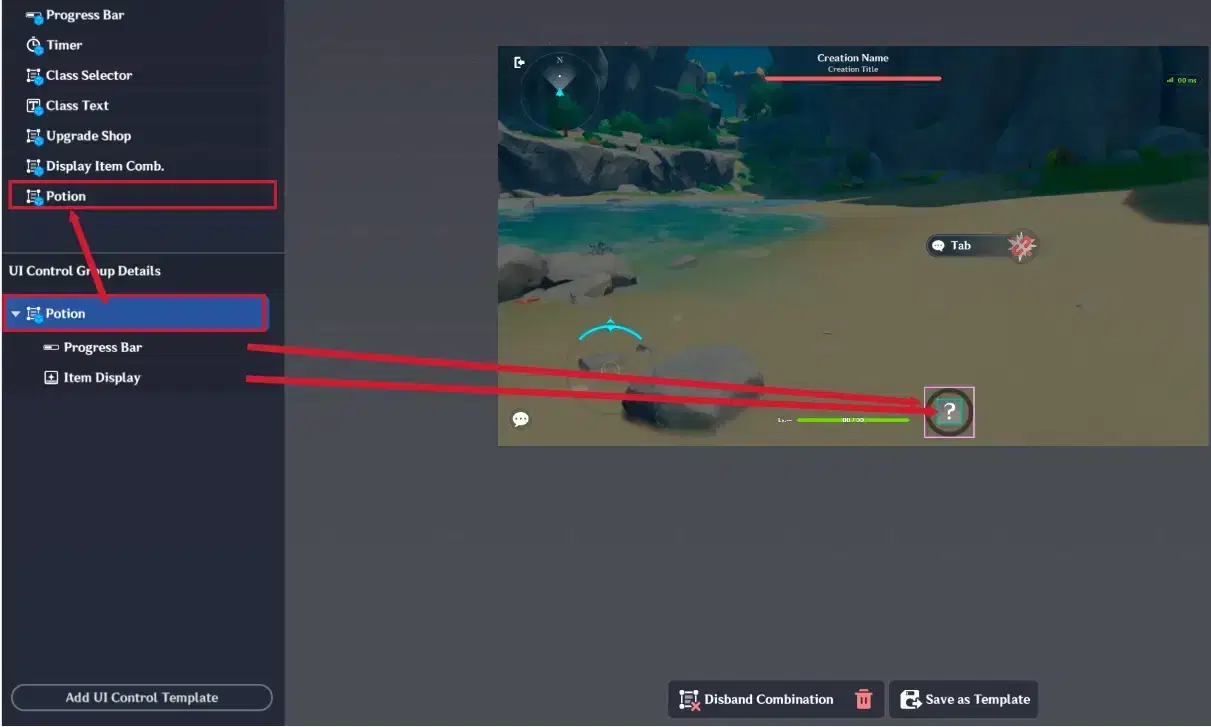
UI Control Groups creation
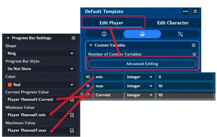
Progress bar settings
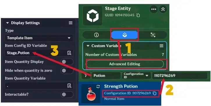
Item Display settings
Step 2: Activation Logic (The Potion)
Attach a Node Graph directly to the Potion Item.
- Trigger: Use the "When Item is Consumed" event.
- Action: This will execute the "Activate UI Control Group" node, making the duration HUD appear on the player's screen the moment they use the potion.
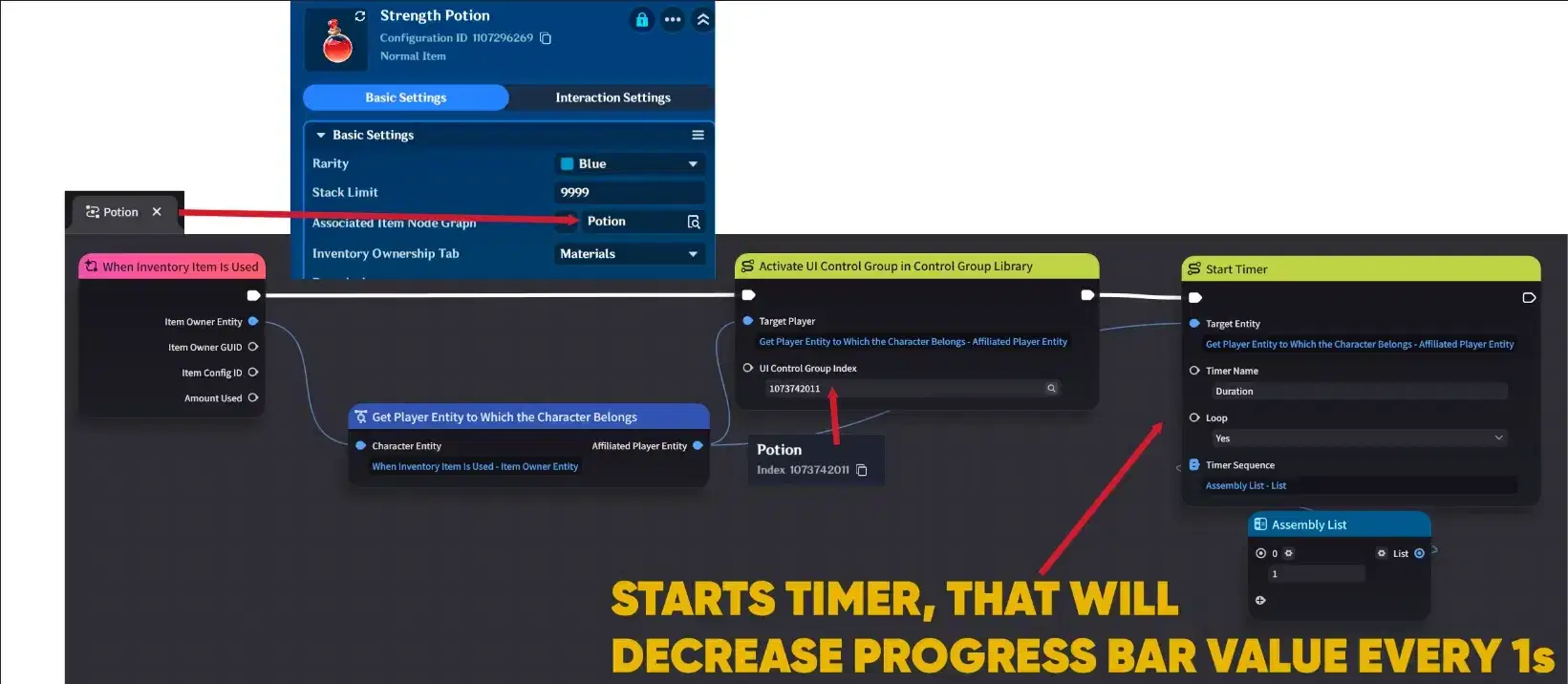
Node Graph logic (Part 1)
Step 3: Duration Timer (Player Entity)
Attach a second Node Graph to the Player Entity to manage the countdown logic:
- The Loop: Start a 1-second loop timer when the potion is used.
- The Countdown: Every time the timer triggers, decrease the Progress Bar's "Current" variable by 1.
- Cleanup: Once the variable reaches 0, the logic will:
- Stop the timer.
- Remove the UI Control Group from the screen.
- Reset the "Current" variable back to 10 (or your max duration) so it's ready for the next potion.
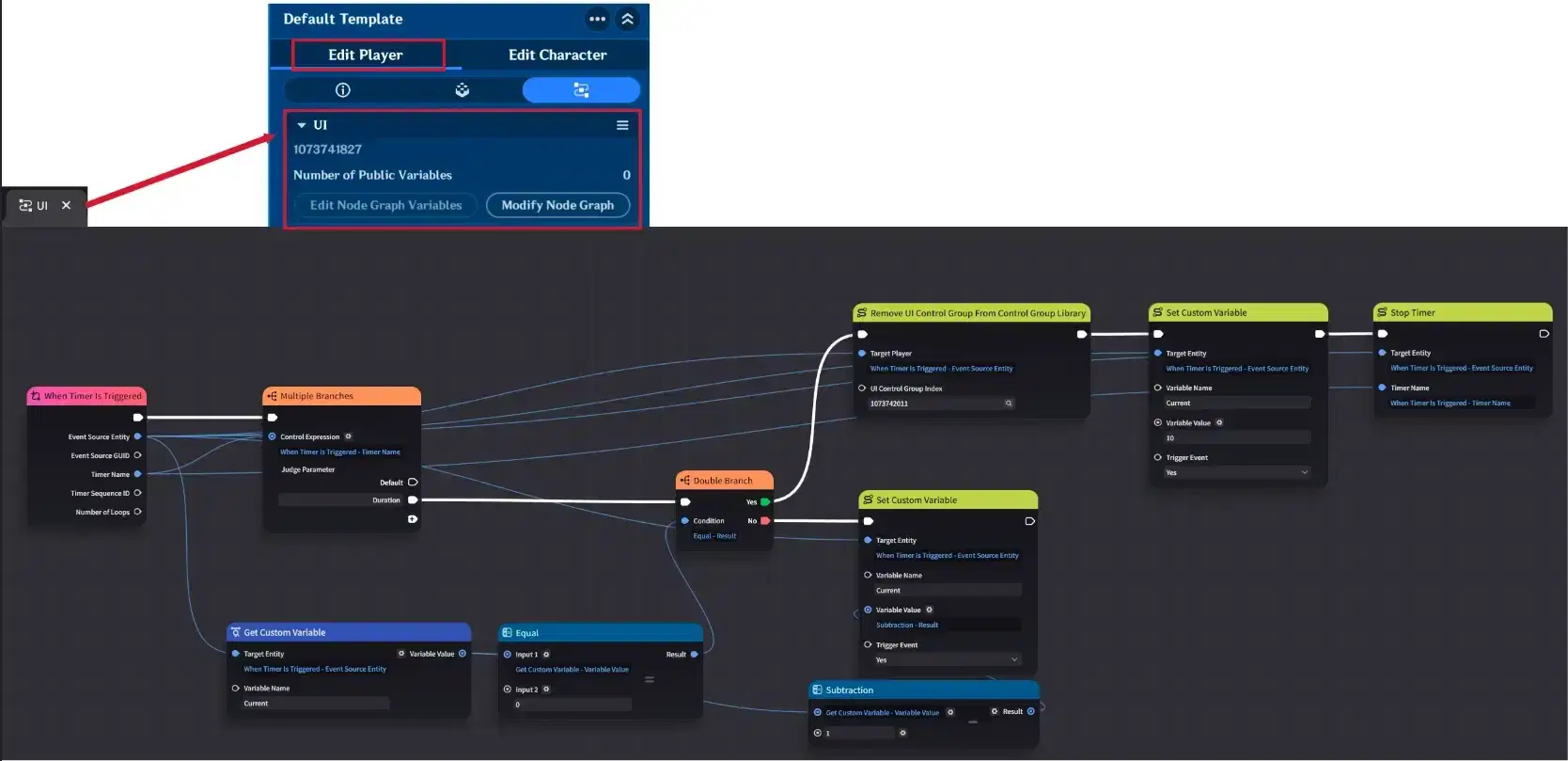
Node Graph logic (Part 2)
1.4. The "Fade-to-Black" Text Box effect
This example demonstrates how to create smooth screen transitions, blinking effects, or a "waking up" sequence. Using this method, you can simulate a player opening their eyes or performing a seamless scene cut.
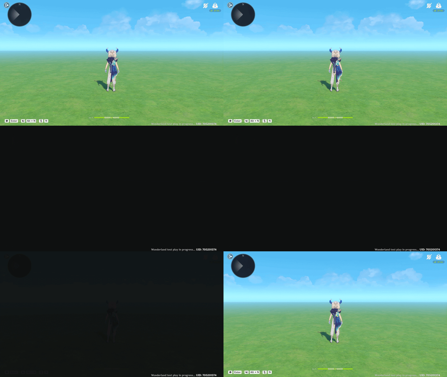
Black Screen
Step 1: Creating the Visual Layers
To achieve a smooth fade, you need to create multiple Text Box Combinations.
- The Elements: Create 5 separate Text Boxes and combine them into a single UI Combination.
- Configuration: For each Text Box, set the Background Color to a Black Translucent.
- Scale: Ensure you expand the Bounding Box for all layers to fully cover the player’s screen, regardless of their resolution.
Then you need to create Node Graph and attach it to Player Entity (In this example black screen will appear when player entity is created in stage. If you want to create different logic, you can attach this node graph to other entities). The Node Graph is following:
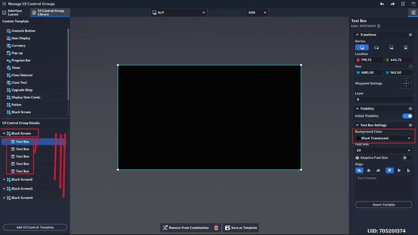
Text Box configuration
Step 2: The Sequential Activation Logic
To make the transition look fluid rather than instant, you must trigger these UI templates one by one using a Node Graph attached to the Player Entity.
- The Setup: In this example, the effect starts as soon as the "When Entity is Created" event triggers.
- The Sequence: The logic executes multiple "Activate UI Control Group in Control Group Library" nodes with a very short delay between them (e.g., 0.03 seconds).
- The Result: As each UI Combination activates, the screen becomes progressively darker until it is completely black, creating a "Fade-to-Black" transition.
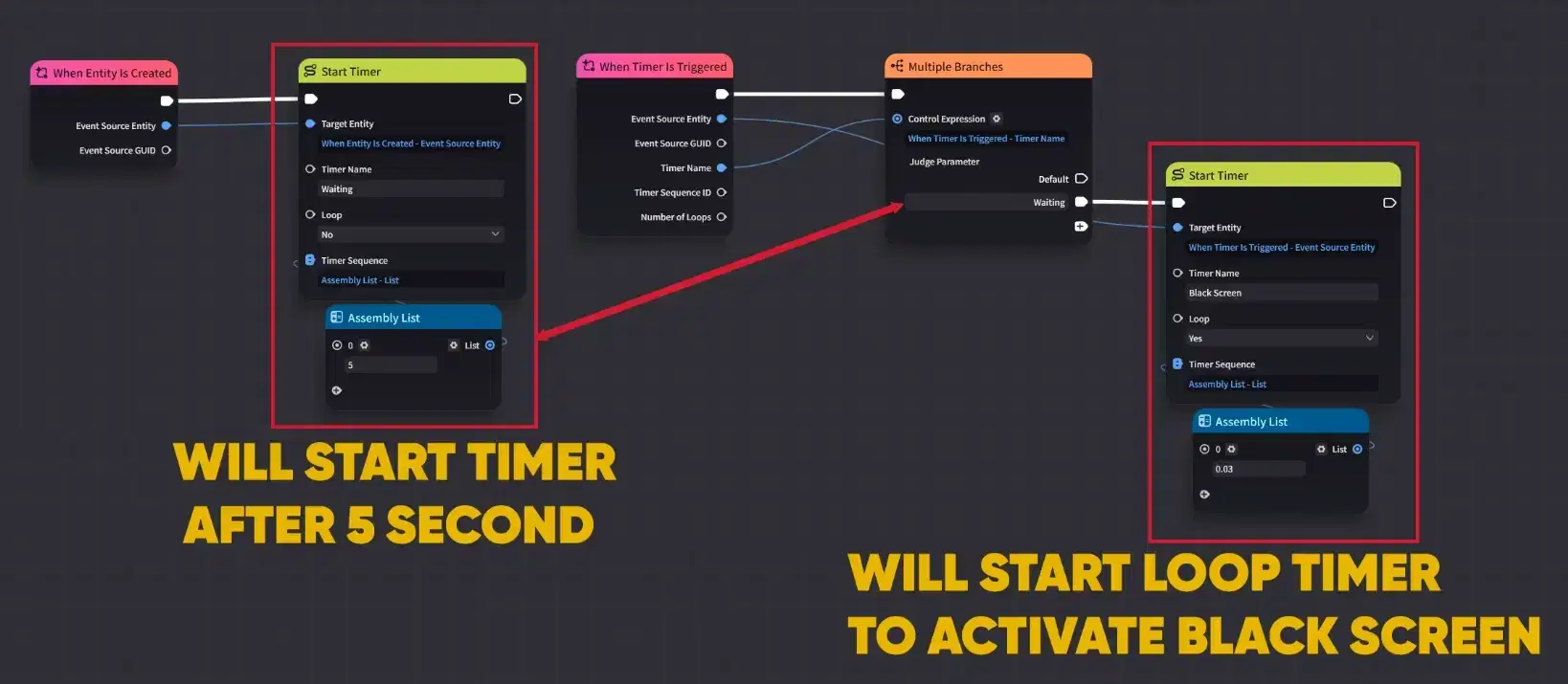
Node Graph logic (Part 1)
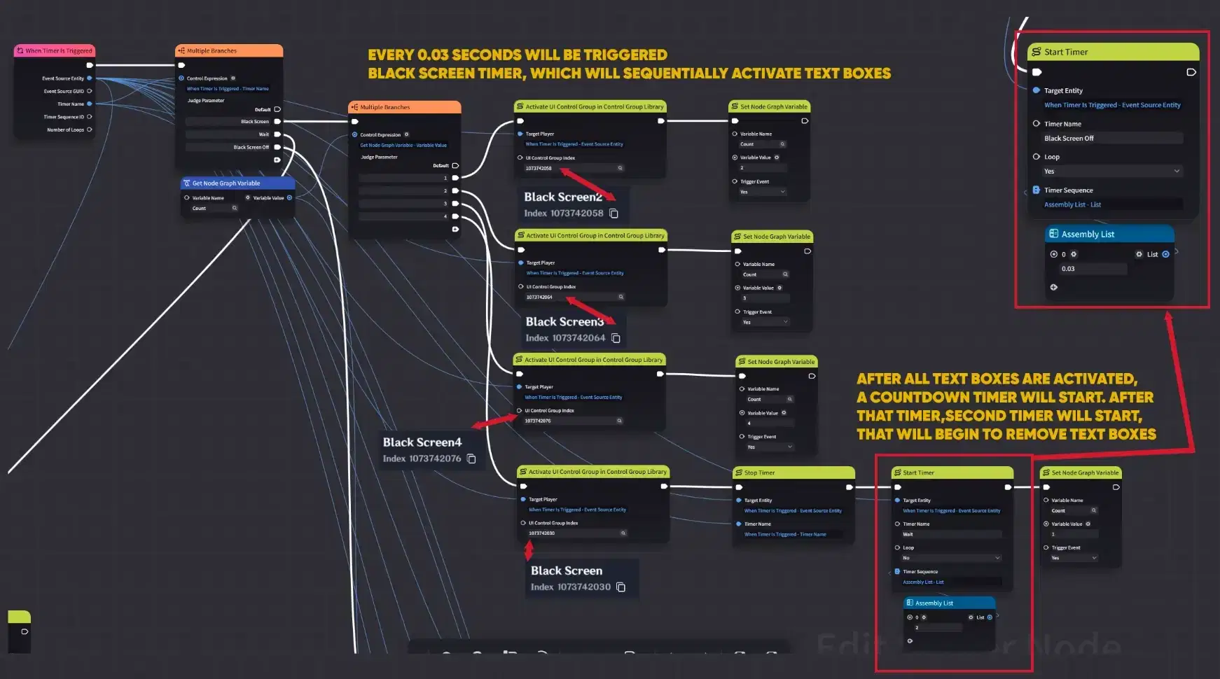
Node Graph logic (Part 2)
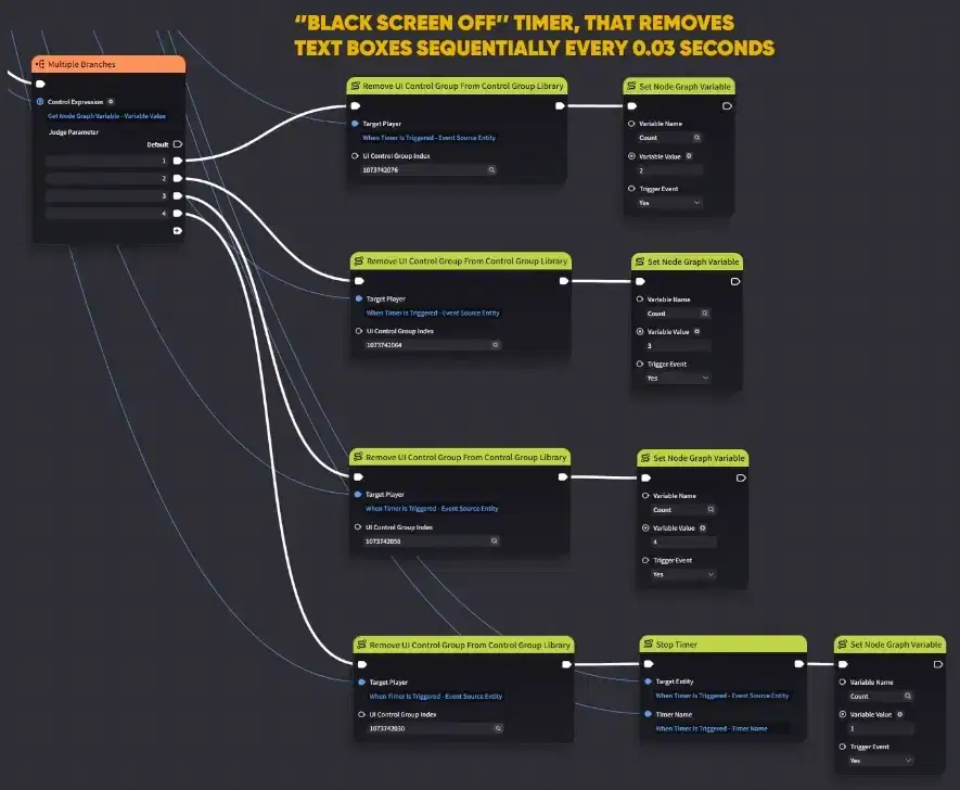
Node Graph logic (Part 3)
1.5. Quest Log
This example demonstrates how to create an appealing Quest Log that updates in real-time as the player progresses through your stage. By using dynamic variables, a single UI template can display any values of different missions.
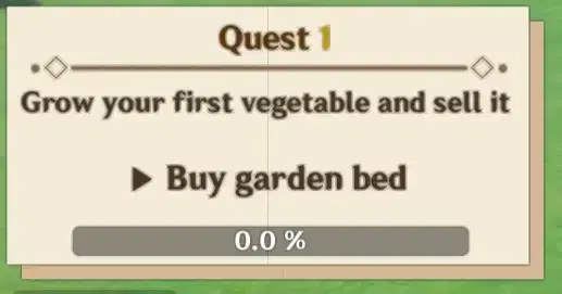
Quest Log
Step 1: Visual Design with Text Symbols
- Background: The log's background t is created using a Text Box filled with the █ character. Use color #F5ECD7 for the main body and #D4B896 for the shade effect.
- Typography: For all quest text, use the dark brown color #4A3520 to ensure high readability against the light background.
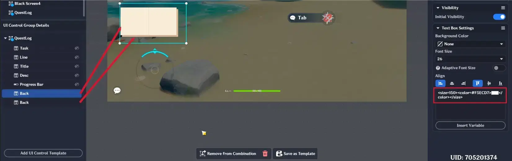
Log's background color
Step 2: Dynamic Data Mapping
To make the Quest Log reusable for multiple missions, link your Text Boxes to Custom Variables:
- "QuestNum": Automatically updates the mission number (e.g., Quest 1, 2).
- "QuestTitle" & "QuestDesc": These variables allow you to change the text content via Node Graphs.
- Progress Bar: Provides detailed visual feedback on the player's completion status.
- Dividers: Use a combination of •◇— characters in a separate Text Box to create decorative lines.
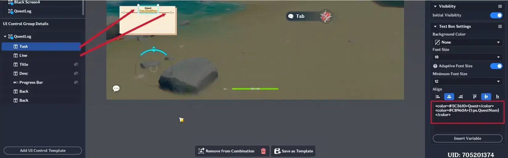
Text Box configuration
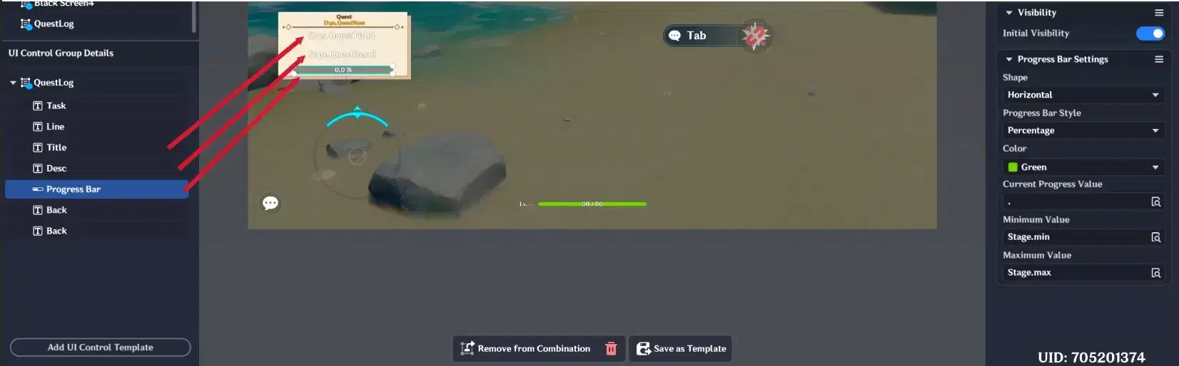
UI Control Group configuration
Step 3: Logic Implementation
To make the tracker functional, you will need two separate Node Graphs:
- Initialization (Player Entity): A graph that activates the UI Control Group when the player spawns.
- Interaction & Progress (Quest Entity): Attach a graph to the objective. When the player interacts with it, the logic updates the QuestDesc and Progress Bar variables to reflect the new mission status.
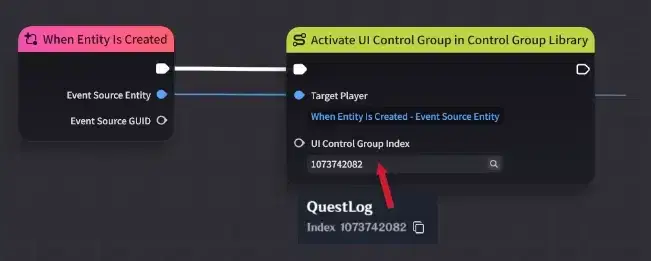
Player Node Graph
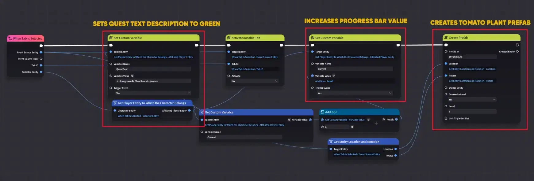
Entities Node Graph
In result you will have Functional Quest log, which tracks players quest completion status.
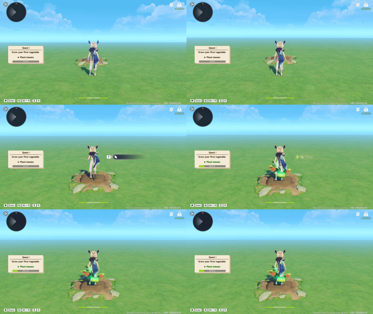
Quest Log showcase
1.6. Custom Timer without using Timer UI Control Group
While the standard Timer UI exists, creating a Custom Timer using a Progress Bar and Text Boxes gives you total control over the visual style.
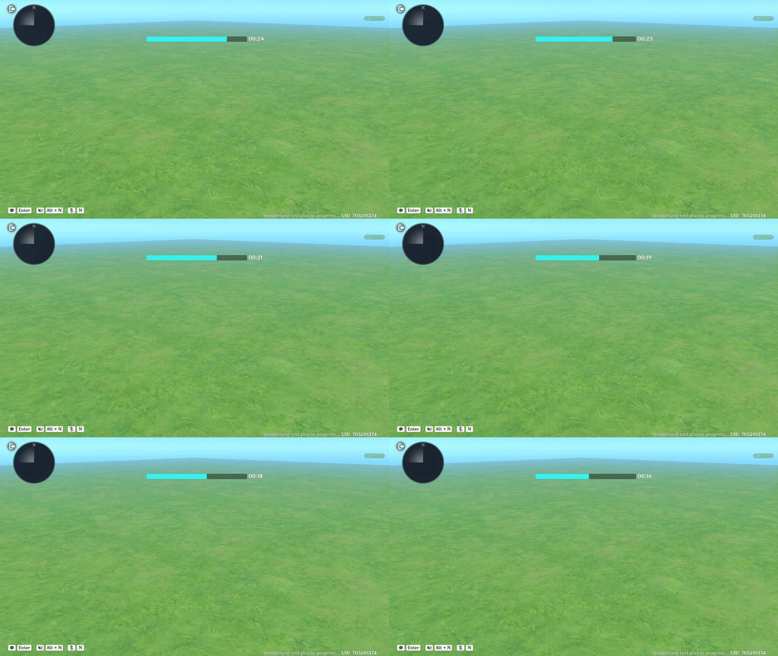
Timer showcase
Step 1: Timer UI Creation
To create this timer, you need to combine three elements into one template:
- Progress Bar: Acts as timer duration indicator.
- Text Box 1 (The Colon): Contains the ":" character. This stays static to mimic a real digital clock (e.g., 00:00).
- Text Box 2 (The Digits): Linked to your time variables.
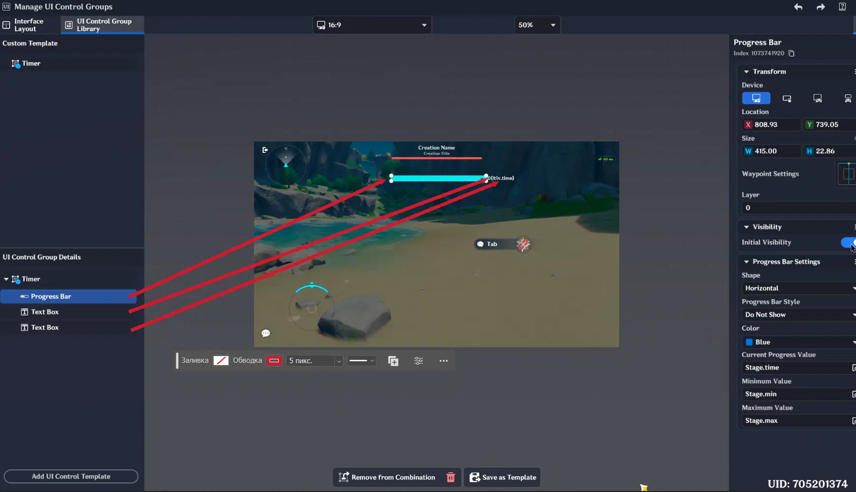
UI Control Groups
Progress bar settings are following:
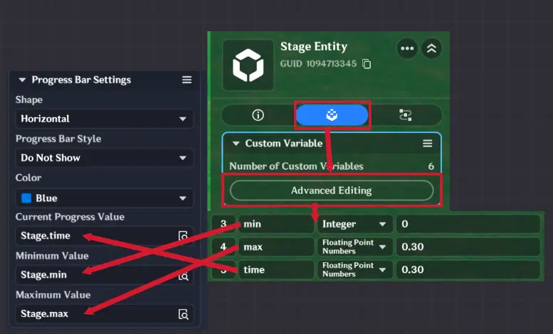
Progress Bar Settings
Text Box settings are following:
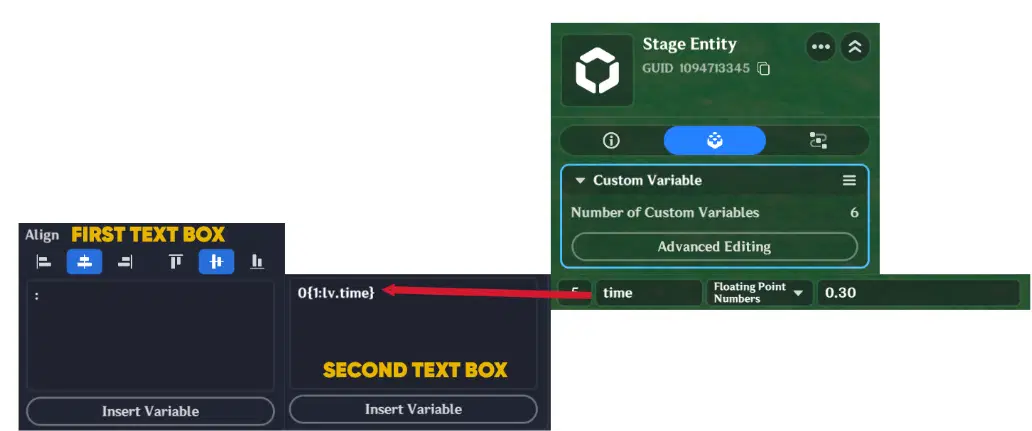
Here is example with first box and without first box:

Timer difference
Step 2: The "Double Zero" Trick
To make the timer look professional (showing "05" instead of just "5"), you can place a static "0" in a Text Box just before the dynamic variable.
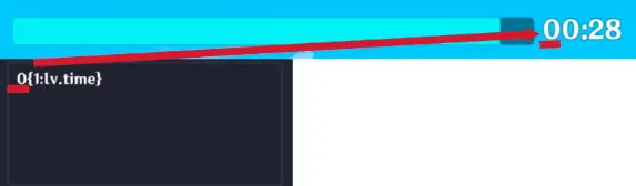
Addition zero in Timer
Step 3: Logic Implementation (Stage Entity)
Attach the Node Graph to the Stage Entity to manage the global countdown:
- Timer Trigger: Use a 1-second loop to decrease your custom "Time" variable.
- Synchronization: Every second, the logic updates the Text Box and reduces the Progress Bar fill percentage simultaneously.
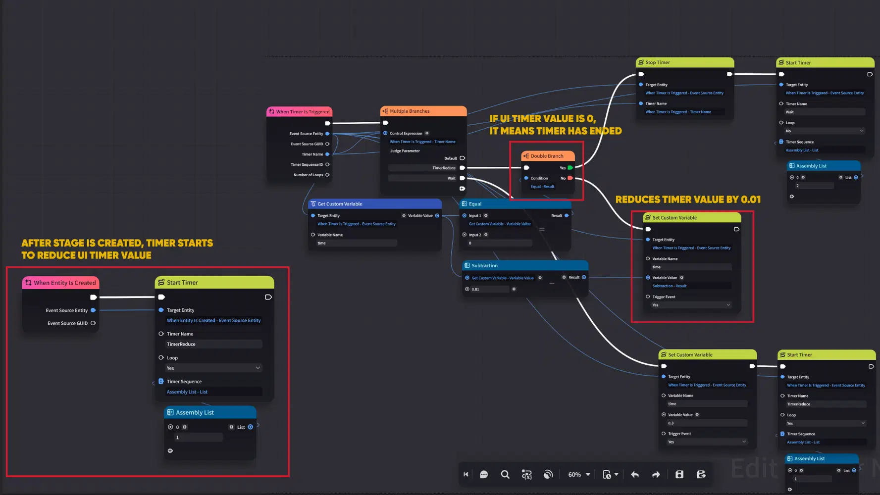
Node Graph logic
1.7. Dynamic Text Transparency & Scaling
This example demonstrates how to create fluid UI animations, such as text that fades in or grows in size. By linking properties to Custom Variables, you can animate your interface via logic.
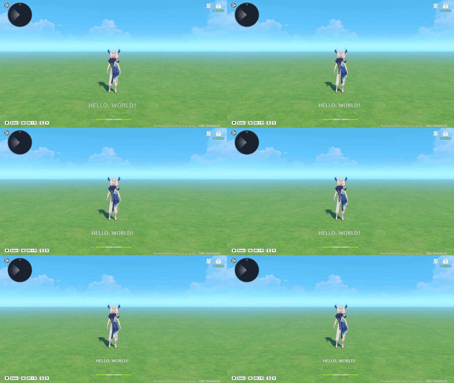
Dynamic Text showcase
Step 1: UI and Variable Setup
Create a Text Box and define two specific Custom Variables on the Player Entity to control the animation:
- "Alpha" Variable: This will handle the transparency (opacity) of the text.
- "Size" Variable: This will control the text size dynamically.
Note: This ensures that any change in the Node Graph instantly reflects on the screen.
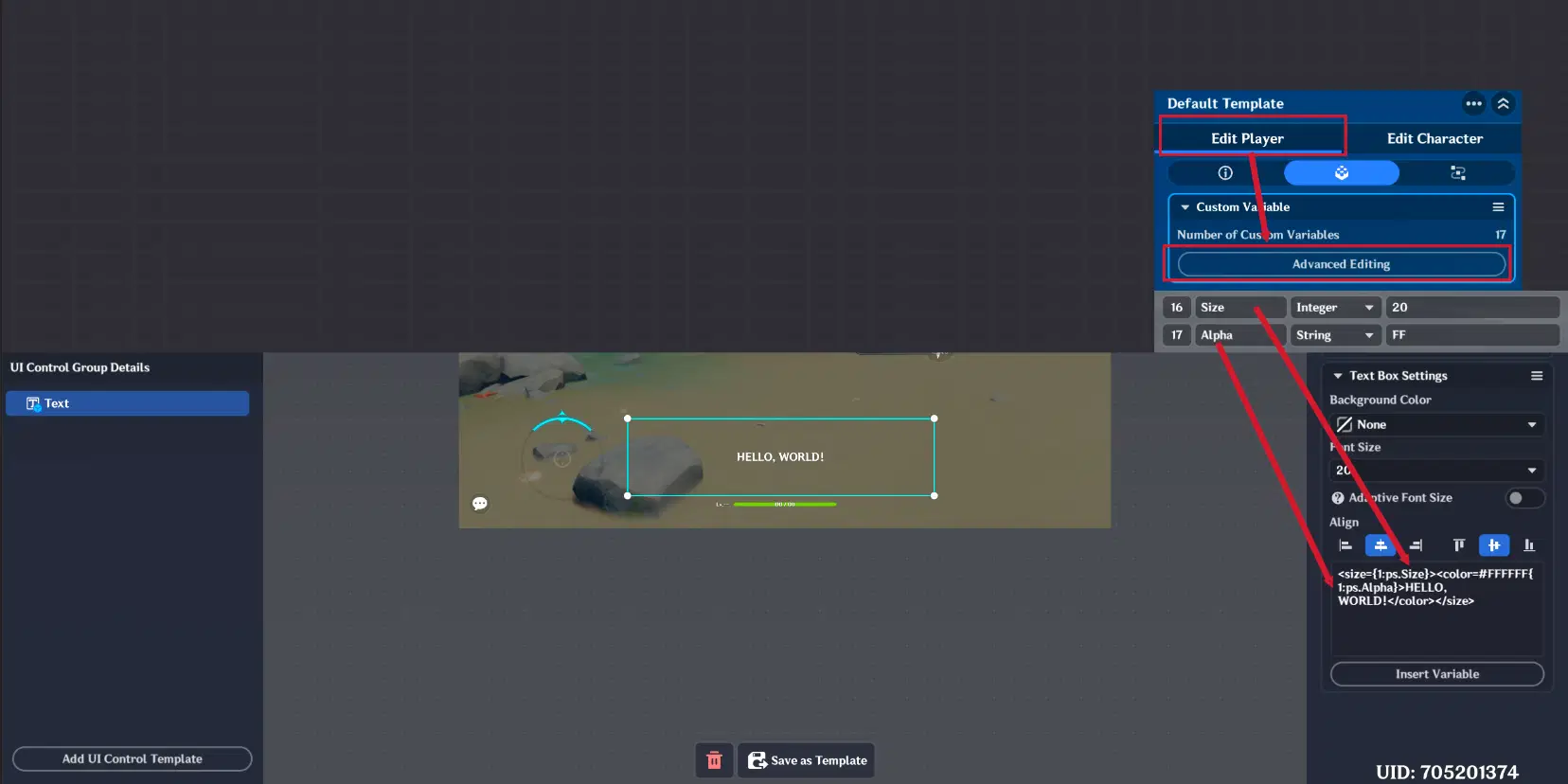
Text Box configuration
Step 2: Animation Logic (Player Entity)
Attach a Node Graph to the Player Entity to activate the transition:
- The Trigger: After player will be created, timer, which will change Size and Alpha values, will be triggered.
- The Transition: Loop Timer is used to gradually increase the text "Size" and "Alpha" values.
- The Result: The text will appear to "grow" or "fade in" smoothly on the player's screen.
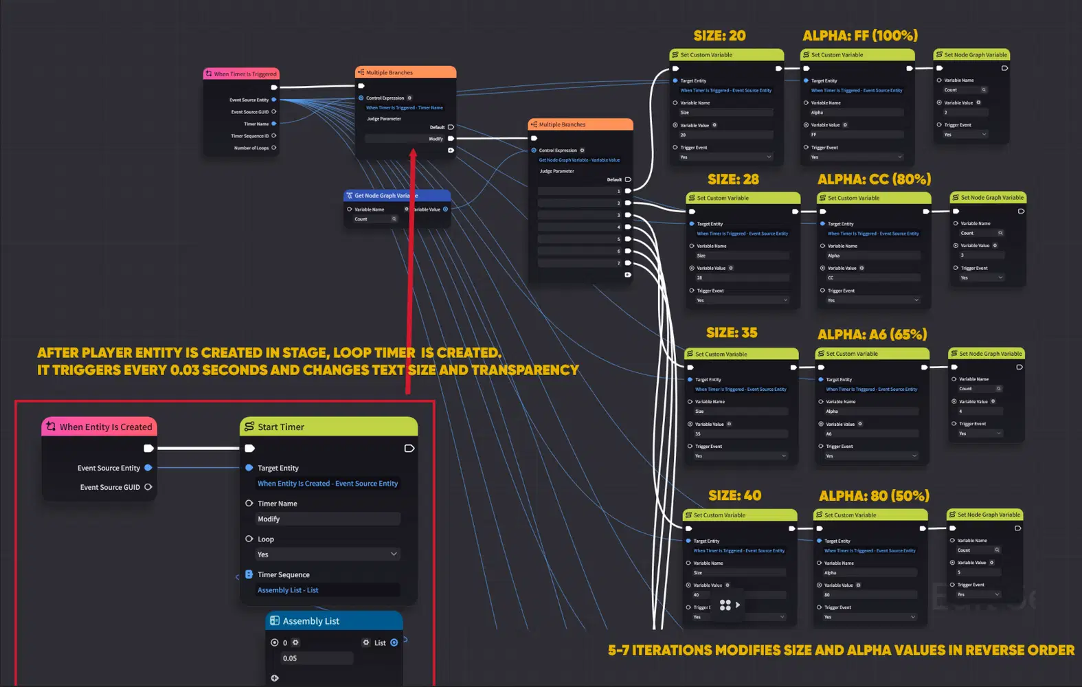
Node Graph logic
I hope this guide helps you better understand how to design and implement UI Control Groups in UI and created complex UI structures.