Content Overview
Welcome, Creators! 
In this guide, we will explore the Miliastra Wonderland UI Editor and learn how systems such as Interface Layouts, UI Control Groups, custom assets, masking systems, and Floating Interactive Pages work together to create interactive and visually appealing game interfaces.
We will also discover how to create interactive Floating Interactive Page with tabs to make our interfaces feel more dynamic and easier for players to interact with.
This guide is for creators who already have basic familiarity with the editor, but have not yet realized some features that will be very useful to simplify and speed up their work. But even if you're a beginner, you can still follow and learn for your own projects~
Alright, let's save time and begin our experiment~
UI Management Editor
Before building our interface, it is important to first understand the editor parts and how its systems work together. But let's first open our UI Editor by opening the menu and select Manage UI Control Groups.
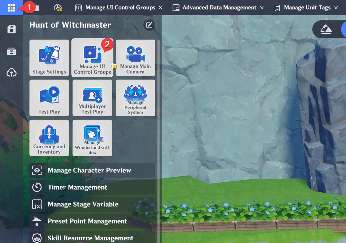
Open UI Editor
The editor is divided into several tabs:
- Interface Layout: This is our main workspace to design the game user interface
- UI Control Group Library: Reusable custom UI templates
- Assets: Reusable custom asset (for image, custom button, custom switch, and floating interactive window style)
In Miliastra Wonderland you can also create dynamic UI behavior with help of Node Graph integration where you can control the visibility of the user interface by using the UI index. You can also listen to player interaction event that triggered from the UI and compare if the event is coming from specific index. The UI index can be seen on the top right corner of your screen after selecting the UI component.
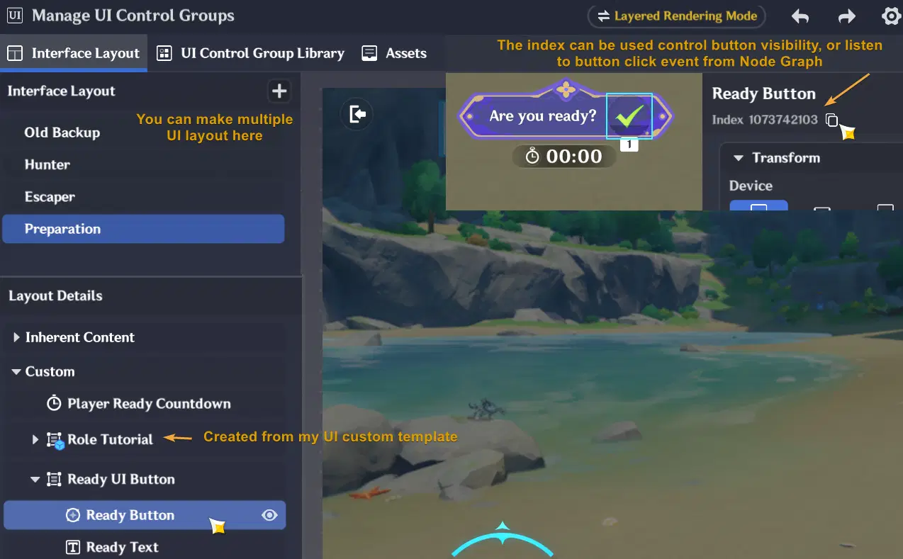
UI Editor Overview
This allows us to build interfaces in a more flexible and organized way as projects continue to grow.
In the following sections, we will explore the main parts of the UI editor and learn how different UI systems are commonly used.

✦ Interface Layout
Interface Layout is our main workspace where UI elements are arranged and organized for the player interface.
You can create multiple different layouts and apply it to different players. This system is usually very useful for asymmetric games, where different player roles require different interface designs and functionality. If you just realized this feature, maybe you're lucky for reading this guide 
For example, an Escaper role may contain UI buttons for healing teammates or using special tools only, while a Hunter role may include UI for capturing other players only.
Multiple UI Layout
By using Interface Layouts, you can manage multiple UI setups more efficiently without manually control the visibility of every UI element with Node Graph for different players. You can also easily switch the UI layout for a player after their role has been assigned.
To switch UI layout for the player, you can use Node Graph or by switching the player class:
Switch UI Layout using Node Graph
Node Graph is the system used to control game logic and UI behavior dynamically. In this guide, we will only use a few simple nodes to switch UI layouts. Below is the tutorial if you want to switch layout using Node Graph:
- Make sure to copy the layout index first to show to the player
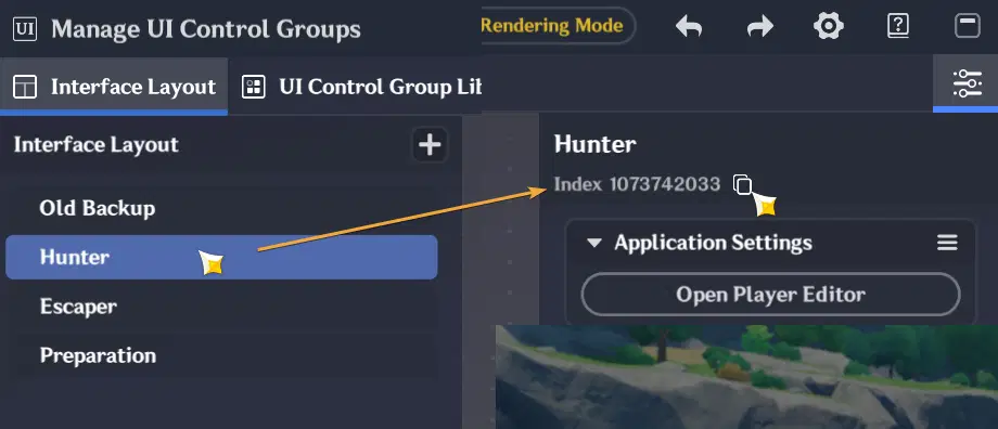
Copy the Layout Index so we can reference it in node graph
- Open Server Node Graph Editor, and create new node graph:
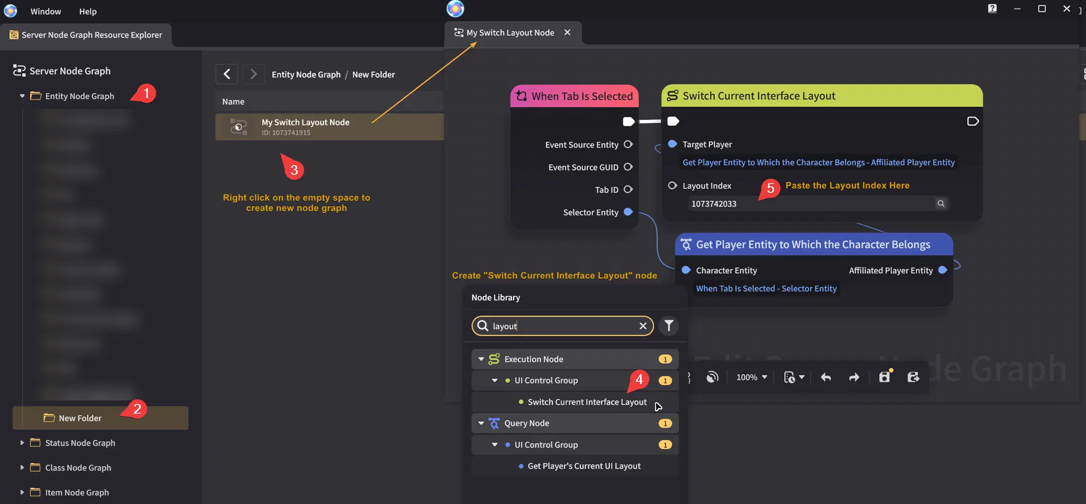
Create Node Graph
- After the node graph has been created and saved, let's make an entity so we can attach our node graph to it. Since this example uses interaction events with "When Tab is Selected" node, we need the entity to have a Tab component so the node graph can receive player interaction input.
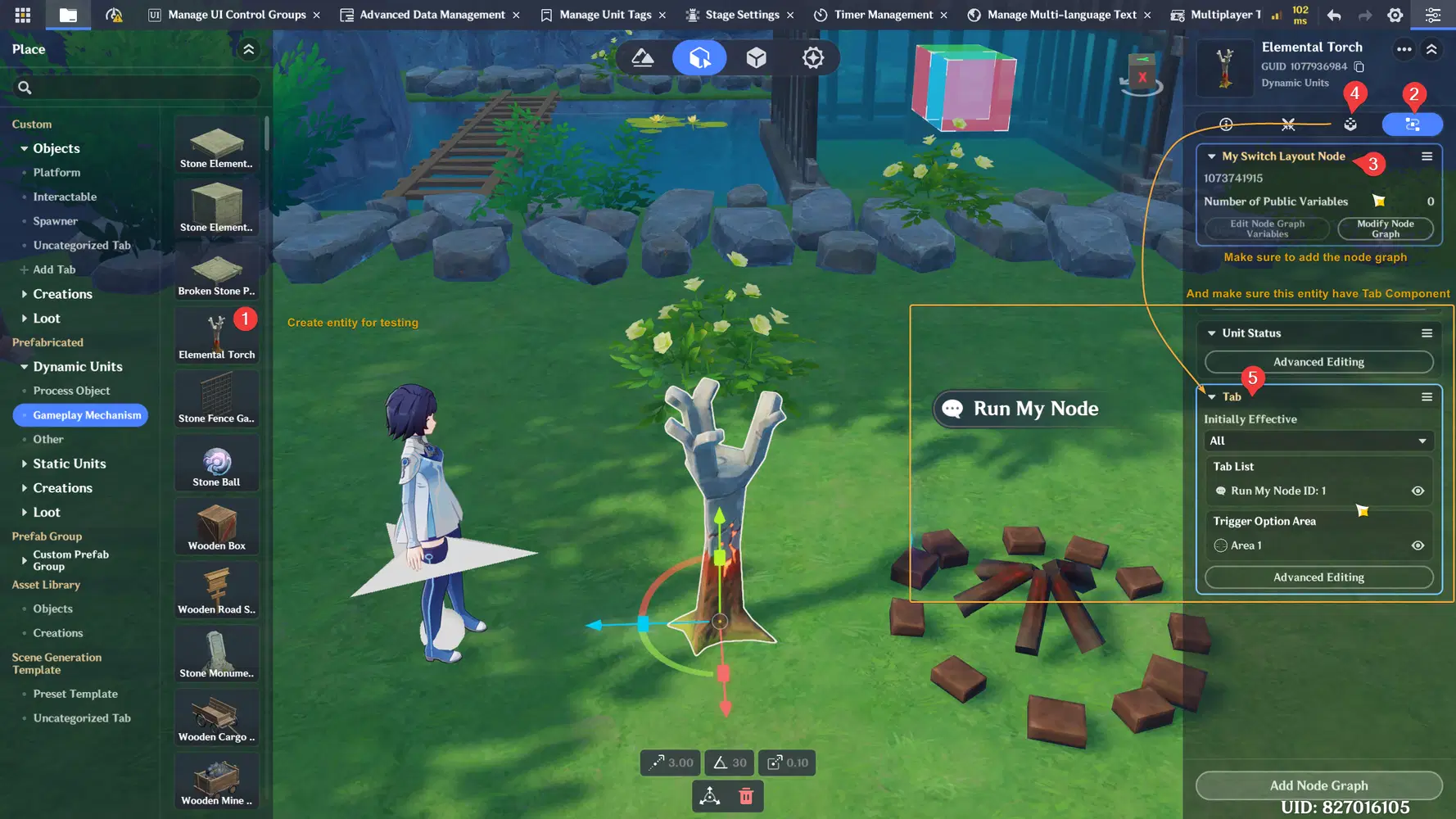
Create an entity for testing, add node graph and Tab component
- Below is the result of switching to Hunter layout from default UI layout. If you achieve similar result like this, then you basically have understand the Interface Layout. You can improve the node graph to switch to different layout (for example switch to Escaper layout) by using similar steps.
Testing Result for Hunter Layout

Switch UI Layout using Player Class
- If you want to apply the UI Layout for specific player class only, you can easily change it from class configuration here:
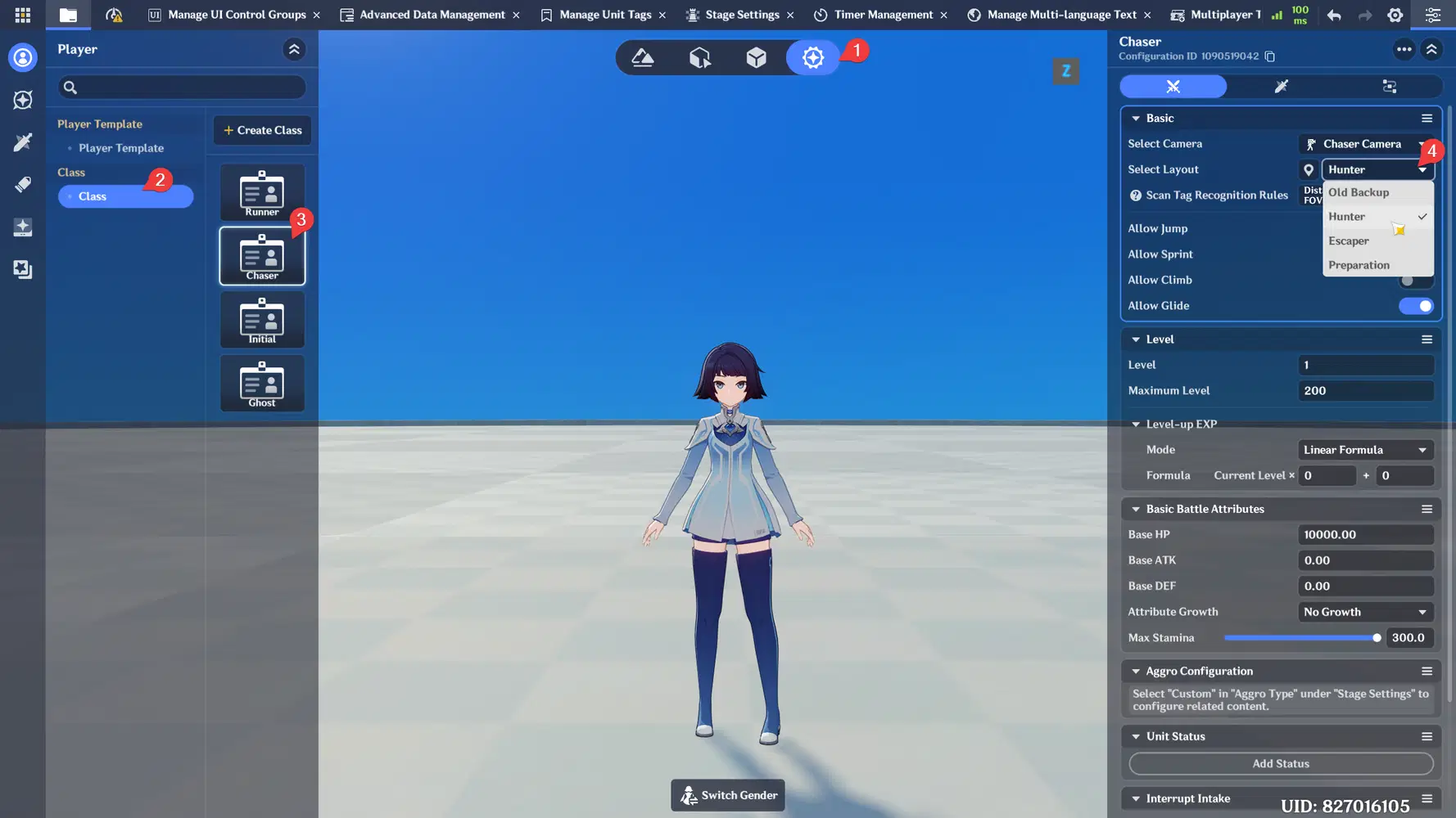
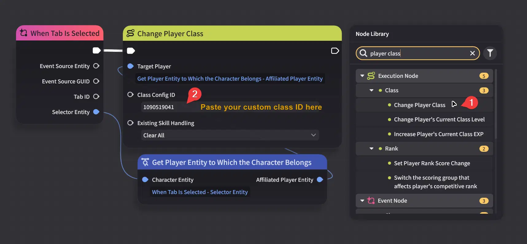
- In the game, the UI layout will also get changed after you switch the player class and you can switch the player class using this Node Graph.
✦ UI Control Group Library
The UI Control Group Library allows creator to create reusable UI components that can be shared across multiple Interface Layouts. Instead of manually copying and pasting the same UI elements into different layouts, you can simply reuse existing user interface design from the template that you have created.
UI Control Groups can also be displayed directly to the player through Node Graph without needing to be placed inside any Interface Layout first. This helps keep projects cleaner and easier to maintain when working with multiple layouts while using the same UI component across all layouts.
Create your first UI template
- In this example, let's start by creating 2 UI component then combine them into single UI component
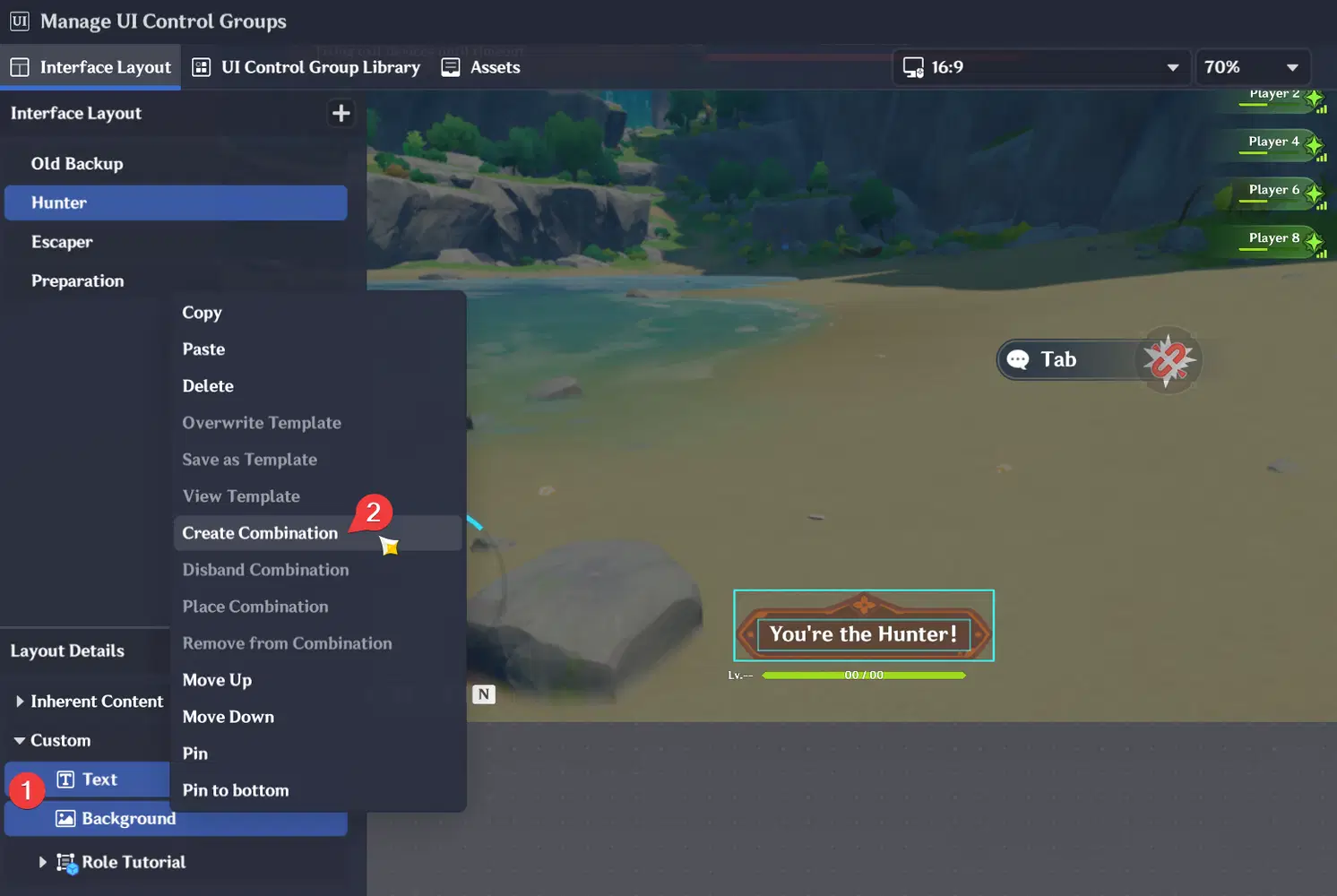
Create 2 text and the image background, then combine them into a single UI component
- Then save the combination as a template, and also rename it so you can easily find it later
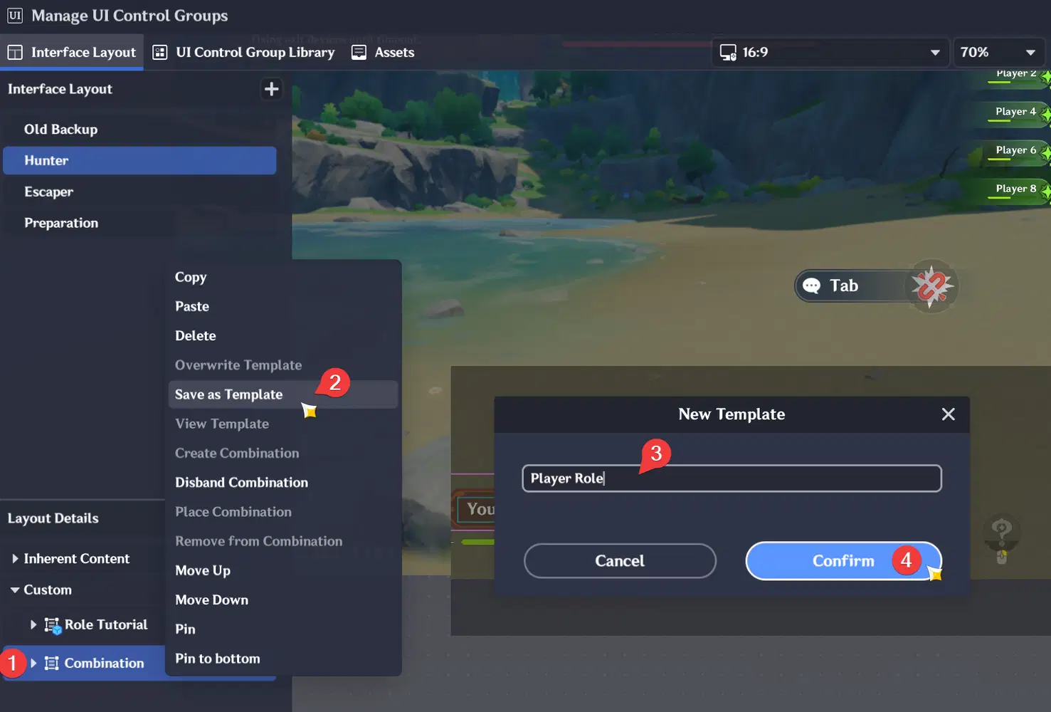
- The template will be saved in UI Control Group Library, you can also modify your template from this editor interface. Make sure to save it after making changes if you modify the template like below:
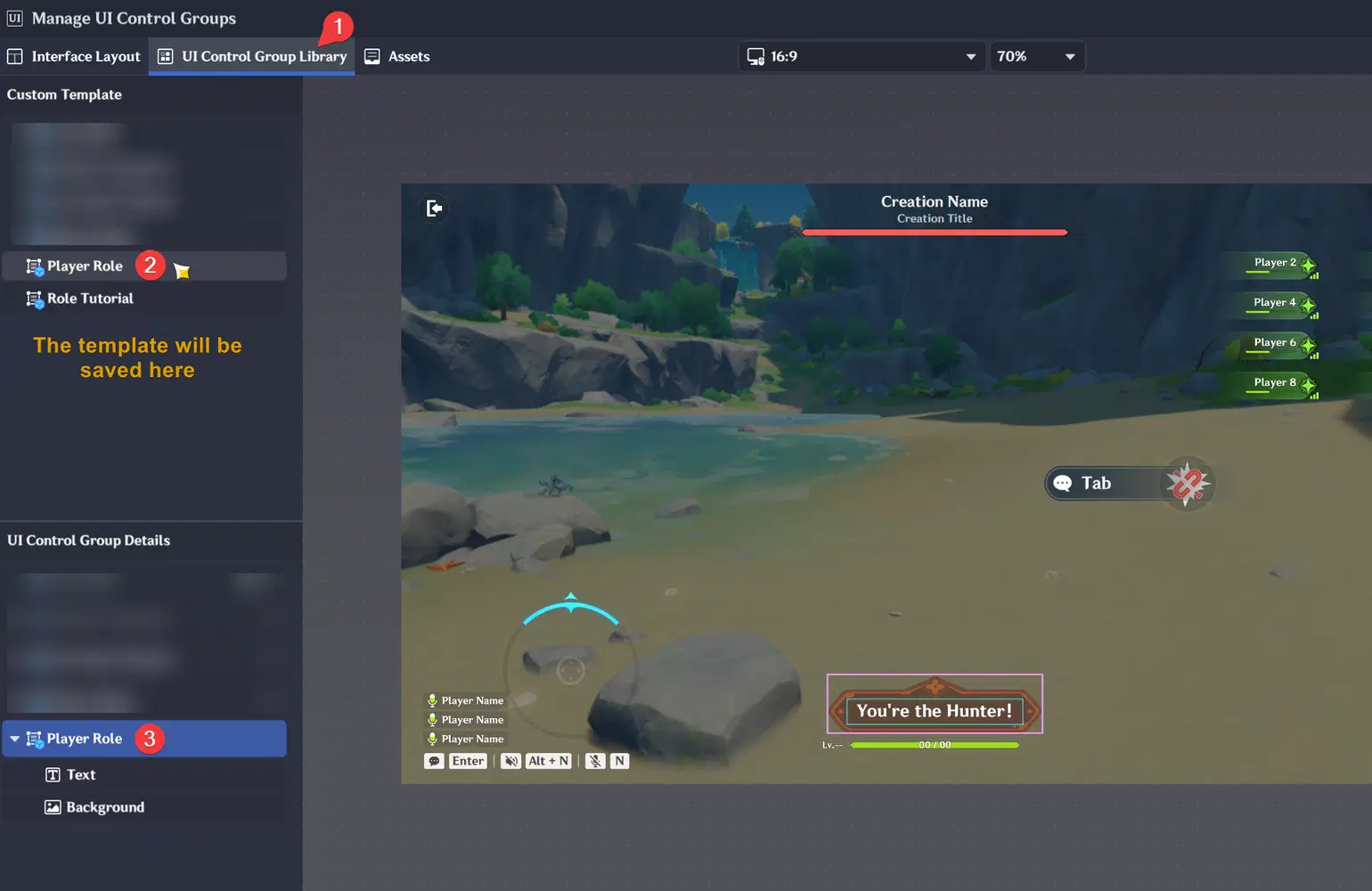
If the text is behind the background image, make sure the Text Box is above of the image
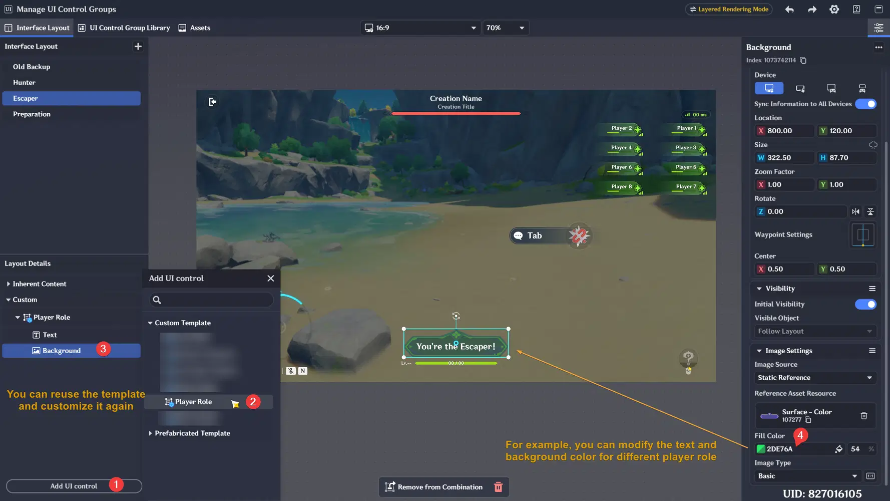
- After your first UI template has been created, you can reuse it by adding it to any Interface Layout and you can customize the inner component when needed like the text or background color. For the example, the original template is for Hunter interface then I customize it for Escaper with green background like below:
Directly show the UI template to every layout
While you can manually add the UI template from UI Control Group Library to the interface layout from the editor. You can also immediately show your created template in UI Control Group Library for every layout with Node Graph. Below is the tutorial on how to directly show your UI into every layout:
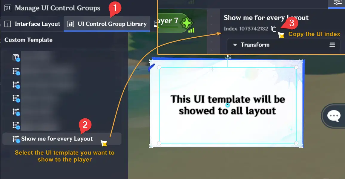
- After you've created the UI template, select the template and copy the index
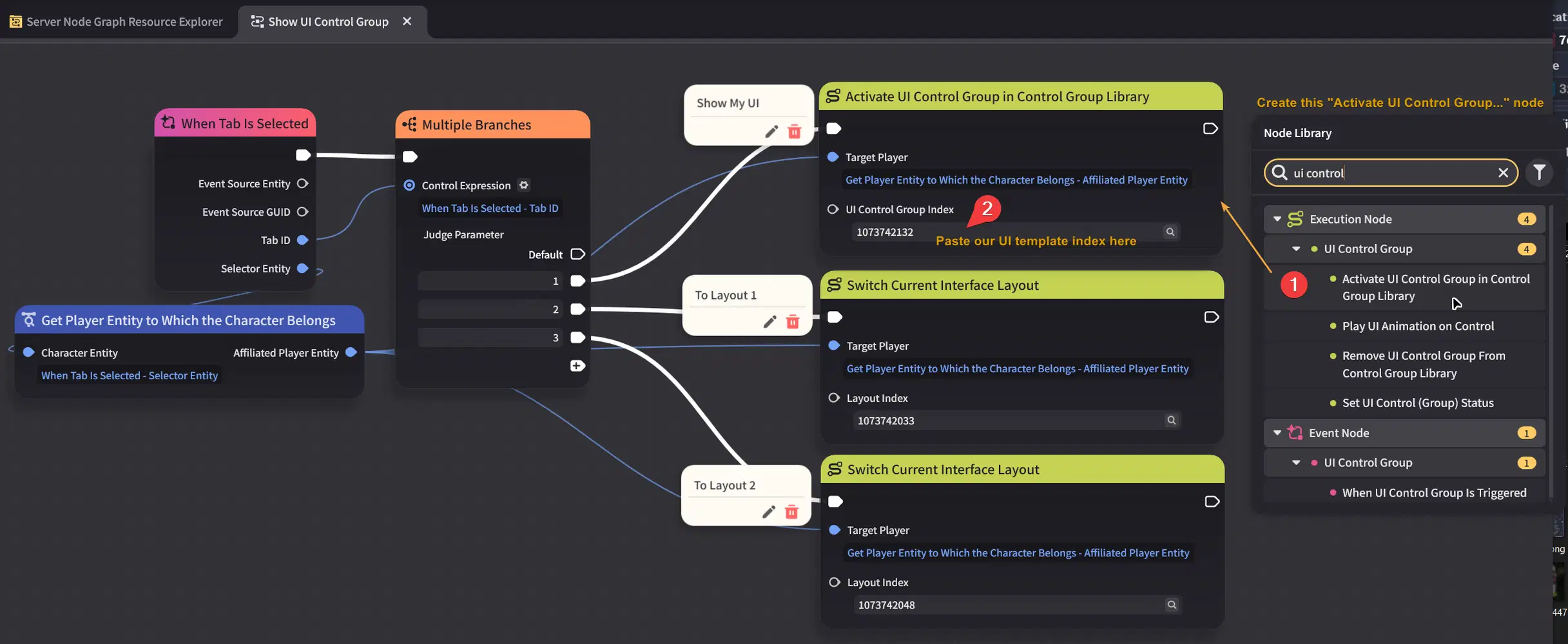
- Then let's create the node graph to show that UI template with "Activate UI Control Group in Control Group Library" node
- Add the node graph to an entity for testing, and make sure you have add Tab component too on the entity
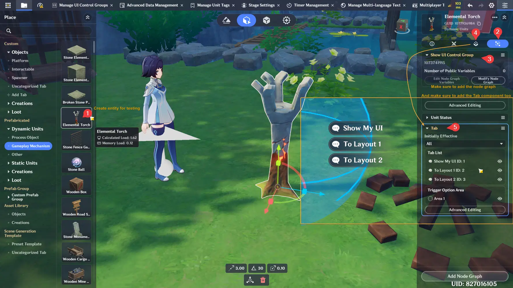
- Below is the result after showing our custom UI template stored in UI Control Group Library and test by switching the into 2 different Interface Layout
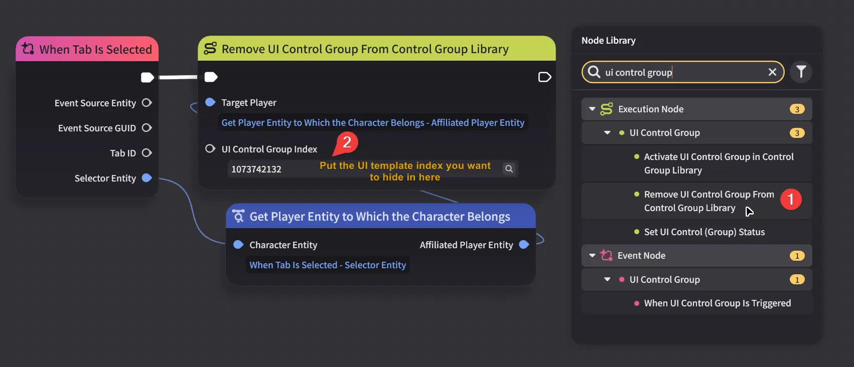
- If you want to hide the UI, you can use node below in the server node graph:
✦ Custom Assets Template
While the editor has built-in image assets provided by Miliastra Wonderland for creating UI elements. You can also create a custom asset by using build-in asset in the Assets section so you can create and reuse custom design for some user interface. You will also need to create custom asset if you’re creating custom style for button in Floating Interactive Page later.
When creating custom asset, it may feel like creating another custom template just like the templates in UI Control Group Library. But in this Assets section, our custom UI asset will be used just like as an background image for some UI component. For the example in Custom Button's custom style, you can use different asset for different button state (default, hovered, pressed):
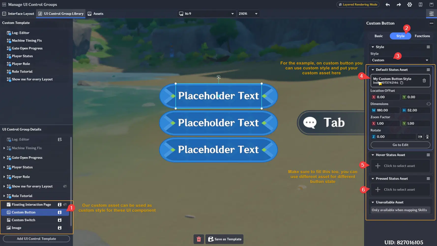
Custom Switch, Image, and some UI in Floating Interaction Page also have this custom style
For different button state, you may want to create different variation for the design. Like when the button is pressed/hovered it would be more bright than other button. Alright, let's try to create our first custom button design. Learn by practicing is usually more faster
Create Custom UI Asset
- Go to Assets on your editor
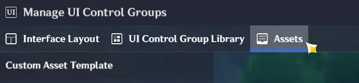
- Create your first asset by adding image and text box, then create an Asset Group from it
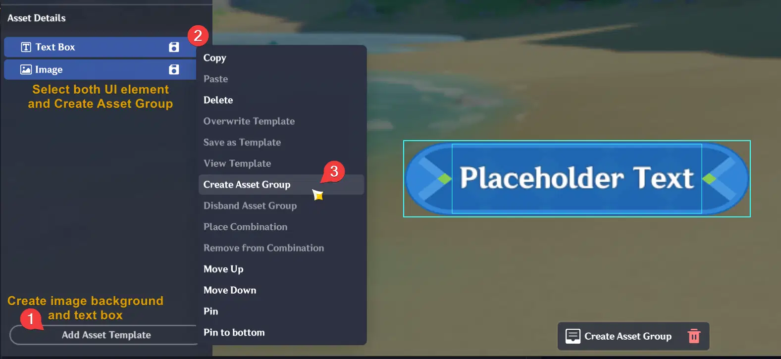
If the text is behind the background image, make sure the Text Box is above of the image
- After your first asset is created, you can copy and paste to duplicate the asset then create different design variation for different state (hovered, pressed). You can change the color of your asset background. Usually for hovered/pressed state, the color is more brighter/white. But it's depends on your design choice.
Masking / Cropping
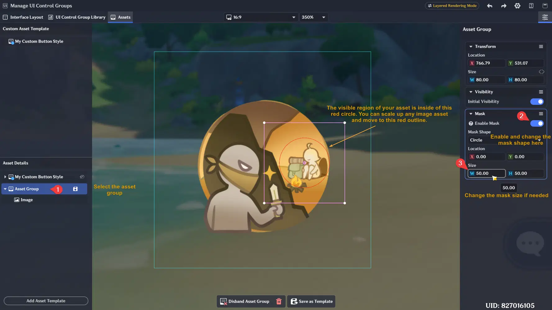
When creating a custom asset, you can also use the masking feature to hide parts of the image that you do not want to display. Currently, the available masking options are limited to square and circle shapes only. It's still limited, but we can try experiment it so we can have idea in the future when we need it.
- Let's create any image from build-in asset and create asset group from that image, then turn on Enable Mask on the asset group's configuration
- To preview the applied mask for your asset, you can click on empty space of the UI editor
- After you happy with the mask result, you can save the asset and use it for your other UI component image or custom styles
Floating Interaction Page
Floating Interaction Page allows creators to build interactive popup-style interfaces that can temporarily take player focus away from the game and redirect it into the UI.
Unlike normal UI elements inside Interface Layouts, this Floating Interaction Pages currently can only be created inside the UI Control Group Library and can be displayed through Node Graph when needed.
This Floating Interaction Page is usually very useful for creating interface like:
- Custom backpack interfaces
- Custom shop interfaces
- Tutorial or structured guide pages
- Interactive popup menus
What Happens When Floating Interaction Page Opens
When a Floating Interaction Page is shown (especially on PC/desktop), the game will automatically display the mouse cursor and shift the player's focus from the game into the UI.
When the player begin interacting with the Floating Interaction Page:
- Player movement control (WASD) will temporarily stop
- Cursor control becomes active and visible
- UI interaction becomes the main focus
This behavior makes Floating Interaction Pages can feel similar to popup windows commonly seen in other games. Once the UI is closed, player control will return back to normal gameplay mode.
Floating Interaction Page Workflow
The general workflow usually looks like this:
- Create the Floating Interaction Page inside UI Control Group Library
- Design the interface and interaction components inside the page
- Create multiple Page Container if needed and use Tabs UI to switch between page container
- Show or hide the Floating Interaction Page using Node Graph
Because the Floating Page is not permanently visible on the player's screen, this system helps keep the game interface cleaner and more organized. As a creator, you can design your own popup-style interface, and provide a button to let the player show/hide the Floating Interaction Page freely. So the player will not overwhelmed if there are so many information or buttons that need to be displayed on their screen.
- Alright, let's get started by creating our first Floating Interaction Page in UI Control Group Library:
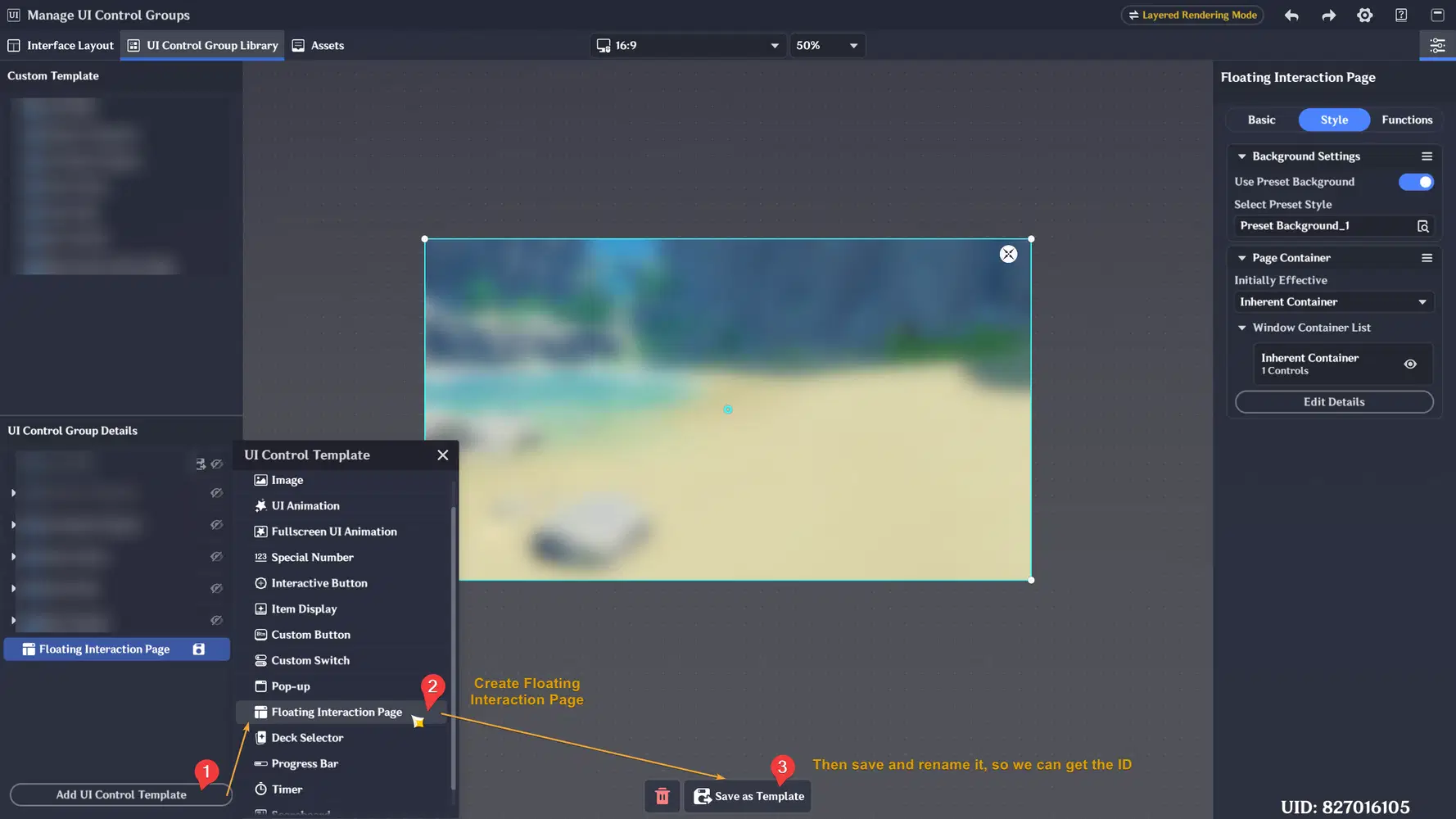
- Make sure to save it as template, so you can obtain the index for controlling the UI visibility for the players. After that let's click the Edit Details button to modify our Floating Interaction Page.
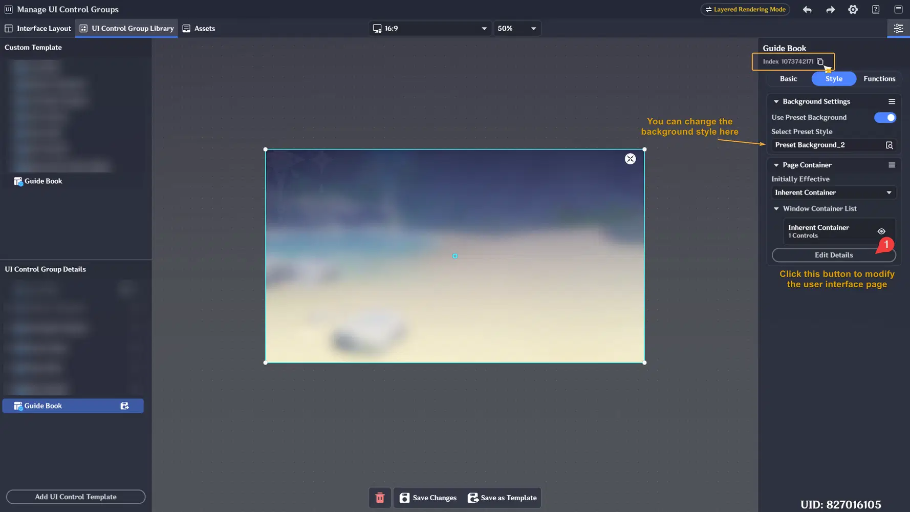
- Below is the preview and small explanation about the Floating Interaction Page's editor
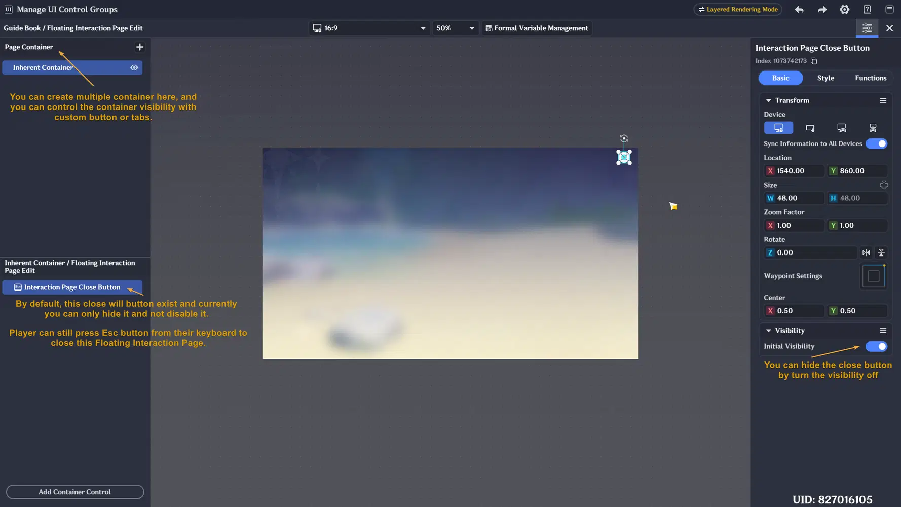
Tabs and List button
Floating Interaction Page supports built-in Tabs and interactive list systems using the Single-Choice Window component.
By combining Tabs and Page Container feature, creators can build interfaces with multiple pages without needing to create multiple separate UI layouts or different Floating Interaction Pages.
For example it would be useful for making:
- Shop categories
- Backpack item categories
- Settings pages
- Tutorial chapters
The buttons used in Tabs and Single-Choice Window lists can use custom Assets created earlier in the Assets section. If you previously created assets variation, those Assets can also be reused here for custom button states such as:
- Default button background styles
- Hovered button appearance
- Pressed button appearance
Switching Panel Container with Tabs
This custom Tab interface is commonly used to control the visibility of different panel containers. For example, if you want to explain two different topics inside the same Floating Interaction Page, you can create two separate panel containers with different UI content and use two tab buttons to switch between them.
In this example, we will create a simple role guide interface for Hunter and Escaper roles, where each tab will display different explanation content for each role:
- Make sure you have prepared button style asset for default and hovered button style in the Assets editor. To make thing easier, you can just copy and paste one of your asset and make the background darker for default button style.
- Let's back to our Floating Interaction Page UI, and create our first Tabs interface. Change the Tab style with our created custom asset
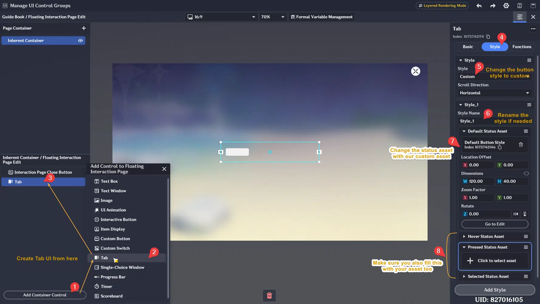
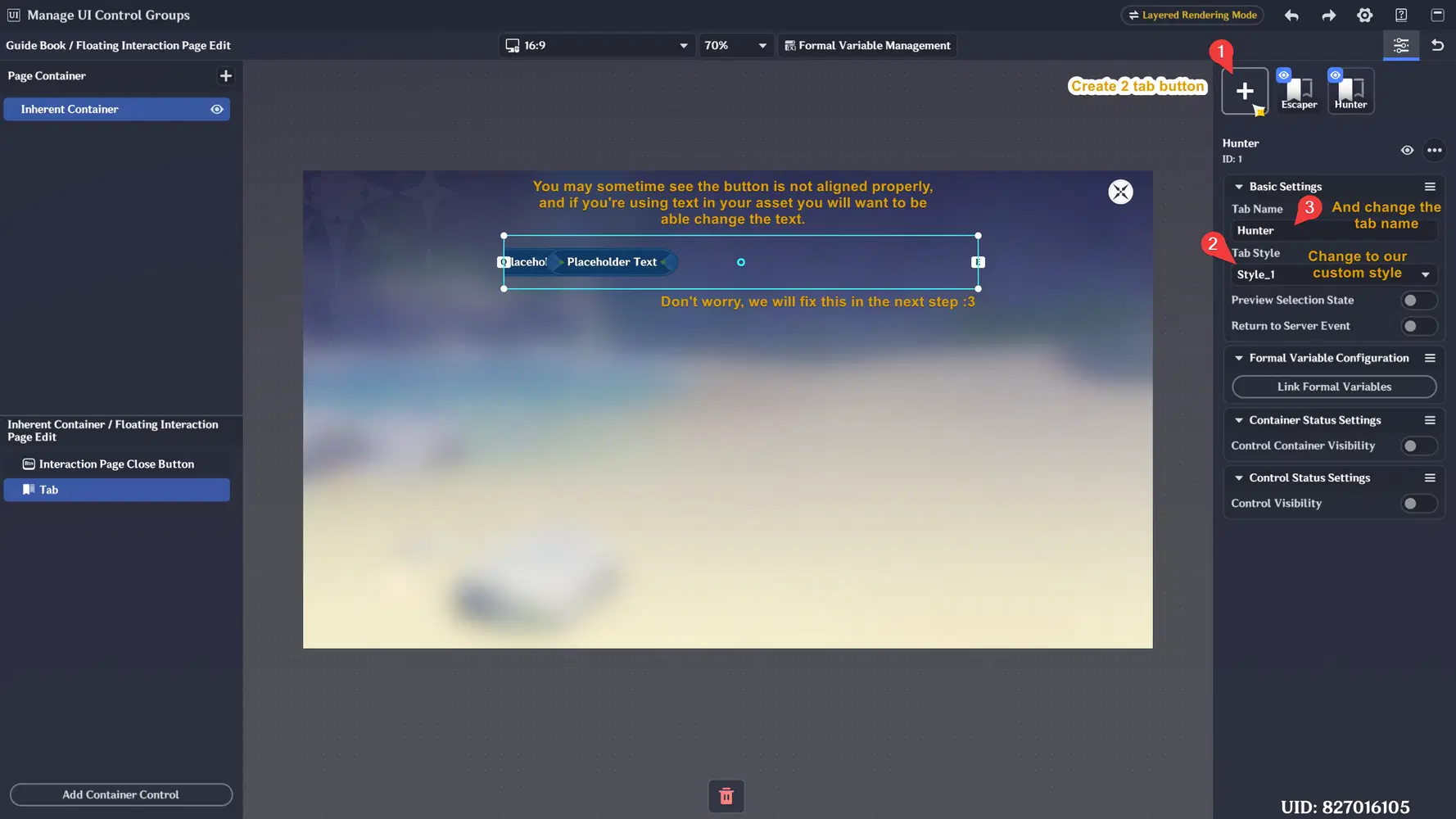
- After setting up the button style, let's create some button and apply the style to our button. Then go to Functions and click Edit Details button to add more Tab button
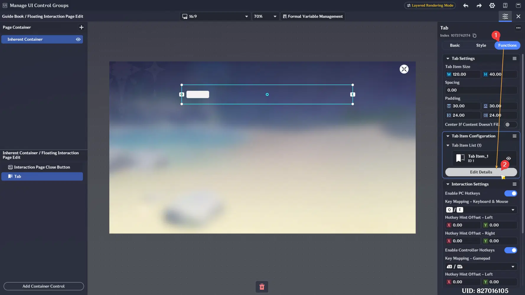
- Create two tab button and change the style
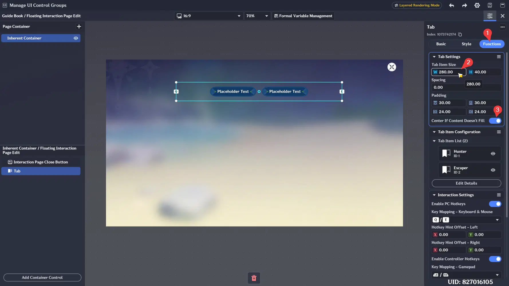
- Then go back to Tab settings to adjust the tab item size. You can also turn on "Center If Content Doesn't Fill" to let the button aligned to the center like the image below:
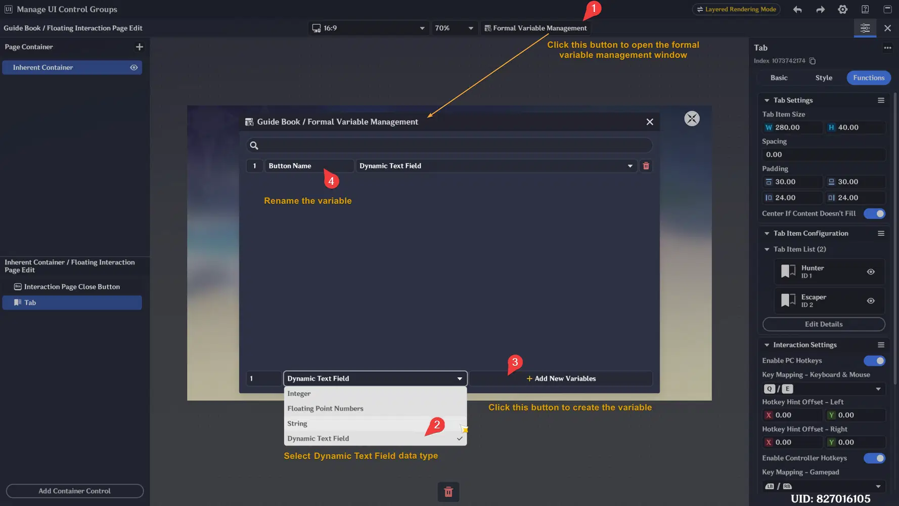
- To change the button text, we will need to create formal variable to this Floating Interaction Page. We need to create variable so our custom asset can use the text value from the variable created inside the Floating Interaction Page instead.
- After you've created the formal variable, let's go back to UI Control Group Library editor by closing the Floating Interaction Page editor. Then save our template first before modify our custom asset.
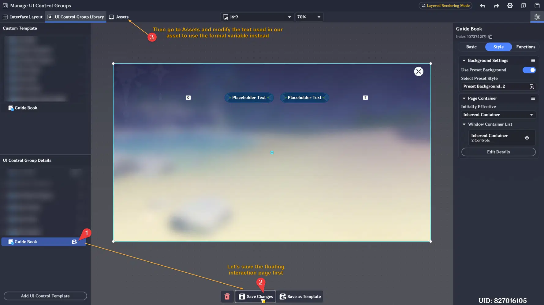
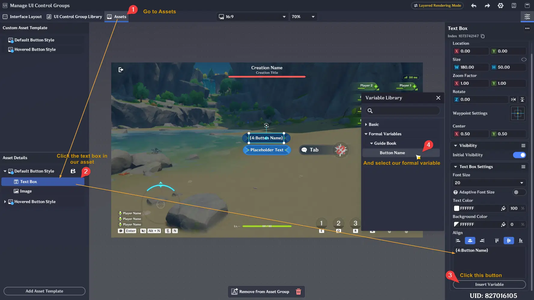
- In the Assets editor, select your asset's text box and modify the content to use the variable we created earlier in the Floating Interactive Page's formal variable
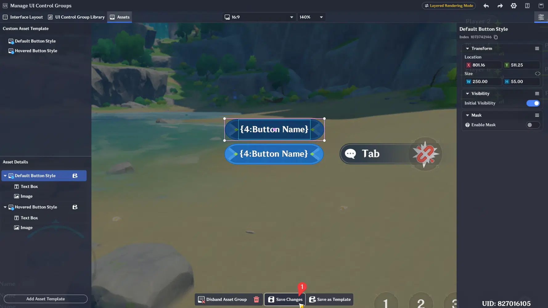
- Always make sure to save your asset after modify it
- Alright, let's go back to our Floating Interaction Page to link and change the variable value for our 2 different button (Hunter and Escaper)
- After the tab button has been made, let's continue by creating 2 page container. One for explaining the Hunter role, and one for explaining the Escaper role.
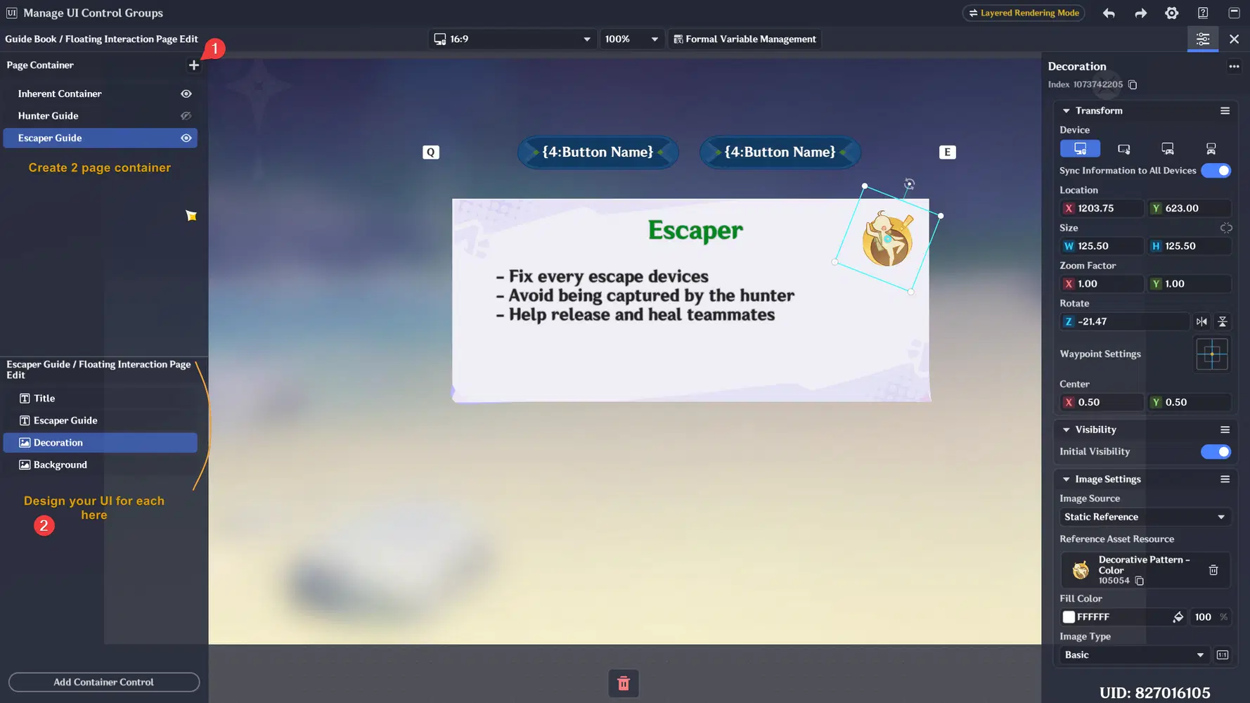
- You can preview switching the visibility of your page containers with the eyes icon in the right side of page container name if you want to make sure if everything looks correct when being shown/hidden.
- After you've done decorating the UI in both page containers, let's show specific Page Container only when the player selects the related tab button
- Alright let's go back and initially hide these two container, then save our Floating Interaction Page.
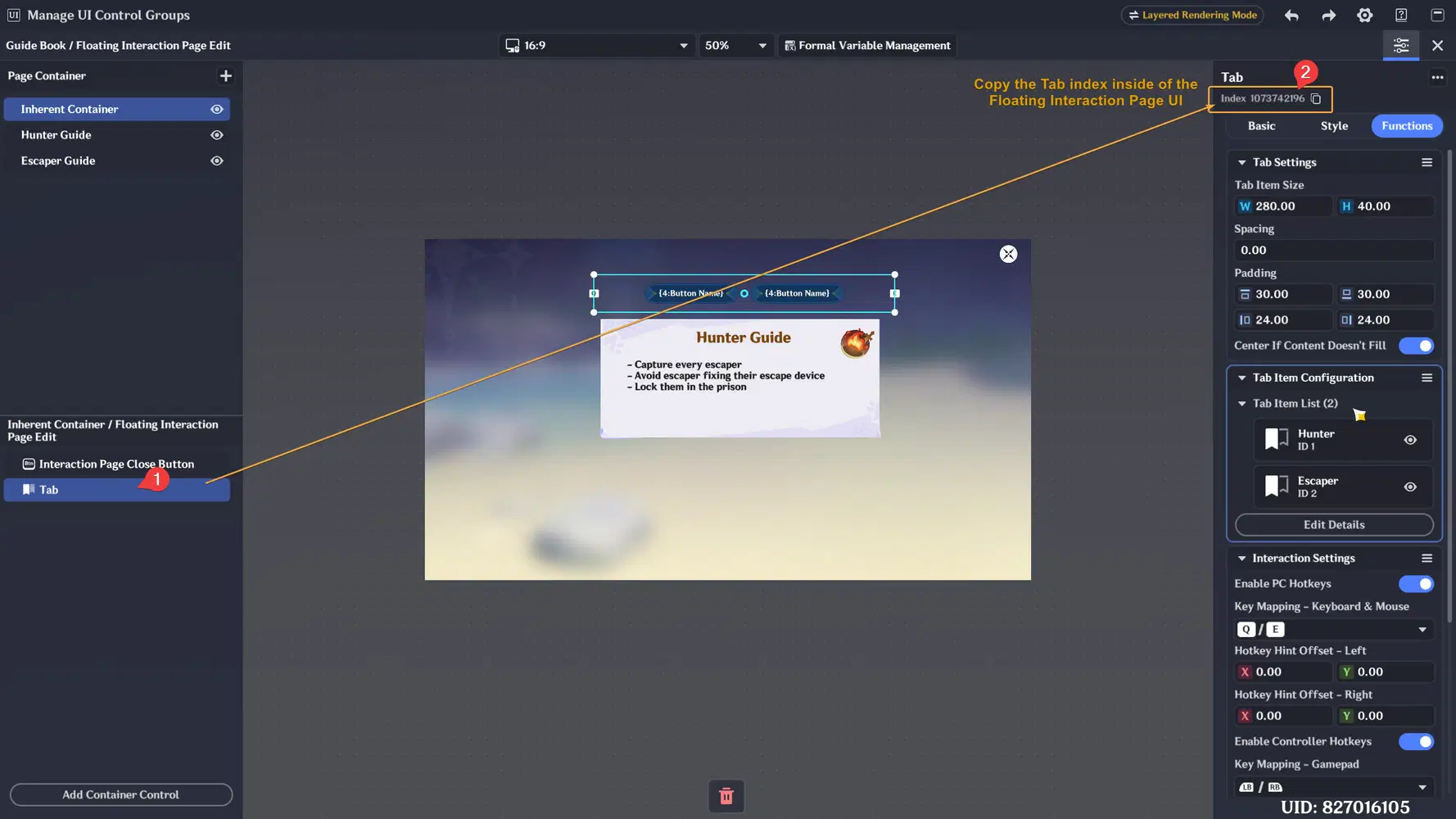
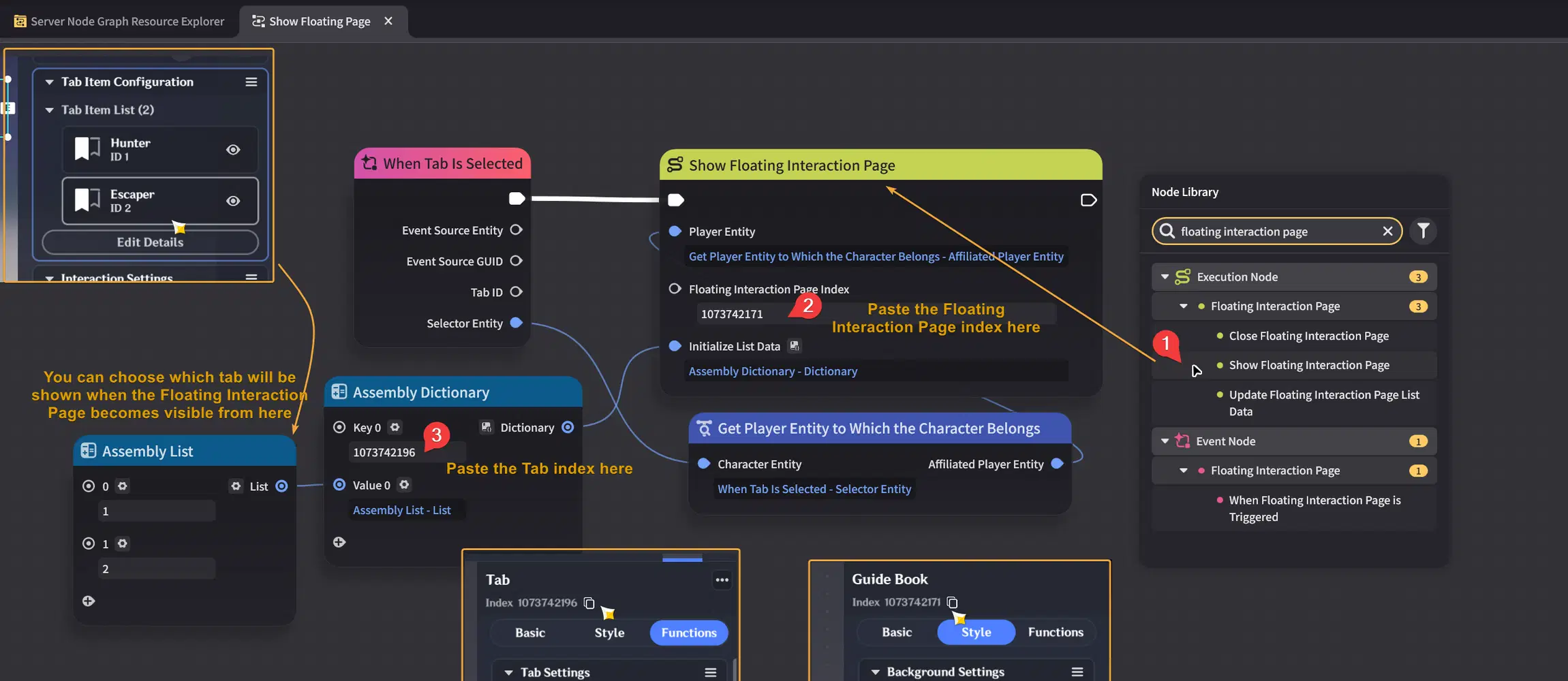
- The next step is showing the Floating Interaction Page to the player, but before doing that we need to copy the index Floating Interaction Page that we want to show first.
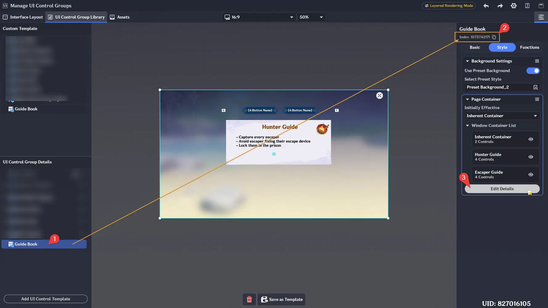
- You need to copy the Tab index inside of the Floating Interaction Page too
- Alright, now let's create new server node graph and use the "Show Floating Interaction Page" node to display our interface to the player
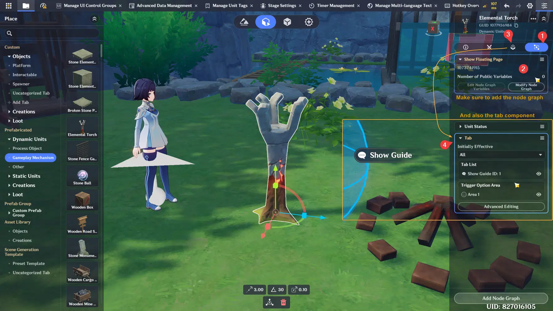
- After the node graph has been created, let's add it to an entity so we can easily interact for testing it
- Below is the result of this example. When player select Hunter tab, the Hunter page container will be shown and the Escaper page container will hide and vice versa.
Using List (Single-Choice Window)
Single-Choice Window almost works similarly to Tabs, but it is designed for interactive lists arranged in rows and columns. It also supports automatic wrapping and scroll bar when the list entries exceed the UI size, making it useful for creating dynamic and organized button lists.
For this example, we will create a simple interactive list using Single-Choice Window. When the player selects one of the list buttons, the selected button index will be stored inside a Player Variable and displayed on the UI. This is a simple way to understand how list interaction events work before using them for more advanced systems such as shops, inventories, or other game features.
- Alright, let's create new Floating Interaction Page for this Single-Choice Window example
- After creating new Floating Interaction Page, make sure to also add a Single-Choice Window for this example
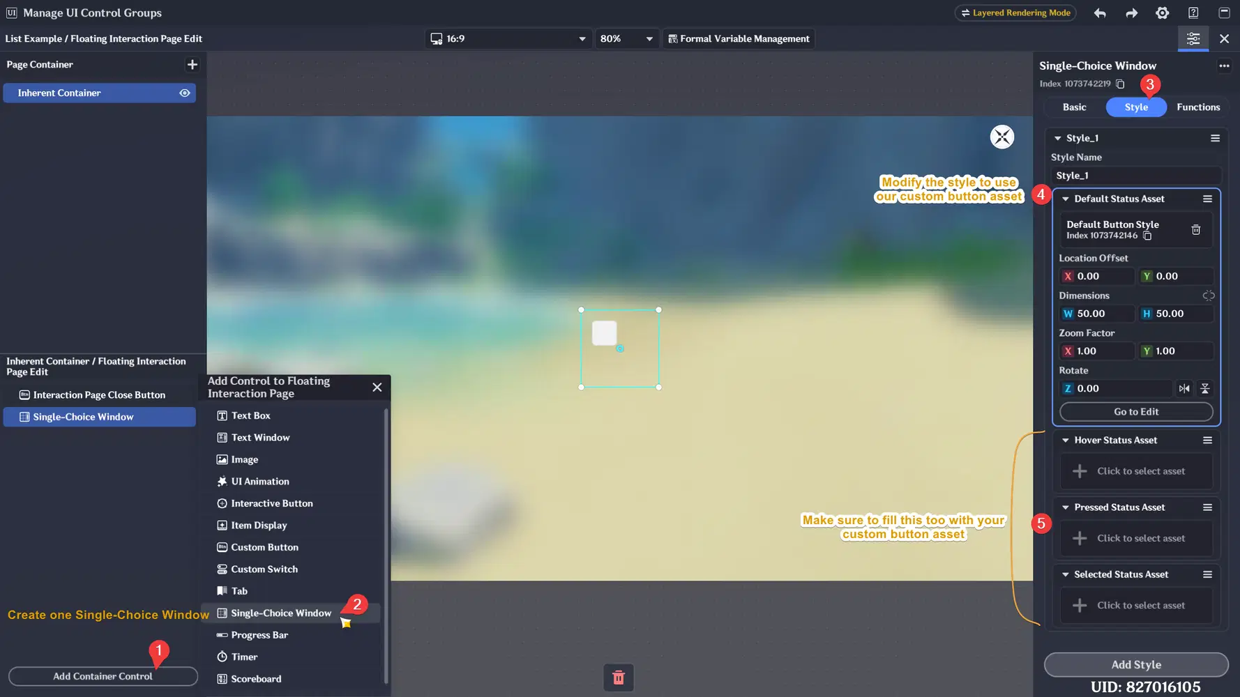
- Go to Functions tab and click Edit Details to add new button to the list
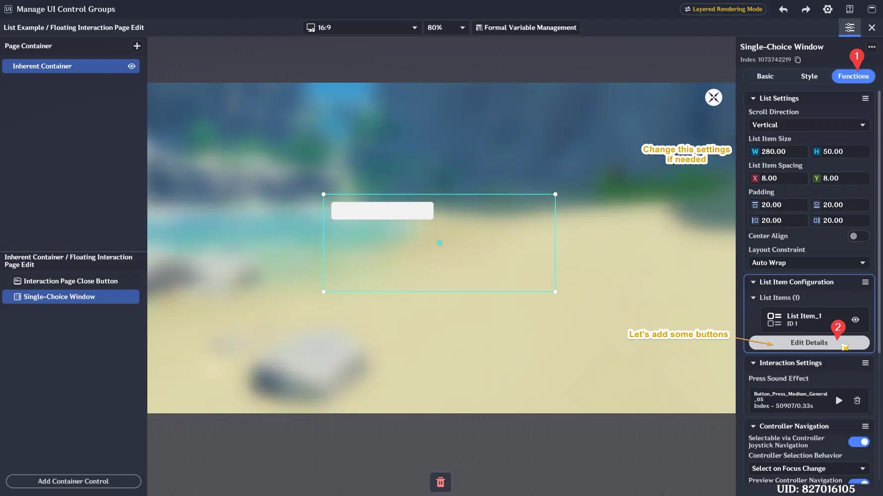
- Let's create 8 button, set the style, and create new formal variable so we can customize the button text
- Make sure to enable "Return to Server Event" so we can listen to the event when the player select a button. Then create a server node graph.
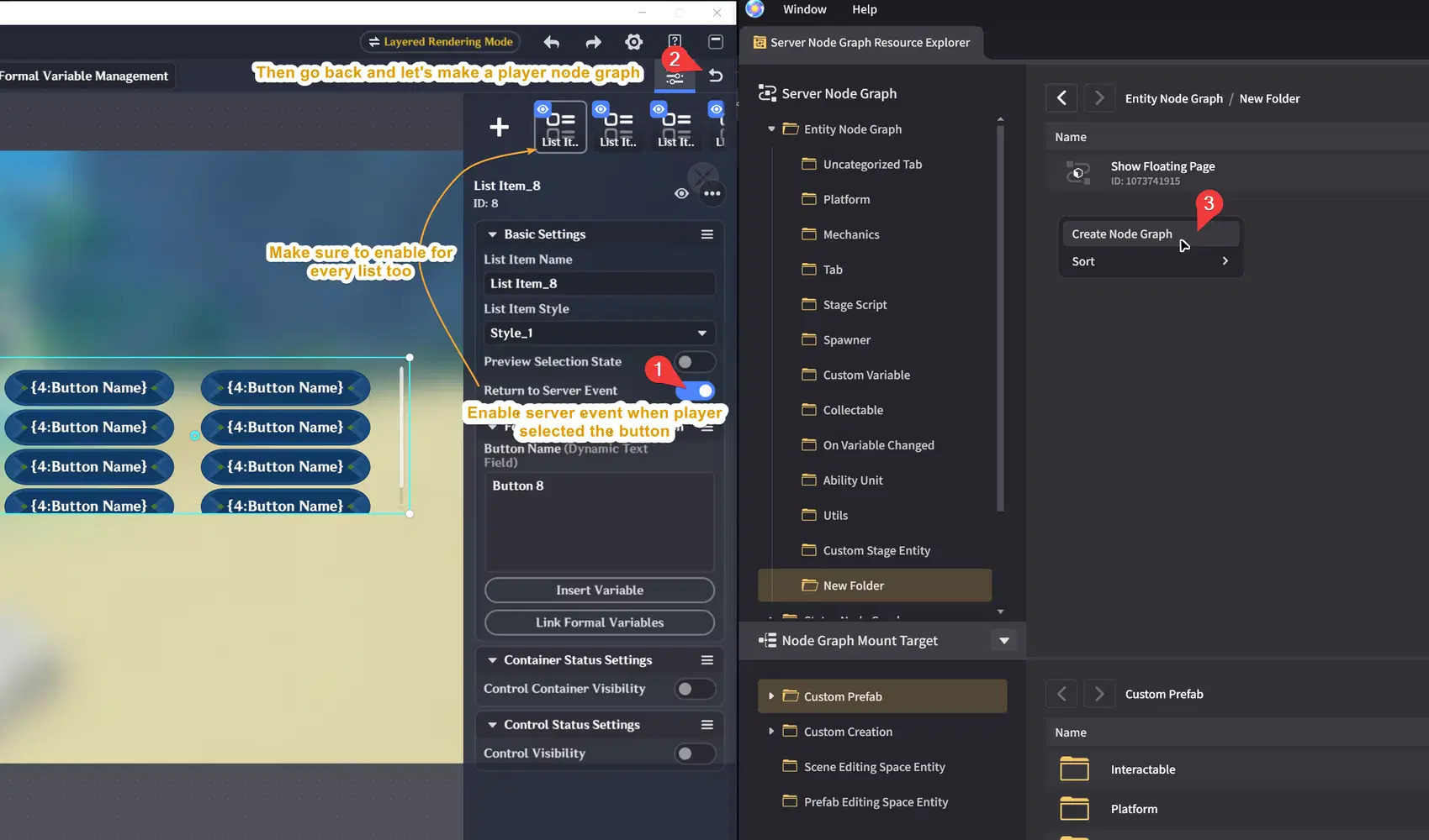
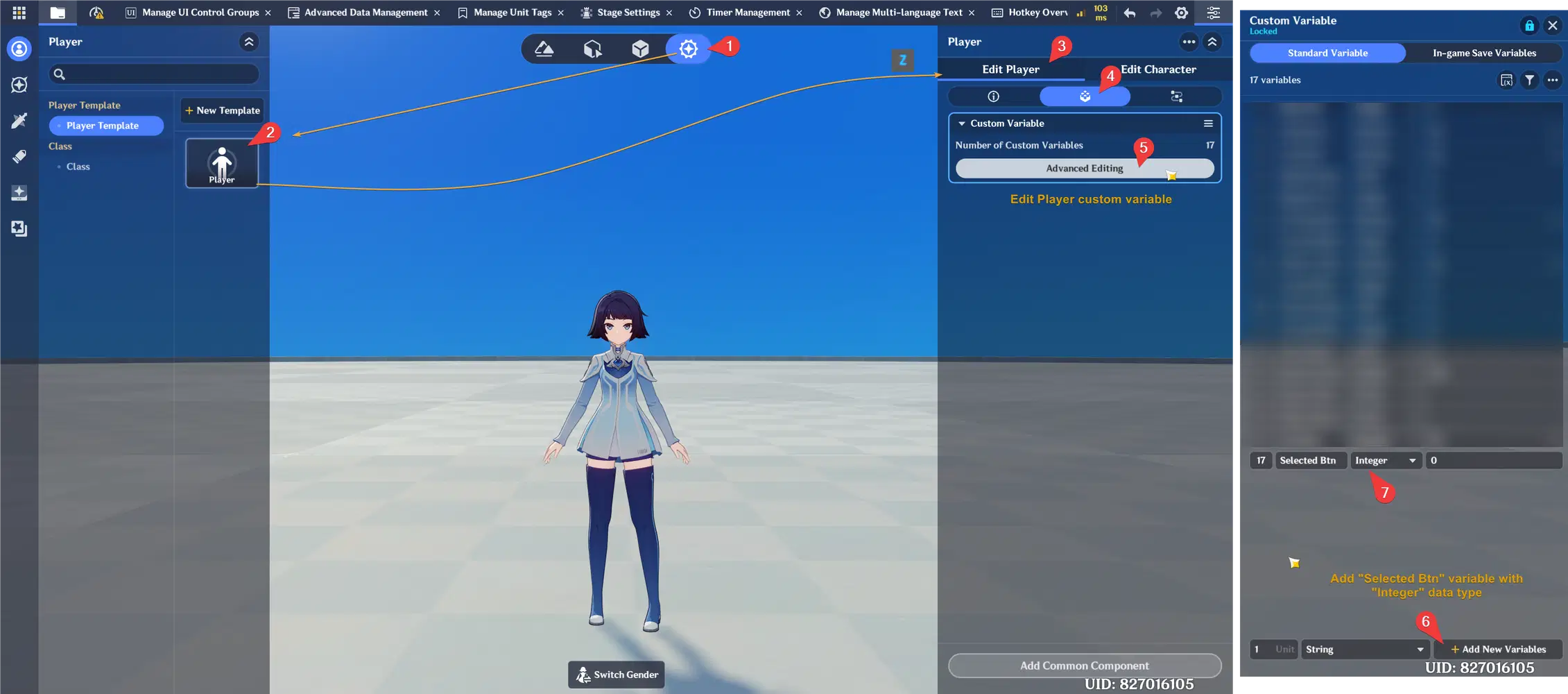
- But before continuing, let's first create a variable in the player's custom variable so we can store the data received from the event. For this example, I named the variable as "Selected Btn" with Integer data type.
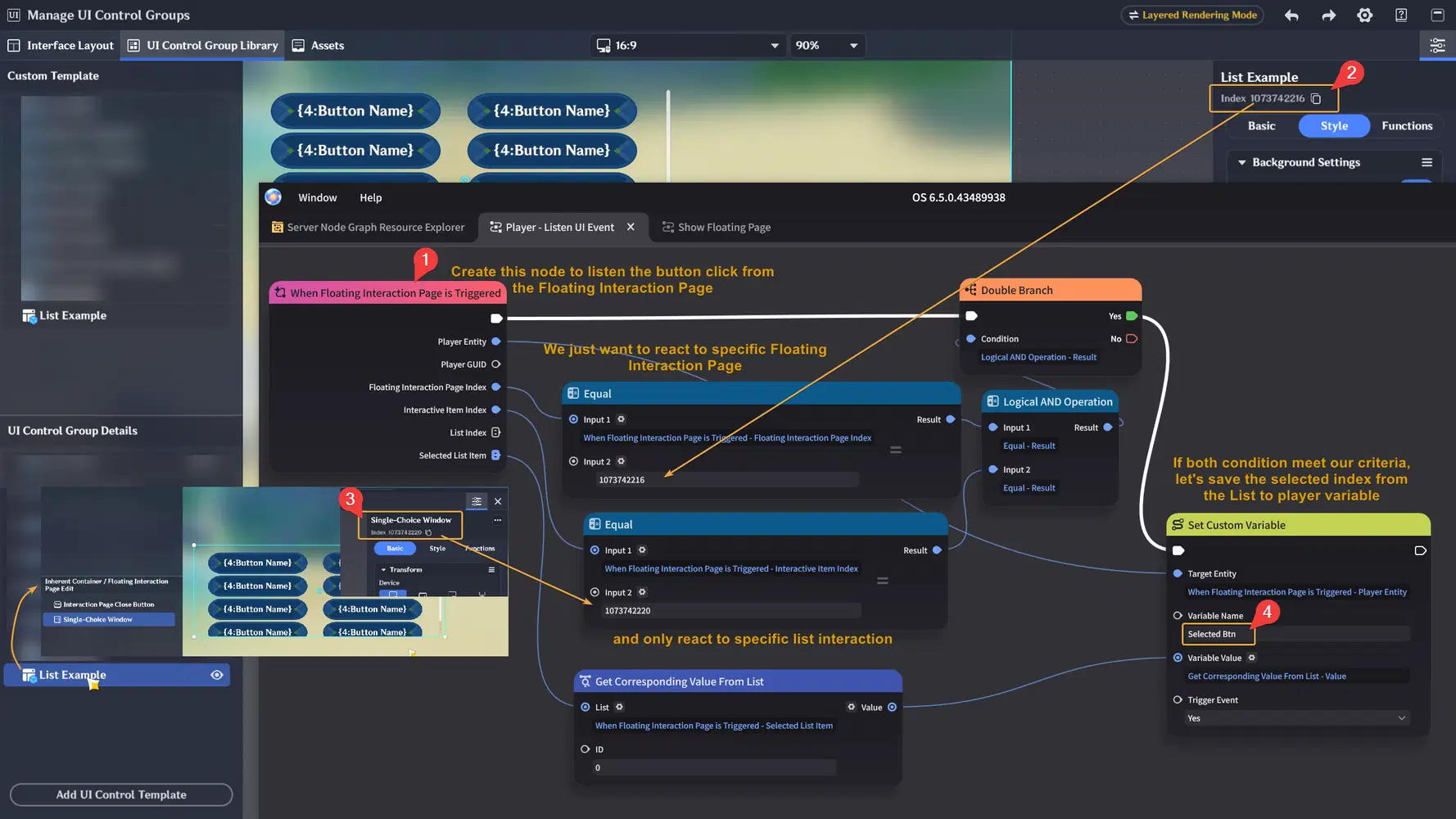
- After having the variable, let's create "When Floating Interaction Page Triggered" node in the node graph, and only set value to our variable if the event is from the example button list we've created earlier
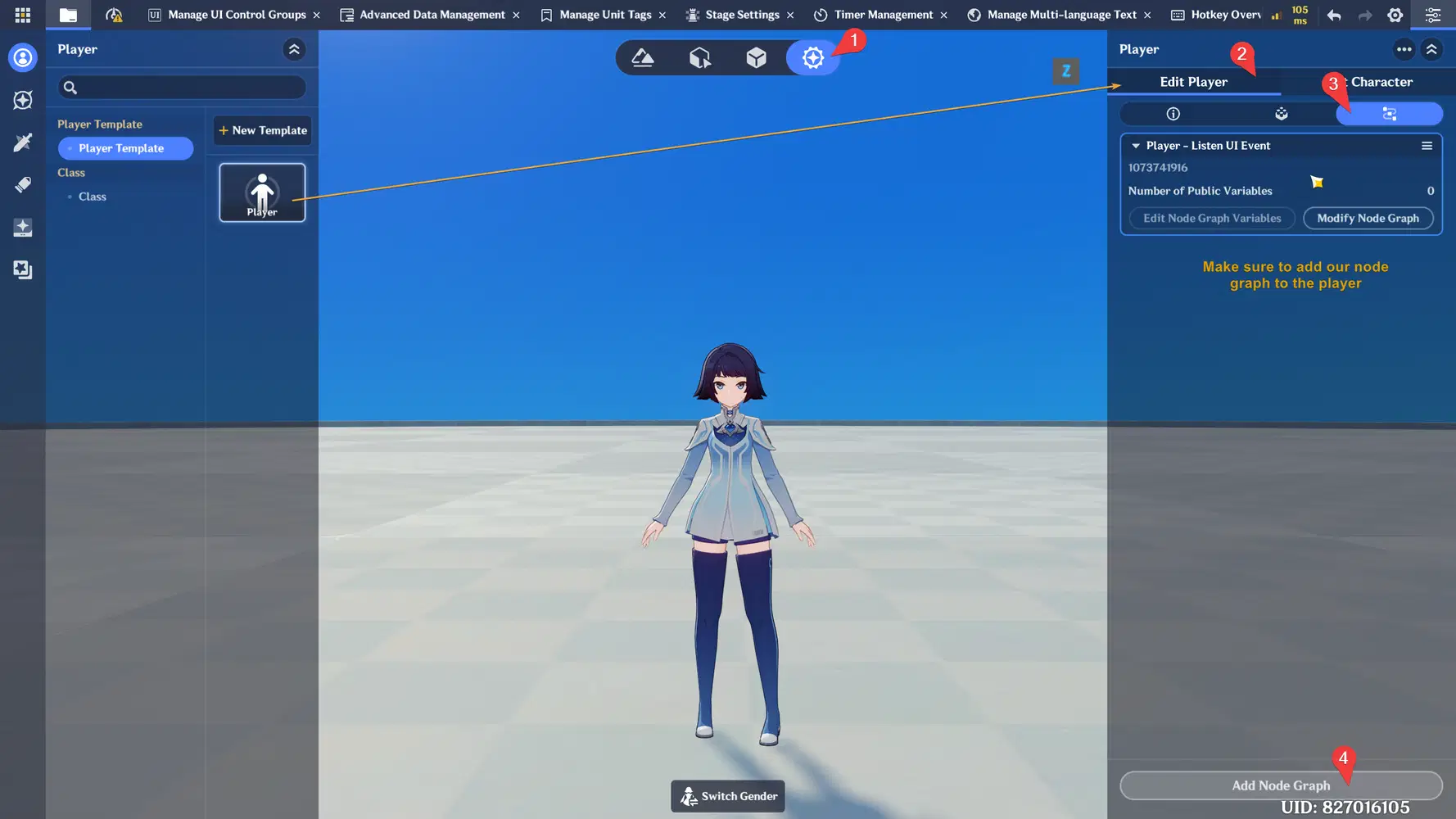
- After creating the node graph, make sure to add the node graph to the player
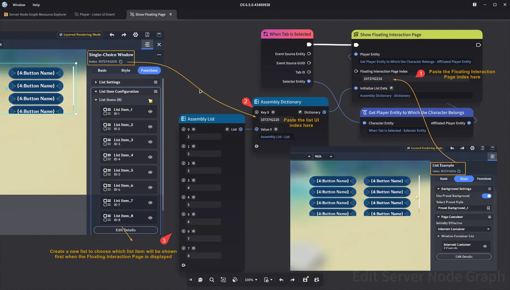
- Let's create another node to show our Floating Interaction Page. We also need to initialize the List Data so we can select which buttons will be displayed inside the Single-Choice Window after the Floating Interaction Page is shown.
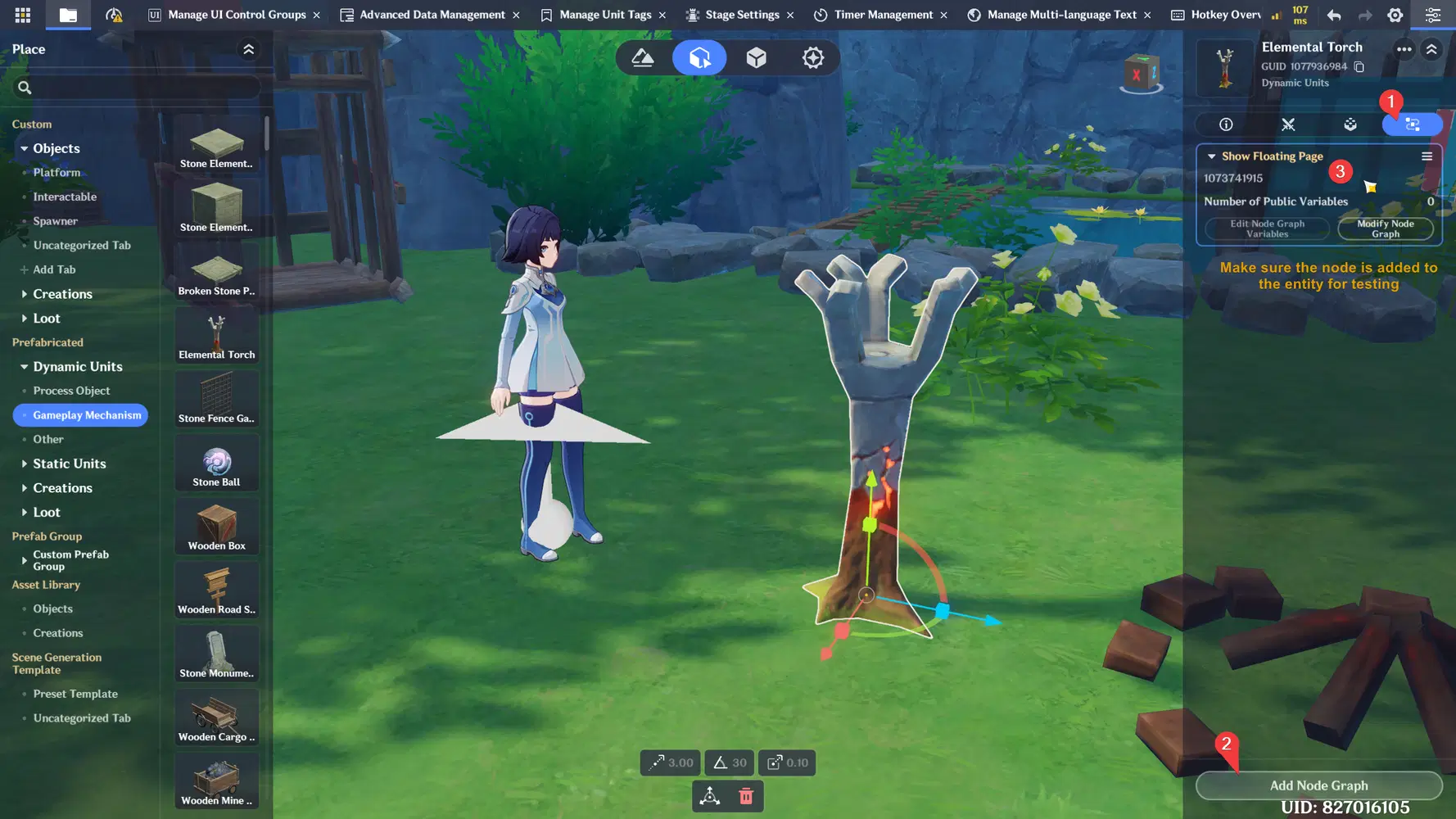
- Don't forget to add the node graph to a testing Entity, and make sure you have Tab component too so the player can easily interact to show the UI.
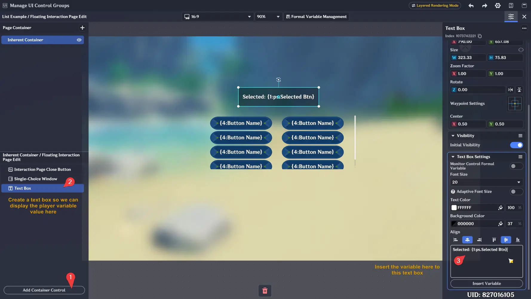
- Alright one last thing, we need to display the variable data stored in player's custom variable into the UI. In this example we can create text box, and reference our custom variable on the player into the Text Box. I previously named the variable as "Selected Btn", so I can insert the value to this Text Box with `{1:ps.Selected Btn}` .
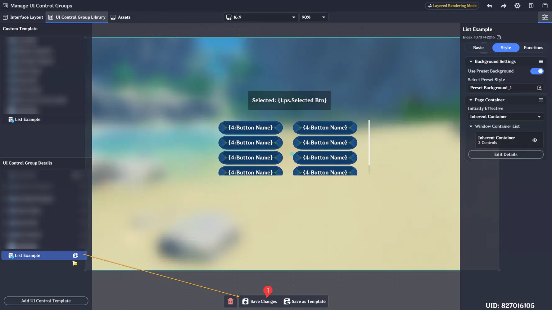
- Don't forget to save the changes before testing
- Below is the final result. The number in the text box changes every time we click the button. The clicked button send event to our node graph, and our node graph saved the button index to player's custom variable then we display the variable value in the text box.
Congratulations for following this guide until the end! Hopefully this guide will inspire and helps you better understand how to create UI in Miliastra Wonderland Editor and gives you ideas for creating your own custom interfaces in future projects.
Thank you for reading, and happy creating!