This guide will teach you how to design and implement Frontend interfaces in MW using new UI Control Groups, introduced in Luna VI

We will cover:
UI Control Group Management Changes
Assets Library
The New UI Control Groups
1. UI Control Group Management Changes
In the new Luna VI version, the UI Control Group Management system has received several improvements and changes.

1.1. Rendering Mode
A new Hierarchical Rendering mode has been added.
Previous versions used Sequential Rendering, which rendered UI Controls in their original creation order.
The new Hierarchical Rendering mode renders UI Controls based on their layer configuration instead. It is strongly recommended to use this new rendering mode when working with the new UI Control Groups.
If you continue using the old rendering mode, some UI Control Groups may display incorrectly. For example, Images may appear with large unwanted offsets.
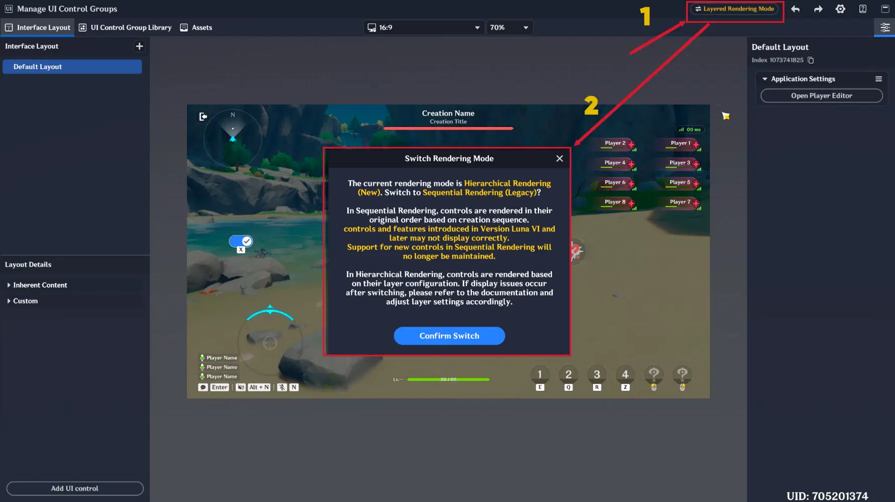
New Rendering Mode enabling
You can safely enable the new rendering mode in already existing stages. It will not affect or break UI created in previous versions.
1.2. Sync Information to All Devices Switch
You no longer need to manually select the Transform tab and press “Sync Information to All Platforms”.
A new “Sync Information to All Devices” switch has been added and is enabled automatically by default.
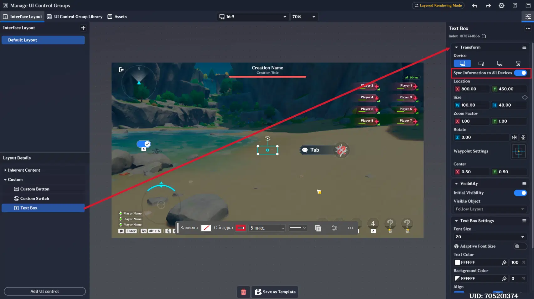
Sync Information to All Devices switch
1.3. Increased Zoom
The maximum zoom level has been increased by 400%.
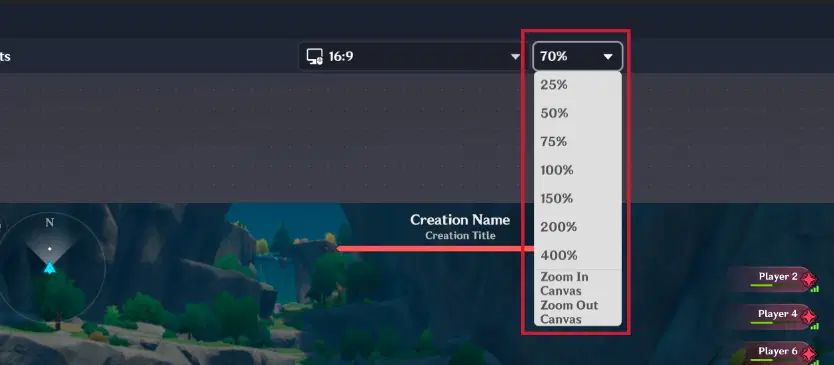
Zoom
1.4. Additional Transform Tab Settings
The new version introduces three additional configuration settings in the Transform tab.
1.4.1. Zoom Factor
The Zoom Factor setting allows you to scale the content of a UI Control Group inside its boundary box without changing the boundaries themselves.
This makes it much easier to align UI Control Groups in the viewport.
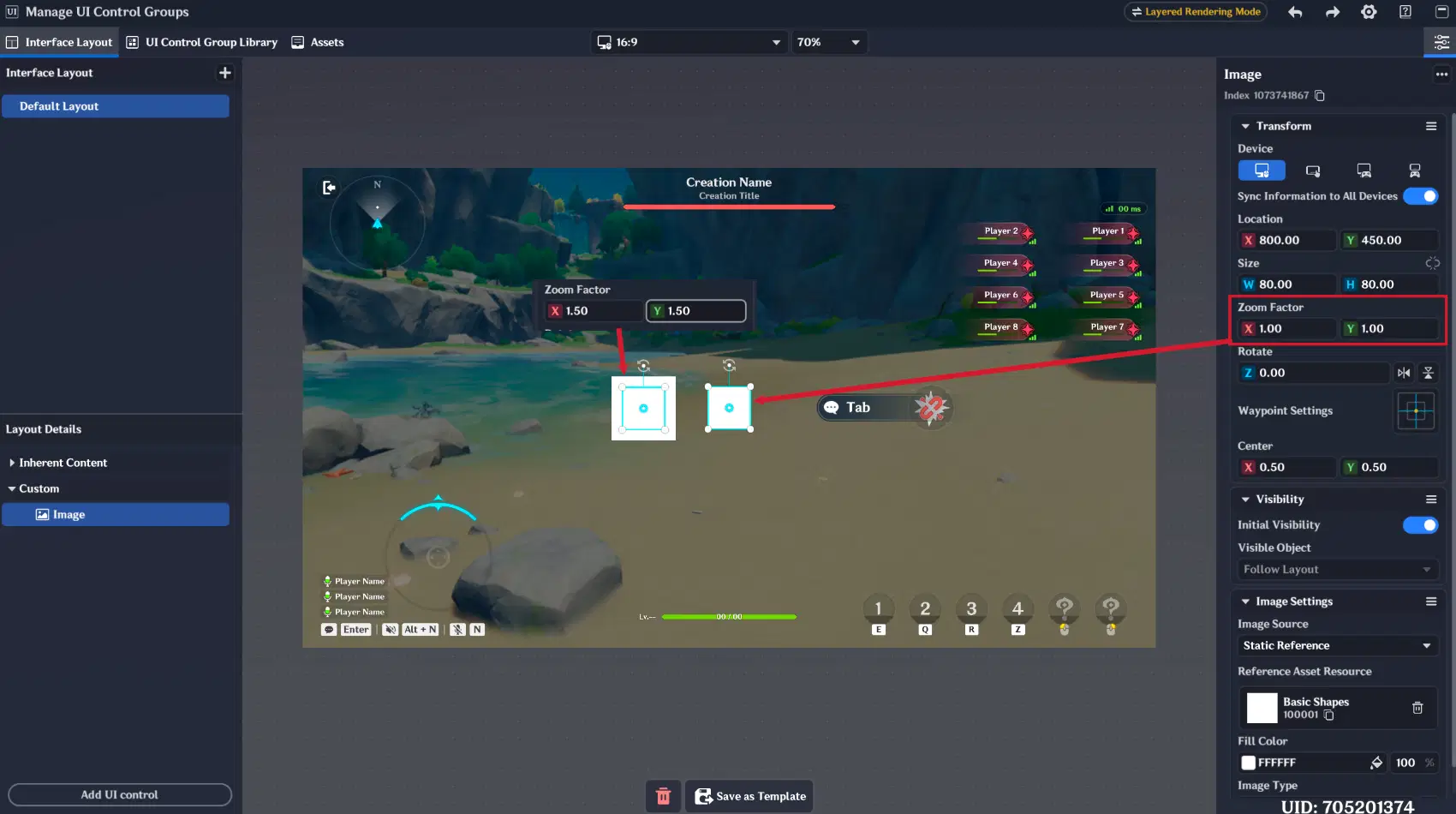
UI Control Group's Zoom Factor
For example, in previous versions you often had to manually adjust both the font size and the boundary box size to display UI Control Groups correctly. After that, aligning different UI Control Groups required additional manual positioning, because even identical Location values could still result in misalignment due to different boundary box sizes.
With the new Zoom Factor setting, this problem is solved much more conveniently.
1.4.2. Rotate
You can now rotate almost every UI Control Group based on your needs. Additionally, UI elements can now be mirrored horizontally or vertically.
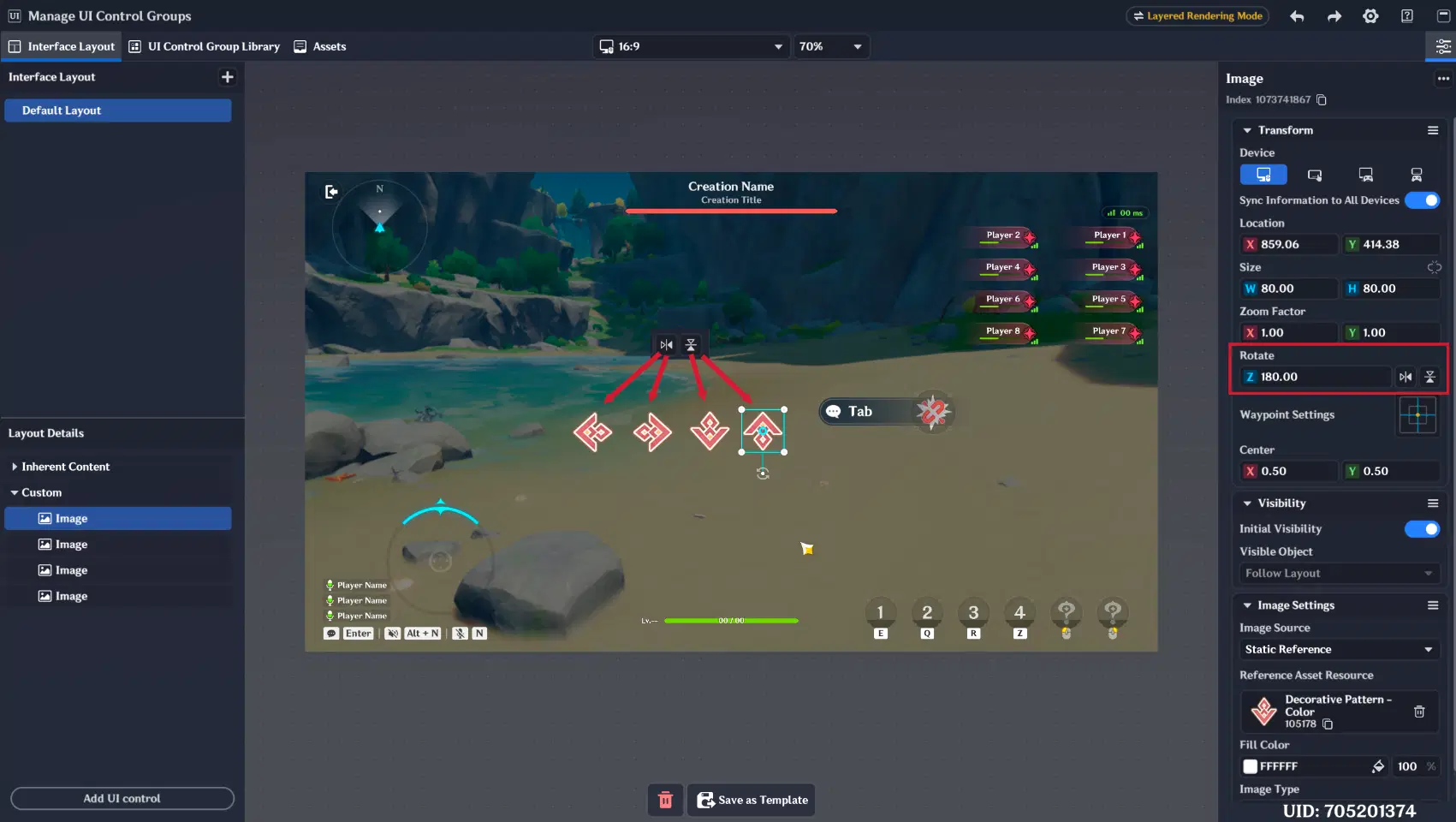
Rotate configuration
This is especially useful for frontend interface implementation.
For example, progress bars can now be mirrored, allowing their fill direction to change depending on the selected mirror orientation.
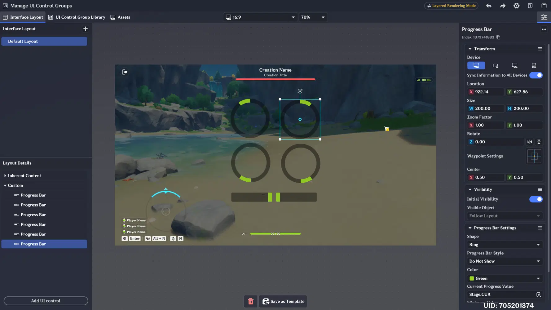
Progress Bar Mirror examples
1.4.3. Center
Most UI Control Groups now include a configurable center point.
This center point is used as the reference point for rotation and mirroring operations.
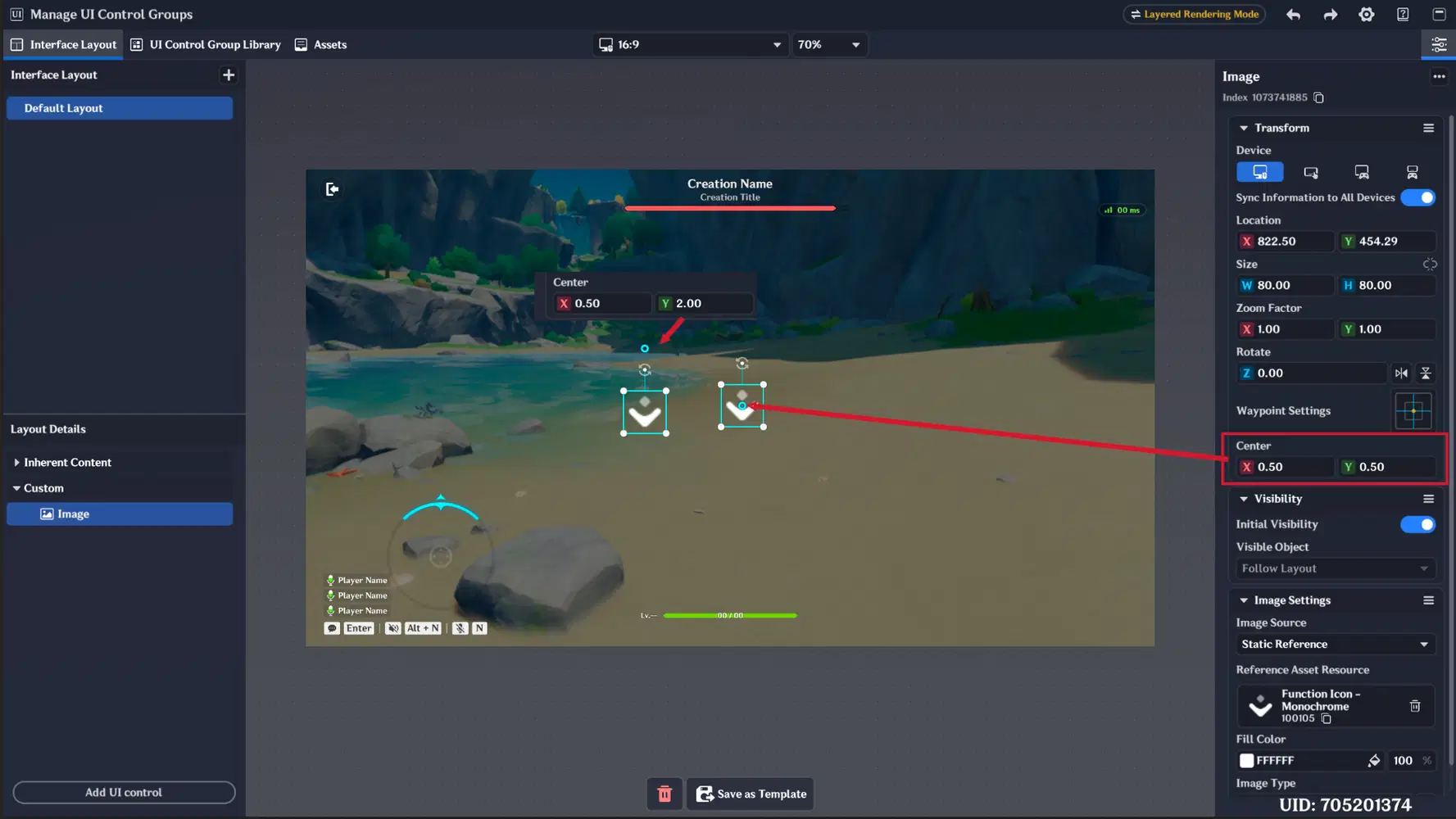
UI Control Group Center point
2. Assets Library
A new “Assets” tab has been added to the UI Control Group Management. This feature allows you to create custom assets and use them later inside the Image UI Control Group.

Asset Library
In previous versions, you had to manually combine multiple Text Boxes and create UI combinations. However, this approach did not guarantee correct in-game rendering, and UI Control Groups could appear with offsets or misalignment compared to how they were positioned in the UI Management viewport.
With the new Assets Library, you can now combine multiple UI Control Groups into a single image-like asset and display it as one unified element in the interface. This removes previous issues related to positioning offsets and inconsistent rendering.
Supported UI Control Groups
The Assets system currently supports the following UI Control Groups:
- Text Box
- Image (new)
- UI Animation (new)
- Special Number (new)
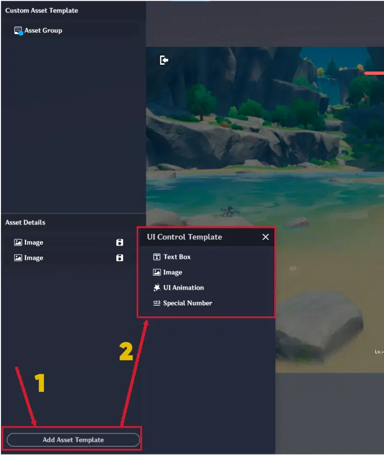
Available Assets UI Control Groups
Asset Group Creation
After you finish assembling your image, you need to create an Asset Group and save it as a template. This process generates an Asset Index, which allows the asset to be used in UI.
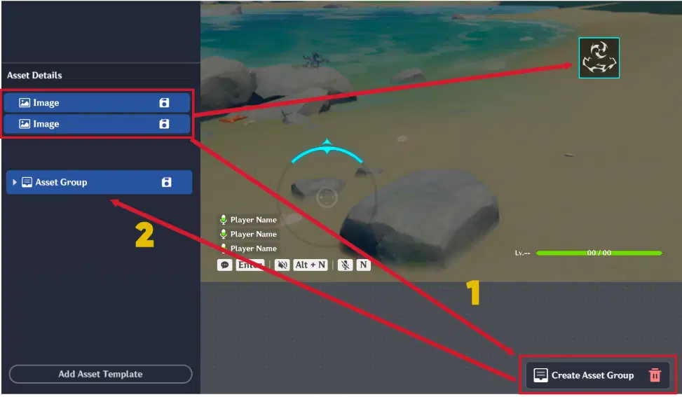
Asset Group Creation
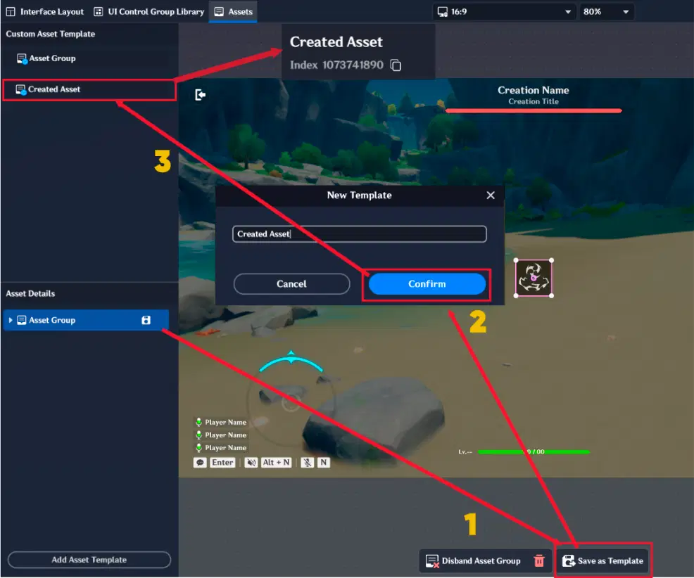
Custom Asset Template creation
Mask System
You can also apply a mask to your Asset Group. This is useful when you want to hide unnecessary parts of an image and only display specific areas.
At the moment, two mask types are supported:
- Circle
- Rectangle
Each mask can be configured using:
- Position (relative to the center point)
- Size
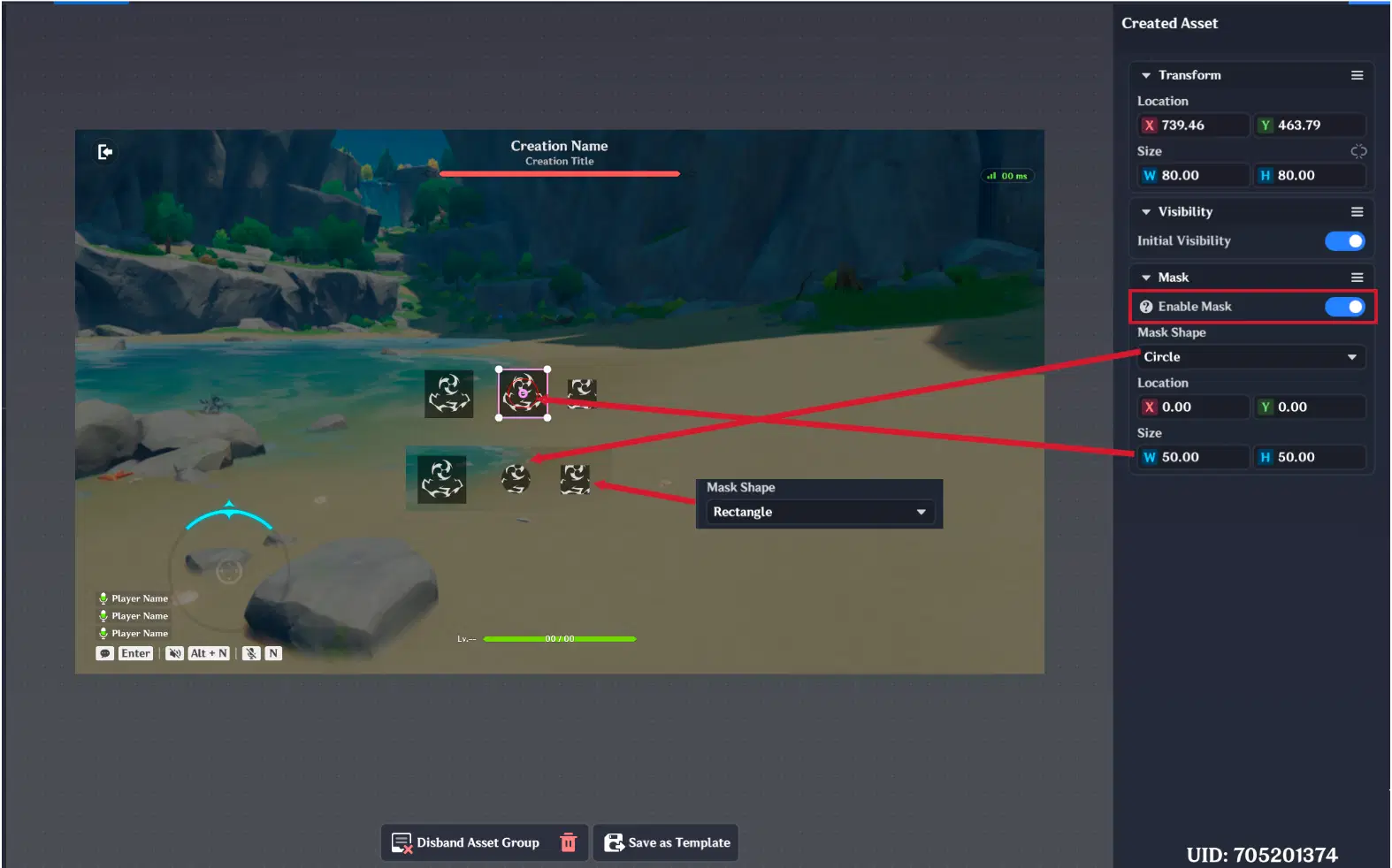
Asset Group Mask
Saving and Using Assets
Once you save the Asset Group as a template, it will appear in the Custom Asset Templates, where it can be selected and changed, if necessary.
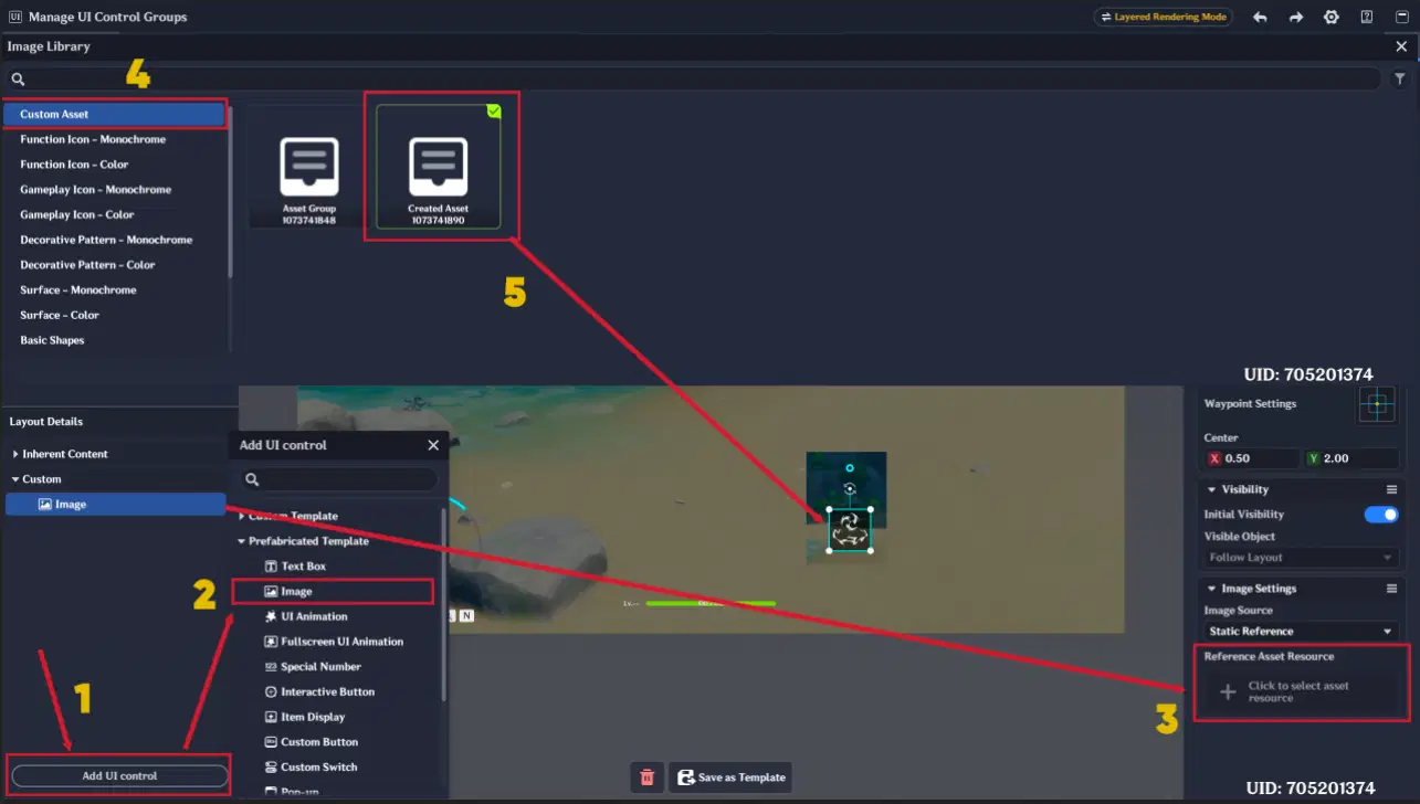
Custom Asset Usage in Interface Layout
3. New UI Control Groups
3.1. Image
The new UI Control Group is designed for displaying images from the Image Library, ranging from monochrome assets to full-color images, including icons and pattern-based visuals.
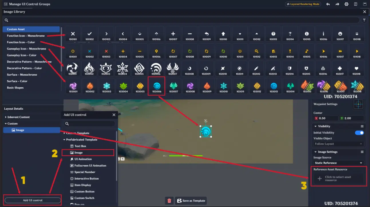
Image creation and Image Library content
It includes a new tab called “Image Settings”, where you can configure the image source.
Image Source Options
You can choose one of the following sources:
- Static Reference
- Selects a fixed image directly from the Image Library.
- Dynamic Reference
- Binds an Asset ID variable. The variable must be predefined on the Stage or Player Entity.
- Item
- Binds an Item Config ID variable. Must be predefined on the Stage or Player Entity.
- Equipment
- Binds an Equipment Config ID variable. Must be predefined on the Stage or Player Entity.
- Skill
- Binds a Skill Config ID variable. Must be predefined on the Stage or Player Entity.
- Unit Status
- Binds a Unit Status Config ID variable. Must be predefined on the Stage or Player Entity.
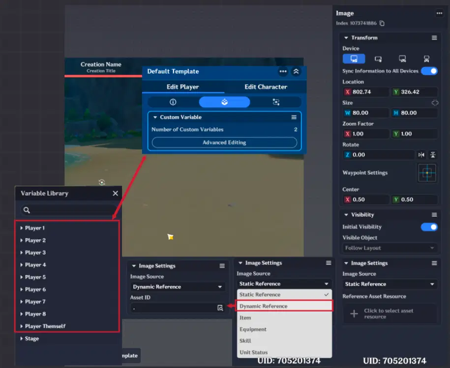
Image Settings configuration
3.2. UI Animation
The new UI Control Group is designed for displaying UI animations. It supports both looping and non-looping animations.
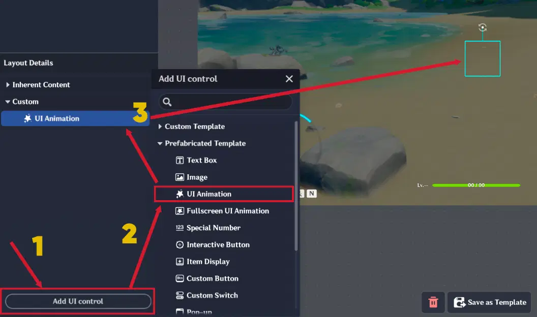
UI Animation
It includes an additional tab called “UI Animation Settings”, where you can:
- Select UI Animation
- Enable/disable UI Animation sound effects (note: not all animations have SFX)
- Set Layer placement (Above All Controls / Below All Controls)
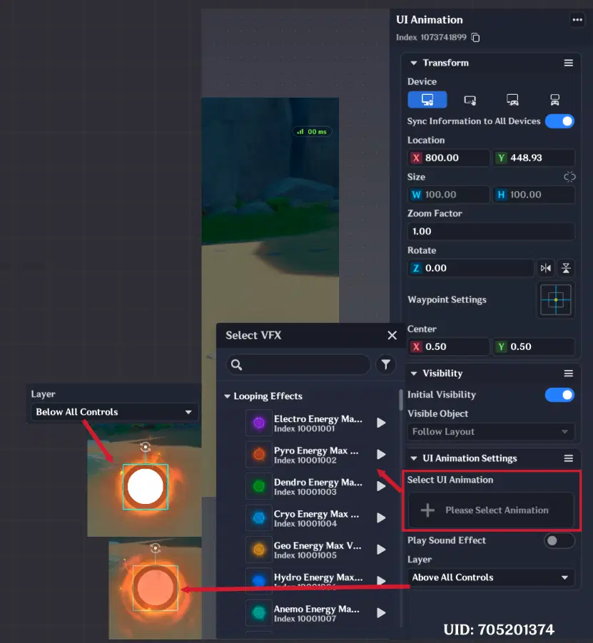
UI Animation Settings
Execution Node: Play UI Animation on Control
A new execution node called “Play UI Animation on Control” has been introduced. This node allows you to replay a UI animation after it has finished.
For example, if you trigger a non-looping animation and it ends, you can use this node to restart it without removing and re-adding the UI Animation.
This works with indexes in both Interface Layout and the UI Control Group Library.
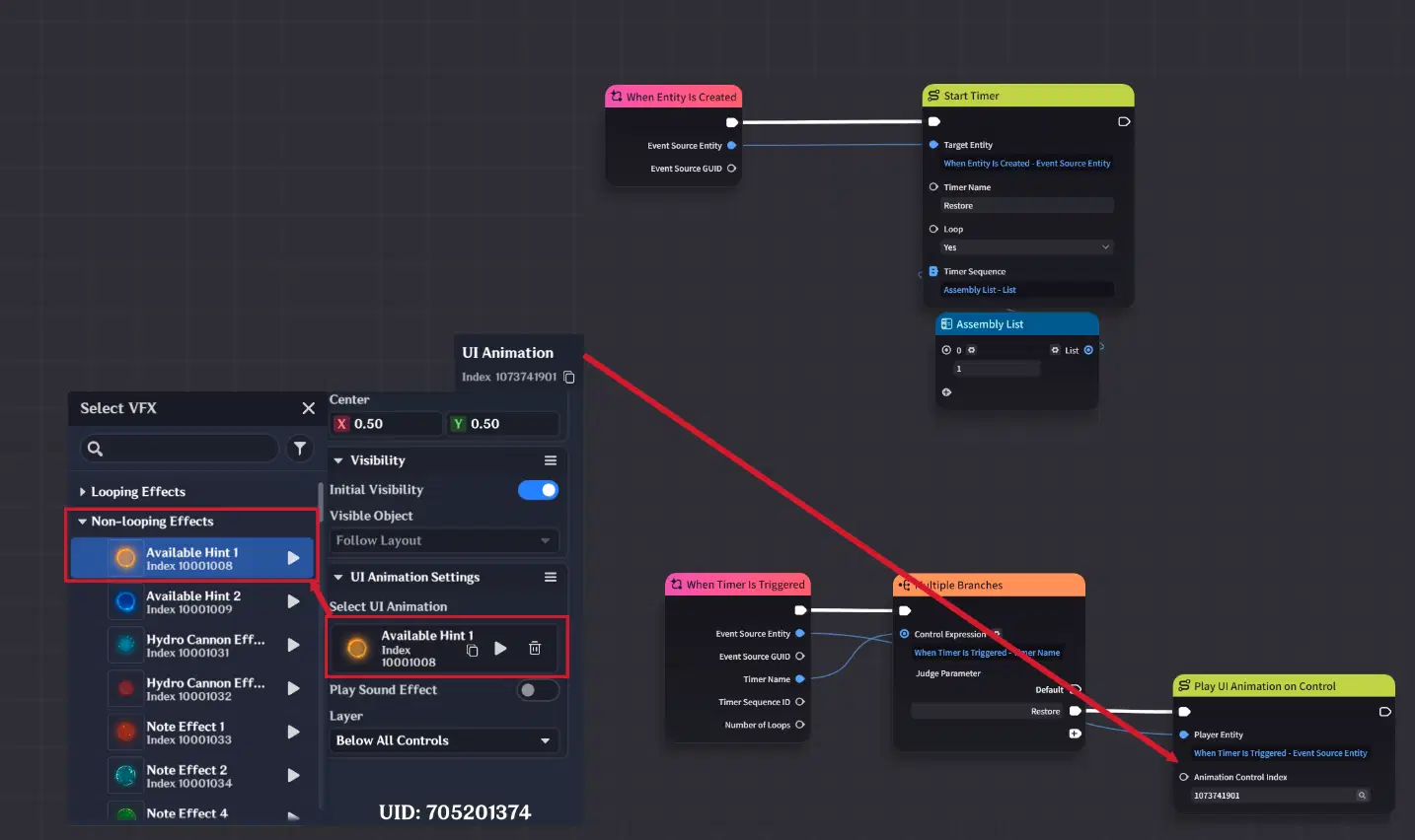
UI Animation configuration and Node Graph Set up
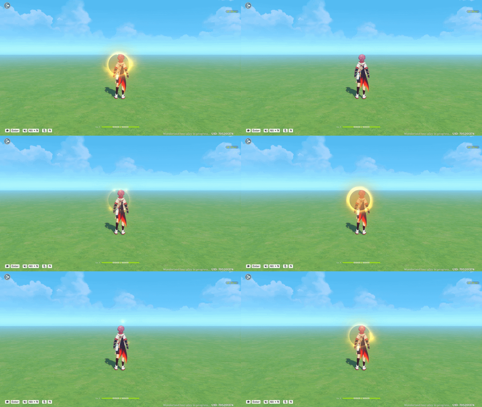
UI Animation showcase
3.3. Fullscreen UI Animation
The new UI Animation Control Group is designed for displaying full-screen animations. It supports both looping and non-looping playback modes.
This UI Control Group can only be created and configured inside the UI Control Group Library.
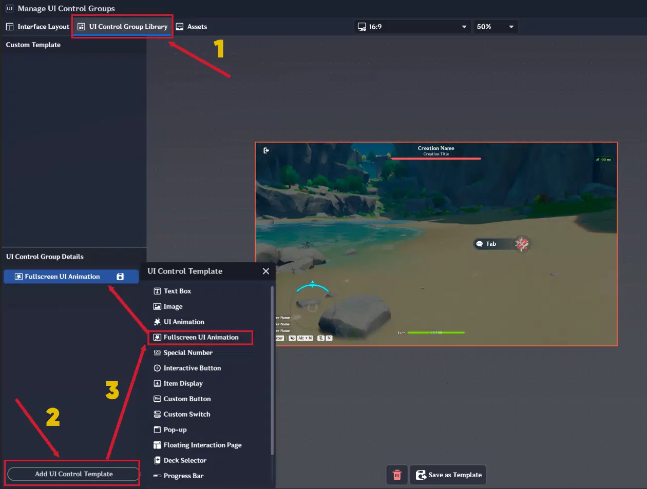
Fullscreen UI Animation
Available Settings
- Select UI Animation
- Toggle sound effects
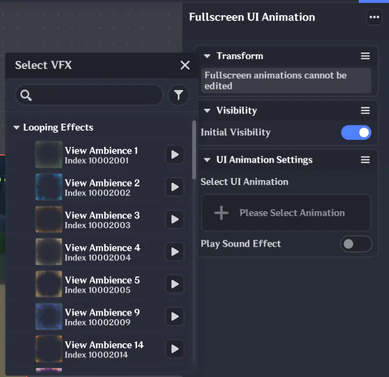
UI Animation Settings
It also supports the same execution node “Play UI Animation on Control”.
3.4. Special Number
The new UI Control Group is designed to display Skill-related data directly in the UI.
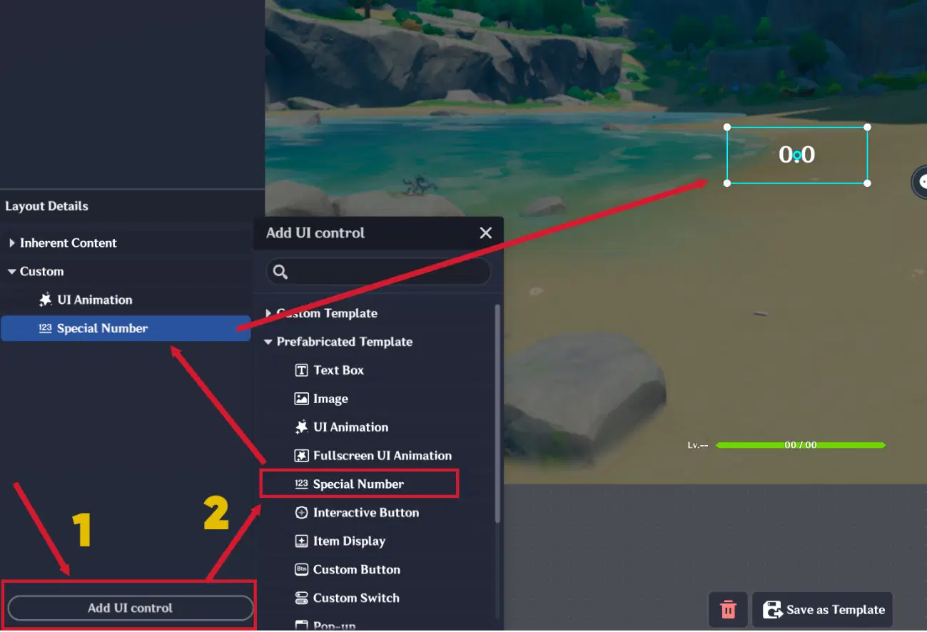
Special Number UI Control Group
It includes an additional tab called “Special Number”, where you can configure the following options:
Configuration Options
- Select the Skill Slot you want to monitor
- Choose the type of data content to display:
- Skill remaining cooldown time
- Skill usage (seconds)
- Skill resources
- Skill availability
- Select the time unit (seconds / minutes / hours)
- Configure font size and text alignment / position
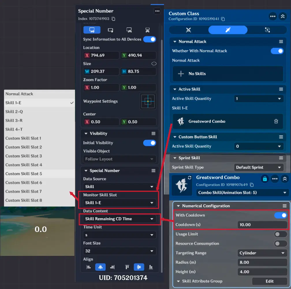
Special Number configuration
3.5. Custom Button
The new UI Control Group allows you to create fully customizable buttons using the Image Library.
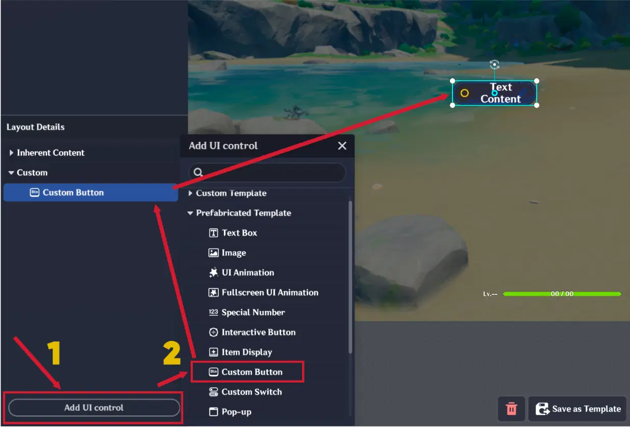
Custom Button
It consists of three main sections:
- Basic
- Style
- Functions
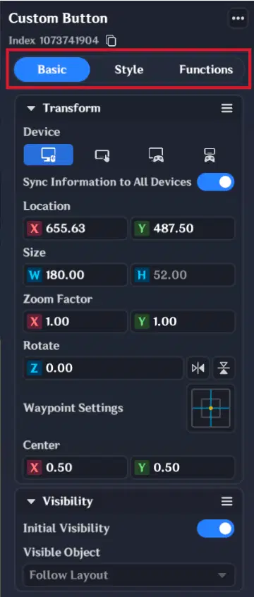
Custom Button Sections
3.5.1. Basic Section
This is the default section. It contains only standard settings such as:
- Transform
- Visibility
No additional configuration tabs are included here.
3.5.2. Style Section
This section is used to define the visual appearance of the button. You can choose between two modes:
- Preset Style
- Custom Style
Preset Style
If Preset Style is selected, you can:
- Choose from 10 predefined styles
- Select a button icon from the Image Library
- Configure button text and/or insert variables
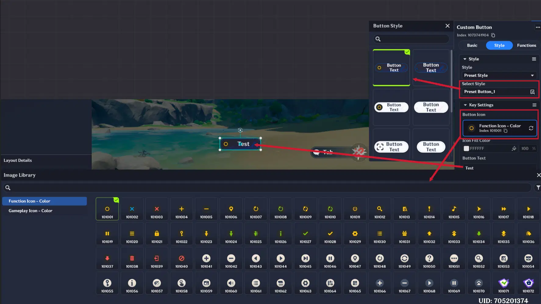
Preset Style settings
Custom Style
If Custom Style is selected, you can manually configure each button state:
- Default state asset
- Hover state asset (when player hovers over the button with the mouse)
- Pressed state asset (when player presses button)
- Unavailable state asset (only for skill buttons)
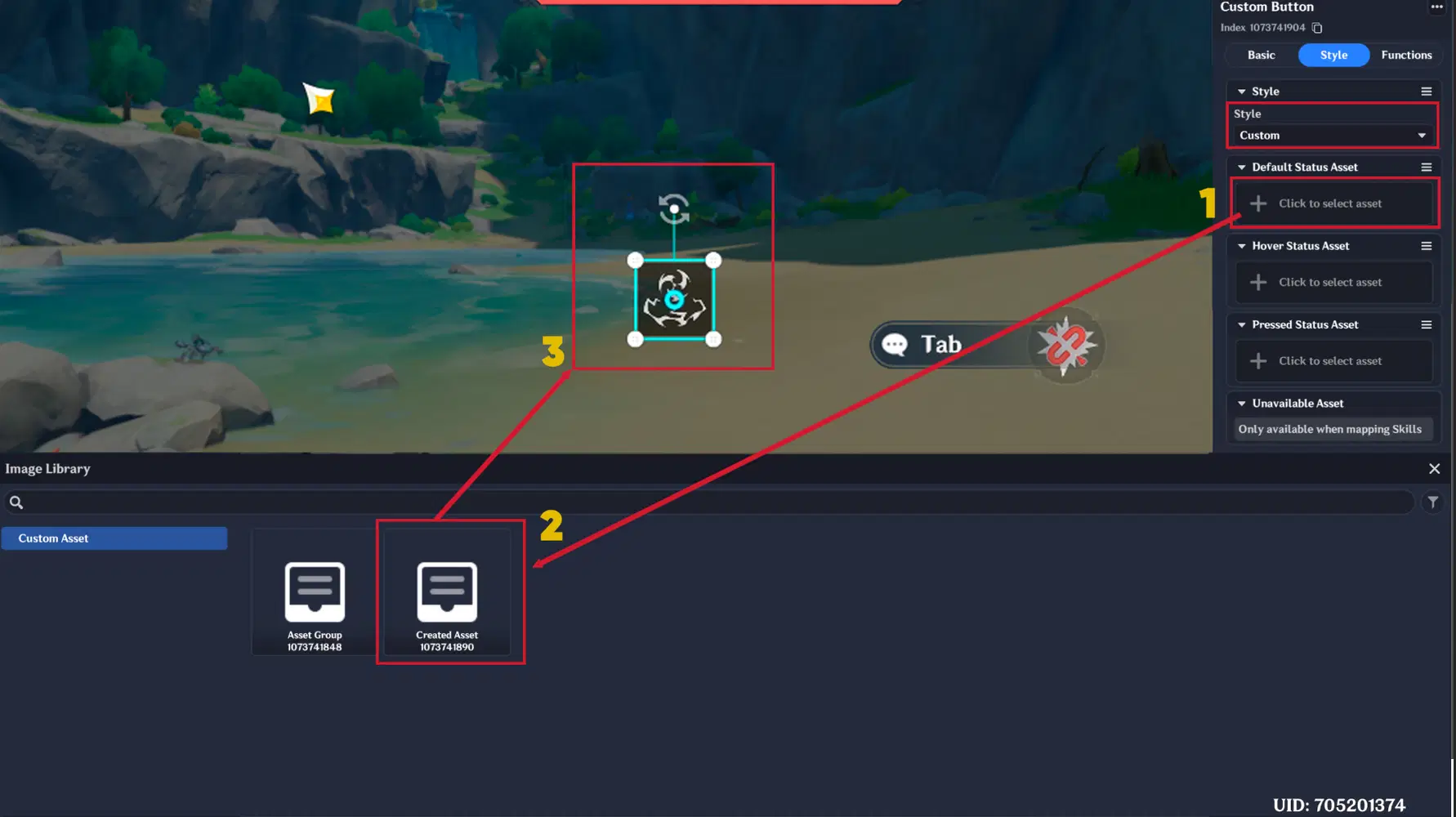
Custom Asset Selection
For each state asset, you can adjust:
- Position offset
- Size (dimensions)
- Zoom factor
- Rotation
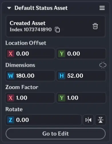
Custom Button State Configuration
3.5.3. Functions Section
This section defines the button behavior and interaction logic:
- Key type selection:
- Interactive event
- Skill
- Item
- Button cooldown (CD)
- Key mapping for keyboard and gamepad
- Key hint offset settings
- Sound effect on press
- Option to enable/disable mouse or touch interaction
- Click area configuration:
- Match button size
- Custom click area size
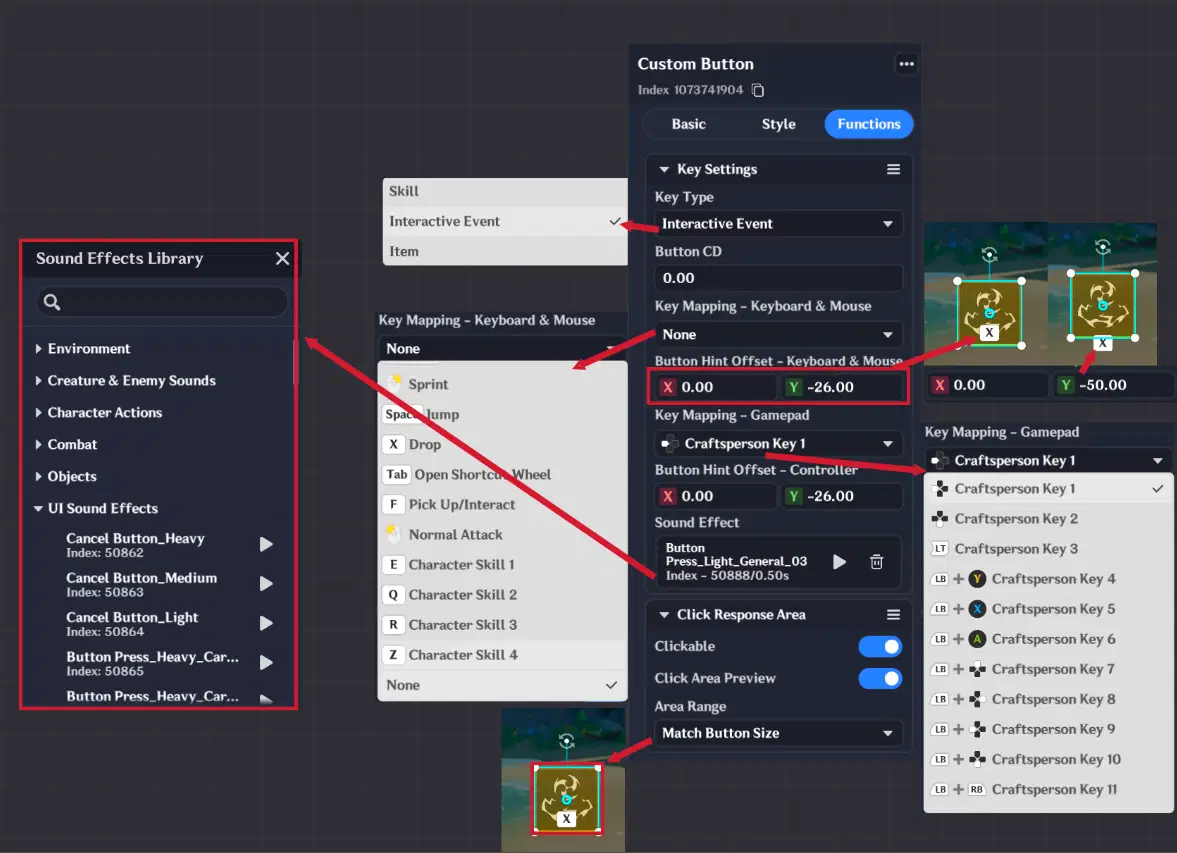
Custom Button "Functions" Settings
3.6. Custom Switch
The new UI Control Group is similar to the Custom Button, but is designed to handle only two states: ON / OFF.
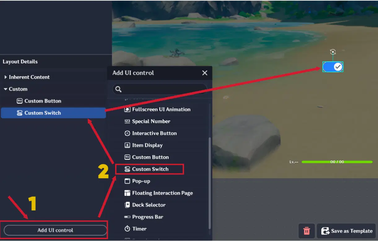
Custom Switch
It uses the same three sections as the Custom Button:
- Basic
- Style
- Functions
Style Section Difference
Instead of custom button states button states, the switch uses 6 states:
- 3 for Enabled state asset
- 3 for Disabled state asset
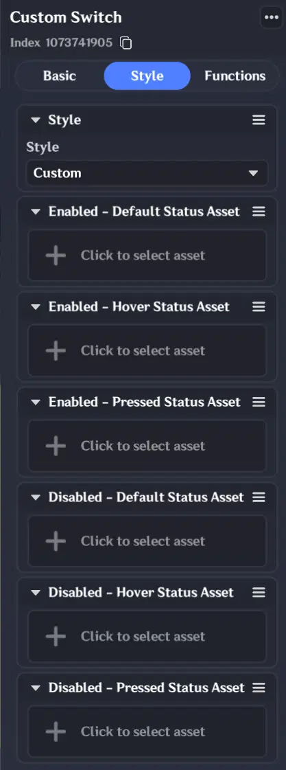
Status Assets for Custom Switch
Functions Section Addition
In the Functions section, you must also assign a Boolean variable, which is attached to the Player Entity.
This variable controls the ON/OFF state of the switch and determines its current status in the UI.
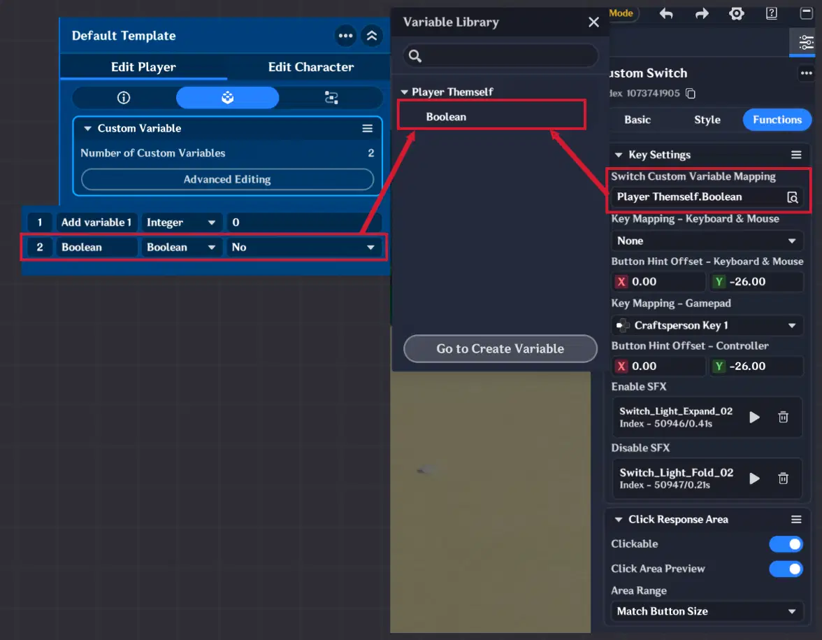
Custom Switch Variable Mapping
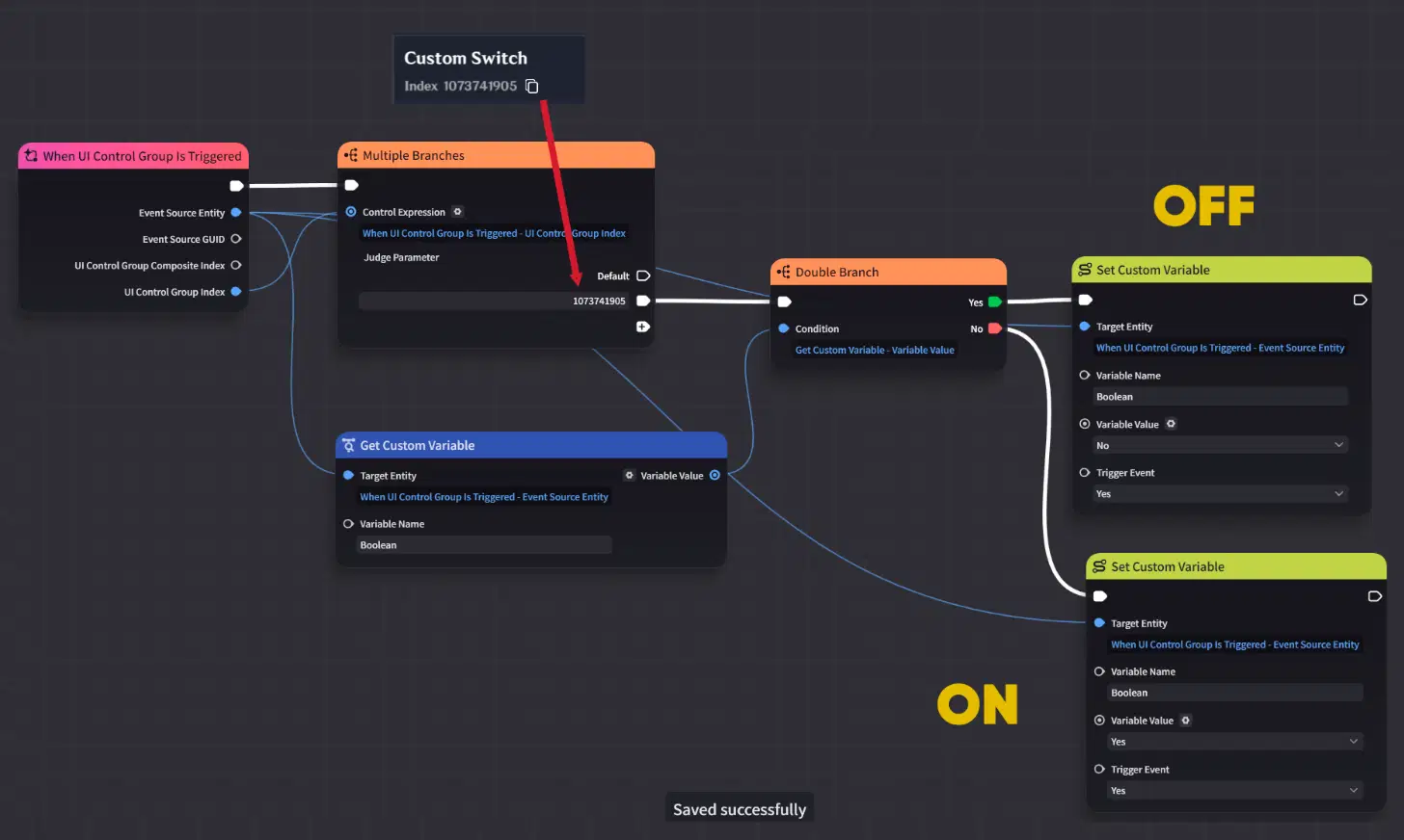
Custom switch node graph logic
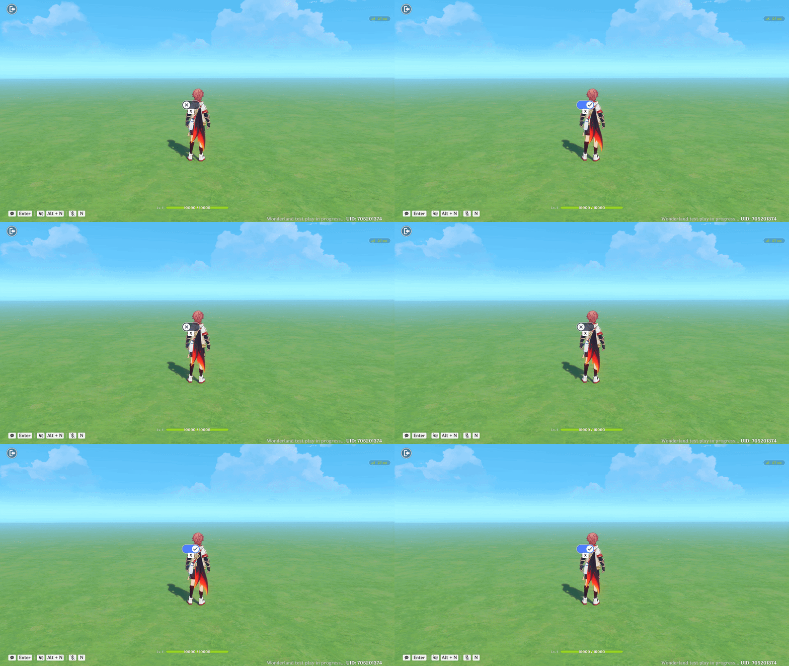
Custom Switch showcase
4. Floating Interaction Page
The Floating Interaction Page is separated from other UI Control Groups due to its large number of features and complexity. It is designed for creating fully custom fullscreen interaction pages and can only be created in the UI Control Group Library.
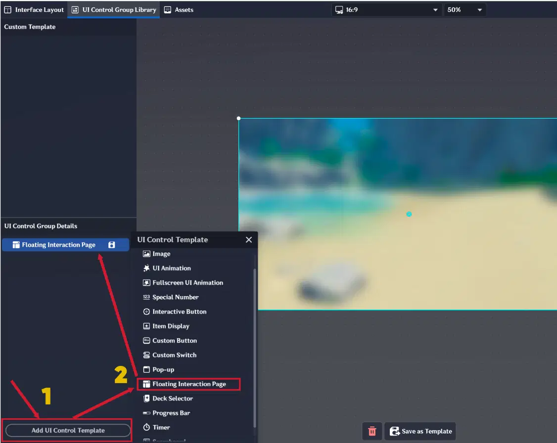
Floating Interaction Page
It contains three main sections:
- Basic (default)
- Style
- Functions
4.1. Style Section
In the Style section, you can configure the visual and structural behavior of the page:
- Enable or disable Preset Background (3 preset backgrounds are available)
- Select initially active containers
- Manage containers themselves
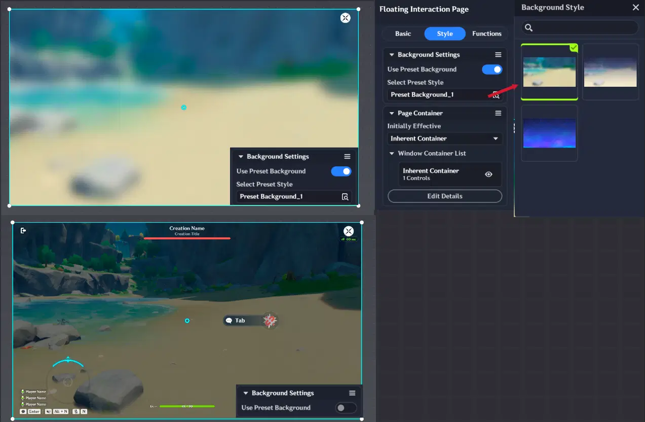
Floating Page Style Section
In this context, a Container represents an individual page that the player will see when the Floating Interaction Page is displayed.
By selecting “Edit Details”, you open the Floating Interaction Page Editor, where you can:
- Add or delete page containers
- Note: inherent containers cannot be renamed or deleted
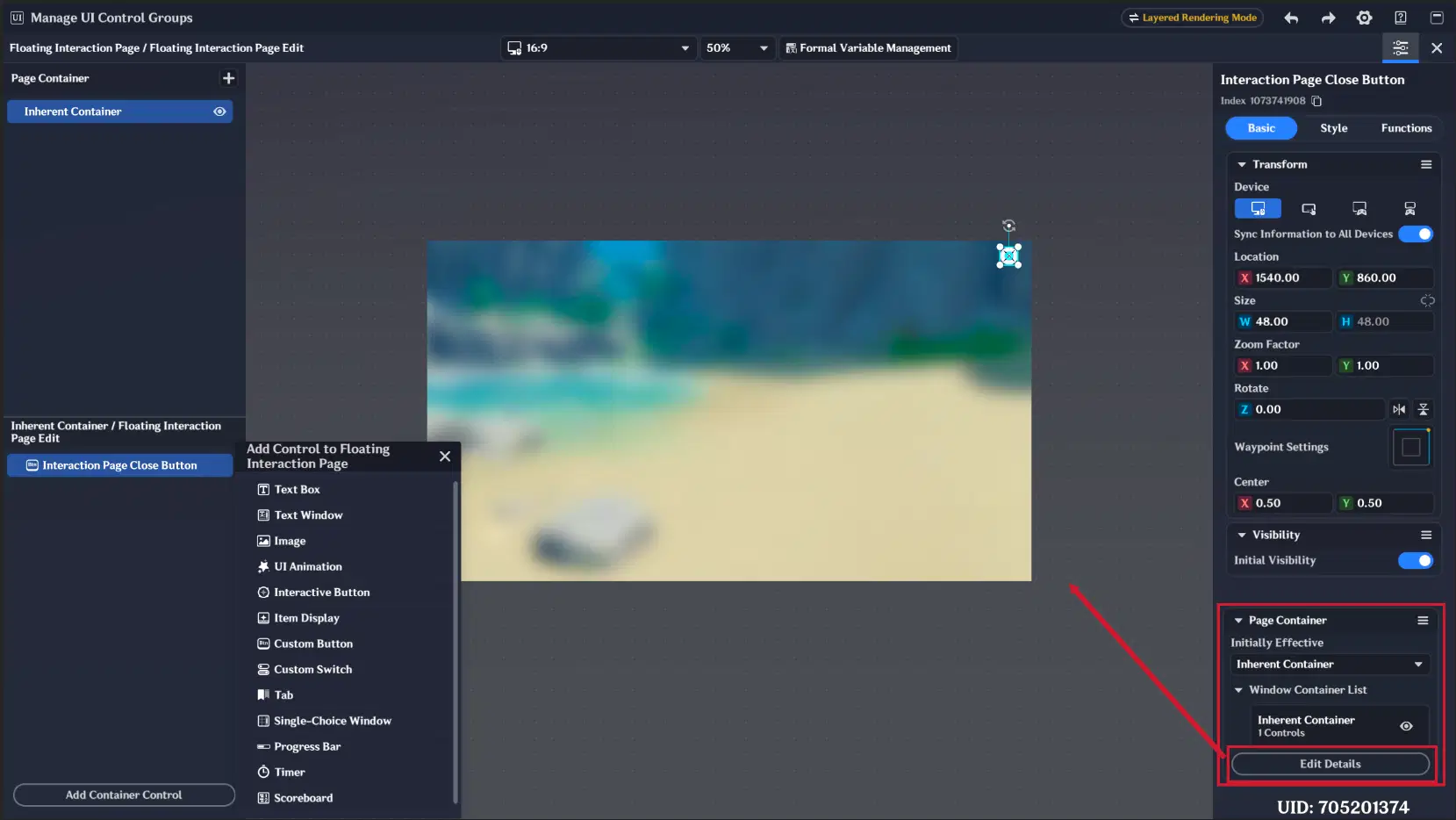
Floating Page Editor
Note: Default Page Close Button can't be deleted. If you disable button Initial Visibility players still be able to close floating page by pressing ESC.
Container Content
Inside each container, you can place any available UI Control Group from the UI Control Group Library, except:
- Deck Selector
- Fullscreen UI Animation
In addition, several new UI Control Groups are available specifically for this system:
- Text Window
- Tab
- Single-Choice Window
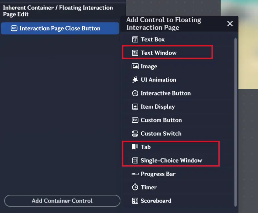
Floating Page new UI Control Groups
4.1.1. Text Window
The Text Window works similarly to a Text Box but includes an additional tab called “Controller Navigation”, where you can:
- Enable selection via controller joystick
- Select controller navigation hint style
- Define navigation links to the nearest controls in all directions (left, right, up, down)
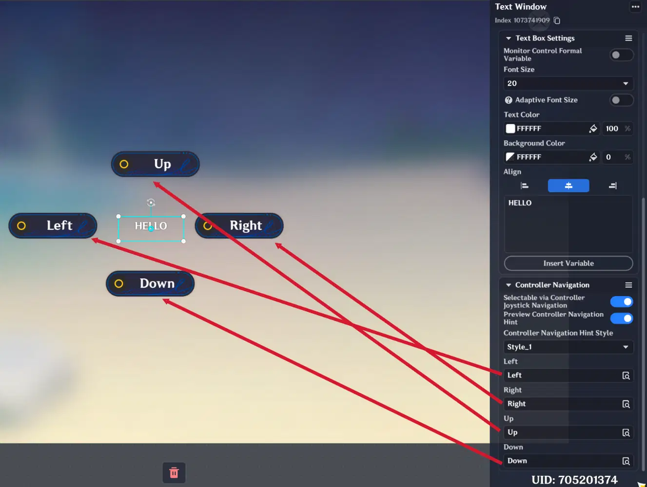
Text Window Settings
If the text is too long to fit inside the boundary box, scrolling options will automatically appear, allowing the user to scroll the text up and down.
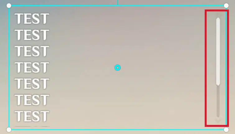
Text Window scrolling option
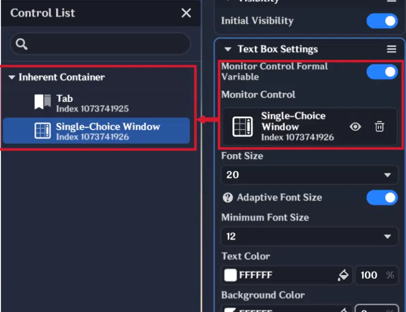
This UI Control Group also includes a “Monitor Control Formal Variable” switch. When enabled, the text window can dynamically display values from other UI Control Groups — for example, the option currently selected in a Single-Choice Window.
Monitor Control Formal Variable
4.1.2. Tab
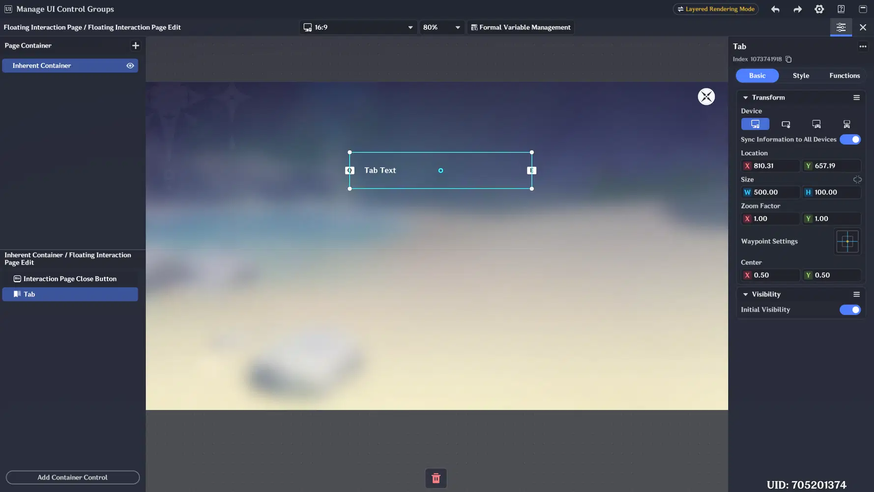
The new UI Control Group is designed for switching between different UI Control Groups or page containers.
Tab
It consists of three sections:
- Basic (default)
- Style
- Functions
Style Section
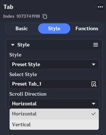
In the Style section, you can configure:
- Tab visual style (appearance preset)
- Scroll direction (horizontal or vertical)
Tab Style section
Functions Section
The Functions section is divided into three parts:
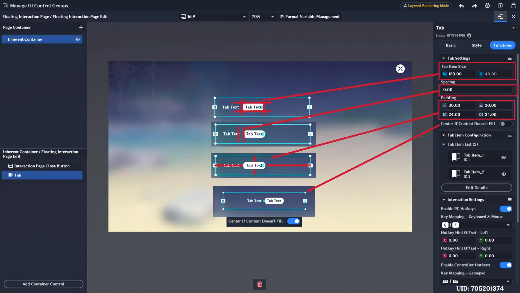
1. Tab Settings
- Configure tab item size
- Set spacing between tabs
- Adjust padding inside the bounding box
- Enable centered alignment when tabs do not fill the full space
Tab settings
2. Tab Item Configuration
- Add or remove tabs
- Set tab names
- Preview selected state
- Edit tab text content
- Configure container visibility when a tab is selected
- Configure UI Control Group visibility when a tab is selected
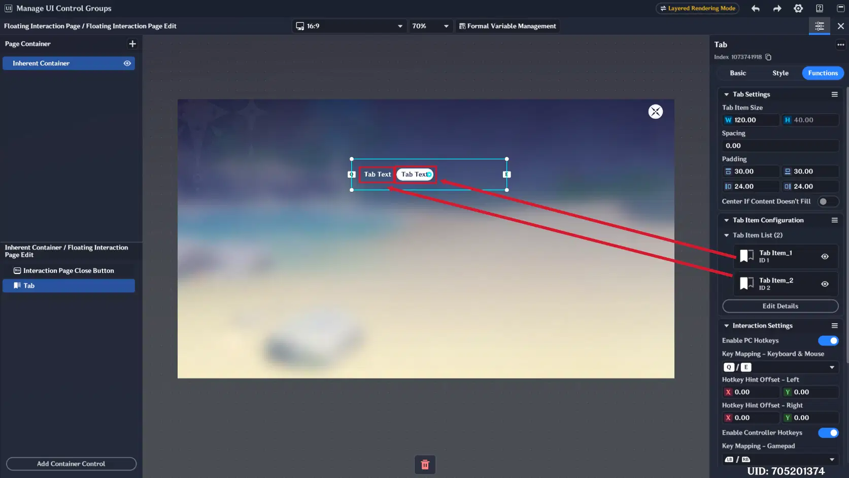
Tab Items
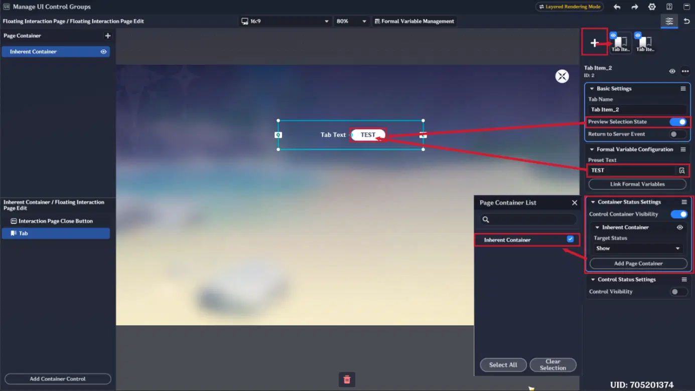
Tab Item Configuration
3. Interaction Settings
- Enable PC hotkeys
- Select keyboard mapping (Q/E or A/D)
- Configure hotkey hint offset
- Enable controller hotkeys
- Select gamepad mapping (LB/RB or LT/RT)
- Configure controller hint offset
- Assign press sound effects
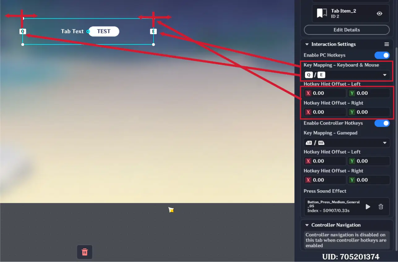
Tab Interaction Settings
4.1.3. Single-Choice Window
The Single-Choice Window UI Control Group is designed for selecting one option from a list of available choices.
It uses the same three sections as the Tab system:
- Basic (same as in tab)
- Style (same as in tab)
- Functions
Functions Section
The Functions section contains three tabs:
1. List Settings (same as in tab)
- Scroll direction (vertical or horizontal)
- List item size
- Spacing between items
- Padding
- Center alignment
- Layout constraint (auto-wrap or fixed columns)
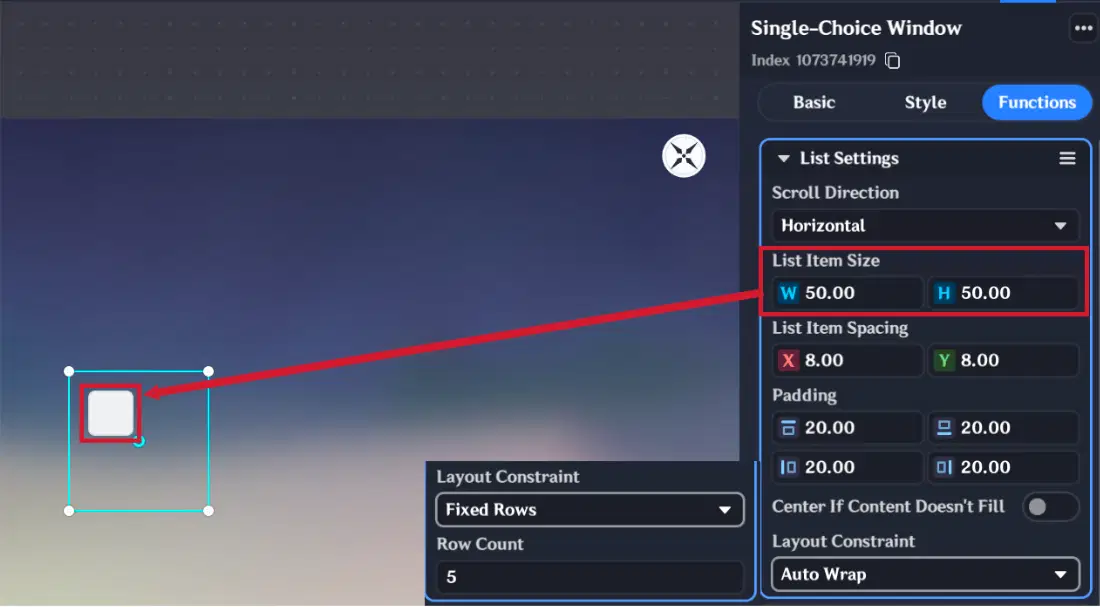
List Settings
2. List Item Configuration
- Add or delete list items
- Set item names
- Select item style
- Preview selected state
- Link formal variables
- Configure container visibility based on selection
- Configure UI Control Group visibility based on selection
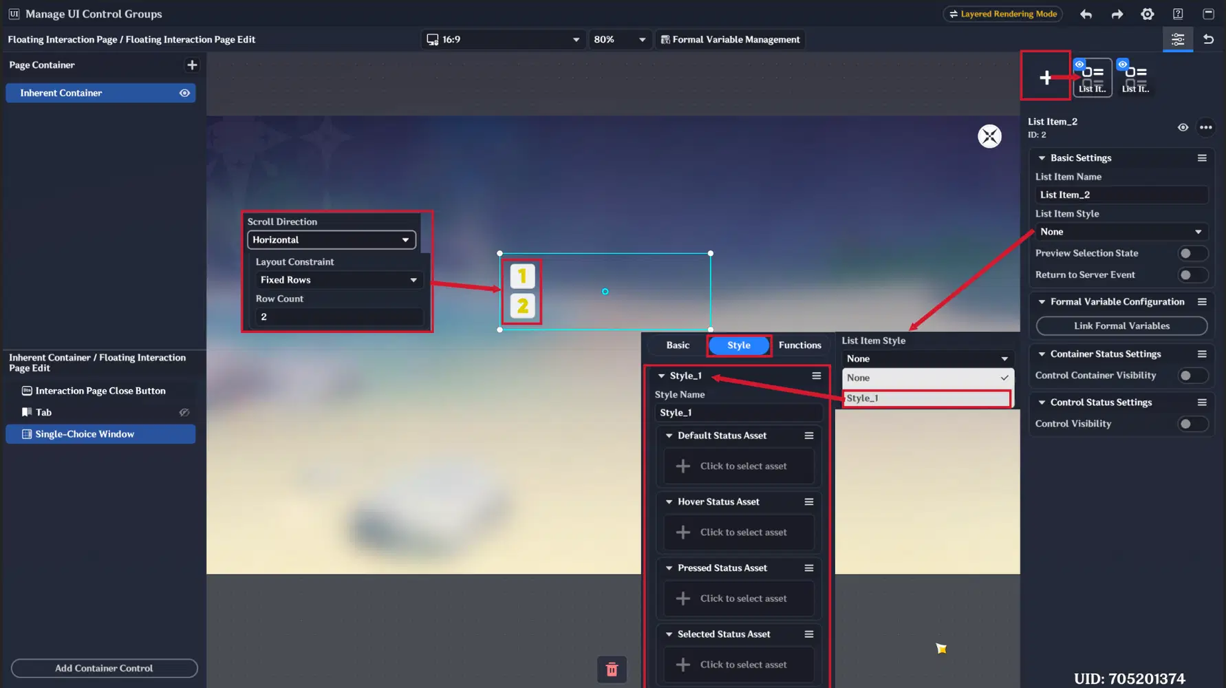
List Item Configuration
3. Controller Navigation (as in text window)
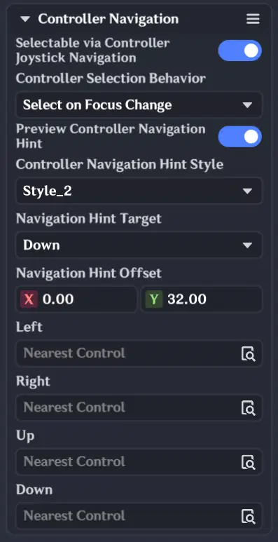
Controller Navigation
4.1.4. Formal Variable Management
Formal variables are UI-specific variables used inside Floating Interaction Pages. They allow you to bind values directly to UI Control Groups, reducing the need for manual alignment between similar components.
This ensures consistent positioning and formatting across the interface.
Supported variable types:
- Integer
- Floating point number
- String
- Dynamic text field
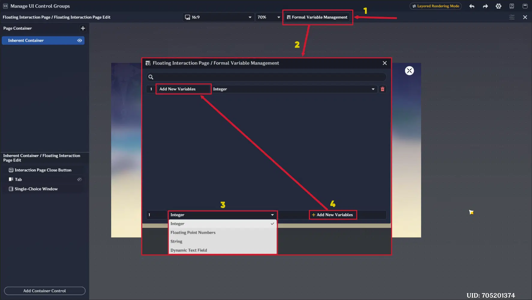
Formal Variable Management
Dynamic Text Field
Unique variable type, available only in Formal Variable Management. Adds Text Field like in Text Box UI Control Group, where you can type text, apply tags (, , , ) and insert Stage/Player variables.
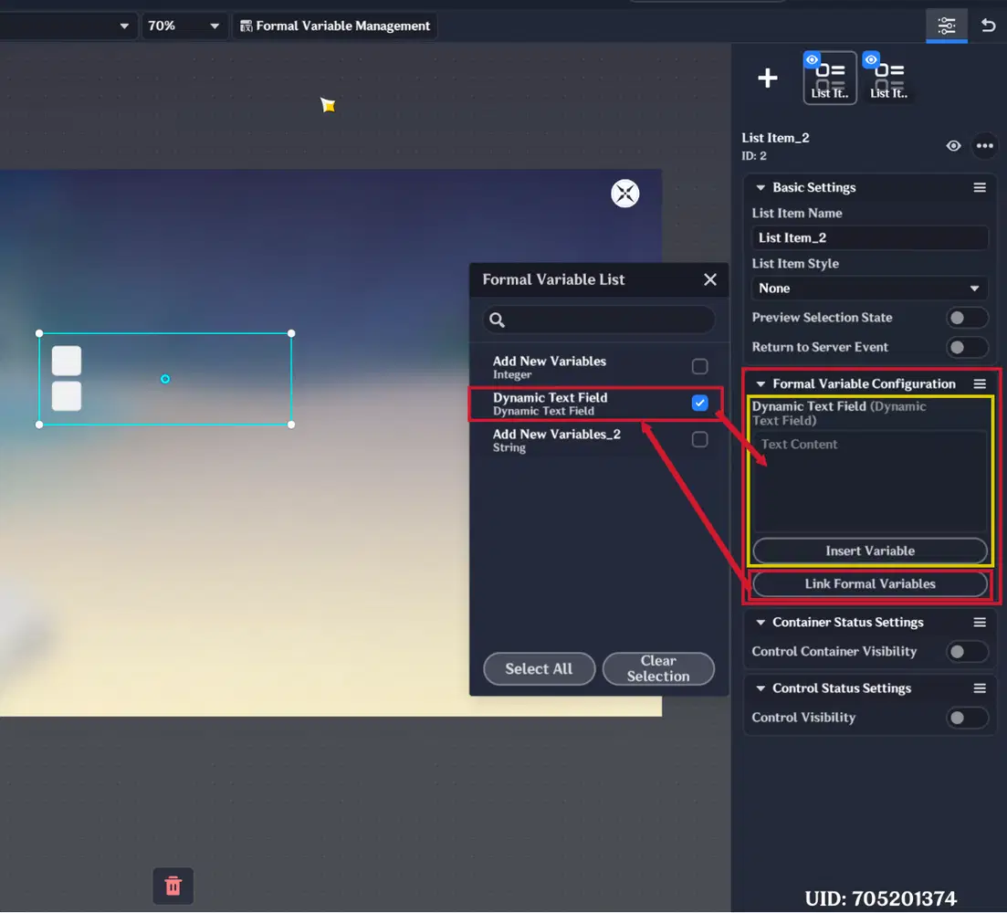
Dynamic Text Field Variable
4.1.5. Floating Interaction Page nodes
UI Control Groups inside Floating Interaction Pages are processed using:
- “When Floating Interaction Page is Triggered”
- (instead of “When UI Control Group is Triggered”)
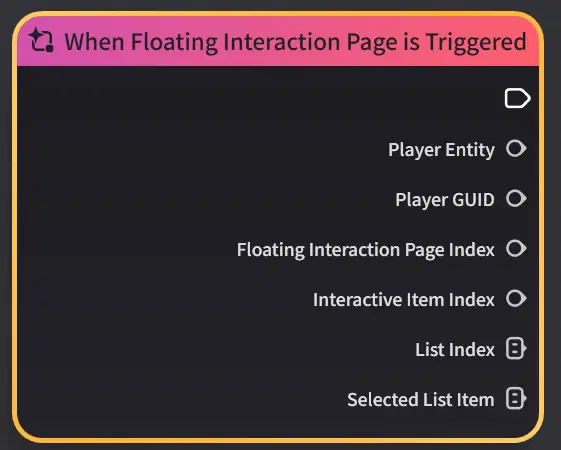
Floating Page event node
Page Control Nodes
- Show Floating Interaction Page – opens the page
- Close Floating Interaction Page – closes the page
- (Note: players can also close it manually)
- Update Floating Interaction Page List Data – updates page content
Note: Initialize List Data & List Index/Visible List Items input pins applies specifically to Tab and Single-Choice Window UI Control Groups. Using node graphs, you can only toggle these two UI Control Groups ON or OFF.
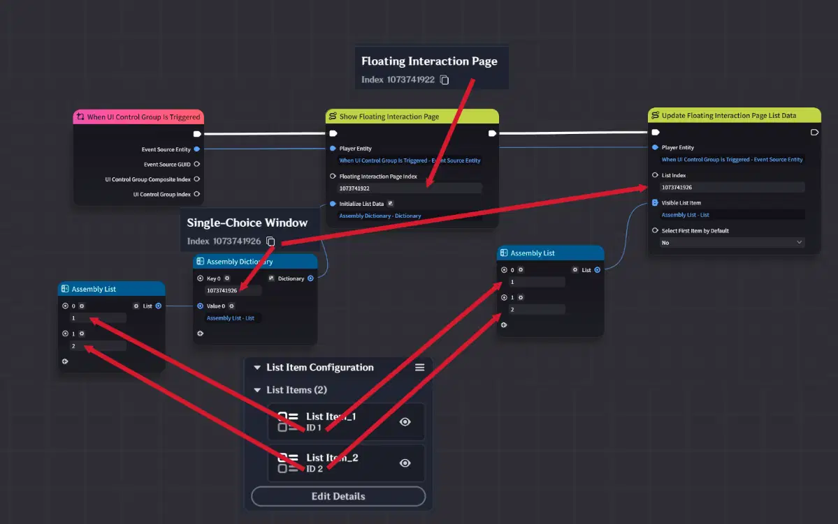
Floating Page execution nodes
4.2. Functions Section
In the Functions section, you can configure:
- Pause game on page open (single-player mode)
- Initial selected control for controller input
- Sound effects for enabling/disabling the page
- Management of formal variables
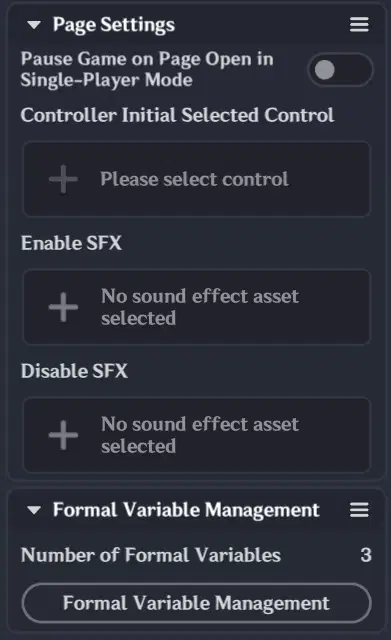
Floating Page Functions section
4.3. Floating Interaction Page example
In this example, we will create a Floating Interaction Page for class selection.
First, create Formal Variables that will store and display information for each class template.
We will create 4 String Formal Variables:
- Class Name
- Class Description
- First Ability Description
- Second Ability Description
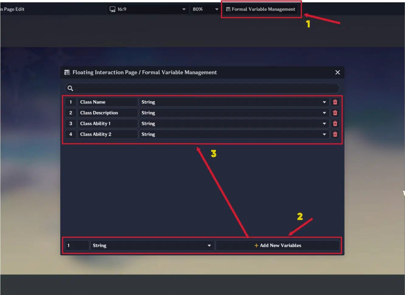
Formal Variable creation
Next, open the Assets tab and create 2 Custom Asset Templates:
- Default / Selected Status
- Hover / Pressed Status
For the Default / Selected asset template, use:
- 3 Text Boxes (for class descriptions)
- 4 Images (3 dividers and 1 background image)
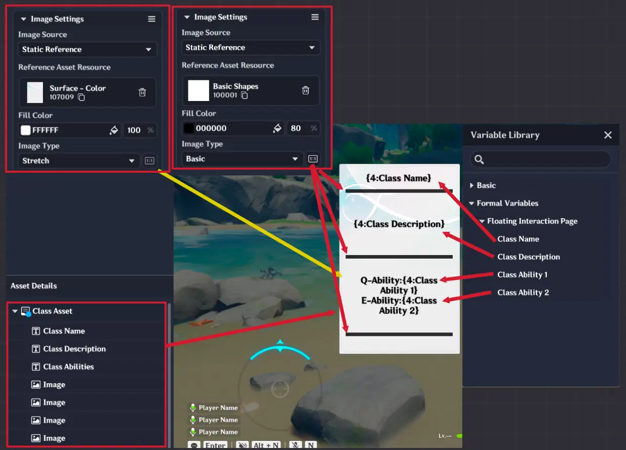
Class Asset Template
For the Hover / Pressed asset template, duplicate the previous asset template and change its image colors to grey.
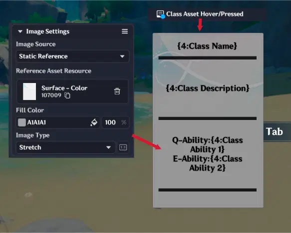
Class Asset Template (2)
Inside each Text Box, insert the corresponding Formal Variables:
- Class Name
- Class Description
- Ability Descriptions
After that, return to the Floating Interaction Page settings and open the Floating Page Editor.
Inside the Inherent Container, create the following UI Control Groups:
- Single-Choice Window — for class selection
- Text Window — for displaying the selected class name
- Custom Button — for confirming and applying the selected class
4.3.1. Single-Choice Window Settings
Style Section
- Set the Default & Selected Status Assets to the first Asset Template.
- Set the Hover & Pressed Status Assets to the second Asset Template.
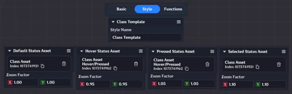
Style configuration
Functions Section
Configure the List Settings as follows:
- List Item Size should approximately match the Asset Template size.
- Set Layout Constraint to Fixed Rows (1).
- Set Scroll Direction to Horizontal.
This setup will display all class options horizontally in a single row.
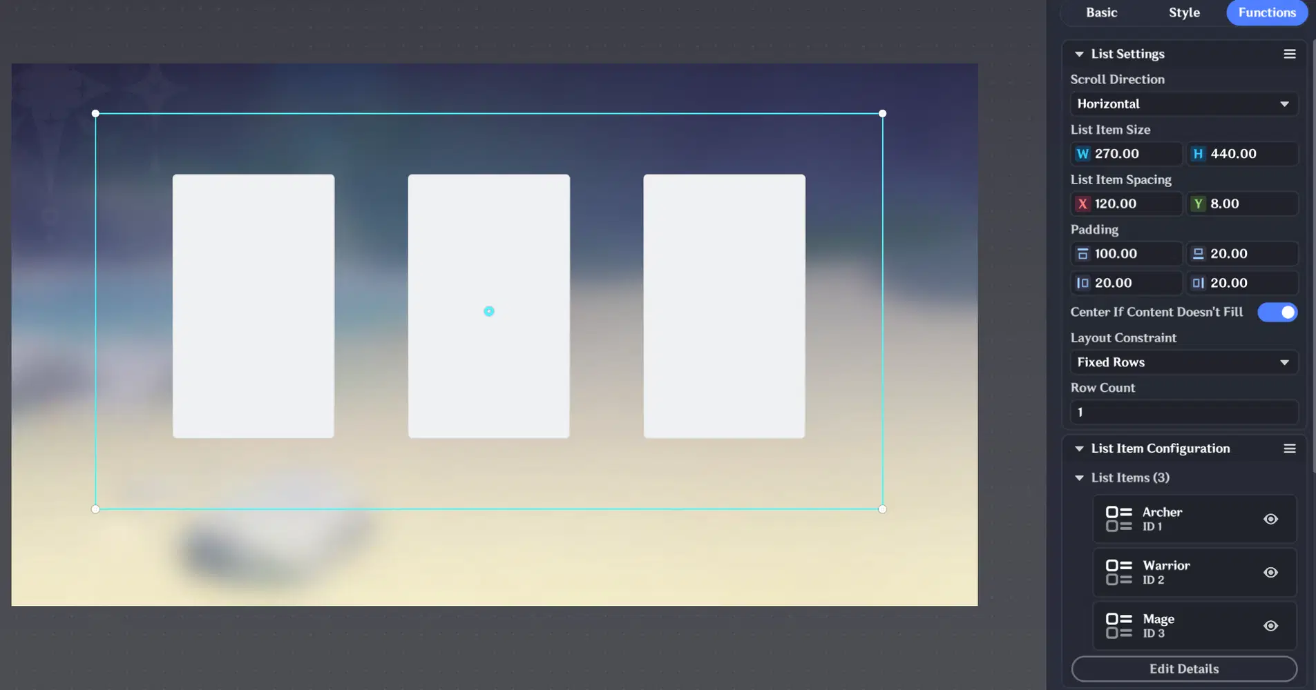
List Settings
List Item Configuration
Create 3 List Items — one for each class.
For every List Item:
- Select the previously created List Item Style.
- Link all 4 Formal Variables.
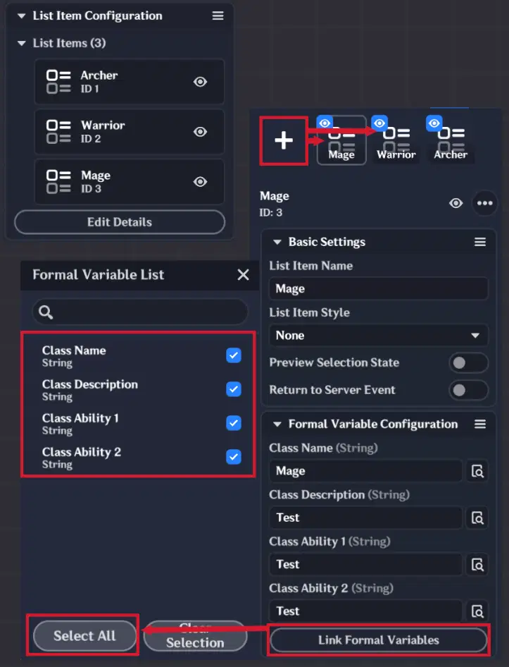
List Item Configuration
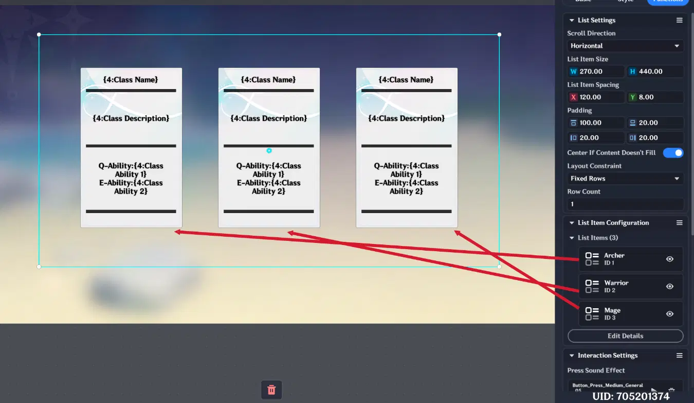
Single-Choice Window Final Appearance
4.3.2. Text Window Settings
Enable “Monitor Control Formal Variable” and select the created Single-Choice Window.
Then insert the Class Name Formal Variable into the Text Field.
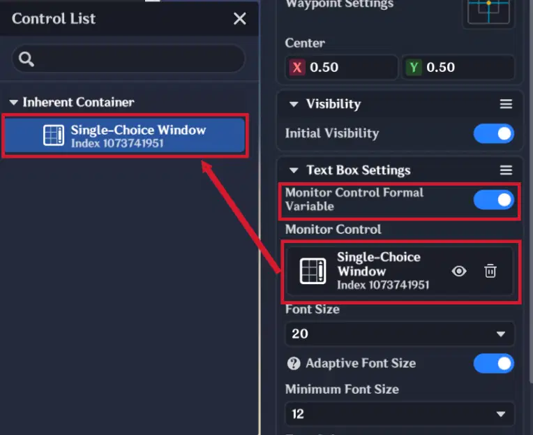
Text Window configuration (1)
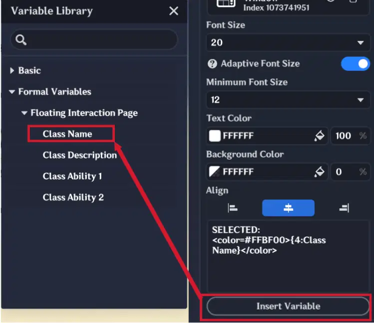
Text Window Configuration (2)
This will automatically display the name of the currently selected class.
4.3.3. Custom Button Settings
In the Functions section:
- Enable Control Monitoring
- Select the created Single-Choice Window
This allows the button to detect the currently List Item and apply player class when pressed.
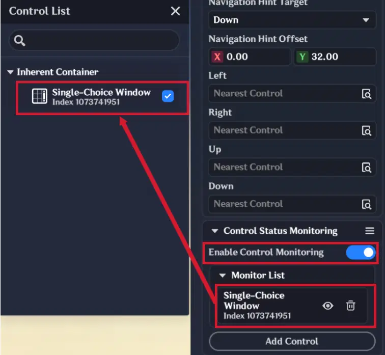
Custom Button configuration
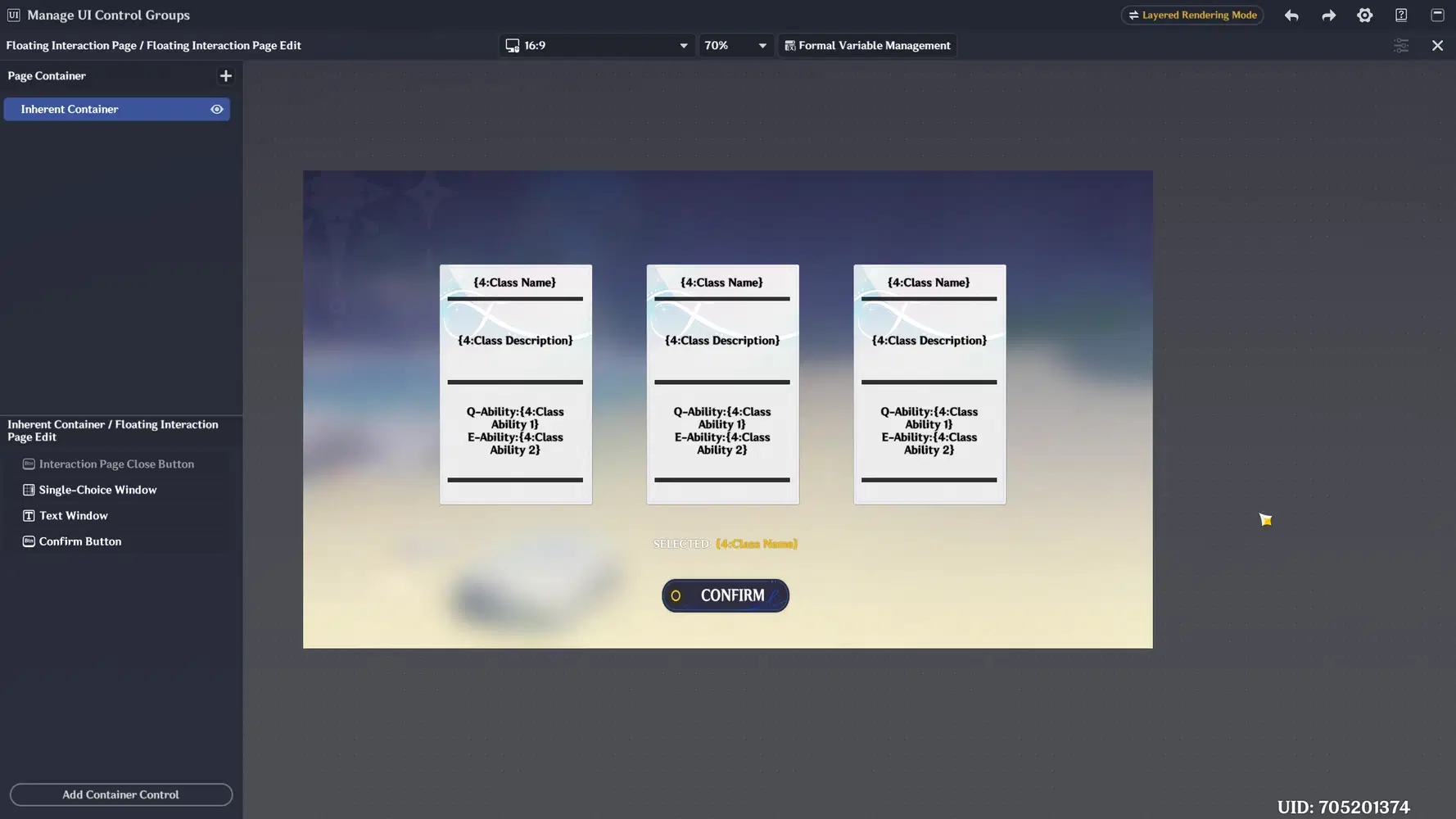
Floating Interaction Page Final Look
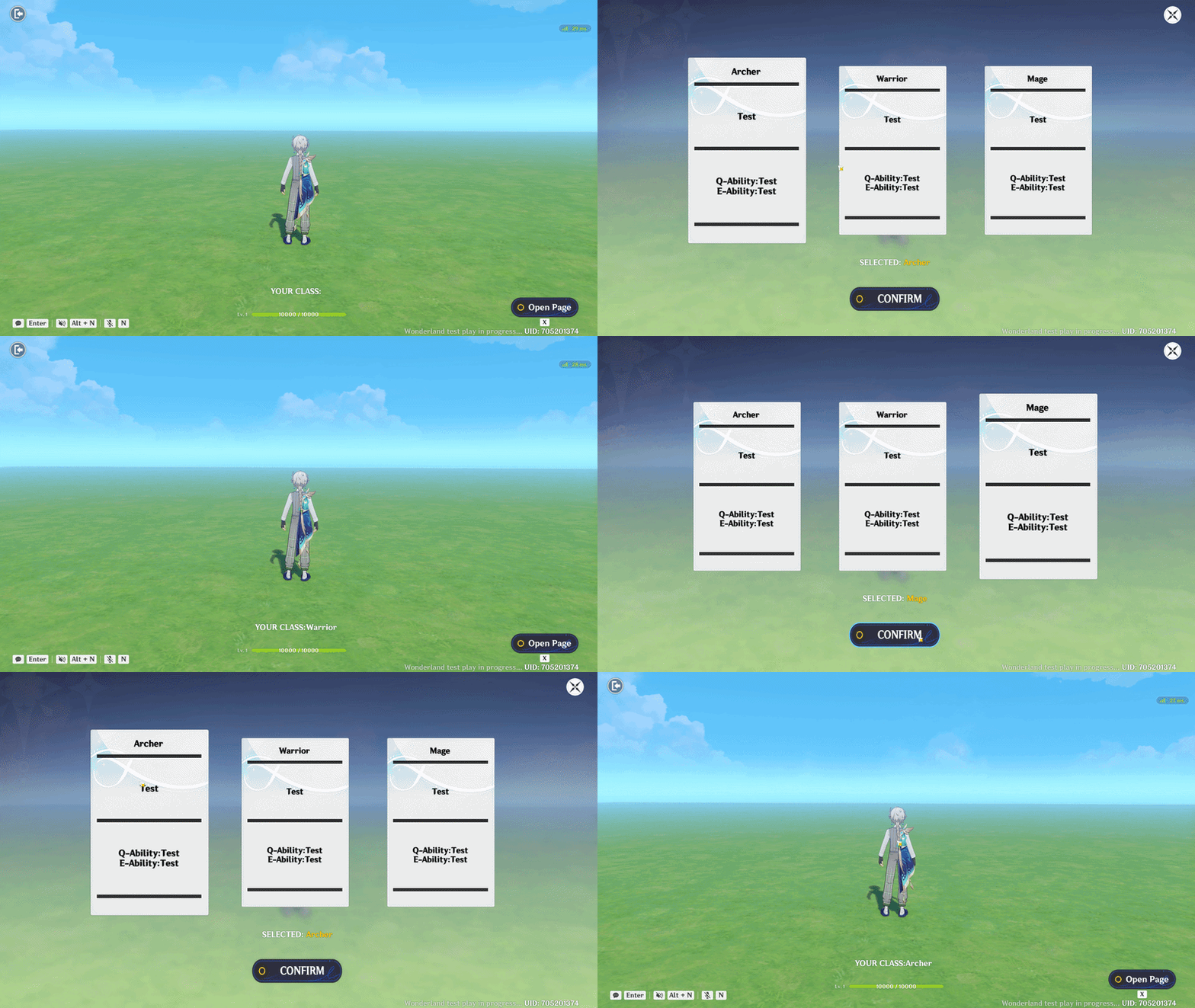
Floating Interaction Page showcase
I hope this guide helps you better understand how to design and implement new UI Control Groups.