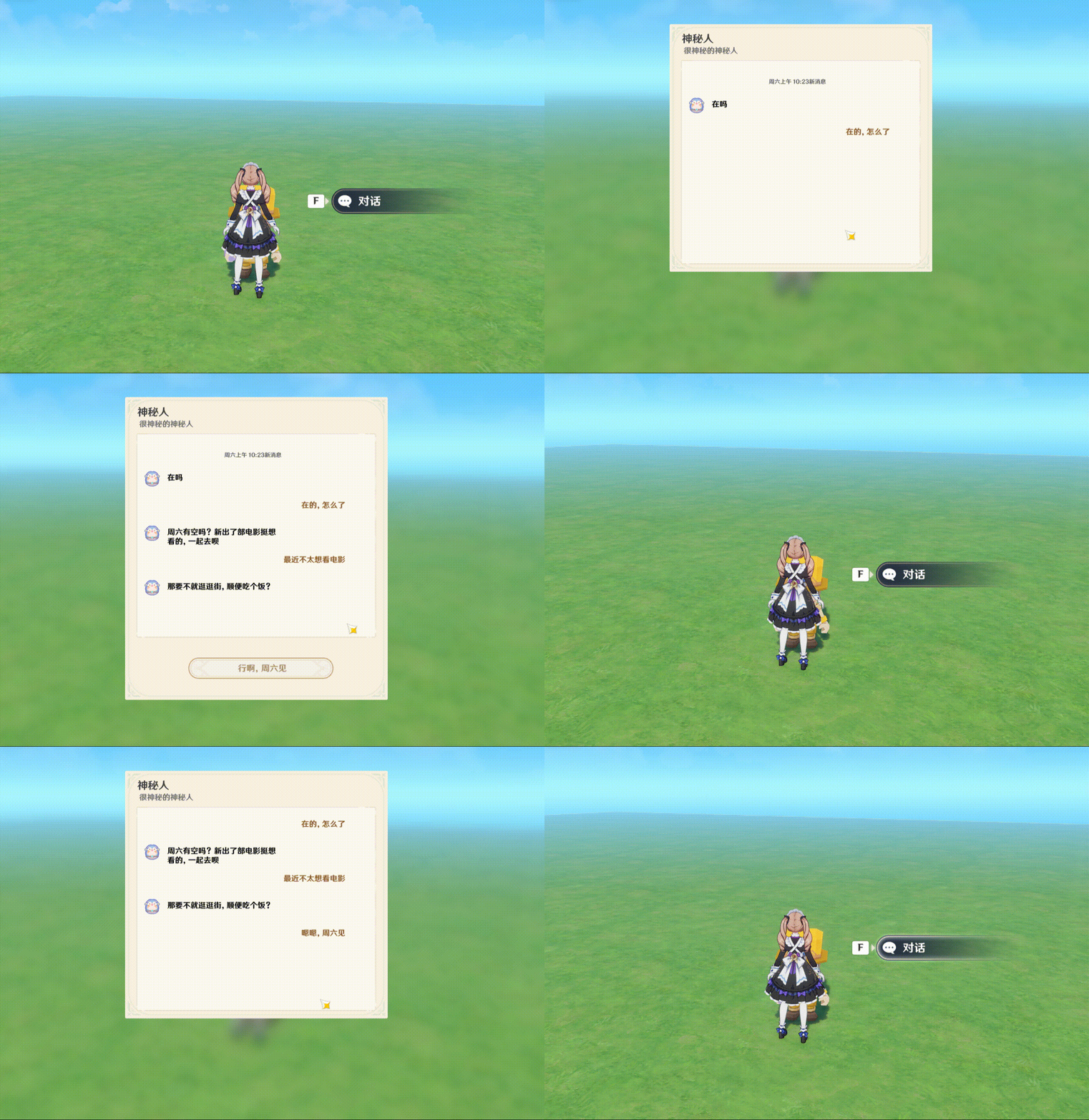
Key Topics Covered
- Floating Interaction Page
- Message Queue
- Tabs
- Formal Parameters
- Material Templates
- Struct Design & Logic Implementation
This tutorial starts with the basic usage of several UI controls, followed by a step-by-step implementation of a bubble chat effect, sharing the underlying ideas and design approaches along the way.
Now, let’s dive into our first section: Basic Usage of UI Controls.
1. Basic Usage of UI Controls
A more powerful UI system was introduced in the Version 6 update and further polished in Version 7. In this section, we will cover the foundational usage of several core elements: Material Templates, Floating Interaction Pages, Message Queues, Tabs, and Formal Parameters.
The content here is relatively basic. If you are already familiar with these fundamentals, feel free to skip to the later sections.
1.1 Material Templates and Buttons
In the new UI system, many components allow us to freely arrange materials to achieve richer visual effects, such as buttons, radio buttons, and tabs. A Material Template is essentially a preset group of combined widget materials that dynamically displays different visual states based on current interactions.
Taking a button as an example, it typically features three states: Hover, Unselected (Default), and Selected (Pressed).
Creating Three Material Groups for Each State
- Add an image and a text box. Select a rectangular template for the image and adjust its size appropriately.
Note: Ensure the text box is layered above the image node so the background doesn't obscure the text.
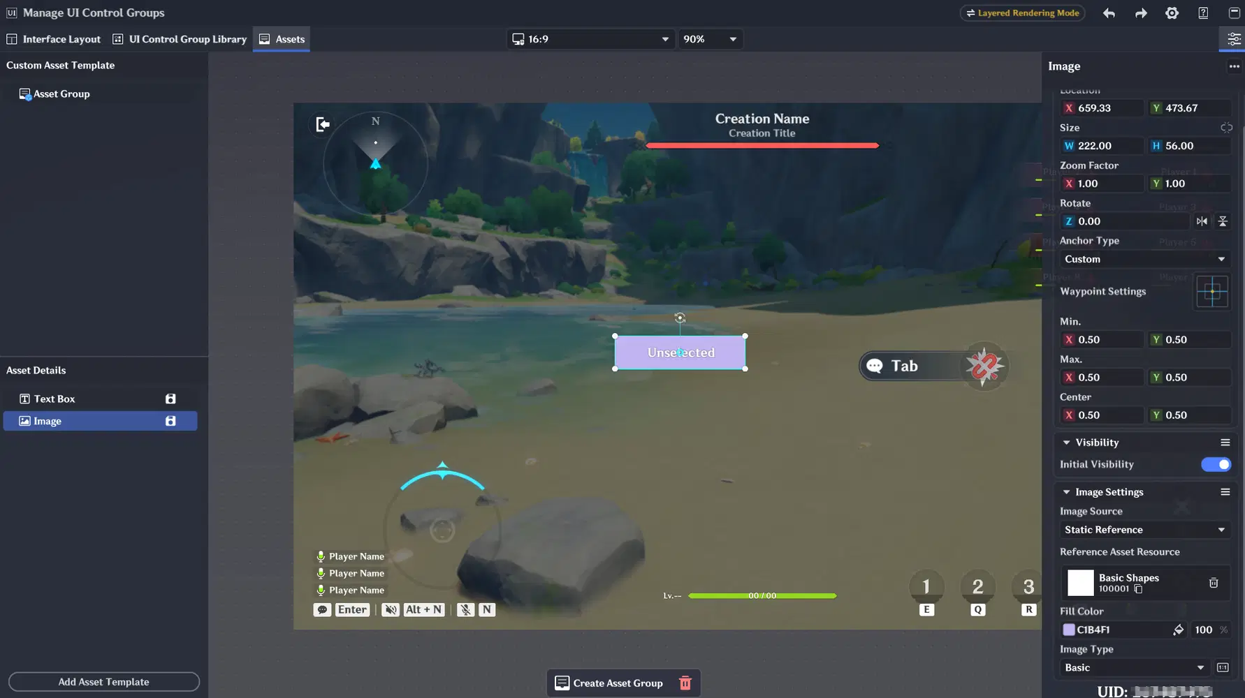
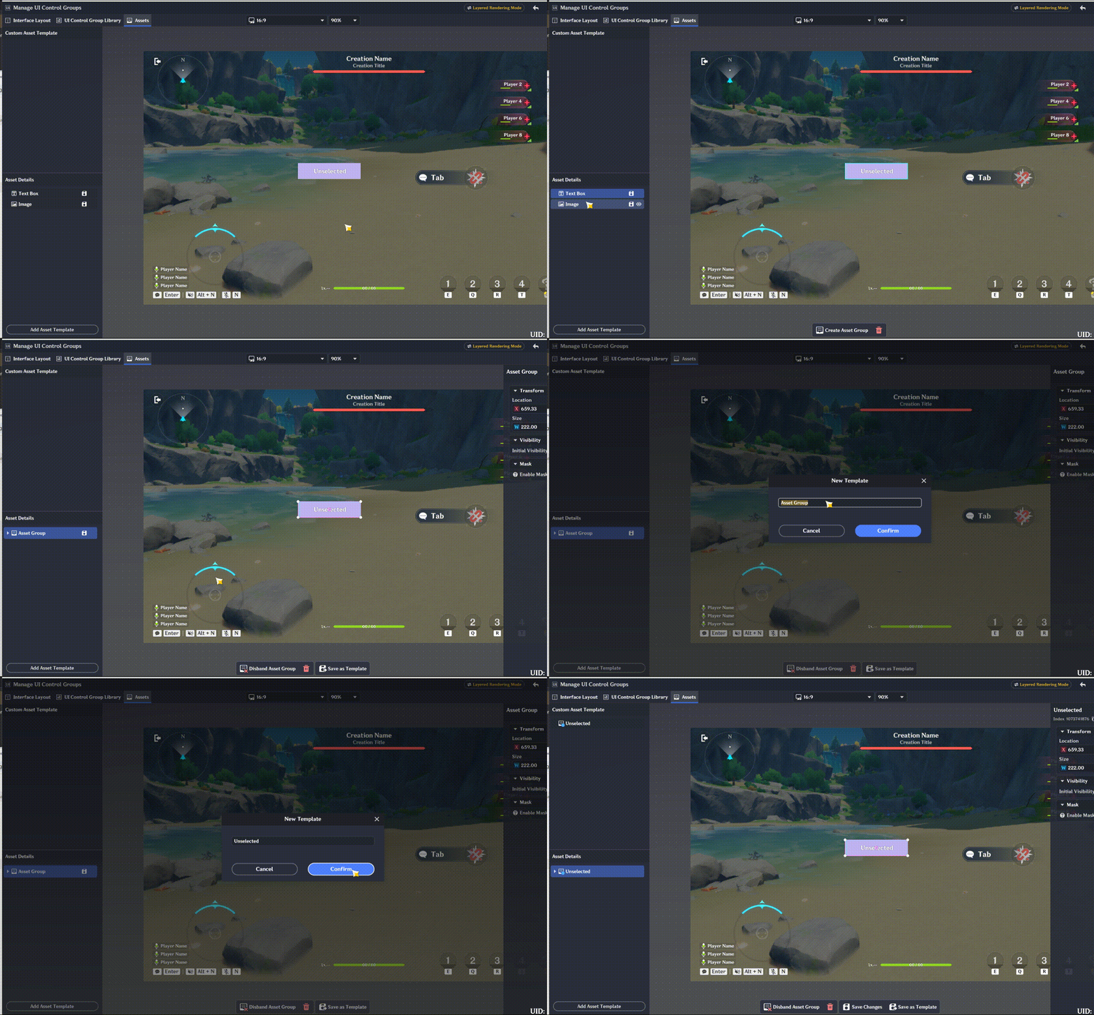
Hold down the Left Shift key, click to select both materials, then right-click and select Create Material Group. Name this group Unselected.
Next, adjust the text and background colors, then save two additional copies: Hover and Selected.
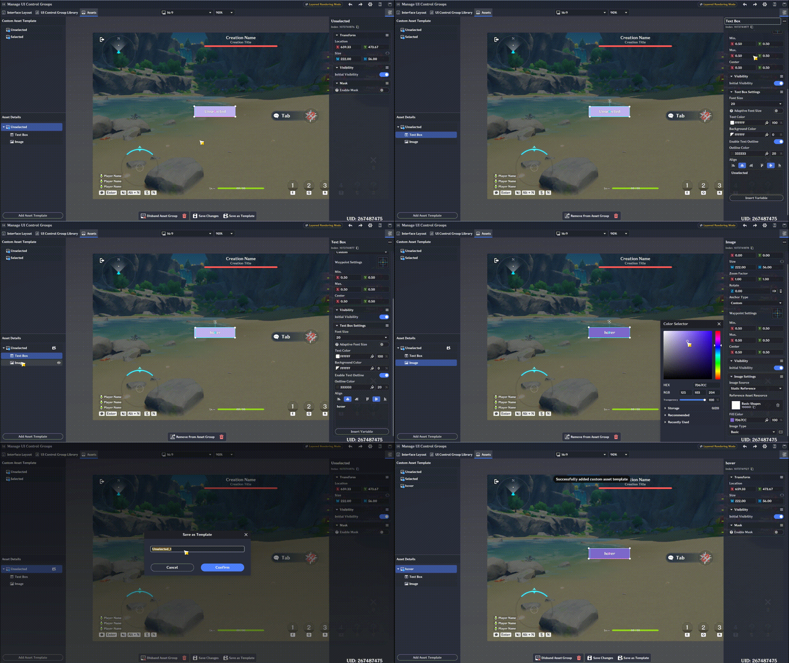
The final result is shown below. You now have the material groups ready for all three states.
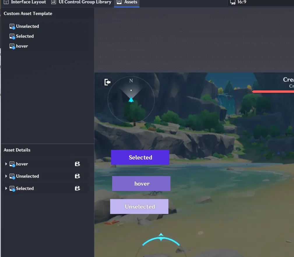
Next, add a button control and assign these materials to its style settings.
By default, the button uses a preset style. Change its style type to Custom. Below is a quick setup guide for one of the states; the other two can be configured using the exact same method:
Map Unselected to Default, Hover to Hover, and Selected to Pressed. (You can also follow the official naming conventions, but we'll stick with this setup for now.)
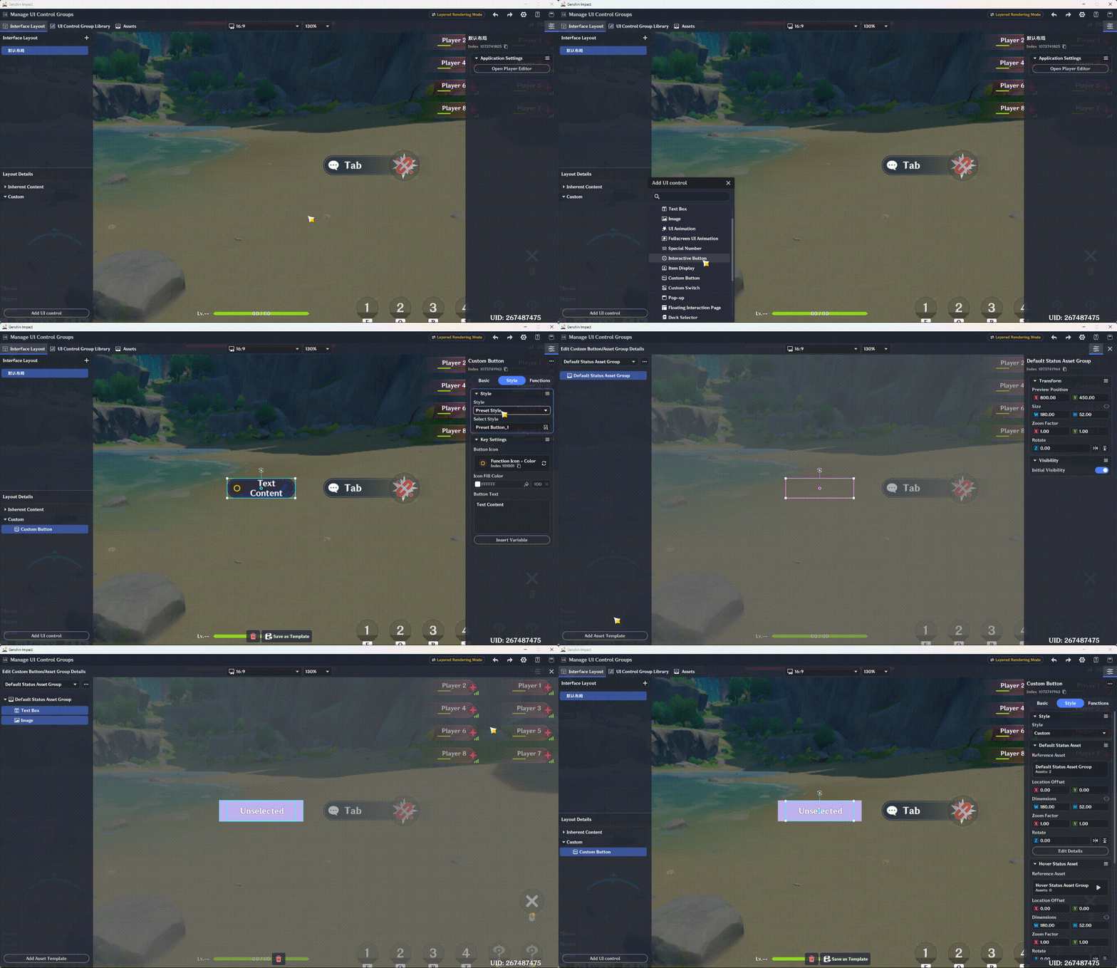
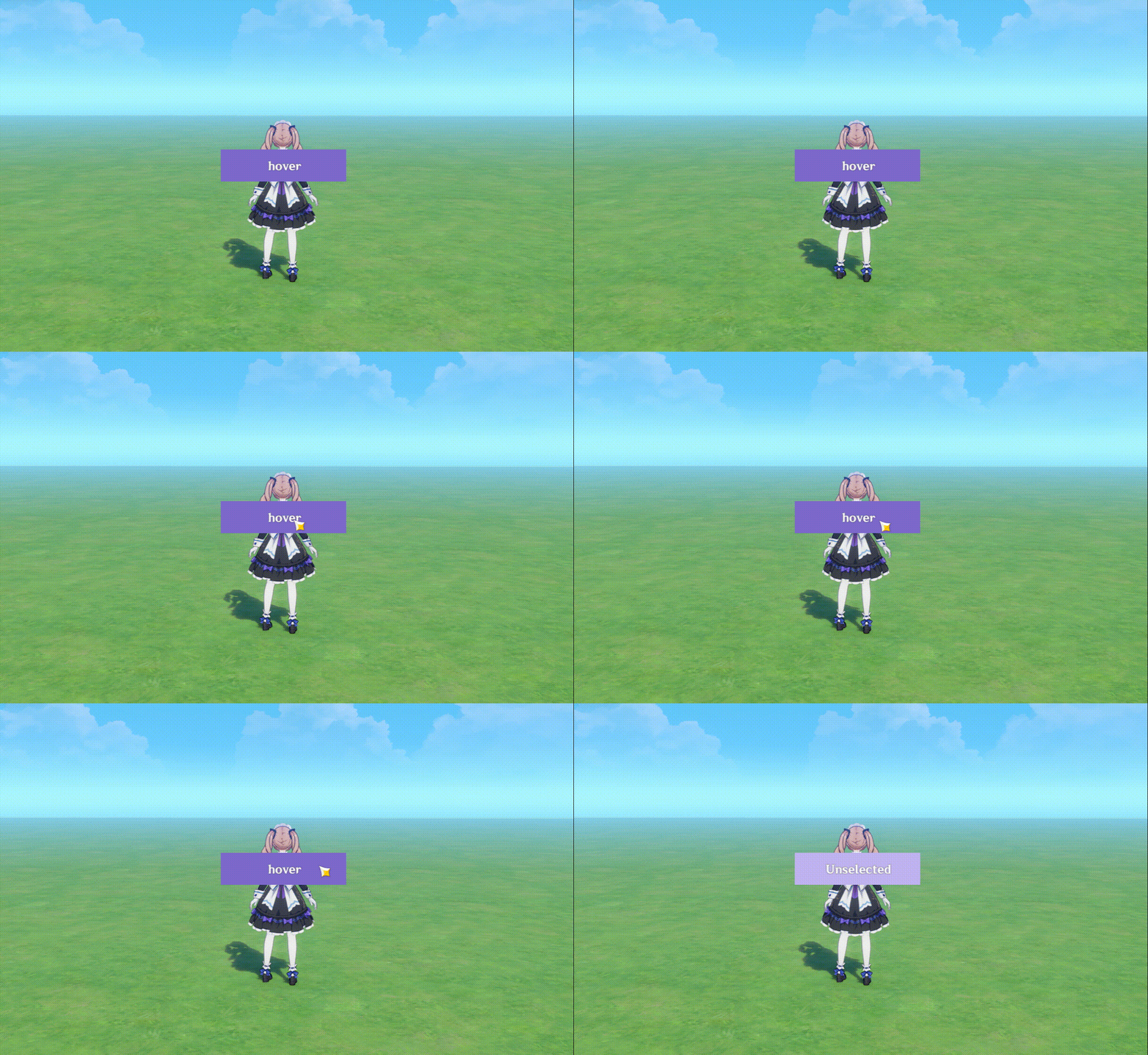
Once configured, your interactive dynamic button is ready. Enter Playtest mode to preview it—you should see the visual state changes work exactly as expected.
For other customizable UI components that require material groups, the workflow is virtually identical: pre-edit your material groups, then map them to the corresponding component states in the style settings.
1.2 Floating Interaction Page and Tabs
The Floating Interaction Page is a full-screen UI page that allows for more complex UI layout management, making it an essential foundation for implementing our bubble chat box.
While it functions primarily as a top-level UI container, it follows several unique runtime behaviors:
- Supports container-level layouts, but offers limited direct Node Graph control. It relies heavily on inter-component controls within the Floating Interaction Page itself.
- Child components cannot be directly shown or hidden via Node Graph. Neither Activate UI Control Group nor Set UI Control Status will work on components inside a Floating Interaction Page.
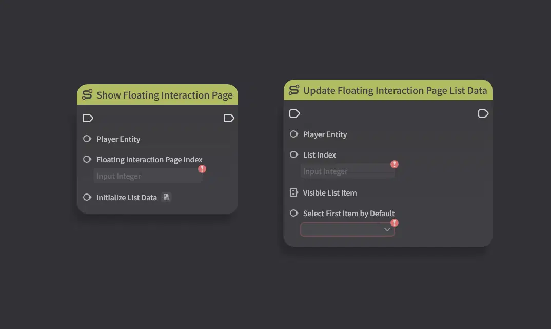
- Components requiring pre-configured data (such as Tabs) rely on the Initialize parameter inside Show Floating Interaction Page to determine their default displayed content.
Next, we will use a simple Tab example to demonstrate how to work with Floating Interaction Pages and Tabs together.
We will place three solid-color cards inside a Floating Interaction Page and control their visibility using the Tab component.
Add a Floating Interaction Page, place a Tab control inside it, and move it to the top.
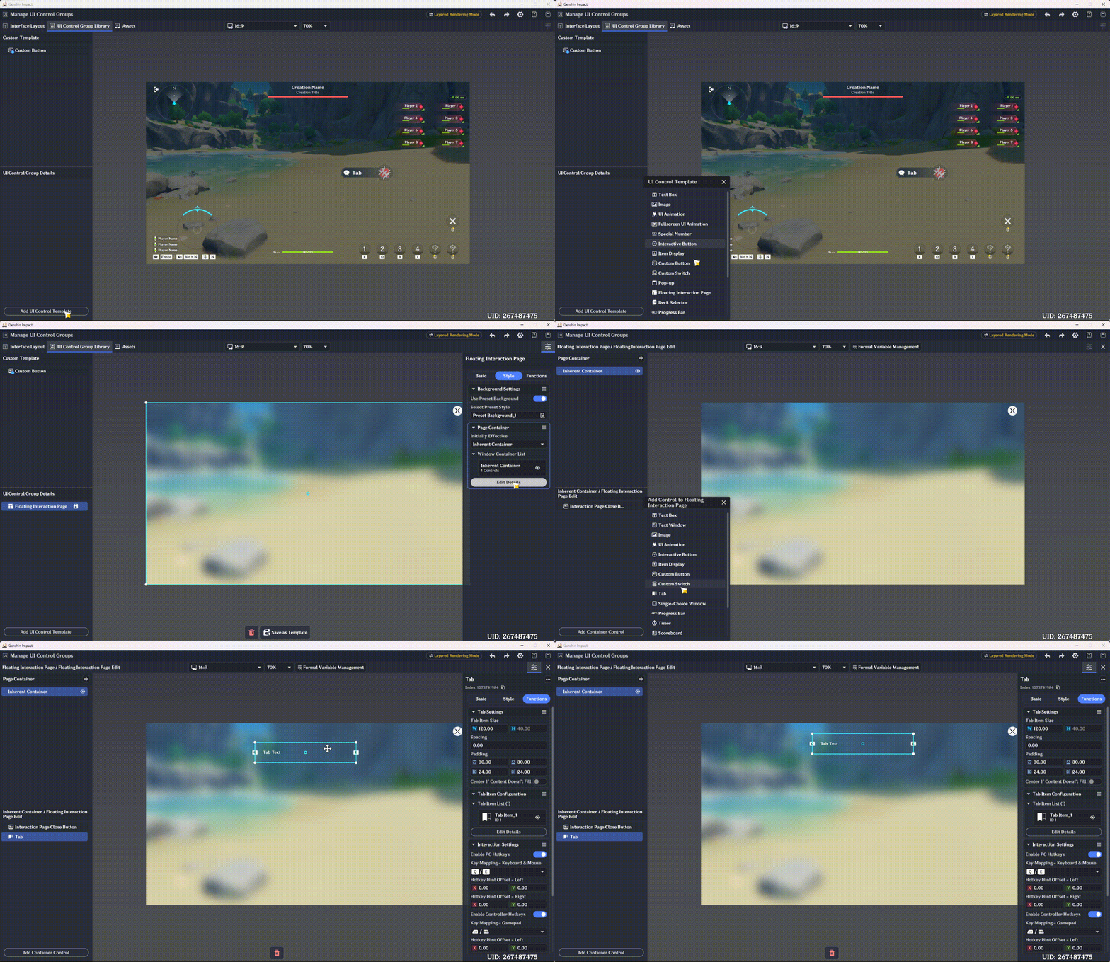
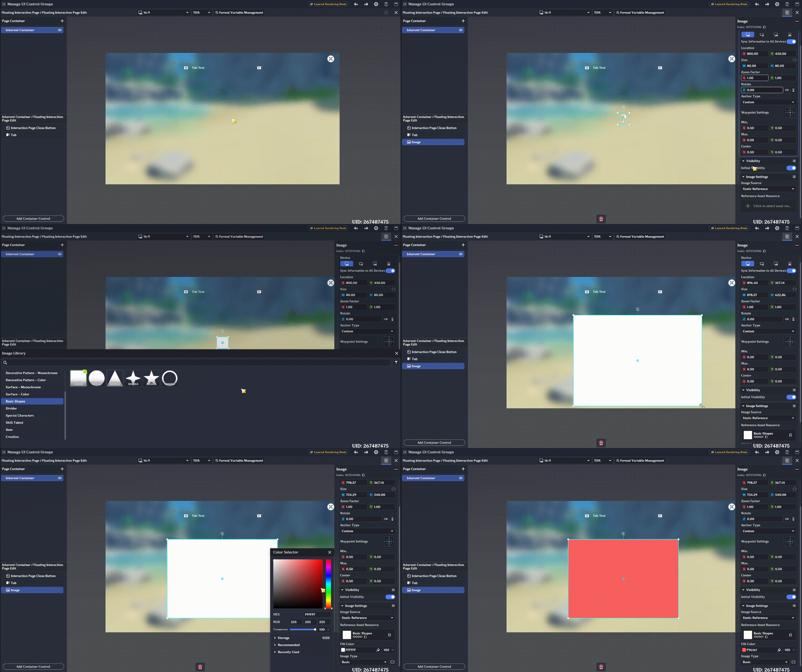
Add three rectangular images and fill them with red, yellow, and blue colors, respectively.
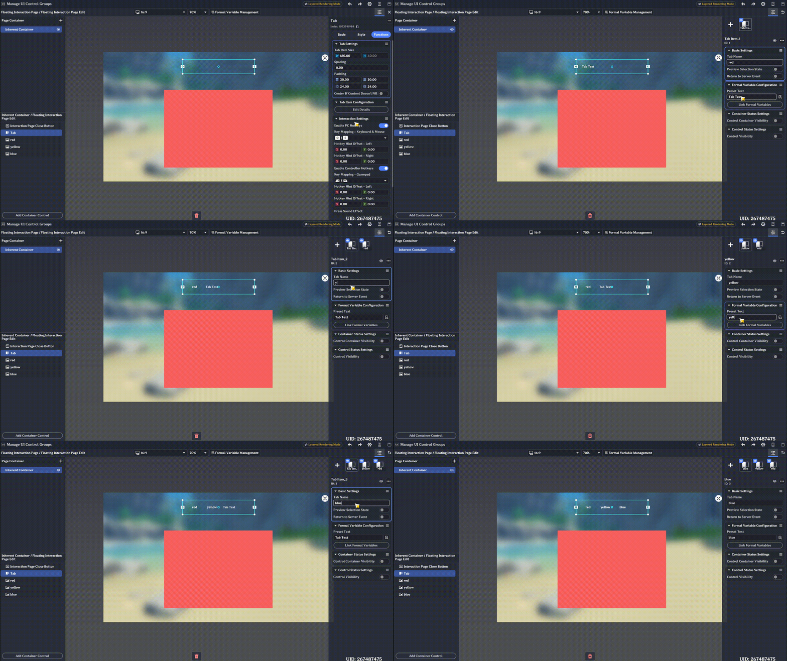
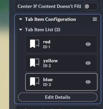
Edit the Tab component. In our setup, the Tab contains three options: Red, Yellow, and Blue. Clicking an option will display the corresponding color card.
Configure the Tab items to control component visibility. Open Control Status Setting inside the Tab item settings: set the target color card to show, and hide the other two color cards.
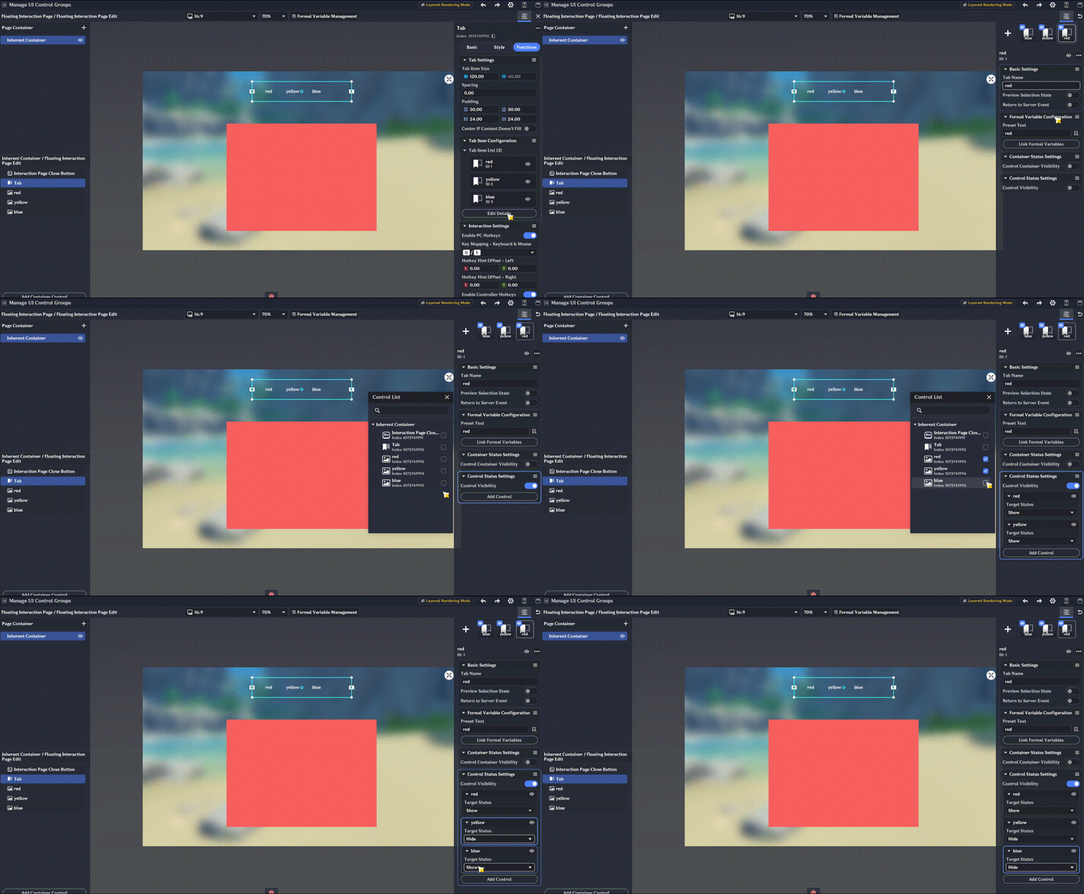
Note: Once all configurations are complete, don't forget to save your edits to the Floating Interaction Page.
Save the Floating Interaction Page as a template. The UI interface setup is now complete. Unlike standard buttons, a Floating Interaction Page must be opened via a Node Graph, and its Tab data needs to be initialized. Next, we will build a Node Graph to handle the initialization process.
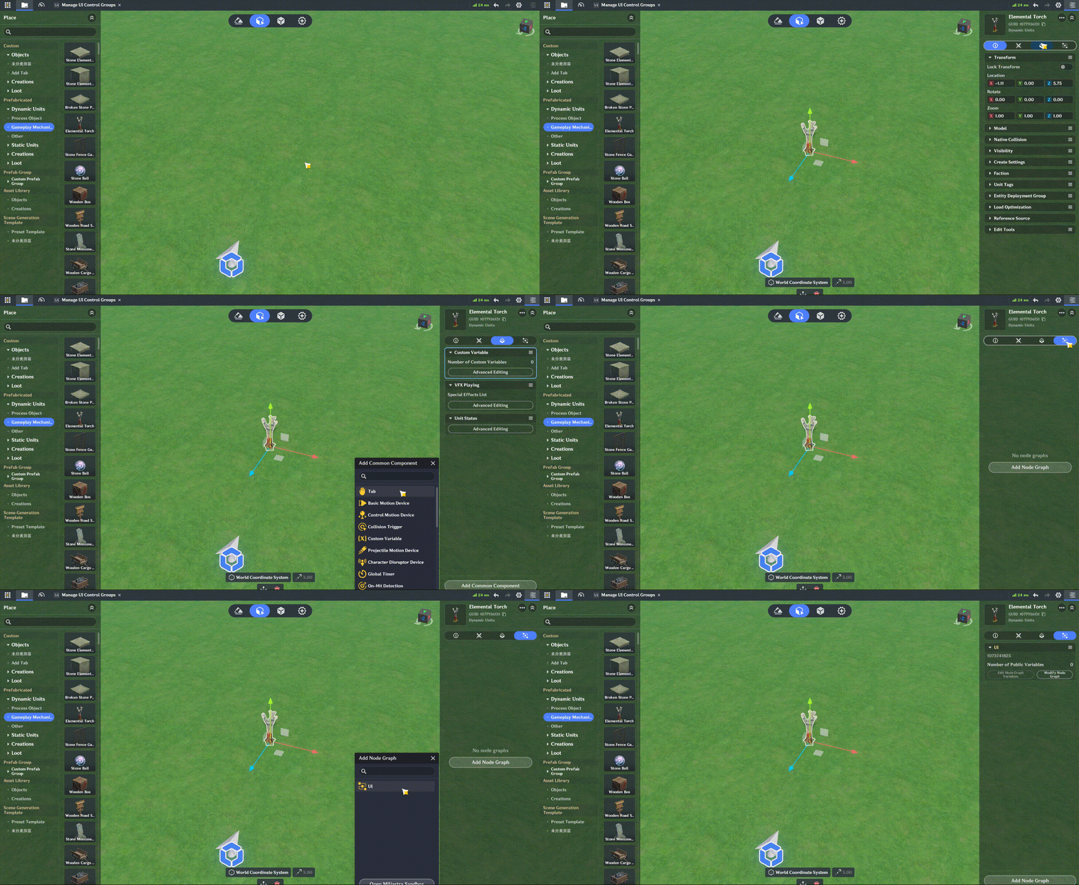
For demonstration purposes, place a torch in the scene and attach an interaction option to it. Clicking this interaction option will trigger the Floating Interaction Page.
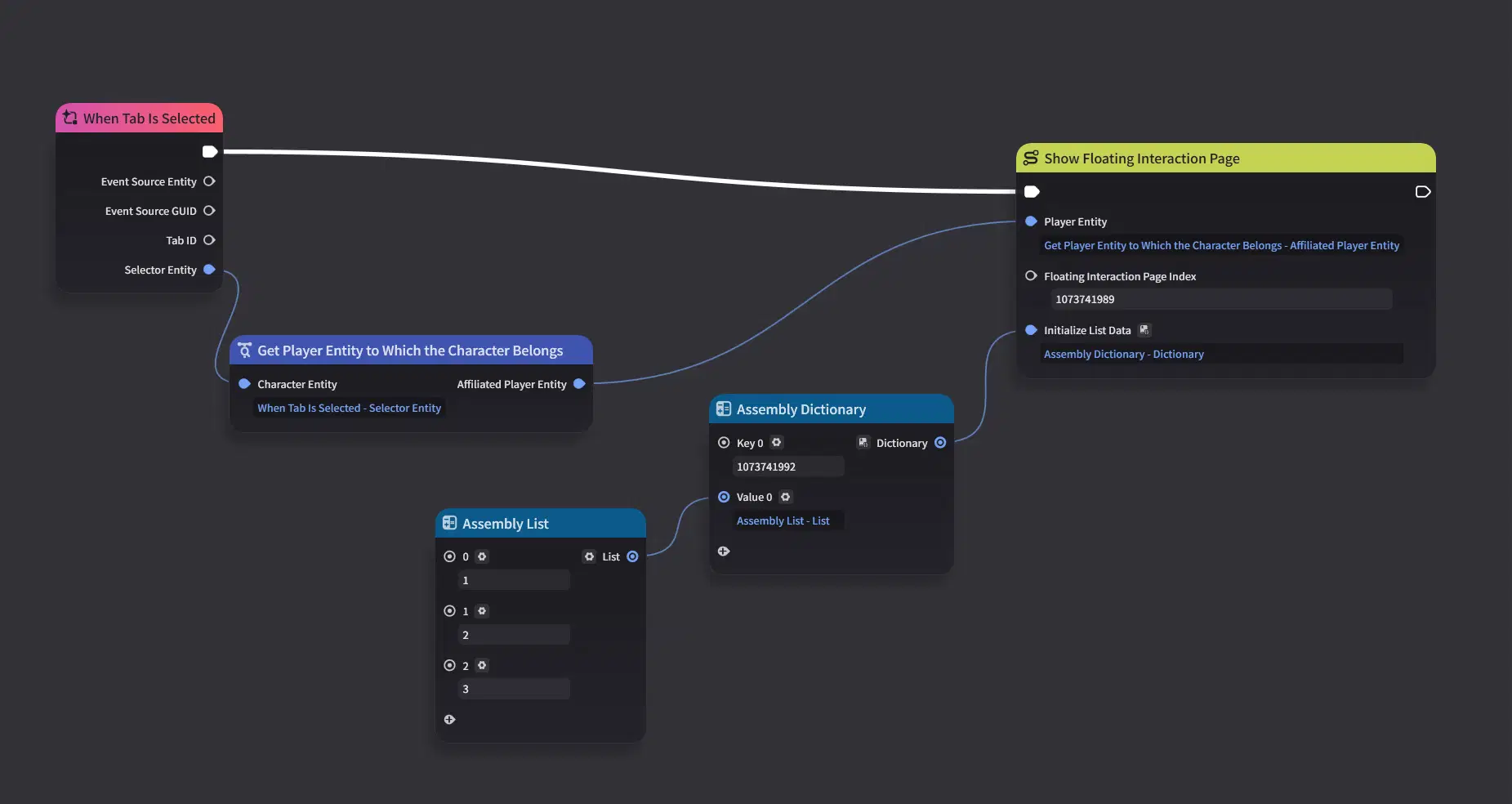
Next, edit the Node Graph. The Show Floating Interaction Page node requires three parameters (Player and Index need no further explanation).
Among them, Initialize List Data is a dictionary structured as Dictionary>:
- Key: The index of the UI component that requires data initialization—in our case, the Tab index.
- Value: The initial values for the component's item list.
Even if you have pre-configured the Tab options in the UI editor, opening the page directly will show no selectable items. The system strictly requires explicit initialization by populating this list with the items you wish to display.
Enter Playtest mode to test and verify the behavior.
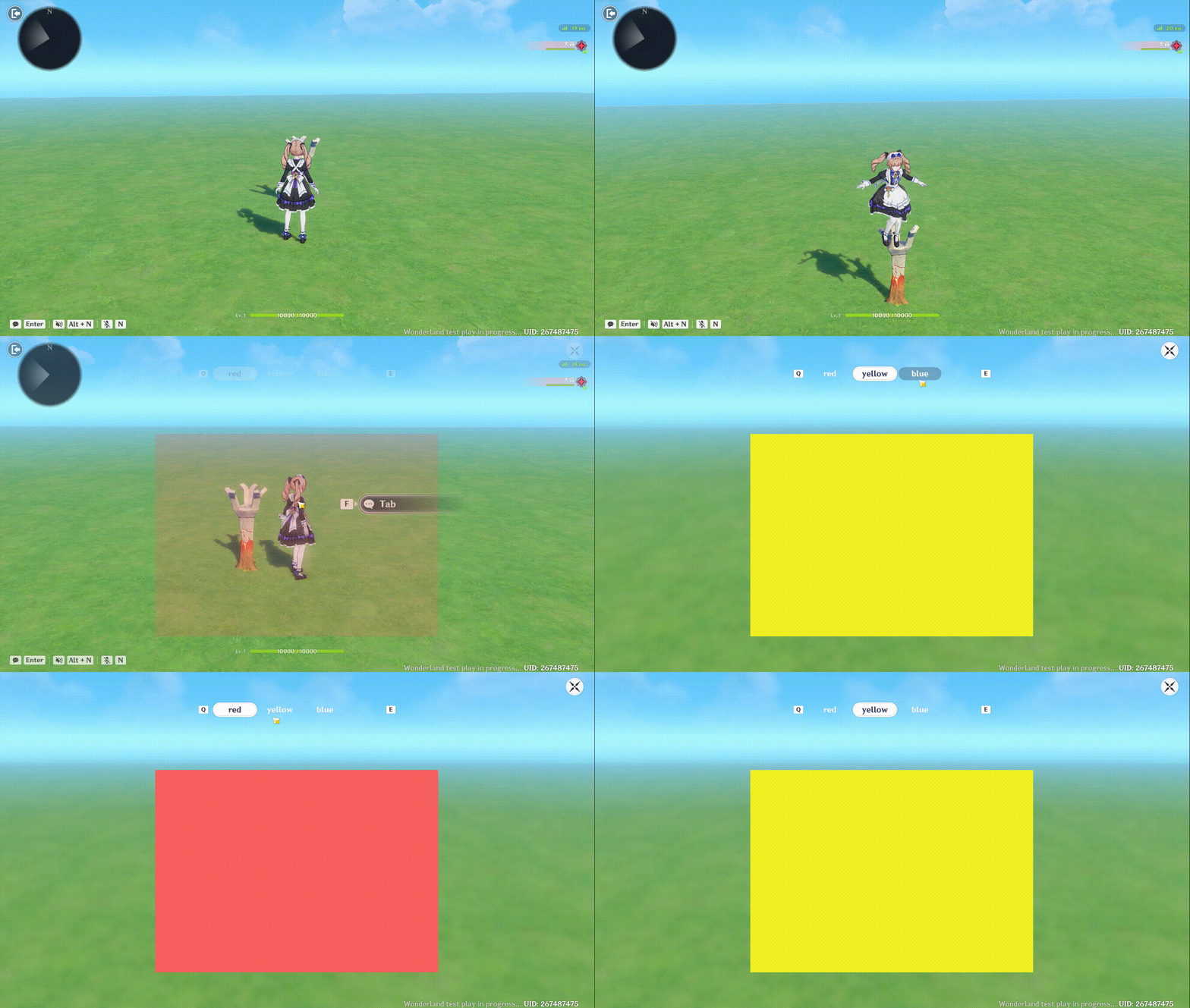
Although this section focuses on Tabs, the framework and logic apply similarly to Single Choice Windows.
1.3 Message Queue and Formal Parameters
The Message Queue is the core component for building our bubble chat box. It is a scrolling message list with customizable materials where incoming messages automatically displace the oldest ones.
Typically, message updates are handled using Formal Parameters bound to a Struct, which is why we present them together here.
- Message Queues can store multiple visual styles, allowing you to select any available style when posting a new message.
- Important Height Constraint: It is best to keep the height of individual messages consistent. While varying message widths are supported, the line height allocated for each message in the queue is fixed. If a message exceeds this fixed height, it may overlap with adjacent messages.
Formal Parameters act as references or placeholders. They cannot function independently and rely on mappings to actual variables. Their main benefit is reusable design: by placing a single formal parameter inside a UI material template, you can dynamically map different values to display varying content across instances. Simply put, it is a data-bound placeholder.
Demonstration: Creating a Simple Bullet-Chat (Danmaku) Effect
Create two message styles as preset material templates. Each message layout consists of an avatar, a text field, and a special effect to form a single bullet-chat line.
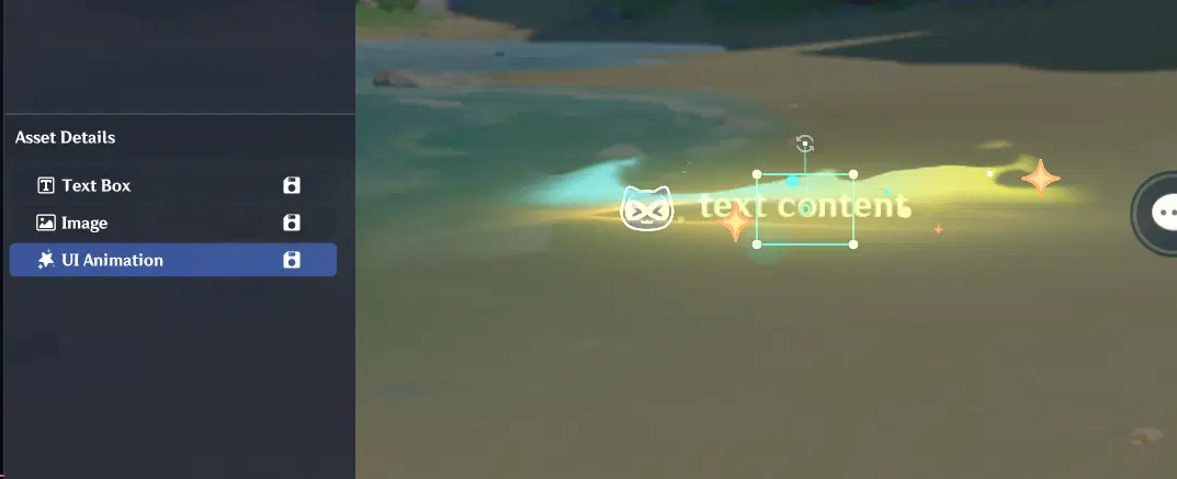
Adjust the visual style to your liking and save it as a template. Please go ahead and create the second message style on your own.
Next, create a Message Queue component and add the two newly created styles into its Style settings.
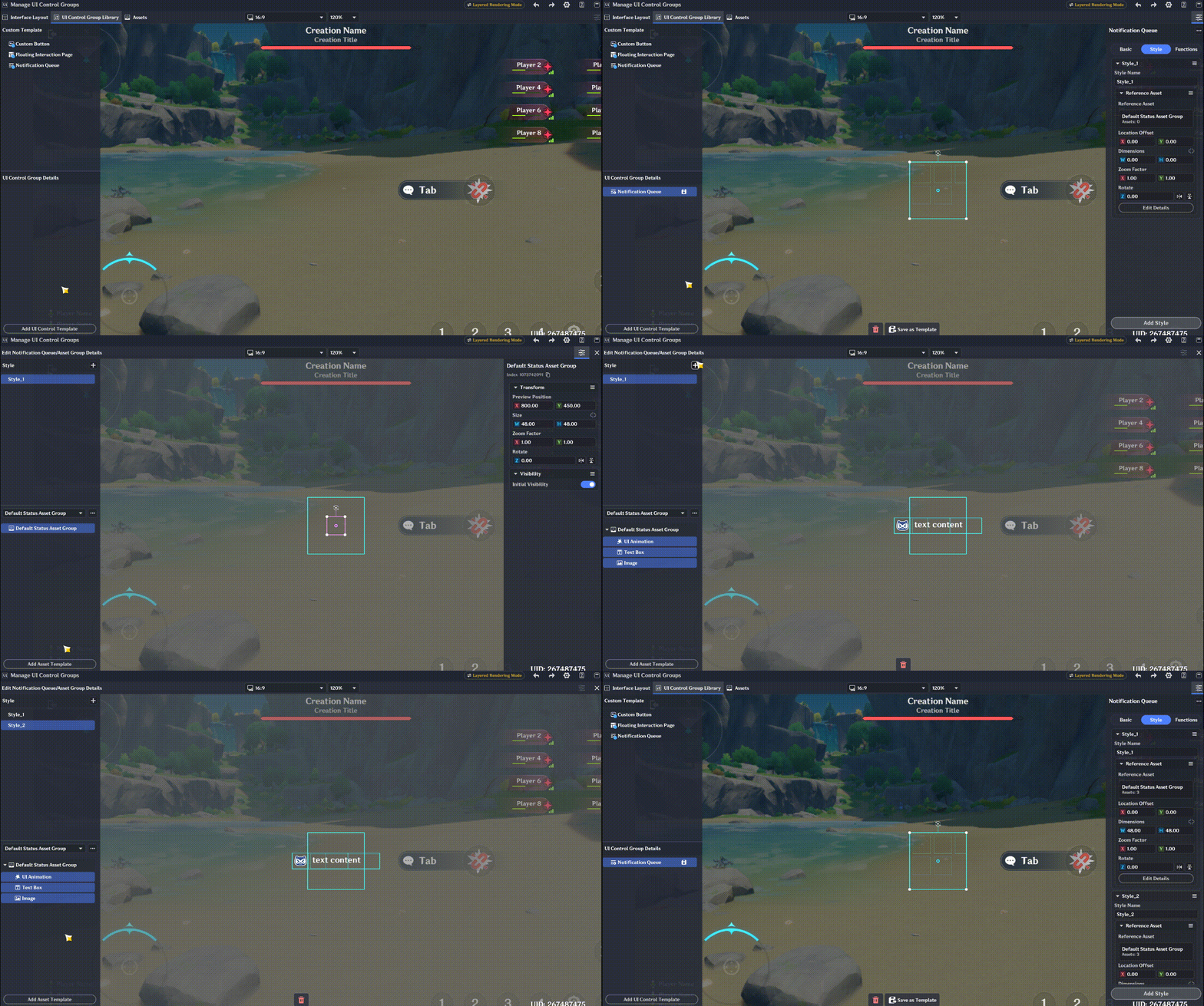
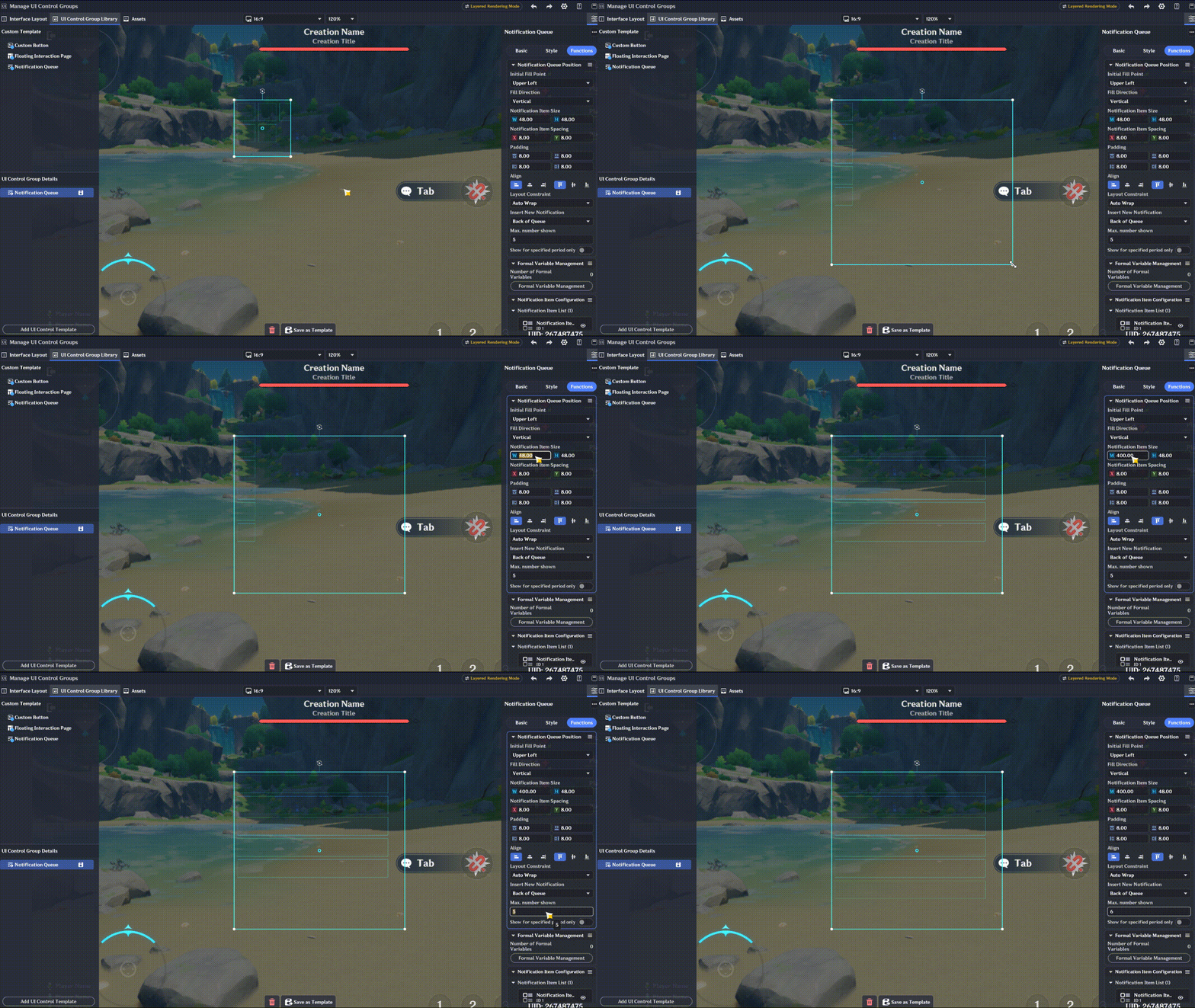
Adjust the overall message box dimensions and set the item width for individual messages.
Add two message templates and align their materials. Since preset materials may not align perfectly along the edges or center by default, manually adjust their XY offsets to ensure precise positioning.
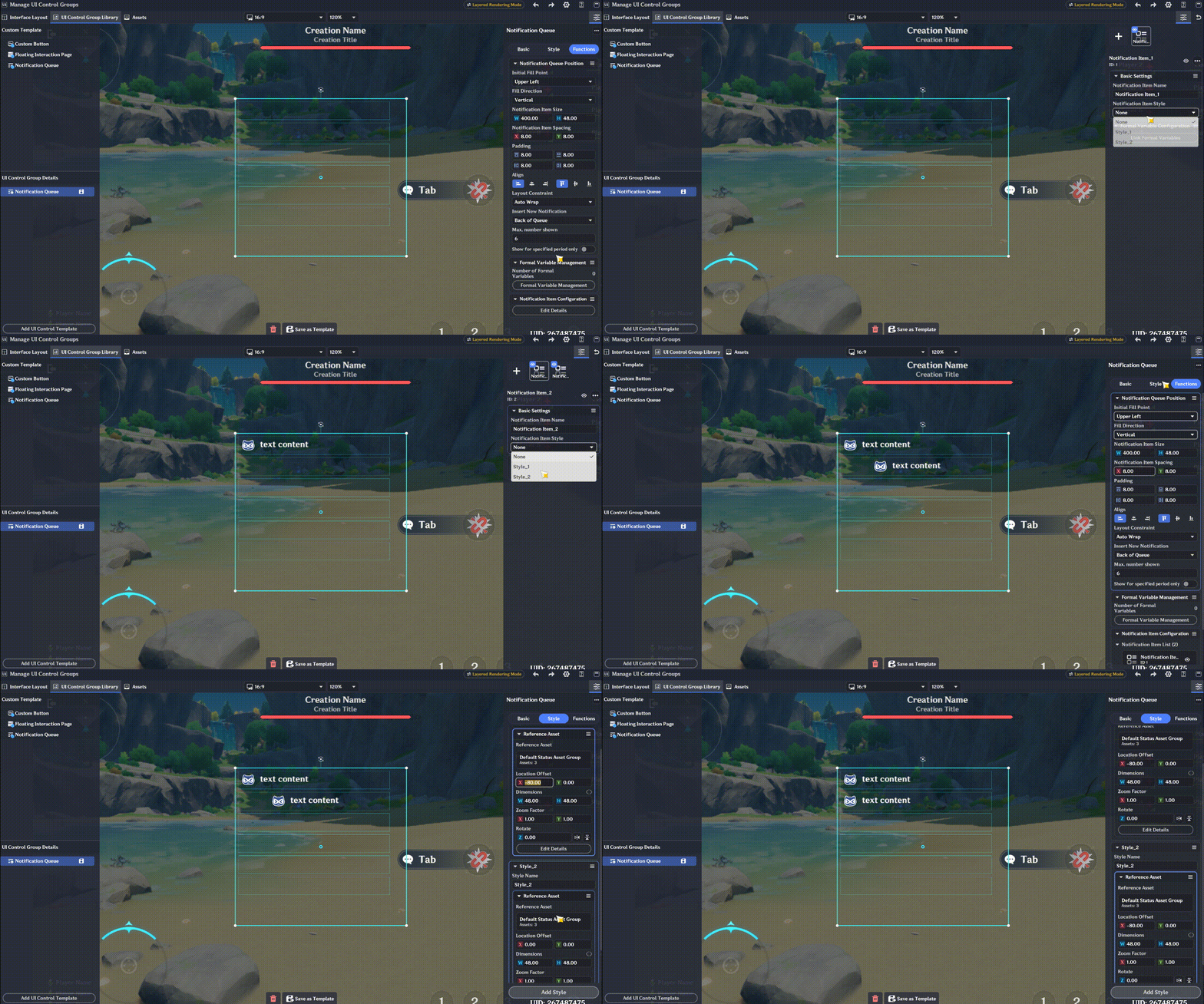
Create two formal parameters: one for the image ID and one for the text content. Replace both the image and text fields inside the styles with these formal parameters.
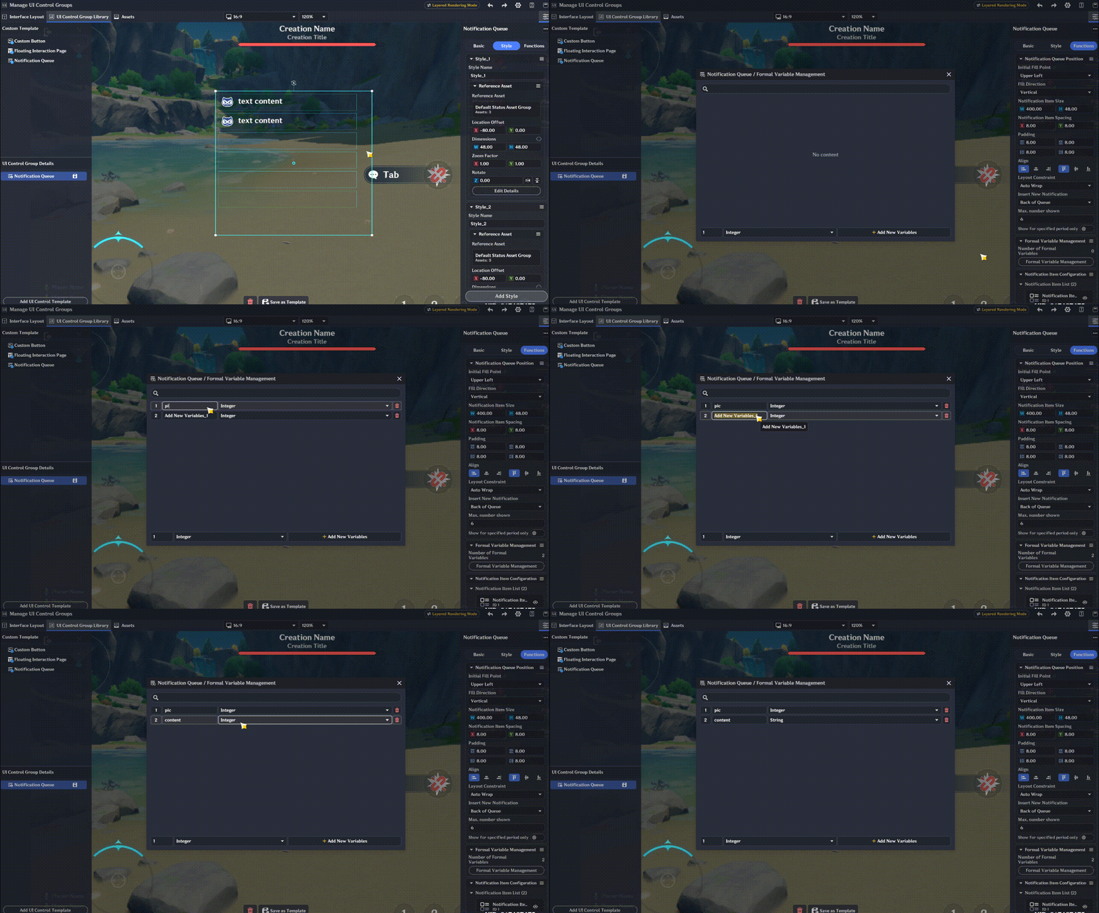
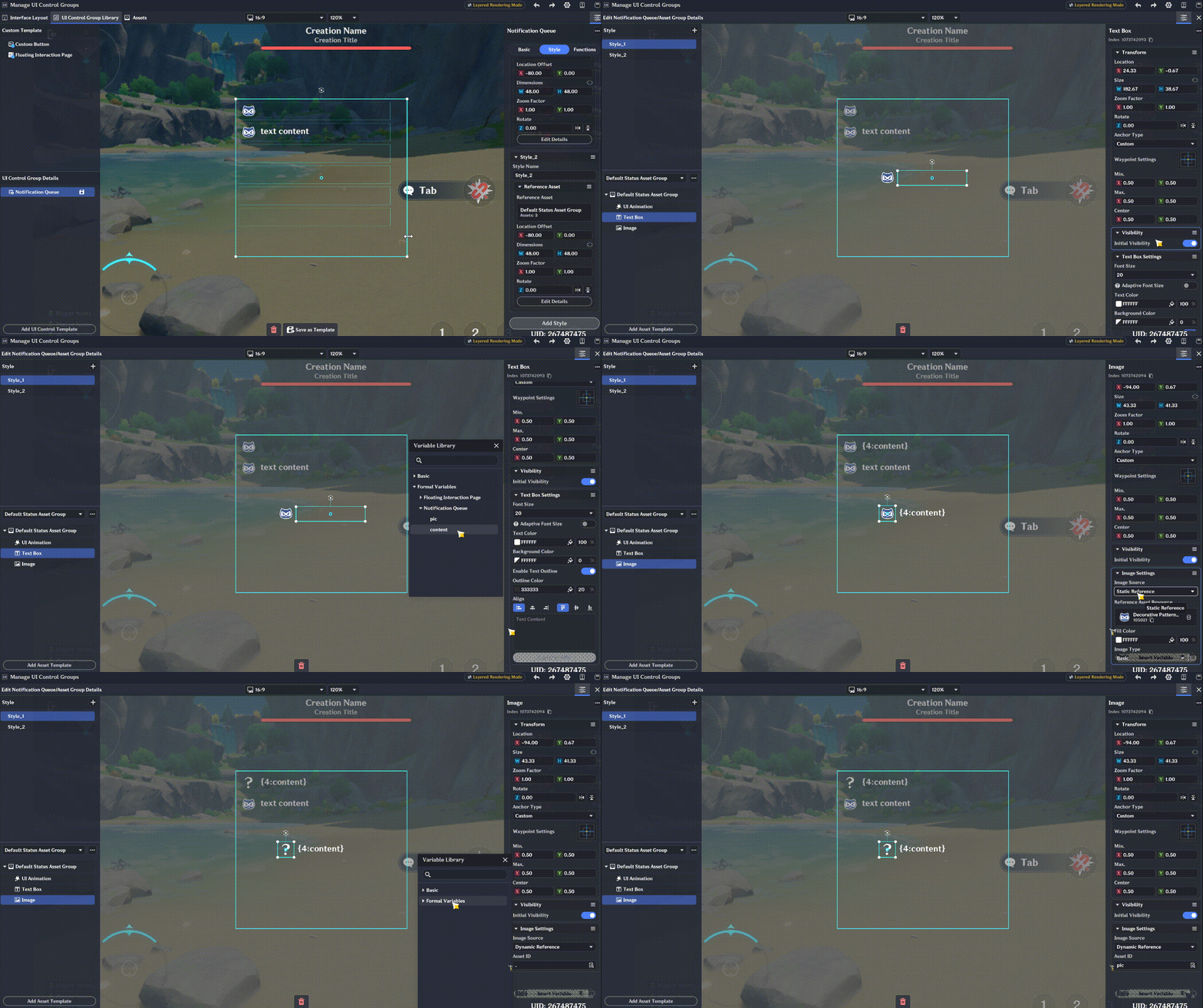
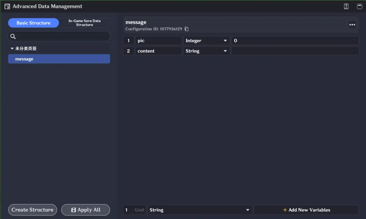
Create a struct and map its fields to the formal parameters inside the message list. Ensure that data types strictly match between the struct fields and formal parameters.
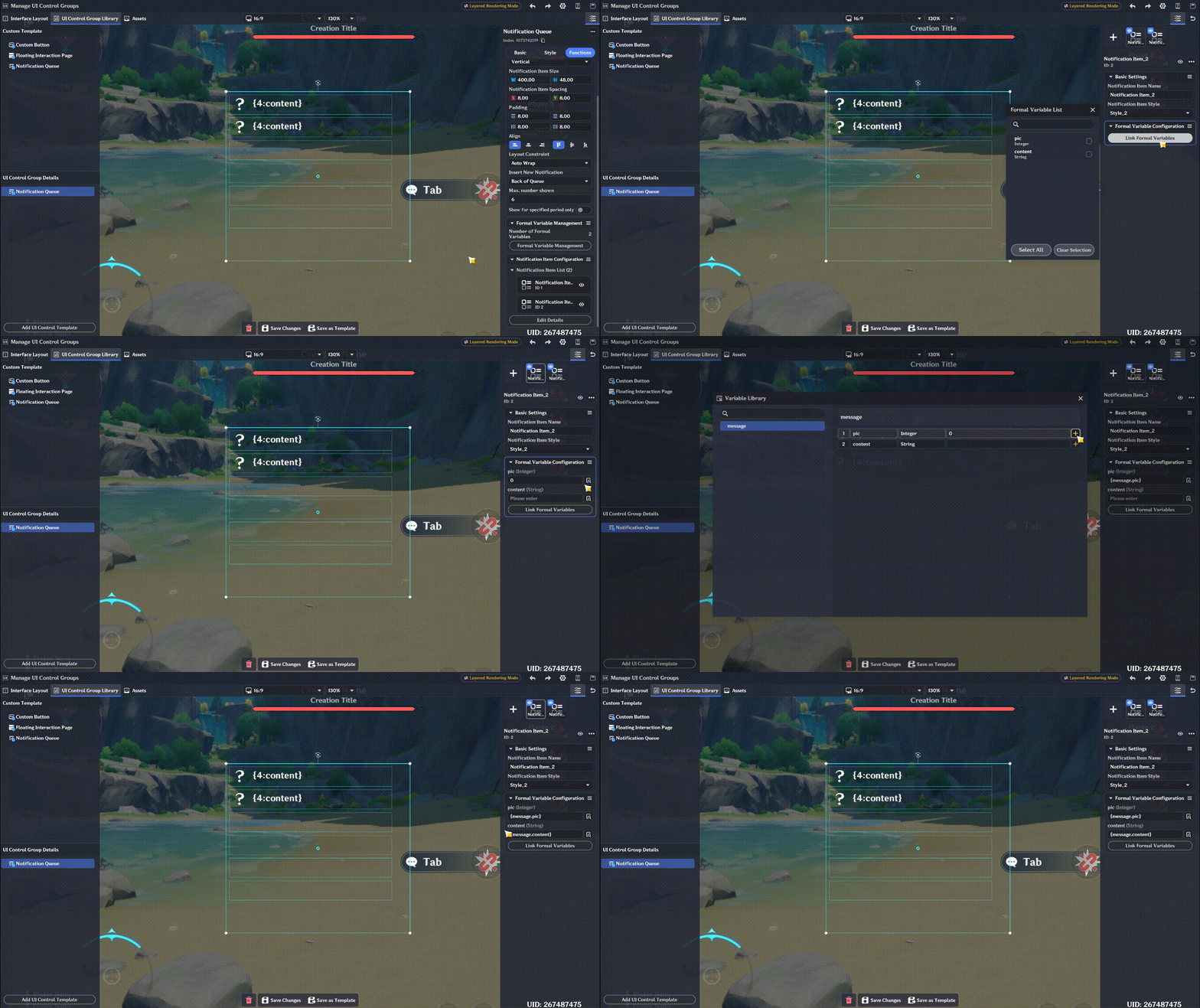
Both message styles use the exact same binding method, so we will only demonstrate one here.
Save it as a template, and the UI portion is now complete. Next, we need to implement the underlying logic.
Create a new interaction option on the torch to serve as the entry point, and implement the logic using the nodes we created earlier. Add a multi-branch node to handle the new logic paths.
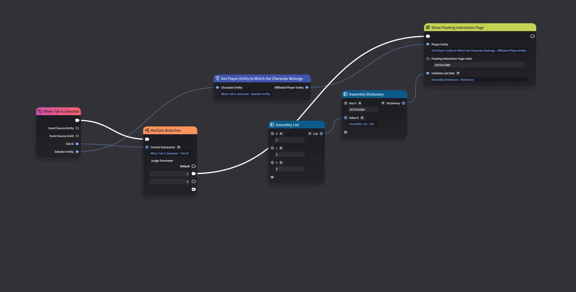
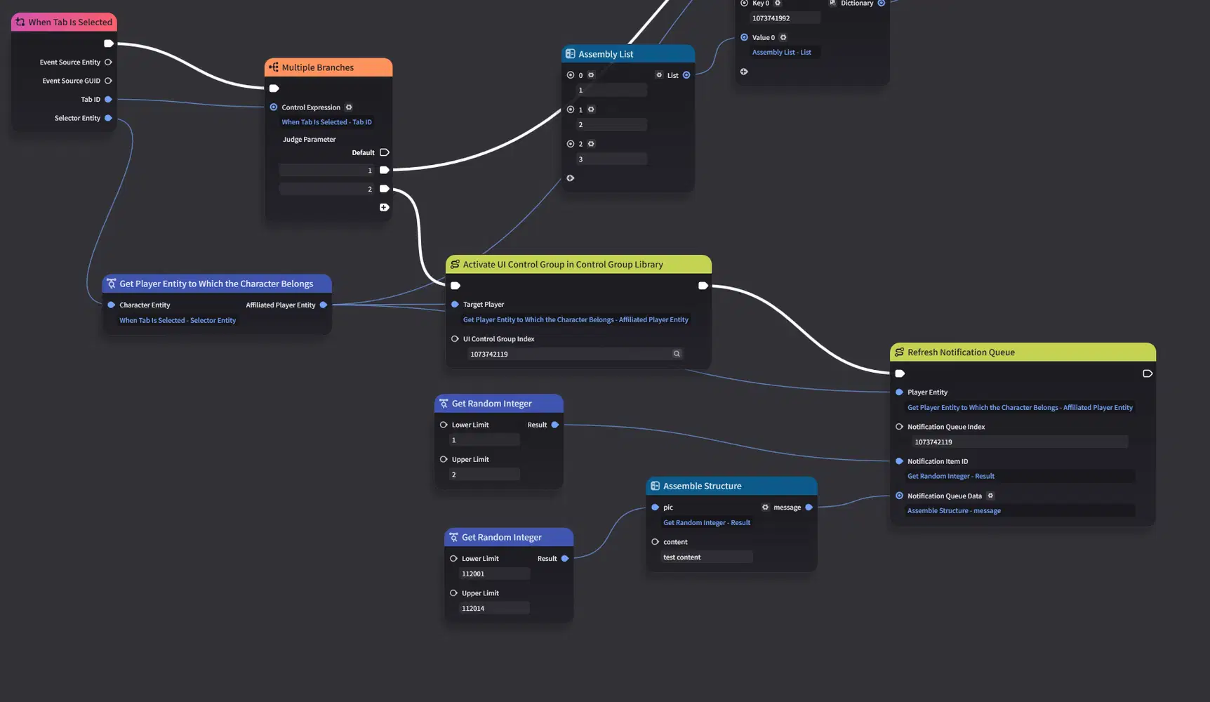
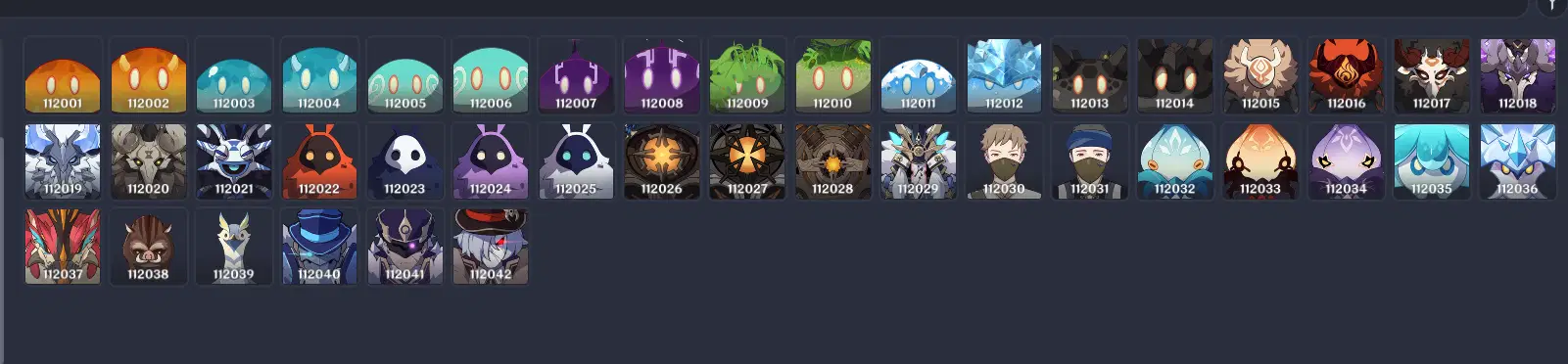
Here, we will implement a simplified version of the logic: randomly select between two message types, and randomize the avatar to a slime image (since image IDs 112001 through 112014 correspond to slime avatars).
Now, let's playtest and check the result!
Note: Once activated, the Message Queue cannot immediately refresh new messages and requires a brief cooldown period. Therefore, the very first click may not show any output. This behavior is left unhandled in this demo.
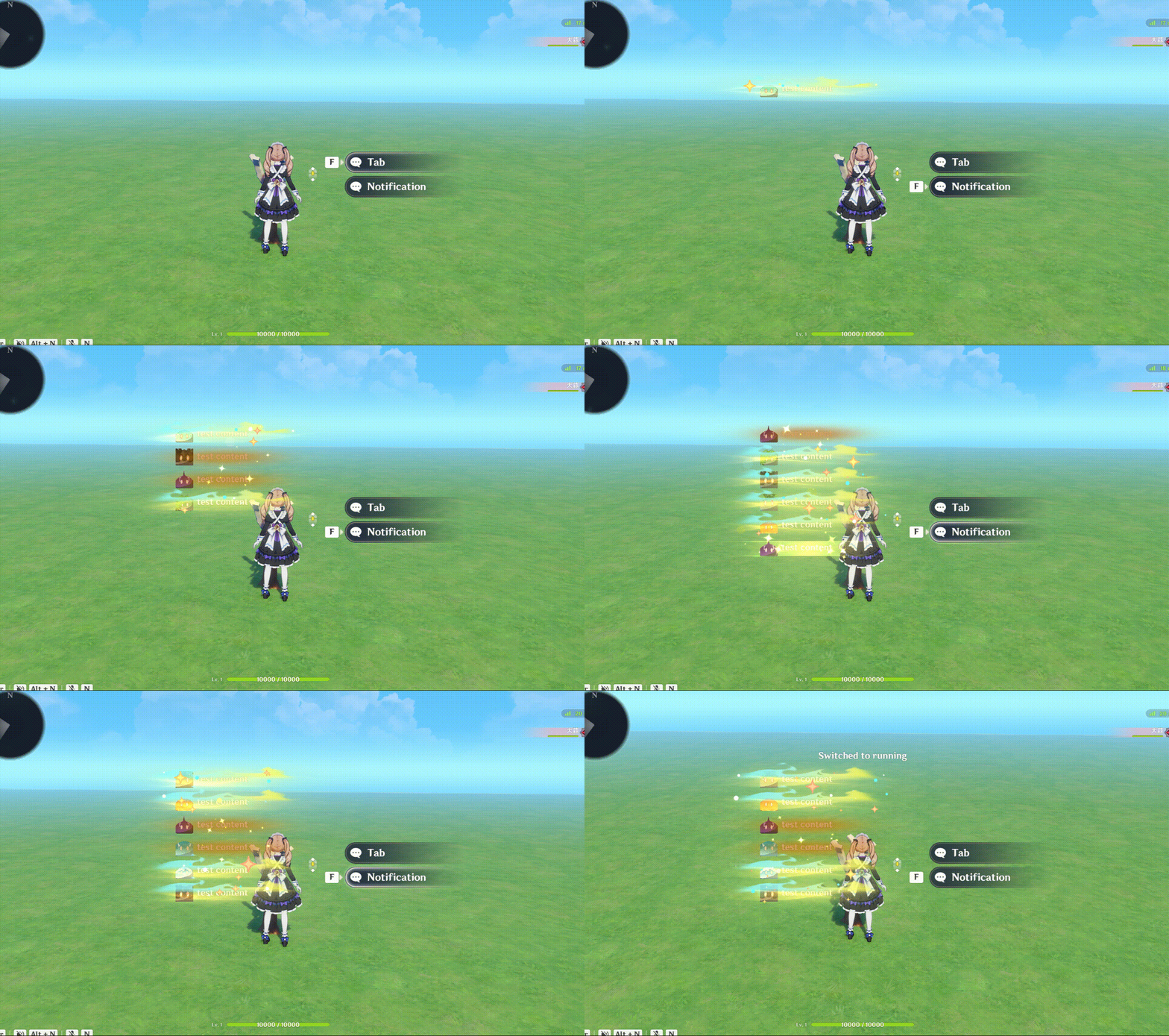
The result matches our expectations, and everything works as intended. Although the particle effects obscure the vision slightly, this can easily be resolved by adjusting the layer hierarchy—we'll leave it as is for now.
We won't cover other scenarios utilizing formal parameters here, but they all follow the same core workflow: Define → rightarrow → Place → rightarrow → Bind.
This concludes Section 1 on the basic usage of UI controls. While not exhaustive, it covers most of the general mechanics you'll need. Hope this helps!
2. Bubble Chat Overview
Unlike simple demo setups, a production-ready dialogue system requires a slightly more structured approach to data loading, branch jumping, and session state restoration.
To break this down logically, our walkthrough is divided into three sections: UI Layout, Data Structure Design, and Node Graph Scripting.
Core Implementation Overview
(If you are an experienced editor author, this overview may be all you need. For others, reviewing this summary first will provide helpful context before diving into the details.)
- UI Presentation Layer: Uses three distinct message style templates:
- Left-aligned message: For NPC responses.
- Right-aligned message: For player replies.
- Center-aligned small notification: For system messages or event logs.
- Top-Level Container: A Floating Interaction Page serves as the outer UI frame, ensuring unified closing animations, layout stability, and clean screen-space management.
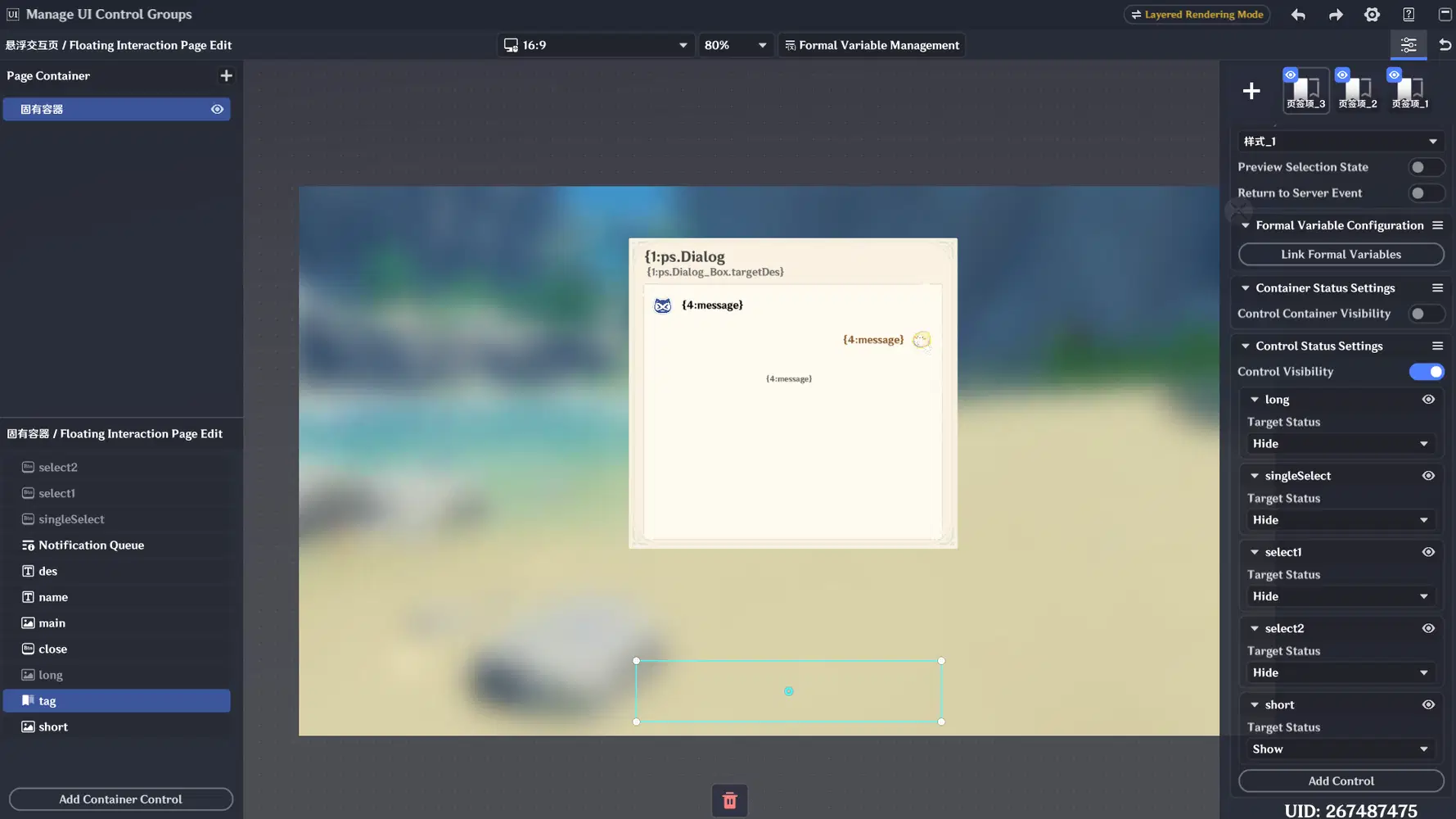
- Invisible Tab Router: Because component visibility inside a Floating Interaction Page cannot be directly toggled via Node Graph commands (Set UI Control Status), we use a fully transparent Tab control as an internal controller. Updating the active Tab index through Node Graph initialization triggers preset tab-visibility rules (Control Status Setting), effectively granting complete Node Graph control over the UI's display states.
Data Structure Design
The data system is powered by three core structures:
- UI Data (Player Variables): Stored directly within player variables, establishing a 1-to-1 mapping for all elements physically rendered on screen.
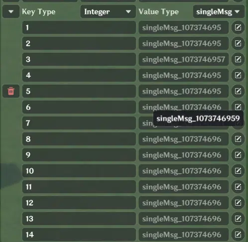
- Message Nodes with Branching Logic: Messages are organized into a dictionary structure (Dictionary), mapping unique Message IDs to individual message data objects. Each message contains its own ID for fast retrieval.
- Type & Jump Classifications:
- Message Types: Left-aligned (NPC), right-aligned (Player), or center notification messages.
- Jump Types: Single-choice branch, dual-choice branch, or auto-advance to the next message.
- By parsing these type configurations at runtime, the system dynamically loads the appropriate UI styles and option controls for player interaction.
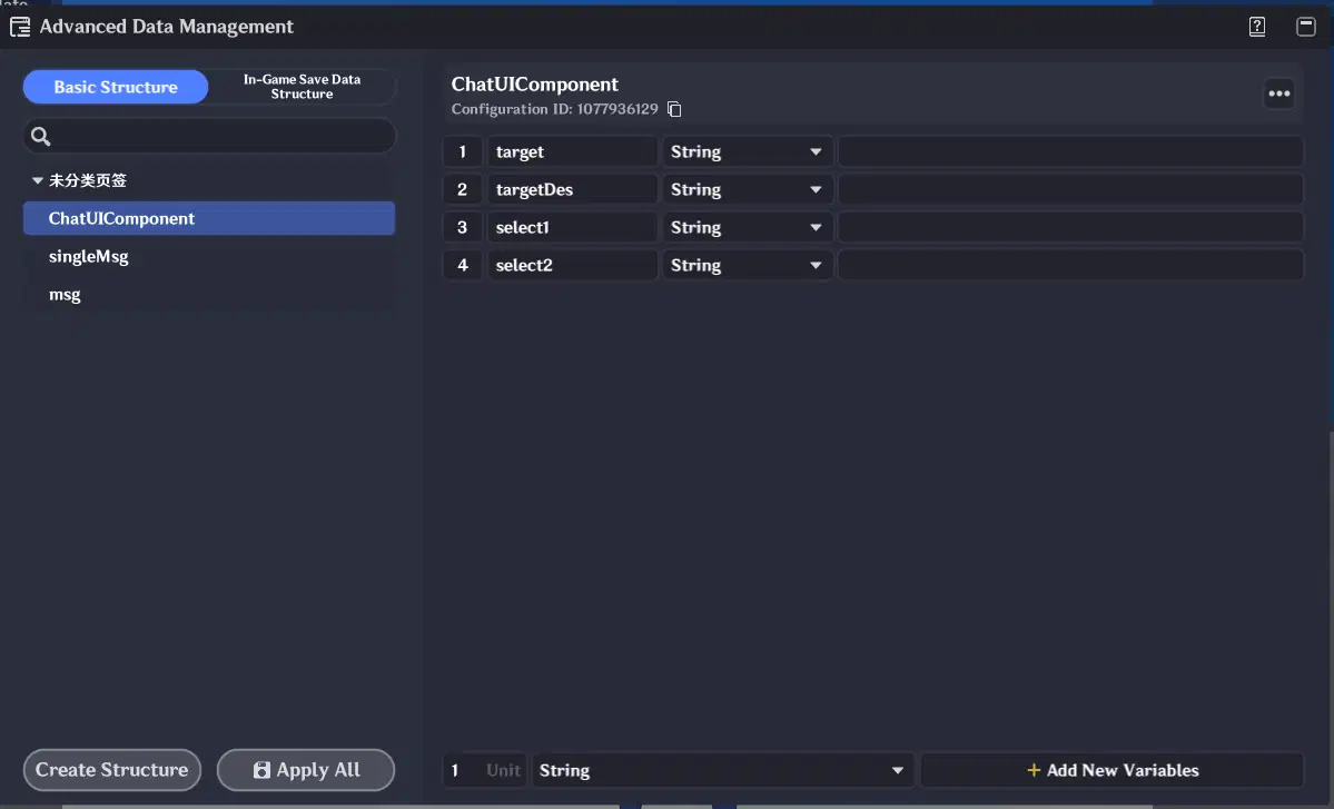
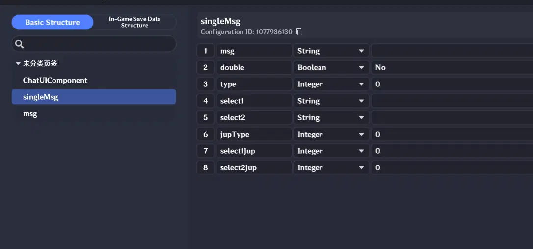
- Message Struct: Acts as a direct, 1-to-1 mapping layer to the formal parameters defined in the UI material templates.
- Core Architecture Design:
- Data Storage (Entity-Bound): Dialogue data is attached directly to the dialogue target entity. Upon interacting with an entity, its avatar and name are loaded into the player's UI data, and its dialogue dictionary is loaded into the Node Graph. The Node Graph handles all dynamic data loading generically without needing hardcoded entity checks.
- Session Management: Uses a lightweight Session array (List storing sequential Message IDs) to track conversation history and enable progress recovery. Newly triggered messages are pushed into the session array. Re-initiating a dialogue parses this session array to fully restore past message logs into the Message Queue.
- Node Graph Execution: Handles session updates, dialogue state restoration, and dynamic UI loading based on message types and jump branches (detailed further in the Node Graph section).
3. UI Construction
3.1 Basic UI Layout
Create a Floating Interaction Page.
Add the corresponding assets and visual components. For learning purposes, precise visual design is not critical—focusing on structural similarity is sufficient. Since granular UI adjustments can be tedious, we will focus only on the core components here.
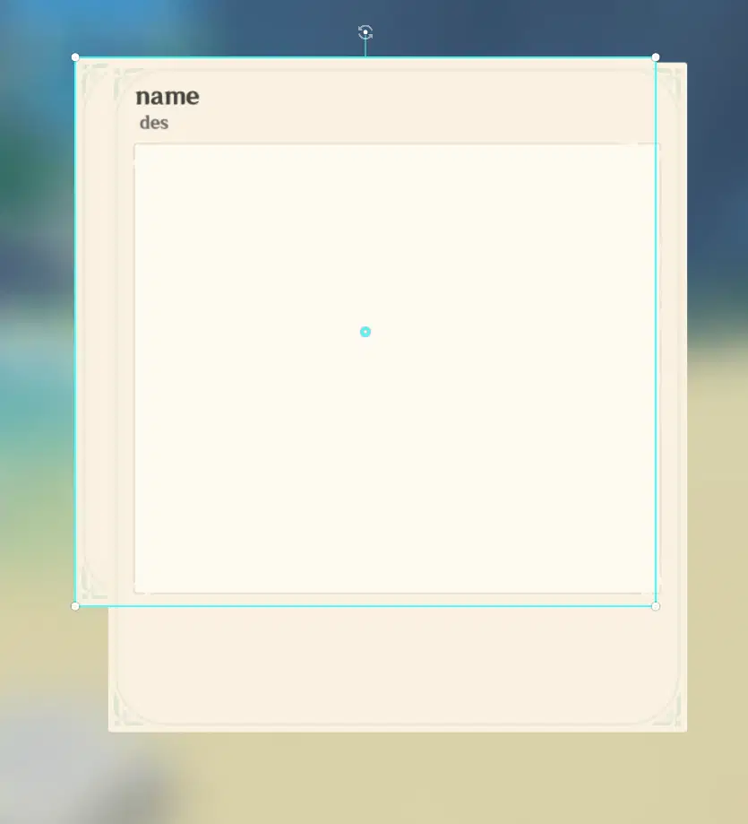
Start by layering the basic UI elements. Here, we use two background panels (the smaller one is slightly offset so it is clearly visible). This setup provides flexibility for dialogue options: when no options are active, the smaller background is displayed; when option buttons are present, the longer background is activated to accommodate them.
Next, add two text boxes for the dialogue target's Name and Description. Finally, place a lighter-colored main chat card in the center to house the conversation elements.
3.2 Message Queue
Next, add a Message Queue component and align its position to overlap neatly with the main chat card background.
Adjust the Item Width of individual messages so that they expand to fill the full width of the container.
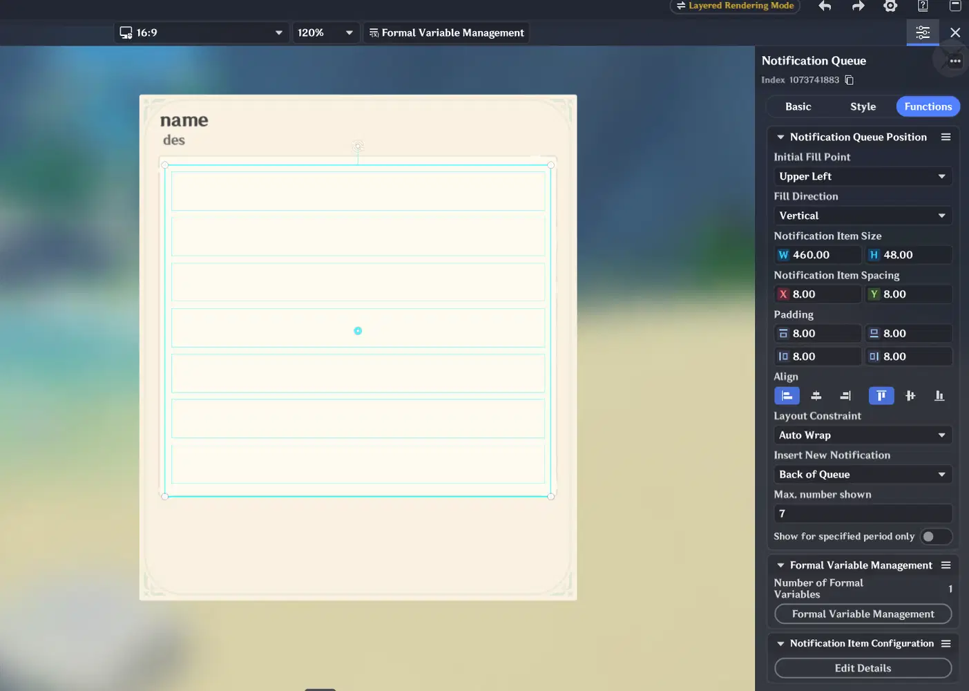
Create the message styles and adjust them to suitable positions within the container. Since this process is straightforward and was already explained during the basic usage section, detailed steps are omitted here. Please try creating a left-aligned message, a right-aligned message, and a center notification message on your own, and adjust them to their proper positions using XY offsets.
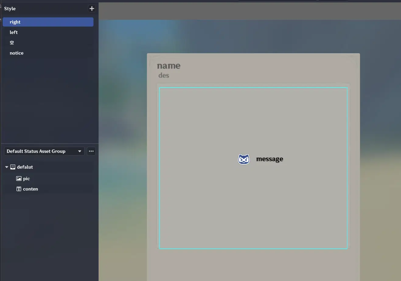
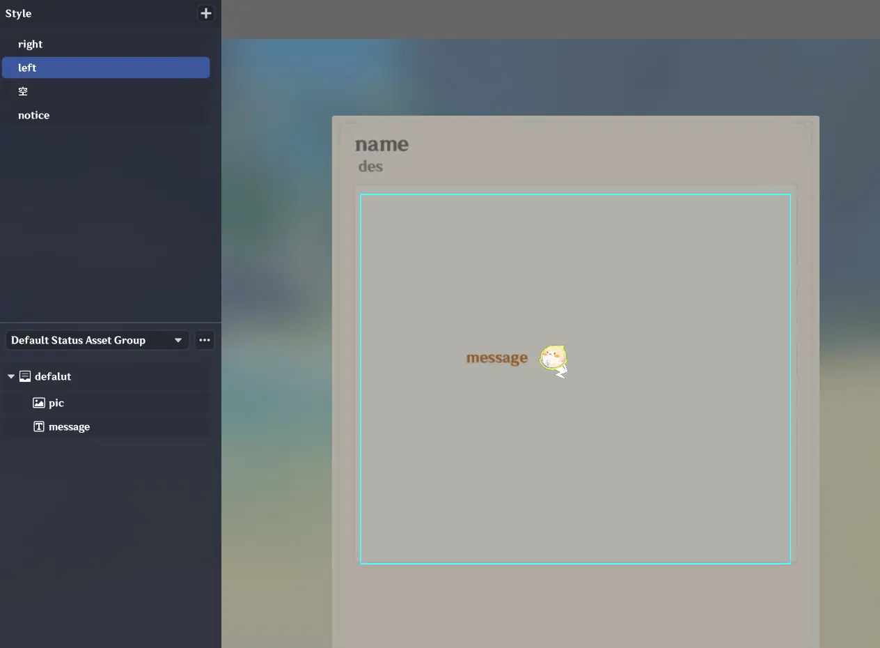
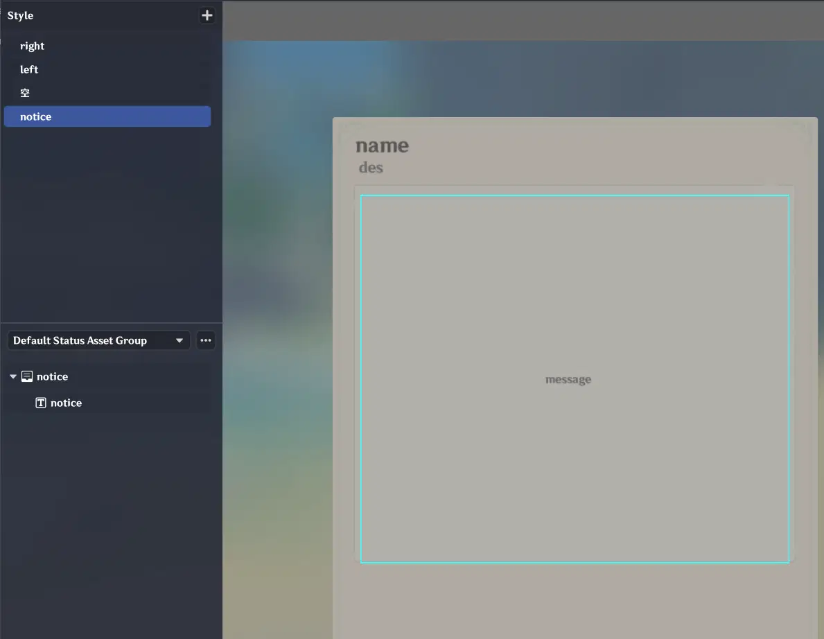
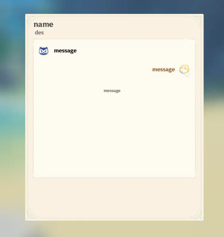
注意调整xy偏移,使位置合适,消息美观
3.3 Option Buttons
Option buttons are implemented using custom button components, as explained in detail earlier. You simply need to create a dual-option layout and a single-option layout, then arrange them neatly on the page.
The steps are straightforward, so we will skip the detailed setup here.
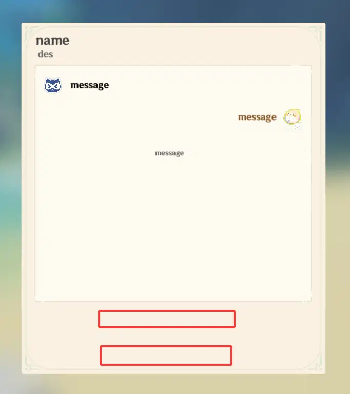
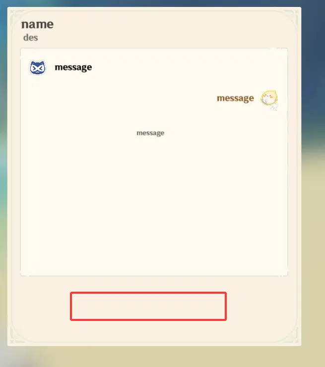
Final Result
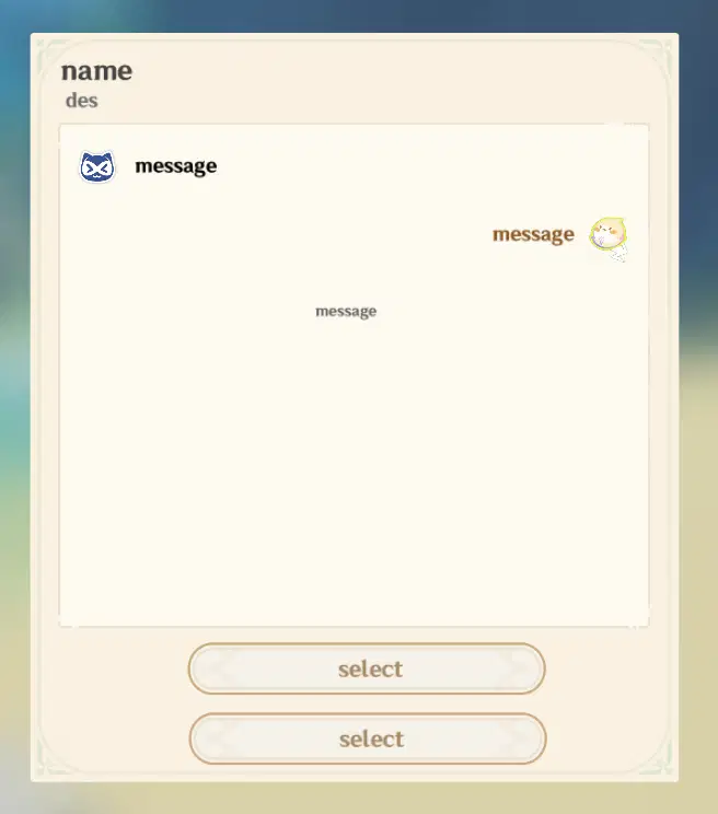
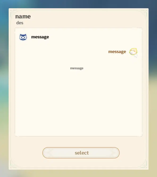
At this point, the UI construction is complete. However, it is currently just an empty shell and will need further implementation to become fully functional.
4. Data Structure Design & UI Binding
The data system mainly consists of two parts: UI variable bindings and dialogue data design. As mentioned briefly in the core overview, this section provides a detailed breakdown of the exact structure and the reasoning behind these design choices.
Let's begin with the simpler part: UI Variable Bindings.
4.1 UI Variables & Binding
Create a struct that primarily contains the content to be rendered on the UI:
- Target: The name of the dialogue target.
- TargetPic: The avatar image of the dialogue target.
- Select1 / Select2: The text content for the selectable options.
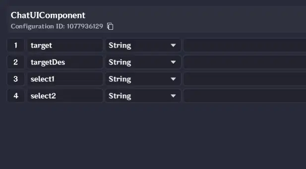
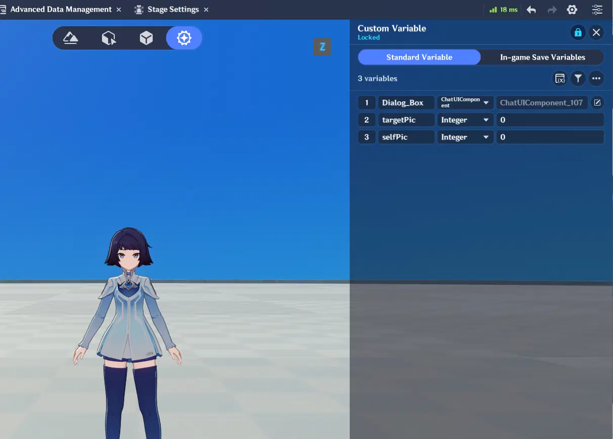
Add this struct variable to the player variables, and create two integer variables: one for the player's own avatar and one for the target's avatar.
Here, we use direct variables for avatars instead of updating them dynamically via messages. Since avatar changes are infrequent, this approach is more than sufficient.
Return to the UI editor page and assign the corresponding variables to each specified location.
Note: Each style variant for the option buttons must be configured individually—be careful not to miss any.
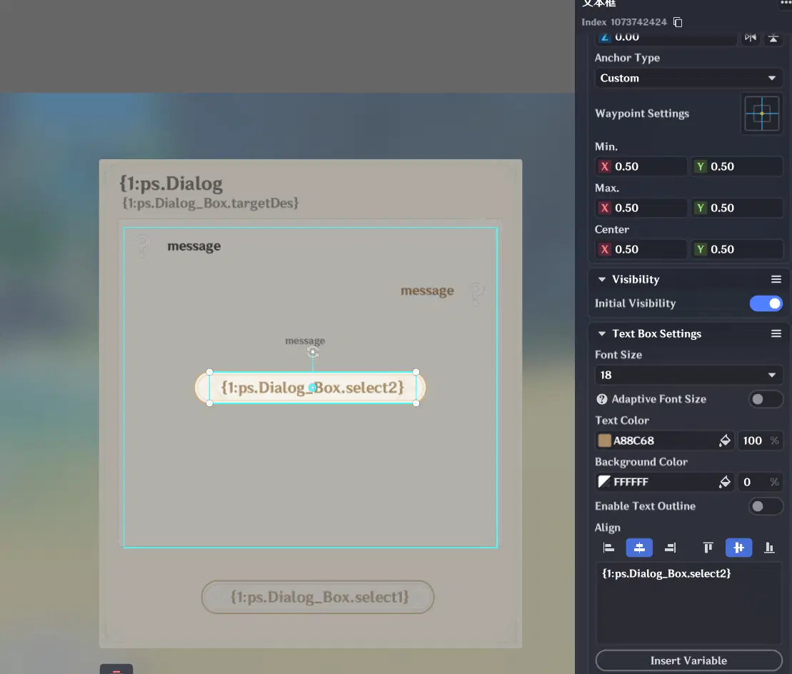
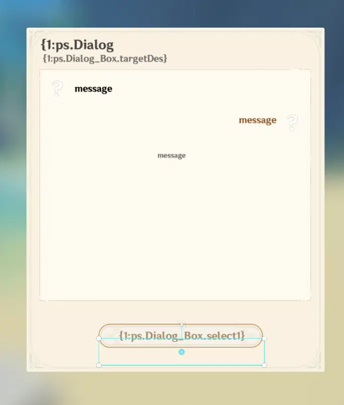
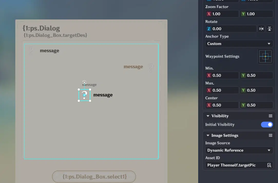
Here, the avatars within the Message Queue also directly use variables.
Next, create the formal parameters and the corresponding struct used for message updates.
For the data update struct, a single String message field is all that is required.
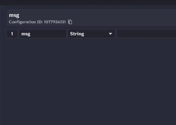
Editing the Message Queue Struct
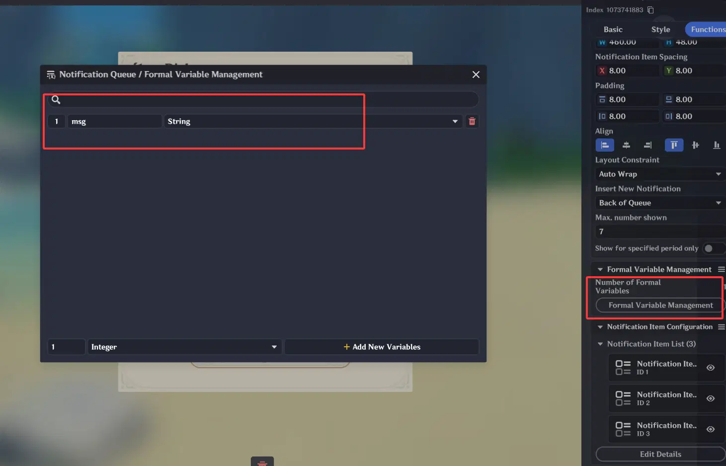
Replace all text fields in the message styles with formal parameters.
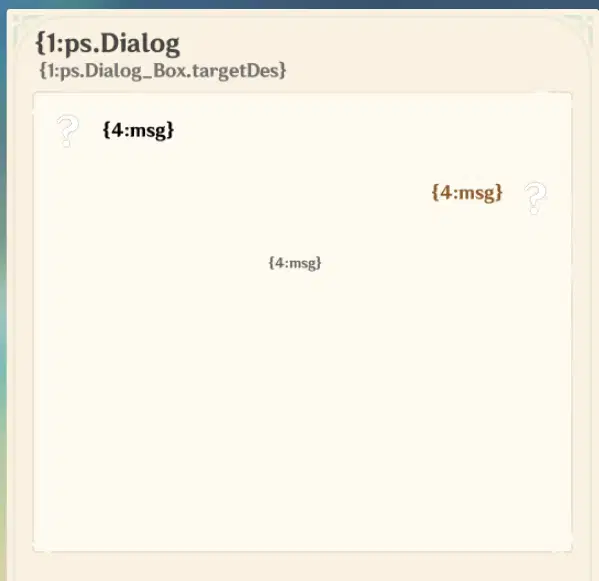
Bind the formal parameters to the struct—all three message styles must be bound one by one.
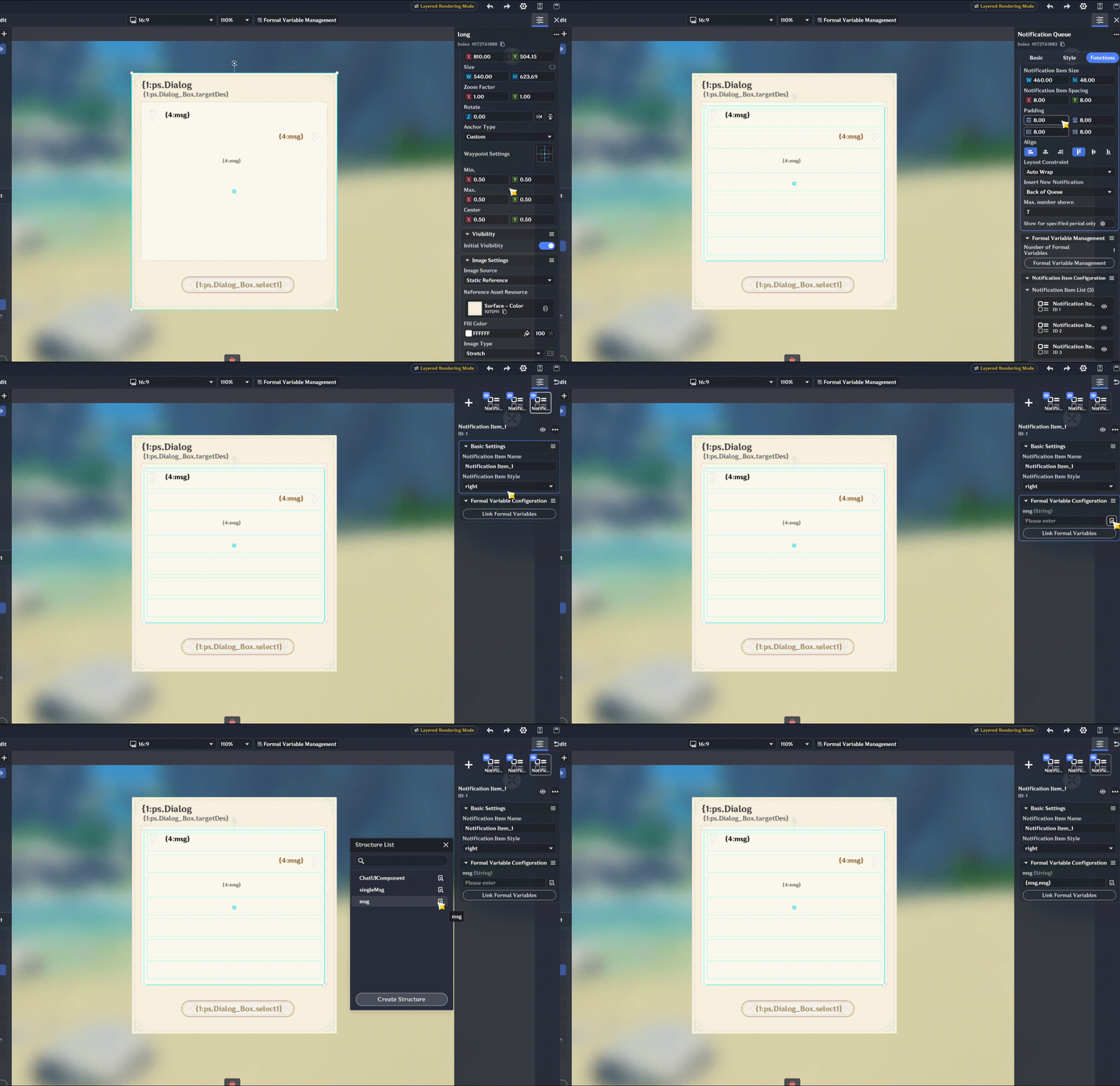
The UI presentation layer is now fully complete. Next, we will step by step implement how to drive this UI into a functional, interactive dialogue system.
Currently, if you update the message queue at this point, it will already render properly with the custom styles. However, it is clearly not yet capable of handling complex, branching conversations.
4.2 Message & Structure Design
In our design, the workflow operates as follows:
Trigger Interaction -> Fetch target name, avatar, etc., and load into UI data -> Query dialogue history -> Restore conversation state (if any) -> Load active dialogue -> Handle branching logic.
Working backward from these requirements, we can determine what each message object must contain:
- Message Content: To store the body of the message, we need msg: String.
- Message Source: To distinguish who is speaking, we use a simplified classification: Left-aligned (NPC), Right-aligned (Player), or Center (System/Notification). Thus, we include a type flag: type: Integer (Enum).
- Branching UI Triggers: To ensure the system correctly pops up the right UI controls (single option, dual options, or no options), the execution layer needs to know how to handle the flow. We define a jump type variable: jupType: Integer.
- Option Data & Routing: For messages with options, we must store both the button labels and their target destinations. This requires:
- select1 / select2 (String): Display text for the respective options.
- select1Jup / select2Jup (Integer): Target Message IDs to jump to upon selection.
With all these requirements identified, our core Message Struct is naturally defined.
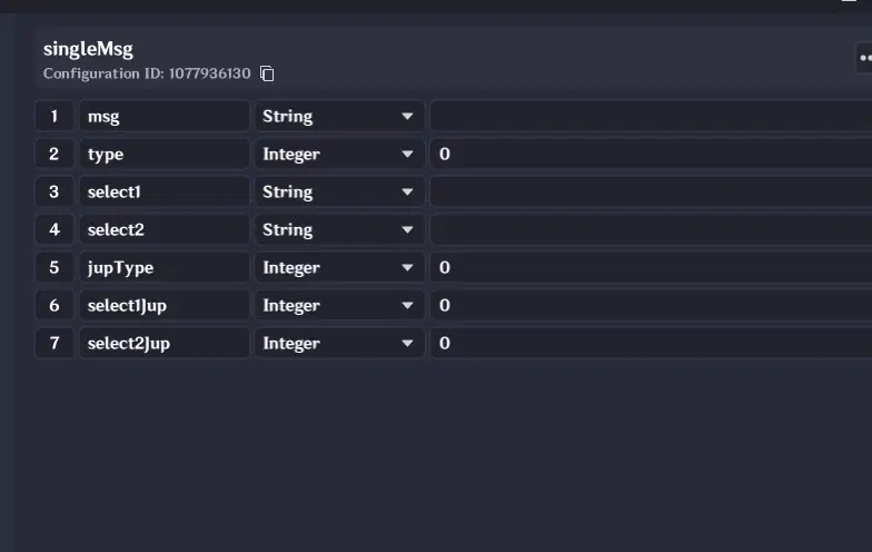
The dialogue data is designed using a dictionary structure: Dictionary.
The primary advantage of this structure is that it makes jumping to specific messages extremely straightforward using the Message ID as the key.
Furthermore, because it uses a dictionary layout, supporting multiple conversation trees is as simple as maintaining multiple dictionary instances.
4.3 Session Management
Imagine a conversation where messages 1, 2, and 3 are loaded sequentially, leading to a branch between options 4 and 5. If we choose option 5, another branch appears between 7 and 8, and we select 8.
Notice how clear our conversation path becomes: 1 -> 2 -> 3 -> 5 -> 8. By storing this sequence in an array, we effectively capture the full history of the dialogue. Because our dialogue flow is predetermined and uses unique IDs as keys, recording a conversation's history is that simple.
To support stored history across multiple conversation trees on a single entity, we only need to add a session dictionary to the target object: Dictionary> (mapping a MessageGroup ID string to an integer list of recorded Message IDs).
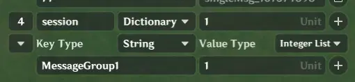
4.4 Additional Notes
On the target entity, three additional variables must be added: Name, Description, and Avatar. During an active dialogue, these values will be dynamically fetched directly from the target entity.
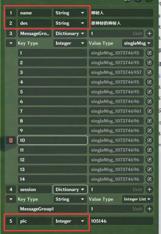
5. Node Graph Implementation
First, let's outline the implementation workflow. Message processing is divided into three core phases:
- Initialization and History Loading: When a dialogue opens, check the session history. Load data based on the existence of prior history while initializing basic display properties. Simultaneously, load necessary data into the Node Graph variables for subsequent processing.
- Message Loading: Process each individual message, supporting message backtracking, type handling, and branching jumps.
- Branch Selection and Jumping: Handle state transitions and routing after an option is selected.
Once this logic is clearly structured, the subsequent logic can be implemented step by step.
5.1 Initiating the Dialogue
We should attach the dialogue trigger logic directly to each entity that requires dialogue. Meanwhile, the execution layer remains centralized, handling all dialogue events uniformly through signals.
First, create a signal used to open the dialogue. This signal needs to pass two parameters: the Target Entity and the active Dialogue Group ID.
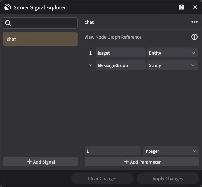
Create a new Node Graph named Initiate Dialogue. Use any trigger event as the entry point, and issue the signal to open the dialogue.
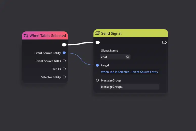
5.2 Initialization & History Loading
Next, we handle the initialization and session loading operations. At this point, the signal has provided us with the target entity and the dialogue group to be loaded.
First, store the entity passed by the signal into a Node Graph variable for convenient reference later. Add the corresponding two Node Graph variables.
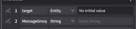
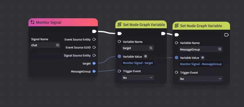
Write the signal parameters into the Node Graph variables.
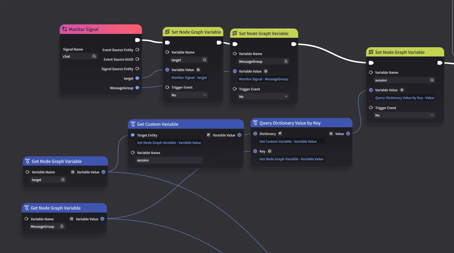
Write the session data into the Node Graph variables as well.

Check whether the session data is empty.
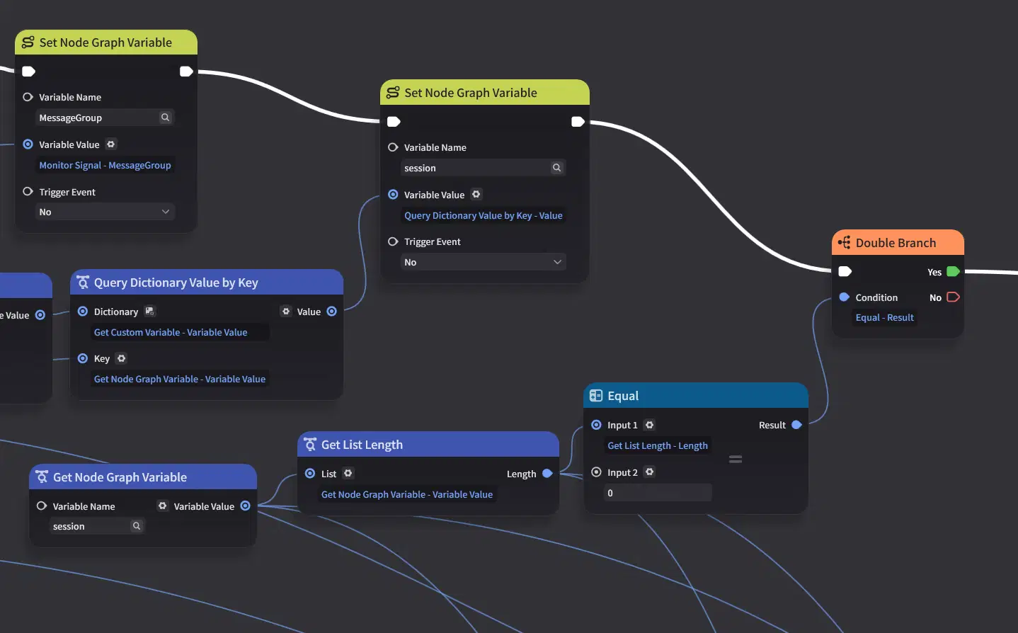
If it is empty, directly load the first message.
Before proceeding, create two Node Graph variables: Current Item (the index/ID currently being loaded) and Message List (the list of messages prepared for loading).


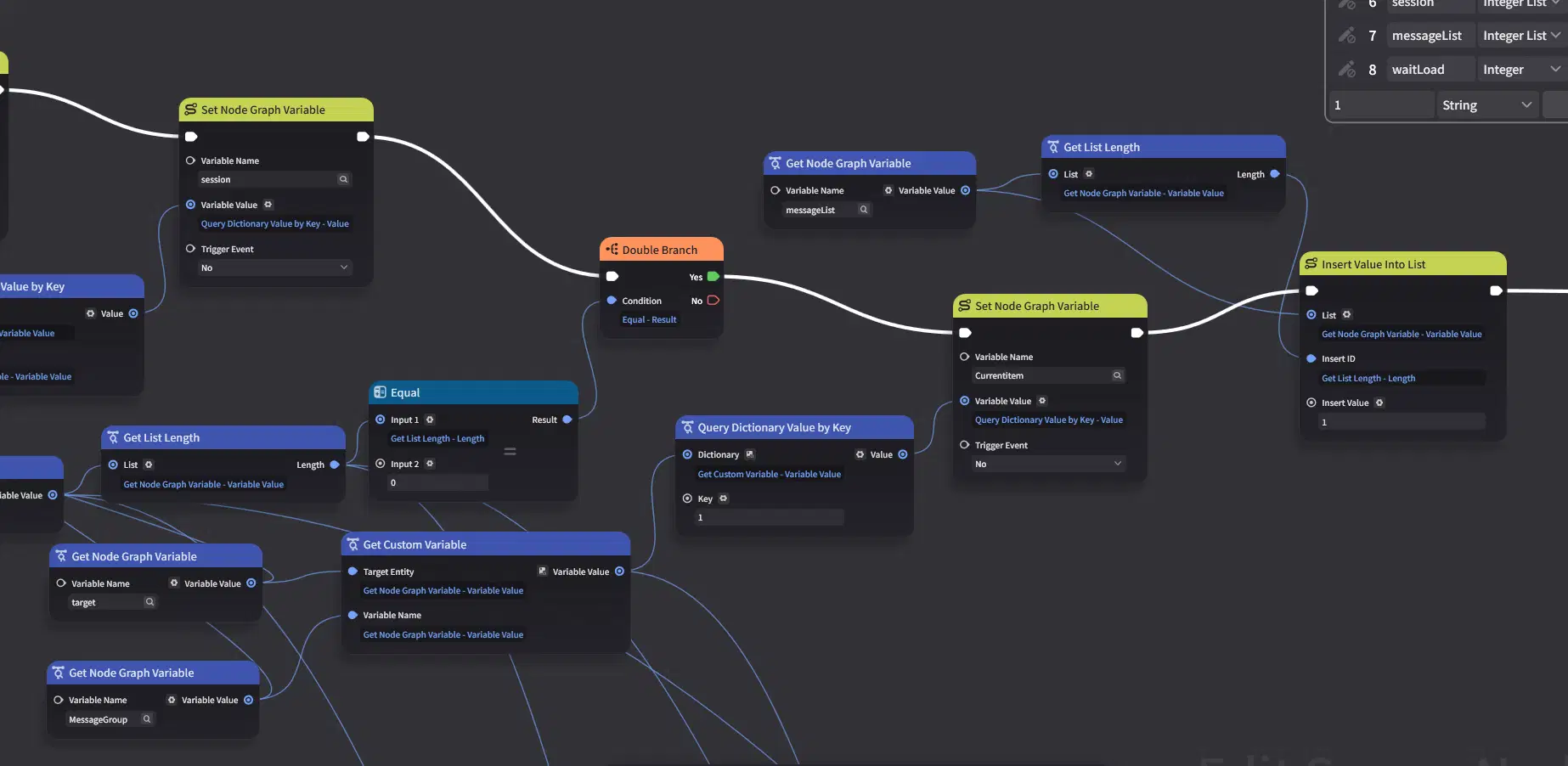
For the other branch, when the session is not empty, load the latest message from the history as the current message.
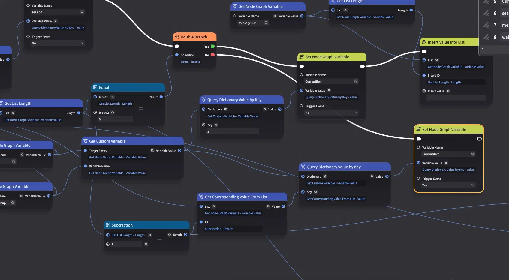
When history exists, load the preceding three messages to serve as prior context. A loop is used for this process: the starting index is set to the maximum of Length - 4 and 0 to prevent out-of-bounds array errors.
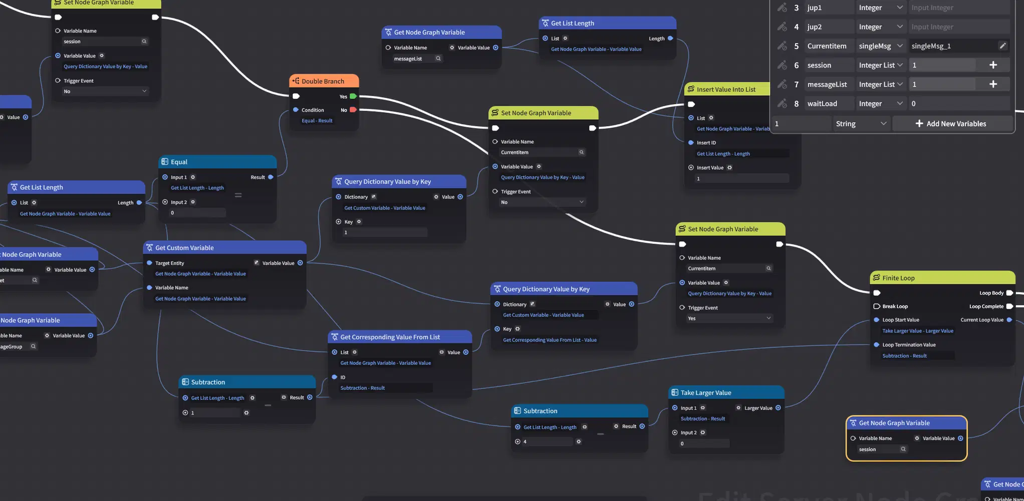
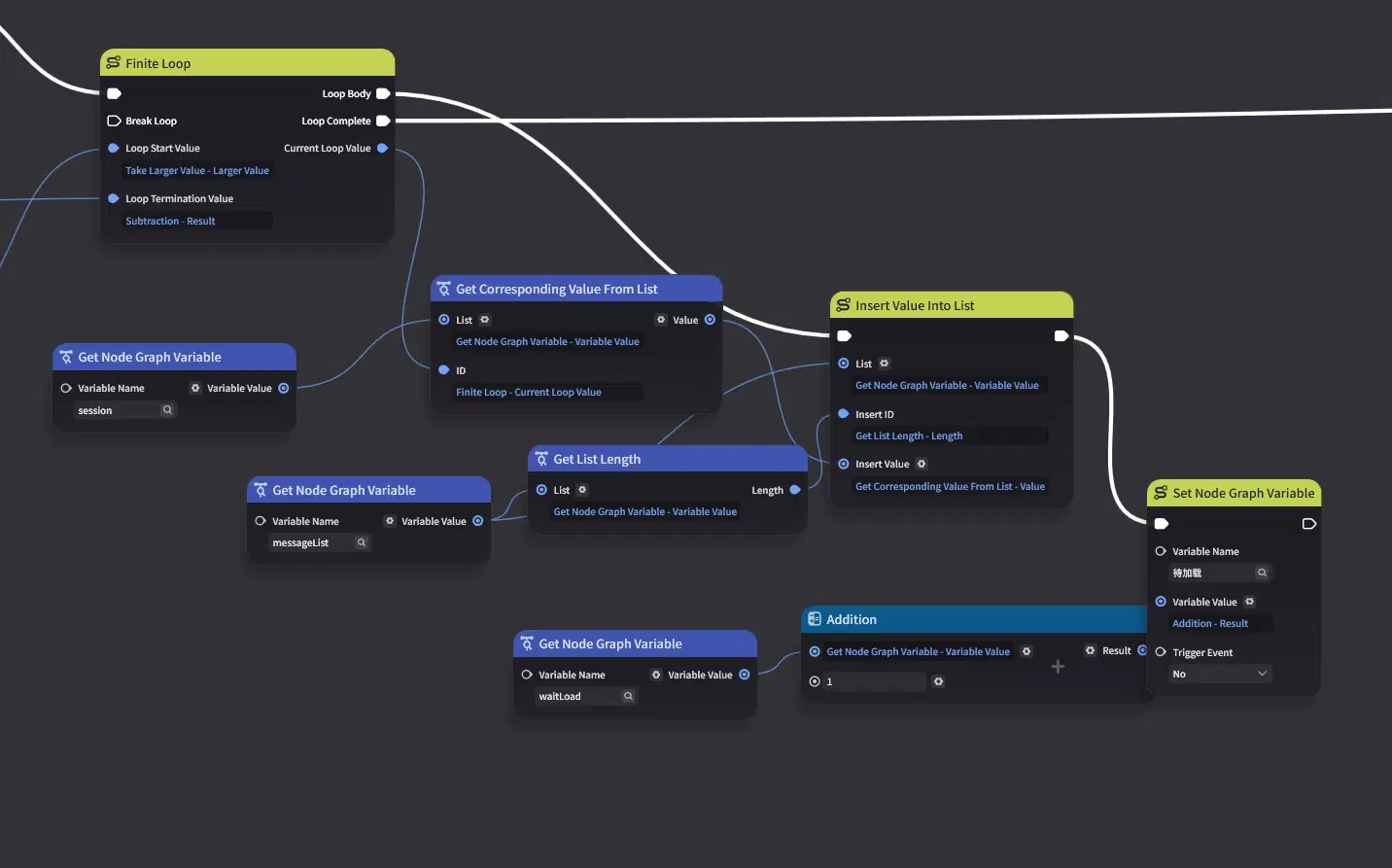
Add a new Node Graph variable named WaitLoad to act as a counter variable. While historical messages are still loading, they should be processed via fast-loading without being recorded into the session history.

Append historical messages to the message list, incrementing WaitLoad by 1 for each loaded message.
Once both branches complete loading, read the target entity's basic profile details, write them to the UI data model, and activate the floating interaction panel.
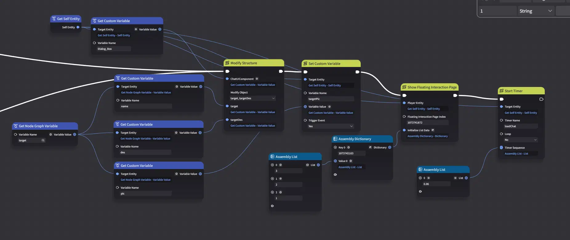
This completes the initial loading sequence for the dialogue system. The core focus lies in initializing UI parameters and restoring conversation history from the session data.
5.3 Message Loading
The primary task here is handling both historical messages and the active (latest) message. The former only requires rendering textual/visual information, whereas the latter demands complete UI logic processing and branching flow evaluation.
First, create two Jump Target variables, which will be used later when handling option jumps.

Use a timer for the entry point. As mentioned earlier, messages cannot be pushed immediately when the message queue is first initialized. At the end of the previous section, we also set up a timer to trigger message loading.
First, check the timer name, then directly execute the historical message rendering. The type field corresponds directly to the message style type being added. Assemble the message into a struct, and the UI will update correctly.
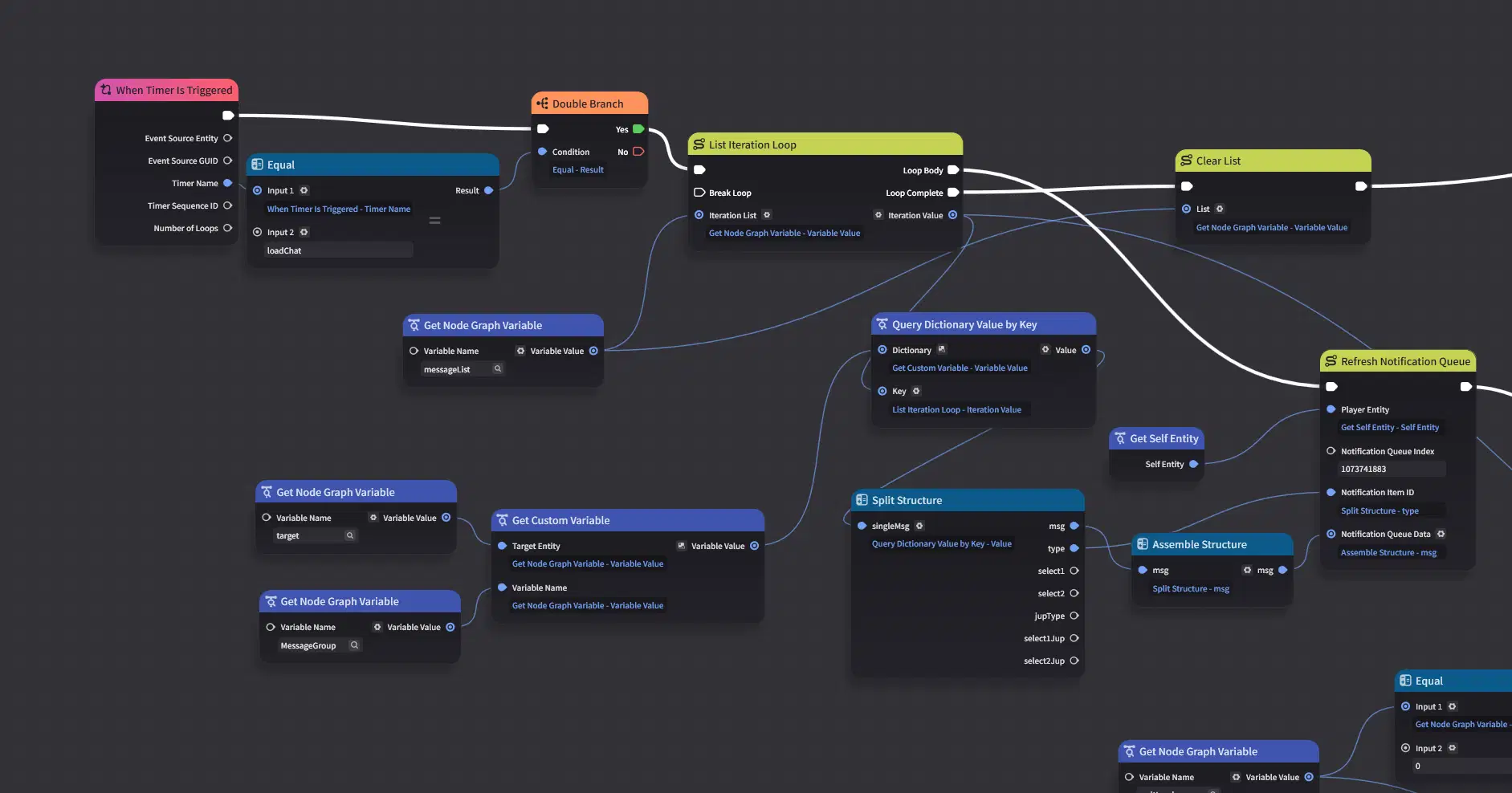
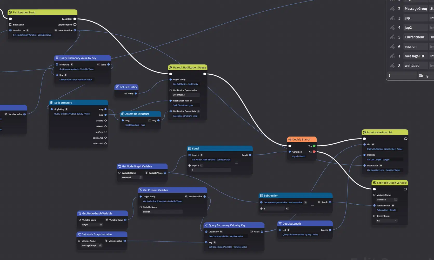
Next, handle the WaitLoad counter. When WaitLoad equals 0, it indicates that all historical messages have been processed; at this point, write the active message ID directly into the session list. If it does not equal 0, decrement the counter by 1.
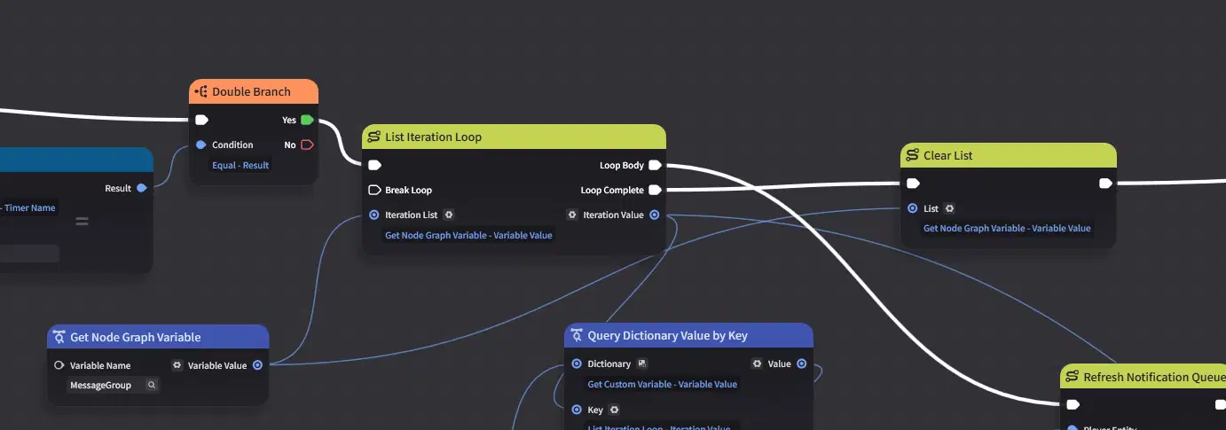
Ensure that the message list is cleared once loading is complete.
After loading the historical messages, process the active item's branching options: perform a data update first, refreshing both option labels and jup1/jup2 values in the UI data layer.
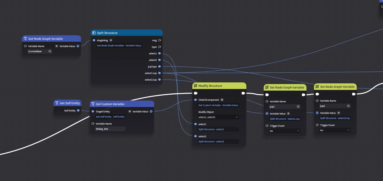
Next, process the jump type (jupType). In our system, the jump type can take three possible values: 4, 1, or 2.
- When jupType = 4: Automatically load the next message.
- When jupType = 1: Load a single-option prompt button.
- When jupType = 2: Load a dual-option prompt choice.
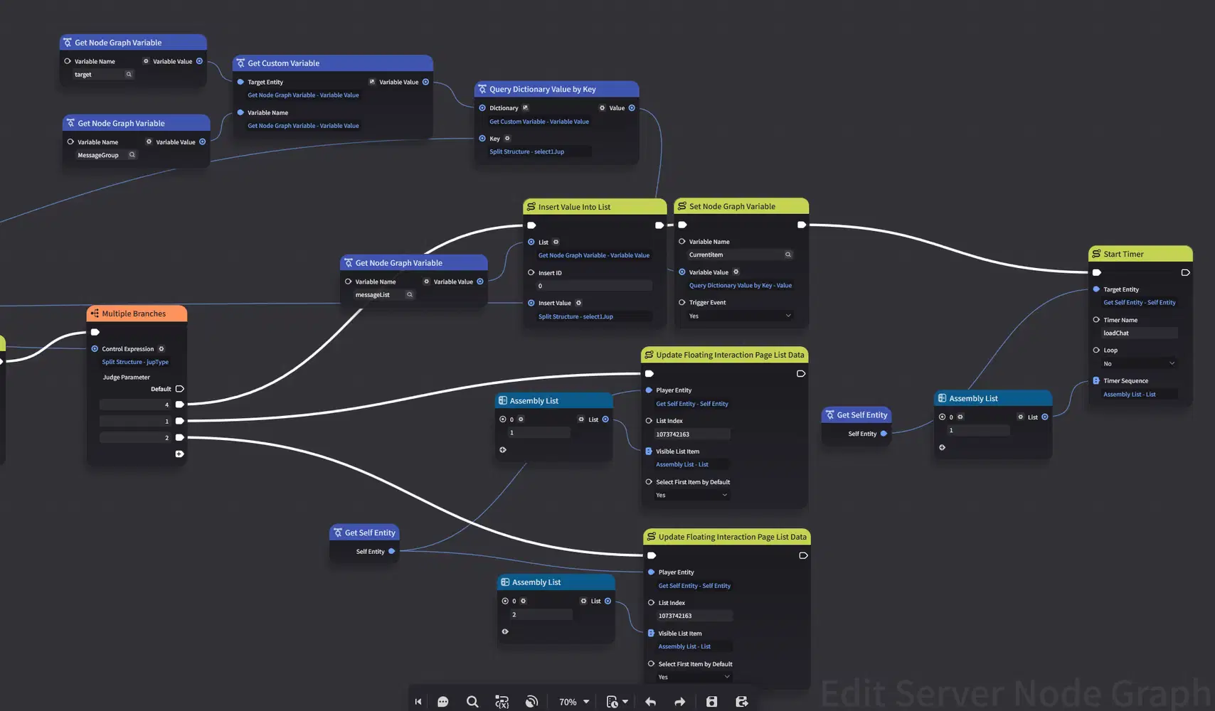
Obviously, up to this point, we have only updated the data layer for the floating interaction page. How do we actually handle the UI visibility and hiding logic?
In our layout design, we introduced a tab view component (or view switcher), but initially configured every visible sub-element to be hidden—including UI styles, action key prompts, and option container overlays.
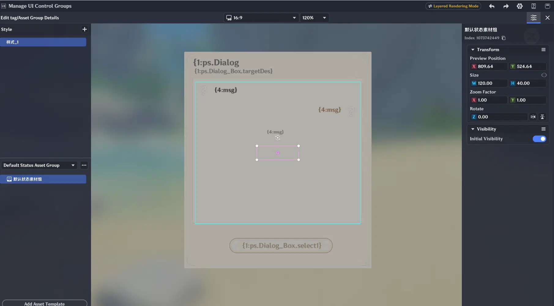
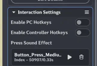
This makes the tab view component completely invisible. However, its structural layout and visibility control logic remain active behind the scenes.
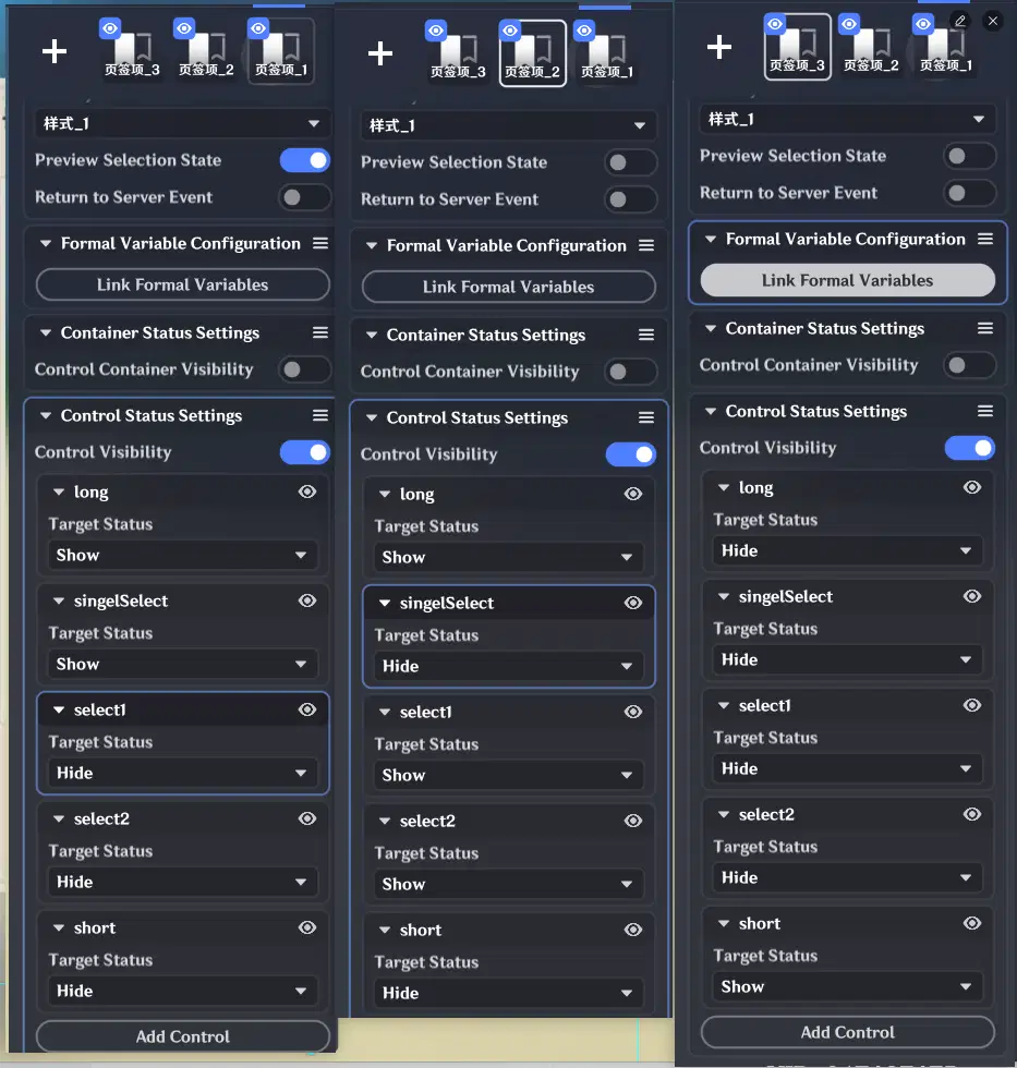
When updating the Node Graph, you can specify the default active tab; triggering this parameter updates the interface state and dynamically controls widget visibility.
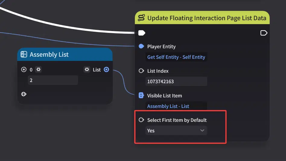
5.4 Option Loading
Because the underlying framework is already built, implementing options is straightforward.
It primarily consists of two parts:
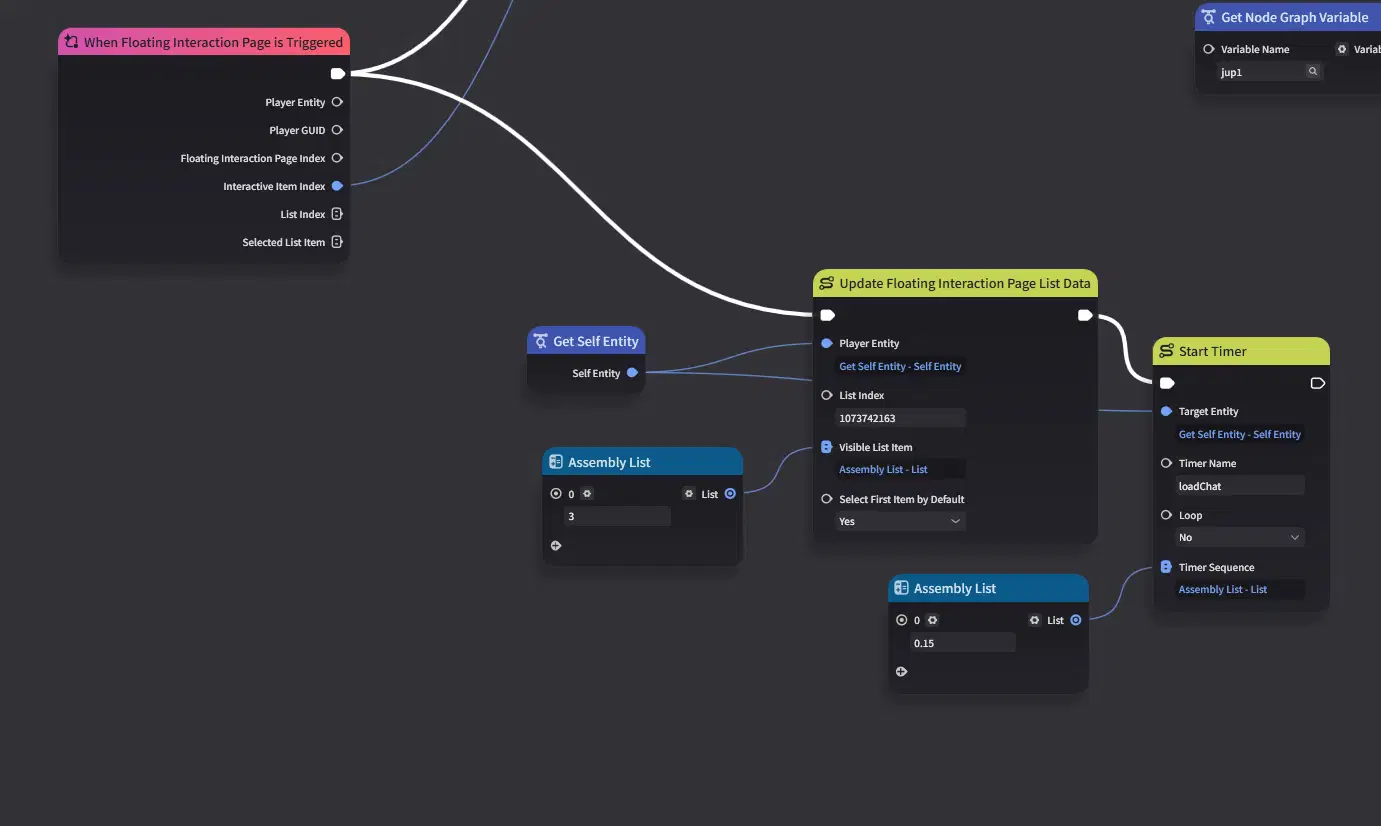
- Delayed Processing & UI Reset: After an option is selected, delay subsequent execution slightly and close the option panel.
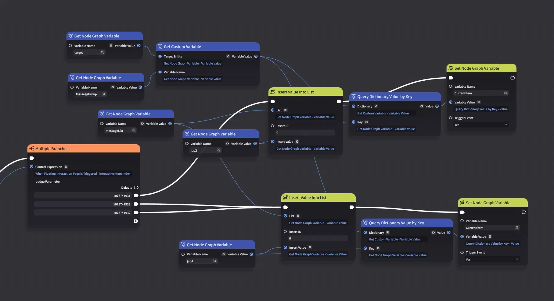
- State Updates: Append the selected item to MessageList and update CurrentItem according to the cached jup destination data.
Upon interaction, trigger a tab view update to toggle component visibility and resume message loading after the configured delay.
Append the message to MessageList and update CurrentItem based on the cached jup destination data.
With all logical systems fully implemented, everything is set.
Let's run the tests!