Content Overview
Hi stage creators! 
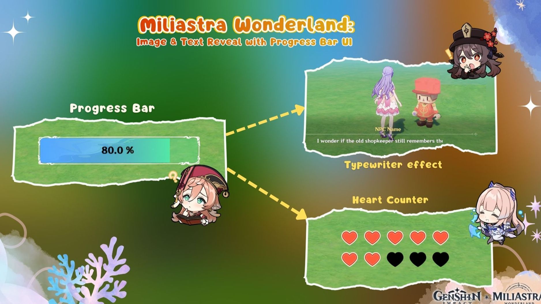
Did you know you can use a Progress Bar UI component to behave more than just a progress bar?
If you're an advanced creator, you may already know it..
But can you guess how these UI component were made?
Yes, they're all made with the Progress Bar UI
The Progress Bar UI has been improved significantly since its first release. You can now customize both the background and progress styles, giving us much more freedom over how the component looks and behaves.
You can also choose from different reveal directions:
- Horizontal: Left to Right / Right to Left
- Vertical: Bottom to Top / Top to Bottom
- Ring: Clockwise / Counter-clockwise
In this guide, we'll explore how we can use these features to create a custom heart point UI, and a text reveal effect.
Well, let's get straight into the guide and start creating! 
1. Image Reveal Effect
The Progress Bar UI can be used to gradually reveal an image based on a percentage.
Simply edit the Progress Bar Asset and design the UI you want to reveal. The custom Progress Bar Asset can be used to gradually reveal custom UI based on a percentage, while the Background Asset remains visible at any progress value.
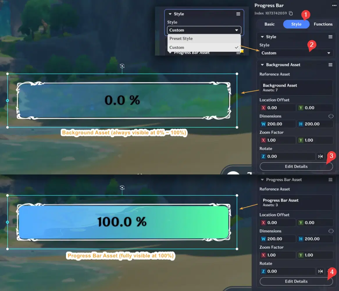
Then, change the Progress Preview to see how it will appears at different percentages. Below is the basic use of the Progress Bar UI, revealing the progress style from 0% to 100% using different reveal directions.
However, instead of simply creating a traditional progress bar, you can use it to create many other types of UI, such as the examples below.
✦ Create a Heart Point UI
You can use the Progress Bar UI to create a custom heart point UI with a single integer variable, eliminating the need to manually create separate show/hide logic for each heart image or control them using multiple nodes.

For example, if your character has 5 heart points, you can place 5 heart icons inside the Progress Bar Asset and use the character's heart value to reveal the heart from 0 to 5.
✦ Designing the Heart Point UI
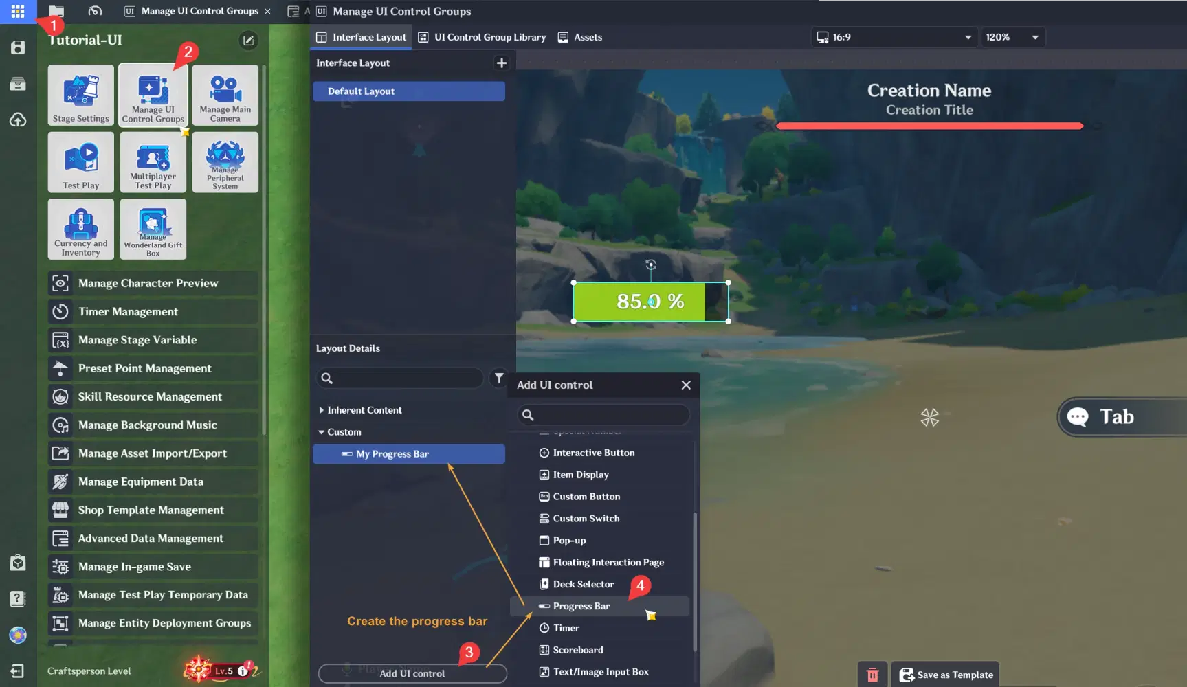
- Alright, let's begin create this UI by preparing one progress bar to your UI
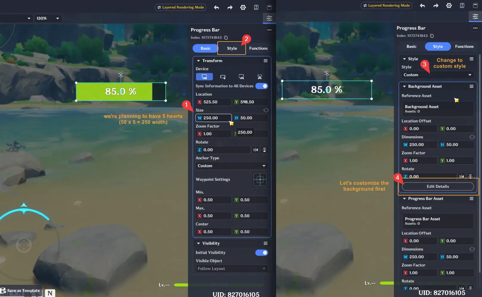
- Then modify the progress bar's width. Our plan is to create a UI with 5 hearts, each with a width of `50`. So, we'll set the progress bar's total width to `250`. Then go to Style tab, set the style to `Custom`, and let's customize the Background Asset first by following example below to step number 4.
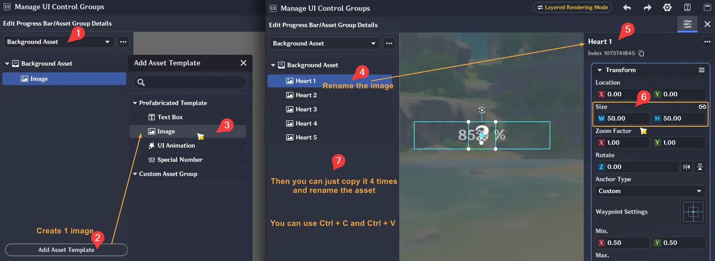
- Inside the Background Asset details, create 1 image and set its size to 50 x 50. After that, copy and paste it 4 times to have 5 images. Then, you can rename them to `Heart 1` to `Heart 5`
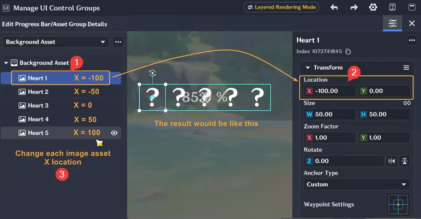
- Change and arrange the position of each image to match the example below:
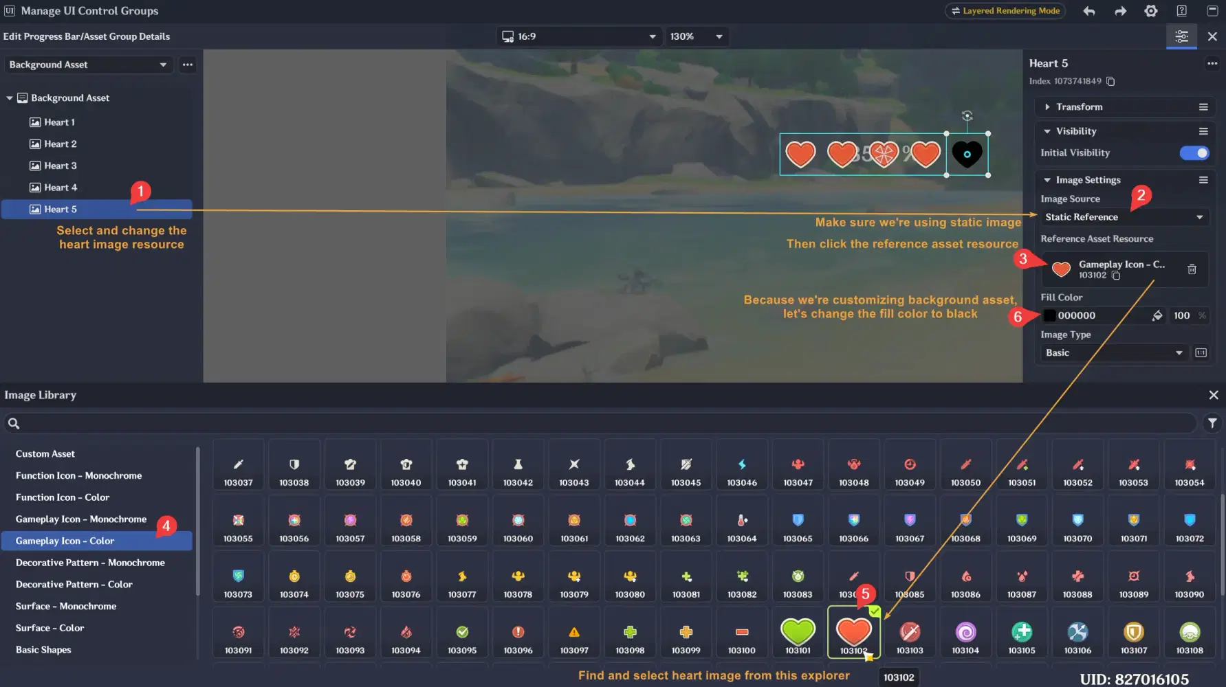
- After that, set the image resources to the heart images by following the steps below. Then change the Fill Color to black, since we’re creating the background first
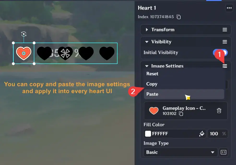
- You can also copy and paste the image settings to other UI elements to make this design process easier
- Once we’ve finished creating the background for these five hearts, let's copy the Background Asset to the Progress Bar Asset.
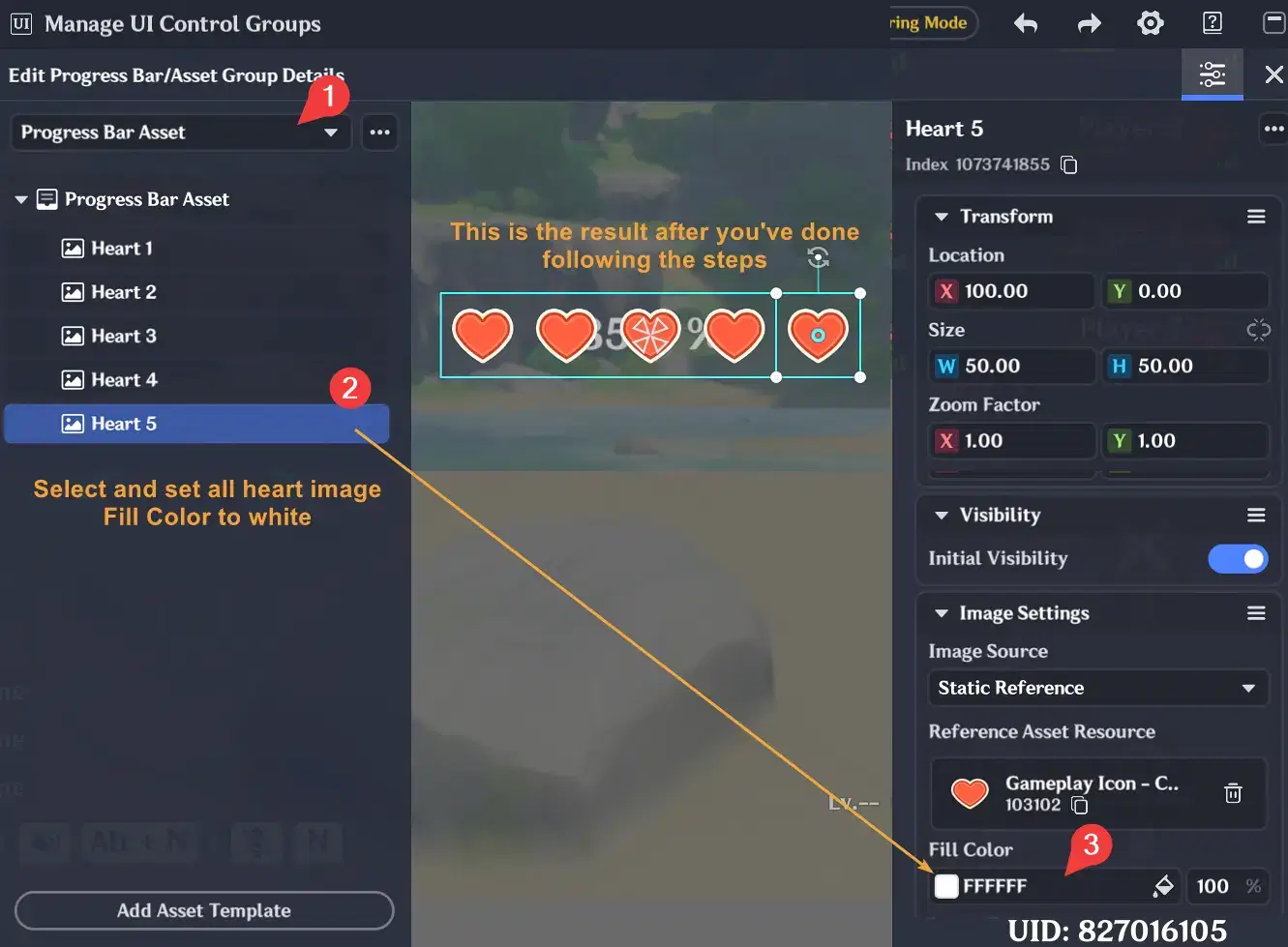
- Then set all the Fill Color to white `FFFFFF`. So now we have a background section with 5 black heart and 5 red heart section that will be revealed.
- Close the asset details section, and return to the Function tab to change the progress bar settings. We need to remove the default percentage text from our progress bar.
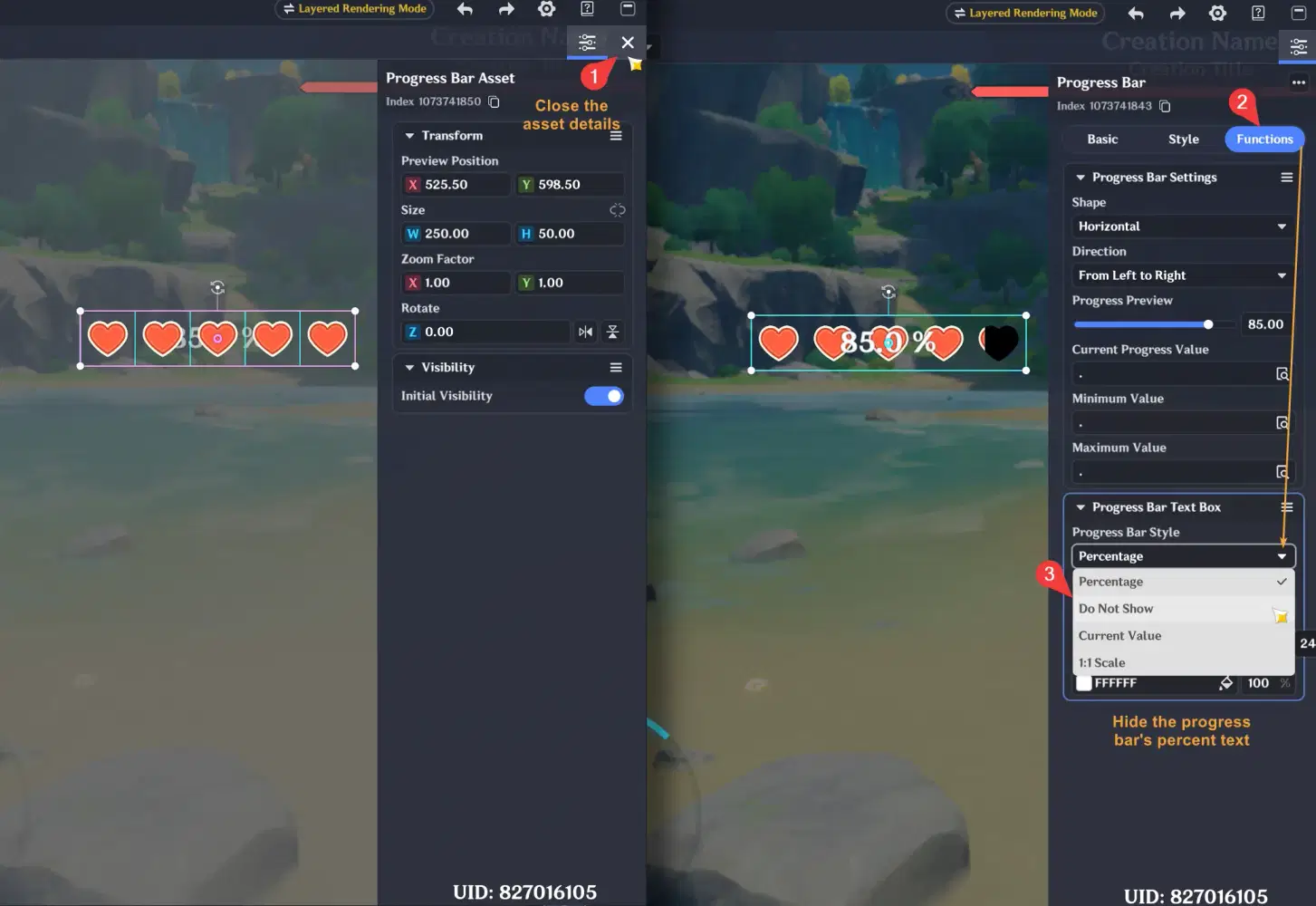
- Once you're done, you can try setting the progress preview to 20%, 40%, 60%, and 80% to make sure the hearts are positioned correctly.
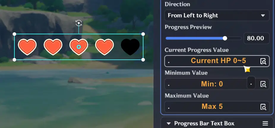
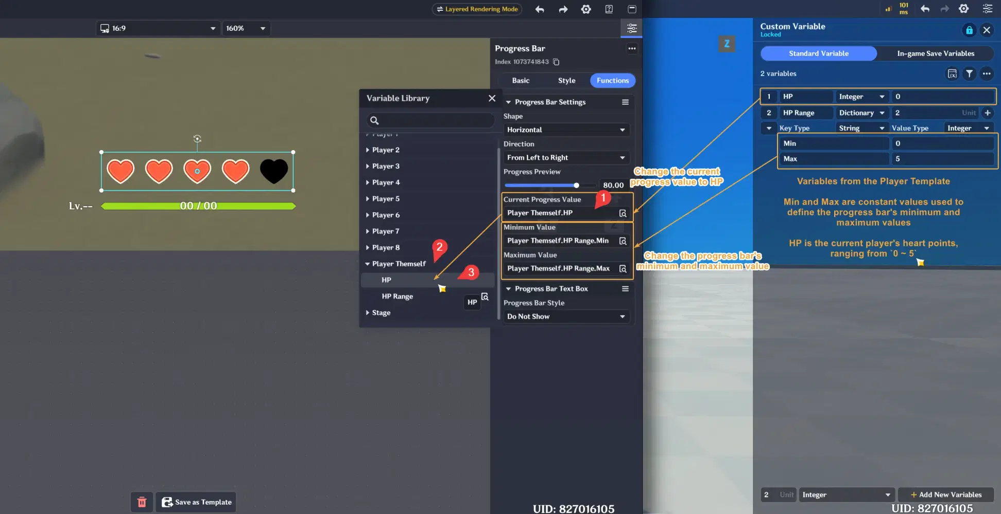
- For the settings below, we want the minimum value to be 0 (progress = 0%) and the maximum value to be 5 (progress = 100%). So, we first need to configure a variable in the Player Entity to reference here.
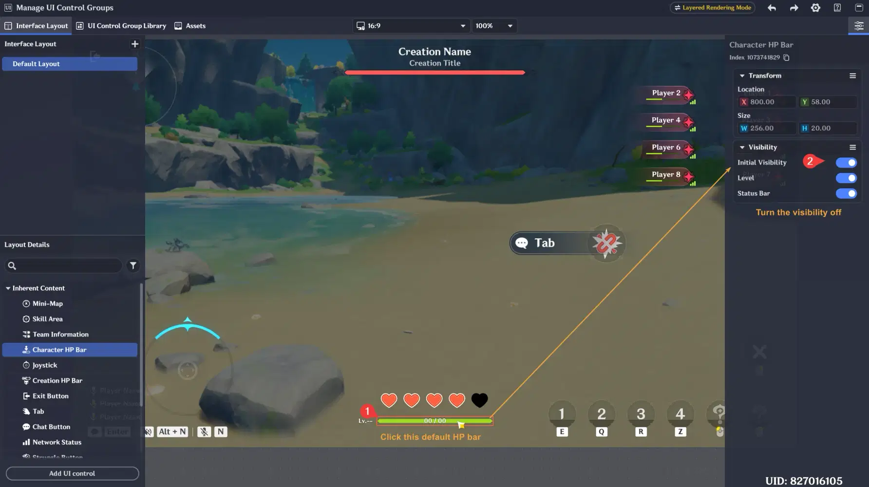
- And if needed, you can also hide the default HP bar UI by following the steps below
✦ Configure Player Entity Variables
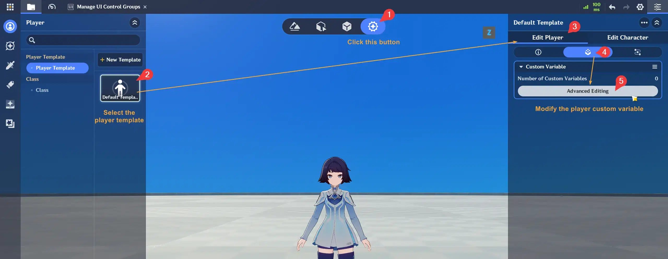
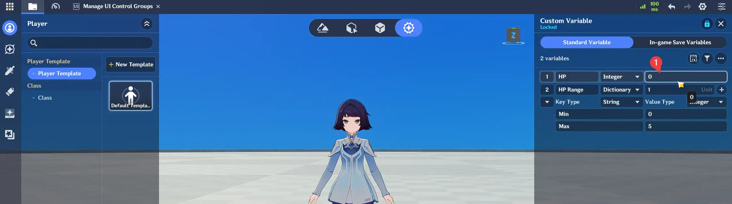
- Alright, let's create a variable in the Player Entity. Follow the steps below to open the Player Template and edit its custom variables.
- Next, create an HP variable with an integer data type, and an HP Range variable with a Dictionary data type. Inside the Dictionary, add Min and Max values, both with an integer data type, to define the progress bar range from 0 to 5.
- Then, let's go back to the progress bar UI we edited earlier and update its settings as shown below.
✦ Create a simple test for the UI
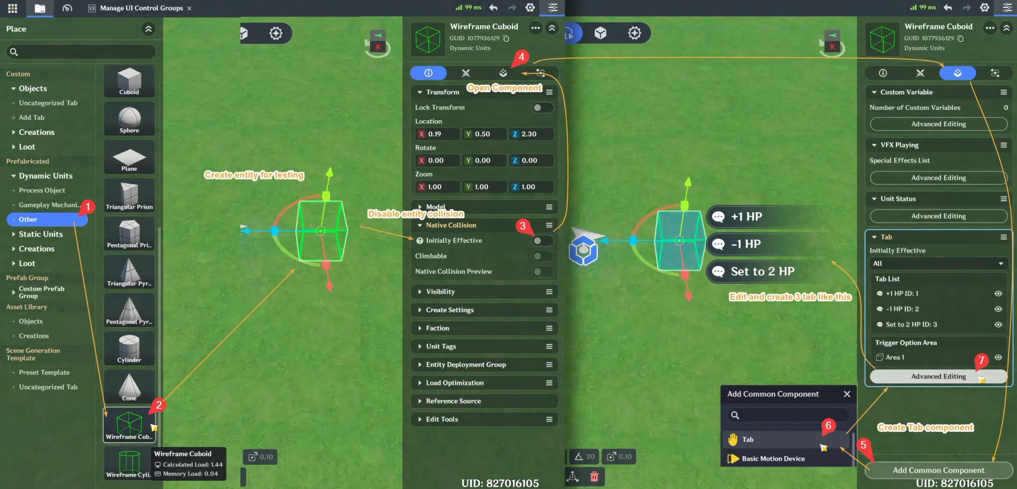
- Alright, we've finished creating the UI. Now, let's create an entity to test it. We'll create a simple test by adding three tabs: +1 HP, -1 HP, and Set HP to 2
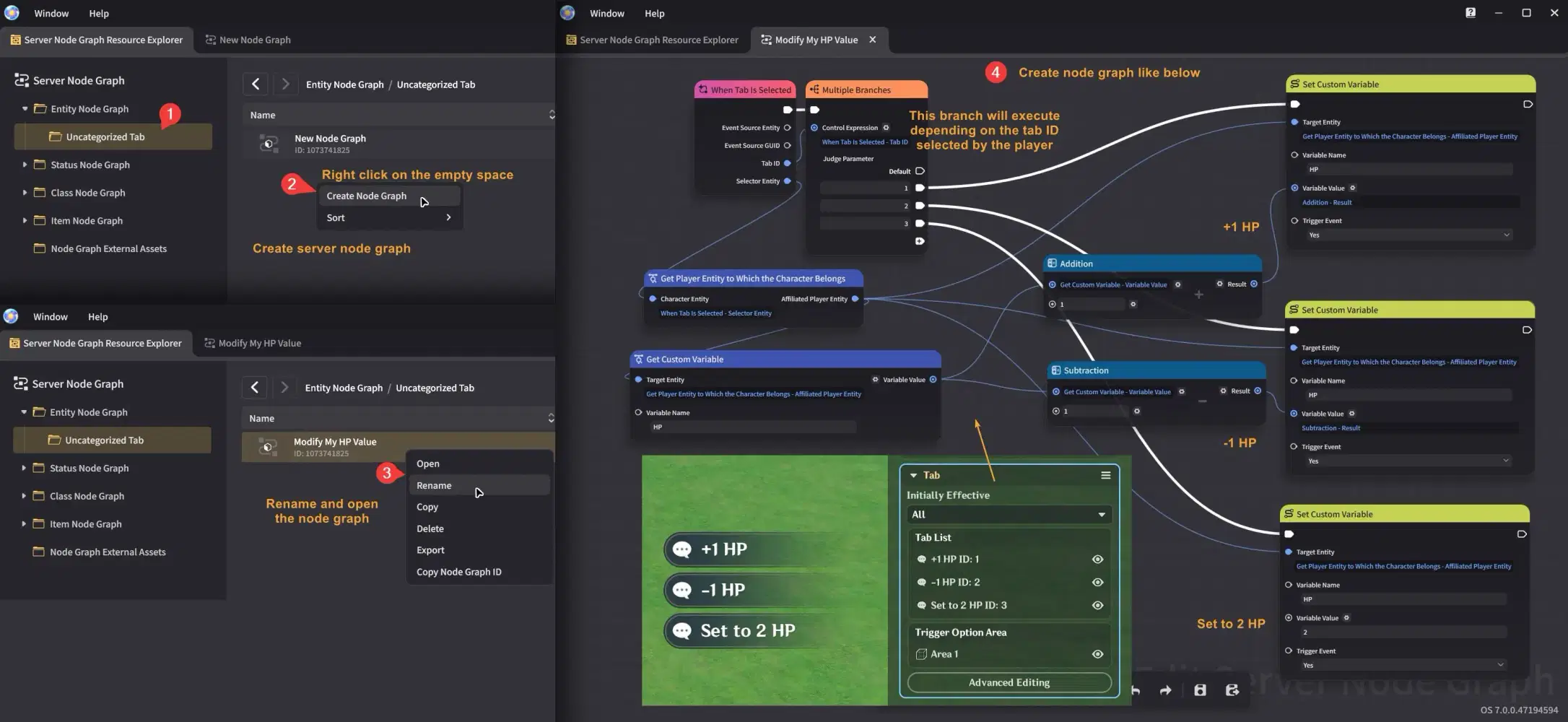
- Our goal is to change the HP variable's value when the player interacts with the tabs we created earlier. To do this, we'll modify the variable using the node graph.
- Open the editor to create a node graph, then create a new node graph as shown below. The node graph only needs to listen for the tab events and set a new value for the HP variable.
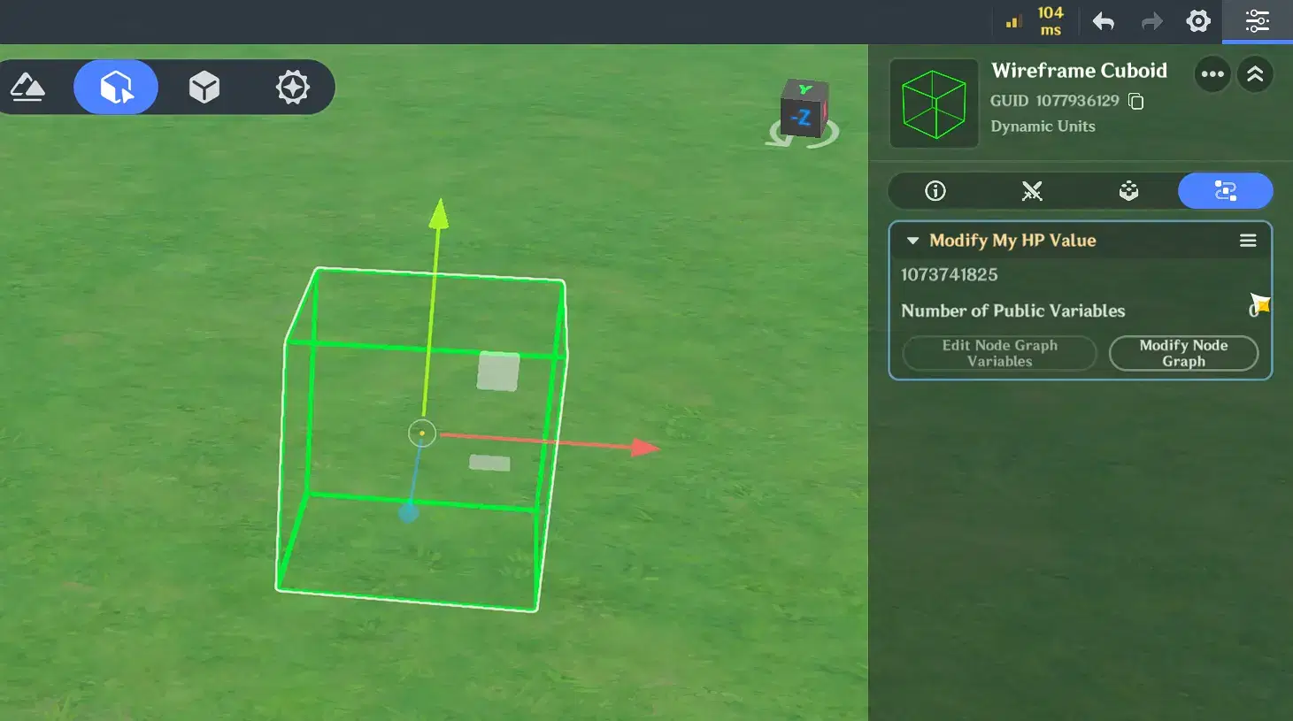
- Make sure you have attached the node graph we created to the entity for testing like below.
- Congrats! If you’ve completed all the steps above, you should see the result shown below

- The node graph we created earlier was only for a simple test. In an actual game, you may want to add this to prevent the HP from going below 0 or exceeding its maximum value.
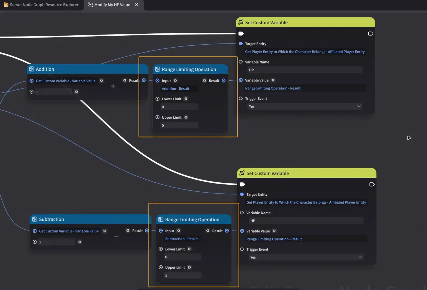
The UI will automatically reveal every heart based on the Current Progress Value, so we only need to modify one value from your node graph. You don't need to manually show or hide each heart UI separately.
This approach also makes it easier to expand the heart point UI later. 
✦ Using Multiple Progress Bars with One Shared Value
You can also use multiple Progress Bar UI components with different minimum and maximum values while controlling them with the same shared variable.
For example, imagine you want to create a heart point UI with 10 hearts, but you already have a 5 heart UI.
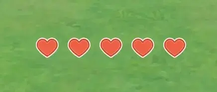
You can simply copy and paste the Progress Bar, then change a few settings:
- Let's go back to the UI editor and simply copy and paste the progress bar, or the heart UI, that we created earlier.
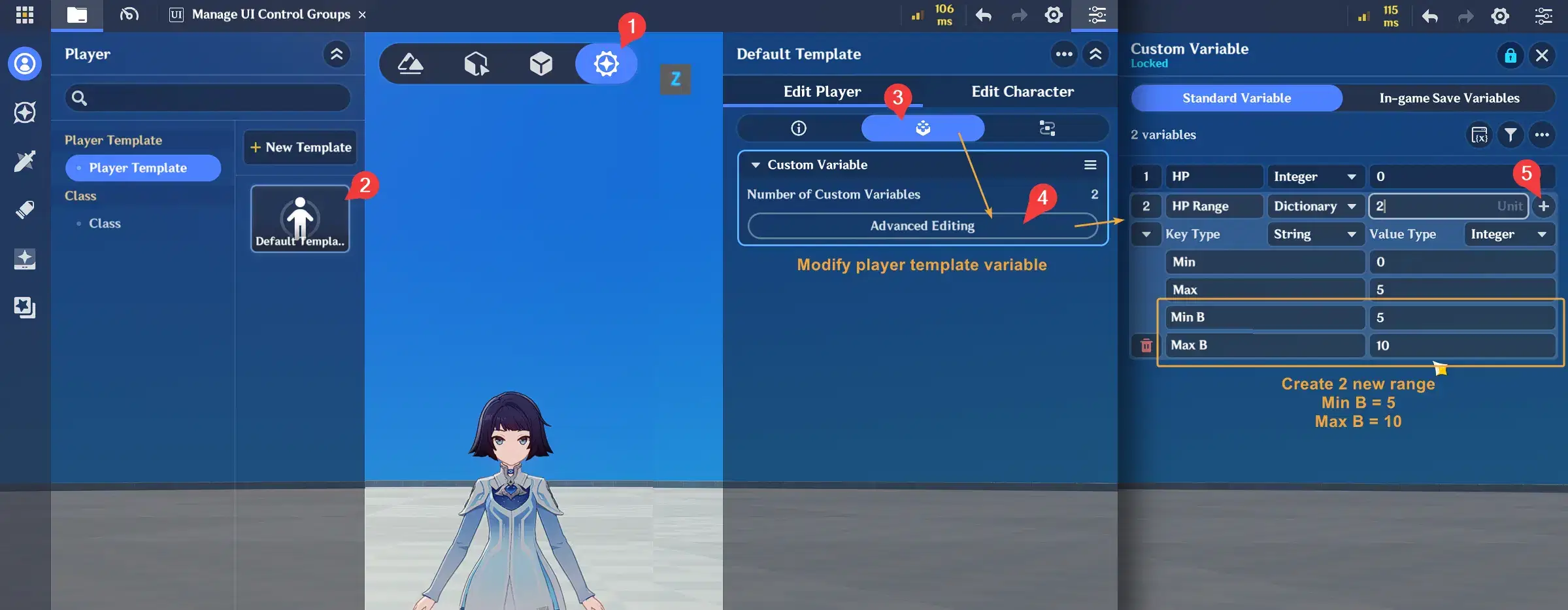
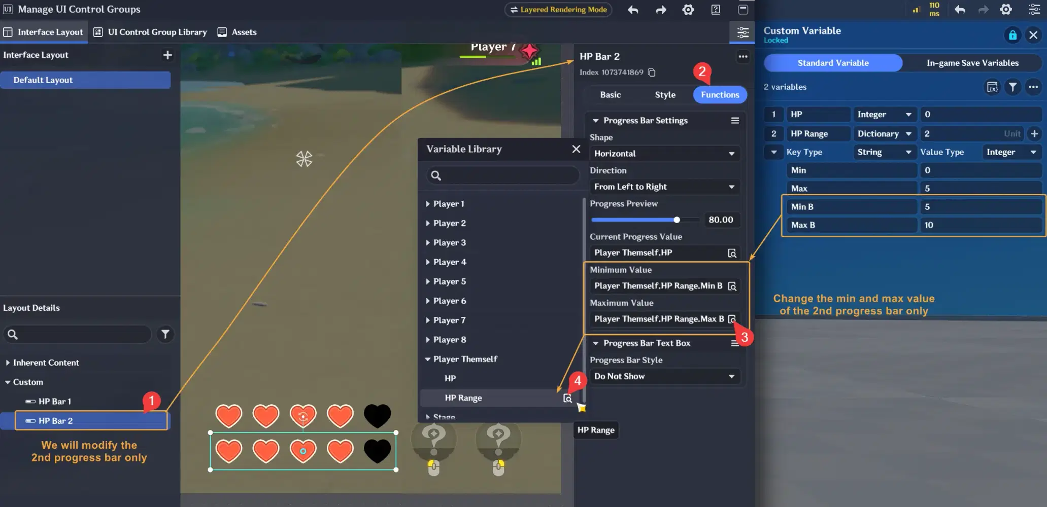
- Before modifying the progress bar, let's first create the range for this second progress bar. Since the previous range was 0–5, we need to create another range from 5–10. Open the Player Custom Variables and edit the Dictionary by adding Min B and Max B.
- After that, let's go back to the UI editor and update the settings for the second progress bar. Change the minimum and maximum values to the new range we created earlier like below.
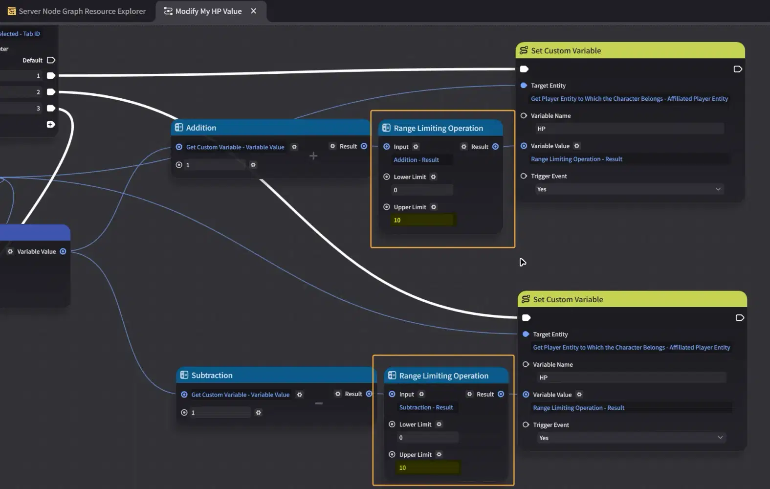
- If you also added the node below, make sure to update its upper limit as well.
- After completing the steps above, you should see the result below when you playtest.
Both Progress Bars use the same shared HP variable value.
The first Progress Bar reveals the first five hearts. Once the HP variable value reaches the second range, the second Progress Bar starts revealing its 10 hearts.
This allows you to divide a larger heart point UI into multiple sections while still controlling everything with one variable.
You can use this technique to create segmented meters, multi-stage UI, or other designs that require different Progress Bar ranges.
2. Text Reveal Effect
The Progress Bar UI can also be used to reveal text instead of images.
Since the progress style can contain different UI components, you can place a Text Box inside the Progress Bar Asset and use the progress value to control how much of the text is visible.
For this setup, you can leave the Background Asset empty if you only want to create a text reveal effect.
The text content can also be dynamic. For example, you can provide the text using another variable, allowing the same setup to display different messages.
✦ Create a Typewriter Effect
By using a horizontal reveal direction from left to right, you can also create a simple type writer effect for your text.
Since the Text Box is placed inside the Progress Bar Asset, you can also add a custom frame or other UI elements around it to create different dialogue designs.
✦ Designing the Dialog UI
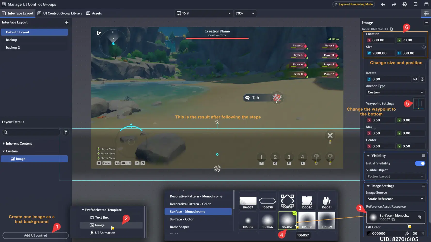
- Alright, let's start by creating a background for the text. If you're confused by the image below, make sure to follow the steps starting from step number 1
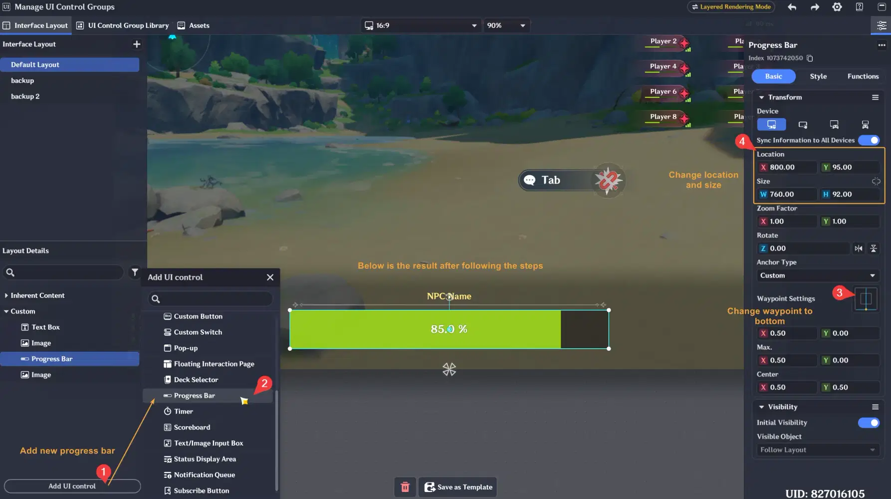
- I also created some other decorations, such as the NPC Name, but for now, we'll focus only on the progress bar as shown below to keep this tutorial from looking too complicated.
- Set the Progress Bar Style to Custom, then open the Progress Bar Asset editor.
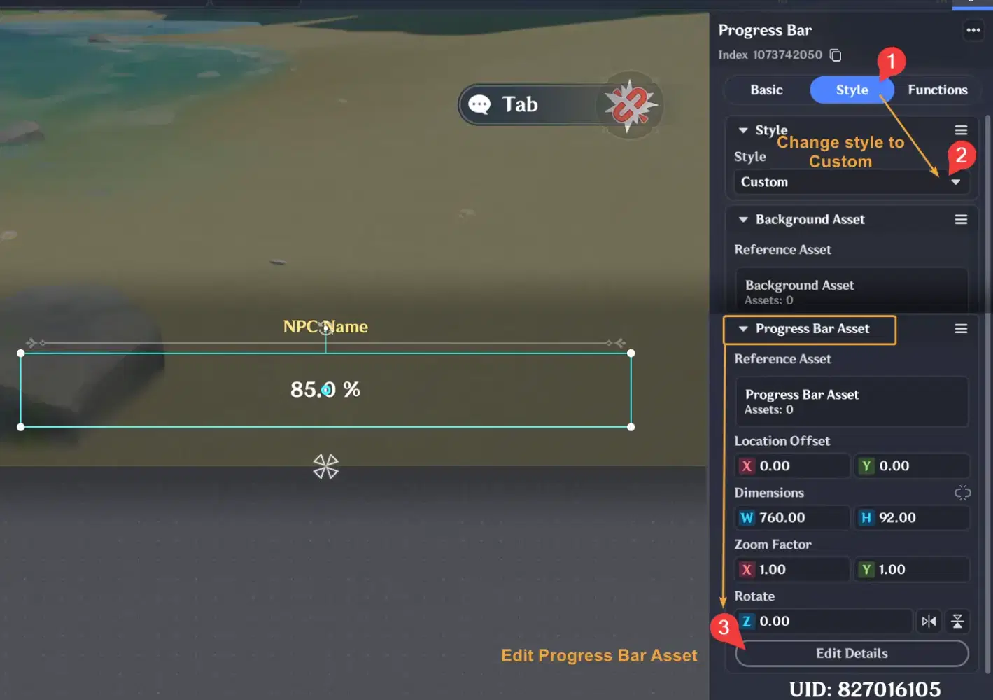
- Inside the Progress Bar Asset, we only need to create one Text Box. Then, resize it to match the current size of the progress bar.
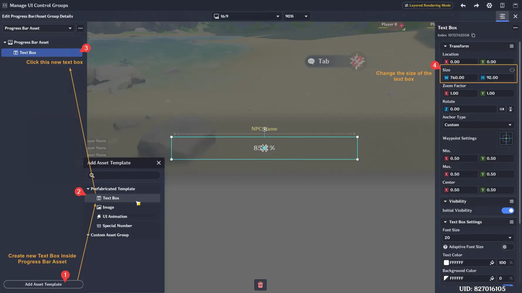
✦ Configure Stage Entity Variables
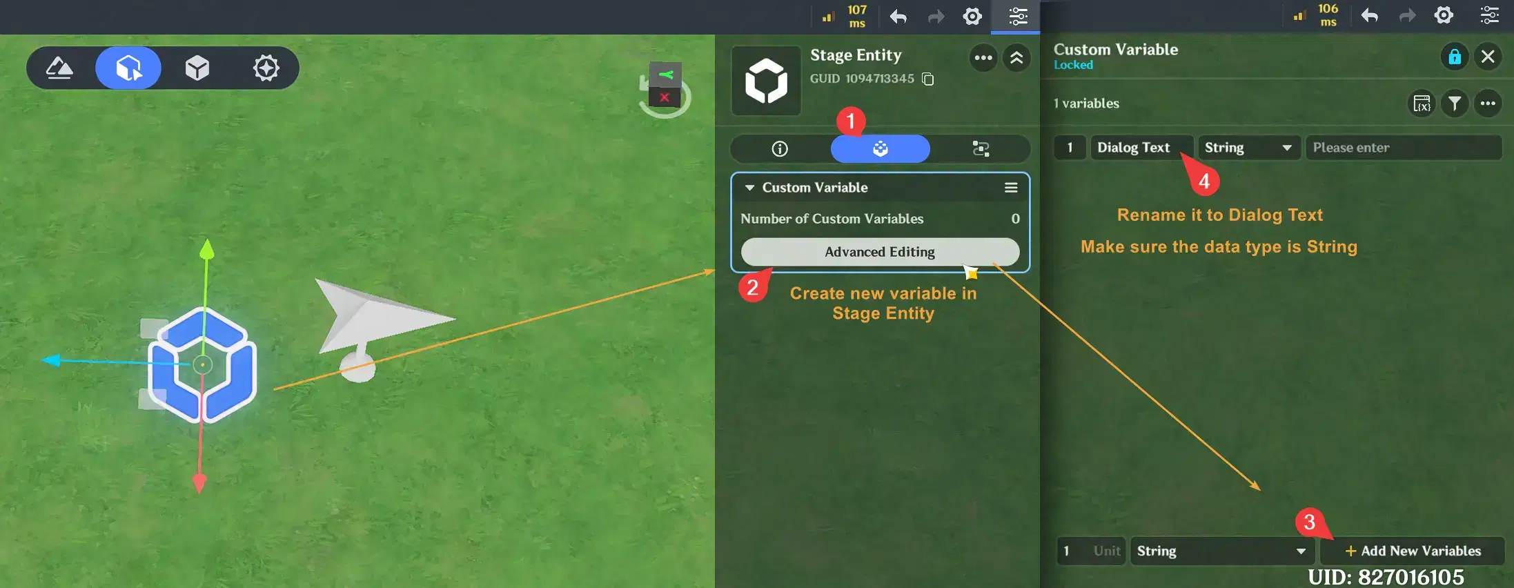
- Okay, once that's done, let's create some new variables in the Stage Entity. We'll need one to store the Dialog Text that will be displayed later.
- And create some new variables to store the text reveal percentage and the progress bar's minimum and maximum range values like below.
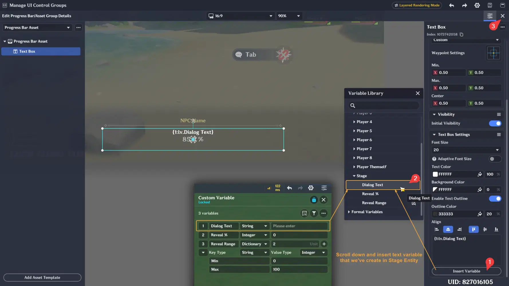
- Once the variables are created, let's go back to the UI editor and update the dialog text inside the Progress Bar Asset as shown below. After that, close the Progress Bar Asset editor so we can configure the other progress bar settings.
- Go to the Functions tab and update the Progress Value, Minimum, and Maximum settings as shown below so they reference the Stage Entity variables we created earlier.
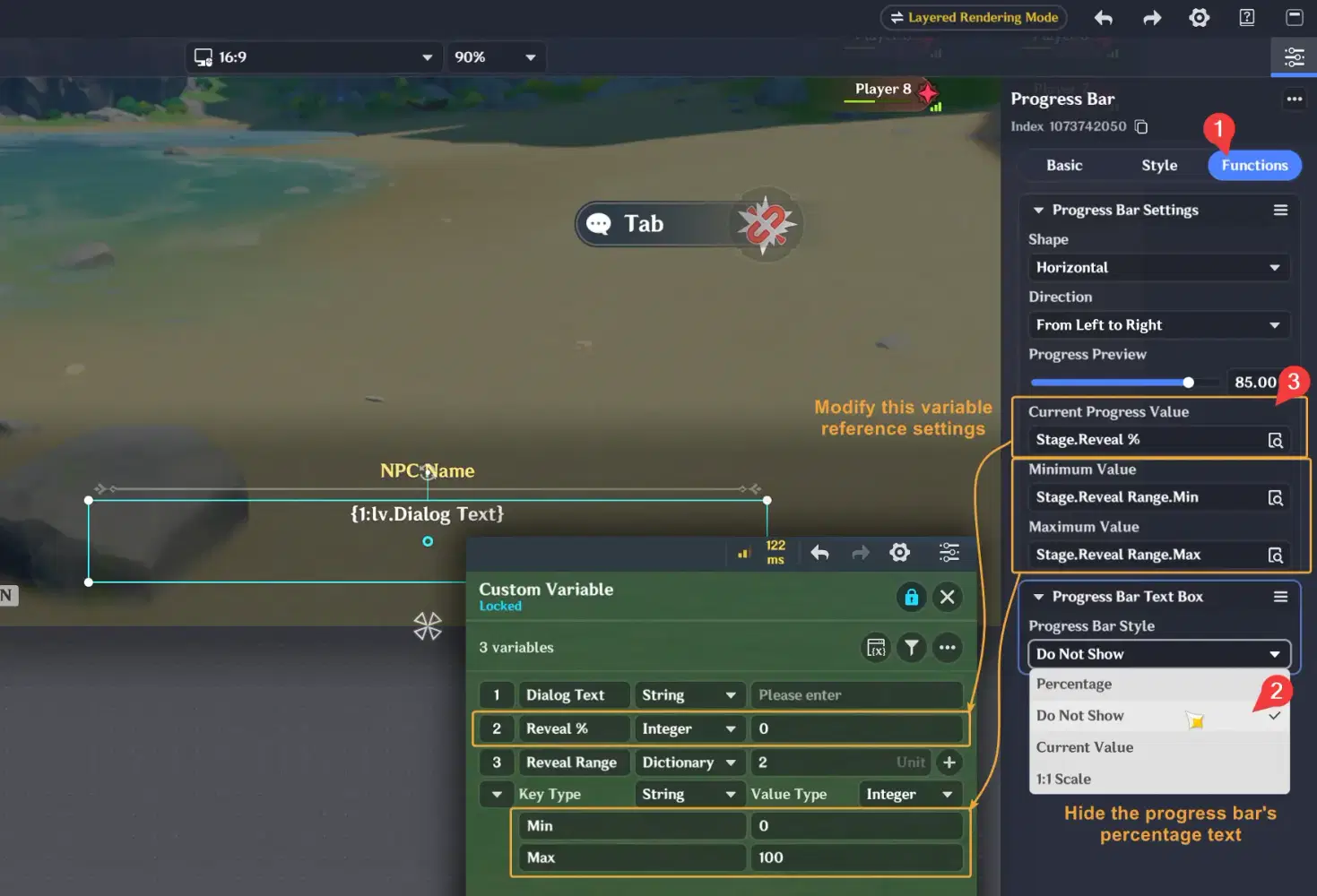
✦ Create a simple random dialog test
- Alright, we're done editing the UI. Now, let's create an entity for a simple test. Our plan is to display random text when the player presses the Tab button. Follow the steps below to set this up, and make sure to increase the Trigger Area range as well.
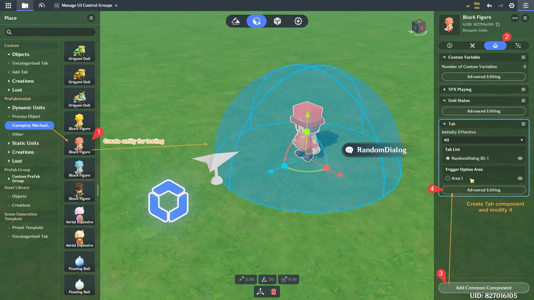
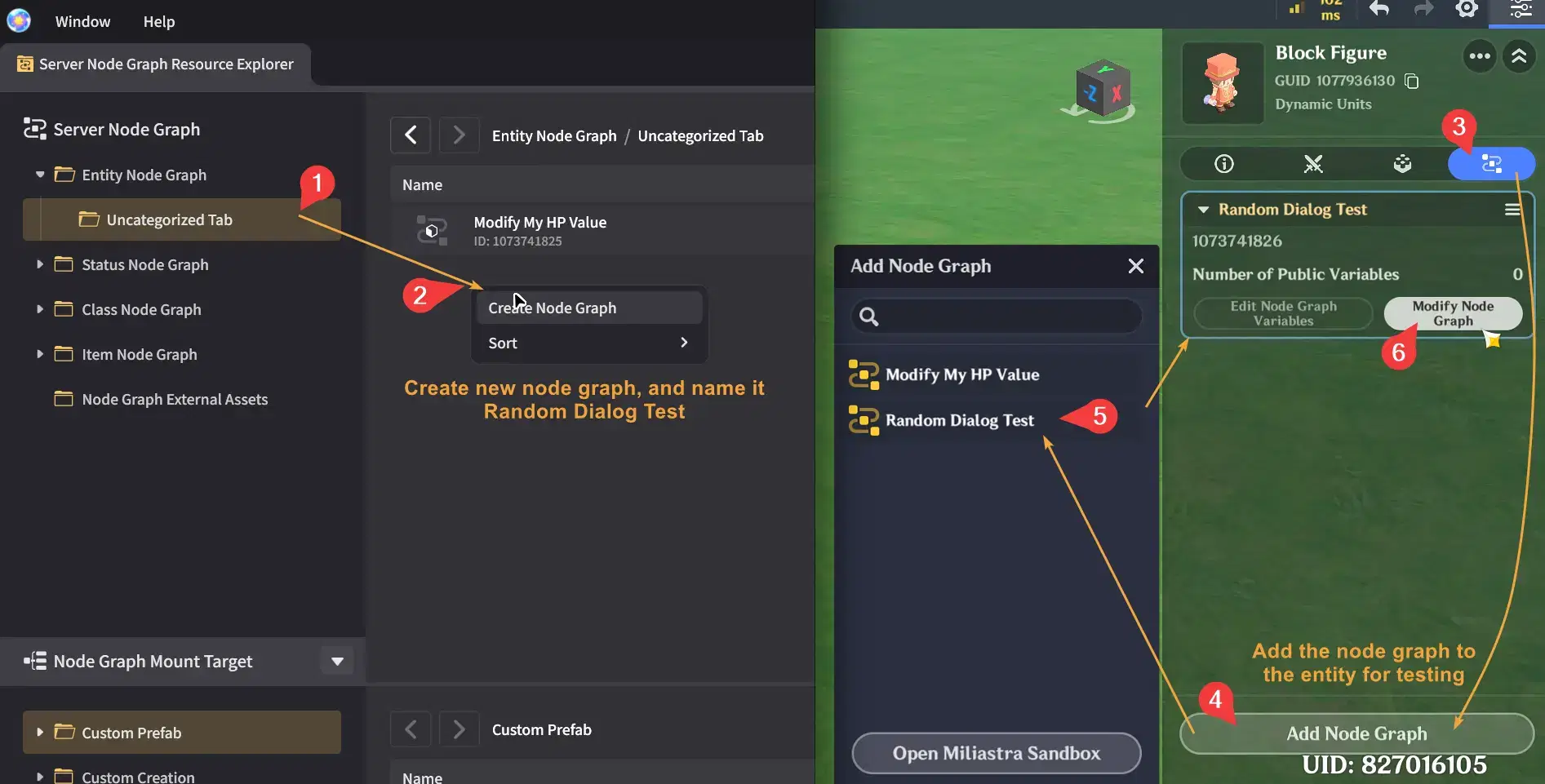
- After that, let's create a new node graph. Make sure to attach the node graph to the entity we created earlier for testing.
- Inside the node graph, create a flow like the one shown below. We'll keep it simple for this test: first, reset the progress bar to 0% so none of the text is visible at the start. Then, set a random dialog text to the variable and start a timer interval that gradually increments the progress bar to 100%, revealing all the text over time.
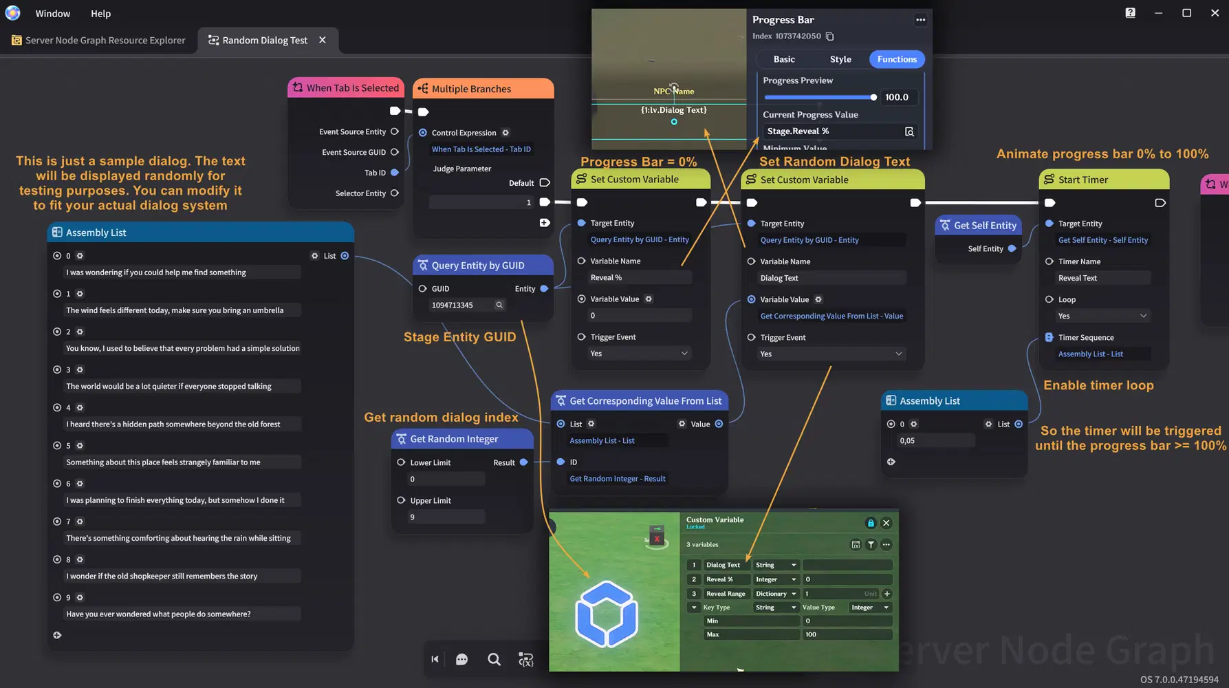
- The node graph below continues from the previous one. Here, we'll listen for the timer interval event and increment the progress bar percentage. Then, check if it has exceeded 100%. If it has, stop the timer interval.
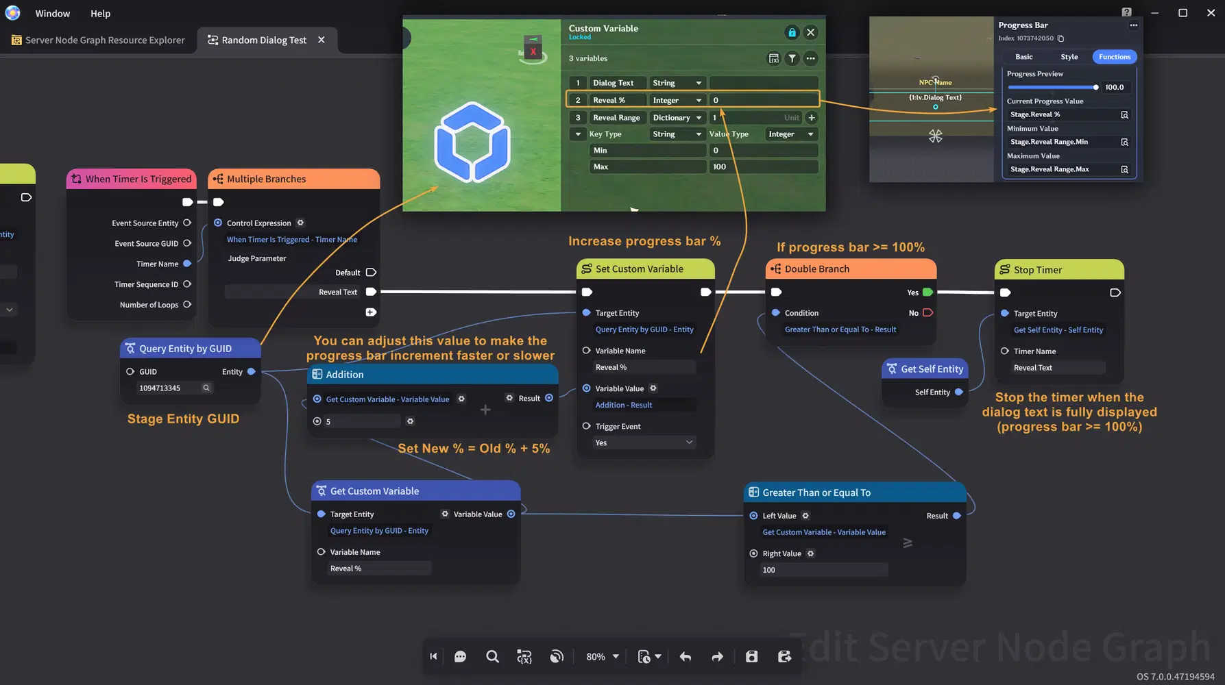
- Congrats! After testing, you should see the result shown below. A random dialog text will be displayed and gradually revealed over time.
In the future, the progress bar may have other improvement again. So you can also check from the official guide

Congratulations for following this guide until the end! Hopefully this guide helps you better understand these features in the Miliastra Wonderland editor and gives you ideas for creating your own game interface in future projects.
Thank you for reading, and happy creating!