This guide introduces the basics of Lua UI scripts and builds several small demos.
Version 7.1 added support for creating and transforming controls at runtime. Lua UI scripts are useful for both 2D and 3D creations. They have also led to a lot of AI-generated content, which may not be a good thing. Understanding how they work can help when directing agents to create stages.
Lua UI has limitations. For example, there is no image upload function, so custom artwork may require many primitive controls. Rendering thousands of controls can cause performance problems; optimization can help but may not eliminate them.
We will refer to the official API documentation throughout this guide. Some screenshots show the Chinese interface.
You can also check out the Japanese version.
Editors:
- For people: VS Code.
- For agents: Codex, Claude Code, and similar tools.
0. Guide Structure
This introductory guide covers:
- Hello World: the first Lua UI script and how scripts run.
- Common controls and their operations.
- Keyboard and mouse events.
- Tween animations.
- Communication with the server through signals.
1. Hello World
1.1 The First Script
First, prepare the tools:
- Install VS Code.
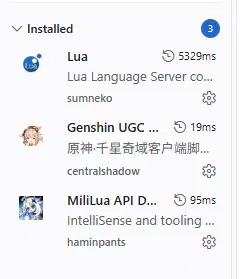
- Install the extensions:
- Lua language support.
- MiliLua API Definitions: a community extension that scans for stages and opens them as projects.
- Genshin UGC Lua API: a community extension with additional type checking and code completion.
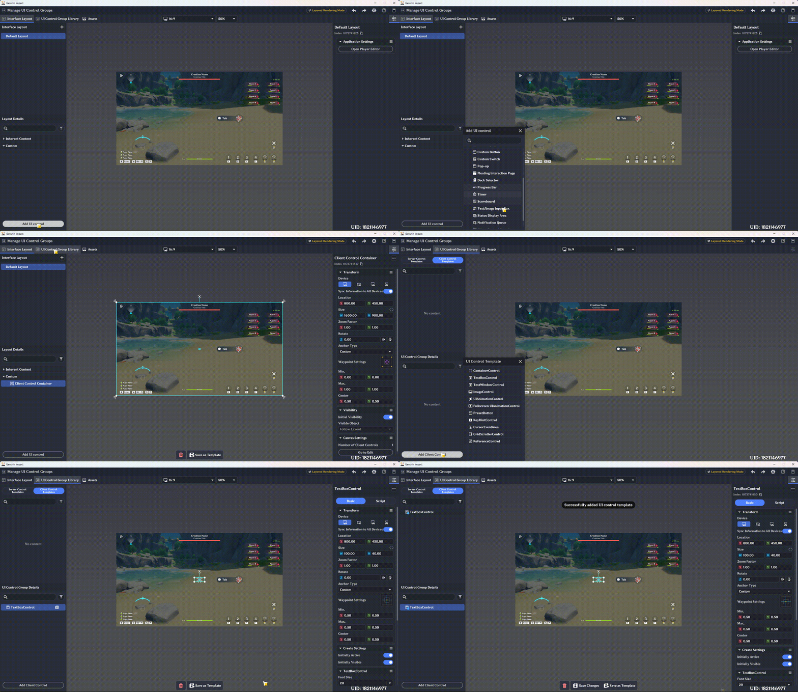
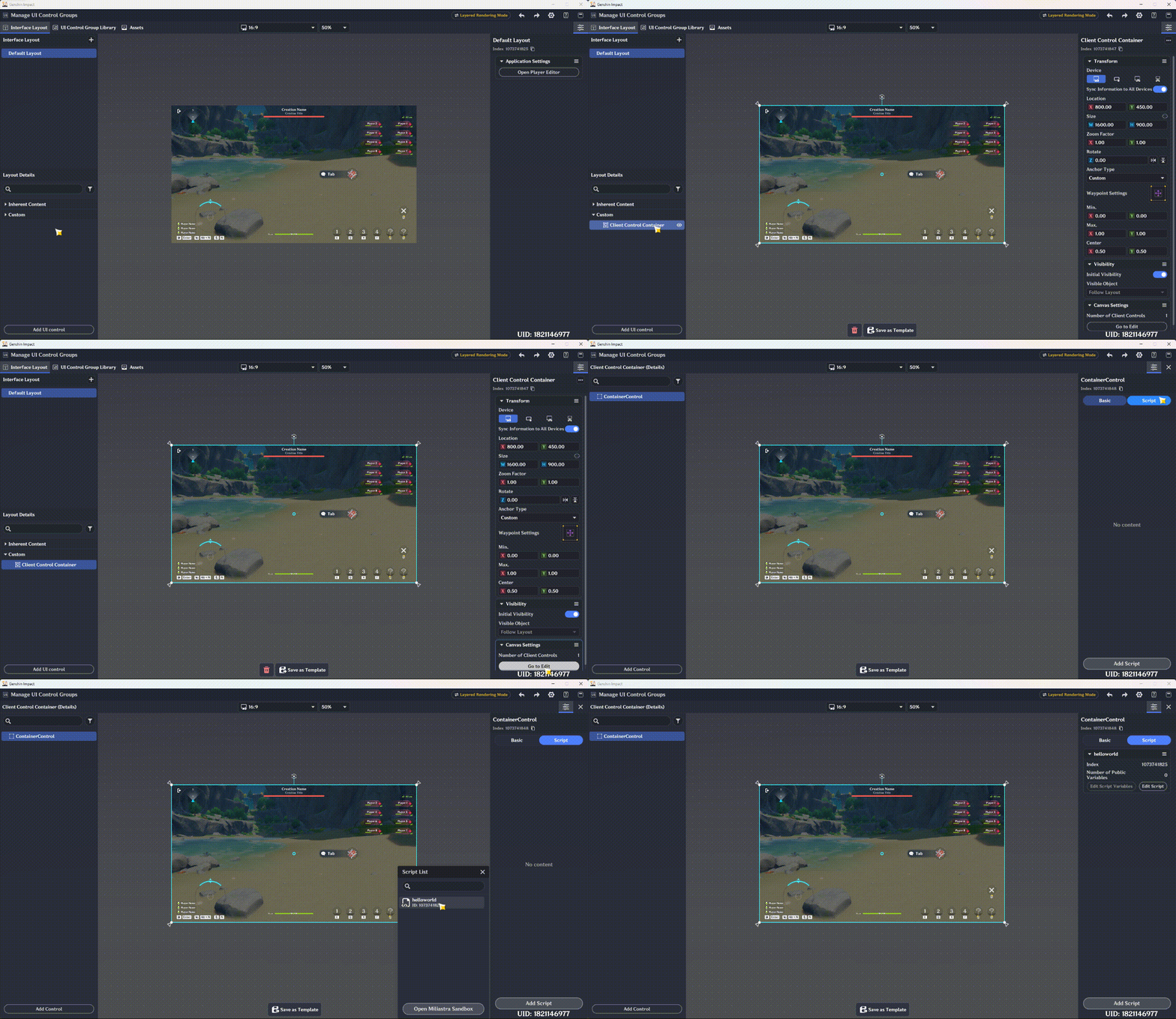
Open the editor and create a new stage. Open Manage UI Control Groups → UI Control Group Library → Client Control Templates. Add a client Text Box control, save it as a template, and note its index.
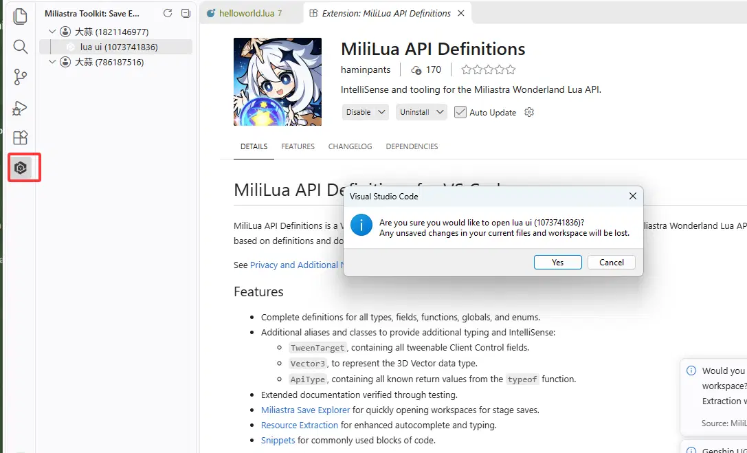
In VS Code, open MiliLua API Definitions. Wait or refresh until the stage appears, then open it. The project path is the script path.
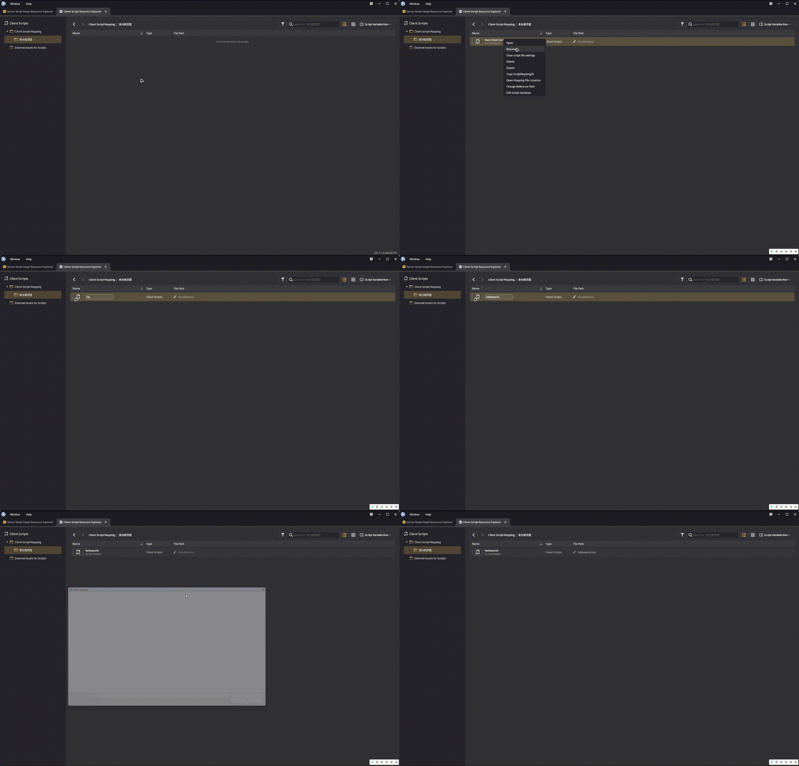
Create helloworld.lua:
function OnStart()
local textbox = game.InstantiateClientUIControl(1073741846, script.object); -- Replace with the template index created earlier.
textbox.text = "Hello World";
end
In Miliastra Sandbox → Client Script Resource Explorer, create a script mapping and select the script. Return to Interface Layout, add a Client Control Container, and under Edit → Scripts, add helloworld.
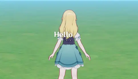
Open the stage to run the script.
1.2 How Client Scripts Work
Client Control Container
Lua UI scripts run on the client, while ordinary server UI controls are controlled by the server. A Client Control Container provides a place for client UI and is the entry point for the client script. The example above needs such a container to display the client UI.
Lifecycle Events
Node graphs use events, such as entity creation and destruction, as entry points for logic. Lua UI scripts also use events, with a more complete script lifecycle:
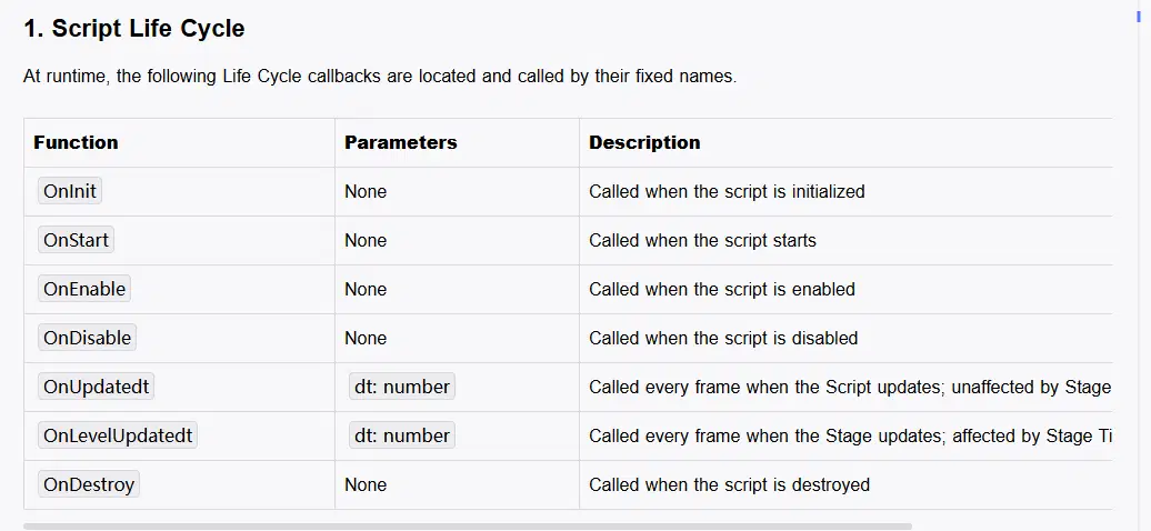
Update events can be used to run logic every frame. To create a control when the script starts, look up OnStart() in the API documentation.
Templates and Instantiation
A Lua script creates text and images from existing Client Control Templates. A template stores default settings and styles but is not displayed directly. Instantiation creates a control from a template; the instance has its own properties.
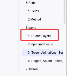
Find UI-related functions under game in the API documentation:
The first UI function creates a control:
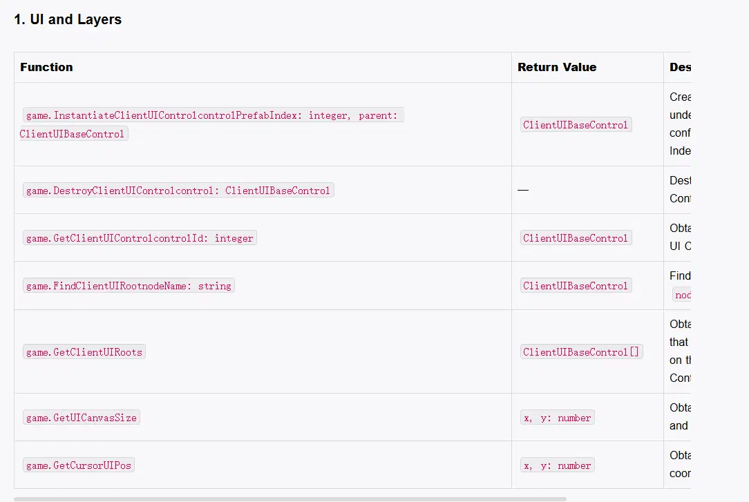
The function signature is:
game.InstantiateClientUIControl(controlPrefabIndex, parent)
controlPrefabIndex is an integer template index; parent is a ClientUIBaseControl. The documentation screenshot has a formatting error in the signature.
Every control needs a parent. The known parent in this example is the container to which the script is attached:
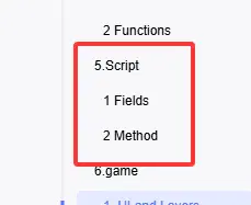
The script.object property provides that control:
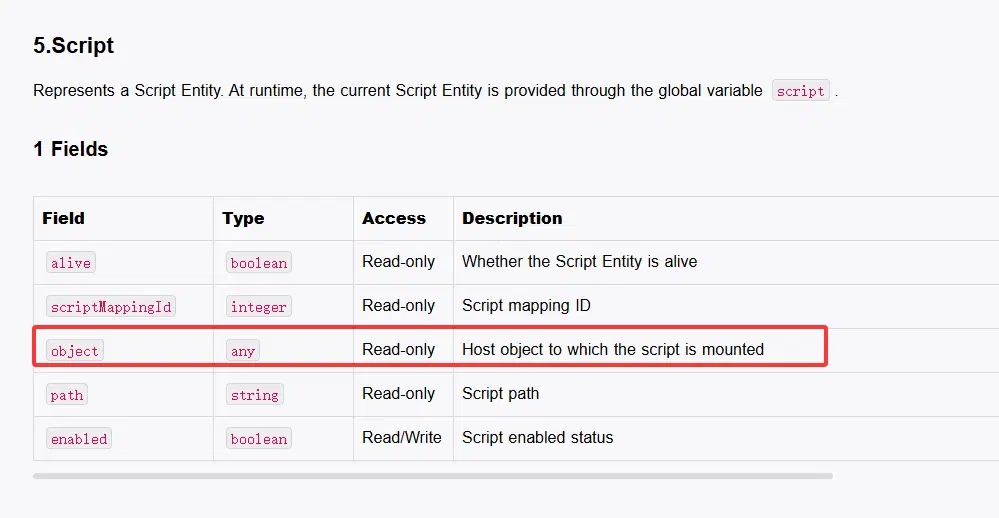
The resulting statement is:
textbox = game.InstantiateClientUIControl(1073741846, script.object);
Object Properties
After creating the Text Box, look up its API:
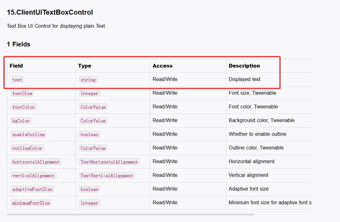
Set the text property to change its contents:
textbox.text = "Hello World";
The first script is complete. Its logic starts from an event, and the API documentation supplies the available operations. The Lua API is large; this guide covers only the UI features used in its examples.
2. Controls
This chapter introduces basic control operations. The API documentation shows an inheritance hierarchy:
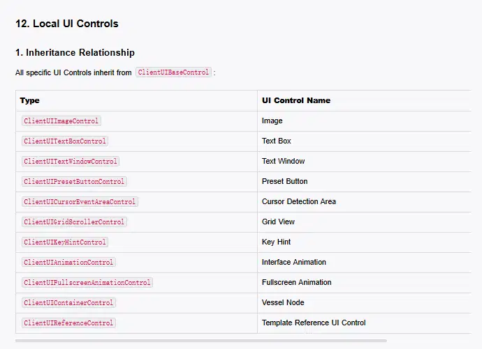
All concrete client controls inherit from ClientUIBaseControl. Inheritance gives them shared properties and methods, while each subclass can also have its own features. Learn both the shared operations and the features specific to each control.
2.1 Control Properties
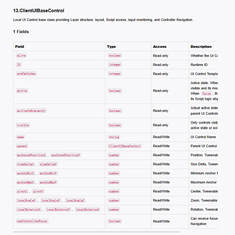
The API provides many properties. Some are read-only and are commonly used to inspect a control's state. Extend the Hello World script to print a few values:
function OnStart()
local textbox = game.InstantiateClientUIControl(1073741846, script.object); -- Replace with the template index created earlier.
textbox.text = "Hello World";
print(textbox.alive) -- whether the control is alive
print(textbox.prefabIndex) -- template ID
print(textbox.id) -- control ID
print(textbox.active) -- active state
end
Run the stage and check the log. These properties will be useful later.
2.2 Control Transforms
Controls have position, size, scale, and other transform properties. Print the current values:
function OnStart()
local textbox = game.InstantiateClientUIControl(1073741846, script.object); -- Replace with the template index created earlier.
textbox.text = "Hello World";
print("x:"..textbox.anchoredPositionX.." y:"..textbox.anchoredPositionY)
print("size_x:"..textbox.sizeDeltaX.." size_y:"..textbox.sizeDeltaY)
print("Scale_x:"..textbox.localScaleX.." Scale_y:"..textbox.localScaleY)
end
Example output:
x:0.0 y:0.0
size_x:100.0 size_y:40.0
Scale_x:1.0 Scale_y:1.0
In this example, (0, 0) places the control at the center of its parent.
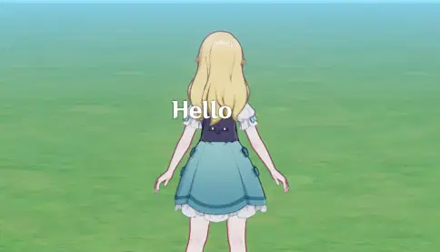
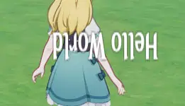
The Text Box only shows “Hello” because its default width is too small. Increase its width, double its height through scaling, and rotate it 180 degrees:
function OnStart()
local textbox = game.InstantiateClientUIControl(1073741846, script.object); -- Replace with the template index created earlier.
textbox.text = "Hello World";
textbox.sizeDeltaX = 200;
textbox.localScaleY = 2;
textbox.localRotationZ = 180;
end
Run the stage to see the result:
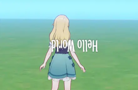
The API also provides methods for setting multiple transform components. Find Layout and Transformation under ClientUIBaseControl:
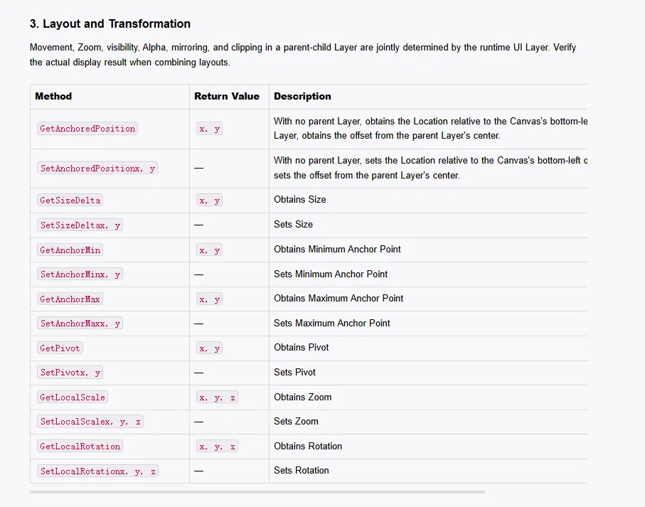
The methods take all components. Read the unchanged components from the control so the result matches the property assignments above:
function OnStart()
local textbox = game.InstantiateClientUIControl(1073741846, script.object); -- Replace with the template index created earlier.
textbox.text = "Hello World";
textbox:SetSizeDelta(200, textbox.sizeDeltaY);
textbox:SetLocalScale(textbox.localScaleX, 2, textbox.localScaleZ);
textbox:SetLocalRotation(textbox.localRotationX, textbox.localRotationY, 180);
end
The result is the same:
2.3 Visibility
There are several ways to hide a control, with different costs:
- Move it outside the screen. Runtime cost is almost the same as when it is on screen, but showing it again is inexpensive.
- Deactivate it. The control remains in the hierarchy but is inactive. Runtime cost is low, while reactivation has a medium to high cost.
- Set it invisible. This is commonly used; runtime cost is moderate and making it visible again is inexpensive.
The last two correspond to these API methods:
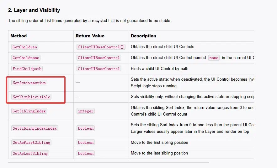
The API screenshot may display the brackets incorrectly. Read these methods as SetActive(active) and SetVisible(visible); separate subsequent methods according to their meaning.
2.4 Hierarchy
Hierarchy has two aspects: parent-child relationships and draw order.
Parent and Child
Client controls must have a parent. Planning a container hierarchy helps organize complex projects and can help performance. A parent is specified when creating a control; afterward, the readable and writable parent property can change it.
Create a Client Control Template for a container. Then create two containers and a Text Box, print their child counts, and move the Text Box to the second container:
function OnStart()
local container1 = game.InstantiateClientUIControl(1073741851, script.object);
local container2 = game.InstantiateClientUIControl(1073741851, script.object);
local textbox = game.InstantiateClientUIControl(1073741846, container1); -- Replace with the template index created earlier.
textbox.text = "Hello World";
textbox.sizeDeltaX = 200;
print("container1 len:"..#container1:GetChildren());
print("container2 len:"..#container2:GetChildren());
textbox.parent = container2;
print("container1 len:"..#container1:GetChildren());
print("container2 len:"..#container2:GetChildren());
end
Log output:
container1 len:1
container2 len:0
container1 len:0
container2 len:1
The child counts change after reparenting.
Draw Order
Server UI has hierarchy-based and time-based rendering modes. To see how client controls are ordered, create an Image control template and note its index.
Give two images different colors using the imageColor field:
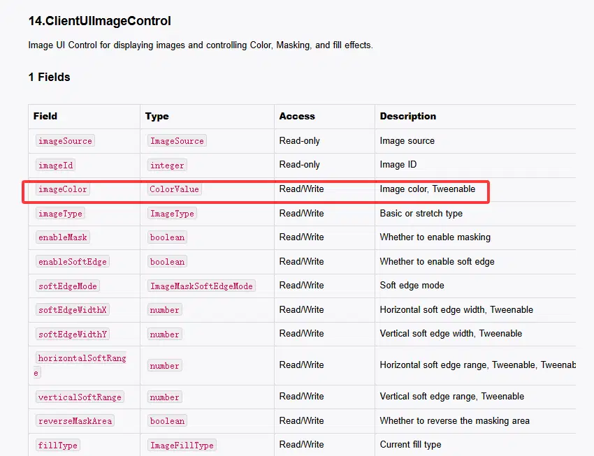
Its type is ColorValue, which can be created with the RGBA constructor:
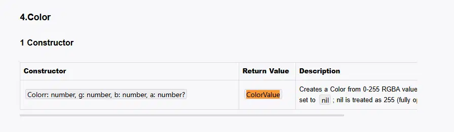
Use SetImage(imageSource, imageId) to select an image. The image ID can be found in the UI Control Group Library. Look up imageSource in the API:
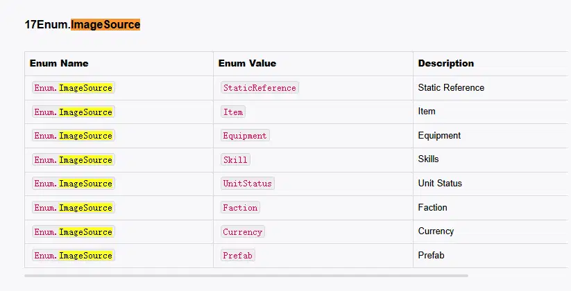
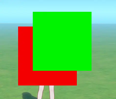
A static image uses Enum.ImageSource.StaticReference, for example SetImage(Enum.ImageSource.StaticReference, 10001). Offset the second image by (50, 50) and run this script:
function OnStart()
local pic1 = game.InstantiateClientUIControl(1073741853, script.object); -- Replace with the template index created earlier.
local pic2 = game.InstantiateClientUIControl(1073741853, script.object); -- Replace with the template index created earlier.
pic1:SetSizeDelta(200, 200);
pic2:SetSizeDelta(200, 200);
pic1:SetImage(Enum.ImageSource.StaticReference, 100001)
pic2:SetImage(Enum.ImageSource.StaticReference, 100001)
pic1.imageColor = Color(244, 0, 0)
pic2.imageColor = Color(0, 244, 0)
pic2:SetAnchoredPosition(50, 50)
end
Swap the creation order and test again:
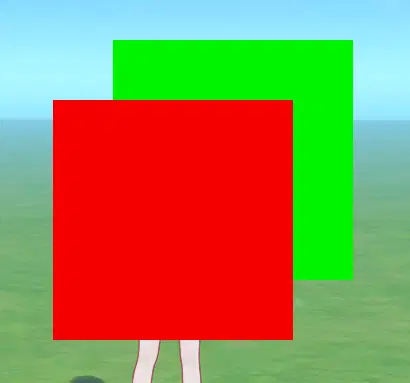
Without other changes, the draw order follows creation order. The API also provides an index to control sibling order; a higher index draws above a lower one:
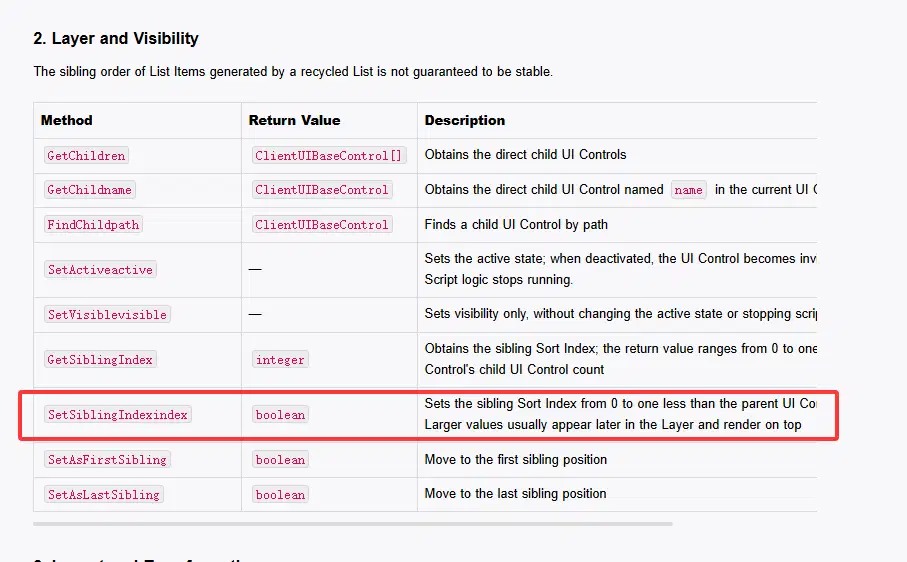
Keep the green image created before the red image, but change their order explicitly:
function OnStart()
local pic2 = game.InstantiateClientUIControl(1073741853, script.object); -- Replace with the template index created earlier.
local pic1 = game.InstantiateClientUIControl(1073741853, script.object); -- Replace with the template index created earlier.
pic1:SetSizeDelta(200, 200);
pic2:SetSizeDelta(200, 200);
pic1:SetImage(Enum.ImageSource.StaticReference, 100001)
pic2:SetImage(Enum.ImageSource.StaticReference, 100001)
pic1.imageColor = Color(244, 0, 0)
pic2.imageColor = Color(0, 244, 0)
pic2:SetAnchoredPosition(50, 50)
pic1:SetSiblingIndex(0)
pic2:SetSiblingIndex(1)
end
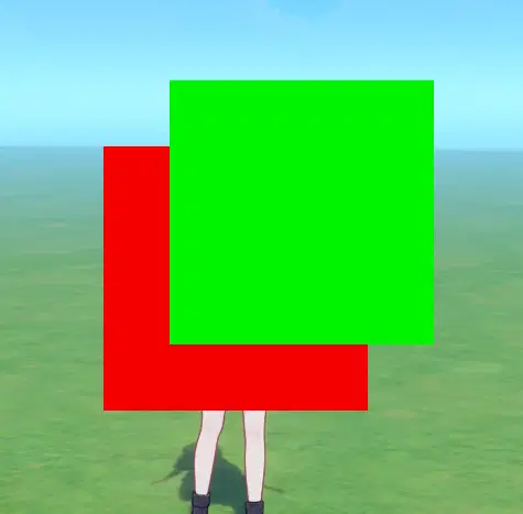
The green image is now on top.
2.5 Simple Motion
Using the previous example, move the red image horizontally and the green image vertically. The OnUpdate event can check boundaries and update positions each frame. Look up update usage in the API:
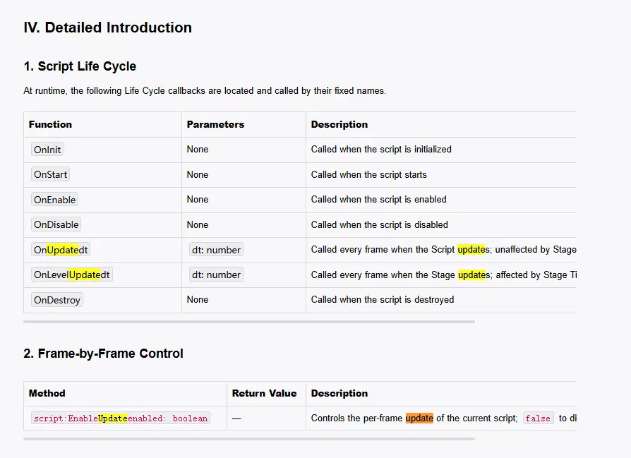
Enable updates explicitly at startup:
script:EnableUpdate(true);
Keep the control creation in OnStart() and put the motion in OnUpdate(). Move the local declarations for the images outside the functions so both functions can access them.
Sibling indices start at 0 and end at the parent's child count minus 1. SetSiblingIndex returns a boolean. Here, indices 0 and 1 place the red image below the green image:
local pic1 = nil
local pic2 = nil
local timer = 0 -- time accumulator
function OnStart()
script:EnableUpdate(true);
pic2 = game.InstantiateClientUIControl(1073741853, script.object); -- Replace with the template index created earlier.
pic1 = game.InstantiateClientUIControl(1073741853, script.object); -- Replace with the template index created earlier.
pic1:SetSizeDelta(200, 200);
pic2:SetSizeDelta(200, 200);
pic1:SetImage(Enum.ImageSource.StaticReference, 100001)
pic2:SetImage(Enum.ImageSource.StaticReference, 100001)
pic1.imageColor = Color(244, 0, 0)
pic2.imageColor = Color(0, 244, 0)
pic2:SetAnchoredPosition(50, 50)
pic1:SetSiblingIndex(0)
pic2:SetSiblingIndex(1)
end
function OnUpdate(dt)
timer = timer + dt * 2
local offset = math.sin(timer) * 200
pic1:SetAnchoredPosition(offset, 0)
pic2:SetAnchoredPosition(0, offset)
end
Observe the result:
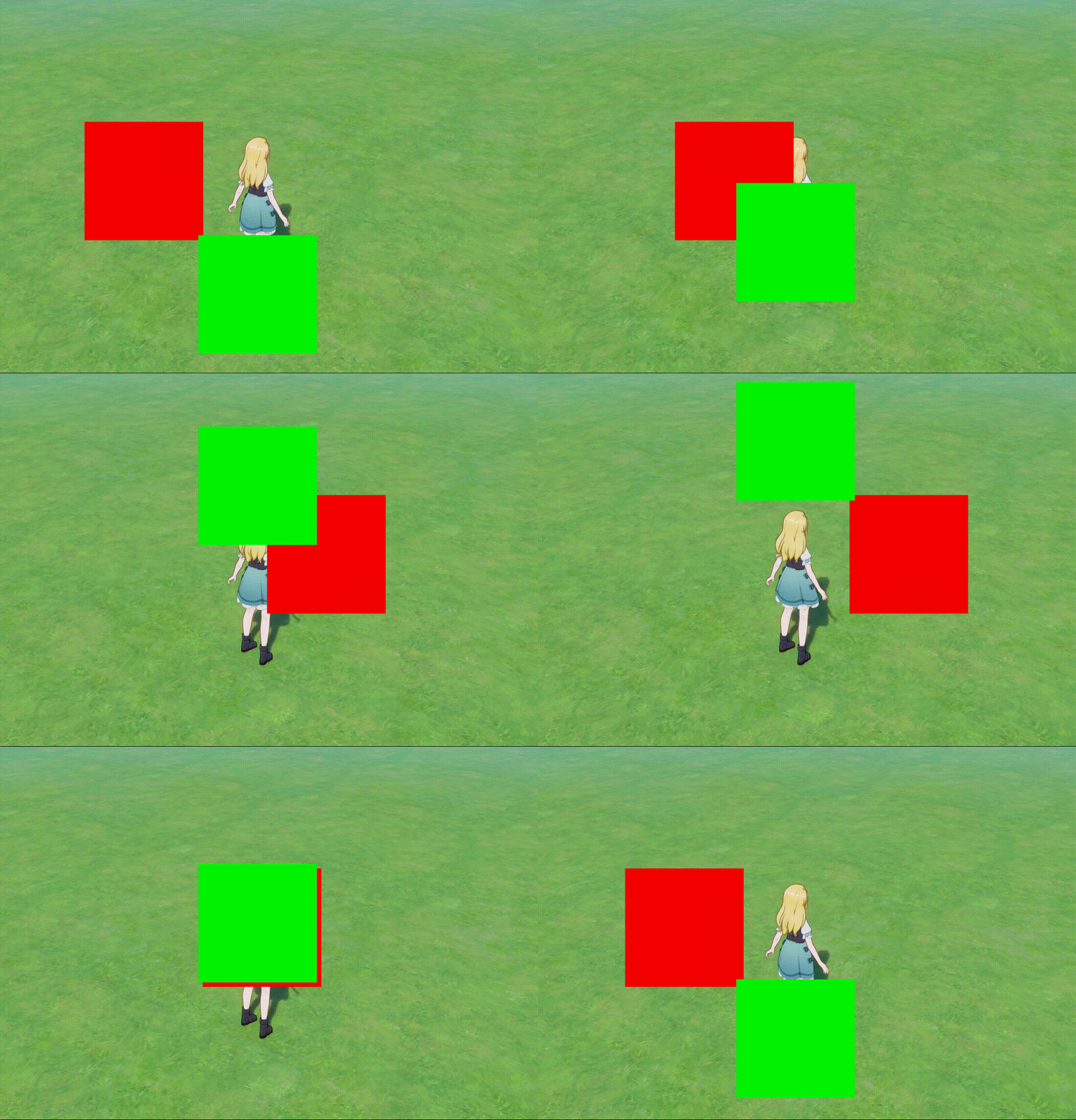
2.6 Common Controls
2.6.1 Image
The earlier examples covered basic Image usage. Images also support soft edges in the X and Y directions and fill settings, controlled through properties and methods.
To enable soft edges, set both enableMask and enableSoftEdge to true. Use SetSoftEdgeWidth(widthX, widthY) to set the widths. Stop the movement from the previous example and add soft edges to the green image:
local pic1 = nil
local pic2 = nil
function OnStart()
script:EnableUpdate(true);
pic2 = game.InstantiateClientUIControl(1073741853, script.object); -- Replace with the template index created earlier.
pic1 = game.InstantiateClientUIControl(1073741853, script.object); -- Replace with the template index created earlier.
pic1:SetSizeDelta(200, 200);
pic2:SetSizeDelta(200, 200);
pic1:SetImage(Enum.ImageSource.StaticReference, 100001)
pic2:SetImage(Enum.ImageSource.StaticReference, 100001)
pic1.imageColor = Color(244, 0, 0)
pic2.imageColor = Color(0, 244, 0)
pic2:SetAnchoredPosition(50, 50)
pic2.enableMask = true
pic2.enableSoftEdge = true
pic2:SetSoftEdgeWidth(30, 30)
pic1:SetSiblingIndex(0)
pic2:SetSiblingIndex(1)
end
Run the stage:
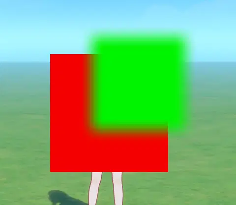
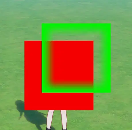
The green image now has soft edges. To try an inverted mask, set pic2.reverseMaskArea = true:
2.6.2 Text Box
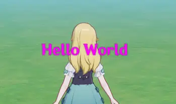
Using a Text Box is similar to configuring one in the interface, except that its properties are set by a script. This example changes its appearance:
function OnStart()
local textbox = game.InstantiateClientUIControl(1073741846, script.object); -- Replace with the template index created earlier.
textbox.text = "Hello World";
textbox:SetSizeDelta(200, 100)
textbox.fontSize = 24
textbox.fontColor = Color(255, 0, 255)
textbox.enableOutline = true
textbox.horizontalAlignment = Enum.TextHorizontalAlignment.Middle
end
3. Keyboard and Mouse Events
The previous examples display controls. This chapter adds clicks and other interactions. The examples use callback functions; if you are new to Lua or programming, learn about callbacks first.
3.1 Preset Button
A Preset Button provides button interaction and cursor event listeners. Configure its appearance for each state and attach the state controls as children. It is less flexible than a Cursor Event Area because the styles must be configured in advance, but it requires less scripting.
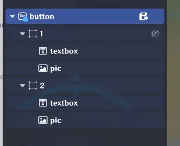
Configure the button before continuing. This guide does not cover the configuration steps.
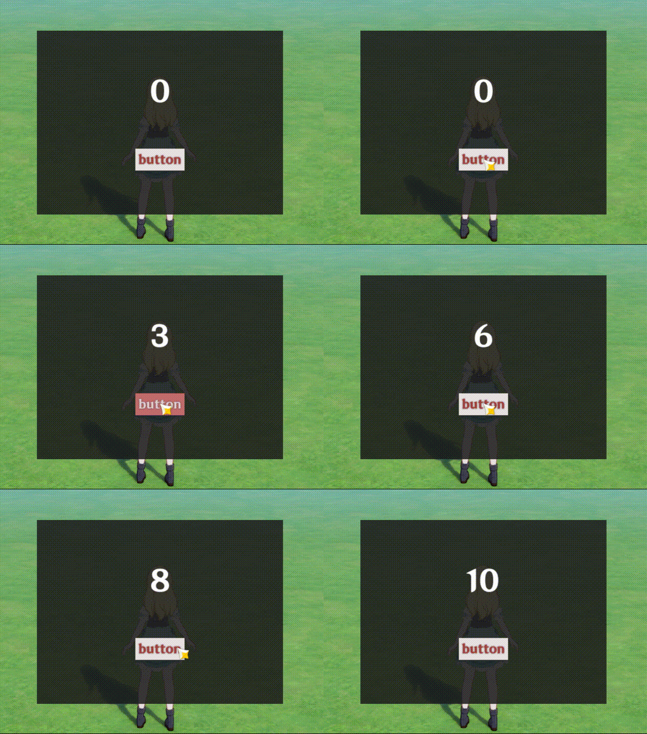
For the demo, create a button and a Text Box on a centered panel. Each click increments the number shown in the Text Box. Look up the listener in the API:
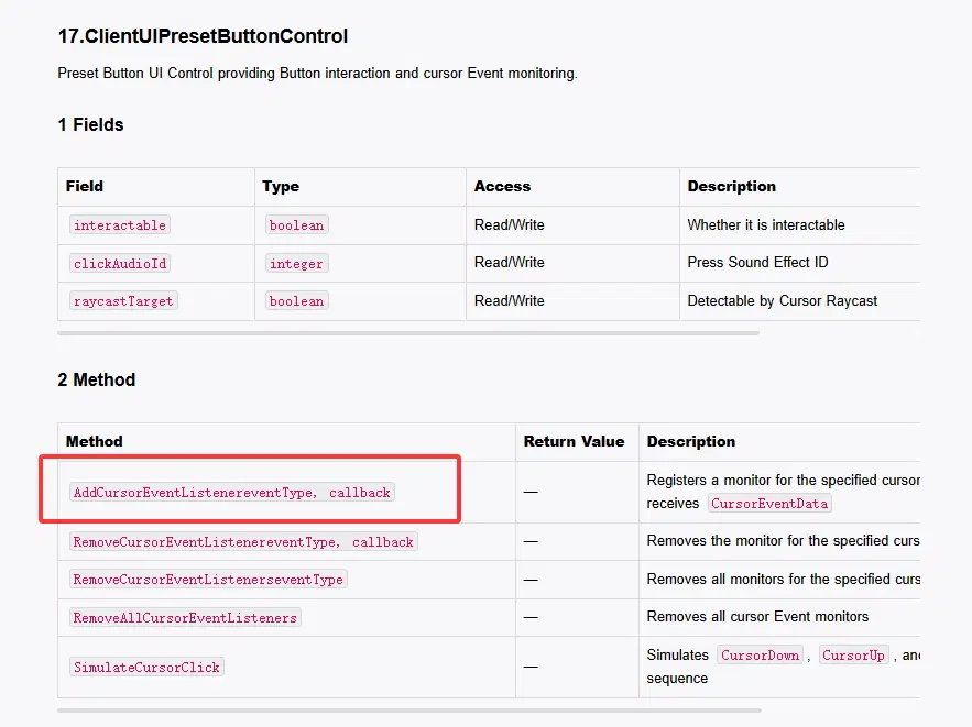
The listener takes an event type and a callback function. Search the API for event types to find mouse, keyboard, controller, and other events. For this example, use a cursor click:
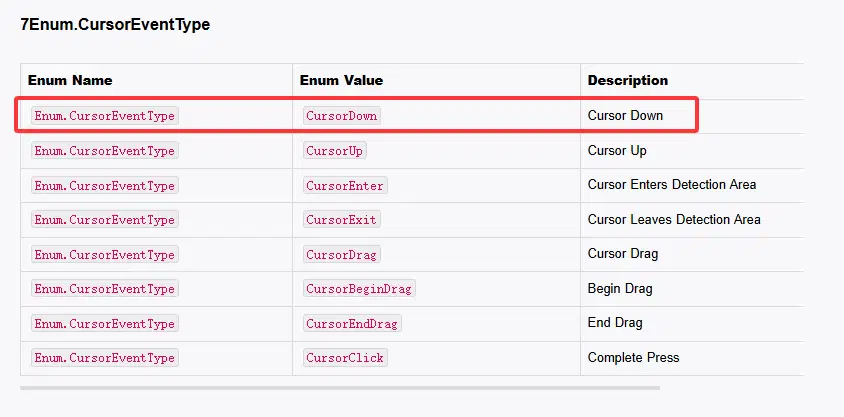
Define shared variables:
local pic = 1073741853
local button = 1073741866
local text = 1073741846
local count = 0
local textbox = nil
Define the callback. It runs when the event occurs:
local function OnButtonClick()
count = count + 1
textbox.text = tostring(count)
end
Create the controls and register the callback:
function OnStart()
local panel = game.InstantiateClientUIControl(pic, script.object)
panel:SetSizeDelta(400, 300)
panel:SetAnchoredPosition(0, 0)
panel.imageColor = Color(30, 30, 30, 220)
panel:SetImage(Enum.ImageSource.StaticReference, 100001)
textbox = game.InstantiateClientUIControl(text, panel)
textbox:SetSizeDelta(300, 80)
textbox:SetAnchoredPosition(0, 50)
textbox.fontSize = 48
textbox.fontColor = Color(255, 255, 255)
textbox.horizontalAlignment = Enum.TextHorizontalAlignment.Middle
textbox.verticalAlignment = Enum.TextVerticalAlignment.Middle
textbox.text = tostring(count)
local button = game.InstantiateClientUIControl(button, panel)
button:SetSizeDelta(180, 70)
button:SetAnchoredPosition(0, -60)
button:AddCursorEventListener(Enum.CursorEventType.CursorClick, OnButtonClick)
end
Test it:
3.2 Key Bindings
Key listeners do not directly respond to touch input, so adapt the interface for the target devices.
Preset Buttons inherit AddKeyEventListener from the base control and can listen for keys as well as cursor events. Images and other controls also inherit key listeners. An Image does not provide its own cursor event listener; use a Cursor Event Area for cursor input, as shown below.
Return to the previous script and remove the Preset Button creation code. Create an image-based button instead:
local customButton = game.InstantiateClientUIControl(pic, panel)
customButton:SetSizeDelta(180, 70)
customButton:SetAnchoredPosition(0, -60)
customButton:SetImage(Enum.ImageSource.StaticReference, 100001)
customButton.imageColor = Color(60, 120, 210)
Add a label:
local btnLabel = game.InstantiateClientUIControl(text, customButton)
btnLabel:SetSizeDelta(180, 70)
btnLabel:SetAnchoredPosition(0, 0)
btnLabel.text = "key [1]"
btnLabel.horizontalAlignment = Enum.TextHorizontalAlignment.Middle
btnLabel.verticalAlignment = Enum.TextVerticalAlignment.Middle
A key event callback must return a boolean. Define a callback outside OnStart() that reuses the existing click logic:
local function OnKeyPress()
OnButtonClick()
return true
end
true is an example return value. Check the current documentation and test how true and false affect event handling and propagation.
In OnStart(), register a key listener on customButton:
customButton:AddKeyEventListener(Enum.KeyEventType.KeyboardCraftspersonKey1Down, OnKeyPress)
Complete code:
local pic = 1073741853
local text = 1073741846
local count = 0
local textbox = nil
local function OnButtonClick()
count = count + 1
textbox.text = tostring(count)
end
local function OnKeyPress()
OnButtonClick()
return true
end
function OnStart()
local panel = game.InstantiateClientUIControl(pic, script.object)
panel:SetSizeDelta(400, 300)
panel:SetAnchoredPosition(0, 0)
panel.imageColor = Color(30, 30, 30, 220)
panel:SetImage(Enum.ImageSource.StaticReference, 100001)
textbox = game.InstantiateClientUIControl(text, panel)
textbox:SetSizeDelta(300, 80)
textbox:SetAnchoredPosition(0, 50)
textbox.fontSize = 48
textbox.fontColor = Color(255, 255, 255)
textbox.horizontalAlignment = Enum.TextHorizontalAlignment.Middle
textbox.verticalAlignment = Enum.TextVerticalAlignment.Middle
textbox.text = tostring(count)
local customButton = game.InstantiateClientUIControl(pic, panel)
customButton:SetSizeDelta(180, 70)
customButton:SetAnchoredPosition(0, -60)
customButton:SetImage(Enum.ImageSource.StaticReference, 100001)
customButton.imageColor = Color(60, 120, 210)
local btnLabel = game.InstantiateClientUIControl(text, customButton)
btnLabel:SetSizeDelta(180, 70)
btnLabel:SetAnchoredPosition(0, 0)
btnLabel.text = "key [1]"
btnLabel.horizontalAlignment = Enum.TextHorizontalAlignment.Middle
btnLabel.verticalAlignment = Enum.TextVerticalAlignment.Middle
customButton:AddKeyEventListener(Enum.KeyEventType.KeyboardCraftspersonKey1Down, OnKeyPress)
end
Run the example to test the key binding.
3.3 Listening for Keys on the Root Control
This example registers a listener on script.object, the control to which the script is attached. Here it is the root node of the Client Control Container.
This remains a control listener; it is not guaranteed to receive every key event. Rendering order, how other callbacks handle the event, and control state can affect the response. Test it in your project.
Add a listener for key 2 to the script container:
script.object:AddKeyEventListener(Enum.KeyEventType.KeyboardCraftspersonKey2Down, OnKeyPress)
Run the example to test it.
3.4 Cursor Event Area
Ordinary controls cannot all listen for cursor events directly. A Cursor Event Area lets a custom image, text, or screen region respond to clicks, hover, and dragging. It acts as a transparent hit-test area. Instantiate one as a child of the custom button to capture cursor events.
Before continuing, open UI Control Group Library → Client Control Templates, add a Cursor Event Area control, save it as a template, and note its index.
Create the area and register a click listener:
local clickArea = game.InstantiateClientUIControl(cursorArea, customButton)
clickArea:SetSizeDelta(180, 70)
clickArea:SetAnchoredPosition(0, 0)
clickArea:AddCursorEventListener(Enum.CursorEventType.CursorClick, OnButtonClick)
Complete code:
local pic = 1073741853 -- Image template
local text = 1073741846 -- Text Box template
local cursorArea = 1073741884 -- Cursor Event Area template
local count = 0
local textbox = nil
local customButton = nil
local function OnButtonClick()
count = count + 1
textbox.text = tostring(count)
end
function OnStart()
local panel = game.InstantiateClientUIControl(pic, script.object)
panel:SetSizeDelta(400, 300)
panel:SetAnchoredPosition(0, 0)
panel.imageColor = Color(30, 30, 30, 220)
panel:SetImage(Enum.ImageSource.StaticReference, 100001)
textbox = game.InstantiateClientUIControl(text, panel)
textbox:SetSizeDelta(300, 80)
textbox:SetAnchoredPosition(0, 50)
textbox.fontSize = 48
textbox.fontColor = Color(255, 255, 255)
textbox.horizontalAlignment = Enum.TextHorizontalAlignment.Middle
textbox.verticalAlignment = Enum.TextVerticalAlignment.Middle
textbox.text = tostring(count)
customButton = game.InstantiateClientUIControl(pic, panel)
customButton:SetSizeDelta(180, 70)
customButton:SetAnchoredPosition(0, -60)
customButton:SetImage(Enum.ImageSource.StaticReference, 100001)
customButton.imageColor = Color(60, 120, 210)
local btnLabel = game.InstantiateClientUIControl(text, customButton)
btnLabel:SetSizeDelta(180, 70)
btnLabel:SetAnchoredPosition(0, 0)
btnLabel.text = "Click / [1]"
btnLabel.fontSize = 26
btnLabel.fontColor = Color(255, 255, 255)
btnLabel.horizontalAlignment = Enum.TextHorizontalAlignment.Middle
btnLabel.verticalAlignment = Enum.TextVerticalAlignment.Middle
local clickArea = game.InstantiateClientUIControl(cursorArea, customButton)
clickArea:SetSizeDelta(180, 70)
clickArea:SetAnchoredPosition(0, 0)
clickArea:AddCursorEventListener(Enum.CursorEventType.CursorClick, OnButtonClick)
end
Test whether clicking the button increments the number.
3.5 Example: Dragging an Image
A Cursor Event Area can also detect dragging, for example when moving inventory cards, map markers, or floating windows.
Drag Event
Enum.CursorEventType.CursorDrag is triggered as the cursor continues to move. The callback receives eventData, a CursorEventData object. Its GetUIPosDelta() method returns the UI screen displacement for the current movement:
local dx, dy = eventData:GetUIPosDelta()
Add the displacement to the image position so it follows the mouse:
local function OnDrag(eventData)
local dx, dy = eventData:GetUIPosDelta()
local curX, curY = dragBox:GetAnchoredPosition()
dragBox:SetAnchoredPosition(curX + dx, curY + dy)
end
Complete Code
Combine the draggable image, hint text, and Cursor Event Area:
local pic = 1073741853 -- Image template
local text = 1073741846 -- Text Box template
local cursorArea = 1073741884 -- Cursor Event Area template
local dragBox = nil
local function OnDrag(eventData)
local dx, dy = eventData:GetUIPosDelta()
local curX, curY = dragBox:GetAnchoredPosition()
dragBox:SetAnchoredPosition(curX + dx, curY + dy)
end
function OnStart()
-- Create the draggable image
dragBox = game.InstantiateClientUIControl(pic, script.object)
dragBox:SetSizeDelta(120, 120)
dragBox:SetAnchoredPosition(0, 0)
dragBox:SetImage(Enum.ImageSource.StaticReference, 100001)
dragBox.imageColor = Color(60, 120, 210)
-- Attach a Cursor Event Area
local dragArea = game.InstantiateClientUIControl(cursorArea, dragBox)
dragArea:SetSizeDelta(120, 120)
dragArea:SetAnchoredPosition(0, 0)
-- Register the drag listener
dragArea:AddCursorEventListener(Enum.CursorEventType.CursorDrag, OnDrag)
end
Hold the left mouse button over the square and drag it. Observe whether it changes color and follows the mouse.
This example is simplified. A real project may focus the item and align it with the cursor when dragging starts, then adjust its position when it is dropped.
4. Tween Animations
Animations make a UI more expressive, but implementing their state changes manually can be cumbersome. Miliastra Wonderland includes a Tween system for smoothly changing control properties such as position, size, scale, and opacity over time.
4.1 Basic Tween: game.Tween
Look up Tween creation in the API:
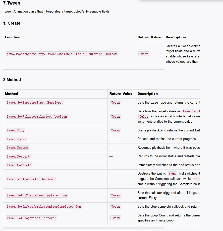
game.Tween creates and returns a Tween object. It takes three arguments:
- object: the target control.
- tweenDataTable: a table mapping property names to target values.
- duration: the animation duration.
Create an image and play a Tween:
local pic = 1073741853 -- Image template
function OnStart()
local pic = game.InstantiateClientUIControl(pic, script.object)
pic:SetSizeDelta(120, 120)
pic:SetImage(Enum.ImageSource.StaticReference, 100001)
pic.imageColor = Color(60, 120, 210)
local test_tween = game.Tween(pic, {localScaleX = 2}, 3)
test_tween:Play()
end
This changes localScaleX to 2 over three seconds. Run it to see the image grow:
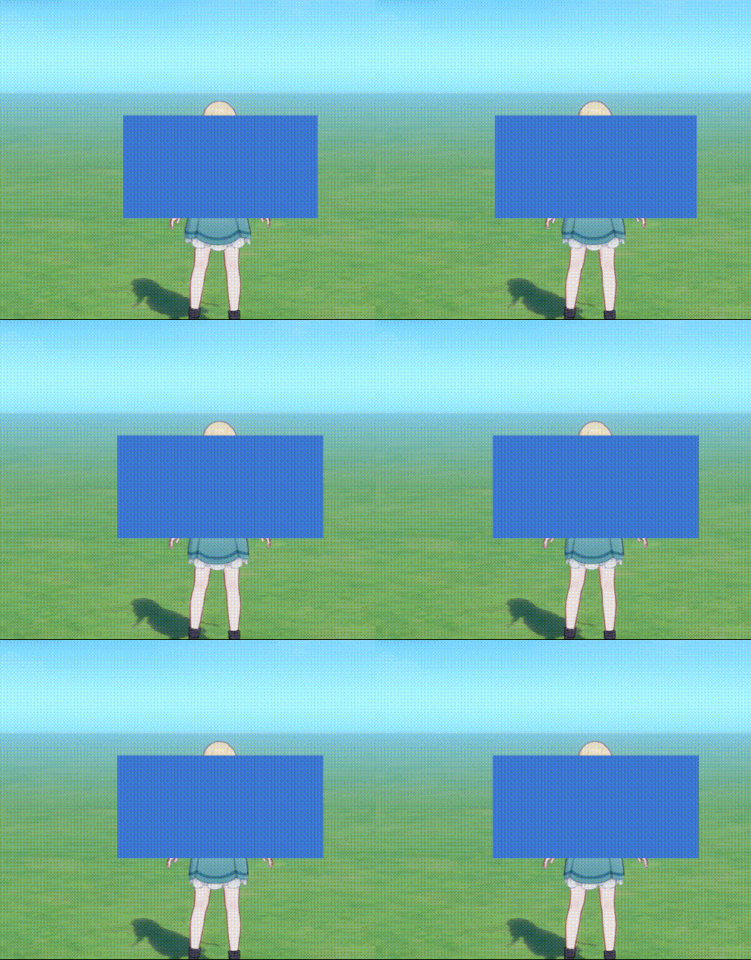
Not every property supports interpolation. Only fields marked Tweenable can be used with Tween; the English API documentation may not mark every such field. Common examples include:
Tweenable fields:localScaleX, localScaleY
Control:All controls
Effect:Scale, such as a button response or breathing effect
Tweenable fields:anchoredPositionX, anchoredPositionY
Control:All controls
Effect:Movement, such as a sliding or floating panel
Tweenable fields:sizeDeltaX, sizeDeltaY
Control:All controls
Effect:Smooth size changes
Tweenable fields:imageColor
Control:Image
Effect:Color transitions and fades, including alpha
Tweenable fields:fillAmount
Control:Image
Effect:Progress fills, such as health bars or cooldowns
Tweenable fields:fontSize, fontColor
Control:Text
Effect:Font size and color changes
4.2 Easing: EaseType
A constant speed is not always suitable. Tween supports different easing types through Enum.EaseType, including:
- Enum.EaseType.Linear: constant speed.
- Enum.EaseType.OutBack: overshoots and returns.
- Enum.EaseType.OutBounce: bounces at the end.
- Enum.EaseType.OutQuad and Enum.EaseType.OutCubic: decelerate smoothly.
Use SetEase to select an easing type. This example binds keys to reset the control and compare effects:
local pic = 1073741853 -- Image template
local box = nil
local currentTween = nil
local function resetui()
if currentTween then
currentTween:Kill(false)
currentTween = nil
end
box.localScaleX = 1
end
function OnStart()
box = game.InstantiateClientUIControl(pic, script.object)
box:SetSizeDelta(120, 120)
box:SetImage(Enum.ImageSource.StaticReference, 100001)
box.imageColor = Color(60, 120, 210)
resetui()
script.object:AddKeyEventListener(Enum.KeyEventType.KeyboardCraftspersonKey1Down, function()
resetui()
currentTween = game.Tween(box, { localScaleX = 2 }, 1):SetEase(Enum.EaseType.Linear)
currentTween:Play()
return true
end)
script.object:AddKeyEventListener(Enum.KeyEventType.KeyboardCraftspersonKey2Down, function()
resetui()
currentTween = game.Tween(box, { localScaleX = 2 }, 1):SetEase(Enum.EaseType.OutBack)
currentTween:Play()
return true
end)
script.object:AddKeyEventListener(Enum.KeyEventType.KeyboardCraftspersonKey3Down, function()
resetui()
currentTween = game.Tween(box, { localScaleX = 2 }, 1):SetEase(Enum.EaseType.OutBounce)
currentTween:Play()
return true
end)
script.object:AddKeyEventListener(Enum.KeyEventType.KeyboardCraftspersonKey4Down, function()
resetui()
currentTween = game.Tween(box, { localScaleX = 2 }, 1.2):SetEase(Enum.EaseType.OutElastic)
currentTween:Play()
return true
end)
end
Press 1, 2, 3, and 4 to compare the animations. Other easing types work in the same way.
4.3 Animation Loops and Control
A Tween can play once or loop. The API lists methods for controlling it:
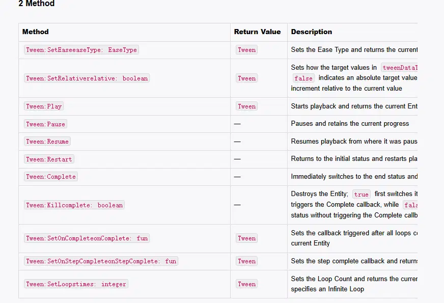
- Play(): start playback.
- Pause(): pause playback.
- Restart(): return to the beginning and play again.
- SetLoops(times): set the loop count; -1 loops indefinitely.
- SetOnComplete(callback): run a callback when the animation completes.
- Kill(false): destroy the animation and release its resources; this is recommended when closing the interface or in OnDestroy().
Use SetLoops(-1) to repeat an animation. In the basic example, add a callback that prints complete:
local pic = 1073741853
local test_tween = nil
function OnStart()
local pic = game.InstantiateClientUIControl(pic, script.object)
pic:SetSizeDelta(120, 120)
pic:SetImage(Enum.ImageSource.StaticReference, 100001)
pic.imageColor = Color(60, 120, 210)
test_tween = game.Tween(pic, {localScaleX = 2}, 3)
test_tween:SetLoops(-1)
test_tween:SetOnStepComplete(function()
print("complete")
end)
test_tween:Play()
end
4.4 Tween Sequences and Delays
A Tween sequence plays multiple effects in order. Look up the sequence API:
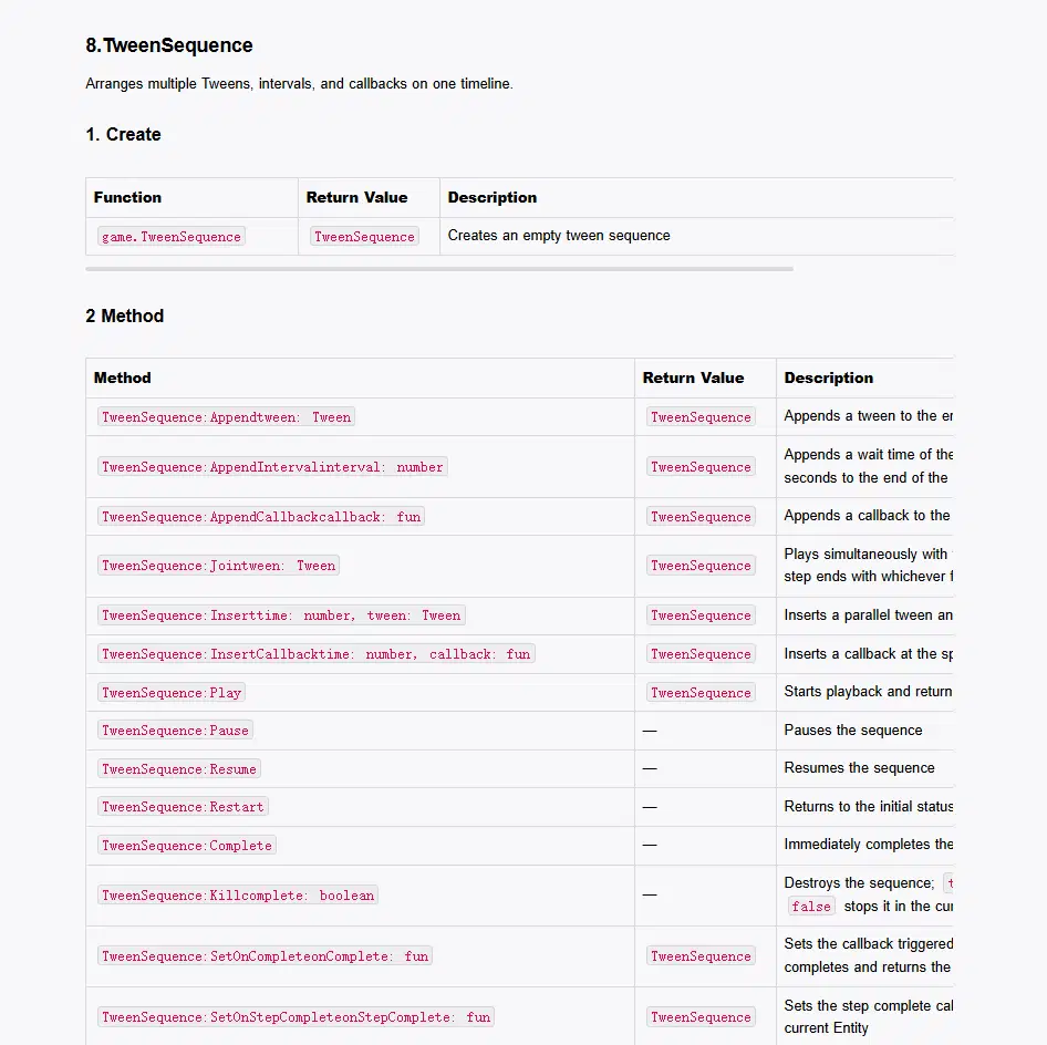
Create an empty TweenSequence:
local seq = game.TweenSequence()
A sequence acts like a timeline: append Tweens, intervals, and callbacks to create a combined animation.
Common Sequence Methods
Method:seq:Append(tween)
Description:Add an animation after the previous step.
Method:seq:AppendInterval(seconds)
Description:Add a delay in seconds.
Method:seq:AppendCallback(function)
Description:Add a callback at the current end of the timeline.
Method:seq:Join(tween)
Description:Play an animation alongside the previous step.
Method:seq:SetLoops(times)
Description:Set the sequence loop count; -1 loops indefinitely.
Method:seq:Play()
Description:Start playback.
Method:seq:Pause() / seq:Resume()
Description:Pause or resume playback.
Method:seq:Kill(false)
Description:Destroy the sequence and release its resources.
Smooth Breathing Effect
In the previous example, a single Tween that grows to twice its size jumps back to its original size at the start of each loop. A sequence can alternate between growing and shrinking:
local pic = 1073741853 -- Image template
local box = nil
local seq = nil
function OnStart()
box = game.InstantiateClientUIControl(pic, script.object)
box:SetSizeDelta(120, 120)
box:SetImage(Enum.ImageSource.StaticReference, 100001)
box.imageColor = Color(60, 120, 210)
-- 1. Create a Tween sequence
seq = game.TweenSequence()
-- 2. Scale to 1.8 over 1.5 seconds
seq:Append(game.Tween(box, { localScaleX = 1.8, localScaleY = 1.8 }, 1.5):SetEase(Enum.EaseType.InOutSine))
-- 3. Wait for 0.2 seconds
seq:AppendInterval(0.2)
-- 4. Scale back to 1.0 over 1.5 seconds
seq:Append(game.Tween(box, { localScaleX = 1, localScaleY = 1 }, 1.5):SetEase(Enum.EaseType.InOutSine))
-- 5. Loop the sequence indefinitely and play it
seq:SetLoops(-1)
seq:Play()
end
5. Signals
Lua UI scripts run locally and are separate from server logic. Signals provide communication between them. This chapter covers receiving and sending signals.
5.1 Receiving Signals
Miliastra Wonderland uses an authoritative server architecture. Player data such as currency, level, health, and the stage timer is managed by the server; client UI does not own that authoritative data.
The server can send signals to client scripts. A Lua script registers a listener to receive and handle them.
Main API
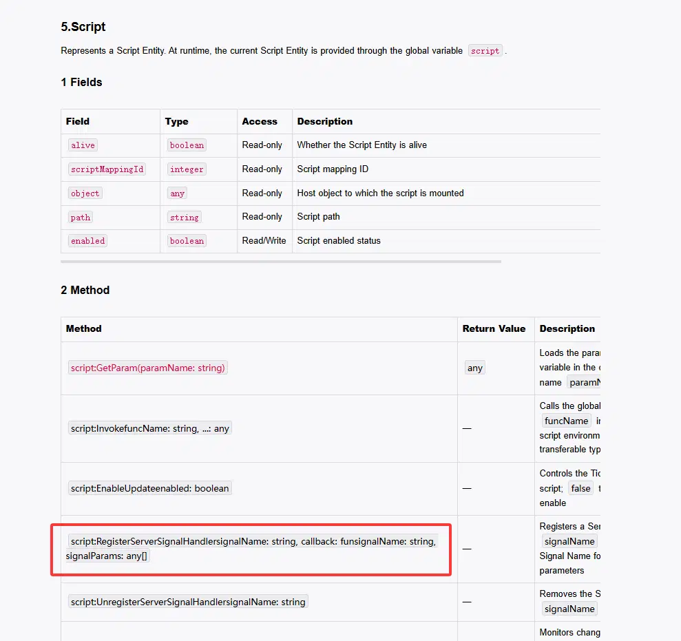
The client script instance script provides two methods:
1.Register a listener with script:RegisterServerSignalHandler(signalName, callback).
- signalName is the name configured in Signal Manager.
- callback receives signalName and signalParams, the array of parameters sent by the server.
2. Remove a listener with script:UnregisterServerSignalHandler(signalName) when it is no longer needed or the control is destroyed, to avoid duplicate handling.
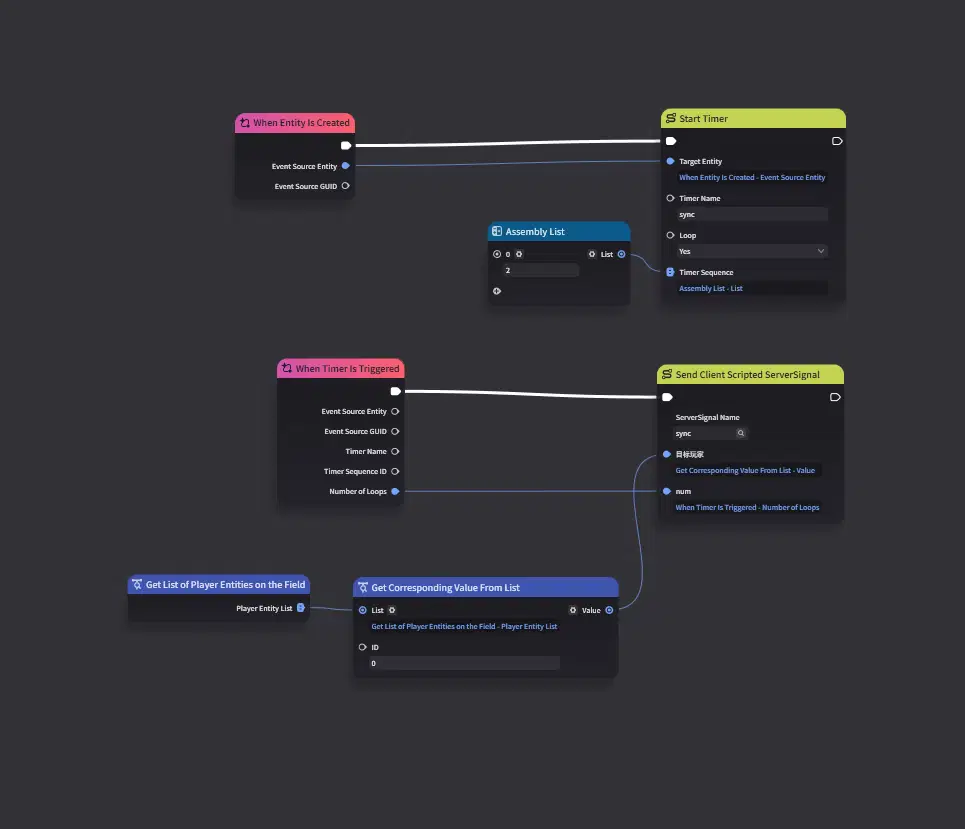
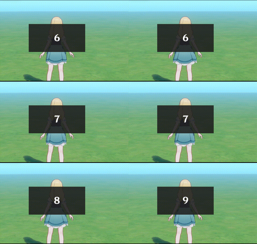
For this example, make a server-side number increase every two seconds and send it to the client script. The script displays the received number.
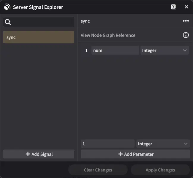
Create a server node graph and attach it to the stage. Add a signal sync with a num integer parameter:
Add a repeating timer and send the count to the client. The screenshot uses When Entity Is Created, Start Timer, Assembly List, When Timer Is Triggered, and Send Client Scripted Signal. The player list and Get Corresponding Value From List supply the target:
In the script, create a centered Text Box and use RegisterServerSignalHandler to listen for "sync". When the server broadcast arrives, display signalParams[1]:
local pic = 1073741853 -- Image template
local text = 1073741846 -- Text Box template
local countLabel = nil
-- Callback for the server sync signal
local function OnReceiveSync(signalName, signalParams)
-- Read the first parameter sent by the server
local num = signalParams[1] or 0
countLabel.text = tostring(num)
end
function OnStart()
-- 1. Create a centered background panel
local panel = game.InstantiateClientUIControl(pic, script.object)
panel:SetSizeDelta(200, 100)
panel:SetAnchoredPosition(0, 0)
panel:SetImage(Enum.ImageSource.StaticReference, 100001)
panel.imageColor = Color(30, 30, 30, 220)
-- 2. Create a centered Text Box for the number
countLabel = game.InstantiateClientUIControl(text, panel)
countLabel:SetSizeDelta(300, 100)
countLabel.fontSize = 32
countLabel.horizontalAlignment = Enum.TextHorizontalAlignment.Middle
countLabel.verticalAlignment = Enum.TextVerticalAlignment.Middle
countLabel.text = "Waiting for signal..."
-- 3. Listen for the server signal named "sync"
script:RegisterServerSignalHandler("sync", OnReceiveSync)
end
Run the stage. The number should increase as the server timer sends an update every two seconds:
5.2 Sending Signals
Client-side data can be lost on disconnect or forced exit. Important data and save data can be sent to the server through signals. UI interactions may also need to be sent to the server in projects combining 2D and 3D gameplay.
A server node graph can receive client signals with the Monitor Signal event node. On the client, create a signal object and send it through the Lua API:
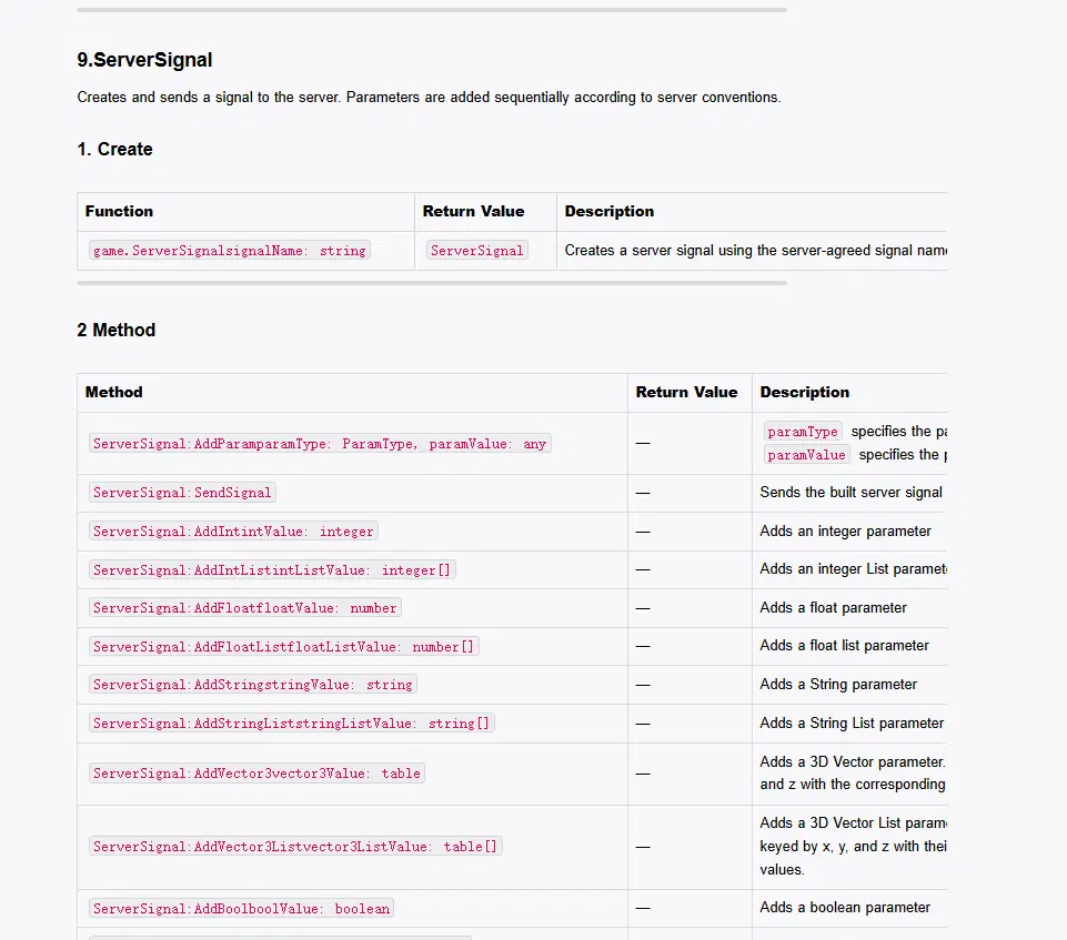
- Create a signal with local signal = game.ServerSignal(signalName).
- Add parameters in the order agreed with the server:
Method:signal:AddInt(intValue)
Description:Add an integer, such as an item ID or quantity.
Method:signal:AddFloat(floatValue)
Description:Add a floating-point number.
Method:signal:AddString(stringValue)
Description:Add a string, such as an action or note.
Method:signal:AddBool(boolValue)
Description:Add a boolean.
Method:signal:AddVector3(vector3Table)
Description:Add a 3D vector as a table such as {x=0, y=0, z=0}.
3.Send it with signal:SendSignal().
Extend the previous example so clicks add to the score using the same signal. The client does not send a meaningful value; the server adds one to the score when it receives the signal.
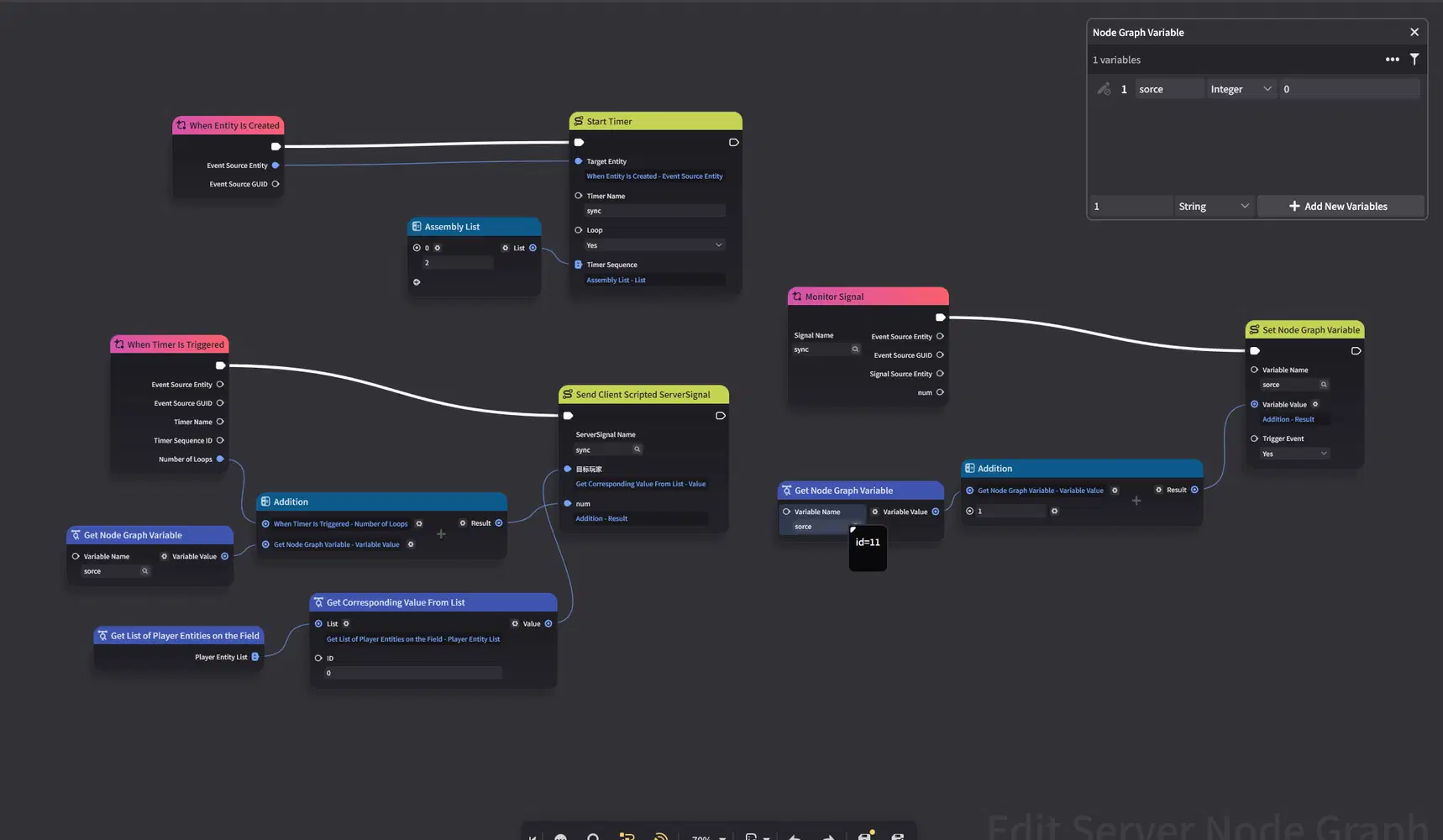
Modify the server node graph. Create a node graph variable to record the accumulated client score. The screenshot uses Monitor Signal, Get Node Graph Variable, Addition, and Set Node Graph Variable:
On the client, attach a Cursor Event Area to the scoreboard panel and listen for CursorDown. Send a signal when the panel is pressed:
local pic = 1073741853 -- Image template
local text = 1073741846 -- Text Box template
local cursorArea = 1073741884 -- Cursor Event Area template
local countLabel = nil
-- 1. Update the display when the server sync signal arrives
local function OnReceiveSync(signalName, signalParams)
local num = signalParams[1] or 0
countLabel.text = tostring(num)
end
-- 2. Send a scoring signal when the scoreboard is pressed
local function OnPanelDown()
local signal = game.ServerSignal("sync")
signal:AddInt(1)
signal:SendSignal()
end
function OnStart()
-- 1. Create a centered scoreboard panel
local panel = game.InstantiateClientUIControl(pic, script.object)
panel:SetSizeDelta(300, 100)
panel:SetAnchoredPosition(0, 0)
panel:SetImage(Enum.ImageSource.StaticReference, 100001)
panel.imageColor = Color(30, 30, 30, 220)
-- 2. Create a centered Text Box for the number
countLabel = game.InstantiateClientUIControl(text, panel)
countLabel:SetSizeDelta(300, 100)
countLabel:SetAnchoredPosition(0, 0)
countLabel.fontSize = 48
countLabel.fontColor = Color(255, 255, 255)
countLabel.horizontalAlignment = Enum.TextHorizontalAlignment.Middle
countLabel.verticalAlignment = Enum.TextVerticalAlignment.Middle
countLabel.text = "Waiting for signal..."
-- 3. Attach a Cursor Event Area and listen for presses
local clickArea = game.InstantiateClientUIControl(cursorArea, panel)
clickArea:SetSizeDelta(300, 100)
clickArea:SetAnchoredPosition(0, 0)
clickArea:AddCursorEventListener(Enum.CursorEventType.CursorDown, OnPanelDown)
-- 4. Register the server sync signal listener
script:RegisterServerSignalHandler("sync", OnReceiveSync)
end
Test it:
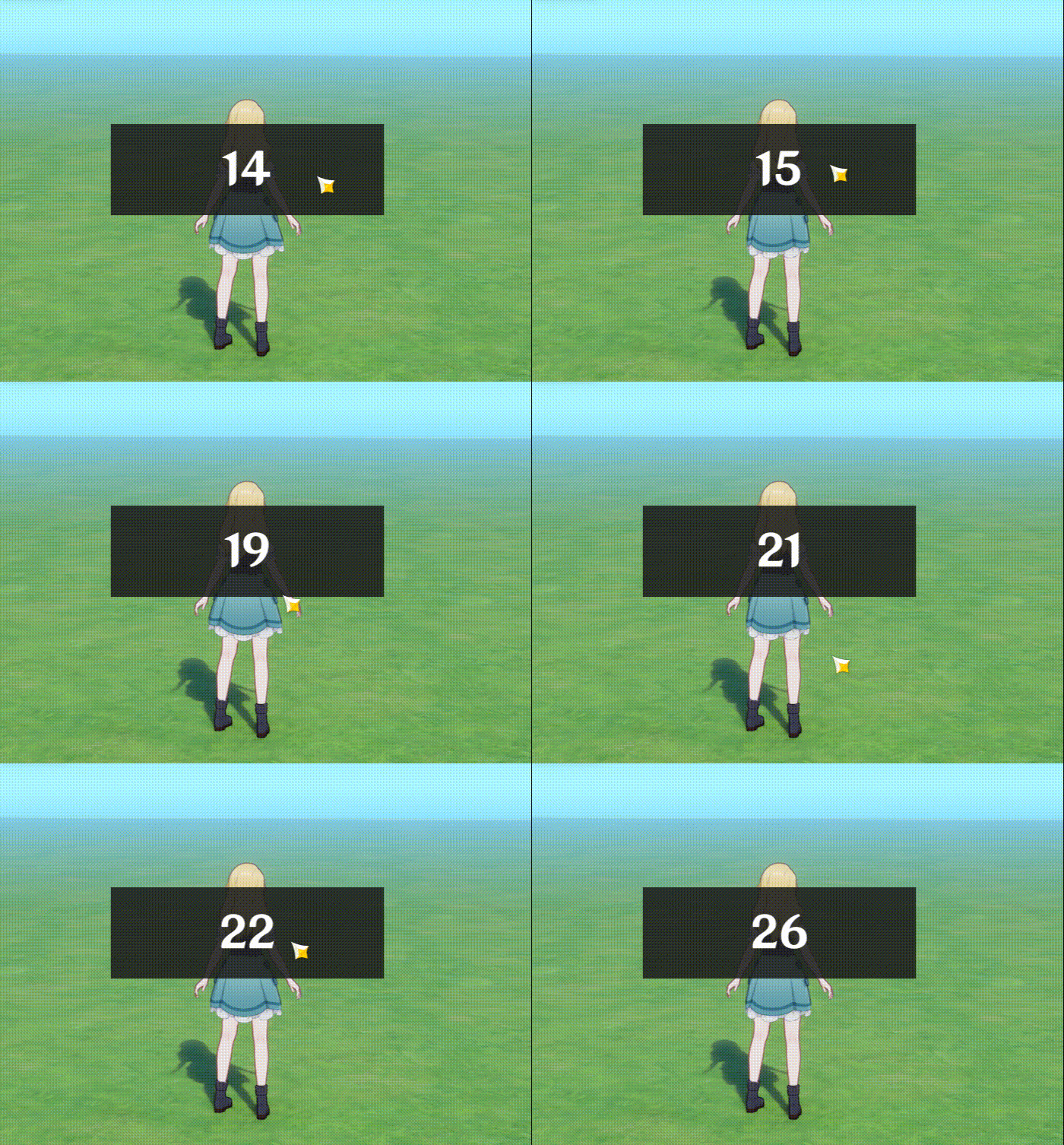
After a click, the next server update includes the added click count. This completes the server-to-client and client-to-server communication example.
6. Summary
This guide covered the basics through several small examples and showed how to find Lua API operations in the official documentation. Once you know the overall structure, use the documentation to look up details as needed.