Home
Interest Group


Related Posts
Inazuma interior teapot Design
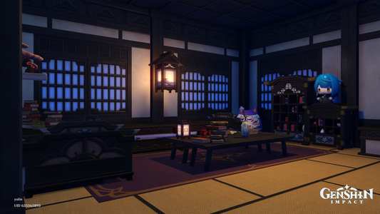
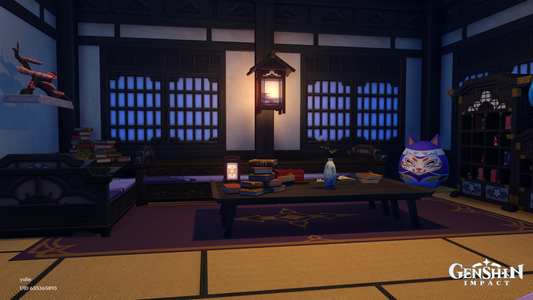
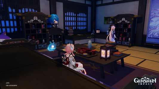

zoglassy
189
Aino’s Clink Clank Bedroom | interior design
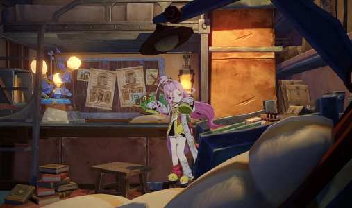
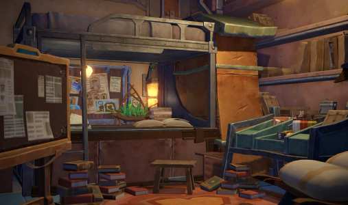
+2

Haru_C
745
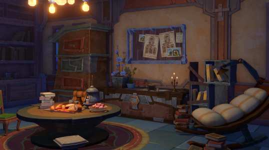
Illuga’s Room | interior design
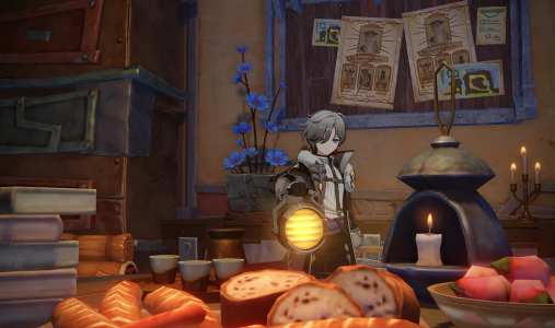
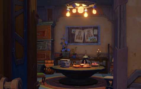
+1
Haru_C
1,383
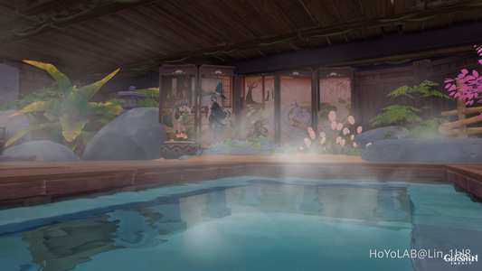
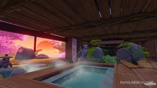
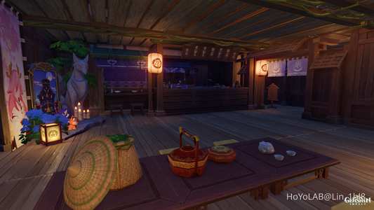
Yae Publishing House & Onsen - Redesigned... again oops~ / Replica ID: 168236770534 EU Server / Two floors in fake interior design with Mansion
+6
Lin_1hl8
2,115
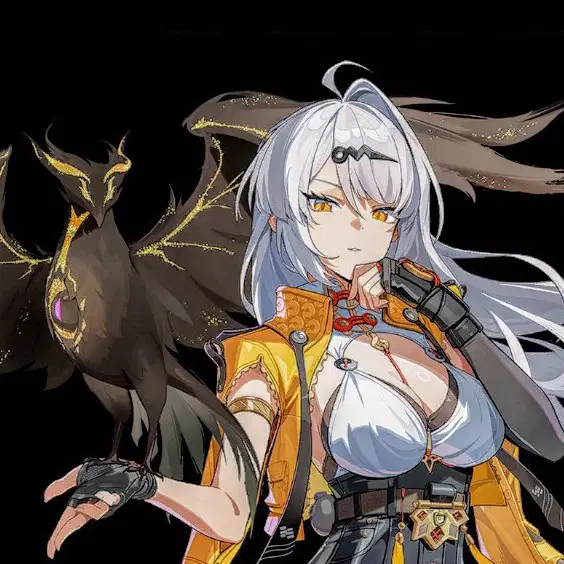
I would never mind if they
release this design of Aha 😭
I don't know why, but I'm still into the original Nihilux design, I'm not saying that new design is bad but Old Nihilux (Aha) design is good tho! Hehe, new design feels more like Sparxie's mom and Himeko's relative. Hehe, we have many White and Red combos already. However, I'm pulling for Aha and this artwork is fantastic. 😝
Source -
https://www.instagram.com/p/DfMxAy3k11Q/?vrfl=NmthbTliamIzcjNu
shine_with_sahin786
1,309
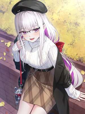
I feel like the first photo should've been be ahas design.
don't get me wrong but the playable design is cute I love it. but uhm..
the thing that I immediately notice when I see the playable design is.. her hair is kinda the same as nihilux design.
I love nihilux design but.. they could've just make her hair different like more drastic, more like a jester or a clown or anything that's unique!

ziwziw
2,200
+1
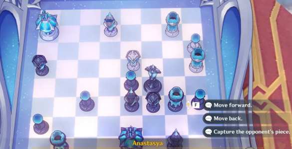
As an occasional chess player, the piece design is extremely bad
The Pawns are perfectly fine with their crystal ball toppers, which basically match the generic design.
The Kings are fine because they're so ornate and large, plus, they are similar to the design in the weekly boss fight.
The Rooks are also fine, thanks to the crenelated top matching generic design.
The Bishops and Knights are terrible. Looking from above, the Knight should have a "mane" and "ears", while the Bishop should evoke a miter, and the Queen should be especially tall and ornate.
None of the remaining designs do any of that, so ever time, I have to try to figure out what's what.
The two matched pieces on E3 and G1 are presumably Knights because they share a diagonal (impossible for Bishops without a Pawn promotion, but such a promotion is invariably to a Queen, or at least a Rook, not a Bishop), and one of them is where a Knight starts, though the path of the other is something of a mystery.
The other pair on A5 and F3 are presumably the Bishops, being on different colors, but with so many wasted moves to get where they are if they were.
The odd one out is, by elimination, the Queen, having a large base, but utterly lacking in the presence and style one would expect. In particular, it lacks a "crown" of similar, but lesser design to the King. I don't think it's position makes much sense.
By comparison, the Wizard Chess set in the Harry Potter movie is quite good. The pieces are thematic, clear, and consistent. I own a set.
OTOH, I would not buy this if it were a set, simply due to the confusion of the pieces.
As for the play, if it were me, I'd be taking pieces like crazy, starting with the Rooks. With such a material advantage, trades and attrition guarantee ultimate victory!

GrauGeist
776
emilie quest (shots of interior design)
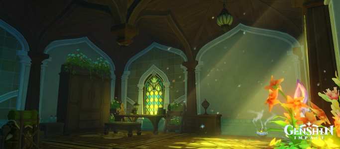
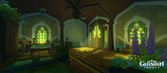
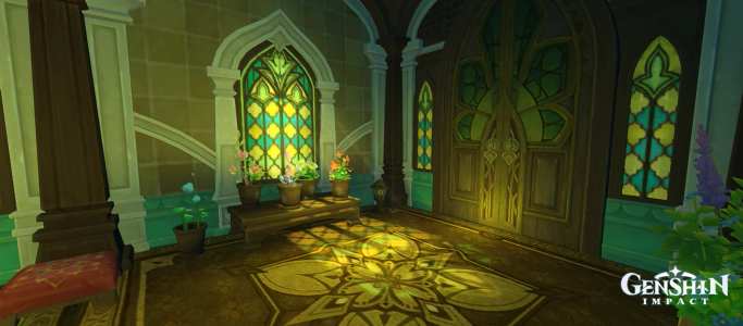
+17

lun_ette
104
Secrets in Nefer's Design
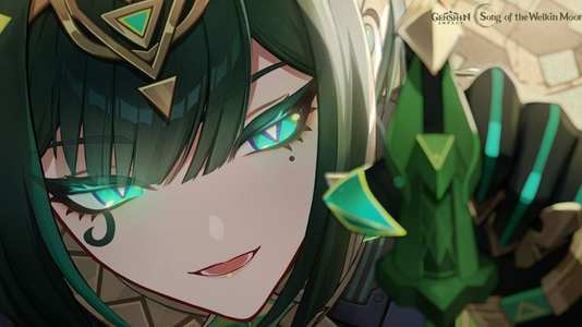
Introduction You can tell at first glance that she is from Sumeru. It is because her design is really awesome. Nefer is dressed like an Egyptian Goddess — her headpiece, the markings under her eyes, the flowing fabric of her dress. They all do a good job at communicating the place of her origin: the desert. Her clothes are actually practical for living in the desert heat, and she was no Ermit, so a more casual outfit does the job, and I really appreciate how well it ties back to it. But I think maybe it could have had used some indications to hint that she is living in Nod-Krai.

Stargazer_12
8,024
+5
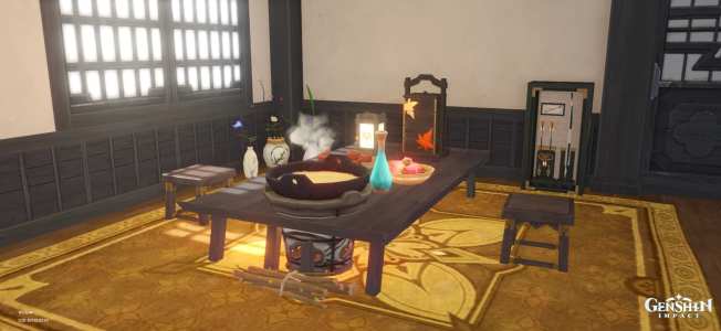
Tea pot mansion interior design

Eye patch man
188
+1
Is Aha's Design Missing That “Aeon” Factor?
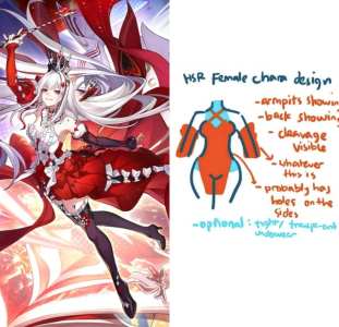
Personally, I actually like the concept of Nihilux's new design. The Queen of Hearts inspiration fits the Alice in Wonderland influence surrounding the Elation cast really well, and the red/white/black palette looks fantastic.
But I can't ignore the criticism either. The detached sleeves, exposed shoulders, short skirt, stockings, and overall silhouette are all very familiar HSR design language. And considering THEY are an Aeon, one of the most incomprehensible beings in the setting, I wonder if the design should have pushed further.
We've already seen people compare Nihilux to Sparxie and other HSR women, while others think the Queen of Hearts motif makes the similarities completely intentional.
So what do you think? Is Nihilux's design appropriately iconic for Aha, or did HoYo play it too safe with the design of their first playable Aeon?

Great Sothoth
38k
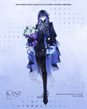
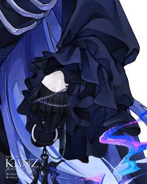
Flins Original Design

+5

kanozey

65k
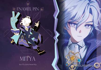
PIN DESIGN SPOTLIGHT: Mitya
The constellation is still a placeholder for now but here's Mitya's pin design with the backcard too! You can still preorder here: https://ko-fi.com/reartity

Reuska
1,484
Behind the Design of Remielle | ZTALK
Remielle, the first-generation Void Hunter, has officially returned! The development team will be on the show to reveal the design journey behind Remielle, sharing fun behind-the-scenes stories from the process. We welcome all Proxies to tune in! ▼YouTube

Zenless Zone Zero

49k
"Sunny Summer Fontinalia" — Version "Luna Ⅷ" Miliastra Wonderland Stage Design Guide Contest
Create your own Wonderland stage design guide for a chance to win up to $1,000! Since the official launch of the Miliastra Wonderland gameplay, we've witnessed countless ingenious ideas and creative designs from talented Craftspeople. We now invite you to share your insights and experiences in stage design, so more Craftspeople can discover the brilliant thought and creativity behind your imaginative creations!

Miliastra Wonderland
9,390

+1


